Hope to see you there in the future. best, Julie
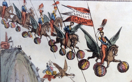
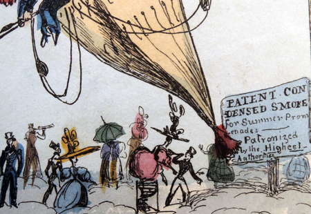
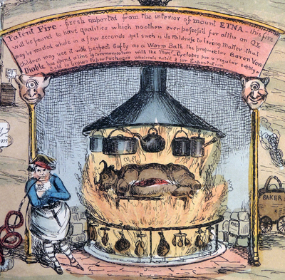
William Heath created three large, multifaceted satires of the Society for the Diffusion of Useful Knowledge (SDUK). The first and third can be found in most collections of British caricature, including ours, but the second is very rare. Thanks to the Friends of the Princeton University Library, the Graphic Arts Collection has now acquired this plate in honor of Dale Roylance.
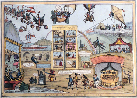
The complexity of the scene reflects the cacophony of inventions and intellectual pursuits raging at that time. Heath begins the group in January 1928, following an accident in the Thames Tunnel, and each feature tunnels to locations around the world. Although they are all varied, the first features accidents due to reading and study; the second focuses on inventions and patents; and the third includes fantastical travel machines.
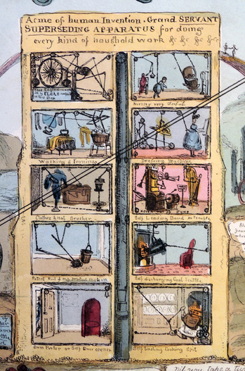
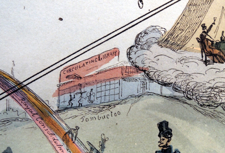
A five-story structure stands at the center of our new print, with ten windows labeled ‘Acme of Human Invention. Grand Servant Superseding Apparatus for Doing Every Kind of Household Work &c, &c, &c.’ Inside each window are different steam-powered machines with elaborate systems of ropes and pulleys for rocking the baby or ironing the clothes or turning the cooking spit. A ‘superseding stair tunnel’ runs up the center.
An exploding volcano shoots travelers from Saint Helena in the South Atlantic Ocean and multiple flying machines fill the sky whle at the bottom right, a chef cooks on ‘Patent Fire: Fresh imported from the interior of Mount Etna.’
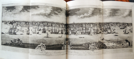
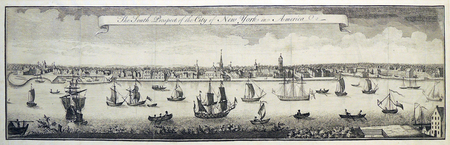
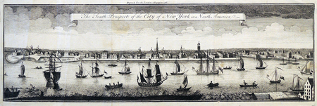
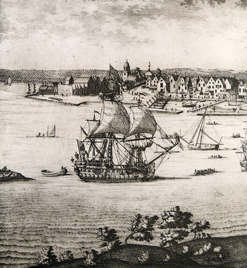
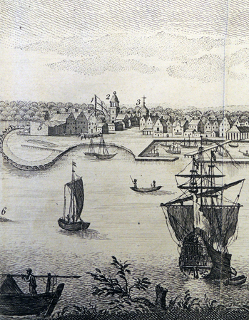
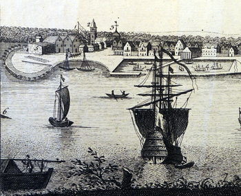
Beginning in 1716, William Burgis stood at the Brooklyn Heights shore and drew the waterfront along the east side of Manhattan, calling it “A South Prospect of the Flourishing City of New York in ye Province of New York in America.” The drawing was probably sent to London to have the British printmaker John Harris (active 1686-1740) engrave the design onto four copper plates, which were printed on sheets of paper 20 ½ x 9 ¼ inches, altogether over six feet long. We know it was completed by 1721 because it was advertised in The American Weekly Mercury as “A Curious Prospect of the City of New-York…”
Many reproductions, reduced in size, have been engraved over the years including the 1746 “Bakewell reissue” and in 1761, a new impression engraved for the London Magazine. Another appears in: William Loring Andrews (1837-1920), New Amsterdam, New Orange, New York (New York: Dodd, Mead and company, 1897) Graphic Arts Collection (GAX) 2009-2656N
When several editions are placed next to each other, it becomes evident that each is slightly different. The numbers identify important buildings, beginning with no.1: Fort Amsterdam first built in 1626. No.2 is a chapel and No.3, the “Secretaries Office” both inside the fort. No.4 is the “Great Dock with a bridge over it” built in 1659 at the bottom of Moore Street. No.5, the south-most buildings are the “Ruines of White Hall built by Governour Duncan [Dongan]”
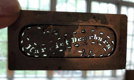
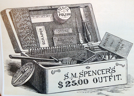
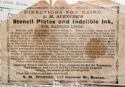
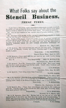
On 15 August 1870, Mr. Chas C. Gates paid $25 for the right to sell the copyrighted stencil designs of S.M. Spencer & Co. of Brattleboro, Vermont. According to the research of Ian Brabner, Gates also received a complete S.M. Spencer & Co. Stencil Outfit, “…well packed in a neat and substantial hand trunk of oiled chestnut….”
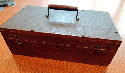
Nearly 143 years later, the Graphic Arts Collection has acquired this hand trunk and its contents (for slightly more than $25). The purchase was made in honor of Dale Roylance, former curator of the Graphic Arts Collection, thanks to the generous support of the Friends of the Princeton University Library.
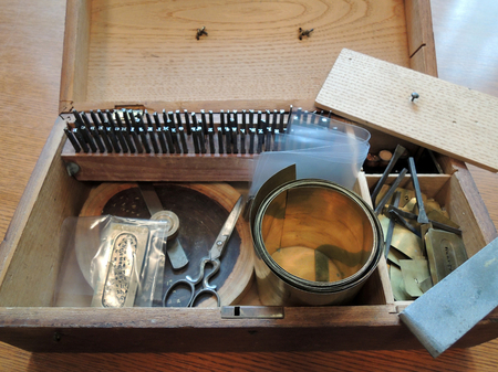
Our “S.M. Spencer’s $25.00 Outfit” includes all the tools, dies, and brass and German silver sheet stock to make small stencils for marking calling cards, books, textiles, and other objects. More importantly, the outfit included S.M. Spencer & Co.’s eight-page Confidential Pamphlet, Containing an Essay on Canvassing, Instructions in Stencil Cutting, Ink Receipts, Etc., Etc. (1870).
Spencer insisted this pamphlet was, “…the key to the outfit … in fact it is a complete budget of stencil information written and copyrighted by me for the exclusive use of my patrons, and it is worth the price of the outfit to any one commencing the business. In no case do I supply this pamphlet to others than those buying my complete outfit, or my dies to the amount of $25, as I paid that sum for single receipts which it contains.”
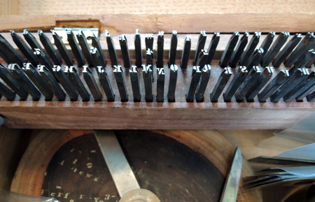
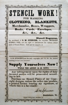
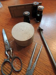
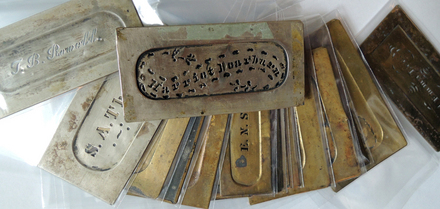
Chas. C. Gates’ stencil outfit form S.M. Spencer & Co. contains the following items: compete upper case and complete lower case alphabet dies; complete numeral dies, 0 to 8 (the numeral 9 accomplished by reversing the 6); 13 ornamenting dies, complete; a case to hold these dies (except for six of the ornamenting dies); a stencil gauge mounted to a hardwood block; a smoothing stone; a framer (lacking its handle); box of polishing powder; two finishing plates: a small pair of shears; a pair of dividers; a four-inch boxwood rule; a steel block scraper; a coil of sheet brass (approx. 3 ½ x 92 inches); some German silver strips remaining from a presumably larger initial stock; design patterns with two zinc curves form laying off the work; an advertising broadside; the aforementioned Confidential Pamphlet; a company issued, tax stamped and sealed certificate of assignment of copyright to use stencil designs dated August 15, 1879 and issued to Chas. C. Gates; and the wooden tool box or “hand-truck” to contain it all. (13 ½ x 7 x 4 ½ inches).
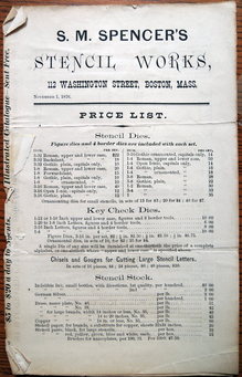
The S.M. Spencer & Company of Brattleboro, Vermont and later, Boston, Massachusetts, was established by D.L. Milliken in 1860. By 1864, Silas Metcalf Spencer (born 1842) had acquired the entire business and was running it by himself. In 1866 Spencer took on as an equal partner Mr. O. B. Douglas and the firm became S.M. Spencer & Co. by 1870, the year Chas. C. Gates purchased his outfit, the company employed 12 workmen.
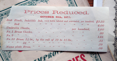
A contemporary source notes that “complete outfits,” which contain within the limits of a small hand-truck everything necessary to carry on a successful and very profitable business, are somewhat a specialty with them.” Sometime in the 1870s, at least by November 1876 based on a price list included with the present outfit, the company had removed from Brattleboro to Boston… . Of the 29 small format stencils, 19 indicate full names, the remaining stencils show only initials or initials and a surname. Interestingly, of the 19 stencils that show a full name, 15 are for women. -thanks to Brabner for this information.
The use of stencils to mark textiles was an important sales avenue form S.M. Spencer & Co.’s business. Their Catalogue of Improved Stencil Dies (1880) boldly states: “Ladies can make Stencil Plates, [o]ften with better success than gentlemen … the business is light and pleasant, and a new field for usefulness is opened to them, promising ample remuneration. Milliners and dress makers can ill afford to be without my stencil outfit. In marking patterns for embroidery, and copying the neat things [Louis A.] Godey and Mme. [Ellen Louise Curtis] Demorest are giving us, the dies and flowering tools are invaluable.”
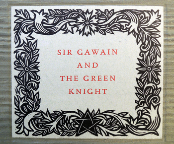
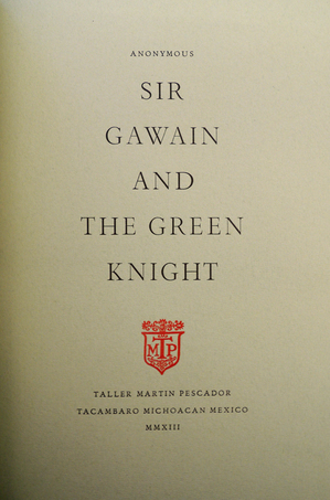
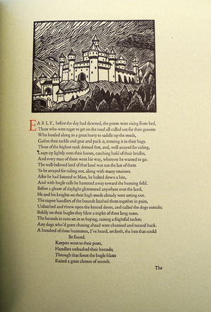
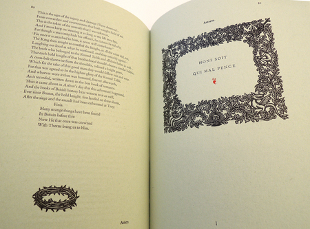
Juan Pascoe’s Taller Martín Pescador (Kingfisher Workshop) in Tacámbaro, near Mexico City, has a new fine press translation of Sir Gawain and the Green Knight. The large quarto is beautifully design and printed on paper made for the project by Pasquale De Ponte in San Lucas Tepetlaco. The Poliphilus and BemboTitling types were cast by Bradley Hutchinson in Austin, Texas, which (the prospectus tells us) were shipped across the Rio Bravo with many an adventure at the customs office, and finally printed with utmost care at Taller Martín Pescador in Tacámbaro, Mexico, on a Vandercook hand press.
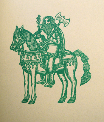
Linocuts were prepared by the Mexican artist Artemio Rodríguez, who has partnered with Pascoe on a number of projects. According to the press, “The majority of the edition has been bound by the printers, sewn on vellum tapes and laced into a dark green stiff paper cover, the structure reminiscent of a classic limp vellum binding.” Graphic Arts has been fortunately to acquire one of twenty-six copies, lettered from A to Z, set aside to be bound in quarter vellum hard covers with a handsome slipcase, by Jace Graf of Cloverleaf Studio in Austin Texas.
To read an English language defence of the authenticity of the Arthurian fables in reply to Polydore Vergil (DNB), see:
John Leland (1506?-1552), A learned and true assertion of the original, life, actes, and death of the most noble, valiant, and renoumed Prince Arthure, King of great Brittaine. Who succeeding his father Vther Pendragon, and right nobly gouerning this land sixe and twentie yeares, then dyed of a mortall wounde receyued in battell, together vvith victory ouer his enemies… (Londin: Imprinted by Iohn Wolfe, dwelling in Distaffe Lane, ouer against the Signs of the Castell, 1582) Rare Books RHT 16th-57
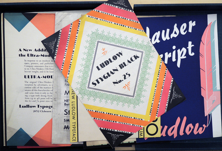
In July 1929, Douglas McMurtrie, director of typography at the Ludlow Typograph Company in Chicago, wrote to Elmer Adler in New York City to say “we are sending you enclosed herewith a newly-issued booklet showing a few of the distinctive ornaments and borders in matrix form offered by the Ludlow Typography Company.”
The Ludlow Typograph Company was founded in 1906 by inventor William I. Ludlow and machinist William A. Reade. From 1912, they marketed a typecasting system called the typograph, specializing in large headline fonts. For a complete description of the company, see the wonderful article by Fred Williams.
http://www.apa-letterpress.com/T%20%26%20P%20ARTICLES/Typecasting/Ludlow%20Typograph.html
Whether Adler purchased their fonts is unknown but he carefully stored the booklet in a box with his other Ludlow type specimen books. This box turned up recently and we opened it to find a treasure-trove of type.
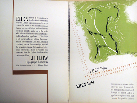
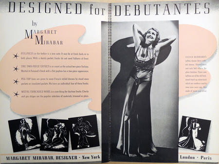
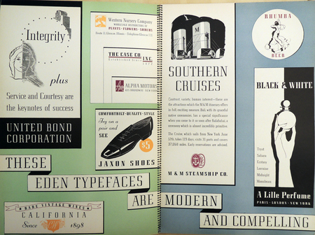
One of the specimen books is labeled “Eden,” here are a few pages from that booklet.
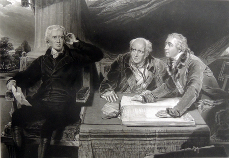
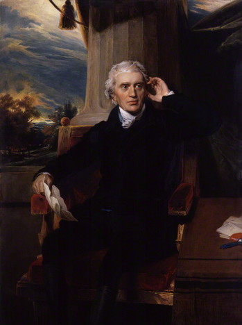
Sir Francis Baring, 1st Baronet (1740-1810), a British merchant and director of the East India Company, is seen on the left, seated with a letter in his right hand. In the center is his brother John Baring (1742-1829) and leaning over the ledger on the right is Charles Wall (1756-1815), a partner in Baring’s Bank and son-in-law to Sir Francis.
Lawrence called portraits like this one “half-history pictures,” combining standard portraiture with the highest level of art, history painting. “Lawrence’s triple portrait … makes you feel like a witness to some grand event, with all the tension, excitement and gravity of history in the making,” writes Sylviane Gold. “Lawrence, like all successful portrait painters, knew how to make his sitters look important. In this case, it wasn’t hard. They were. (The banking trio, after all, provided funds for the Louisiana Purchase, among other epoch-making deals.)” -The New York Times April 23, 2011.
Why does the ledger say “Hope”?
Charles Muss, after Sir Thomas Lawrence, Sir Francis Baring, 1st Bt, 1823. Enamel on bombé copper panel. (c) National Portrait Gallery, London. NPG 1256

Thomas Lawrence, Sir Francis Baring, 1st Baronet, John Baring and Charles Wall, 1806-1807. Oil on canvas. Private Collection
See also: Sir Francis Baring (1740-1810), Observations on the establishment of the Bank of England: and on the paper circulation of the country (London: Printed at the Minerva Press for Sewell and Debrett, 1797). Rare Books (Ex) HG2994.B23
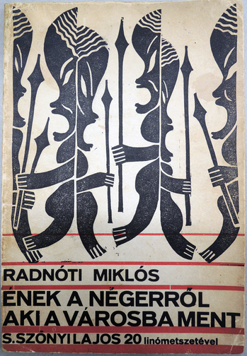
Miklós Radnóti, birth name Miklós Glatter, was a Hungarian poet who died in the Holocaust. We recently acquired this volume published when he was twenty-five.
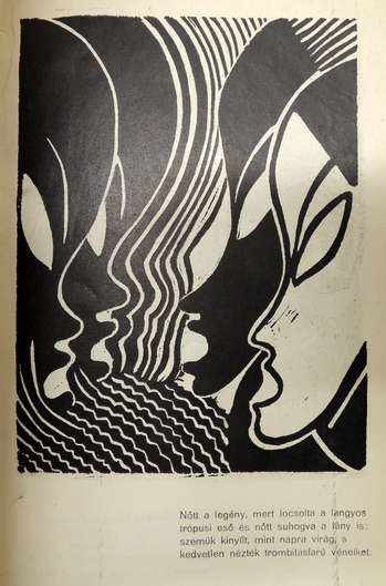
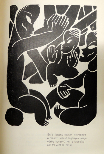
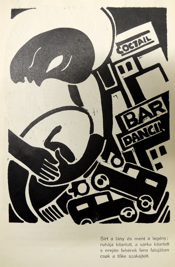
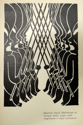
"In 1934 the Gyarmati printing house edited in a separate volume the last poem of Convalescent Wind. This slim book was illustrated by twenty high quality lino cuts of Lajos S. Szőnyi. According to printer Lajos Müller, in spite of the good illustrations they could not sell a single copy of this publication."-- Exhibition of the Library of the Hungarian Academy of Sciences 2009, edited by Dr. Antal Babus.
1934-ben, a Gyarmati könyvnyomtató műhely kiadásában külön kötetben is megjelent a Lábadozó szél egyik ciklusa, az Ének a négerről, aki a városba ment. A könyvet S. Szőnyi Lajos húsz darab színvonalas linómetszete illusztrálja. A nívós illusztrációk ellenére Müller Lajos nyomdász emlékezése szerint a kötetből egyetlen példányt sem sikerült eladni.
"...a truly great poet, one in whom the lyrical image-maker and the critical human intelligence dealing with the tragic twentieth century are utterly fused, as they so rarely are . . . one is always aware of Radnóti's vision as European and of his locus as Hungary."--Denise Levertov
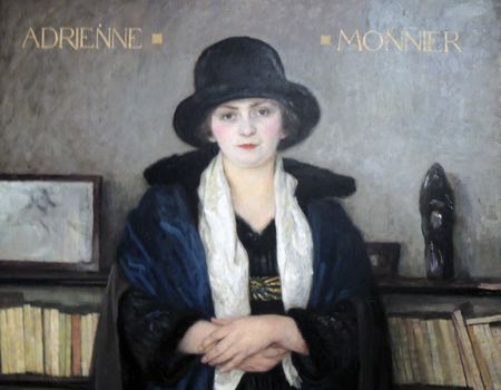
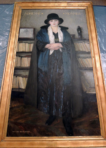
Paul-Émile Bécat (1885-1960), Adrienne Monnier (1892-1955), 1921. Oil on canvas.
The French painter and book illustrator Paul-Emile Bécat worked at the center of the Parisian literary scene in the early 20th century. Among his foremost supporters and patrons were his sister-in-law and her partner, Adrienne Monnier and Sylvia Beach. Monnier ran a bookshop called La Maison des amis les livres on the Left Bank of Paris and assisted Beach in opening her own shop, Shakespeare and Company, which eventually moved right across the street on rue de l’Odeon. Beach commissioned two portraits, one of her lover and two years later, one of herself. She kept both in their apartment until her death in 1962, when Princeton University acquired her estate.
Acquired in 1964 from the Sylvia Beach estate, through the generosity of Graham D. Mattison, Princeton Class of 1926, and with the interest and support of Miss Beach’s surviving sister, Mrs. Frederic J. (Holly Beach) Dennis of Greenwich, Connecticut. Rare Books and Special Collections, Firestone Library.
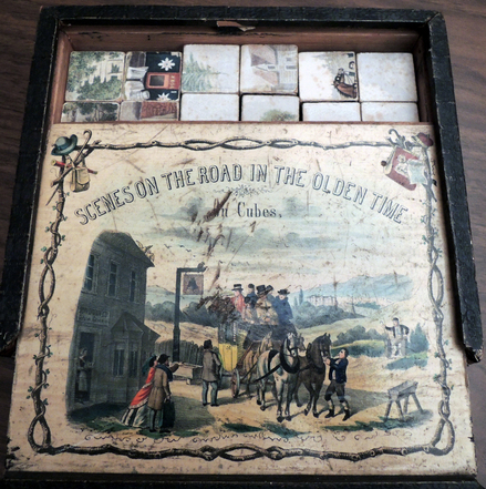
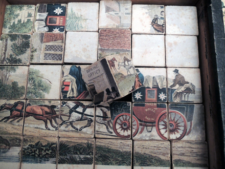
Scenes on the Road in the Olden Time on Cubes, ca. 1850. Wood blocks with pasted paper in wood box. Graphic Arts Collection. Optical Toys
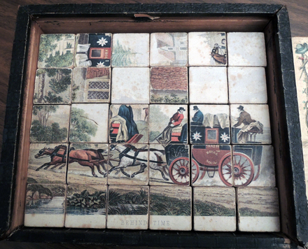
Victorian box of 30 puzzle blocks that form six complete pictures. They can be flipped and turned to change the image or make up one of your own.
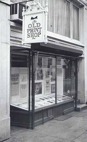
Congratulations to Kenneth Newman, who had a birthday this month and today, after 63 years running The Old Print Shop on Lexington and 29th Street, has retired from the print business. I was one of the fortunate last customers to benefit from his expertise, take his advice, and come home with a wonderful new treasure for our collection.
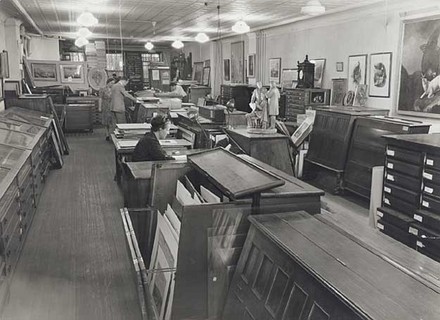
Although we have his sons, Robert and Harry, to continue the family business, print curators across the country are going to miss having Mr. Newman welcomed us into his wonderfully crowded shop, with original tin ceilings and wood cases, to show us rare and remarkable treasures.
Their website offers a few facts. Kenneth’s father Harry Shaw Newman (1896-1966) purchased The Old Print Shop in 1928 and his son joined the business in 1949. Both in New York City and traveling across the country, they probably sold masterpieces to every museum in the United States and helped to build many of the leading collections of fine art prints.
And how many dealers can boast having Berenice Abbott as the shop photographer?
Although the shop is in good hands, with a new gallery coming in the fall, we will miss Kenneth Newman and wish him well in his new life.
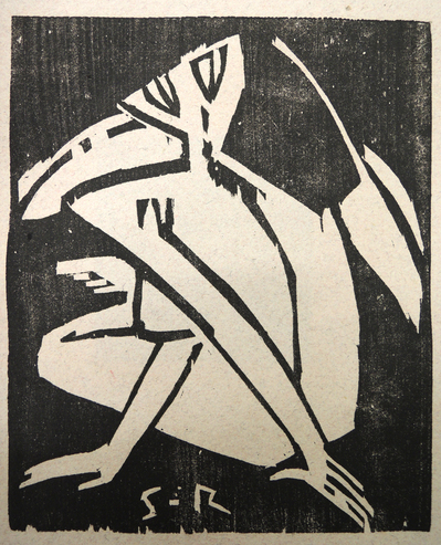 Karl Schmidt-Rottluff (1884-1976)
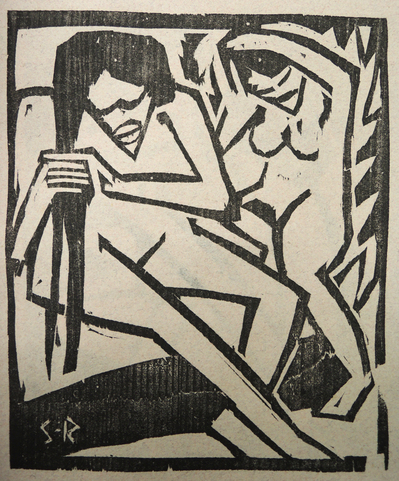 Karl Schmidt-Rottluff (1884-1976)
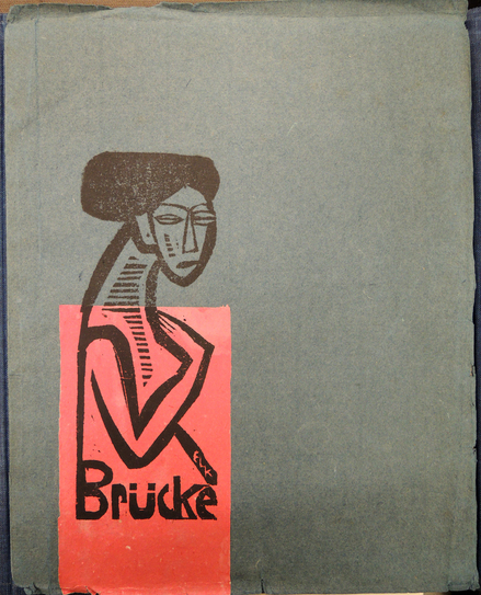
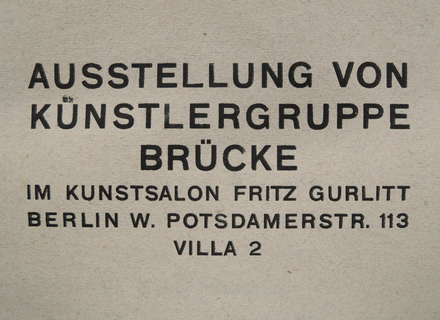
This very rare Berlin exhibition catalogue with original woodcuts is back home after being on view in the Princeton University Art Museum’s splendid show on 1913 and French modernism. Note that our copy also Includes a curious advertisement for the “7. Graphikmappe für passive Mitglieder” of the artists’ group Brücke, to be issued 1912. Illustrations: 9 prints on pink wove paper; full-page woodcuts: 2 each by Erich Heckel (1883-1970), E.L. Kirchner (1880-1938), Max Pechstein (1881-1955), Karl Schmidt-Rottluff (1884-1976); 1 by Otto Mueller (1874-1930). Issued in paper covers (ours are bluish-grey) with an additional woodcut by Kirchner on red paper on the front cover.
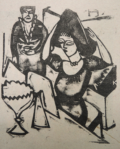 E.L. Kirchner (1880-1938)
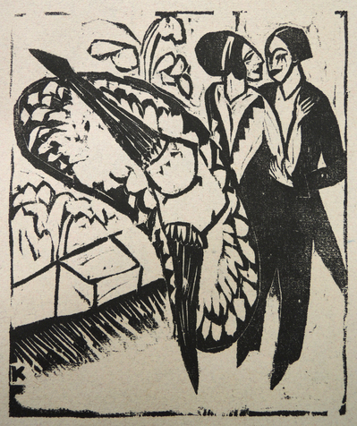 E.L. Kirchner (1880-1938)
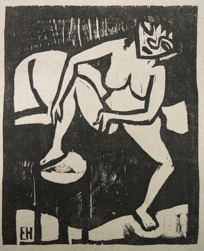 Erich Heckel (1883-1970)
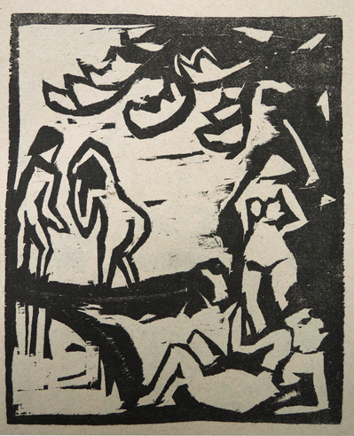 Otto Mueller (1874-1930)
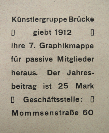
Recent Comments