October 2009 Archives

To vaccinate or not to vaccinate

| 1 Comment

recto

verso

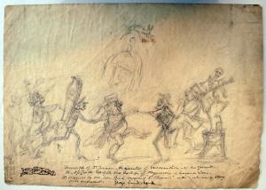
George Cruikshank (1792-1878), Triumph of Dr. Jenner …, ca. 1807. Pencil drawing. Inscribed in ink: “Triumph of Dr. Jenner - the inventor of vaccination - & his friends. The [illegible] is on the top of the old College of Physicians on Warwick Lane - [illegible] suggested by old John Birch, surgeon of ‘St. Thomas’s’ and who was a strong anti-vaccinist.”

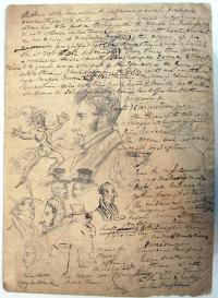
Early in the nineteenth century, the British public was divided as to the benefits of a small pox vaccine. This sketch by George Cruikshank refers to Edward Jenner (1749-1823) who was a strong advocate for vaccination and John Birch (1745?-1815) who was anti-vaccination. A group of figures with joined hands dance in a circle as a skeleton plays a stringed instrument. One of the figures on the left carries a coffin. On the back of the sheet, Cruikshank wrote some notes around a self-portrait. This drawing has not been matched to any published print.

The vaccination debate led to a number of satirical drawings. James Gillray (1757-1815) published an anti-vaccine print in 1802, depicting cows sprouting and leaping from vaccinated patients. In 1808, the year the government finally established a National Vaccine Institute, Isaac Cruikshank (1756-1811) published an engraving supporting Jenner entitled “Vaccination against Small Pox, or Mercenary & Merciless spreaders of Death and Devastation driven out of Society.”

George Cruikshank illustrated several articles on vaccine quackery in the humorous periodical The Scourge including “The Cow Pox Tragedy” and “The Examination of a Young Surgeon.” See, The Scourge, or, Monthly Expositor of Imposture and Folly (London: W. Jones, 1811-1814). Graphic Arts Collection (GA), Cruik 1811.2

Audubon's Double Elephant Copper Plates

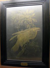
According to the book The Double Elephant Folio, chapter G “The Copper Plates,” John James Audubon (1785-1851) had his engraver Robert Havell Jr. (1793-1878) prepare and ship the set of 365 copper plates for The Birds of America to the United States in 1839. Double elephant refers to the enormous plate size of 1016 x 678 mm. The plates survived a warehouse fire in 1842, about which Audubon wrote “They have indeed passed through the great fire of the 19th ulto but we are now engaged in trying to restore [them] to their wonted former existence; although a few of them will have to be reingraved for use, if ever the work is republished in its original size at all.”

After Audubon’s death, his wife took charge of the plates. An advertisement was published in 1870 offering 350 plates for sale, although no buyer was found. A 1908 article by Ruthven Deane indicates that the plates were eventually stored with William Dodge, Princeton class of 1879, who gave a number of them to the American Museum of Natural History, the Metropolitan Museum of Art, the Smithsonian Institution and Princeton University.

Happily, The Double Elephant also contains an inventory to the 78 plates that are currently known to be held in public or private collections (the rest were presumably sold for scrap). Princeton is fortunate to hold plate no.56 Red-Shouldered Hawk; no.101 Raven [above]; no.417 Maria’s, Three-toed, Phillips’s, Canadian, Harris’s, and Audubon’s Woodpeckers; no.422 Rough-legged Falcon (Rough-legged Hawk); and no.434 Little tyrant fly-catcher; Blue mountain warbler; Short-legged pewee; Small-headed fly-catcher; Bartram’s vireo; Rocky mountain fly-catcher [below].

Waldemar H. Fries, The Double Elephant Folio: the Story of Audubon’s Birds of America (Amherst, Massachusetts: Zenaida Publishing, c2006). Graphic Arts: Reference Collection (GARF), QL674.A953 F74 2006

Heartfield's "Money Writes!" censored and uncensored

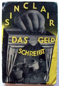
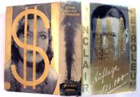
Upton Sinclair (1878-1968), Das Geld schreibt. Eine Studie über die amerikanische Literatur (Money Writes! A Study of American Literature, originally published 1927) (Berlin: Malik-Verlag 1930). Graphic Arts (GAX) 2009- in process

The German artist-activist John Heartfield (born Helmut Herzfelde, 1891-1968), created images in photomontage using labels, newspaper ads, photographs, and engravings. These were cut, assembled, and re-photographed (by Janos Reisman) for half-tone reproduction. Heartfield himself was not a photographer but a collage artist who prepared the work for commercial reproduction. George Grosz said he and Heartfield invented photomontage “in my South End studio at five o’clock on a May morning in 1916.” (George Grosz, “Randzeichnungen zum Thema,” Blätter der Piscatorbühne, Berlin 1928). Unlike other reproductive work, the published half-tones are usually bought and sold as Heartfield originals.

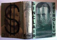
Heartfield joined the German Communist Party in 1918 and remained sympathetic to these ideals throughout his life. His younger brother, Wieland Herzfelde, founded the publishing house of Malik Verlag where leftist writers were championed, such as American Upton Sinclair who sought to expose social injustice and economic exploitation through his writing. Heartfield created many of the dust jackets for his brother’s publications.

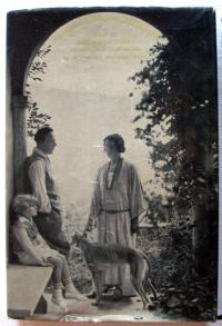
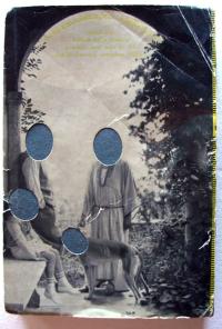
Heartfield’s cover designs involved two images, one for the front cover and one the back, interrupted by a separate spine element. The two images for Sinclair’s Das Geld schreibt depict a group of writers as puppets of the state on the front and the family of German writer Emil Ludwig (1881-1948) on the back. Ludwig, who was himself persecuted by the National Socialist Party, threatened to sue Malik for defamation of character. As a result, the faces of the Ludwig family, including the dog, were punched out on all unsold copies. Princeton now owns both the censored and the original uncensored copies.

Heartfield was eventually forced to leave Germany in the 1930s but thanks in part to Berthold Brecht, was able to return in 1950 when he worked primarily in theater design.

Below, see two of the color variations Heartfield created for Oil! (Petroleum), Sinclair’s novel recently translated to film as There will be Blood, by Paul Thomas Anderson, starring Daniel Day Lewis. Heartfield tried the design both in green and in gold, representing both paper money and hard currency.

For more, try this volume on bindings and dust jackets of Berlin Publishing Houses: Blickfang: Bucheinbände und Schutzumschläge Berliner Verlage 1919-1933 by Jürgen Holstein (2005).

Magdalena Dabrowski, “Photomonteur: John Heartfield,” MoMA magazine no.13 (Winter/Sprint 1993): 12-15.

Peter Selz, “John Heartfield’s ‘Photomontages’,” The Massachusetts Review 4, no. 2 (Winter 1963): 309-36.

True and Correct Tables of Time

This posting is to remind us all that the daylight savings time clock change is coming next weekend.

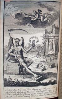
A sacrifice to Time, Fate dooms us all // And at his Feet poor Mortals daily fall // Time whose bold hand alike does bring to Dust // Mankind, and Earthly Pov’ns in which they Trust

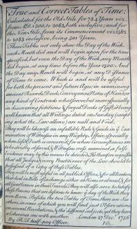
Robert Tailfer (1710-ca.1736), True and correct tables of time: calculated for the old stile for 784 years viz. from A. D. 1300, to 2083, both inclusive; and for the new stile, from its commencement viz. 1582 to 2083 inclusive, being 501 years (London 27 Decr. 1736). Graphic Arts (GAX) 2009 -in process

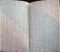
Written by a British naval officer Robert Tailfer, these tables were designed to ease the conversion between dates on the Gregorian calendar and the Julian (Old Style) calendar. The book includes a brief history of the Gregorian calendar (part seen above) and three tables: the first giving the dominical letter for each year from 1300 to 2083, the second relating the days of the week to the dominical letter for each month of the year, and the third relating the epact (surplus days of the solar over the lunar year) and golden number for each year in both the Old Style and the Gregorian systems. See: http://www.newadvent.org/cathen/05480b.htm

According to Tailfer, these tables are useful “in examining ancient Records, Deeds, Conveyances, Notes of Hand, or any kind of Contracts whatsoever, but more especially in discovering fictitious & forged Deeds of Gift, it being well known that all Writings dated on Sunday (excepting what the Law allows) as null and Void.”

The English artist George Bickham I (also known as the Elder, ca. 1684-1758) engraved the entire work, including the allegorical frontispiece. Bickham was a writing master who is best known for his engraved copy books, such as Art of Writing, in its Theory and Practice (1712) Rare Books (Ex) 2007-0692Q; Second Part of Natural Writing: Containing the Breakes of Letters and Their Dependance on Each Other (1740) Graphic Arts Collection (GAX) 2007-0421Q; Natural Writing: In All the Hands, with Variety of Ornament (1740) Graphic Arts Collection (GA) 2007-0462Q; and most important of all, The Universal Penman; Or, the Art of Writing Made Useful to the Gentleman and Scholar, as well as the Man of Business … (1743) Cotsen (CTSN) Folios 11406

Why is Maximilian looking the wrong way?

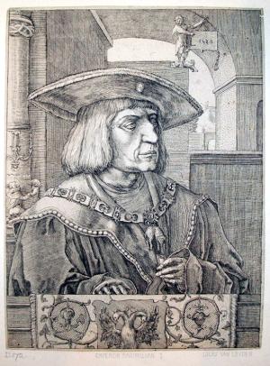
Attributed to Jan Harmensz. Muller (1571-1628) after Lucas Van Leyden (ca. 1494-1533), Portrait of Emperor Maximilian I, no date (original 1520). Engraving and etching. Gift of J. Monroe Thorington, Class of 1915. Graphic Arts GAX 2009-00445

In most impressions of this engaging portrait of Maximilian I (1459-1519), the Holy Roman Emperor is looking to the left. Here at Princeton, he looks to the right. All the details in the scene are exactly the same except laterally reversed. That is, until you look at the top right, where a decorative figure with a horned headdress is holding a tablet with the artist’s signature and printing date: L 1520. While the scene is laterally reversed, the signature and date are correctly printed left to right. Our impression is not from the original plate.

The original portrait of Maximilian I was conceived, printed, and published by the Netherlandish artist Lucas van Leyden (ca.1494-1533) after seeing the 1518 woodcut Portrait of Maximilian I by Albrecht Dürer (1471-1528). In both, Maximilian wears the necklace of the Order of the Golden Fleece and a rimmed hat. However, Lucas’ print is one of the first to combine etching with engraving on a copper plate, using the quicker etched lines to lay down the preparatory drawing and the elegant engraved lines to finish the scene.

According to New Hollstein, this laterally reversed copy of Lucas’ print may have been done by the Dutch artist Jan Harmensz. Muller (1571-1628). Muller apprenticed under the master printer Hendrick Goltzius (1558-1617) and eventually came to equal his teacher’s virtuosity with the burin. Nowhere is the reason behind this copy explained, although it may have simply been to prove that Muller’s talent was equal to that of Lucas.

Muller’s engraving came to Princeton University with a gift of approximately ninety-five prints and drawings of Alpine views. The Portrait of Maximilian I was included with a note explaining that the emperor was the first climber to be depicted using various articles of mountaineering equipment. Maximilian had three books commissioned to document his life, although he probably wrote some of it himself. The third, Theuerdank (1517) (facsimile: Graphic Arts GA PT1567.M6 A7 1979), includes these mountain climbing images.

The New Hollstein: Dutch and Flemish Etchings, Engravings and Woodcuts 1450-1700 (Amsterdam, 1996). Vol. 14 Lucas Van Leyden, p.112. Marquand Library SA ND653.L5 F502 1996

Ellen S. Jacobowitz and Stephanie Loeb Stepanek, The Prints of Lucas Van Leyden & His Contemporaries (Washington D.C.: National Gallery of Art, 1983. Marquand Library SA ND653.L5 J32

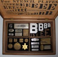
Reese's New Patent Adjustable Stencil Letters

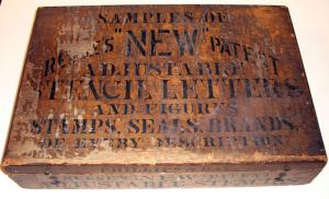
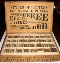
Samples of Reese’s New Patent Adjustable Stencil Letters and Figures, Stamps, Seals, Brands, of Every Description [Chicago: Samuel W. Reese, ca. 1880]. Three-tiered box of over 200 letters, numbers and ornaments. Graphic Arts GA2009-00444

The first U.S. patent (no. 1,767) for “settable-unit stencils” was filed in 1840 by Edwin Allen, who designed stencils of individual letters that could be joined together to form words. This and other U.S. patents can be read at www.uspto.gov.

Samuel Widdows Reese (1843-1913) was a veteran, who served in the 1st Pennsylvania Reserve Cavalry. After the war, he moved to Chicago where he is listed in the city directory as a stencil cutter. Reese filed his first patent for a series of adjustable stencil letters in June 1873 (no. 148,087) and filed a second in 1876 for stencils with an S-fold on one edge to lock together with adjacent letters. The stencils were “machine-cut in spring brass with steel dies”. A broadside advertised Reese’s stencils

for shippers in marking merchandise and produce … manufacturers for labelling contents on boxes … merchants and real estate men in making signs and bulletin boards … cheese factors for dating cheese … in fact nearly all classes find them useful, profitable and desirable.

1876 was also the year his firm S.W. Reese and Company opened in Chicago, where one could buy stencils, badges, and other sign-making equipment. Although the company continued to operate under Reese’s name, he left it in the hands of his partner Christian Hanson (1843-1914) and moved to New York City. A second business called Reese and Company was established on Pearl Street in Manhattan, where it remained until late in the twentieth-century. So successful was the Reese interlocking stencil design that it is still used today.

See Eric Kindle, “Patents Progress: the Adjustable Stencil,” Journal of the Printing Historical Society no. 9 (Spring 2006): 65-93
and
Eric Kindle “Recollecting Stencil Letters,” Typography Papers 5 (Reading, 2003)

Orphan Works

On Tuesday, October 20th, from 6-8pm, the New York City Bar Association will present

Lost and Found: A Practical Look at Orphan Works

You will hear from a diverse panel of speakers, including: Brendan M. Connell, Jr., Director and Counsel for Administration, The Solomon R. Guggenheim Foundation; Frederic Haber, Vice President and General Counsel, Copyright Clearance Center, Inc.; Eugene H. Mopsik, Executive Director, American Society of Media Photographers; Maria Pallante, Associate Register for Policy & International Affairs, U.S. Copyright Office; Charles Wright, Vice President and Associate General Counsel, Legal and Business Affairs, A&E Television Networks; Moderator: June M. Besek, Executive Director, Kernochan Center for Law, Media and the Arts, Columbia Law School.

This free public program will be held at 42 W. 44th Street, in the Meeting Hall of the Association. Please register at: http://www.nycbar.org/EventsCalendar/show_event.php?eventid=1222

Sir Hubert von Herkomer (1849-1914), Orphans, 1878. Drypoint. GA 2006-02669

In addition, The Society of American Archivists (SAA) has issued:
Orphan Works: Statement of Best Practices

a 16-page report that provides what professional archivists consider the best methods to use when attempting to identify and locate copyright holders. The statement, which primarily focuses on unpublished materials because they are usually found in archives, is available on the association website as a PDF at http://www.archivists.org/standards/.

Orphan works is a term used to describe the situation in which the owner of a copyrighted work cannot be identified and located by someone who wishes to make use of the work in a manner that requires permission of the copyright owner. Eight archivists and a recognized legal expert in intellectual property and copyright law developed the statement, based upon their experiences researching copyright status.

We created this statement to provide archivists with a framework to discover what materials they hold are truly orphaned works, and in the hopes of empowering them to provide wider access and use of those materials as a result
said Heather Briston, chair of SAA Intellectual Property Working Group.

The primary authors of the statement include Briston (University of Oregon), Mark Allen Greene (University of Wyoming), Cathy Henderson (University of Texas, Austin), Peter Hirtle (Cornell University), Peter Jaszi (American University) , William Maher (University of Illinois, Urbana-Champaign), Aprille Cooke McKay (University of Michigan), Richard Pearce-Moses (Arizona State Library), and Merrilee Proffitt (OCLC). Financial and administrative support was provided for this project by OCLC Research and the RLG Partnership. More information on SAA’s Intellectual Property Working Group can be found at: http://www.archivists.org/saagroups/ipwg/.

Calligraphy in its Entirety

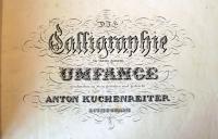
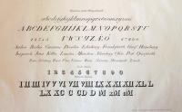
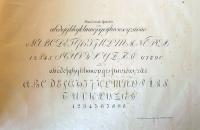
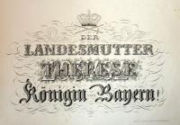
Anton Kuchenreiter, Die Calligraphie in ihrem ganzen Umfange, geschrieben in Stein (Calligraphy in its entirety, written in stone) (Neuburg an der Donau, 1831). 35 x 51 cm.

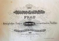
This is the first and only edition of a German writing album containing thirty-three plates printed lithographically by Anton Kuchenreiter. It is a dedication copy for Princess Therese von Thurn und Taxis (1773-1839) and the bookplate bears the Thurn und Taxis arms. The dedication is signed “Anton Kuchenreiter lithograph.”

Kuchenreiter is not listed in any of the standard indexes to printmakers. However, there was a Swiss firm named Kuchenreiter known for their elaborately engraved firearms, led by Andreas Kuchenreiter I (1716-1795). It seems likely that Anton learned engraving from members of the family and incorporated the detail of the cut line with the ease of lithography.

The book was printed in Neuburg an der Donau (Neuburg on the Danube River), the capital of the Neuburg-Schrobenhausen district in the state of Bavaria, not far from the first quarries of Bavarian limestone, which was the favored stone of the earliest lithographers.

Princess Therese was born Duchess von Mecklenburg-Strelitz before marrying Prince Karl Alexander von Thurn und Taxis. Her younger sisters were Louise, Queen of Prussia; Duchess Charlotte von Saxe-Hilburghausen; and Princess Friedrike of Prussia. In the volume’s final plate, Kuchenreiter has drawn three names as though they were printed on top of each other: Louise, then Charlotte, and finally Therese. If you look closely, you will see additional words inside the letters of Therese’s name.


One more point of interest, the work is an example of lithographic engraving, or engraving on stone. A coating of grease-resistant gum arabic is painted on the stone and the artist scrapes away the text with a steel point. The exposed stone is inked and the rest is treated like lithography. This means that it would be written laterally reversed. For more, see Michael Twyman’s Early Lithographed Music (1996), p. 504. Mendel Music Library Ref SV ML112.T89 1996

Beware of Men Traps

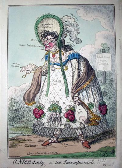
George Cruikshank (1792-1878), A Nice Lady or an Incomparable!!!! Hand-colored etching. Published by S. W. Fores, London, 20 October 1818. Graphic Arts 2009 -in process

Cruikshank’s print is described by the British Museum as: A bedizened hag walks to the left with an insinuating leer, with the stoop fashionable in 1816, and with splayed-out feet. Features and dress are inscribed with the names of food in which fish predominate: her skirt is covered with a Fishing Net, which forms a transparent hem; her high bonnet is a Scallop shell; her mouth Tulips; her teeth Pearl Oyster, or Sweet Meat; her hand, in which she affectedly holds an eyeglass: Fish hooks or Crabs Claws. There are many other disparaging inscriptions. Behind is a notice-board among trees: Beware of Men Traps.

The print is a companion plate to An Exquisite Dandy - Prodigious!!! A Nice Gentleman, (12 September 1818) also designed and printed by Cruikshank, in which a man is depicted walking in profile, bending at the waist. His features and dress are also inscribed with the names of food: his red carbuncled rose is Currant Jelly, his shallow broad-brimmed hat (an eccentricity) is Calves Head Jelly and Pancake; the cravat which covers neck, cheek, and chin is Puff Paste; his loose short trousers are White Sugar Bags; his handkerchief Blow Monge; his long spurs Gilt Gingerbread. Graphic Arts 2009- in process

Hot Corn

It seem fitting in a week when announcements are issued concerning Playboy as mandatory reading for certain Architecture graduate students and masturbation being prohibited in Princeton bathrooms, that we post something from a temperance book devoted to showing the “lamentable conditions” to which the wicked are apt to fall.

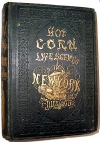
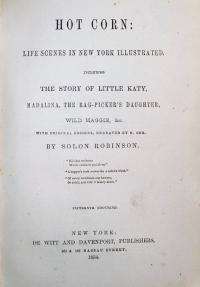
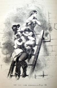
Solon Robinson (1803-1880), Hot Corn: Life Scenes in New York Illustrated. Including the Story of Little Katy, Madalina, the Rag-Picker’s Daughter, Wild Maggie, etc. (New York: DeWitt and Davenport, 1854). Half title and six full-page illustrations by John McLenan (1827-1865) and one by Frederick M. Coffin, all engraved on wood by N. Orr. Graphic Arts Hamilton 1043.

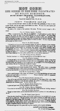
This is a collection of stories first published individually in the New York Tribune, then released, according to an 1853 advertisement in the New-York Daily Times, in an edition of 15,000. The book sold in a cloth binding for $1.25 and in a gilt edition for $2.00. It was a best-seller. The sad stories focus on the beggars, the alcoholics and the prostitutes who lived in and around the Five Points area in the lower east side of Manhattan.

So popular were the stories that three separate theater productions were developed around the character of Little Katy (who sold hot corn in the winter and peanuts in the summer) at Barnum’s American Museum, the Bowery Theatre, and the National Theater. At the latter venue, Little Katy ran in repertory with Uncle Tom’s Cabin.

There are many such books on our collection. See also Ernest Gray or The Sins of Society by Maria Maxwell (1855) Graphic Arts Hamilton 1055

According to Sinclair Hamilton, the artist John McLenan was discovered by the publishers working in a pork-packing plant in Cincinnati and making drawings on the tops of barrels. He became one of the most prolific of our early illustrators. Besides the American temperance books, McLenan illustrated many English novels for Harper’s, such as The Woman in White, Tale of Two Cities, and Great Expectations, as well as being well-known as a comic draftsman.

Unfortunately McLenan died in 1865 at the age of thirty-eight. The memorial which appeared in the May number of Yankee Notions called him:

…one of the best draughtsman America has ever produced…. Equally at home in caricature and in sketches from the life, with a quick perception of the ridiculous and a fine appreciation of the picturesque, he soon took his place among the illustrators of our current literature, second to none.

See another biography at http://www.victorianweb.org/art/illustration/mclenan/bio.html

Books that can't be read with Google, no. 1

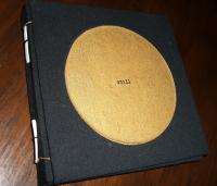
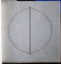
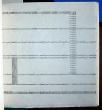
Molly Burgess, Still ([Piscataway, N.J.] : Carolingian Press, 1975). Copy 16 of 25. Graphic Arts Collection (GAX) in process

This is a book of concrete poetry, based on Eastern philosophy and religion. The words have the appearance of a typewriter face but are in fact printed by letterpress at the Carolingian Press on different handmade rice papers. The book includes anagraphic, concrete poems incorporating the words: breath, earth, heart, death.

The artist writes:

Still is my response to a study of Eastern philosophy and religion. Though the book is based on personal interpretation and experience, there are specific links to both the history and philosophy from which it was conceived. Designed as a complete experience, it leads from the unfolding of the cover through the colors, into the patterns, the paradox, the stillness….

The book is arranged on four different levels: by color, by country, by thought, and by number…. There are thirty-two poems, eight in each of the four sections (the Eightfold way: right views, right intentions, right speech, right action, right profession, right effort, right watchfulness, right concentration). Each section of eight is again divided in two sections of four (the Four Noble Truths) by the ‘lace’ papers. The paterns of the four ‘lace’ papers progress from diamond to star to scallop to circle.

British Officer's photography album, part two

In the previous post, we described the first section of a nineteenth-century photography album compiled by a British Army officer, attributed to be the Army surgeon Alexander Dudgeon Gulland, MD Edinburgh University. The second section of the album includes photographs of the Indian Northwest Frontier Hazara Campaign (1867-1870) and others taken in Malta, Ireland, Guernsey, Spain, and elsewhere.

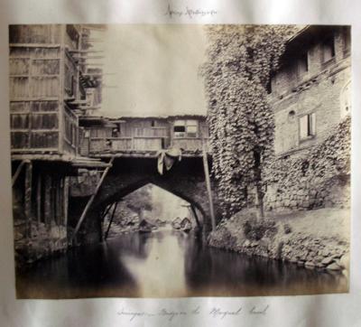
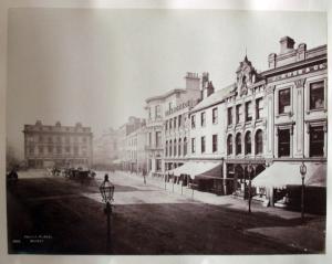
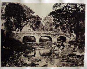
After the Jamaica photography, the album moves on to India and includes 32 photographs of Kashmir and the Northwest Frontier, in particular 8 fine photographs of Kashmir by the British photographer Samuel Bourne (1834-1912). The Bournes are numbers 792, 805, 815 (prize-winning photograph Srinagaar a Bridge on the Margual Canal above), 782, 776, 261, 818, and one titled Glimpse through the Forest.

There are also group portraits of the Sixth Royal Regiment, all annotated with names, including one with Gulland as a blurred figure at the edge of the frame, perhaps suggesting he was the photographer and moved into the frame at the last minute? A two-part panorama of the camp of the Hazara Field Force includes notes on all the batteries and contingents of Sikh, Gurkha, and Punjabi troops as well as men from the Maharaja of Cashmere and the Nawab of Ulm. The British recognized that collaborating with native troops was an essential part of sustaining the campaigns they had to fight to keep India.

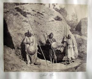
There are also two striking and unusual images: one is of Hill Men in chainmail armour; and the other of what is noted as The Attack on Mhunnah-Ka-Dhunnah showing a cannon ball arching through the air and landing on a hillside. The other areas included in the album are mainly ports and bases used by the British Army and Navy. Most of these photographs are by commercial studios, which indicates that Gulland, like many nineteenth-century tourists, bought photographs of the places he visited.

One of 5 views of Malta is by Giorgio Sommer (1832-1914) and taken around 1860-1865. Among the 20 of Ireland are 12 large blind-stamped views and 3 others by William Lawrence. One of the 19 views of Guernsey is a mammoth print of the Harbour and Castle Cornet, most unusual for the time, and the views of Gibraltar and Spain are from Francis Frith’s Series.

This album is still being processed but will soon be available for research in the reading room of Rare Books and Special Collections, Firestone Library. Special thanks go to Katherine Spears who did the majority of the research on this unique album.

On October 11, 1865, several hundred native Jamaicans marched into the town of Morant Bay, the capital of the predominately sugar-growing parish of St. Thomas, to demonstrate against injustices. Several members of the crowd, on both sides, were killed. In the days that followed, the British Army was called in and over 500 people were murdered along with hundreds wounded.

We recently acquired an album with 165 rare albumen photographs: 59 of the Morant Bay Rebellion in Jamaica (1865), 32 photographs of the Indian Northwest Frontier Hazara Campaign (1867-1870), and 64 others depicting Malta, Ireland, Guernsey, and elsewhere. The prints are primarily by unidentified amateur photographers, although there are 8 by Samuel Bourne, 5 by G. Sommer, 3 by William Lawrence, several by Francis Frith.
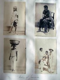
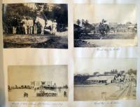
This post will describe the 59 photographs relating to the 1865 Morant Bay Rebellion and future posts will deal with the other sections. The album’s careful compilation includes detailed notes of the people, places, and dates relevant to each photograph. It may be the work of a surgeon in the British Army, Alexander Dudgeon Gulland, MD Edinburgh University, who appears in the album. Appointed Staff Assistant Surgeon in 1854, he served with the 6th Foot which was in Jamaica in 1865 and is listed as having been in China from 1860-62 and Hazara in the Northwest Frontier in 1868 (See: Hart’s Army Lists and Returns Relating to Medical Officers (Army) 1854). The Jamaica section of this album begins with photographs of the Morant Bay military base including a view from the Surgeon’s Quarters and general views of the area to set the scene.

My thanks to Dr. Mimi Sheller, Professor of Sociology, Director, Center for Mobilities Research and Policy Department of Culture and Communication Drexel University, for the following summary of these events.

The events at Morant Bay in 1865 followed on the heels a period of public meetings known as the Underhill Meetings, and peaceful expression of grievances through petitions. Complaints included a series of economic issues related to wages, land tenure, access to markets, and labor rights; political issues related to unfair taxation, no justice in the courts, and elite-biased government policies; and civil issues that included voting rights, and access to healthcare, education, and land. In that sense it was not a riot so much as a social movement, which was rejected by the Governor and finally turned to violence against the representatives of the local government.

Here is a basic description of the facts of what took place before the government sent in military reinforcements to “suppress” the rebellion. During a trial for trespass held in the Morant Bay Court House on the 7th of October 1865, James Geoghagan disrupted proceedings by shouting that the defendant should not have to pay the costs. He was ordered out of the court. When he did not go quietly the Judge ordered his arrest. However, his sister Isabella challenged the police, and when they got outside a “mob” including the Native Baptist deacon Paul Bogle and some of his followers from the hamlet of Stony Gut rescued him from the police. The following day the police went up to Stony Gut to arrest those involved, but the policemen were instead captured and made to swear an oath to “cleave to the black”. To continue reading Dr. Sheller’s description, click on the extended entry link below.
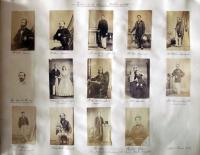
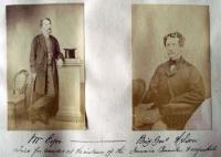
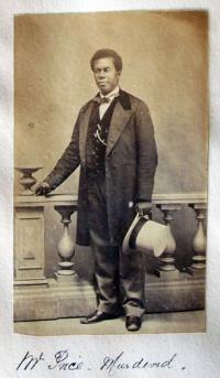
Portraits of key figures from the rebellion tell more of the story. Among them are a page of portraits of “The Victims of the Jamaica Rebellion of 1865”, a portrait of George William Gordon who is now considered a Jamaican national hero, portraits of unidentified Jamaican natives, and of British Army officers. Listed among the victims are not only those who were murdered but also those in the colonial government who were later tried for murder and acquitted.

It is probable that these portraits were gathered after the rebellion and some may have been taken by the only commercial studio we can identify in Jamaica at the time, run by Adolphe Duperly (1801-1865) and taken over by his son, Armond.
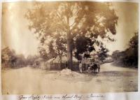
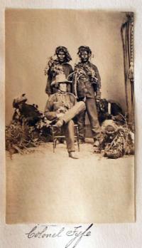
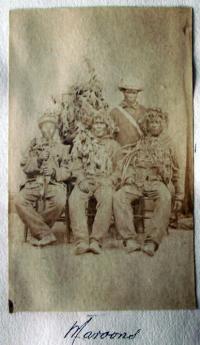
Two small photographs of Jamaican Maroons, including one of Maroons in camouflage with Colonel Fyfe, reflect an interesting social dynamic in the rebellion. Originally runaway slaves who set up communities that engaged in guerrilla warfare against the British, the Maroons eventually cooperated with the British authorities after they started to deport them and confiscate their land in 1796. Used to suppress slave revolts until 1838, they were also used to suppress the 1865 rebellion.

For more information, see “The Town of Morant Bay, Morant Bay, Jamaica,” Harper’s Weekly, December 23, 1865.

“Morant Bay, Jamaica, the Scene of the Negro Insurrection,” The Illustrated London News, November 25, 1865.

Gad Heuman, The Killing Time, The Morant Bay Rebellion in Jamaica (London: Macmillan, 1994) Firestone F1866.H48 1994b

Arvel B. Erickson, “Empire or Anarchy: The Jamaica Rebellion of 1865,” The Journal of Negro History, 44, no. 2 (April 1959): 99-122.

Henry Bleby, The Reign of Terror: a Narrative of Facts concerning Ex-Governor Eyre, George William Gordon, and the Jamaica Atrocities (London: s.n., 1868). Firestone HF 1569.E53
Koloman Moser in the TLS

| 2 Comments

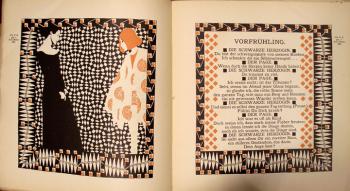
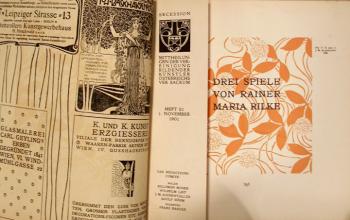
In the September 18, 2009, issue of the Times Literary Supplement on paper, the TLS chose to illustrate Robert Vilain’s review of three books about Rainer Maria Rilke with a double-page spread from Ver Sacrum (correct citation: Heft 21, 1. November 1901). Don’t check the digital article because the online TLS does not include the images from the paper copy, only the words. The Rilke verse is from the dialogue Vorfrühling (Early Spring) from Drei Spiele (Three Plays), spoken by Die Schwarze Herzogin (the Black Duchess) and a servant. There is a credit line for Rilke but no mention of the graphic artist who makes the pages so appealing.

The pages were drawn and printed by Koloman Moser (1868-1918). In the outer margins you can see his small printed signature “Kolo Moser”. As a cofounder of the Vienna Secession, Moser joined Gustav Klimt, Josef Hoffmann, and others to establish a revolutionary new art outside of academia. Moser served as editor of their journal, Ver Sacrum, as well as the chief designer for several years. Through the journal’s pages, Moser endeavored to fuse art and literature, graphics and text. With respect to TLS, I’m not sure he would have approved of their description of his work as illustration or the disconnect between paper and digital versions of their publication.

Ver sacrum: Organ der Vereinigung Bildener Künstler Österreichs (Wien: Verlag Gerlach & Schenk, 1898-1903). Marquand Library (SAX) Oversize N6494.W5 V47q

For more information, see also Koloman Moser, 1868-1918 (Vienna: Leopold Museum; Munich; New York: Prestel, c2007). Marquand Library (SA), ND509.M7 A4 2007b

During 1903, Moser and Hoffmann left the Secession group and founded the Wiener Werkstätte. Their Almanach also included texts by Rilke and designs by Moser. See Almanach der Wiener Werkstätte (Wien: Rosenbaum, [1911]). Graphic Arts Collection (GAX) 2007-0687N

Portrait of Einstein by Okamoto Ippei

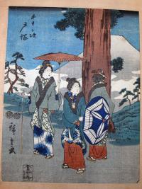
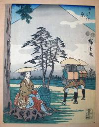
We recently found we have a rare copy of Ando Hiroshige’s Fifty-Three Stations on the Tokaido (Jimbutsu (Mankind) Tokaido), Muraichi, 1852. Chuban tateye. As if that isn’t good enough, it may have been the personal copy of Albert Einstein (1879-1955), who traveled to Japan in 1922. The library has a number of ephemeral items from that trip. http://diglib.princeton.edu/ead/getEad?id=ark:/88435/9880vr03d.

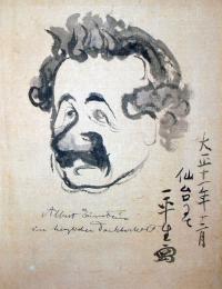
At the back of this volume is a portrait of Einstein by the cartoonist Okamoto Ippei (1886-1948), done in December of 1922 in Sendai, Miyagi Prefecture, Japan. The artist was fluent in English, having traveled a great deal, and was actively publishing his cartoons in several magazines and newspapers at the time. We hold a number of his published books, such as Yama to umi (Mountain and ocean) ([Osaka]. Osaka Asahi Shinbunsha. 1926) Cotsen Children’s Library (CTSN) Non-Roman — Japanese 38189. He must have made Einstein’s acquaintance and agreed to do this caricature in the man’s book.

World War I book drive

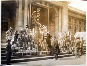
The caption on the back of this photograph states: “The New York Public Library steps are much used now. Books in the centre and at the right [is] the tent where purchasers of War Savings Stamps gained a look at a new Brow[n]ing gun.” The poster seen in the back, designed by Charles Buckels Falls, ca. 1918 reads: Books Wanted For Our Men in Camp and ‘Over There’. Take your gifts to the public library.

Graphic Arts photography collection GA 2009 -in process

Recent Comments

  • Howard Coblentz: I have a round seal shaped like a pear a read more
  • John Overholt: Wikipedia's entry for Sir Francis says: "Throughout Baring's lifetime his read more
  • Serge Rodrigue: It is a precious thing you have a book from read more
  • Colin Wicks: I have a copy of “A Round Game.” And it read more
  • Laurence Hilonowitz: I was a Customer, Friend of Bob Wilson. I Live read more
  • allen scheuch: Absolutely STUNNING! Those colors, those designs made my day! Thanks, read more
  • Olivier: Hello Diane, If you are still looking for an examplare read more
  • Stella Jackson-Smith: I have a framed picture by A.Brouet, signed with the read more
  • John Podeschi: I remember Dale fondly from my days at Yale (1971-1980). read more
  • Joyce Barth: I have some or all of this same poem. I read more