June 2010 Archives

Happy Anniversary Ed Colker

In honor of fifty years of poetry and prints from Ed Colker and his presses Editions du Grenier and Haybarn Press, a new portfolio has just been issued featuring one poem each from fifteen poets and visual responses from Mr. Colker. The letterpress printing is by Bradley Hutchinson and the color lithograph frontispiece was printed by Maurice Sanchez at Derrière L’Etoile Studio. Poets House (10 River Terrace at Murray Street in Lower Manhattan) is mounting an exhibit of the poems & prints by Mr. Colker, with an opening reception on Thursday, July 8, from 6:00-8:00 p.m. The show will be on view through Saturday, September 18 during regular Poets House library hours. Admission Free. http://www.poetshouse.org/progcoming.htm

Ed Colker and Michael Anania, Gathering: Fifteen Poets/Poems (Millwood, NY: Haybarn Press, 2010). Copy 47 of 125. Graphic Arts GAX 2010 -in process.

Contents: Thursday’s child / Michael Anania —Argument / René Char; translated by Mary Ann Caws — Pentecost Sunday in Lahinch / J.A. Collins — Crush #77; Crush #320 / Lea Graham — The price / Robert Hawks — The book is molded from clay / Edmond Jabes (from The book of questions); translated by Rosmarie Waldrop — A sentence to be read upon those who refuse to soar / J. Curtis Johnson — Second threshold, learning to trust in another language; Boulevard, meals in the open air / Catherine Kasper (from Blueprints of the city) — A hundred love sonnets, XII / Pablo Neruda; translated by Audrey Lumsden Kouvel — Vision, a note on astrophysics / Kathleen Norris — Abnormal weather / Deborah Pease — The rainbow is a tree / Abraham Sutzkever; translated by Barnett Zumoff — Unresolved / David Ray Vance — (from The reproduction of profiles) / Rosmarie Waldrop — Praying for rain in Sante Fe (for Don Murdoch) / Jeanne Murray Walker.

The Haybarn Press announcement reads “To mark the 50th year of our fine print editions inspired by poetry and poets, we present Gathering - a new portfolio of fifteen poems and translations … with visual responses by Ed Colker. … The publication is meant as an expression of appreciation for the poets and the works that have joined and illuminated the journey of a half-century. …A color lithograph frontispiece is followed by the artist’s preface and a broadside page with a color vignette for each poem.”

John Baptist Jackson (1701-1780?), An Essay on the Invention of Engraving and Printing in Chiaro Oscuro, as Practised by Albert Durer, Hugo di Carpi, &c., and the Application of It to the Making Paper Hangings of Taste, Duration, and Elegance (London, 1754). Graphic Arts GAX 2010- in process.

In 1745, the English chiaroscuro printer John Baptist Jackson (1701-1780?) returned to London and found work designing calico cloth. After six years, he saved enough money to established a wallpaper manufacturing company hoping to revolutionize the industry. To help promote his work, Jackson published two books on printing: Enquiry into the Origin of Printing in Europe (London, 1752) and Essay on the Invention of Engraving and Printing in Chiaro Oscuro (London, 1754).

The latter has an eight page essay and eight color plates (with desciption), printed from multiple woodblocks with oil-based inks. It sold for two shillings and sixpence. On the title page Jackson printed his favorite passage from Pascal’s Thoughts: “Ceux qui sont capables d’inventer sont rares: ceux qui n’inventent point sont en plus grand nombre, et par conséquent les plus forts.” This has been very loosely translated as “For those who are capable of originality are few; the greater number will only follow and refuse glory to those inventors who seek it by their inventions.” Unfortunately, Jackson’s business was forced to close shortly after the volume was published.

For more on Jackson, see an earlier post: John Baptist Jackson

John Henning metal relief plaque binding

John Henning, Jr. Large metal relief plaque designed for the upper cover of a bookbinding. 1822. Attached to a folio album with blank sheets. Graphic Arts GAX 2010- in process.

The Scottish sculptor John Henning (1771-1851), first saw the Elgin marbles at Burlington House on a visit to London in 1811. He stayed for the next twelve years copying the Parthenon reliefs. “I began to draw,” he wrote, “on August 16, 1811, which fixed me in the mud, dust, and smoke of London. I was so fascinated with the study, that I was there by sunrise every morning except Sunday, and even the cold of winter did not mar my darling pursuit.”

Henning began working in wax, then carving in ivory, and finally making slate moulds, from which plaster models were cast. By 1821, he completed enough to begin selling his casts, which were housed in mahogany cabinets with nine drawers to hold the series. The cost was £42 for a set approximately two inches high by twenty-four feet long.

Unfortunately, Henning failed to register for copyright on his work and thousands of reproductions were pirated and sold, bankrupting the poor sculptor. He went on to produce the the screen at Hyde Park Gate (1827) and the frieze around the Athenaeum (1830) in Waterloo Place but ultimately, died in poverty.

This metal relief, designed for the upper cover of a bookbinding, is signed Henning F 1822 (f stands for fecit or made by). The plaque contains two relief panels from his Parthenon series and two decorative angels. This might have been one of the many ways he hoped to market his reproductions of the Elgin marbles, although we have not found other examples of bookbindings by Henning.

Cries of London

On January 1, 1799, Rudolph Ackermann (1764-1834) published the first of eight plates designed by Thomas Rowlandson (1756-1827) of the Cries of London. Rowlandson’s ink drawings were etching and printed by the Swiss artist H Merke (fl.1799-1820) and hand colored in Ackermann’s shop on the Strand. The cost was two shillings and six pence colored or one shilling and six pence uncolored. Rowlandson continued to add to the Cries and in 1820, the complete set of fifty-four prints was published under the title of Characteristic Sketches of the Lower Orders. Princeton owns two copies of Rowlandson’s original peddlers and street hawkers, pasted into albums.

Graphic Arts’ second set of Cries has the artist’s name added to the bottom of each mat.

Thomas Rowlandson (1756-1827), [Etchings from Cries of London] (London: Ackermann’s, 1799). Graphic Arts Collection (GA) Oversize Rowlandson 1820.01.11q.

see also:
Diana Donald, The Age of Caricature: Satirical Prints in the Reign of George III (New Haven: Yale University Press, 1996). Firestone DA505 .D73 1996

Joseph Grego, Rowlandson the Caricaturist: A Sketch of his life, Times, and Contemporaries (New York: J.W. Bouton, 1880). Graphic Arts GARF Oversize NE642.R7 G8q

The Tools of Arts and Industry

The Austrian tool manufacturer Franz Freiherr von Wertheim (1814-1883) was born in Krems and received international recognition for his knives and axes made from Styrian steel. He first exhibited his tools at the 1845 World’s Fair and continued to present bigger and better displays every few years. This cabinet of his firm’s hand tools was at the Paris Exposition of 1867. The following year, Wertheim published a sumptuous trade catalogue with forty-five lithographed plates of tools. According to OCLC, Princeton University holds the only copy in North America.

Franz Freiherr von Wertheim (1814-1883), Manuel de l’outillage des arts et métiers: à l’usage des écoles techniques, compagnies de chemins de fer et de navigation[Handbook of the Tools of Arts and Industry: For the Use of Technical Schools, Railroad Companies, and Navigation]. Portfolio has title proper: Recueil des outils et machines. (Vienne [Vienna]: Charles Gerold fils, Libraire-Éditeur, 1869). Graphic Arts Collection (GAX) Oversize 2005-0002E

For more on the Wertheim company see: http://www.wertheim.at/0e_Biografie.htm

Walt Whitman and Zelda Fitzgerald are going away

Our exhibition The Author’s Portrait: “O, could he but have drawne his Wit” is closing soon and our old friends are going back into storage. The final day to visit will be July 3, 2010 since Firestone Library will be closed on July 4 and 5. Until then, the exhibition galleries are on summer hours if you want to stop by one more time before the show closes: Monday to Friday, 8:30 a.m. to 4:15 p.m., and weekends, 12:00 to 5:00 p.m.


Top to bottom: Charles Dickens, Mark Twain, Harriet Beecher Stowe, Phillis Wheatley, Luis Palés Matos, Confucius, John Milton, Alfred Lord Tennyson, William Blake, and Anne Killigrew.

Zweite Enzyklopädie von Tlön

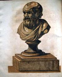
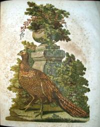
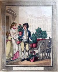
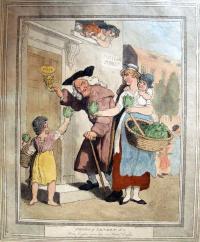
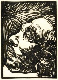
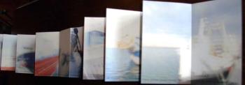
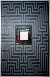
Ines von Ketelhodt and Peter Malutzki, Zweite Enzyklopädie von Tlön [Lahnstein, Oberursel and Flörsheim: von Ketelhodt and Malutzki, 1997-2006]. 50 volumes. Graphic Arts GAX 2010- in process

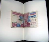
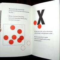
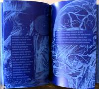
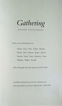
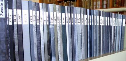
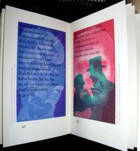
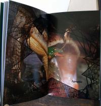
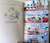
“If our foresight is not mistaken, a hundred years from now someone will discover the hundred volumes of the Second Encyclopedia of Tlön,” wrote Jorge Luis Borges (1899-1986) in the epilogue to his 1941 story Tlön, Uqbar, Orbis Tertius. Borges’ words led the German artists Peter Malutzki and Ines von Ketelhodt to work from 1997 to 2006 (re)constructing the Second Encyclopedia of Tlön in a fifty volume, limited edition set. Each volume, although uniform in format, is unique in concept and execution. Even the bindings vary in material and printing, while each spine is labeled with the first four letters of its keyword from A to Z.

The artists write,

“Because our system of order was the alphabet, we of course wanted all letters to be represented in the end. We did realize that we could only do justice to our presumptuous ambition of packing the whole world into fifty volumes in details and fragments; but we hoped the found shards would give a notion of the whole structure.”

“Borges’ story, to which we owed the encyclopedia’s title, played an important role as a source of inspiration, but we could present the idealistic world of Tlön only mirrored on our own world. Already in the first volumes quotes from Borges’ had sporadically flowed in. But only after some years did we realize that … a substantial part of the Tlön-text, distributed over the various volumes, had found its way into the encyclopedia, and we then decided to gradually incorporate the complete text in the encyclopedia; like a red thread, so to speak, that winds its way through the project in intricate paths.”

For more information, see their website: http://www.tloen-enzyklopaedie.de/e_texts/index_texts.htm

Not all the cataloguing records in OCLC are correct in their details and so, the artists have written us a note to set the record straight, which I share with their permission:

“The project was done and published equal by Ines von Ketelhodt and Peter Malutzki from 1997 to 2006. Each one of us did 24 volumes, two volumes are collaborations of the two of us. The colophons of the single volumes will tell you who did it, where, in which year.”

“Although Ines was member of the group Unica T for many years as Peter was of the FlugBlatt-Presse these groups or presses have nothing to do with the publication of the encyclopedia. At the beginning we decided to publish the project under the name Zweite Enzyklopädie von Tlön, nothing else you’ll find in any colophon of any volume.”

“Concerning the place of publishing there are three: Peter worked from 1997 til 2003 in Lahnstein, Ines from 1997 til 2001 in Oberursel, later we both moved to Flörsheim so the last volumes until 2006 were produced in Flörsheim. So one can say Lahnstein, Oberursel and Flörsheim are the places where we produced the encyclopedia.”

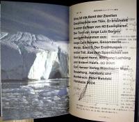
Along with the fifty volume Enzyklopädie, the artists have prepared a separate exhibition catalogue offering information on the history, development and production of the project. Each volume is described in detail with its theme, imagery, and texts. Note to collectors, if you can’t purchase the entire set, the exhibition catalogue can be purchased separately.

Peter Malutzki and Ines von Ketelhodt, Zweite Enzyklopädie von Tlön: ein Buchkunstprojekt von Ines von Ketelhodt und Peter Malutzki 1997-2006 ([Flörsheim am Main: the artists, 2007). Exhibition catalogue published to accompany exhibitions of the Zweite Enzyklopädie von Tlön project. Graphic Arts GAX 2010- in process

Special thanks to Ben Primer, David Magier, and Patty Gaspari-Bridges who helped make this acquisition possible.

Advertise with blotter paper

Many years ago, when writing was done with a pen and liquid ink, soft sheets of unsized paper were used to blot the excess ink from the page. During the nineteenth century, the ubiquitous blotter packet was quickly recognized as an advertising opportunity for local companies. Michael Twyman writes “The advertising blotter, effectively a desk-top trade card and year-round promotion piece, remained in general use until the advent of the ball point pen, which in the period 1945 to 1960 progressively replaced the steel rib and liquid inks” (Encyclopedia of Ephemera, 2000).

Early blotting paper was grey and coarse but during the nineteenth century, a higher quality paper was used in a variety of colors. Pink was most common due to the use of turkey and cotton rags, which resisted bleaching. Queen Victoria is said to have used a red blotting paper but we don’t know for sure because each sheet was carefully destroyed. Graphic Arts, Ephemera Collection.

Fiddler D.D. and Scraps Magazine

D.C. Johnston (1799-1865), Scraps (Boston: D.C. Johnston, [1830?]-1849). Some issues include separate titles such as no. 4 for the year 1833: Trollopania; no. 5 for 1834: Fiddle,-D.D.; no. 7: Phrenology exemplified and illustrated. Designed, etched and published by Johnston. Sinclair Hamilton Collection of American Illustrated Books, GAX Oversize Hamilton 938Q

Look closely, see the title in the hair.

David Claypoole Johnston gave up acting after only a few years to pursue a career in engraving, both on copper and wood. He started one of the earliest comic magazines in the United States, called Scraps, which was printed from engraved copper plates and included four pages of cartoons in each issue. Some frames are sequential and some frames stand alone. Here are a few examples.

Stitched silk bookmarks or Stevengraphs

Sewing Machines and the World's Fair

All Over the World: Singer, the Universal Sewing Machine (New York?: Singer Manfg Co., 1901). Graphic Arts GC149 Ephemera Collection, Booklets

For the Pan-American Exposition of 1901 in Buffalo, New York, the Singer Manufacturing Company printed this eight page booklet to advertise their products. Scenes from the World’s Fair were interspersed with vignettes featuring sewing machines. Here are a few of the photo-lithographed pages.

Printed by the weird sisters

In 1902, the Irish carpet designer Evelyn Gleeson (1855-1944) wrote to Elizabeth Yeats (1868-1940) and her sister Lily (1866-1949) in London. She persuaded them to return to Dublin and join her new women’s arts and crafts cooperative. Evelyn taught girls to weave tapestries and rugs, Lily oversaw embroidery, and Elizabeth established a fine press. They named it the Dun Emer Guild, after the nearby village of Dundrum.

Elizabeth’s first book was a collection of poems by her brother, William Butler Yeats, entitled In the Seven Woods. W.B. wrote an introduction mentioning that the book was “finished the sixteenth day of July, in the year of the big wind, 1903.”

When James Joyce wrote Ulysses (1920), he commented on the Yeats family business and the weird sisters:
Haines sat down to pour out the tea.
—I’m giving you two lumps each, he said. But, I say, Mulligan, you do make strong tea, don’t you?
Buck Mulligan, hewing thick slices from the loaf, said in an old woman’s wheedling voice:
—When I makes tea I makes tea, as old mother Grogan said. And when I makes water I makes water.
—By Jove, it is tea, Haines said.
Buck Mulligan went on hewing and wheedling:
—SO I DO, MRS CAHILL, says she. BEGOB, MA’AM, says Mrs Cahill, GOD SEND YOU DON’T MAKE THEM IN THE ONE POT.
He lunged towards his messmates in turn a thick slice of bread, impaled on his knife.
—That’s folk, he said very earnestly, for your book, Haines. Five lines of text and ten pages of notes about the folk and the fishgods of Dundrum. Printed by the weird sisters in the year of the big wind.

The Yeats sisters eventually split from Gleeson, renaming their operation Cuala Press (pronounced Cool-a), which continued until 1946. Besides the books, Cuala also printed ephemera including Christmas cards, Easter cards, bookplates, calling cards and broadsides. These are a few examples from graphic arts collection.

For more information, try Boston College’s website: http://www.bc.edu/libraries/newsletter/2008fall/cuala/index.html ;
Gifford Lewis, The Yeats Sisters and the Cuala (Blackrock, Co. Dublin: Irish Academic Press, 1994). Firestone Library Z232.C962 L49 1994
and the RBSC exhibition Unseen Hands: Women Printers Binders and Book Designers: http://infoshare1.princeton.edu/rbsc2/ga/unseenhands/printers/yeats.html

Benjamin Champney

Benjamin Champney (1817-1907), New Public Library Boston, 1850. Watercolor. GC031 Benjamin Champney Watercolors Collection.

When most people hear the name Benjamin Champney, they think of images of the White Mountains. However, this American painter also loved his adopted home of Boston, Massachusetts, and sketched many Boston cityscapes.

Born in New Ipswich, New Hampshire, Champney studied and exhibited in Paris during the 1840s. He settled in Boston for only a few years before returning to New Hampshire but remained active in the Boston art scene. Champney helped found the Boston Arts Club in 1855 and exhibited regularly at the Boston Athenaeum. These are a few of Champney’s watercolors in the graphic arts collection.

Benjamin Champney (1817-1907), New Boston Theater. Washington Street, 1850. Watercolor. GC031 Benjamin Champney Watercolors Collection

Benjamin Champney (1817-1907), Boston City Library, 1850. Watercolor. GC031 Benjamin Champney Watercolors Collection.

Benjamin Champney (1817-1907), Blackstone Square. Boston, 1850. Watercolor. GC031 Benjamin Champney Watercolors Collection

Audubon's Tufted Duck

John James Audubon (1785-1851). Pattern Print for Tufted Duck. Fuligula Rufitorques. 1834. Engraved, printed, and colored by Robert Havell Jr. (1793-1878). Graphic Arts collection GAX Audubon case.

Thanks to the “Adopt-a-book” benefit sponsored by the Friends of the Princeton University Library this spring, and specifically to the donations given by Ruta Smithson in honor of Andrew Smithson and by Ursus Books, one of our Audubon prints has been conserved and rehoused by Special Collections Paper Conservator Theodore Stanley.

Plate 234 Tufted Duck (common name Ring-Necked Duck). Fuligula Rufitorques was drawn in watercolors by John James Audubon (1785-1851) and then, engraved, printed, and colored by Robert Havell, Jr. (1793-1878), completed in 1834. For a view of the editioned print in the copy of Birds of America at the University of Pittsburgh see: http://digital.library.pitt.edu/a/audubon/plates.html.

In 1827, Audubon approached Robert Havell, Sr. (1769-1832) to take-over the engraving of his watercolors for The Birds of America. His original printer, Edinburgh engraver W.H. Lizars dropped out of the project after his staff went on strike. Havell Sr. was joined by his son, Robert Havell, Jr. (1793-1878), who engraved the plates while his father supervised the printing and coloring. Health problems led to Havell Sr.’s retirement in 1828 and his death four years later, leaving the majority of the work to his son. Havell Jr. finished the final print in 1838 and the first edition of the book is often called the Havell Edition.

One of Audubon’s biggest complaints with Lizars’ first plates was the variation in the hand coloring between impressions. Havell solved this by creating a working proof or pattern print for each plate. Audubon marked up the trial proofs until one satisfied him and this was used by the colorists as a guide. In a modern edition, the artist’s approved print is known as the bon à tirer (BAT), which in French means good to print. Note Havell’s initials, added in ink on the center title, presumably to indicate his approval.

Howard C. Rice wrote in the catalog for a 1959 Audubon exhibit at Princeton University:

This is one of the so-called ‘Pattern Prints’ used by the workers in Havell’s studio to guide them in the coloring. Since two hundred or more impressions of each plate had to be hand-colored, it was necessary to establish a standard pattern for the workers to follow in order to maintain uniformity in the coloring … It is said that the margins of such pattern prints were often trimmed irregularly or otherwise mutilated, as a security measure, to prevent them from being stolen from the studio or surreptitiously sold.

Recent Comments

  • Howard Coblentz: I have a round seal shaped like a pear a read more
  • John Overholt: Wikipedia's entry for Sir Francis says: "Throughout Baring's lifetime his read more
  • Serge Rodrigue: It is a precious thing you have a book from read more
  • Colin Wicks: I have a copy of “A Round Game.” And it read more
  • Laurence Hilonowitz: I was a Customer, Friend of Bob Wilson. I Live read more
  • allen scheuch: Absolutely STUNNING! Those colors, those designs made my day! Thanks, read more
  • Olivier: Hello Diane, If you are still looking for an examplare read more
  • Stella Jackson-Smith: I have a framed picture by A.Brouet, signed with the read more
  • John Podeschi: I remember Dale fondly from my days at Yale (1971-1980). read more
  • Joyce Barth: I have some or all of this same poem. I read more