Recently in Illustrated books Category

Calligraphy in its Entirety

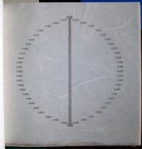
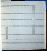
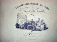
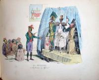
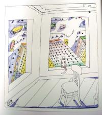
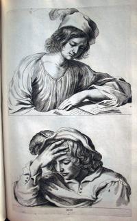
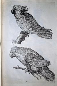
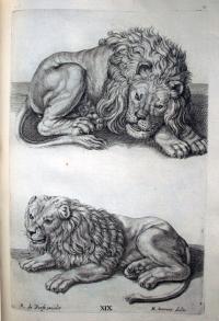
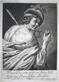
Anton Kuchenreiter, Die Calligraphie in ihrem ganzen Umfange, geschrieben in Stein (Calligraphy in its entirety, written in stone) (Neuburg an der Donau, 1831). 35 x 51 cm.

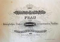
This is the first and only edition of a German writing album containing thirty-three plates printed lithographically by Anton Kuchenreiter. It is a dedication copy for Princess Therese von Thurn und Taxis (1773-1839) and the bookplate bears the Thurn und Taxis arms. The dedication is signed “Anton Kuchenreiter lithograph.”

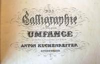
Kuchenreiter is not listed in any of the standard indexes to printmakers. However, there was a Swiss firm named Kuchenreiter known for their elaborately engraved firearms, led by Andreas Kuchenreiter I (1716-1795). It seems likely that Anton learned engraving from members of the family and incorporated the detail of the cut line with the ease of lithography.

The book was printed in Neuburg an der Donau (Neuburg on the Danube River), the capital of the Neuburg-Schrobenhausen district in the state of Bavaria, not far from the first quarries of Bavarian limestone, which was the favored stone of the earliest lithographers.

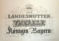
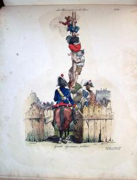
Princess Therese was born Duchess von Mecklenburg-Strelitz before marrying Prince Karl Alexander von Thurn und Taxis. Her younger sisters were Louise, Queen of Prussia; Duchess Charlotte von Saxe-Hilburghausen; and Princess Friedrike of Prussia. In the volume’s final plate, Kuchenreiter has drawn three names as though they were printed on top of each other: Louise, then Charlotte, and finally Therese. If you look closely, you will see additional words inside the letters of Therese’s name.


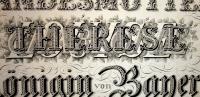
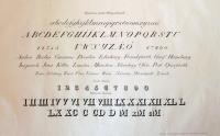
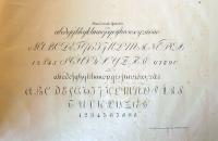
One more point of interest, the work is an example of lithographic engraving, or engraving on stone. A coating of grease-resistant gum arabic is painted on the stone and the artist scrapes away the text with a steel point. The exposed stone is inked and the rest is treated like lithography. This means that it would be written laterally reversed. For more, see Michael Twyman’s Early Lithographed Music (1996), p. 504. Mendel Music Library Ref SV ML112.T89 1996

Hot Corn

It seem fitting in a week when announcements are issued concerning Playboy as mandatory reading for certain Architecture graduate students and masturbation being prohibited in Princeton bathrooms, that we post something from a temperance book devoted to showing the “lamentable conditions” to which the wicked are apt to fall.

Solon Robinson (1803-1880), Hot Corn: Life Scenes in New York Illustrated. Including the Story of Little Katy, Madalina, the Rag-Picker’s Daughter, Wild Maggie, etc. (New York: DeWitt and Davenport, 1854). Half title and six full-page illustrations by John McLenan (1827-1865) and one by Frederick M. Coffin, all engraved on wood by N. Orr. Graphic Arts Hamilton 1043.

This is a collection of stories first published individually in the New York Tribune, then released, according to an 1853 advertisement in the New-York Daily Times, in an edition of 15,000. The book sold in a cloth binding for $1.25 and in a gilt edition for $2.00. It was a best-seller. The sad stories focus on the beggars, the alcoholics and the prostitutes who lived in and around the Five Points area in the lower east side of Manhattan.

So popular were the stories that three separate theater productions were developed around the character of Little Katy (who sold hot corn in the winter and peanuts in the summer) at Barnum’s American Museum, the Bowery Theatre, and the National Theater. At the latter venue, Little Katy ran in repertory with Uncle Tom’s Cabin.

There are many such books on our collection. See also Ernest Gray or The Sins of Society by Maria Maxwell (1855) Graphic Arts Hamilton 1055

According to Sinclair Hamilton, the artist John McLenan was discovered by the publishers working in a pork-packing plant in Cincinnati and making drawings on the tops of barrels. He became one of the most prolific of our early illustrators. Besides the American temperance books, McLenan illustrated many English novels for Harper’s, such as The Woman in White, Tale of Two Cities, and Great Expectations, as well as being well-known as a comic draftsman.

Unfortunately McLenan died in 1865 at the age of thirty-eight. The memorial which appeared in the May number of Yankee Notions called him:

…one of the best draughtsman America has ever produced…. Equally at home in caricature and in sketches from the life, with a quick perception of the ridiculous and a fine appreciation of the picturesque, he soon took his place among the illustrators of our current literature, second to none.

See another biography at http://www.victorianweb.org/art/illustration/mclenan/bio.html

Books that can't be read with Google, no. 1

Molly Burgess, Still ([Piscataway, N.J.] : Carolingian Press, 1975). Copy 16 of 25. Graphic Arts Collection (GAX) in process

This is a book of concrete poetry, based on Eastern philosophy and religion. The words have the appearance of a typewriter face but are in fact printed by letterpress at the Carolingian Press on different handmade rice papers. The book includes anagraphic, concrete poems incorporating the words: breath, earth, heart, death.

The artist writes:

Still is my response to a study of Eastern philosophy and religion. Though the book is based on personal interpretation and experience, there are specific links to both the history and philosophy from which it was conceived. Designed as a complete experience, it leads from the unfolding of the cover through the colors, into the patterns, the paradox, the stillness….

The book is arranged on four different levels: by color, by country, by thought, and by number…. There are thirty-two poems, eight in each of the four sections (the Eightfold way: right views, right intentions, right speech, right action, right profession, right effort, right watchfulness, right concentration). Each section of eight is again divided in two sections of four (the Four Noble Truths) by the ‘lace’ papers. The paterns of the four ‘lace’ papers progress from diamond to star to scallop to circle.

Koloman Moser in the TLS

| 2 Comments

In the September 18, 2009, issue of the Times Literary Supplement on paper, the TLS chose to illustrate Robert Vilain’s review of three books about Rainer Maria Rilke with a double-page spread from Ver Sacrum (correct citation: Heft 21, 1. November 1901). Don’t check the digital article because the online TLS does not include the images from the paper copy, only the words. The Rilke verse is from the dialogue Vorfrühling (Early Spring) from Drei Spiele (Three Plays), spoken by Die Schwarze Herzogin (the Black Duchess) and a servant. There is a credit line for Rilke but no mention of the graphic artist who makes the pages so appealing.

The pages were drawn and printed by Koloman Moser (1868-1918). In the outer margins you can see his small printed signature “Kolo Moser”. As a cofounder of the Vienna Secession, Moser joined Gustav Klimt, Josef Hoffmann, and others to establish a revolutionary new art outside of academia. Moser served as editor of their journal, Ver Sacrum, as well as the chief designer for several years. Through the journal’s pages, Moser endeavored to fuse art and literature, graphics and text. With respect to TLS, I’m not sure he would have approved of their description of his work as illustration or the disconnect between paper and digital versions of their publication.

Ver sacrum: Organ der Vereinigung Bildener Künstler Österreichs (Wien: Verlag Gerlach & Schenk, 1898-1903). Marquand Library (SAX) Oversize N6494.W5 V47q

For more information, see also Koloman Moser, 1868-1918 (Vienna: Leopold Museum; Munich; New York: Prestel, c2007). Marquand Library (SA), ND509.M7 A4 2007b

During 1903, Moser and Hoffmann left the Secession group and founded the Wiener Werkstätte. Their Almanach also included texts by Rilke and designs by Moser. See Almanach der Wiener Werkstätte (Wien: Rosenbaum, [1911]). Graphic Arts Collection (GAX) 2007-0687N

Portrait of Einstein by Okamoto Ippei

We recently found we have a rare copy of Ando Hiroshige’s Fifty-Three Stations on the Tokaido (Jimbutsu (Mankind) Tokaido), Muraichi, 1852. Chuban tateye. As if that isn’t good enough, it may have been the personal copy of Albert Einstein (1879-1955), who traveled to Japan in 1922. The library has a number of ephemeral items from that trip. http://diglib.princeton.edu/ead/getEad?id=ark:/88435/9880vr03d.

At the back of this volume is a portrait of Einstein by the cartoonist Okamoto Ippei (1886-1948), done in December of 1922 in Sendai, Miyagi Prefecture, Japan. The artist was fluent in English, having traveled a great deal, and was actively publishing his cartoons in several magazines and newspapers at the time. We hold a number of his published books, such as Yama to umi (Mountain and ocean) ([Osaka]. Osaka Asahi Shinbunsha. 1926) Cotsen Children’s Library (CTSN) Non-Roman — Japanese 38189. He must have made Einstein’s acquaintance and agreed to do this caricature in the man’s book.

Trvth Brought to Light and Discouered by Time

We don’t actively collect pages torn out of books but we have them. Some are easier to trace than others. This half-title page from a folder labeled seventeenth century leaves was designed and engraved by Flemish artist John Droeshout (1596-ca. 1652) while working in London. It was printed by Richard Cotes and sold by Michaell Sparke in 1651 to accompany a volume concerning the poisoning of Sir Thomas Overbury (1581-1613) and its aftermath.

When you go to the actual book, entitled The Narrative History of King James, for the First Fourteen Years (Ex 14431.669) you will not only find the engraving happily bound in it place but the “Emblematical Title explained” next to it. This text explains the print’s iconography beginning in the top left where a naked female figure of Truth tramples on Error. On the right the male figure of Time stands on the skeletal body of Death. Together they pull back a curtain to reveal the sleeping King James I. At the bottom left is Memory with his feet holding down black Oblivion. On the lower right is History, writing down what Memory tells him, with Sloth under his feet. Between them is a coffin, out of which grows a tree sprouting books and lights to make “succeeding Times most rich and rare.”

De anima brutorum commentaria (Commentary on the soul of animals)

| 3 Comments


Francesco Maria Soldini, De anima brutorum commentaria: curiosum nobis natura ingenium dedit (Commentary on the soul of animals: nature gave us an inquiring mind) (Florence: Cajetan Cambiagus, 1776). Frontispiece and seven additional engravings, along with engraved initials, borders, and headpieces. Artist unidentified. Graphic Arts (GAX) 2007-2116N

An odd combination of animals, real and imagined, are depicted in these lovely engraved plates, printed in various colored inks and interspersed throughout Soldini’s text. The title page is printed À la poupée, which means the plate was carefully hand inked in several colors printed altogether (instead of individual plates for each color printed separately). The process is named after the wad of cloth that was used in the inking, which looked like the head of a rag doll (poupée)

The animals include a rhinoceros, a camel, various amphibians, and even prehistoric beings. It is curious to see them all crawling or walking or flying together. I see from other copies that the plates are not always bound in the same order and the frontispiece (in ours) is not always at the front. Note, the PhotoShopping of the color of these digital imagines is not very good; not particularly close to subtle original tones in our book.

The dealer Susanne Schulz-Falster points out that the book was “issued nearly a century before Darwin’s theories of evolution” and it earned a place on the Index Librorum Prohibitarum. This was the list of publications prohibited by the Roman Catholic Church, happily abolished in 1966 by Pope Paul VI. Princeton’s earliest copy of the Index dates from 1611.
Indices expvrgatorii dvo, testes fravdvm ac falsatonium pontificiarum (Hanoviæ, apud G. Antonium, anno 1611). Rare Books (Ex) 0408.49.121

Mark Farrell, our brilliant rare book cataloguer, adds these notes about the title and its translation: Julie, the title proper and subtitle are divided wrong. Commentaria belongs to the title proper, not to the subtitle. Also, there is no such word as nobii in Latin. The title should be transcribed thus:
De anima brutorum commentaria: curiosum nobis natura ingenium dedit: Seneca de vita beata cap. 32.
and translated thus:
Commentary on the soul of animals: nature gave us an inquiring mind: Seneca De vita beata, ch. 32 [i.e. Seneca De otio, ch. 5].

The subtitle is actually an epigraph, and it is taken from chapter 5 of Seneca’s De otio (On leisure), not, as the title page says, from chapter 32 of his De vita beata, which, by the way, has only 28 chapters. Here is a translation by Aubrey Stewart of the whole sentence:

Nature has bestowed upon us an inquiring disposition, and being well aware of her own skill and beauty, has produced us to be spectators of her vast works, because she would lose all the fruits of her labour if she were to exhibit such vast and noble works of such complex construction, so bright and beautiful in so many ways, to solitude alone.

Asher B. Durand Extra-Illustrated or Grangerized?

Catalogue of the Engraved Work of Asher B. Durand. Introduction by Charles Henry Hart (1847-1918), (New York: Grolier Club, 1895). Graphic Arts (GAX) 2009- in process

In April of 1895, there was an exhibition held at the Grolier Club in New York City focused on the engravings of American artist Asher Brown Durand (1796-1886). 350 copies of the catalogue were printed in a large-paper edition in May of that year and circulated to the members of the Club.

A devoted fan of Durand’s work (as yet unidentified) took that catalogue and extra-illustrated it with all the original engravings he/she could acquire. This acquisition will provide Princeton researchers with not only a description of what Durand produced but also a copy of the actual print.

The term extra-illustrated refers to a book that has more prints or illustrations in it than when the book was published. These were usually added by trimming and tipping the prints onto extra pages (or sometimes right on top of the text) and then, rebinding the original text pages with the new plates.

The British term “Grangerizing” has a slightly different connotation, stemming from James Granger’s Biographical History of England (1769), which was published with blank leaves already provided for the reader to fill with prints. Grangerizing became a popular hobby in England and unfortunately, many other books were cut up to provide the extra prints for these homemade editions.

For more information on the difference between the two terms, and more history, see: H. J. Jackson, Marginalia: Readers Writing in Books (New Haven: Yale University Press, 2001). Firestone Library (F) Z1003 .J12 2001

The Least-Loved Long Poem of the Sixteenth-Century

With apologies to the curator of rare books, in whose collection this book lives, I must mention John Heywood (1497?-1580?) and his obscure 1556 allegory of the Protestant spider and the Catholic fly. A trained singer and actor, Heywood was also a devoted Catholic who supported the religious beliefs of Queen Mary and dedicated several poems to her. Mary appears in the last portion of The Spider and the Fly, as the housemaid who cleans up the house of England.

Heywood’s illustrated poem has 98 chapters, each introduced by a woodcut. Running 456 pages, the parable has been called “the least-loved long poem of sixteenth-century England.” The fly, named Buz, gets caught in the web at the center of the window. Buz argues with a spider that flies (Catholics) have as much right to be there as the spiders (Protestants). Other insects join the fight: the ants come to support the spiders and the butterflies support the fly. This leads to a battle in which 5,000 flies and 5,000 spiders are killed.

Mary arrives, frees Buz, takes down the web, and crushes the Spider.


John Heywood (1497?-1580?), The Spider and the Flie (London: Tho. Powell, 1556). Robert Taylor Collection (RHT) 16th-49


For more information, read Judith Rice Henderson, “John Heywood’s ‘The Spider and the Flie’: Educating Queen and Country” Studies in Philology, 96, no. 3 (summer 1999): 241-274.

Harrild & Sons Printing Machinery

| 5 Comments

In 1813, printer Robert Harrild (1780-1853) joined the debated raging inside the London printing community as to the use of rollers rather than balls to ink a printing plate. The majority of hand-printers preferred inking balls but Harrild’s demonstration of his new roller was so successful that rollers became compulsory in every print shop throughout the city. Harrild established a company, located at 25 Farringdon Street, to manufacture the rollers and eventually all kinds of printing equipment.

His advertisements boasted: “Harrild and Sons’ Manufacture … have on sale every article connected with printing machinery; type, presses, machines…” Shortly before his death, Harrild’s rollers and Paragon platen press were exhibited in the Crystal Palace during the Great Exposition of 1851. His sons continued to run the company well into the twentieth century.

Graphic Arts recently acquired two of their equipment catalogues: Catalogue of Printing Machinery and Materials with Selected Type Specimens, ca. 1895, and Harrild & Sons’ Complete Illustrated Catalogue of Printers, Bookbinders’ & Stationers’ Machinery & Materials, 1892. Note in particular the machine to fold newspapers.

Thysiastērio tēs leuterias

| 1 Comment

Most Pitiful Kalavryta [a town in Peloponnesus]

Thysiastērio tēs leuterias [Altar of Freedom] (Athēnai: “Ho Rēgas” Ekdot. Organismos, 1945). Gift of the Program in Hellenic Studies with the support of the Stanley J. Seeger Hellenic Fund. Graphic Arts Off-Site Storage: Contact rbsc@princeton.edu, Oversize D766.3 .T48 1945f.

My sincere thanks to Dimitri H. Gondicas, Executive Director, Hellenic Studies, for finding this graphic depiction of Greece during World War II. Note the remarkable date of 1945. Thanks also to Jeffrey Roueche Luttrell, Leader, Western Languages Cataloging, for his translations.

Heroic Crete

Wretched Doxato [a town in northern Greece]

The Hanged People of Athens

Eugene Alain Seguy

| 1 Comment

Graphic Arts holds 10 albums of original pochoir (hand-screened) prints by the French designer Eugene Alain Seguy (1889-1985). We are missing one, since he is known to have published 11 books offering Art Deco patterns. His final volume, released in 1930, is seen here. These patterns, meant for textiles, carpets, drapery, etc., were published by Armand Guérinet and A Calavas under the imprint “Libraire d’Art Décoratif”. Both editors were themselves artists and, certainly in the case of Calavas, photographers who collaborated with many of the French designers of that period.

Pochoir was a time-consuming process but resulted in deep, rich colors. The geometric designs of Art Deco were ideal for stenciling and the technique became something of a fad with French fashion publishers. Photography was often used to print the primary outline and then, the colors added with a brush through zinc or aluminum stencils.

Seguy’s books at Princeton:
Samarkande: 20 compositions en couleurs dans le style oriental, 1900. GAX NK8667.S43 S25f
Fleurs et leurs applications décoratives, 1902. GAX 2004-0019E
Document du décorateur, 1908. GAX 2003-0012E
Floréal dessins & coloris nouveaux, 1910. GAX NK8667.S43 F56e
Papillons: vingt planches en phototypie coloriées au patron donnant 81 papillons et 16 compositions décoratives, 1920. GAX Oversize NK8667.S43 P36f
Laques du Coromandel, 192?. GAX 2004-0032F
Primavera: dessins & coloris nouveaux, 192?. GAX 2004-0031E
Suggestions pour étoffes et tapis; 60 motifs en couleur, 1923. GAX 2006-0060E
Insectes: vingt planches en phototypie coloriées au patron donnant quatre-vingts insectes et seize compositions décoratives, 1929. GAX 2003-0044F
Prismes: 40 planches de dessins et coloris nouveaux, 1930. GAX 2004-0676Q

Read more: Sarah Schleuning, Moderne: Fashioning the French Interior (Miami Beach, Fla.: Wolfsonian-Florida International University; New York: Princeton Architectural Press, 2008) Graphic Arts Collection (GA), Oversize 2007-0759Q

Notable Women, too

Notable Women [London, no. 1, 1890-no. 4, 1891]. Graphic Arts GAX 2009-0236Q

Although publications such as Men of Mark (posted below) celebrate only men, women had their own share of bio-journals in the late 1800s. Notable Women is one example. Each issue includes 3 original mounted carbon prints by commercial photographers Alexander Bassano (1829-1913), Elliot & Fry, Winslow and Grove, and others. Princeton holds four issues, which include flowery biographies for the sitters Alexandra, Princess of Wales; Lady Dorothy Nevill; Mrs. Arthur Stannard (John Strange Winter); Lady Brooke; Mrs. Louise Jopling-Rowe; Mrs. Campbell Praed; Lady Hallé (Norman Neruda); Miss Ellen Terry; Mrs. Lynn Linton; Lady Algernon Borthwick; Lady Monckton; and Miss Jessie Bond.

Less grand in their format but with better information are: Notable Women Authors of the Day; Biographical Sketches, by Helen C. Black, 1893, Firestone Library (F) 3565.183
Notable Women in History; the Lives of Women Who in All Ages, All Lands and in All Womenly Occupations Have Won Fame …, by Willis J. Abbot, 1913 Firestone: CT3203 .A2

Les metamorphoses du jour

The French artist Jean-Ignace-Isidore Gérard went by the name Grandville, which was the stage name his grandparents used. In the early nineteenth-century, Grandville created several hand-colored lithographic books to satirize the bourgeois middle class of Parisian society in the Romantic period. His best, and today the rarest, is Les metamorphoses du jour published in 1829.

The characters of the book have a human body and an animal face, exposing people for the beasts they really are. The preface comments that the artist was thereby able to encompass “both the living picture of social manners and the satire of institutions and prejudices. Truth can circulate with impunity under the very eyes of the men it attacks.”

J.J. Grandville (1803-1847), Les metamorphoses du jour (Paris: Chez Bulla…et chez Martinet, 1829). 73 lithographic plates drawn by Grandville, printed by Langlumé. Graphic Arts (GAX) 2009- in process

The first edition was a huge success and quickly went out-of-print. A new edition was prepared in 1854, this time using wood-engraved reproductions of Grandville’s original lithographs. It is unfortunate that most people only know the series through these poor copies.

Princeton’s Les metamorphoses is a complete set of hand-colored lithographs with the extra two plates issued in 1830 in Belgium and then censored. In addition, the book is extra-illustrated with four lithographs in the style of the series: La chasse et la Pêche (1830), La revanche ou le Français du Missouri (1829), Casse nationale sur les terres royales (1830), and Chasse aux ordonnances (1830?).

Princeton also holds a number of books illustrated by Grandville including Jonathan Swift (1667-1745), Voyages de Gulliver dans des contrées lointaines (Paris: H. Fournier ainé: Furne et Cie, 1838). Graphic Arts (GAX) 2005-2172N; along with an original preparatory drawing for Gulliver by Grandville in the Cotsen Collection, (CTSN) Framed Artwork 3976

A Dialogue Between a Blind-Man and Death

Richard Standfast (1608?-1684), A Dialogue Between a Blind-Man and Death (Boston: printed and sold at John Boyle’s printing-office in Marlborough-Street, 1773). Graphic Arts (GAX) Hamilton 63b

In 1660, Richard Standfast, rector of Christ Church, Bristol, wrote and published a meditation in verse titled “There’s None So Blind As He That Will Not See.” A separate edition was later printed and published, this time called “A Dialogue Between a Blind-Man and Death.”

When publisher John Boyle began planning a Boston edition in 1773, he went to the engraver and silversmith Paul Revere (1735-1818) for a title page illustration. Revere returned with this image of a man conversing with a skeleton. According to Sinclair Hamilton’s Early American Book Illustrators and Wood Engravers, Revere’s day book records that on August 7, 1773, he charged Boyle the sum of 12 shillings for 2 “leading plates.” One was this cut, which must have been made expressly for this pamphlet.

The second cut Revere sold to Boyle, which depicted four devils grouped at the mouth of hell, was also published in 1773 in the pamphlet, A Vision of Hell by Theodorus Van Shemain [Hamilton 64a]. The cut of the blind man and death was also used in A Vision of Hell and as the order of printing is not known, it is impossible to say which publication marks the first appearance of Revere’s print.

A Merz Sonata

Jerome Rothenberg (born 1931), A Merz Sonata, [illustrated] by Debra Weier ([Easthampton]: Emanon Press; Rosendale: Women’s Studio Workshop, 1985). Weier created the two multiple-plate etchings, four type-high line plates & rubber stamp drawings. Graphic Arts Collection (GAX) Oversize 2004-0600Q


Krystyna Wasserman, director of the Library and Research Center at the National Museum of Women in the Arts, wrote “Many artists’ books have been inspired by works of art, literature, and music, while others are illustrations of favorite poems or stories. The Merz Sonata by Debra Weier is a tribute to Dada master Kurt Schwitters, who elevated collage to a true art form. Weier incorporates glued bits of paper, ticket stubs, and pop-ups into her visual interpretation of Jerome Rothenberg’s poem.”

Canal Street


In 1990, two long-time New Yorkers, Ian Frazier (born 1951) and Saul Steinberg (1914-1999), joined forces to create the book Canal Street. The first in the American Journals series published by the Library Fellows of the Whitney Museum of American Art, Canal Street features 16 photo-lithographs and two woodcuts by Steinberg depicting the traffic, architecture, and noise of the neighborhood where Frazier lived for more than twelve years.

Canal Street was organized and edited by May Castleberry, who is now making books for the Museum of Modern Art, and designed by Katy Homans. Michael Berdan hand-printed the watercolor woodcuts, which were proofed with the artist in New York. The edition of 160 copies was printed by Stamperia Valdonega in Verona under the supervision of Martino Mardersteig.

Ian Frazier & Saul Steinberg, Canal Street (New York: Library Fellows of the Whitney Museum of American Art, 1990). Gift of James Kraft, class of 1957. Graphic Arts Collection (GAX), Oversize 2004-0804Q

Lessons for Children

Anna Letitia Barbauld (1743-1825), Lessons for Children, in Four Parts. Wood engravings designed by S. Pike and engraved by Alexander Anderson (Philadelphia: Benjamin Warner, 1818) Graphic Arts Collection (GAX), Hamilton 265

Anna Laetitia Aikin (later Mrs. Rochemont Barbauld) and her brother John began publishing small books in 1773. When Anna adopted John’s son, Charles, she began writing a series of books for children, including Lessons for Children in 1778 and Hymns in Prose for Children in 1781. Anna was a dedicated teacher and hoped these volumes would introduce “elements of society’s symbol-systems and conceptual structures, inculcate an ethics, and encourage [children] to develop a certain kind of sensibility.”

As depicted in the image shown above, the text is meant to be a personal dialogue between mother and child. The books were printed in large type with wide margins making them easy to read for all ages. Their popularity led to numerous editions in several languages. Anna and her brother also collaborated on the six-volume Evening at Home, or The Juvenile Budget Opened; The Farm-Yard Journal; and Books of Stories, or, Allegorical Instruction and Entertainment, from Animated Creation, for Children.

Graphic Arts is fortunate to hold copies of all these books as well as the original wood-engraved block for one illustration from Lessons for Children.

Never a Day Without a Line

| 2 Comments
Crispijn [van] de Passe (1594-1670), La prima-[quinta] parte della luce del dipingere et disegnare, … (Ghedruckt t’ Amsterdam: Ende men vintse te koop by Ian Iantsz. … als mede by den Autheur selve … , 1643-1644). Five parts bound as one. Graphic Arts (GAX) 2009- in process

The frontispiece for Crispijn de Passe’s five volume manual for painters depicts Minerva as the patroness of the arts.

She is holding a torch to symbolize the light mentioned in the title of this volume. In her lap is an open book with the artist’s motto: Nulla dies sine linea (Never a day without a line). Behind her are eight Utrecht painters: Abraham Bloemaert, Gerard van Honthorst, two unidentified, Jan van Bronckhorst, Roelandt Saverij, Joachim Wtewael, and Paulus Moreelse. Apprentices sit at Minerva’s feet drawing.

The manual was meant for a wide audience and so, the text is printed in Italian, Dutch, French, and German. Part one is devoted to proportions; part two to drawing from the male nude; part three drawing from the female nude; part four to figure studies by famous contemporary master including Guercino, Jan Cousin, Abraham Bloemaert, and Roelandt Saverij; and part five focuses on the study of mammals, birds, fish, and insects.

There are only four other copies of this book in the United States. One is at the National Gallery of Art in Washington D.C., one at the Getty Research Institute, and two at the Museum of Fine Arts, Boston. Each copy is slightly different in the plates included, their sequence, and the altering of dates. The title pages of part 1-2 in Princeton’s copy have imprint: t’Amsterdam : By Crispijn de Pas, M.D.C.XLIV (altered with pen to M.D.C.LXIV), while the National Gallery of Art’s copy is altered similarly for parts 2-3. Princeton’s copy also has plate dates altered to reflect the addition of a number of prints.

Each of the five parts has its own title page, hence the combined title: La prima-[quinta] parte della luce del dipingere et disegnare, used for the single bound volume. The polyglot book is also known as Van ‘t Licht der teken en schilderkonst and Luce del dipingere et disegnare.

Most of the 225 plates in these volumes were engraved by Crispijn the Younger himself, although the years following the publication of this opus were troublesome for the artist. He had more and more trouble keeping up with demand for his work and in 1645, the artist was admitted to an asylum to be “cured of his insanity of mind.” Although he returned to work, this manual remains his most ambitious project.

The book is dedicated to the city of Utrecht, where his father Crispijn de Passe the elder, had moved for religious reasons. The entire family, father and four children, worked together as artists and print publishers. When the family estate was settled near the end of the 18th century, their work totaled more than 14,000 prints and around 50 print books or illustrated volumes. Princeton is fortunate to now hold 5 rare volumes with prints by Crispijn the younger, and 6 illustrated by Crispijn the elder.


The honour is immortal that remains
Of virtuous artists whose name shall never wither.
Just so with De Passe, the praise the Muses sing
In the vale of Pegasus, of all the wondrous marvels
That he disclosed with his needle,
By etching on the plate, of which Belgica boasts.
So skillfully done, stippled and boldly cut,
As can still be seen up to this very day.
The proof demonstrates the work’s deed to the master’s honour,
Aye, the hand may perish, but the spirit never dies.

Whistleriana

University of Rochester Memorial Art Gallery, Catalogue of an Exhibition of Portraitures of James McNeill Whistler ([Rochester, N.Y.] Priv. print., 1915). Graphic Arts: Reference Collection (GARF) ND237.W6 R6


The title page of this James McNeill Whistler (1834-1903) exhibition catalogue holds the collector’s mark, “From Whistleriana of Elmer Adler.” A further look reveals this is copy no. 1 of an edition of 130, printed on hand-made paper by the Craftsman press of Rochester, New York. Princeton’s volume is heavily extra-illustrated with mounted or tipped-in correspondence, prints, drawings, and photographs of the works in the exhibition.

The curator and major lender of the show was 34 year old Elmer Adler. In the early years of the 20th century, Adler was living in Rochester and well-known for his collecting interests. The local university art gallery tapped him several times to exhibit his holdings.

In 1915, Adler was asked to prepare an exhibition of portraits of the American artist J. M. Whistler, one part of his larger Whistleriana collection. What followed was a great deal of personal correspondence, research notes, and reproduction inquiries. When the show was complete and the catalogue printed, Adler gathered all the paperwork together and had it bound with the catalogue into one unique, extra-illustrated edition, now part of Princeton’s graphic arts collection.

1 2 3 4 5 6 7 8 9 10 11 12 13 14

Recent Comments

  • Howard Coblentz: I have a round seal shaped like a pear a read more
  • John Overholt: Wikipedia's entry for Sir Francis says: "Throughout Baring's lifetime his read more
  • Serge Rodrigue: It is a precious thing you have a book from read more
  • Colin Wicks: I have a copy of “A Round Game.” And it read more
  • Laurence Hilonowitz: I was a Customer, Friend of Bob Wilson. I Live read more
  • allen scheuch: Absolutely STUNNING! Those colors, those designs made my day! Thanks, read more
  • Olivier: Hello Diane, If you are still looking for an examplare read more
  • Stella Jackson-Smith: I have a framed picture by A.Brouet, signed with the read more
  • John Podeschi: I remember Dale fondly from my days at Yale (1971-1980). read more
  • Joyce Barth: I have some or all of this same poem. I read more