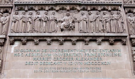
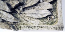
Here is a sampling of the stones and inscriptions I pass everyday at Princeton.
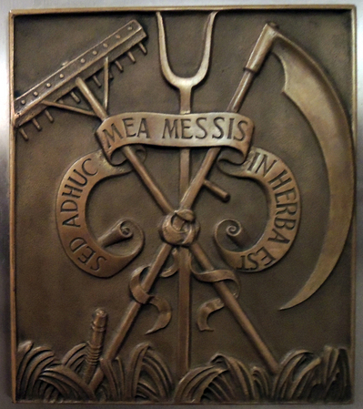
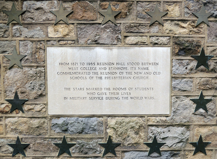
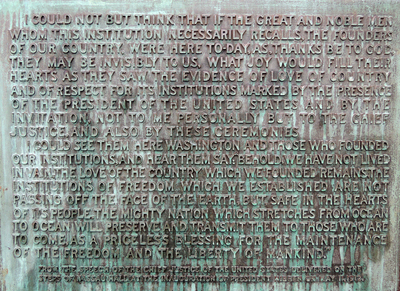
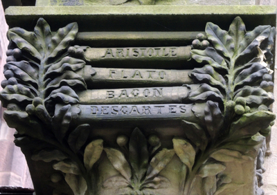
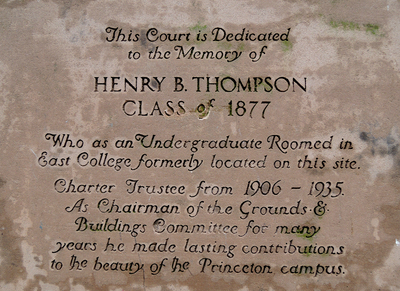
Sed adhuc mea messis in herba est = But the time of my harvest has not yet come. Ovid
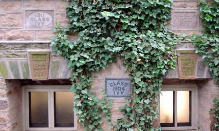
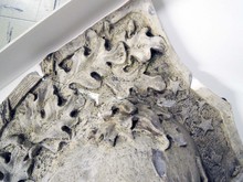
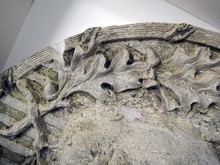
Here is a sampling of the stones and inscriptions I pass everyday at Princeton.
Sed adhuc mea messis in herba est = But the time of my harvest has not yet come. Ovid
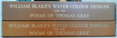
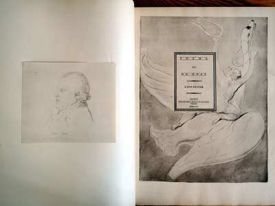
In 1795, William Blake (1757-1827) was given a commission to illustrate the poems of Edward Young (1681-1765). He produced 537 watercolors from which 43 were selected for engraving. One volume of the proposed four volume set was completed and released but failed to find an audience. The project was discontinued.
To help the disappointed and struggling artist, his friend John Flaxman (1755-1826) commissioned a new set of watercolors to illustrate the poems of Thomas Gray (1716-1771). Blake painted 116 watercolors, each framing a page of text, completing the project in 1798. Sadly, it wasn’t until 1922 that the general public was able to see Blake’s work, when it was reproduced and published under the title William Blake’s Designs for Gray’s poems … from the unique copy belonging to His Grace the Duke of Hamilton (Ex Oversize ND497.B5 A32e).
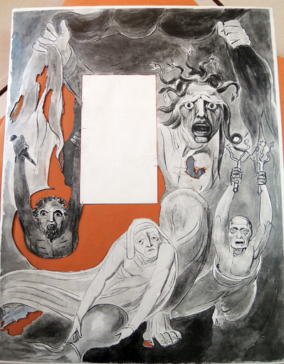
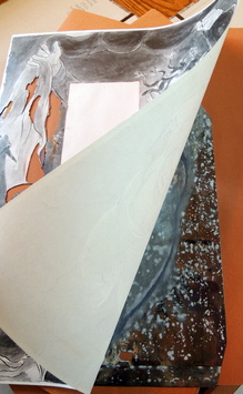
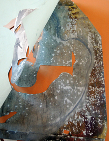
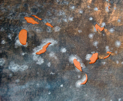
In 1971, a much more ambitious recreation of the illustrations was begun [seen here]. Not only was the process more elaborate but the multi-volume set included actual plates and stencils for one of the designs, allowing the public to follow the sequence of steps necessary to recreate Blake’s work.
“The water-colour designs were reproduced by the collotype and hand-stencil process in the workshops of the Trianon Press in Paris. The texts of Gray’s poems were printed on pure rag laid paper from copper plates, using three additional printings to reproduce Blake’s pencil crosses and to obtain the tone of the paper”
 Zinc stencils
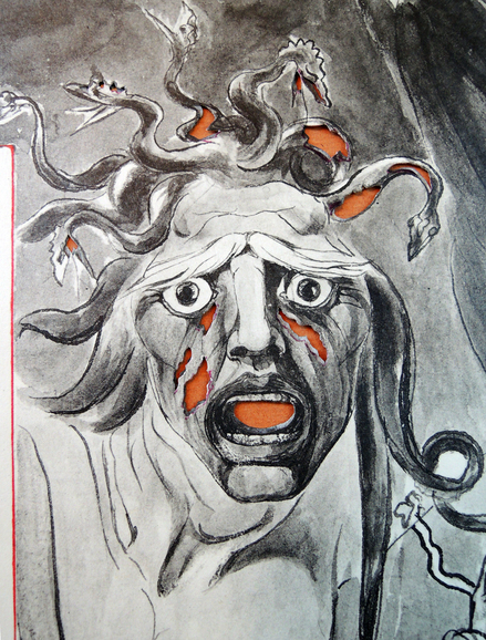
“They were widely acclaimed and at once recognized to be among Blake’s most important works. The marriage of Blake’s visual imagination to Gray’s poetry is perhaps unexpected and it is surprising that the classic Gray was able to bring out the best in the romantic Blake, arousing a fertility of imagination remarkable even for him.”
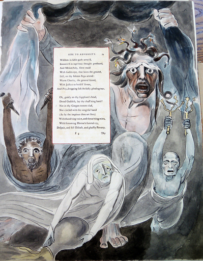
The Graphic Arts Collection holds the stencils, collotypes, and negatives for plate 5 of Gray’s “Ode to Adversity,” in which Blake illustrates the Gorgon terrors.
In thy Gorgon terrors clad
Screaming horrors funeral cry
Despair & Fell Disease & Ghastly Poverty
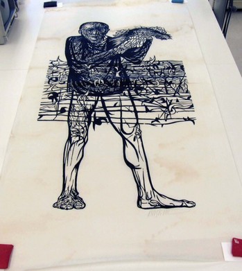
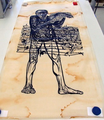
How do you store fragile prints that are five or more feet long and nearly three feet wide? Unfortunately, the past solution was to roll them up and store them on top of various cabinets, in the few inches between the furniture and the ceiling. Keeping the prints “out of sight” was not the best idea, as no one was aware of the water damage being done by a leak. We have now rescued a number of these fine art prints, many by the artist Leonard Baskin, and saved them from further decay.
Thanks to our Special Collections Paper Conservator, Ted Stanley, they are being washed one-at-a-time because of their enormous size. We are rehousing them in large, flat folders stored on oversize shelves. Here’s an example of before and after.
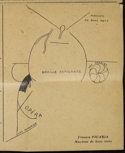
In the March/April 1920 issue of Proverbe. Feuille mensuelle pour la justification des mots (Proverb. A Monthly Pamphlet for the Justification of Words), editor Paul Eluard (1895-1952) selected two works by Francis Picabia (1879-1953) for the front page. “La jeune fille” (The Young Girl) features a hole or vagina in the paper surrounded by the words “Bracelet de la vie” (Bracelet of Life) at the top left and “Machine de bons mots” (Machine of Witticisms) frames the words “Oreille fatigante” (Tiring the ear) on the bottom right.
For his own contribution, Eluard wrote:
Hoo! Que disions-nous? Que disions-nous?
Nous avons perdu la mémoire
Hoo! Que faisions-nous? Que faisions-nous?
Nous avons perdu la mémoire
Hoo! What were we saying? What were we saying?
We’ve lost the memory
Hoo! What were we doing? What were we doing?
We’ve lost the memory
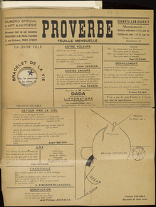
Also in March of 1920, the front page of Picabia’s magazine 391 featured his manifesto on Dada, proclaiming (here translated):
Art is a pharmaceutical product for idiots.
Tables turn, thanks to the spirits; pictures and other works of art are like strong- box-tables, the spirit is within them and gets more and more inspired as the prices rise in the salerooms.
Comedy, comedy, comedy, comedy, comedy, dear friends.
…Dada, on the other hand, wants nothing, absolutely nothing, and what it does is to make the public say “We understand nothing, nothing, nothing.”
“The Dadaists are nothing, nothing, nothing and they will surely succeed in nothing, nothing, nothing.”
Both Picabia and Eluard show the influence by their colleague Guillaume Apollinaire (1880-1918), particularly the lines from his poem “Victoire”:
Ô bouches l’homme est a la recherche d’un nouveau langage
Auquel le grammairien d’aucune langue n’aura rien à dire
O mouths, humanity seeks a new language
Beyond the reach of grammarians
Our complete run of Eluard’s Proverbe has been digitized and will soon be available through Princeton Blue Mountain project.
http://library.princeton.edu/projects/bluemountain/journals
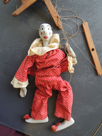
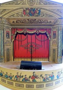
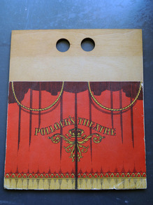
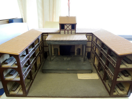
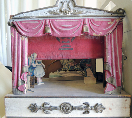
The Graphic Arts Collection holds a small selection of paper and model theaters, along with sets, costumes, figures, and props. Several are particular stages, such as the Globe Theatre where William Shakespeare's plays were performed. The rest are 19th century toy theaters produced by such manufacturers as Benjamin Pollock and Skelt & Webb. A larger selection can be found in the Cotsen Children's Library.
Robert Louis Stevenson (1850-1894) was given a paper theater as a child and remembered the toy in an essay for the Magazine of Art published in April 1884 entitled, "A Penny Plain And Twopence Coloured."
"These words will be familiar to all students of Skelt's Juvenile Drama. That national monument, after having changed its name to Park's, to Webb's, to Redington's, and last of all to Pollock's, has now become, for the most part, a memory. Some of its pillars, like Stonehenge, are still afoot, the rest clean vanished. It may be the Museum numbers a full set; and Mr. Ionides perhaps, or else her gracious Majesty, may boast their great collections; but to the plain private person they are become, like Raphaels, unattainable..."
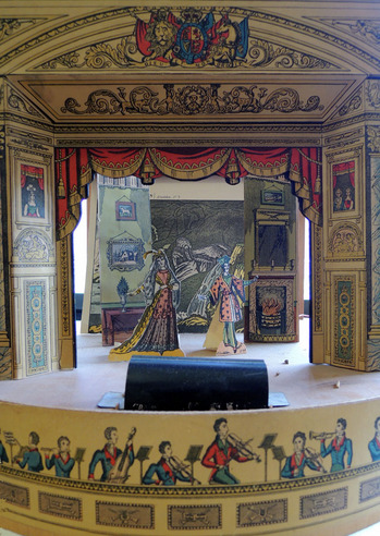
"There stands, I fancy, to this day (but now how fallen!) a certain stationer's shop at a corner of the wide thoroughfare that joins the city of my childhood with the sea. When, upon any Saturday, we made a party to behold the ships, we passed that corner; and since in those days I loved a ship as a man loves Burgundy or daybreak, this of itself had been enough to hallow it. But there was more than that. In the Leith Walk window, all the year round, there stood displayed a theatre in working order, with a "forest set," a "combat," and a few "robbers carousing" in the slides; and below and about, dearer tenfold to me! the plays themselves, those budgets of romance, lay tumbled one upon another. Long and often have I lingered there with empty pockets."
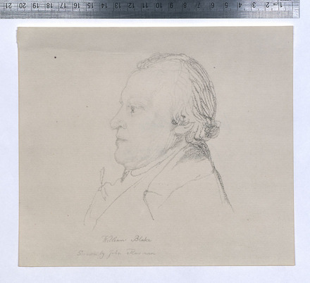
One day in 1802, William Blake (1757-1827) sat for his colleague John Flaxman (1755-1826) to have his portrait drawn. Flaxman’s final drawing is now located in the Yale Center for British Art, B1992.8.11(59). For a few minutes this week, we though we might have found a second drawing. It would not be uncommon for an artist to make several versions of a portrait, especially if it were for another artist who needed to approve the work.
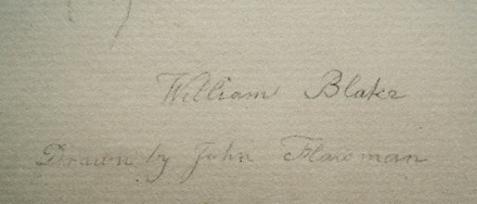
The signature matched; the size, the drawn line, even the chain lines were as they should be. We shared our good fortune with colleagues at the Blake archive, hoping they might tell us they had been waiting and searching for this drawing to turn up.
What they told us was to look closely at the graphite.
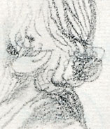
Sure enough, when we magnified the lines of the drawing it became clear we had a collotype reproduction of the Yale drawing. Further research led us to Blake’s designs for Gray’s poems, a large volume of facsimiles of Blake watercolors produced in 1922. Tiny marks on the surface of a page indicated that someone had removed the facsimile of the Flaxman drawing originally tipped into the volume.
At least the portrait is back where it belongs.
John Flaxman (1755-1826), Portrait of William Blake, ca. 1804. Graphite on medium, slightly textured, cream wove paper. Yale Center for British Art, Paul Mellon Collection. B1992.8.11(59)
William Blake (1757-1827), William Blake’s designs for Gray’s poems (London, New York [etc]: H. Milford, Oxford University Press, 1922). No. 206 of 650 copies. (Ex) Oversize ND497.B5 A32e
On June 2, 1813, a trial was held at London’s central criminal court, The Old Bailey, where the book and print seller Rudolph Ackermann (1764-1834) accused a Soho print dealer named Peter Brown of “feloniously receiving one hundred and fifty-two books,” including five sets of the Abbey Church of St. Peter, Westminster and two sets of the Microcosm of London.
Brown was ultimately found not guilty because one of Ackermann’s artists, Thomas Sutherland (1785-1838), confessed to the crime of grand larceny. Sutherland was fined one shilling and released. For the original transcript, see the Old Bailey Online
When Sutherland was asked if he sold Brown copies of Ackermann’s books, he replied, “Yes, about five sets of Westminster Abbey; the first two sets at five pound each, and the others at four pound ten shillings. I swear positively to having sold from seven to ten sets; seven I am sure I have sold. The Microcosm was the same price, and about three sets at four pound ten shillings. I am sure I am speaking within compass of the number. I received money and goods both for them; the goods were furniture and birds. The agreement was to take part money and part goods.”
The artist continued… “[Brown] asked me … whether I was still in the service of Mr. Akerman [sic]. I told him I was, but that I should shortly quit it. He then said, Mr. Akerman [sic] has published some pretty works, and that he should like to possess them if he could get them cheap; he asked me if I could help him to any. I asked him what price he would go to. He desired me to name my own price. I named eight pound or eight guineas; I would get him a set of the Westminster Abbey; he ridiculed the idea. I told him the trade price was ten guineas, and the price to the public was fifteen guineas; he said, that would not do; he could get them cheaper; he did not mind what the trade gave. I took him one set, which I sold him for five pound.”
“…I could afford to let him have them a great deal cheaper than that, for in the way that he should dispose of them I need not fear any thing; he would take to any extent, and always pay ready money. On Thursday morning, the 15th of April, I saw Mr. [John] Simpson come out of his door, and when I came up Brown was at the door; he asked me if I knew that gentleman. I said I did, it was Mr. Simpson, a friend of Mr. Akerman’s [sic]. He then said he suspected all was not right, Mr. Simpson had been there the night before; his son had told him there were many copies in the house; he begged me to take away two sets, if I could deposit them safely. I took away two of the sets I had sold for four pound ten shillings.”
When Sutherland was asked if he deposited any pawnbrokers tickets with Brown, Sutherland replied, “Yes, I sold him some duplicates of sets I had pawned. Brown told me he expected to get into trouble, but he would not give up my name, nor was I to mention his.”
Henry Morland was called as a witness and said he knew Brown, “I exchanged with him for one set of the Westminster for a leaden figure that stood in my yard. I communicated it to Mr. Akerman [sic].” Then, John Simpson testified that Ackermann had asked him to go to Brown’s house and question him. Simpson goes on at length to describe Brown’s explanation, ending, “Not being able to make any thing more of him I went to Mr. Akerman [sic] and told him what he said.”
It is recorded that Brown’s lawyer call fifteen witnesses, who all gave him “a good character” and Brown was found not guilty. On the same day, Thomas Sutherland was indicted for feloniously stealing one hundred and fifty-two books that were the property of Rudolph Ackerman. “To this indictment the prisoner pleaded guilty, was fined 1 s. and discharged.”
Posted in honor of serving jury duty.
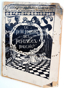
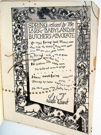
Thanks to the wonderful lecture by Johanna Drucker last night at the Grolier Club, entitled “Graphic Hijinks in Gelett Burgess’s 1896 Le Petit Journal des Refusées,” we now know more about this unique magazine in Princeton University Library.
Printed on oddly cut pieces of wallpaper, the journal was edited by Gelett Burgess (1866-1951) under the pseudonym James Marrion. Not content with one or two copies of this extraordinarily rare single issue magazine, Princeton owns three. Because each was hand printed, all three copies are slightly different.
To be considered for the journal, each poem or essay had to have been rejected by at least three other magazines. Drucker pointed to the advertisement in Burgess’s other magazine, The Lark, soliciting authors for Petit journal: “The Century is Coming to a Close! Hurry Up and Get Your Name in Print or You’ll be Left. There are 63,250,000 people in the United States. 50,000 have suffered amputation of both hands. For the remaining 63,200,000 writers, there are only 7000 periodicals.”
“It will be the smallest and most extraordinary magazine in existence. It will be printed on Black Paper with Yellow ink. The margins will be very wide, the cover almost impossible. The rates for insertion of prose articles will be only five dollars a page; poetry, ten dollars a page, but no manuscript will be accepted unless accompanied by a letter of regret at not being able to find the same available from some leading magazine. No manuscripts will be refused. Terms are cast, invariably, in advance. Each article in every paper will be blue penciled, and the author’s signature underlined. Each contributor will be allowed one hundred free copies of the number in which his article appears. Subscription to the Petit Journal de Refusées will be five dollars a year, single copies, ten cents.”
Le petit journal des refusées (San Francisco : James Marrion, No. 1, July 1st, 1896). Only issue published.Cotsen Children’s Library (CTSN) Pams / Eng 19 / Box 080 11405 Rare Books (Ex) 0901.612; Rare Books: Robert Metzdorf Collection (ExMe) 0901.612
See also Johanna Drucker, “Bohemian by Design: Gelett Burgess and Le Petit Journal des Refusées,” Connexions. 1 June 2009.
and
Johanna Drucker, “Le Petit Journal des Refusées: A Graphical Reading,” Victorian Poetry 48.1 (2010): 137- 169.

Martin Heijdra (East Asian Library) has provided us with a title for this book: Bilig-ün činadu kürügsen ǰaγun mingγan toγ-a-tu (probably chapter 4). He goes on to mention that this is the most common Buddhist sutra, the (large version of the) Prajñāpāramitā sutra. Our woodblock has not been dated, except for a small label guessing Ming Dynasty, also called Empire of the Great Ming, which was the ruling dynasty of China for 276 years (1368-1644). The text begins with Namu Buddha, Namu… etc. (Hail the Buddha, hail the dharma, hail the sangha).


The figure on the left might be Manjushri, a meditational deity who holds a book and a sword. Manjushri is the Bodhisattva of transcendent wisdom and the sword is used to cut through illusion. Manjushri is one of the most important of all Buddhist deities, the veritable god of wisdom and herald of emancipation.
The figure on the right might be Avalokitśvara, a Bodhisattva who embodies the compassion of all Buddhas. This figure holds a locus branch in one hand and what might be a snake in the other.
If you can add more information about this woodblock, please contact jmellby@princeton.edu. Thank you

View William Heath and his Print Dealers in a larger map
In order to better understand the activities of the British caricaturist William Heath, I created a google map of his dealers from 1808 to 1840. Control/click on the link above to see a larger view. Although it is often repeated that he worked exclusively with Thomas McLean, Heath was doing business with many of the print and book shops around town.
 Thomas McLean’s Shop
 Samuel William Fores’s Shop
 Hannah Humphrey’s Shop
 Thomas McLean’s Shop
 Unidentified shop. Variation on McLean’s, see Paul Pry figure and other Heath caricatures
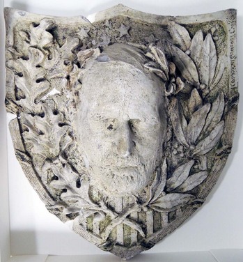
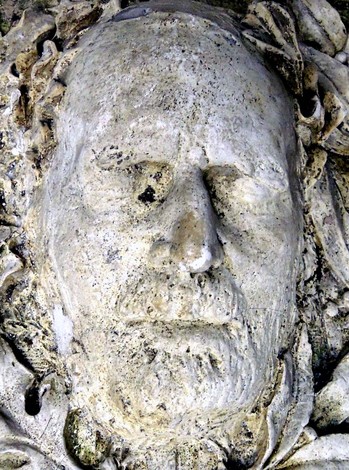
Our death mask of Ulysses S. Grant (1822-1885), the 18th President of the United States (1869-1877) and Major General of the Union Army during the American Civil War, was recently requested for loan. Unfortunately, a quick trip to the vault revealed that the plaster had been broken in several places, sometime in the past. It was a sad reminder of just how delicate these very heavy commemorative objects can be.
Grant’s head is framed with oak leaves on one side and laurel on the other. Oak leaves can stand for power, authority, longevity or victory. Laurel represents special achievements, distinction, success, triumph of worldly accomplishment, and heroism.
Collector and donor Laurence Hutton (1843-1904) wrote, “Two moulds from the face of General Grant, another warrior, maker of history, and leader of men, were made almost immediately after his death at Mount McGregor: one without the knowledge or consent of his family, nobody knows by whose connivance; the other, at the request of his family, by Mr. Karl Gerhardt. Both of these, or copies of them, came eventually into my collection.”
“The first is very distressing, and at the request of the present General Grant I have never exhibited it or permitted it to be reproduced in any way. The second was bequeathed to me by Mr. Arthur Dodge, although I have never learned how or from whom he obtained it. It has been put into an allegorical national frame but nothing has been added to its value or its interest thereby.” —Talks in a Library with Laurence Hutton (New York: G.P. Putnam’s Sons, 1907).
Gerhardt was introduced to Grant by Samuel Clemens (Mark Twain 1835-1910) in the last days of his life and at Clemens’ recommendation, agreed to the death mask. It is unknown how many additional copies Gerhardt had made from this original mould. Later, Clemens paid Gerhardt to return his bust, made in terra cotta, to Mrs. Grant and it is now in the collection of the Smithsonian Museum in Washington D.C.
What would you buy if you wanted to start a graphic arts collection?
Elmer Adler (1884-1962) began with the Roman Alphabet of Leonardo da Vinci (1509) purchased in March 1924 from W.A. Gough for $30. This was followed a day later by Aulus Cornelius Celsus’s De re medica (1554) given to Adler as a gift from David Silva. Not bad.
Adler’s accession book has now been digitized and is available online: http://libweb5.princeton.edu/visualmaterials/EA/AdlerAccessionBookopt.1.pdf
This is the collection which, for the most part, came to Princeton University as the beginning of a Graphic Arts Collection for Firestone Library. Take a look.
A Note on Da Vinci’s Roman Capitals
“Qebastian Serlio, in 1537, Albert Durer, in 1525, and Geoffroy Tory, in 1529, designed and published Roman capitals constructed by geometrical rules following order and method, but all three had been preceded by the great Da Vinci, whose Roman alphabet appeared in 1509.”
“The magnificent Roman capitals of Leonardo Da Vinci are the results of an attempt to apply to the letters of the alphabet certain basic geometric proportions. They were composed within squares, and were engraved on wood, with the lines and circles of projection also cut on the wood blocks, as models for constructing by almost purely mechanical methods an alphabet of letters in divine proportion. They are to be found in a treatise, “Divina Proportione,” by Luca Pacioli, printed at Florence in 1509, and which existed in manuscript for some time previous.”—Printing Art, Volume 39 (University Press, 1922).
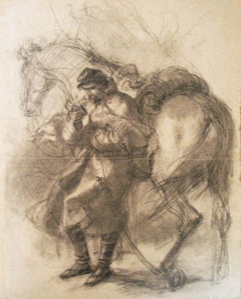
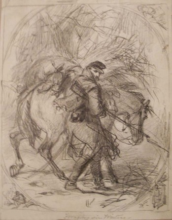
Felix Octavius Carr Darley (1822-1888), Study for Thinking of Home, [1866]. Charcoal and graphite. Graphic Arts Darley collection GC007.
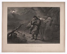 John Sartain (1808-1897) after a drawing by Felix Octavius Carr Darley (1822-1888), Thinking of Home. [1866]. Mezzotint and engraving. (c) American Antiquarian Society
For many years this sketch of a Union soldier leaning against his horse, holding a miniature portrait in his right hand, has been held at Princeton unidentified except for the artist’s name. Happily, we now know it is a sketch for a scene mezzotinted by John Sartain in 1866, honoring the Civil War soldiers returning home from war.
There are many other unidentified sketches in the Darley collection and hopefully, this is only the beginning.
The Atlanta Constitution published an article in 1879 entitled Felix O.C.Darley. “‘Men with four names,’ said Dickens once to a friend, ‘are as useless as they would be with four legs.’ Darley comes under the ban thus pronounced and yet he is as useful, probably, as he could have been with a less number of titles. One of the most powerful draughtsmen of the age, his sketches of subjects from contemporaneous literature are unrivaled. His illustrations from Cooper and other novelist, and the drawings furnished by him for various standard periodicals, have stamped him as an artist of rare fidelity and unusual power.”
“His face is one of the most striking to be found in New York. A tremendous expanse of forehead, fringed with the silken hair, and lighted by a pair of deep-set eyes, that sparkle from their cavernous recess like two finely-set jewels of mammoth size and wondrous purity are the first of his features that catch the beholder’s vision … Mr. Darley is a hard worker, a companionable gentleman, and a hearty hater of anything like sham. That he may live to pencil, crayon, sketch, and design, in his own inimitable way many years to come, is the wish of all who have ever enjoyed the pleasure of his hearty friendship.”
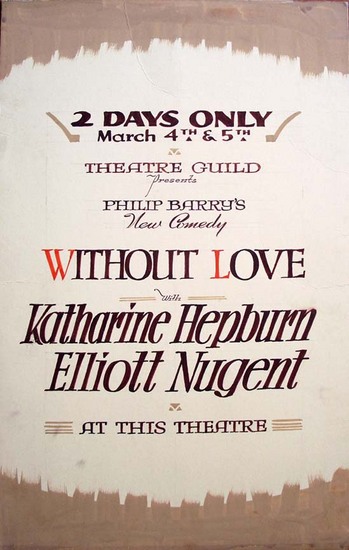
“Fresh from her Hollywood success in The Philadelphia Story and the current Woman of the Year, Katharine Hepburn returns to the legitimate stage in Philip Barry’s new comedy, Without Love,” announced the Daily Princetonian on Monday March 2, 1942.
“Presented by the Theatre Guild, the play will receive its world premiere at the McCarter Theatre Wednesday evening at 8:30 and will stage a repeat performance on Thursday at the same time.”
The play moved to Broadway where it had an extended run at the St. James Theatre. In 1945, it was made into a movie starring Katharine Hepburn and Spencer Tracy, directed by Harold S. Bucquet, and a screenplay adapted by Donald Ogden Stewart.
This hand-painted poster advertising the two performances was found recently among a group of commercial posters in the RBSC theater collection.
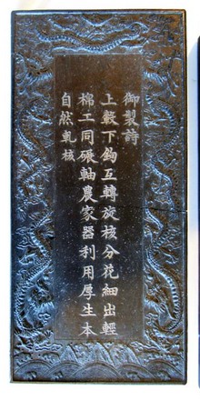
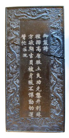
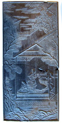
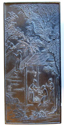
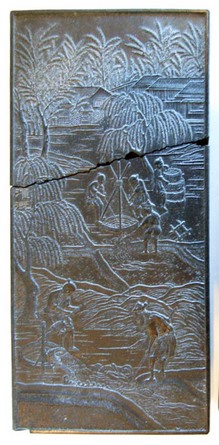
Thanks to my colleagues with expertise in Asian materials, we believe we found half a dozen Chinese blocks or tiles with poems on one side and a carved image on the other side. The blocks were found broken into pieces but happily, have been reassembled. Each one has the same title, which loosely translates as “Poem(s) of the Emperor.” We have not yet found such a poem or series of poems. These are not printing blocks. Perhaps they were part of a poetry game?
For information on Imperial Chinese poetry, see
Jack Wei Chen, The Poetics of Sovereignty: on Emperor Taizong of the Tang Dynasty (Cambridge: Harvard University Asia Center, 2010). East Asian Library (Gest): Western, PL2677.T39 Z55 2010
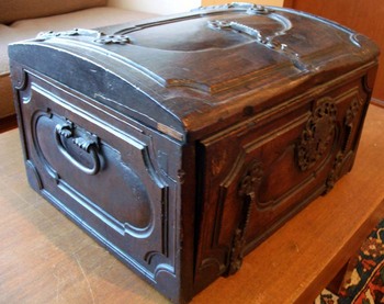
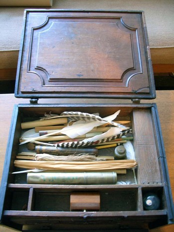
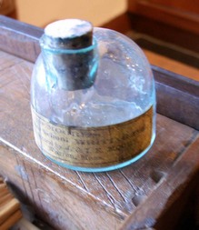
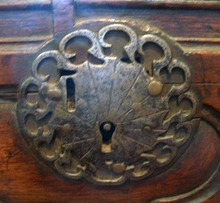
Portable writing chest, 18th century. Carved wood, ornamental metal hinges and handles. Museum objects collection, for many years in the Friends of the Library Room. Distinguished Furniture Collection 25807. Gift of Pratt.
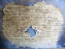
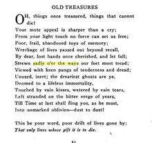
A hand-written poem glued to the back of the chest is by Marion Couthouy Smith (1853-1931), “Old Treasures,” published in The Final Star: Poems (New York, J. T. White & Co., 1918) Rare Books (Ex) 3936.05.334.
“Oh, things once treasured, things that cannot die!
Your mute appeal is sharper than a cry;”
Thanks to Stephen Ferguson, we know “Miss Marion Couthouy Smith was born in Philadelphia, Pa., October 22, 1853. Her parents were Henry Pratt, of Philadelphia, and Maria Couthouy Williams, of Boston. She was educated at Miss Anable’s School in Philadelphia, Pa. Her principal literary works consist of magazine articles and poems contributed to the Century, Atlantic Monthly, The New England Magazine, and other publications… ” She lived in East Orange, New Jersey.
Presumably, a member of the Pratt family donated this box, which has been in our collection for many years. It was inventoried in 1970 as part of Princeton’s distinguished furniture collection.
“Distinguished Furniture Committee,” Princeton Weekly Bulletin 67, no. 14 (January 30, 1978).
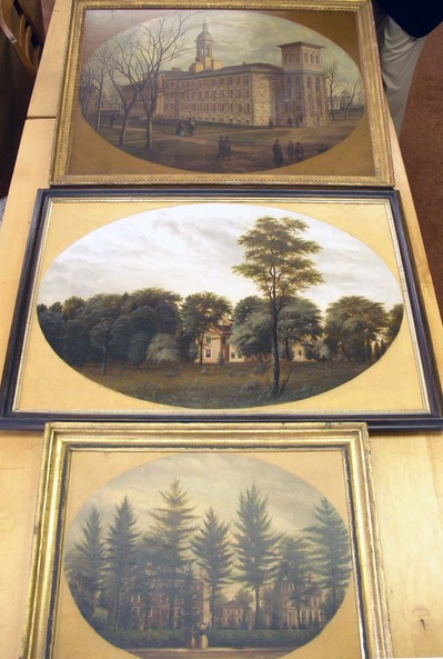
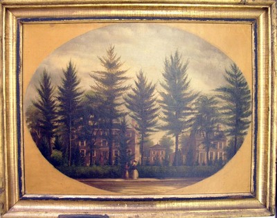 Frank Childs, [Unidentified scene], 1800s.
 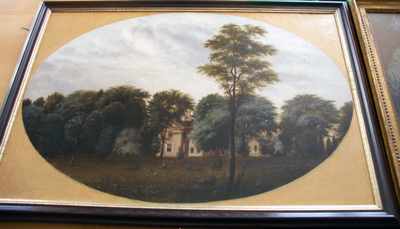 Attributed to Frank Childs, [View of Morven Museum and Garden, Princeton, New Jersey], ca. 1860. Oil on canvas.
 Earlier this week, we had the good fortunate to view several framed works by the 19th-century American painter Frank Childs side-by-side. Happily, the topographic view seen here at the top is signed and so, we can now confidently attribute the view of Morven Museum and Gardens to Childs.
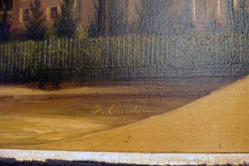
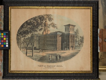
Unfortunately, Princeton University Library’s view of Nassau Hall (after 1859) remains a mystery. Unlike the other two, it is painted on a prepared board rather than stretched canvas. The foliage so carefully rendered on the other two paintings as well as on Childs’ prints of Nassau Hall, has disappeared and the trees are bare. Other differences are evident, which leads us to believe it might have been painted later, possibly commissioned for an alumnus after one of Childs’ two published prints. Our sincere thanks to Elizabeth G. Allan, Curator of Collections & Exhibitions, Morven Museum & Garden; Joseph J. Felcone, antiquarian bookseller; and collector David Doret for their help with this project.
See also:
http://www.nysm.nysed.gov/treasures/treasure.cfm?object=300284
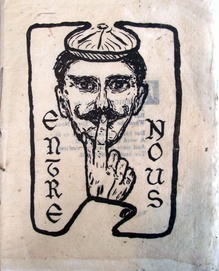
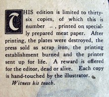
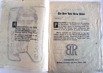
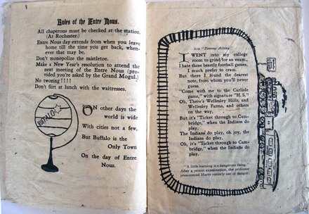
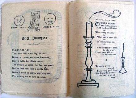
For Christmas in 1906, twenty-two year old Elmer Adler (1884-1962) conceived, printed, and published this small volume in an edition of 35 copies. Although the title page indicates it is the second issue of Entre Nous, no other copies have (yet) been found at Princeton or in other libraries. If you know of any, please let us know.

Biographies for the American artist Howard Cook often repeat the note that he was commissioned by The Forum magazine to go to New Mexico and create illustrations for Willa Cather’s novel Death Comes for the Archbishop.
During the 1920s, Forum regularly published portfolios of prints by contemporary artists. The magazine printed a series of Cook’s prints made during a trip to Maine in 1926 and the following year, three other groups of prints made in New Mexico. Our print, seen above, was part of ‘Dobe and Pueblo in Santa Fe - Wood and Linoleum Cuts printed in the March 1927 issue.
1927 was also the year that Forum serialized Cather’s novel from January to June. Her illustrator was Harold von Schmidt (1893-1982), who went on to create additional prints for the edition of Death Comes for the Archbishop organized and designed by Elmer Adler for Knopf.
Below are the microfilm pages for each of these separate, unrelated features:
-thumb-220x348-19746.bmp)
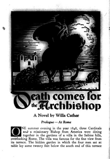
Willa Cather (1873-1937), Death Comes for the Archbishop; with drawings and designs by Harold von Schmidt (New York: A.A. Knopf, 1929). Copy inscribed from the artist to Elmer Adler, who gave it to Princeton. Graphic Arts Collection GA 2009-0257N
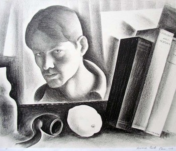 Howard Norton Cook (1901-1980), Self-portrait, 1919. Lithograph. Graphic Arts Collection GA 2007.01060
When photographer Alec Soth was asked to participate in Apeture’s Remix project by creating a work in response to a book that influenced his career, Soth chose photographer Robert Adams’s 1985 photo-essay Summer Nights (Marquand SAPH TR610 .A33 1985).
This beautiful video, Summer Nights at the Dollar Tree, is Soth’s reply to Adams.
See also Soth’s limited edition artists’ book in the graphic arts collection:
Alec Soth and Lester B. Morrison, Broken Manual. ([Saint Paul, Minn.]: Little Brown Mushroom; Göttingen, Germany: Steidl, 2010). Graphic Arts Collection (GAX) Oversize 2012-0036E
Recent Comments