Recently in Notable holdings Category

Vattemare, the Father of Interlibrary Loan.

vattemare2.jpg

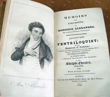
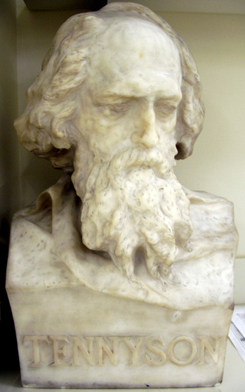
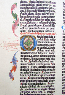
W.T. Moncrieff, Memoirs and Anecdotes of Monsieur Alexandre, the Celebrated Dramatic Ventriloquist. Adventures of a Ventriloquist; or, The Rogueries of Nicholas . . . . Illustrations by Robert Cruikshank (London: J. Lowndes, 1822). Graphic Arts Cruik R 1822

Graphic Art holds a rare copy of the memoir of Nicolas-Marie-Alexandre Vattemare (1796-1864), an actor, ventriloquist, quick-change artist, and philanthropist, who used as his stage name Monsieur Alexandre. Although trained as a doctor, Vattemare's natural talents as an entertainer led him onto the stage, a career which lasted from 1815 to 1835.

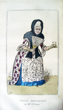
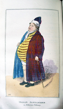
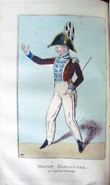
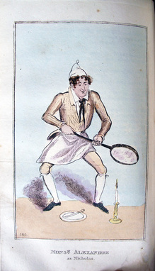
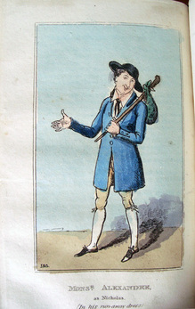
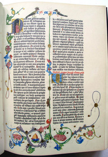
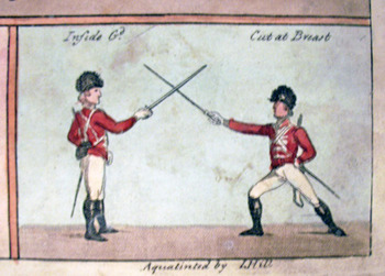
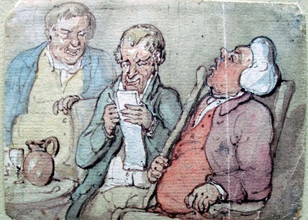
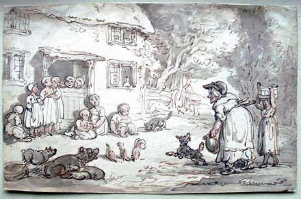
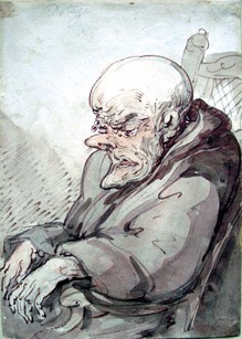
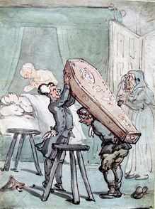
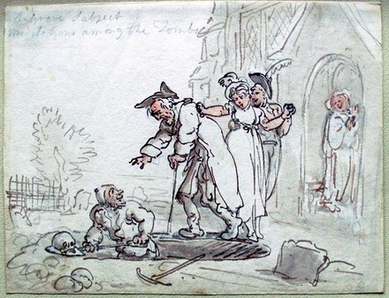
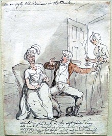
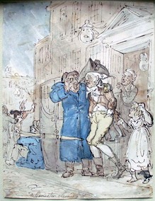
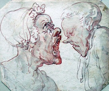
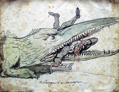
Vattemare performed a one-man show in which he transformed into dozens of different characters, each with their own costumes and voices. Bound with his memoir are scripts of the various sketches he performed, each one illustrated with a frontispiece portrait of that individual persona, made by Robert Cruikshank (1789-1856).

vattemare5.jpg
vattemare4.jpg

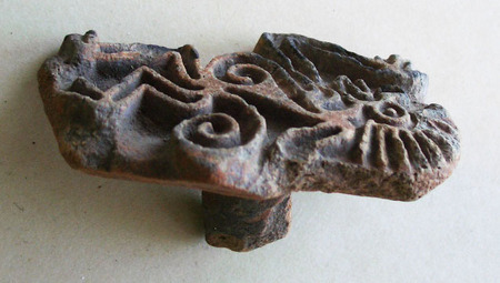
Vattemare's fame led to great wealth, which he used to acquire a vast collection of rare books and coins (among other things). Late in his life, Vattemare was instrumental not only in founding of the Boston Public Library but also a system of interlibrary loans and cultural exchanges between libraries around the world.

vattemare3.jpg
vattemare6.jpg

"The extraordinary life of Nicolas-Marie-Alexandre Vattemare (1796-1864)," wrote Suzanne Nash (Princeton University Professor of French and Italian, Emeritus), "known today by a handful of bibliographers as the founder of the American Collection at the Bibliothèque Administrative de la Ville de Paris and for his role in the creation of the Boston Public Library, deserves to be told, not only as a revealing page in the history of Franco-American relations, but as a window onto the rapidly changing cultural history of nineteenth-century France."
"Alexandre Vattemare: A 19th Century Story," Society of Dix-Neuviémistes (2004) http://www.sdn.ac.uk/dixneuf/september04/nash/vattemare.pdf

In 1824, Sir Walter Scott wrote Vattemare an epigram:
Of yore, in Old England, it was not thought good
To carry two visages under one hood;
What should folks say to you who have faces so plenty
That from under one hood you last night showed us twenty?

Stand forth, arch-deceiver, and tell us in truth
Are you handsome, or ugly? In age, or in youth?
Man, woman, or child? Or a dog or a mouse?
Or are you at once each live thing in the house?

Each live thing, did I ask, each dead implement too?
A workshop in your person -- saw, chisel and screw.
Above all, are you one individual? I know
You must be, at the least, Alexandre and Co.

But I think you're a troop, an assemblage, a mob,
And that I, as the sheriff must take up the job;
And instead of rehearsing your wonders in verse,
Must read you the riot act and bid you disperse.

vattemare1.jpg


See also Earle Havens, "The Ventriloquist Who Changed the World," American Libraries 38, no.7 (2007): 54-57.

James Whitney, "Incidence in the History of the Boston Public Library," Papers and proceedings of the ... General Meeting of the American Library Association, 24 (1902): 16.

The Grammar of Color

grammar of color3.jpg
Unbalanced Color (left) and Balanced Color (right)

grammar of color6.jpg
grammar of color4.jpg
Thomas Maitland Cleland (1880-1964), A Grammar of Color: Arrangements of Strathmore Papers in a Variety of Printed Color Combinations According to the Munsell Color System, with an introduction by Professor A.H. Munsell (Mittineague, Mass.: Strathmore Paper Co., 1921). Two plates engraved by Rudolph Ruzicka and 19 folding color-printed specimens demonstrating color combinations. Gift of Elmer Adler (1884-1962). Graphic Arts GAX Oversize QC495 .C545 1921q.

Following World War I, Thomas Cleland wrote a practical manual of color, funded and published by the Strathmore Paper Company. He outlines the almost endless options, good and bad, of printing various colored inks onto colored papers. Readers are encouraged to experiment with using various samples included at the back of the volume. Cleland went on to practice his own lessons, as art director of Fortune Magazine.

In his introduction, color theorist A.H. Munsell writes, “With white at the North pole and black at the South pole; and its axis between these points a measured scale of grays, we have a decimal neutral scale which painters call Value. The middle point of this axis must be a middle gray, and a plane passing through to the equator must contain colors of middle value. If, therefore, the equator be spread with a color circle … we have the equator as a decimal scale of hues merging gradually from one to the next and returning upon itself….”

grammar of color2.jpg
grammar of color1.jpg

“Each of these hues is supposed to grow lighter until it merges into the North pole at white, and darker similarly to black, and these are called the values (light) of color. They may also be imagined as passing inward until they disappear in the gray axis. Should there be still stronger colors, they will continue upon the same radii outside the sphere. These we call the chromas (strength) of color.”

grammar of color7.jpg

Tennyson's motto "Y Gwir yn erbyn y byd"

tennyson bust.jpgPostridge,Tennyson, 1900. Carved marble. Museum Objects Sculpture Collection

The poet laureate Alfred Tennyson, 1st Baron Tennyson (1809-1892), was sixty years old before his friend, Julia Margaret Cameron (1815-1879) started photographing him. In all, Tennyson sat for 19 portraits including the one on the right.

The portrait bust we hold in Firestone Library [above] appears to date from this period. Tennyson is even wearing the monk’s robe Cameron used when she dressed up her sitters.

More likely the sculptor (signed in stone “Postridge”) simply used a Cameron photograph as the basis for his portrait bust, which was completed in 1900.

tennysonkeep.jpgJulia Margaret Cameron (1815-1879), Alfred Tennyson, albumen print from wet collodion-on-glass negative, 1869. Graphic Arts GAX 2011-00455

According to Tennyson’s son, Hallam Tennyson, around the same time Cameron was immortalizing his father, a letter arrived from the Tennyson Society of Philadelphia. The Society was asking permission to use the poet’s name and to give their organization a motto.

Tennyson replied, “You have done me honour in associating my name with your institution, and you have my hearty good wishes for its success. Will the following Welsh motto be of any service to you? I have it in encaustic tiles on the pavement of my entrance hall: “Y Gwir yn erbyn y byd” (The truth against the world). A very old British apophthegm, and I think a noble one, and which may serve your purpose either in Welsh or English.” —Alfred Lord Tennyson: a Memoir By His Son (1897)

Timothy C. Ely

ely2.jpg
ely1.jpg
Timothy C. Ely, Alpha Deep ([New York?: T. Ely, 1991]). Graphic Arts Collection (GAX) Oversize N7433.4.E49 A47 1991q

ely3.jpg
ely5.jpg
ely4.jpg
Graphic Arts is fortunate to own one of Tim Ely’s unique manuscript books, written in his own language and beautifully hand bound in covers of his own design and construction.

The letterforms that Ely uses are as much a part of the visual imagery as the pictures. He calls the font “cribriform.” When I searched this on Google, a medical dictionary popped up with the definition “Perforated like a sieve.” The artist writes, “I liked the idea that there were these vessels that could hold meaning, and that they had holes.

Collectors stand in line, waiting for Ely to finish these one-of-a-kind artists’ books, which he began making in 1971. Ely trained as a designer and printmaker. He has an MFA from the University of Washington and received a grant from the National Endowment for the Arts to study book binding in Japan, Italy, and England.

Ely writes visual stories, not to be confused with graphic novels. His narratives are anything but linear. “I like the idea of making an art that forces you to confront the mystery,” Ely says. “No matter how you try to deal with it, there is no solution.”

His website lists his influences as, “comic books, Steam Punk design and the study of history, religion, and sociological and psychological phenomena. The works often include soil, sand, and other detritus from pertinent sites around the globe, metals, pigments, textiles, inks, resins, and wax.” http://www.timothyely.com/

Graphic Arts also owns Daniel Berrigan, Lost & Found, illustrated by Timothy Ely ([Montclair, N.J.]: Caliban Press, 1989).Copy no. 86 of 125. Graphic Arts Collection (GAX) 2004-3443N

S. Gallus panem porrigit urso

ivory4.jpg

Graphic Arts holds a small collection of sample bindings and sewing structures, which includes this facsimile of a Carolingian carved ivory book cover.

“According to a monastic writer at St Gall, the ivories with the Virgin and St Gall were carved by the monk Tuotilo, whose artistic interests apparently included book illumination and music. The beautifully carved vines, with a lion attacking a bull, almost exactly reproduce another ivory in the St Gall collection, and a recent book suggests that both ivories came to St. Gall from the court of Charlemagne, but with one pair remaining blank until carved by Tuotilo.”—Lawrence Nees, Early Medieval Art (2002) Marquand N5970 .N44 2002

James Midgley Clark points out that the most interesting items at the St Gall Abbey in Switzerland are the ivory tablets attributed to Tuotilo. “They form the cover of the famous Evangelium Longum. Both tablets are enclosed in a frame of gilded silver with precious stones. … The second tablet depicts a fight between animals, surrounded by foliage, the assumption of the Virgin Mary, two scenes from the life of St Gall with the inscription: S. Gallus panem porrigit urso [St Gall gives bread to the bear].”

“There is a striking resemblance between the decorative foliage of this tablet and the designs on a small ivory relief which serves as the cover of Codex No. 60. The subject depicted here is lions and panthers attacking a bull and a hind. The upper cover consists of skillfully carved but plain rosettes. That Tuotilo was a historical personage is an indisputable fact; after his death he was reversed as a saint and a chapel in the Abbey Church was named after him, from which we may conclude that he was one of the outstanding personalities of his day.” —The Abbey of St Gall as a Centre of Literature and Art (1926). (F) DQ549.4 .C6 1926

To see a digital image of the original, see: http://tinyurl.com/tuotilo

ivory1.jpg
ivory2.jpg
ivory3.jpg

Wooden American Indian Maiden

indian1.jpg
indian3.jpg

Indian Maiden or [slang] Cigar Store Indian, no date [1800s]. Hand-painted, carved wood. Western Americana Collection, transferred from Nassau Hall October 1957. Provenance unknown. Ex 4872.

Alfred Bush, former curator of Western Americana writes, “I realize I really don’t know anything about that fine Indian lass. I always assumed she came from Philip Rollins (Philip Ashton Rollins, Class of 1889 and chairman of the Friends of Princeton University Library) but I really don’t know.”

“For years she greeted visitors to Western Americana when it was in the old faculty lounge on the third floor (with the Cigar printing on the base covered so as not to offend the many Indian students who were regular visitors back then). But, as you know, there were several artifacts that came with the collection.”

No images of Nassau Hall have been found that include this figure.

Bound by Christine Hamilton

christine hamilton6.jpg

Laurence Binyon (1869-1943), The Drawings and Engravings of William Blake (London: The Studio, Limited, 1922). Gift of Sinclair Hamilton, Class of 1906. Graphic Arts Collection (GAX) Oversize 2006-0730Q


When the bibliophile Sinclair Hamilton died in 1978, he left a group of 150 rare books to the Princeton University library. Forty-nine of these were bound by his wife, Christine Hamilton (died 1968) who studied bookbinding under Eleanor van Sweringen in New York and Charles Pagnier in Paris.

“For many years she headed the Guild of Book Workers in New York. Books bound by her were exhibited at the World’s Fair in San Francisco in 1939, at the exhibition at the Grolier Club in 1947, at the Princeton Exhibition in 1951, and on many other occasions. An exhibition devoted entirely to her work was held at the Argent Galleries … in 1949.”—Library Chronicle Autumn 1978

Here are a few more examples.

christine hamilton5.jpg
Gordon Christian Aymar (born 1893), Bird Flight ([S.l.]: Dodd, Mead, 1935). Gift of Sinclair Hamilton, Class of 1906. Graphic Arts Collection (GAX) 2006-2574N


christine hamilton4.jpg
Woldemar von Seiditz (1850-1922), A History of Japanese Colour-Prints (Philadelphia: J.B. Lippincott Company, 1910). Gift of Sinclair Hamilton, Class of 1906. GAX 2012- in process


christine hamilton3.jpg
Henry Adams (1838-1918), Mont-Saint-Michel and Chartres (Boston: Houghton Mifflin, 1925). Gift of Sinclair Hamilton, Class of 1906. Graphic Arts Collection (GAX) Oversize 2006-0757Q


A Devil or Satyr by William Blake

blake devil.jpg

William Blake (1757-1827), A Squatted Devil with Young Horns, ca. 1810. Pencil on paper. Butlin no. 596. Robert H. Taylor art collection.

This pencil drawing by William Blake was never published and in fact, it hasn’t yet been identified as a study for any particular book or print or painting. Blake wrote about many devils but the word satyr does not appear in any of Blake’s poetry (which we can check thanks to the searchable Blake archive at the University of Virginia).

However, Blake did engrave two satyrs in the print he made after William Hogarth’s painting Beggar’s Opera. In Hogarth’s design the stage is framed with a crouching satyr on either side and according to the Tate records, the original frame also had two satyrs carved into the sides.

Princeton’s drawing is mentioned twice in Blake literature. Butlin writes, “The title is taken from Rossetti, who continues, ‘The face is somewhat of the Satyr type. Ordinarily good.’ Certainly, a satyr rather than a devil seems to be intended in this fairly highly finished figure. The background is slightly indicated to suggest rocks.” (Martin Butlin, The Paintings and Drawings of William Blake (EX N6797.B57B87Q)).

William Rossetti is quoted from p. 251 in Alexander Gilchrist (1828-1861), Life of William Blake, “Pictor ignotus”. With selections from his poems and other writings … (London, Cambridge: Macmillan and Co., 1863). Rare Books (Ex) 3631.3.692.

Benfolly by Janice Biala

painting22.jpg

Janice Biala (1904-2000), Benfolly, no date [1930s]. Oil on canvas.
Museum object collection GA 2006.02658

In 1913, Schenehaia Tworkovska (1903-2000) and her older brother Yakov (1900-1982) immigrated to the United States from Biala, Poland. She took the name Janice, he became Jack, and they anglicized the family name to Tworkov. Each worked to pay for painting classes at the National Academy of Design and the Art Students League. To avoid the stigma of being a female artist, Janice painted under the name of her hometown, Biala. Before long, both Janice and Jack were American citizens.

Janice traveled to Paris in 1930 to continue her education in art and there, she met and moved in with the English writer Ford Madox Ford (1873-1939). Ford was the founder of The Transatlantic Review, where he published James Joyce, Ernest Hemingway, Gertrude Stein, Ezra Pound, and other friends. Describing their relationship, Janice wrote, “He found a little handful of dust and turned it into a human being.”

Through Ford, she met the poet Allen Tate (1899-1979) and Tate’s wife Caroline Gordon (1895-1981), who worked as Ford’s secretary. The Tates invited Ford and Biala to spend time at their antebellum home on the Cumberland river near Clarksville, Tennessee. Purchased with the help of Tate’s brother Ben, the house was dubbed Ben’s Folly or Benfolly. In the summers it was filled with visiting writers and artists, as seen in Biala’s painting (purchased by Princeton from the Tates’ daughter).

“All of Biala’s paintings seem touched by a tough ingenuousness — never sentimental or naive, but slightly nostalgic in their playful intimacy. Suffusing them is the outlook of a painter who has found what she needs and knows what she wants to do. The results glow with a wondrous candor.” John Goodrich, “Bohemian Rhapsody,” New York Sun, December 13, 2007

See also: Ford Madox Ford (1873-1939), Provence: from Minstrels to the Machine; illustrations by Biala (Philadelphia; London: J.B. Lippincott Company, 1935). Gift of Edward Naumburg. (Ex) 2004-1848N

Ford Madox Ford (1873-1939), Great Trade Route; with drawings by Biala (London: George Allen & Unwin, 1937). (Ex) PR6011.O53 Z99036

Joseph Zaehnsdorf binding

cruikshank binding2.jpg
cruikshank binding3.jpg

William Makepeace Thackeray (1811-1863), An Essay on the Genius of George Cruikshank. With Numerous Illustrations of His Works ([London]: H. Hooper, 1884). Extra illustrated copy. Unique binding by Joseph Zaehnsdorf in full red calf; solid gilt edges, original cloth covers bound in. Graphic Arts Collection (GA) Cruik 946

cruikshank binding4.jpg

Princeton University Library owns 48 books hand bound by the Austrian craftsman Joseph Zaehnsdorf (1816-1886), one of Europe’s most famous custom binders. Founded in London in 1842, his firm created a wide variety of traditional and less-traditional leather bindings. The company merged with Sangorski & Sutcliffe and continues to produce fine art bindings under the heading SSZ.

Zaehnsdorf apprenticed to the German binder Herr Knipe before moving to London in 1837. There he worked for a number of shops before opening his own firm in 1844 and eventually, became a British citizen. London directories list the Zaehnsdorf shop first at 2 Wilson Street, then at 36 Catherine Street, and finally, 14 York Street, Covent Garden where he died.

For more about Zaehnsdorf, see Frank Broomhead, The Zaehnsdorfs (1842-1947): Craft Bookbinders (Middlesex, England: Private Libraries Association, 1986). Graphic Arts Collection (GA) 2009-0177N

cruikshank binding1.jpg

Your change, with thanks

| 1 Comment
change packets11.jpgSamples from our Change Packet Collection. GC149 Graphic Arts Ephemera
change packets18.jpg
change packets17.jpg
change packets16.jpg


change packets15.jpg

“Among the refinements of middle-class Victorian shopping was the giving of change not directly from hand to hand but in paper packets. Chamber’s Edinburgh Journal in a review of London shops and shopping (15 October 1853), makes passing note of the custom. A customer seeking to buy a pair of kid gloves ‘is met at the door by a master of the ceremonies, who escorts him to the precise spot where what he seeks awaits him … He walks over rich carpets, in which his feet sink as though upon a meadow-sward; and he may contemplate his portrait at full length in half-a-dozen mirrors, while that pair of gentlemen’s kids at 2s 10 ½ d is being swaddled in tissue-paper, and that remnant of change in the vulgar metal of which coal-scuttles are made … is being decently interred in a sort of vellum sarcophagus ere it is presented to his acceptance’.”

change packets14.jpg
change packets13.jpg

“The envelope, known as a ‘change packet,’ measured some 60 mm (2 ½ in) square and was printed with the legend ‘The change, with thanks’, often in a decorative roundel or other device. Printing was generally in a single colour; sometimes the design appeared as a white, embossed image on a coloured background.”

change packets12.jpg
change packets10.jpg

“The packets were supplied to the shopkeeper either as a stock design in which there was no trade message, or printed specially to order with name, address, and designation presented as a form of miniature trade card. Additionally, the shopkeeper might be supplied with the packets at much reduced rates, if not free of charge, by the new breed of national advertisers who used the printing space on the packet for their own message. Typical of these were Huntley & Palmers, biscuit manufacturers, whose change packets were widely used. Their Royal Appointment design appears in two packet sizes and a variety of colours.”

change packets9.jpg
change packets8.jpg

“Stock packets supplied by printers and stationers are also found with topical references, as for example one specimen commemorating the International Exhibition of 1862 [above left]. Wording also provided some variation; a number of specimens bear, in addition to an expression of thanks, the words ‘The favour of your recommendation is respectfully solicited’.”

change packets7.jpg
change packets6.jpg

Quoted from:
Maurice Rickards, The Encyclopedia of Ephemera: a Guide to the Fragmentary Documents of Everyday Life for the Collector, Curator, and Historian. Edited and completed by Michael Twyman (New York: Routledge, 2000). Graphic Arts Reference Collection (GARF) Oversize NC1280 .R52 2000q

change packets3.jpg
change packets.jpg

Feuillets d'art

| 2 Comments
feuillet4.jpg
feuillet6.jpg

Feuillets d’art (Pages of Art) (Paris: L. Vogel; New York, C. Nast, 1919-1922). Bimonthly. Charles Rahn Fry Pochoir collection. GAX 2004-0383Q

feuillet1.jpg
feuillet2.jpg

Lucien Vogel (1886-1954) founded several gorgeous high fashion magazines including Gazette du Bon Ton, L’illustration des modes, and La jardin des modes. Feuillets d’art was dedication to “finding in the taste of the moment all that is traditional and durable.”

Each issue contained only five or six pages of text covering articles on contemporary literature, theater, music, and fashion. A pochoir print was also inserted “for the beauty alone” designed by some of the greatest illustrators of the day, such as Georges Lepape, George Barbier, Édouard Halouze and Charles Martin. Literary contributors include Marcel Proust, Paul Claudel, Jean Giradoux, Paul Valery, Jean Cocteau, and Anatole France.

feuillet3.jpg
feuillet5.jpg

During the same period, Vogel’s wife Cosette de Brunhoff worked as editor of the French Vogue and Vogel served as art director from 1922 to 1925. If that was not enough, in 1920 he and his brother Jacques founded a perfume company named Vigny, after the poet Alfred de Vigny, with such fragrances as Golliwog, Chick-Chick, Guili-Guili, and Be Lucky.

A copy (or two) of the Gutenberg Bible

gutenberg3.jpg

[Facsimile edition of the Biblia Latina, commonly known in English as the Gutenberg Bible, formerly known as Mazarin or Mazarine Bible] [Leipzig: Insel-Verlag, 1913-1914]. 2 v. Copy 6 of 300. Gift of Elmer Adler. GA Oversize 2006-0087F

“Diese faksimile-ausgabe des ersten [-zwelten] bandes der zweiundvierzigzeillgen Gutenburg-Bibel erschien im jahre 1913[-14] im Insel-verlag zu Leipzig. Die wiedergabe in mehrfarbigem lichtdruck erfolgte durch die Hofkunstanstalt Albert Frisch in Berlin nach dem pergament-exemplar der Königlichen bibliothek in Berlin und dem der Ständischen landsbibliothek in Fulda. Gedruckt wurden 300 exemplare / davon nr. 1-3 auf pergament / die übrigen auf van Gelder-bütten. Durch professor Ansgar Schoppmeyer in Berlin wurden die exemplare nr. 1-3 mit der hand ausgemalt und bei diesen / wie auch bei 10 exemplaren auf büttenpapier nr. 4-13 das gold mit der hand aufgelegt. Der einband ist dem Fuldaer exemplar nachgebildet.”

gutenberg5.jpg
gutenberg1.jpg

Johann Gutenberg (1397?-1468), working with merchant and money-lender Johann Fust (1400-1466) and printer Peter Schöffer (ca. 1425-ca. 1502), completed the printing of a 42-line Bible some time before August 1456. This lavishly produced facsimile edition of their book is based on the copies held by the Berlin Koniglichen Bibliothek and in the Stadtischen Landes-bibliothek in Fulda (the binding comes from this copy). Our former curator of graphic arts, Elmer Adler, generously donated a copy to Princeton University. A second set is housed in the William H. Scheide Library.

gutenberg12.jpg
gutenberg7.jpg
gutenberg9.jpg
gutenberg11.jpg
gutenberg6.jpg
gutenberg10.jpg
gutenberg13.jpg
gutenberg4.jpg

Spektrum

spektrum5.jpgHAP Grieshaber
spektrum4.jpgGeorges Lemoine

Spektrum: internationale Vierteljahresschrift für Dichtung und Originalgrafik Zürich. Edited by Sven Knebel (Zürich: S. Knebel, 1958-1992). Jahrg.1 (1958/1959)-Jahrg.33/34 (1991/1992). Missing issues 1958-59. Graphic Arts GAX 2012- in process

spektrum3.jpgJuana Faure
spektrum2.jpgGisela Sternstein-Feucht
spektrum1.jpgViktor Hermann

Beginning in 1958, the Swiss artist Sven Knebel (born 1927) established a publishing firm to promote the work of young writers and artists. Felix Rellstab joined him as an editor. The oversize format of their quarterly magazine Spectrum accommodated large scale original woodcuts, linocuts, and screen prints in every issue.

Authors include Günter Eich, Max Frisch, Ludwig Hohl, Alfred Andersch, Rainer Brambach, Walter Gross, and many others. One of artist Knebel frequently published was the German printmaker Helmut Andreas Paul (HAP) Grieshaber (1909-1981), who cut large, dramatic images on course wood blocks. Bert Schmidmeister, Samuel Lier, Viktor Hermann, and Juana Faure are among the many other artists given a platform at Spektrum.

Pre-Columbian Stamp Seals and Roller Seals

| 4 Comments
precolumbian8.jpg
Pre-Columbian Stamp Seals and Roller Seals Collection, Pre-Columbian era to approximately 1600 ADE. Graphic Arts Collection GC185. Gift of Gillett G. Griffin.

precolumbian9.jpg
precolumbian2.jpg
precolumbian6.jpg

Thanks to the generosity of our former curator of graphic arts, Gillett G. Griffin, we hold a collection of 147 clay stamp seals, roller seals, and flat seals with handles. Housed in four large boxes, staff members Teresa T. Basler and Charles E. Greene organized the collection into the following series: Series 1: Stamp Seals: Anthropomorphic Designs; Series 2: Stamp Seals: Zoomorphic Designs; Series 3: Stamp Seals: Geometric, Floral, and Other Designs; Series 4: Large Flat Seals (with handles); Series 5: Roller Seals.

precolumbian3.jpg
precolumbian4.jpg

Mesoamerican seals (or sellos) were used for printing with colored pigments. The Oxford Companion to Western Art, notes that surviving Pre-Columbian examples are made of clay or terracotta and occasionally of stone, but later seals have been found made of wood. The relief patterns were either for a positive or negative image (by contrast, the designs on Ancient Near Eastern seals are always negative, since they were intended to produce positive images on wet clay).

precolumbian5.jpg

The use of seals was widespread in Mesoamerica, parts of the Caribbean, and in the intermediate areas between Mesoamerica and the central Andes in South America. Use in Mesoamerica began about 1500 B.C.E. during the Pre-Classic period. A large numbers of seals have also been found at Olmec sites in the Gulf Coast region from the same era.

For more information, see Anthony Ortegon, Pre-Columbian Stamp Seals (Pueblo, Colo.: AOA Associates, 1999). Rare Books: Reference Collection (ExB) E59 .A7 1999

Remember browsing the shelves?

You can’t do this on google books. A selection of nineteenth-century American imprints in the Sinclair Hamilton Collection, Graphic Arts

browsing1.jpg
browsing3.jpg
browsing4.jpg
browsing5.jpg
browsing8.jpg

See also: American Decorated Publishers’ Bindings, 1872-1929 / collected and described by Richard Minsky (GA Oversize Z269.3.P89 M567 2006q)

The Highland Broad Sword

fensing 2.jpg

Thomas Rowlandson (1756-1827), Highland Broad Sword: As Practiced by the Dismounted Troops of the Light Horse Volunteers of London and Westminster ([London]: Henry Angelo, 1799). 56 x 39 cm. Graphic Arts Rowlandson 1798.11

fensing 5.jpg

This large color etching with aquatint contains 150 figures drawn by Thomas Rowlandson depicting the various positions in the use of the Highland broad sword. Graphic Arts is fortunate to hold two copies, which shows us the coloring differed greatly from copy to copy. Each sheet was folded to fit into a paper slipcase measuring 17 x 14 cm.

The images depict the ten lessons (or “set play” sequences) of fencing as dictated by Henry Angelo (1756-1835) and followed by the Guards of the Light Horse Volunteers of London and Westminster. Angelo ran a fencing academy on Old Bond Street and financed the publication (which is still followed today http://youtu.be/rt8gFOjMopM).

Later the same year, Angelo also published a training manual for cavalrymen entitled Hungarian and Highland Broadsword (Rowlandson 1798.12f). That volume includes twenty-four color plates, also designed by Angelo’s good friend Thomas Rowlandson.

fensing 1.jpg

Unpublished Rowlandson Drawings

| 1 Comment
rothrock1.jpg

“Shelved in the Department of Rare Books and Special Collections in the Princeton University Library—and totally unexplored so far as I know—are sixty-three … [Thomas] Rowlandson drawings,” writes Joseph Rothrock, professor emeritus, University of New Mexico and former curator of graphic arts.

“Almost all are laid down in a mid-nineteenth-century album acquired from Scribner’s on July 13, 1920 and donated to the Library in 1933. Its leaves, without watermarks or identifiable collectors’ marks, measure 9 1/8 by 12 1/2 inches. The drawings themselves are on both wove and laid papers with various watermarks. A light-table reveals on the reverse of many of the drawings one pen sketch, a variety of inscriptions and money accounts, and that the backs of several were used as watercolor palettes.”

rothrock2.jpg
rothrock3.jpg
rothrock8.jpg

“The album was part of a major gift to the Princeton University Library of Rowlandson’s illustrated books and of around two thousand prints by Rowlandson, Bunbury, Woodward, and Gillray. Well over half the prints are by Rowlandson and include many of his earliest etchings as well as numerous proofs, proofs delicately hand colored, and prints not listed in the estimable Grego.”

rothrock4.jpg
rothrock7.jpg
rothrock5.jpg

“The collector was Dickson Q. Brown, Princeton Class of 1895. Brown donated most of the material in 1928 and continued to augment it until his death in 1939.” The rest of Rothrock’s article and a complete listing of the drawings can be found in Princeton University Library Chronicle 36, no. 2 (winter 1975): 87-110. http://libweb5.princeton.edu/visual_materials/pulc/pulc_v_36_n_2.pdf

rothrock6.jpg
rothrock9.jpg
rothrock11.jpg


Shakespeare and Company

shakespeareCom2.JPG
shakespeareCom.JPG

Along with the books and papers that came to Princeton University in 1964 from Sylvia Beach’s Paris bookshop, Shakespeare and Company, was the signboard that hung outside the shop’s front door. With a brightly colored enamel portrait of William Shakespeare on one side and the bookstore’s name on the other, this heavy steel sign became the icon for the shop until it closed in 1941.

Princeton’s is the third of three signs commissioned for the shop, this one painted by Marie Monnier-Bécat (1894-1976), the wife of the artist Paul-Émile Bécat (1885-1960) and sister of Sylvia Beach’s partner Adrienne Monnier (1892-1955).

Beach wrote, “Charles Winzer, a Polish-English friend of Adrienne’s, made the signboard, a portrait of Shakespeare, to be hung outside. Adrienne didn’t approve of the idea, but I wanted it anyway. The signboard hung from a bar above the door. I took it down at night. Once, I forgot it, and it was stolen. Winzer made another, which also disappeared. Adrienne’s sister made a third one, a rather French-looking Shakespeare, which I still have.” - Sylvia Beach (1887-1962), Shakespeare and Company (ExB 0350.854.15)

See Steve Ferguson’s rare book blog for more information: http://blogs.princeton.edu/rarebooks/2011/01/thedispesalofsylviabeachs.html

And here is a video of Beach talking about her life in Princeton and then, in Paris: http://www.rte.ie/player/#!v=1129703=

Loyd Haberly at the Gregynog Press

binding 44.jpg
binding 45.jpg

Xenophon, Cyrupaedia: the Institution and Life of Cyrus, the First of That Name, King of Persians … (Newtown, Montgomeryshire [Wales]: Gregynog Press, 1936). Copy 12 of 150. Graphic Arts GAX Oversize 2007-0113Q


Iowa native and Rhodes Scholar Loyd Haberly (1896-1981) learned the crafts of book making from Mrs. Arthur Durnford and Agatha Walker at Seven Acres in Long Crendon, where he was responsible for the printing and binding of sixteen books.

From there, Haberly moved to Gregynog Press but only stayed for two years, producing only four volumes. His best work during this period may be Cyrupaedia, (1936) published in an edition of 150 hand-set and hand-bound copies. Haberly’s bindings tend to be overly ornate but in this case, he successfully balances a simple design with bright color.

Haberly returned to the United States and ended his long career as an English professor and dean at Fairleigh Dickinson University in New Jersey. The original University shield, recently updated, was designed by Haberly. He continued to print and publish books of his own poetry throughout his life.

With thanks to Jay Satterfield, who has written an extended biography of Loyd Haberly (1993): http://www.lib.uiowa.edu/spec-coll/Bai/satter2.htm

His obituary in the New York Times can be found here: http://www.nytimes.com/1981/03/28/obituaries/loyd-haberly-dies-at-84-poet-teacher-and-dean.html

1 2 3 4 5 6 7 8 9 10 11 12 13 14

Recent Comments

  • Howard Coblentz: I have a round seal shaped like a pear a read more
  • John Overholt: Wikipedia's entry for Sir Francis says: "Throughout Baring's lifetime his read more
  • Serge Rodrigue: It is a precious thing you have a book from read more
  • Colin Wicks: I have a copy of “A Round Game.” And it read more
  • Laurence Hilonowitz: I was a Customer, Friend of Bob Wilson. I Live read more
  • allen scheuch: Absolutely STUNNING! Those colors, those designs made my day! Thanks, read more
  • Olivier: Hello Diane, If you are still looking for an examplare read more
  • Stella Jackson-Smith: I have a framed picture by A.Brouet, signed with the read more
  • John Podeschi: I remember Dale fondly from my days at Yale (1971-1980). read more
  • Joyce Barth: I have some or all of this same poem. I read more