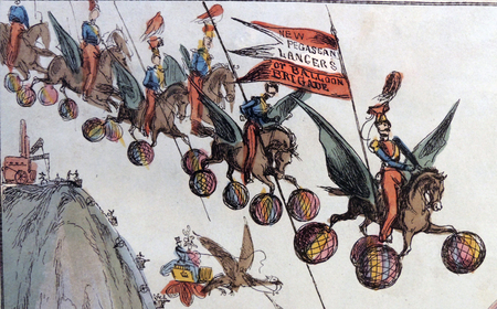
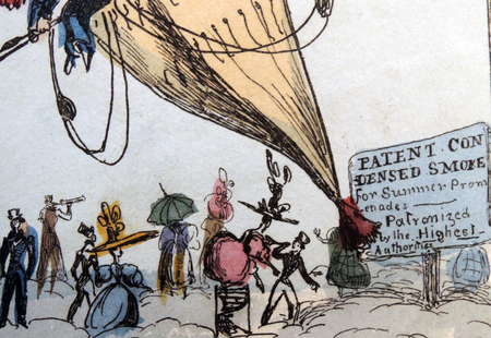
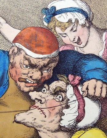
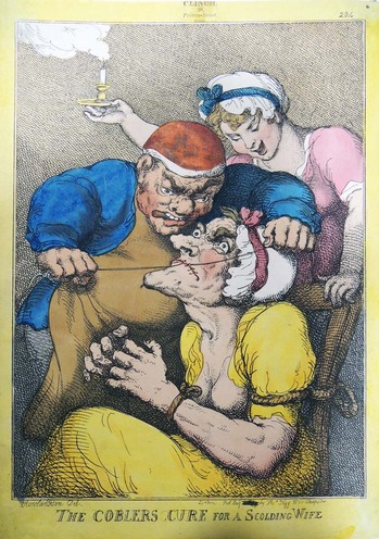
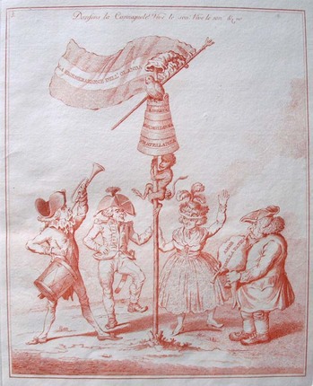
Thomas Rowlandson (1757 - 1827), The Coblers Cure for a Scolding Wife, 1813. Etching. Graphic Arts Collection. Gift of Dickson Q. Brown, Class of 1895.
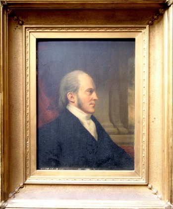
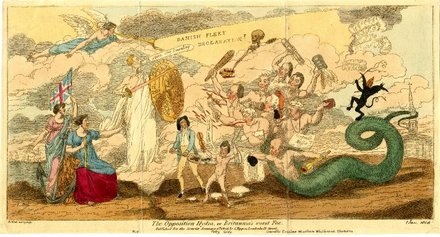
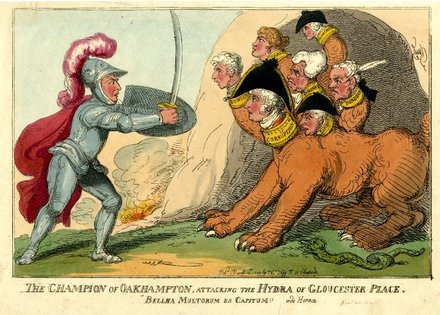
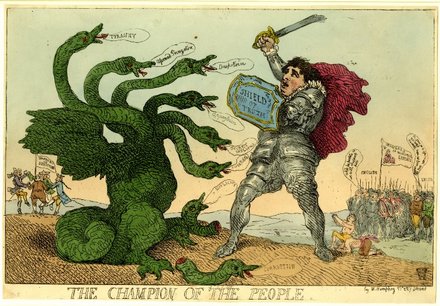
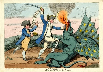
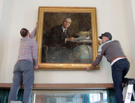
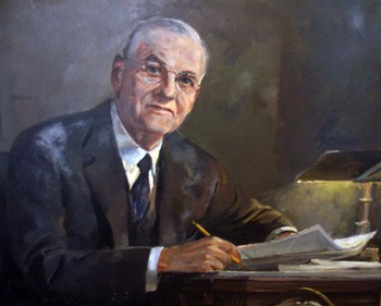
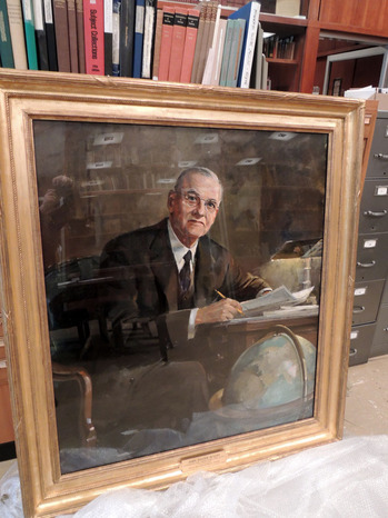
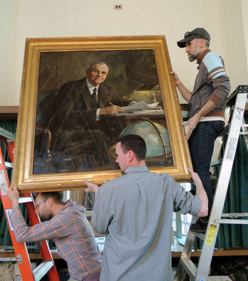
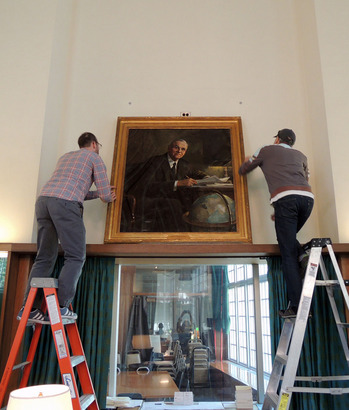
The graphic arts collection holds nearly 2800 prints and drawings donated by Dickson Queen Brown (1873-1939), most British caricatures from the 18th and 19th centuries. A great deal has been written about the artists he collected but little about the collector himself. Here are some facts from his class profile.
Brown was born in Pleasantville, Pennsylvania on April 2, 1873, the son of Samuel Brown, president of Tide Water Oil Company. He attended the Hamilton School in Philadelphia and Phillips Exeter Academy, before entering Princeton in 1891 and graduating four years later. While at Princeton, Brown was a member of Whig Hall, Klu Klux, Valhalla, Tiger Inn, and President of Republican Club.
After Princeton, he attended the Massachusetts Institute of Technology, graduating in 1898 with degree of B. S. Electrical Engineering. From 1899 to 1900, Brown studied at the Royal Mechanical Technical Hochschule, Berlin, before joining the family firm. Working his way up through numerous positions, Brown was ultimately named President of Tidal Oil Company and President, Associated Producers Company (producing oil and operating in Pennsylvania, West Virginia, Ohio, Kentucky, Illinois, Tennessee, Kansas, Oklahoma, Texas, Louisiana and Mexico).
“… the older Independents of the Pennsylvania Oil Regions were still “fighting the civil war” so far as Standard Oil was concerned. We remember reporting a dinner at the Union League Club at the invitation of Robert D. Benson, president of Tide Water, a mild-mannered gentleman. We had come to know him at his office at 11 Broadway from the windows of which he and his co-executives, Robert McKelvy and Dickson Q. Brown, could not help but see “26 Broadway” headquarters and symbol of Standard Oil across the street. They were sons of Bryon David Benson, David McKelvy and S. Q. Brown, founders of the Tide Water and famed builders of the first interstate pipeline from the Pennsylvania oil fields to the Atlantic seaboard.”
“Having lost out in winning control of Tide Water, John D. Rockefeller had gone ahead with his Northern and Southern tiers of lines to carry oil to his tidewater refineries. At the Union League dinner, Benson gave his personal recollection of the alleged Standard Oil-inspired raid of Tide Water’s annual meeting of January 17, 1883, held at Titusville. The “Taylor-Satterfield” (Rockefeller) faction, opposing the “majority Benson” faction, elected itself to control of the company. Benson vividly recalled his father rushing to Titusville, taking him along. There was no elevator in the building and the offices were on the second and third floors. The main stairway was barricaded with heavy planks and guarded by a force of Benson men. Benson pere and fils joined the defenders.”
“The enemy, it turned out, made no physical attempt to take the offices, contenting themselves with carrying the case to court. The speaker recalled the anxiety of officers and employees sweating out the verdict of Judge Church at Meadville who heard the argument of the old management - the arrival of a telegram from his father, reading, “Thank God, a just judge reins in Crawford County, ” meaning that Judge Church had declared “the pretended election void.”
“Since the fight for control in Titusville in 1883, the success of the company has been unbroken, ” Benson finished proudly. The clicking of the pipeline dispatcher’s telegraph key as you entered Tide Water’s offices bore him out. But the Bensons, McKelvys and Browns were not forgetting. Many old-time Independents would not be caught dead talking to a Standard Oil man.”
From The story of the American Petroleum Institute by Leonard M. Fanning.

Recent Comments