Recently in Prints, Drawings, Paintings Category

The Modern City

Three views of London, pulled for Professor Yair Mintzker’s Junior Seminar ‘The Modern City’.

Joseph Smith (active 18th century), A Prospect of the City of London (La Ville de Londres), ca. 1724. Engraving.

In 1707, Johannes Kip (1653-1722) engraved a series of panoramic views after drawing by Leonard Knyff (1650-1721), which he published under the title Britannia Illustrata, or, Views of Several of the Queen’s Palaces (Marquand Library SAX Oversize NA961 .B74F). The series was later expanded and published as Nouveau théâtre de la Grand Bretagne (1724), with additional prints, such as this one by Joseph Smith. The panorama stretches from Temple (no.43) on the left to the Tower of London (no.64) on the right.

John Bluck (active 1791-1819), after a drawing by Thomas Rowlandson (1756-1827) and Agustus Pugin (1762-1832), A Bird’s Eye View of Smithfield Market Taken from the Bear and Ragged Staff, 1812. Hand colored aquatint.

From 1808 to 1811, Thomas Rowlandson worked with the architectural artist Agustus Pugin to create the 104 watercolors, aquatinted by John Bluck, for Rudolph Ackermann’s The Microcosm of London. Their second project for Ackermann was Views of London, with eighteen aquatints, which kept them busy for the next eleven years. This print is the second plate from Views of London, showing the cattle and sheep markets at the east side of the market.

Thomas Rowlandson (1756-1827), State Barge, City of London, 1810. Pencil, pen and ink drawing.

While working for Ackermann, Rowlandson continued to pursue individual commissions. This original drawing seems never to have been converted to a print but may have been a preliminary sketch for his Views of London.

Edward Orme's Transparent Prints

Jas. Hook, Outside of a Castle. To Lady Charlotte Campbell, this print from the original Transparent Drawing, 1798. Sold and published by Edwd. Orme, Conduit Street, London. Transparency etching.

Although the British engraver and publisher Edward Orme (1774-ca. 1838) always claimed to have invented transparent prints, Michael Twyman reminds us that Rudolph Ackermann (1764-1834) published 109 transparent etchings between 1796 and 1802, along with a book entitled Instructions for Painting Transparencies (1799). Even before Ackermann, the caricaturist Mary Darly published a few “humorous and transparent prints” in 1763.

However, it was Orme who made the genre popular in the early nineteenth century through his bilingual manual, An Essay on Transparent Prints and on Transparencies in General (1807) Graphic Arts Collection (GA) Oversize Rowlandson 8415q. The effect was created by taking a normal etching or engraving, painting large areas of color on back of the print and then, adding varnish to specific areas make the paper translucent when held up to a light. Scenes often included fire light, moon light, and other glowing illusions. Orme’s instructions suggest that transparent prints could be substituted for stained glass, in lanterns, lampshades, and fire screens.

W. Orme, A Glass House. From the Original Transparent Drawing, 1799. Sold & Published by Edwd. Orme, Conduit Street, London. Transparent etching.

The Tomb of Rosicrucious. A Blacksmith’s Shop, 1799. Sold & Published by Edwd. Orme, Conduit Street, London. Transparent etching.

Frank Vincent DuMond

Frank Vincent DuMond (1865-1951), The Noise of the Falls Makes Music, ca. 1900. Oil on board. Graphic Arts (GA) 2009- in process

When F.V. DuMond moved to New York City in 1884, he quickly found work as an illustrator at the New York Daily Graphic. Although DuMond went on to publish in Harper’s Weekly, Century and McClure’s magazines, it was not the career he wanted and so, left for Paris and the Académie Julian.

When DuMond returned to New York, he accepted a teaching position at the Art Students League and presided over ASL classes for the next fifty years. His students included a who’s who of modern American artists, including John Marin, Georgia O’Keeffe, and Norman Rockwell.

This undated oil painting comes from DuMond’s early career when he was under the influence of the late-nineteenth-century symbolists. An angler is caught in a trance, brought on by the music of three sirens, who appear from inside a nearby waterfall. The painting comes to Princeton thanks to the Otto von Kienbusch, class of 1906, who liked anything to do with angling.

For more information, see The Harmony of Nature: the Art and Life of Frank Vincent DuMond (Old Lyme, Conn.: Florence Riswold Museum, 1990). Marquand Library SA ND237.D846 F58

Henry Irving's "Macbeth" 1888


Charles Cattermole (1832-1900), Costume designs for Macbeth, 1888. Watercolors. Theater Collection (TC) in process


When Sir Henry Irving (1838-1905) first played the title role in Shakespeare’s Macbeth in 1875, The Times noted that it was to Irving’s advantage that he was “appearing at a time when there is no important rival to suggest comparisons.” The unnamed reviewer goes on to characterize the performance as “a conception of the actor’s own fancy, which can be supported only by a corruption and misinterpretation of the plain meaning of the dramatist. From first to last Irving’s Macbeth is a poor, frightened, whimpering cur, without even a passing touch of any kind of manliness, except, perhaps, one flash in his last moments.” The production closed in less than three months.

In 1878, Irving purchased the Lyceum Theatre and in 1888, along with his lover Ellen Terry (1847-1928), revived his Macbeth in a freshly designed and directed production, with music by Arthur Sullivan. They played to standing room crowds for over six months. Costumes and props were designed by Charles Cattermole (not to be mistaken for George Cattermole, 1800-1868, who illustrated books by Charles Dickens and Sir Walter Scott).

Cattermole worked several times for Irving, creating everyone’s costumes except Terry’s, who used her own designer/advisor Alice Comyns-Carr along with the dressmaker Mrs. Nettleship. Unfortunately for Cattermole, when John Singer Sargent (1856-1925) chose to immortalize Terry in her Lady Macbeth costume, the other designs by Cattermole were all but forgotten.

Jean Louis Prévost

| 1 Comment

Louis Charles Ruotte (1754-ca. 1806), after a watercolor by Jean Louis Prévost (ca. 1760-after 1810), Vingt-neuvième cahier de fleurs (Twenty-Ninth Book of Flowers), ca. 1805. Stipple engraving with hand coloring. Graphic Arts (GA) French prints.

Princeton does not own a complete set of Prévost’s Collection des Fleurs et des Fruits (1805), which was published in twelve livraison or parts with four plates in each. We do have an index to the collection’s 48 plates and this exquisite botanical is not included. We assume our print is one of many that Prévost and Ruotte published separate from the 1805 Collection.

Born in Nointel, France, Prévost was associated with the botanical artist Gerrit van Spaendonck and exhibited at the Academie Royale, as well as the Academy of Saint-Luc. His designs can be found repeated on many fine works of French china, toiles, and chintzes.

Gordon Dunthorne, in his book, Flower and Fruit Prints of the 18th and Early 19th Centuries (GA Oversize 2005-0484Q), compliments Prévost:

A work of outstanding importance and interest, unlike anything published at this time, is Prevost’s Collection des Fleurs et des Fruits of 1805. This was issued for the specific purpose of maintaining the great French tradition for excellence of design and draughtsmanship. And it was Prevost’s hope that the forty eight plates of flowers and fruits would furnish patterns and inspiration to designers and manufacturers of china, toiles, chintzes, and other fabrics. Perhaps no other prints are more worthy of carrying on the tradition of Jean Baptiste and van Spaendonck than these fine examples of Prevost.

George Herriman's "Krazy Kat"

George Herriman (1881-1944), Krazy Kat: A Wail in the Night. A Watch in the Night. Pen and ink drawing, April 21, 1940. GA 2006.01942
George Herriman (1881-1944), Krazy Kat: [Krazy Kat follows Kitten, fends off Mouse], Pen and ink drawing on board, October 17, 1943. GA 2006.01941

George Herriman (1881-1944), Krazy Kat: [Echoes of yodeling], Pen and ink drawing on board, May 17, 194?, GA 2006.01940

Cartoonist George Herriman had a number of early comic strips before he found characters that clicked, including Major Ozone, Musical Mose, Acrobatic Archie, Professor Otto and his Auto, Two Jolly Jackies, Goosebury Sprig, and The Dingbat Family. In the last strip, he began a subplot in the margins of the main story, which involve the family’s cat and mouse. By 1913, the black cat and white mouse got their own strip called Krazy Kat. The cartoon ran for over thirty years and was going to continue after Herriman’s death but when William Randolph Hearst saw the work of the new artists, Krazy Kat came to an end.

There were a number of spin-offs. Herriman partnered with the composer John Carpenter to create Krazy Kat: A Jazz-Pantomime, which opened at New York’s Town Hall in January 1922. Herriman not only wrote the scenario but also designed the scenery and costumes.

Princeton is fortunate to hold several of Herriman’s original Krazy Kat panels in the graphic arts collection. Mendel Music Library has the score for his Jazz-Pantomime, along with a DVD of Carpenter’s score.


John Alden Carpenter (1876-1951), Krazy Kat; A Jazz Pantomime (New York, G. Schirmer [c1922]). Mendel Music Library (MUS) Oversize M33.C3K7q


John Alden Carpenter (1876-1951), Krazy Kat [sound recording] … (New York, NY : New World Records, [199-?]) Recorded at UCLA’s Royce Hall Auditorium. Mendel Music Library (MUS), A-302 N 228

George Bernard Shaw information needed

Rackell, Portrait of George Bernard Shaw (1856-1950), 1938. Pastel on board, author age eighty-two. Graphic Arts Collection GA2009- in process

Coming up this winter is an exhibition of author portraits. Included will be this pastel caricature of the Irish playwright G. B. Shaw, created in 1938 by an artist using the pseudonym Rackell. Who is Rackell? This name does not turn up in any of the standard art history sources, or in Shaw biographies. Surely someone out there knows someone who can give us some information on this artist or the making of this drawing?

During the 1930s, Shaw published several full-length plays including Too True to Be Good (1931), On the Rocks (1933), The Millionairess (1935), and Geneva (1938). 1938 is also the year Shaw received an Oscar for his screen adaptation of Pygmalion. This portrait may have been one of the many tributes Shaw received due to the critical success of that film.

Sincere thanks if you would forward this post to anyone who might help with our research.

C. H. Perkins' Colored Concert Company

C.H. Perkins’ Original Virginia and Texas Colored Concert Company, ca. 1882. Lithographic poster. Graphic Arts GC2009- in process

In researching our new poster for The Colored Concert Company we found one article by Josephine Wright, “Songs of Remembrance” from the Journal of African American History 91:4 [Fall 2006] p.413-424rs that mentioned the group in a footnote:

Three other African American musicians besides Robert Hamilton compiled and published text and music anthologies of Negro spirituals in the early 1880s: M. G. Slayton, ed.. Jubilee Songs, as Sung by Slayton’s Jubilee Singers (Chicago, 1882), 14 songs; Marshall W. Taylor, comp., A Collection of Revival Hymns and Plantation Melodies, Composition by Miss Josephine Robinson… (Cincinnati, 1882), 64 plantation songs; and Jacob J. Sawyer, air., Jubilee Songs and Plantation Melodies (Words and Music), as Sung by the Original Nashville Students, the Celebrated Colored Concert Company (N.p., 1884), 12 songs. Jacob J. Sawyer served ca. 1882 as pianist for Slayton’s Jubilee Singe

Otherwise, this celebrated organization is not mentioned in any of the major newspapers or magazines of the period. Not mentioned in the International Index to Black Periodicals; African American Music Reference http://aamr.alexanderstreet.com/; African American Newspapers: The 19th Century (1827-1882); the archives of the Center for Black Music Research, Columbia College, Chicago, http://www.colum.edu/cbmr/; or the The Harvard Guide to African-American History.

We did however have luck with the dating by matching the clothing in the index: http://www.marquise.de/en/1800/index.shtml).

Cruikshank printing plate for "The Tail of the Comet of 1853"

| 1 Comment

George Cruikshank’s Magazine; edited by Frank E. Smedley (Frank Fairlegh). no. 1-2 (Jan.-Feb., 1854). Illustrations by George Cruikshank. Graphic Arts Collection (GA), Cruik 1854.4


After the demise of The Comic Almanack in 1853 (see posting September 2008), George Cruikshank (1792-1878) tried to publish a magazine under his own name: Cruikshank’s Magazine. It only lasted two issues, January and February 1854, but opened with the spectacular fold-out “Passing Events, or, The Tail of the Comet of 1853.” This 15 ¼ x 7 inch sheet includes hundred of figures chronicling the events of the previous year.

Princeton is fortunate to hold the steel printing plate for this etching. Although it is hard to photograph, I’ve posted a few images to give you an idea of the complexity of this plate. The iconography includes Albert Smith’s lecture on Mont Blanc, a prize cattle show (along with a beef dinner close by), emigration to Australia, and Harriet Beecher Stowe’s Uncle Tom’s Cabin. Although Princeton is sadly missing, the New York’s Crystal Palace can be seen at the top right just above a peace conference. Also depicted is the war between Russia and Turkey, spirit rapping, table turning, ceiling walking, John Gough and the temperance movement (see post December 2008), Charles Keen’s Sardanapalus, Captain McClure and the North-West Passage, and much more.

In his lifetime Cruikshank created nearly 10,000 prints, illustrations, and book plates. Princeton holds the largest set of Cruikshank material in this country, including prints, drawings, watercolors, illustrated books and magazines, proofs, correspondence, and printing plates. The collections are open to the public Monday to Friday.

Johannes Stradanus's Prints of Renaissance Novelties

| 1 Comment

Lia Markey, Curatorial Research Assistant in the Department of Prints and Drawings, Princeton University Art Museum, has mounted a small exhibition focusing on the Flemish artist Johannes Stradanus (1523-1605), including several prints from the graphic arts collection. These engravings, printed at the Antwerp workshop of Philips Galle (1537-1612) after Stradanus’s designs, depict nova reperta or new discoveries, such as the revolutionary changes in printing. In fact, in the frontispiece for the series, seen above, Markey notes that Stradanus places the printing press above the cannon.


For more information, see
Jan van der Straet (1523-1605), New Discoveries; the Sciences, Inventions, and Discoveries of the Middle Ages and the Renaissance as Represented in 24 Engravings Issued in the Early 1580’s by Stradanus (Norwalk, Conn.: Burndy Library, 1953) Marquand Library (SA) Oversize NE674.S89 A3q

Jan van der Straet (1523-1605), Johannes Stradanus, compiled by Marjolein Leesberg ; edited by Huigen Leeflang (Ouderkerk aan den IJssel: Sound & Vision Publishers, in co-operation with the Rijksprentenkabinet, Rijksmuseum, Amsterdam, 2008). Marquand Library (SA) ND673.S85 A4 2008

Princeton University Art Museum is open to the public, free of charge: http://artmuseum.princeton.edu/

Drawn by Wicked Ned

U.S. Frigate Savannah. stuck by a heavy Squall when entering the Harbor of Rio de Janeiro, between the hours of 7 & 8, on the evening of July 5th 1856. Drawn by Wicked Ned and lithographed by Endicott & Company, New York. Graphic Arts GA American prints

The U.S.S. Savannah was built in the Brooklyn Navy Yard and launched on May 5, 1842. The Savannah served as the flagship for the Pacific Squadron, with a crew of 480 officers under Captain Andrew Fitzhugh. In 1853, she sailed a three-year cruise on the Brazil Station, until 1856 when the frigate was struck by a heavy squall entering the harbor of Rio de Janeiro, as seen above. The Savannah was inactivated that fall but recalled for several additional missions before being taken out of service for good in 1862.

When this print was found in the department, it was so light damaged and water stained that we could barely see the image. After treatment by our senior paper conservator, Ted Stanley, it is again in good condition, although we still have no clue as to the artist.

Blake's Virgil


Virgil, The Pastorals of Virgil: with a course of English reading adapted for schools: in which all the proper facilities are given, enabling youtm [sic] to acquire the Latin language, in the shortest period of time. Edited by Robert John Thornton. (London: F.C. & J. Rivingtons, 1821). Graphic Arts Collection (GAX) NE910.G7 B5 1821

Late in 1820 and early 1821, Blake put aside his own work to complete a commission for wood engravings to illustrate the third edition of Dr. Robert Thornton’s juvenile Virgil. Thornton claimed that his instructional volumes were meant to “enable youth to acquire ideas as well as words.” He had added a few illustrations to the Virgil second edition and sales were increased. Thornton hoped to build on this success with a fully illustrated edition.

Wood engraving was a new reproductive technique gaining in popularity for illustrating books and Blake, with no training or experience, was willing to try it. He made twenty drawings and from these, cut seventeen blocks illustrating Ambrose Philips’ Imitation of Eclogue, I (v. 1, p. 13-18). When they were delivered to the publisher, the blocks were rejected completely and Thornton was told that they should be completely recut. Happily, Thornton was persuaded by several other artists to keep Blake’s work but he did publish a caveat in his introduction, “The illustrations of this English Pastoral are by the famous Blake … They display less of art than of genius.” Three blocks were added, cut by an unidentified artist, clearly not equal to Blake.

Hopfer's Die Macht der Liebe

Hieronymus Hopfer (ca. 1500-1563), Die Macht der Liebe (The Power of Love), no date. B. 35. Engraving. Graphic Arts division (GAX) German Prints.

The German printmaker Hieronymus Hopfer (ca. 1500-1563), son of Daniel Hopfer (1470-1536), learned to print working with his father, who is credited with being the first to use etching in Germany. Daniel found it useful for ornamenting armor and guns. Like many artists at that time, they were both fluent in many printmaking techniques, including woodcutting primarily for book illustration. It is his elaborate engravings for which Hieronymus is best-known today, often copied for a German audience after Mantegna, Jacopo de’ Barbari, Nicoletto da Modena, and other early Italian engravers.

The creation date of this print, entitled Die Macht der Liebe (The Power of Love), is unknown. It is an allegorical scene, showing Venus standing at the center, holding a half moon. She is surrounded by various groupings of men, women, and children, each depicting a different form of love.

Les metamorphoses du jour

The French artist Jean-Ignace-Isidore Gérard went by the name Grandville, which was the stage name his grandparents used. In the early nineteenth-century, Grandville created several hand-colored lithographic books to satirize the bourgeois middle class of Parisian society in the Romantic period. His best, and today the rarest, is Les metamorphoses du jour published in 1829.

The characters of the book have a human body and an animal face, exposing people for the beasts they really are. The preface comments that the artist was thereby able to encompass “both the living picture of social manners and the satire of institutions and prejudices. Truth can circulate with impunity under the very eyes of the men it attacks.”

J.J. Grandville (1803-1847), Les metamorphoses du jour (Paris: Chez Bulla…et chez Martinet, 1829). 73 lithographic plates drawn by Grandville, printed by Langlumé. Graphic Arts (GAX) 2009- in process

The first edition was a huge success and quickly went out-of-print. A new edition was prepared in 1854, this time using wood-engraved reproductions of Grandville’s original lithographs. It is unfortunate that most people only know the series through these poor copies.

Princeton’s Les metamorphoses is a complete set of hand-colored lithographs with the extra two plates issued in 1830 in Belgium and then censored. In addition, the book is extra-illustrated with four lithographs in the style of the series: La chasse et la Pêche (1830), La revanche ou le Français du Missouri (1829), Casse nationale sur les terres royales (1830), and Chasse aux ordonnances (1830?).

Princeton also holds a number of books illustrated by Grandville including Jonathan Swift (1667-1745), Voyages de Gulliver dans des contrées lointaines (Paris: H. Fournier ainé: Furne et Cie, 1838). Graphic Arts (GAX) 2005-2172N; along with an original preparatory drawing for Gulliver by Grandville in the Cotsen Collection, (CTSN) Framed Artwork 3976

Les Artistes

In 1838, Paul Gavarni (Sulpice Guillaume Chevalier) began a sixteen-part series of caricatures entitled The Artists (Les artistes) for the journal La charivari. Here are a few examples:

No. 1
Paul Gavarni (1804-1866), Ma sainte te ressemble n’est pas (sic) Nini? -Pus souvent que j’ai un air chose comme ça!, 1838. Hand-colored lithograph. Graphic Arts GA French prints
No. 9
Paul Gavarni (1804-1866), O bon! M’ame Jean! v’lá qui tire vot’ clos! …Un peu qui tire l’clos de M’ame Jean, 1838. Hand-colored lithograph. Graphic Arts GA French prints

No. 13

Paul Gavarni (1804-1866), S’Pierre mon ami, vous êtes capot!, 1838. Hand-colored lithograph. Graphic Arts GA French prints

No. 16

Paul Gavarni (1804-1866), L’atelier du lithographe, 1840. Hand-colored lithograph. Graphic Arts GA French prints


For more information, see:
Marie Joseph François Mahérault (1795-1879), L’œuvre de Gavarni: catalogue raisonné des estampes (Dijon: L’Échelle de Jacob, c2002). Marquand Library (SA), NE650.G2 M3 2002

The Wheel of Fortune

Thomas Cook (1744-1818) after the original print by William Hogarth (1697-1764), An Emblematic Print on the South Sea, 1 August 1800. Engraving. Published London: G.G. & J. Robinson. This is the bottom plate on a sheet that originally included Rehearsal of the Oratorio of Judith and The Laughing Audience. Graphic Arts GA 2005.01324

William Hogarth created this scene in 1721 as a satire of the South Sea investment frauds in 1720. A monument to the destruction that was caused is shown on the right, with wolves fighting at the top. The central Wheel of Fortune is labeled “Who’l Ride” and is crowned with a goat. At the left, a devil is auctioning off pieces of Fortune’s body as religious leaders gamble below. The naked figure of Honesty, at the bottom center, is being tortured by Self-interest. At the right, Honor is whipped by Villainy and Trade lies dead below.

The text at the bottom reads:

See here the causes why in London
So many men are made and undone
That arts and honest trading drop,
To swarm about the Devil’s Shop (A),
Who cuts out (B) Fortune’s golden haunches,
Trading their souls with lots and chances,
Sharing ‘em from Blue Garters down
To all Blue Aprons in the town.
Here all Religions flock together,
Like tame and wild fowl of a feather,
Leaving their strife Religious battle,
Kneel down to play at pitch and hustle(C) :
Thus when the Shepherds are at play
Their flocks must surely go astray
The woeful cause that in these times
(E) Honour and Honesty (D) are crimes
That publickly are punish’d by
(G) Self-Interest and (F) Vilany
So much for mony’s magic power,
Guess at the rest, you find out more.
Price One Shilling

Little Devils

Isaac Cruikshank (1764-1811), after a drawing by George Moutard Woodward (1760-1809), John Bull Troubled with the Blue Devils, 1799. Hand-colored etching. London: S.W. Fores, 1799. Graphic Arts division (GAX) R1800.02E

Shortshanks (Robert Seymour 1798-1836), Morning, no date. Hand-colored etching. “Etched by shortshanks in imitation of George Cruikshank” Graphic Arts (GAX) R2800.02E
George Cruikshank (1792-1878) after a drawing by Captain Frederick Marryat (1792-1848), The Cholic. Hand-colored etching. Originally published London: G. Humphrey, 1819; second state published London: McLean, Aug. 1, 1835. Graphic Arts division GC022 Cruikshank

James Gillray (1757-1815), Le Diable-Boiteux,-or- The Devil upon Two Sticks, Conveying John Bull to the Land of Promise, 1806. Hand-colored etching. Published London: Hannah Humphrey, 1806. Graphic Arts (GC Gillray Collection)

Lovis Corinth

Lovis Corinth (1858-1925), Self-portrait, no date. Drypoint. GC018 German print collection.

Lovis Corinth (1858-1925), Self-portrait, 1909. Drypoint. GC018 German print collection

In the last years of the nineteenth-century, discontented artists in Germany and Austria chose to leave the formal, academic salons to form a “free association for mounting art exhibitions.” The Munich Secession formed in 1892, the Vienna Secession in 1897 and the Berlin Secession in 1898.

German artist Franz Heinrich Louis Corinth (1858-1925), later called Lovis Corinth, founded the Munich Secession. It’s interesting to note this influential artist hadn’t yet sold a single painting—his first sale was in 1895. Corinth then moved to Berlin, where he joined the 65 dissident artists of that Secession, eventually serving as their president from 1915 to 1925.

By that time, however, the power of the organization was lessening. There was a new generation of young artists who objected to what had become the establishment. They left Corinth’s Secession and formed their organization, they called The New Secession.

Corinth created over 900 prints, including 60 self-portraits. The Graphic Arts collection is fortunate to own these two drypoints.

Never a Day Without a Line

| 2 Comments
Crispijn [van] de Passe (1594-1670), La prima-[quinta] parte della luce del dipingere et disegnare, … (Ghedruckt t’ Amsterdam: Ende men vintse te koop by Ian Iantsz. … als mede by den Autheur selve … , 1643-1644). Five parts bound as one. Graphic Arts (GAX) 2009- in process

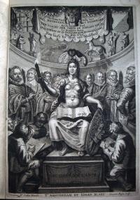
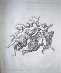
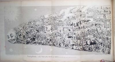
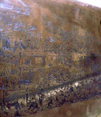
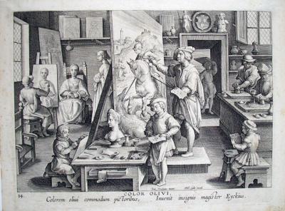
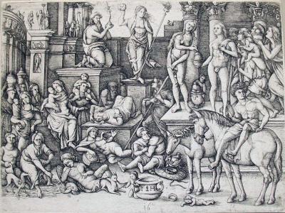
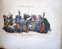
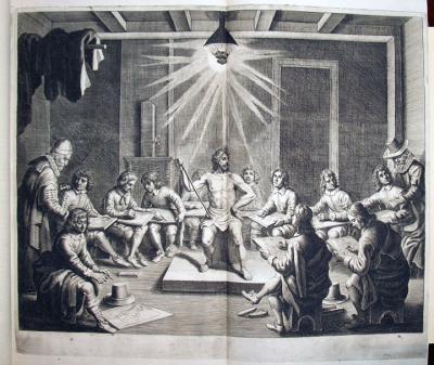
The frontispiece for Crispijn de Passe’s five volume manual for painters depicts Minerva as the patroness of the arts.

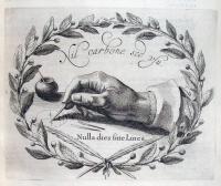
She is holding a torch to symbolize the light mentioned in the title of this volume. In her lap is an open book with the artist’s motto: Nulla dies sine linea (Never a day without a line). Behind her are eight Utrecht painters: Abraham Bloemaert, Gerard van Honthorst, two unidentified, Jan van Bronckhorst, Roelandt Saverij, Joachim Wtewael, and Paulus Moreelse. Apprentices sit at Minerva’s feet drawing.

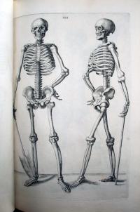
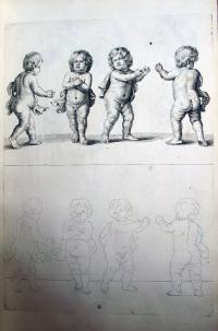
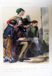
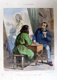
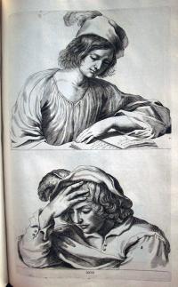
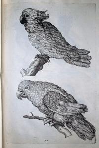
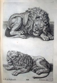
The manual was meant for a wide audience and so, the text is printed in Italian, Dutch, French, and German. Part one is devoted to proportions; part two to drawing from the male nude; part three drawing from the female nude; part four to figure studies by famous contemporary master including Guercino, Jan Cousin, Abraham Bloemaert, and Roelandt Saverij; and part five focuses on the study of mammals, birds, fish, and insects.

There are only four other copies of this book in the United States. One is at the National Gallery of Art in Washington D.C., one at the Getty Research Institute, and two at the Museum of Fine Arts, Boston. Each copy is slightly different in the plates included, their sequence, and the altering of dates. The title pages of part 1-2 in Princeton’s copy have imprint: t’Amsterdam : By Crispijn de Pas, M.D.C.XLIV (altered with pen to M.D.C.LXIV), while the National Gallery of Art’s copy is altered similarly for parts 2-3. Princeton’s copy also has plate dates altered to reflect the addition of a number of prints.

Each of the five parts has its own title page, hence the combined title: La prima-[quinta] parte della luce del dipingere et disegnare, used for the single bound volume. The polyglot book is also known as Van ‘t Licht der teken en schilderkonst and Luce del dipingere et disegnare.

Most of the 225 plates in these volumes were engraved by Crispijn the Younger himself, although the years following the publication of this opus were troublesome for the artist. He had more and more trouble keeping up with demand for his work and in 1645, the artist was admitted to an asylum to be “cured of his insanity of mind.” Although he returned to work, this manual remains his most ambitious project.

The book is dedicated to the city of Utrecht, where his father Crispijn de Passe the elder, had moved for religious reasons. The entire family, father and four children, worked together as artists and print publishers. When the family estate was settled near the end of the 18th century, their work totaled more than 14,000 prints and around 50 print books or illustrated volumes. Princeton is fortunate to now hold 5 rare volumes with prints by Crispijn the younger, and 6 illustrated by Crispijn the elder.


The honour is immortal that remains
Of virtuous artists whose name shall never wither.
Just so with De Passe, the praise the Muses sing
In the vale of Pegasus, of all the wondrous marvels
That he disclosed with his needle,
By etching on the plate, of which Belgica boasts.
So skillfully done, stippled and boldly cut,
As can still be seen up to this very day.
The proof demonstrates the work’s deed to the master’s honour,
Aye, the hand may perish, but the spirit never dies.

She's pretty but how is her handwriting?


Kitao Masanobu (1761-1816), The courtesan Chōzan seated at a Chinese writing table copying poems from a book while Hinazuru stands talking to her, (also called Chōzan and Hinazuru), 1784. Double ōban tate-e color bookplate from 吉原傾城新美人合自筆鏡; Yoshiwara Keisei Shin Bijin Awase Jihitsu Kagami (A Comparison of New Beauties with Samples of their Calligraphy). Graphic Arts collection, GA2009- in process.

This is one in a series of woodblock prints offering the Japanese public a look at the leading prostitutes of the Yoshiwara (pleasure district). Along the top of each sheet is a waka (thirty-one-syllable) poem written in the women’s own hand to show her abilities in calligraphy. Handwriting was only one of the many attributes expected from a high-class courtesan at that time.

The artist Kitao Masanobu was only twenty-two when he produced what would become his most famous work, Seirō meikun jihitsu-shū (Collection of calligraphy by celebrated Yoshiwara courtesans). The seven double ōban woodblock prints each depict two bijin or beauties along with their kamuro (eight to twelve year old attendants learning the business).

According to Cecilia Seigle’s book Yoshiwara (Firestone HN730.T65 S45 1993), Masanobu practically lived in the pleasure district during the 1780s and may have drawn these images from life. The following year, the artist teamed up with publisher Tsutaya Jūsaburō to reformat the series into a book, newly titled Shin Bijin Awase Jihitsu Kagami.

In this sheet, Hinazuru is on the right, showing her New Year kimonos. Chōzan is seated on the left at a writing desk. She has a calligraphy primer, a copy of the book Eiga monogatari (Tales of Glory), and strips of paper waiting for her to write New Years poems.

1 2 3 4 5 6 7 8 9 10 11 12 13 14 15 16 17 18 19

Recent Comments

  • Howard Coblentz: I have a round seal shaped like a pear a read more
  • John Overholt: Wikipedia's entry for Sir Francis says: "Throughout Baring's lifetime his read more
  • Serge Rodrigue: It is a precious thing you have a book from read more
  • Colin Wicks: I have a copy of “A Round Game.” And it read more
  • Laurence Hilonowitz: I was a Customer, Friend of Bob Wilson. I Live read more
  • allen scheuch: Absolutely STUNNING! Those colors, those designs made my day! Thanks, read more
  • Olivier: Hello Diane, If you are still looking for an examplare read more
  • Stella Jackson-Smith: I have a framed picture by A.Brouet, signed with the read more
  • John Podeschi: I remember Dale fondly from my days at Yale (1971-1980). read more
  • Joyce Barth: I have some or all of this same poem. I read more