 We are truly honored to bring an old friend back to the blog today. Remember Hope, our kid tester? The last time we saw her, she was testing ice cream makers. Then she made it to finals for National History Day, started high school, joined marching band, and designed a kick butt hands-on history program for her community library – you know, keeping busy. But this summer, I lured her back to the offices to test a calligraphy kit by ARTSCHOOL, which retails for around $30. Take it away Hope!
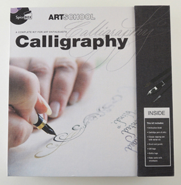
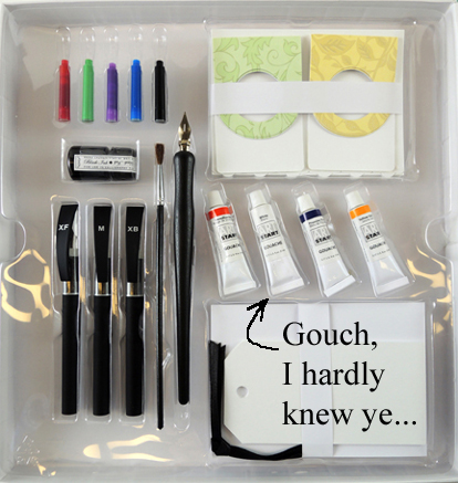
Hey everybody! I’m glad to be back reviewing cool crafty products for Pop Goes the Page. I guess I’m your “teen-tester” now! With that being said, I was enthusiastic to test this calligraphy kit by ARTSCHOOL. The box was aesthetically pleasing, with a fold-over magnet fastener and a modern color palette of gray, teal, black, and white. The box also doubled nicely as reusable storage for the kit items because it wasn’t flimsy cardboard.
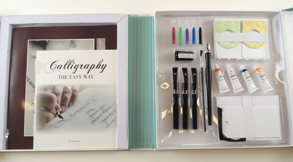 The kit includes: 1 instruction book, practice paper, 3 cartridge pens (xtra fine, medium, and xtra bold), 5 ink cartridges (red, green, purple, blue, and black), 1 classic dipping pen with metal nib, 1 small bottle of black ink, 4 tubes of gouache (red, white, blue, orange), 1 paint brush, 4 gift tags, 4 bottle tags, and 8 note cards with envelopes. After reading the extensive list of supplies included in the kit, I searched the exterior of the box, the interior of the box, the instruction manual, and pretty much everywhere else for a suggested age range for the product…
Now, if you’ve read some of the other product reviews featured on Pop Goes the Page, you know by now that most products that have age ranges are not estimated very carefully, and a product suggested for ages 8+ gives a 14 year old and 2 full-grown adults trouble (like this. And, uh…this). But I couldn’t even find an age range suggested for this kit. Personally, I find that more troubling than an inaccurate age range because as a customer purchasing the product, you don’t have even the faintest inkling (did you catch that calligraphy joke?) of how difficult the projects included will be. At least an inaccurate age range still is able to tell you, even roughly, that the product is intended for children, or teens, etc.
I’ve done a bit of calligraphy in the past because I received a book and pen set as a gift, so this wasn’t my first calligraphy rodeo. I mean, that was probably three-ish years ago, so I needed a refresher, but there were a few things I thought I might have kept with me. Just like riding a bike, right? So I thought, Sounds like fun! And hey, maybe this instruction booklet will be helpful in rekindling my minimal calligraphy talent! Ah, well, “the best laid plans of mice and men…” truly applies here.
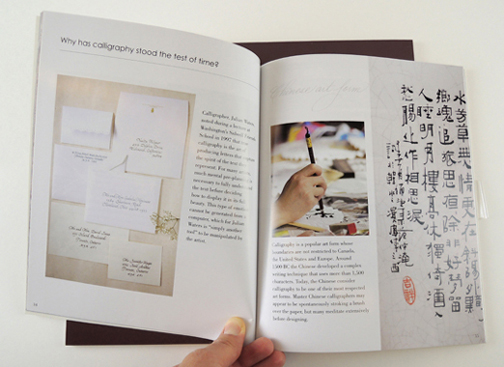
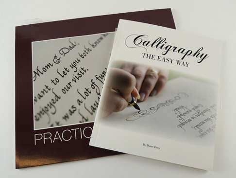 Upon opening the instruction booklet, which was titled Calligraphy the Easy Way by Diane Foisy, I was pleasantly surprised to find a ten page history on calligraphy’s origins, purpose, and more recently, its decline, and those who are attempting to keep the art form alive.
 With the ending of that section, in bold letters, it said “History has shown us that calligraphy will prevail.” I’m not sure about you, but to me that sounded a bit sinister, a bit secret society-ish. There was nothing exactly wrong with the statement itself; it just felt a bit chilling for a craft kit instruction booklet.
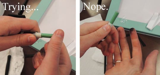
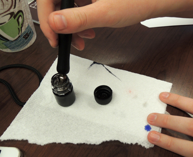
Following this seemingly superstitious statement, there was a page titled “Equipment: Basic Materials” that did not specifically mention the items in the kit, though there was a photo that showed the gouache in the center of a palette. I flipped through the whole booklet; there is not a single place where it tells you how to use the items specifically in the kit, except for a set of instructions telling you how to load each kind of pen included. Also, the cartridge pens were very hard to load, and it almost hurt to pop the seal on the cartridge so that the ink could flow.
 On that page, it also mentioned directions for using a “classic stylus”… nowhere else in the kit is this mentioned. Perhaps it is referring to the “classic dipping pen,” but if so, that was not made clear.
To be honest, though using the dipping pen was more difficult, it was much more fun to use. It felt like a portal to the past, and you could imagine famous writers doing exactly what you were doing; Dickens, Tolstoy, Wells, Poe…
There was a page in the booklet with photographs detailing the cleaning of your pens after each use that I thought was a nice touch. Right after the page about pen care and cleaning, the booklet dove straight into “The Basics.” This was a 4-page section on the basic lines of calligraphy that are used to make all of the letters. However, there were no pictures of someone actually holding a pen so that you were able to gain an understanding of how to angle the pen for optimal ink flow. The directions simply made the callous suggestion “…if the ink does not flow, correct the angle until you have the stroke like the sample shown. You will develop a feel for when the ink flows well.”
Excusez-moi! What does “correct the angle” mean, exactly? To me, this felt like the pretentious calligrapher’s way of saying, “Sorry that you’re new at this, but you’ll figure it out eventually.” I did not feel properly instructed by this instruction booklet; I felt slighted for my comical lack of talent.
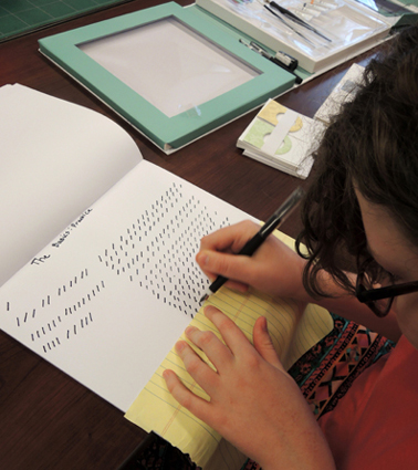 Needless to say, I was not very adept at creating even these simple lines. When I was making these lines on the practice paper provided, the ink went right through the paper. When it did not go through the paper, it bled on the surface of the paper, so it did not make clean lines like those pictured in the booklet.
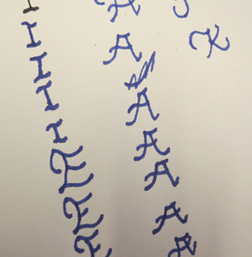
Finally, I just decided to move on to trying to make actual letters in what the booklet called the “Chancery Style” of calligraphy. Overall, it was much more satisfying to make slightly misshapen versions of the letters pictured instead of creating row after row of little dashes. However, again there were no pictures of someone actually writing the letters; there were simply arrows with numbers silently instructing you how to shape the letters.
Considering the minimal amount of instruction provided concerning how to make the letters, I felt like I was doing a decent job. Please don’t misunderstand me- I am certainly no expert (as is evidenced by these misshapen letters). But it was certainly more satisfying to make complete letters instead of what felt like, what must’ve been, hundreds of dashes, row after row, never succeeding.
 The last section of the instruction booklet was titled “Projects”, and mostly pictured completed versions of the tags, note cards, and bottle labels included in the kit with long descriptions of the pictures. It was pretty much the biography of a thank-you note card, the origin story of a gift tag, and the memoir of a wine bottle label.
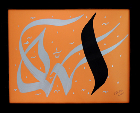
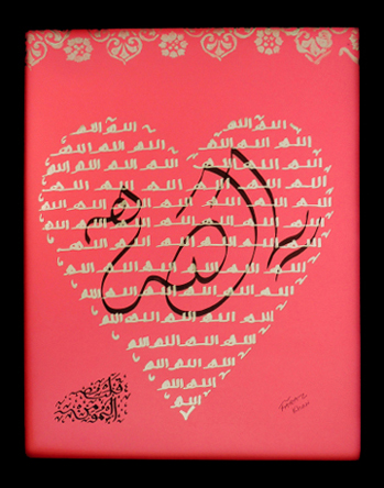
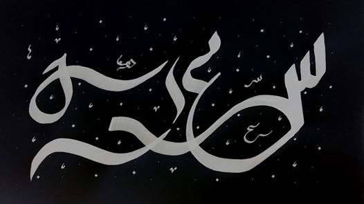
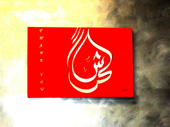
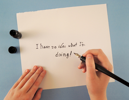
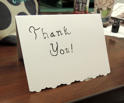
I think I would have appreciated it more if these had been the actual histories instead of the author narrating every pen stroke it took to design the aforementioned items. Despite this, the photographs included were helpful in inspiring my creations, including, a note card, a tag, and a wine bottle label (along with the honest statement, “I have no idea what I’m doing!” pictured at the beginning of this post).
 The booklet ended with a brief piece about the history of illumination, a type of medieval calligraphy done mostly by monks, and a few pages of flower templates that the author encouraged you to copy and use in your own designs.
There was never a mention of using the gouache and paintbrush. Not once. This was puzzling and frustrating because I was interested in getting to work with gouache (hybrid between watercolors and acrylic paint).
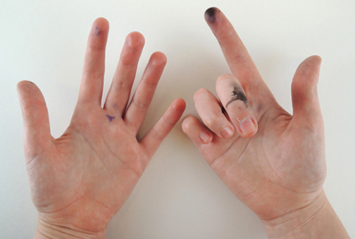
 By the end of this kit, by hands were speckled with ink, and I felt like that more than just my fingers had been immersed in the messy history of calligraphy. (The ink came off of my hands after 6-10 hand washes.)
 I was so excited to use this product to make something beautiful with calligraphy, but instead I felt inadequate and mocked by the instruction manual. I should’ve been the one mocking the inadequate instruction manual. Since it was called (and I quote) an “instruction book,” I felt that I should have been instructed, not loosely guided by numbers and arrows. On the plus side, I gained a new appreciation for Charles Dickens’ incredibly long novels because he had to write them with one of these pens!
PROS: Nice packaging, good array of supplies, fun concept.
CONS: Lacking detailed instructions and sympathy for the learner.
After reviewing the pros and cons, I rate this product:
A sigh out of five. Which I’d categorize as a 2 out of 5.
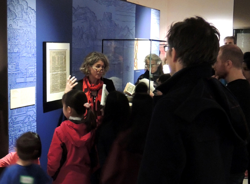 Recently, the Department of Special Collections at Princeton University Library hosted an amazing exhibit, “Gutenberg & After: Europe’s First Printers 1450-1470,” and our library hosted a special event that featured a children’s tour and hands-on activities. If you’ve ever wanted to do something related to printing and the history of the book, read on!
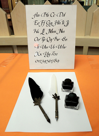 For the calligraphy activity, we purchased both traditional feather quill pens and metal nib quill pens on Amazon, along with bottles of ink. Katie printed different examples of calligraphy so kids could replicate some letters. We also had calligraphy pens and brush pens in rainbow colors. Everyone loved trying the pens, and the calligraphy wasn’t just limited to the English language…
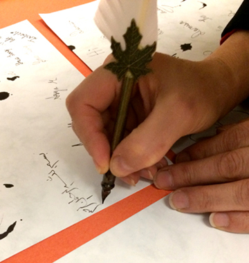 We also had a massively popular typewriter petting zoo. There were 5 typewriters in all, 2 working, 2 non-working, and 1 toy for the really little kids. Kids could touch, explore, and clatter away on them! Katie and I were a wee bit worried about how loud the zoo would be, but quickly learned that the sound of multiple typewriters is actually incredibly soothing (at least to us!).
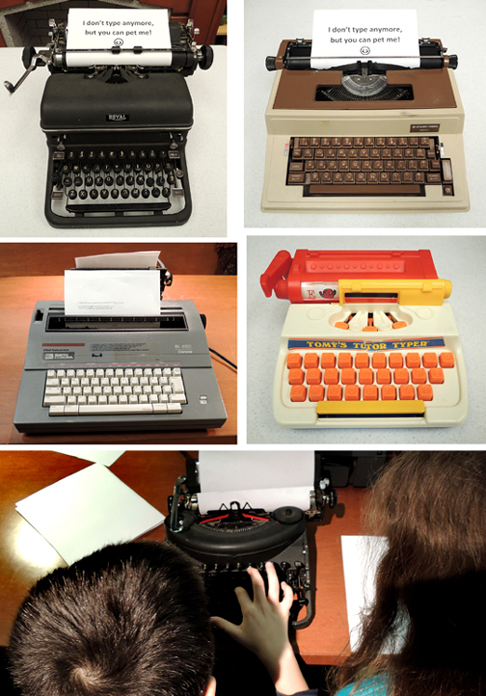 The final activity was something I’ve been wanting to do ever since I spotted in on the Eric Carle Museum‘s blog (see this post for my tour of their awesome art studio). Namely, A PASTA MACHINE PRINTING PRESS! It was fantastic.
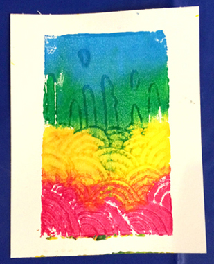
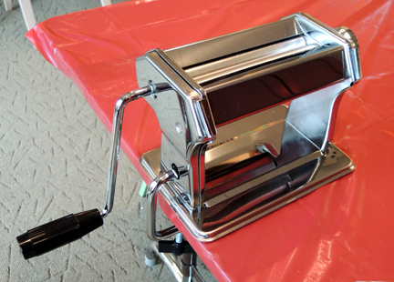 The steps for the activity are as follows: Firs, use a tool to carve a design into a foam sheet. The tool can be a pen, pencil, or wooden scratch art styluses. The foam sheets are the same material that meat is packaged on. We bought thinner versions on Amazon (Presto foam printing plates, a 100 pack of 6″ x 4″ sheets is $15).
 Next, roll paint over your engraved foam sheet. We used trays to reduce the mess. They were definitely helpful!
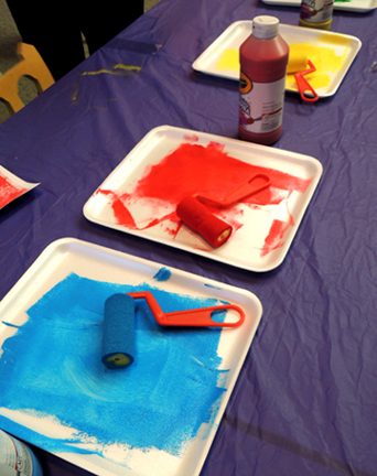 Finally, place a piece of paper on top of your painted engraving and run it through the pasta machine printing press. Peel the foam sheet and the paper apart, and you have a beautiful custom print!
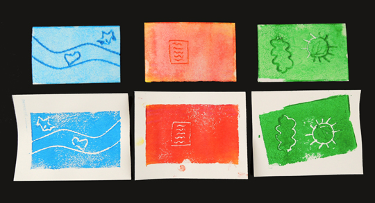 Important! Make sure the pasta machine is set to a wider setting. As you can see in the photo below, if the machine setting is too narrow, the paint will just squish into the lines of your engraving. The wider setting allows to white lines of your design to appear.
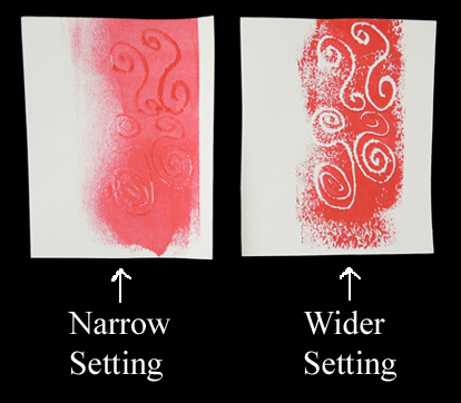 Also, make sure kids know that if they want to print words, they have to carve them backwards as the printing process reverses the carved image. And you might want paper plates handy so kids can transport their still-damp prints home.