March 2009 Archives

Walt Whitman

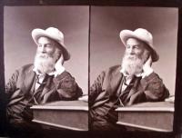
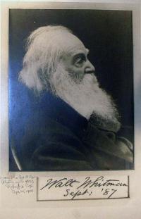
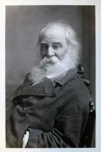
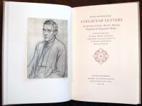
In the first edition of Walt Whitman’s Leaves of Grass (1855), a wood engraving after a daguerreotype portrait of the author was published as a frontispiece, although the author’s name was left off the title page. Whitman (1819-1892) was one of the first writers to understand the importance of the new medium of photography for the promotion of his work and his own celebrity. This appreciation continued throughout his life and made Whitman one of the first authors to be known as much for his image as for his words.

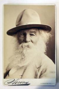
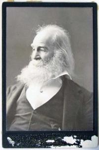
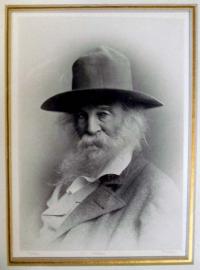
The Library of Congress holds over 100 individual portrait photographs of Whitman, the earliest from 1848. Princeton University has its own smaller collection, with some as loose prints and others bound into volumes of his poetry. These are a few.


Selection from Song of Myself

I know perfectly well my own egotism,
Know my omnivorous lines and must not write any less,
And would fetch you whoever you are flush with myself.

Not words of routine this song of mine,
But abruptly to question, to leap beyond yet nearer bring;
This printed and bound book—but the printer and the printing-office boy?
The well-taken photographs—but your wife or friend close and solid in your arms?
The black ship mail’d with iron, her mighty guns in her turrets—but the pluck of the captain and engineers?
In the houses the dishes and fare and furniture—but the host and hostess, and the look out of their eyes?
The sky up there—yet here or next door, or across the way?
The saints and sages in history—but you yourself?
Sermons, creeds, theology—but the fathomless human brain,
And what is reason? and what is love? and what is life?

John Baptist Jackson

John Baptist Jackson (1701-1780?), Titiani Vecelli, Pauli Galiarii, Jacobi Robusti, et Jacobi de Ponte opera (Venetiis: J. B. Pasquali, 1745). 24 leaves of plates Graphic Arts Collection (GA) GC171

In 1731, the British printmaker John Baptist Jackson arrived in Venice and found work with printmaker Count Antonio Maria Zanetti. Jackson impressed his employer with images printed from multiple blocks, dramatically reproducing paintings and sculpture in a two-dimensional format. He went on to have success designing and cutting woodcuts for book illustration for various Venetian publishers. This came to an end when Jackson learned that some of his designs had been stolen and the blocks printed under another name.


The Crucifixion after Tintoretto (1518-1594)

Fortunately, he met the wealth British banker and bibliophile Joseph Smith (ca. 1674-1770) who offered Jackson several commissions for reproductive prints of works in Smith’s art collection. The last, completed in 1739, was a multi-block or chiaroscuro reproduction of Rembrandt’s Descent from the Cross (the painting now in the National Gallery of Art, London). The success of this print led his friends Charles Frederick and Smart Lethieullier to propose a larger series of chiaroscuro prints reproducing the great paintings of the Venetian masters.

The Virgin in the Clouds and Six Saints after Titian (ca. 1488-1576)

The project took 4 ½ years, during which time Jackson proofed nearly 100 blocks to produce 24 plates after 17 paintings by such artists as Titian, Tintoretto, Veronese, Leandro da Ponte Bassano, Jacopo Bassano, and Francesco da Ponte Bassano. This was not the first or only such project Jackson attempted but it was the only one to be successfully completed and published in a large edition.

Jackson’s book brought the Renaissance process of chiaroscuro printing back into favor and in 1754, he published a technical manual entitled, An Essay on the Invention of Engraving and Printing in Chiaro Oscuro. In it, Jackson comments “… there is a masterly and free Drawing [in chiaroscuro], a boldness of Engraving and Relief, which pleases a true Taste more than all the little Exactness found in the Engravings in Copper plates..”

Princeton’s copy of Jackson’s book has been disbound and digitized. The prints can be seen in their entirely at http://diglib.princeton.edu/xquery?_xq=getCollection&_xsl=collection&_pid=jacksonprints

Presentation of the Virgin in the Temple after Titian (ca. 1488-1576)

For more information, see: John Baptist Jackson (1701-1780): chiaroscuri dalla Collezione Remondini del Museo biblioteca archivio di Bassano del Grappa (Vicenza: La Serenissima, 1996) Marquand Library (SA) NE642.J13 M37 1996

The Man Who Ate "Art and Culture"

John Latham (1921-2006), The Mechanical Bride by Marshall McLuhan, ca. 1969. Altered book. Gift of William Howard Adams. Graphic Arts GAX Oversize 2006-0384Q.

In 1966, conceptual artist John Latham (1921-2006) had a part-time teaching job at St. Martin’s School of Art in London. One day, he went to the school library and borrowed a copy of Clement Greenberg’s Art and Culture. Latham invited his students to participate in one of his “event-based” art works by chewing pages of the book into a pulp, which was then dissolved, distilled, and the fermented liquid sealed in several glass vials. When Latham received an overdue notice from the library, he attempted to return a vial (housed in a leather case, just like the book) but the librarian rejected it as unreadable. Latham’s teaching contract was not renewed but the artwork, entitled “Chew and Spit: Art and Culture,” was purchased by the Museum of Modern Art in New York City.

http://www.moma.org/collection/object.php?object_id=81529

That same year, William Howard Adams met Latham, possibly through the Fluxus symposium at which Latham set fire to a tower of books outside the British Museum. Adams suggested Latham do something with Marshall McLuhan’s book The Mechanical Bride, and gave the artist a copy. Three years later, Latham returned the volume, altered and autographed. This “event-based” object was donated to the Princeton University Library’s graphic arts collection, where it can be seen today. Special thanks to Hannes Mandel for this discovery.

For more information on Latham, see John Albert Walker, John Latham: the Incidental Person (London: Middlesex University Press, 1995). Marquand library SA Oversize N6797.L37 W344 1995Q

http://www.tate.org.uk/britain/exhibitions/latham/default.shtm

International edible books festival, April 1 each year: http://www.books2eat.com/Books2eat/books2eat.html

Anthony Morris Family Tree

| 3 Comments

Anthony Morris Family Tree, compiled by Anthony Saunders Morris, lithographed by L. Haugg, 1861. Graphic Arts division (GA) 2009- in process

Anthony Saunders Morris (1803-1885) must have had great interest in the history of his family because in the 1860s, he began compiling a complete Morris family tree. When he succeeded in documenting nine generations of male decedents, he hired lithographer Louis Haugg (1856-1894), one of Philadelphia’s leading printmakers, to draw the family tree in its entirety.

The result is this massive sixteen-plate panorama of an actual tree (approximately six by five feet), which holds all the names of the Morris family. Note that the men are the branches that continue the lineage and the women the foliage, only good for decoration.

Printed by F. Bourquin and Company on Chestnut Street, it is unclear how large an edition Morris commissioned. No other copy of this print is currently recorded.

Sketches in France, Switzerland, and Italy

| 1 Comment


Samuel Prout (1783-1852), Sketches in France, Switzerland, and Italy (London: Hodgson & Graves, [1839]). 26 tinted lithographs, GAX copy imperfect. Graphic Arts Collection (GAX) Oversize Rm 2-15-G, cabinet 33.

“It is not unlikely that the day may arrive when the connoisseur of a future age shall turn over the pages of a book, and pause upon an aquatinta print, with the same solemn delight as those of our day are wont to do upon a woodcut of Albrecht Dürer, an etching of Hollar, or a production of any ancient engraver.”

At the time Samuel Prout (1783-1852) wrote these words, aquatint prints had taken over English book illustration, dominating it from 1790 to 1830. The leading publishers, such as Rudolph Ackermann, maintained stables of artists who turned-out watercolor drawings, which were converted to black and white aquatints by master printers, hand colored by cheaper technicians. Samuel Prout worked for Ackermann and others as a watercolorist, specializing in picturesque views for armchair travelers.

Prout’s real interest lay in the newer technique of lithography, being one of the first English artists to perfect the process. In 1817, when Ackermann wrote an article praising lithography in his Repository of the Arts, it was Prout who illustrated the text with an original lithographic print.

As the audience grew for Prout’s topographical views, so did his geographic range. Prout made frequent trips across the continent of Europe, producing multiple series of tinted lithographs with hand-colored highlights. Most prints celebrate towering Gothic cathedrals and other romantic architectural views rendered with astonishing detail. This is one such set with views from France, Switzerland, and Italy.

A Legacy of Letters

Mark Argetsinger, A Legacy of Letters, An Assessment of Stanley Morison’s Monotype ‘Programme of Typographical Design’, with specimens of Centaur, Bembo, Poliphilus, Garamond, Van Dijck, Perpetua, Fournier, Baskerville, Bell, and Walbaum (Skaneateles, New York: Michael and Winifred Bixler, 2008). Edition of 80 copies. Graphic Arts GAX 2009- in process

If you love printed books, you need to move fast. This is a limited edition, scholarly text by the amazing book designer Mark Argetsinger, published by the press & letterfoundry of Michael and Winifred Bixler, concerning the life and legacy of the English designer and typographer Stanley Morison (1889-1967). It is a double treat, placing such interesting research into such an elegant package.

“The typefaces and ornamental material here printed sprang chiefly from the vision and taste of an extraordinary man, Stanley Morison” begins the preface. We all know the facts. Morison founded the Fleuron Society dedicated to typography, was a staff writer for the Penrose Annual, and a consultant for the Monotype Corporation, where he developed some new and revived some forgotten typefaces. He went on to consult for The Times of London, redesigning the whole paper in 1932.

But if you thought you knew the history of modern type design, think again. Argetsinger’s essay will change your mind about the development of letterform in our time and bring you up-to-date with the effect Morison’s legacy has on printers of today.

He writes

“As much as Morison sought to produce a new design, his achievement stands largely in the series of revivals born from his important scholarship. These classical faces, amounting in Morison’s tally to one or two permanent styles through the span of a century, have stood the years and they still stand today. Creation is a gift given by the gods to a few Promethean individuals. The gift is unsolicitable. Morison strove to be one of these persons, but in an odd modern way, by industrial proxy.”

The book was designed by Mark Argetsinger and Michael Bixler and bound by the Campbell-Logan Bindery in Minneapolis, Minnesota. Our copy is being catalogued and will be on the shelf for you to read next week.

Meryon's San Francisco

| 1 Comment
Charles Meryon (1821-1868), View of San Francisco, 1856. Etching and drypoint. Graphic Arts GA 2005.00259
By the vigor, the delicacy and the certainty of his drawings, Meryon recalls what is best in the work of the early etchers. We have rarely seen represented with more poetry the solemnity peculiar to a great capital. -Charles Baudelaire 1859

Baudelaire was reacting to “Eaux-fortes sur Paris,” a series of 22 etchings documenting Paris before it was transformed into a modern city by Baron Georges-Eugene Haussmann. Completed by the French printmaker Charles Meryon (1821-1868) between 1850 and 1854, the prints were rejected by the Salons of the time.

Meryon must have been grateful to receive a commission in the spring of 1856 from François Louis Alfred Pioche (1818-1872), a banker, investor and art collector, who traveled between his native Paris and his adopted home of San Francisco. Poiche asked Meryon to create a panoramic landscape of San Francisco, although the artist had never been there. For inspiration, he was given a five-daguerreotype panorama of the city (now in the Art Institute of Chicago), from which five large paper photographs were made for his use.

While much of the landscape was copied directly from the photographs, Meryon added a cartouche to the center foreground with allegorical figures of Abundance and Labor, as well as portrait medallions of Pioche and his partner Jules B. Bayerque. Meryon pulled the first proofs in September and finished some time that winter. Princeton’s copy is a rich, clean impression from the fourth of four states, measuring 185 x 950 mm.

Not long after finishing this panorama, the artist checked into the asylum in Charenton. Although he returned to Paris and his work several times, Meryon’s final years were spent in Charenton, where he died of self-starvation in 1868.

The Court of Henry VIII

| 2 Comments

Edmund Lodge (1756-1839), Portraits of Illustrious Personages of the Court of Henry VIII (London: John Chamberlaine, printed by W. Bulmer, 1812). Graphic Arts (GAX) 2009- in process

This is the second edition of 84 stipple engravings reproducing drawings by Hans Holbein, the younger (1497-1543), with biographical and historical descriptions by Edmund Lodge. It was Queen Caroline (1683-1737), who found the Holbein originals in a bureau at Kensington Palace and asked Richard Dalton (Keeper of the King’s drawings and medals) to have them copied and published. When Chamberlain took over Dalton’s position he also inherited the project. Chamberlain edited and published a folio edition of Holbein’s work in 1792, printed and issued in parts over the next 8 years by William Bulmer and Company, Shakespeare Printing-Office.

For the 1792 edition, Chamberlaine called on Francesco Bartolozzi (1725-1815), to prepare a set of prints. Bartolozzi had developed his own technique of stipple engraving with printed color to reproduce the look of chalk drawings, such as Holbein’s. The folio edition of Illustrious Personages was such a success that a large quarto edition was prepared in 1812 (seen here), using additional engravers working in the style of the elderly Bartolozzi, including Bourlier, Cardon, Cheesman, Cooper, Facius, Knight, Meyer, Minasi, and Nicholls.


Of the 84 portraits, 68 are identified by name. The last 12 could not be identified and are grouped at the front of the book without description. A letterpress index is included in the 1812 edition, seen on the left. In addition, portraits of Holbein and his wife serve as frontispieces to both editions.

Paul Praetorius 1521-1565

Paul[um] Praetorius (1521-1564 or 5), Chronica darinnen der Römischen Keiser historien, vom ersten Keiser Julio, bis auff Carolum den fünfften, und ire Bieldnis gefunden werden (Wittenberg: durch Peter Seitz, aus Verlegung Christopheri Schram, 1561). 118 circular woodcut portraits (white on black). Graphic Arts GAX 2009- in process

The 1559 first edition of Praetorius’s history of the Roman Emperors was published in Latin without illustrations. For the first German edition, Praetorius added over one hundred woodcut portraits of the emperors described, taken from imperial coins and later commemorative medals.

The final portrait is that of Ferdinand I of Prague, who Praetorius met while on a diplomatic mission for the Archbishop of Magdeburg. This may have been a last minute substitute since the earlier text indicates the final portrait is to be Emperor Charles V.

Note the words in the woodcuts are printed white on a black background. It was easier to use a thin knife to cut out the letters than to cut around them. The large areas left in relief, printing black, make for a stronger block that would last through a large printing run. In fact, these same blocks were also used in Georgius Sabinus’ Catalogues Romanorum et Germanicorum Imperatorum in 1561.

Julia Margaret Cameron and Alfred Lord Tennyson

| 2 Comments

Julia Margaret Cameron (1815-1879), Illustrations to Tennyson’s Idylls of the King, and other poems (London: Henry S. King, 1875). volume 1, 12 albumen silver prints. Graphic Arts Collection (GAX) Oversize 2007-0055F. Purchased with David H. McAlpin Fund of the Art Museum, Friends of the Library Fund, and the Elmer Adler Memorial Fund. 1974.


“The Parting of Sir Lancelot and Queen Guinevere,” 1874. Albumen silver print. Idylls of the King and Other Poems


“Elaine, the Lily Maid of Astolat,” 1874. Albumen silver print. Idylls of the King and Other Poems

“Vivien and Merlin,” 1874. Albumen silver print. Idylls of the King and Other Poems

“Vivien and Merlin,” 1874. Albumen silver print. Idylls of the King and Other Poems

In the summer of 1874, Julia Margaret Cameron (1815-1879) was living next door to Alfred Lord Tennyson (1809-1892) at Farringford, Freshwater, on the Isle of Wight. Tennyson had taken “Morte D’Arthur” published in 1842 and expanded it into “Idylls of the King” in 1859. He asked Cameron to make illustrations for a new publication of these poems and she produced over 200 prints from wet-plate collodion-on-glass negatives. Unfortunately, the publisher chose only two to be reformatted as wood-engravings and even those did not reproduce well in the final book.

At Tennyson’s encouragement, Cameron went on to produce a book of her own with albumen silver prints interspersed with texts by Tennyson lithographed from Cameron’s hand-writing. The first volume appeared in January 1875 and the second in May, selling for six guineas. The frontispiece for each volume was a portrait of Tennyson dressed as “The Dirty Monk,” dated 1869.

Cameron wrote, “My aspirations are to ennoble Photography and to secure for it the character and uses of High Art by combining the real and ideal sacrificing nothing of Truth by all possible devotion to Poetry and beauty.”

Alfred Lord Tennyson (1809-1892), Idylls of the King (London: E. Moxon, 1859). Contents: Enid. - Vivien. - Elaine. - Guinevere. PUL nine copies available

William Penn, Extra Illustrated

| 2 Comments


Samuel M. Janney (1801-1880), The Life of William Penn. 2nd ed. (Philadelphia: Lippincott, Grambo & Co., 1853). 208 engravings. Graphic Arts GAX 2009- in process

This single-volume biography originally published in 1852, has been extra illustrated with 208 additional engravings bound into a three-volume set. The prints include portraits of William Penn (1644-1718), his colleagues and contemporaries, and the landmarks from his life story.

The earliest print in this set is a portrait of Penn at age twenty-two, posed in armor for his father, an admiral in the Royal Navy. Penn never joined the military but instead joined the Religious Society of Friends, later known as the Quakers. He petitioned Charles II, King of England, and received a grant of land in America, north of Maryland. Penn suggested naming his territory Sylvania but the King wanted to honor Penn and so we call this area Pennsylvania.

L’art de dessiner proprement les plans, porfils [sic], elevations geometrales, et perspectives, soit d’architecture militaire ou civil… (Paris: Christophe Ballard, 1697). Graphic Arts GAX 2009- in process

Graphic Arts holds books with many types of bindings, including books bound in the skin of cows, pigs, sheep, and other mammals. Recently, we acquired a book described as bound in cat’s paw calf. A quick search revealed several other volumes in the stacks with similar cat’s paw bindings.

Happily, it turns out that “cat’s paw” is a descriptive term for the leather made from young cows not cats. This is a variation of Tree calf or Tree marbled calf. For such bindings, a light-colored calfskin has been treated with chemicals to represent a mottled tree trunk with branches or the marks made by a cat’s paw.

The leather is first paste-washed and the book hung between two rods, which keep the covers flat. The book is tilted so that it inclines upward towards it head. A small amount of water is applied to the center of both covers to form the trunk, then more water is thrown on the covers so that it runs down to the trunk and to a central point at the lower edge. Copperas (a green hydrated ferrous sulfate) is sprinkled in fine drops on the covers, followed by potassium carbonate, which causes the chemical reaction that etches the leather to form a permanent pattern in shades of gray.

This and other binding descriptions can be found in Etherington & Roberts’ Bookbinding and the Conservation of Books: A Dictionary of Descriptive Terminology available now online: http://cool-palimpsest.stanford.edu/don/dt/dt3574.html or on paper: Graphic Arts GA Oversize Z266.7 .R62q

Travels amongst the Todas

William Elliot Marshall, Lieutenant Colonel of Her Majesty’s Bengal Staff Corps, was an amateur ethnographer. He was introduced to the Todas people, who lived on the Nilgiri Hills in southern India, while on a furlough to Ooty. Although he did not speak their language, Marshall decided to study the small tribe in order to uncover physiognomic proof of their “primitive nature.”

His final report was published in two similar editions, one titled A Phrenologist amongst the Todas and the other Travels amongst the Todas or the Study of a Primitive Tribe in South India. Both are illustrated with 14 carbon prints from glass negatives. At least two of these plates are from the Simla photography firm Bourne & Shepherd (founded by British photographers Samuel Bourne 1834-1912 and Charles Shepherd) and printed by the Autotype Fine Art Company.

Bourne and Shepherd sold their business in 1870 and Bourne returned to England (although their stock of glass negatives remained in circulation for many years). The images of the Todas are clearly made from life and so, must have been taken a number of years before Marshall’s book was finally published in 1873.

William E. Marshall, Travels amongst the Todas, or The Study of a Primitive Tribe in South India (London: Longmans, Green, 1873) “A brief outline of the grammar of the Tuda language by the Rev. G.U. Pope … From a collection of Tuda words and sentences presented by the Rev. Friedrich Metz”: p. [239]-269. Graphic Arts Collection (GAX) 2006-2348N

For more information, see Kavita Philip, Civilizing Natures : Race, Resources, and Modernity in Colonial South India (New Brunswick, N.J.: Rutgers University Press, c2004). Firestone Library Q127.I4 P48 2004

Home and Haunts of Shakespeare

| 2 Comments

James Leon Williams (1852-1932), The Home and Haunts of Shakespeare (New York: C. Scribner’s sons, 1892) Graphic Arts (GAX) oversize 2009- in process


American born dentist Dr. James Leon Williams (1852-1932) moved to London in 1887. He spent summers in Stratford-on-Avon making photographs and printing the negatives as photogravures. In 1890, his first project matched these gravures with the poem “Elegy Written in a Country Churchyard” written by Thomas Gray (1716-1771). Boston publisher Joseph Knight brought it out in a small edition.

Two years later, Williams followed this with a massive folio entitled The Home and Haunts of Shakespeare published by Charles Scribner’s Sons in New York. Reproductions of 15 watercolors by 15 different American artists are completely overshadowed by Williams’ 45 pictorialist gravures. The New York Times published a review before the book was even finished, crediting Williams with reviving America’s interest in Shakespeare.


Henry Martin's Spots

Henry Martin, class of 1948, worked as a cartoonist and illustrator for more than forty-five years, publishing in the New Yorker, Ladies’ Home Journal, Saturday Evening Post, and many other magazines. He also had a single-panel comic strip, “Good News/Bad News,” which was nationally syndicated.

Martin had his first drawing accepted at the New Yorker in April 1950 but it was another ten years before his first cartoon was accepted there. It is, in fact, these drawings or “spots,” for which Martin is best represented in the magazine. A search of the New Yorker’s cartoon database reveals 188 cartoons but our archive of Martin’s drawings shows he made over 1,000 spots. These are the tiny drawings that fill the spaces above and below the stories, articles, and columns of the magazine.

In March of 2005, New Yorker editor David Remnick changed the handling of these spots (Martin was by then retired). The earlier spots Martin drew had no running narrative of their own; no connection with politics or current events or each other. They were visual poems living gloriously apart from daily life. This changed with the magazine’s 80th anniversary issue. The spots, now created by a series of artists, have their own narrative or running theme throughout an individual issue. This week, for instance, they are all about garbage.

We include a few here in the old style.

And one cartoon for good measure.

For some other Princeton University related Henry Martin cartoons, see: http://tigernet.princeton.edu/
~ptoniana/cartoons.asp

For an extended commentary on the redesign of the New Yorker, see http://www.aiga.org/
content.cfm/redesigning-the-new-yorker
-part-one?pff=2

Andy Warhol's "a is an alphabet"

| 2 Comments
Andy Warhol (1928-1987), a is an alphabet. Text by Ralph Thomas (Corkie) Ward. ([New York: Andy Warhol, 1953]). Graphic Arts GAX N7433.4.W37 A4 1969

Princeton University libraries hold two copies of this thin portfolio of 26 offset lithographs issued in a vellum paper cover with a typewritten label. The one in graphic arts was given by Warhol to then curator Gillett Griffin. It is one of a series of books and multiples Warhol printed from 1953 to 1959 as personal gifts. “[Each] month, he’d send art directors hand-finished work that looked for all the world like original art. He might, for example, mail out stamps of hand-colored butterflies. Or packages of birdseed, with instructions to plant the seeds and watch as they grew to become birds. Starting in 1953, the gifts became more elaborate. Warhol embarked on a series of privately printed books. In that year, he turned out four: Love is a Pink Cake, A is an Alphabet, A House That Went to Town, and There Was Rain in the Street.” Happily, Graphic Arts was on the Warhol mailing list and received copies of A is an Alphabet and Love is a Pink Cake.

For more information see Andy Warhol Prints by Jorg Schellmann, updated by Frayda Feldman, 2003. Marquand Library Oversize ND237.W16 F44 2003q

See also Love is a Pink Cake Graphic Arts GAX N7433.4.C67 A4 1969

Recent Comments

  • Howard Coblentz: I have a round seal shaped like a pear a read more
  • John Overholt: Wikipedia's entry for Sir Francis says: "Throughout Baring's lifetime his read more
  • Serge Rodrigue: It is a precious thing you have a book from read more
  • Colin Wicks: I have a copy of “A Round Game.” And it read more
  • Laurence Hilonowitz: I was a Customer, Friend of Bob Wilson. I Live read more
  • allen scheuch: Absolutely STUNNING! Those colors, those designs made my day! Thanks, read more
  • Olivier: Hello Diane, If you are still looking for an examplare read more
  • Stella Jackson-Smith: I have a framed picture by A.Brouet, signed with the read more
  • John Podeschi: I remember Dale fondly from my days at Yale (1971-1980). read more
  • Joyce Barth: I have some or all of this same poem. I read more