May 2010 Archives

Penmanship

“Drawing [as a preliminary to the art of writing] is not only a pleasing amusement, but a genteel and useful accomplishment: and where there is a taste or inclination for it, youth seems to be the proper time to indulge it.”

Here are three new writing and drawing manuals, which offer “practical hints” and models for young penmen. These books are a gift from Donald Farren, Class of 1958, to whom we are sincerely grateful.

Edwin D. Babbitt (1828-1905), The Science & Art of Penmanship (New York: Newman & Ivison, 1852). Graphic Arts (GAX) 2010. in process

Howard’s Large and Small Round Text Copies: with the New Rules for Learners (Newburyport [Mass.]: Pub. & sold by Thomas & Whipple booksellers, 1805). Graphic Arts (GAX) 2010. in process.

William Edward Shinton, Lectures on an Improved System of Teaching the Art of Writing: by the Aid of which It May Be Acquired, Both in Theory and Practice, in One Third of the Time Usually Devoted To It Under the Rules of the Old System: to which Are Added Practical Hints to Young Penmen (London: Longman, Hurst, Rees, Orme, Brown …, 1823). Graphic Arts (GAX) 2010. in process.

Souvenirs d'Egypte

Souvenirs d’Egypte, ca. 1880s. Albumen silver prints. Graphic Arts GAX 2010. in process

Graphic Arts recently acquired a two-volume set of nineteenth-century albumen silver prints, which include the work of Turkish photographer and publisher J. Pascal Sébah (1823-1886) and the French photographer Félix Bonfils (1831-1885), among others. Although the primary focus is Egypt, the album begins with photographs in Venice and takes the viewer on a tourist’s journey to Cairo and then, Constantinople.

The fifty-five photographs, taken in the 1870s and 1880s, include two iconic images of Victorian tourists climbing the Great Pyramid of Khufu (Cheops). The negatives are not signed but they may have been created by Émile Béchard, who worked for the Sébah studio. Note, the printer had one of the glass negative up-side-down and made an image in reverse of the original.

Attribution on these prints is difficult. They can be loosely attributed to the Sébah studio, where tourists could choose from a library of images, which were then printed on demand. The negatives signed “P. Sébah” may have been by Pascal himself while those signed “Sébah” might have been by his brother Cosimi, who ran the studio after 1883. Pascal’s son Jean signed his negatives “J.P. Sébah” and also formed a partnership with the Frenchman Policarpe Joaillier (1872-1947) in the 1890s, publishing as “Sébah & Joaillier.” All negatives were printed and sold for many years with little distinction between vintage prints and those created much later.

See Engin Ozendes, Sébah & Joaillier ‘den Foto Sabah ‘a (Istanbul: YKY, 1999). Marquand Library (SAPH) TR562 .O93 1999

Besides the landscape views, these albums include a number of portraits, believed to have been staged by the Turkish painter Osman Hamdi Bey (1842-1910), who dressed and posed models to form exotic tableaux vivants.

230: Dame turque chez elle [Turkish lady at home], ca. 1870. Albumen silver print.

A Country Inn Yard at Election Time

William Hogarth (1697-1764), The Stage-Coach, or The Country Inn Yard, June 1747. Engraving. Graphic Arts Collection Hogarth GC113.

Hogarth’s print, The Stage-Coach, was first advertised on June 26, 1747 as a print representing “a country inn yard at election time.” Since the election had only been announced eight days earlier, Hogarth must have completed the scene with some haste. The only direct reference to the campaign is the crowd in the back, perhaps a comment on the lack of attention the election received from the English people.

The central focus of Hogarth’s print is the woman with her back to us, entering the coach. Ronald Paulson wrote, “whether we think of her as “broadbottom” or as backside, she embodies self-absorption and unawareness of what is going on around her as she prepares to disappear inside the coach. The composition focuses on her back, and creates another verbal pun: she is literally “turning her back” on the urgency of the election… .”

Over seventy years later, George Cruikshank took this image and re-imagined it for contemporary London society. At first only indirectly as The Piccadilly Nuisance, Dedicated to the Worthy Acting Magistrates of the District with the stage coach seen from the side. The followed year, he tried again with Travelling in England, which more directly echoes Hogarth’s print.

George Cruikshank (1792-1878), The Piccadilly Nuisance. Dedicated to the Worthy Acting Magistrates of the District, December 29, 1818. Etching with hand coloring. GC022 Cruikshank Collection. Gift of Richard W. Meirs, Class of 1888.

George Cruikshank (1792-1878), Travelling in England, or A Peep from the White Horse Cellar, August 12, 1819. Etching with hand coloring. GC022 Cruikshank Collection. Gift of Richard W. Meirs, Class of 1888.

William the Silent, Prince of Orange, Count of Nassau

Welcome back Princeton University alumni.

John Augustus Mapes, Class of 1920 (died 1970), In Praise of Old Nassau. A Portrait of William (the Silent), Prince of Orange; Count of Nassau, no date. Watercolor. Graphic Arts GA 2006.02632. Painted expressly for George H. Sibley, Class of 1920.

No, Princeton colors do not come from William I, Prince of Orange (1533-1584), also called William the Silent. Born to the House of Nassau, a princely German family, William I became Prince of Orange in 1544 and went on to liberate The Netherlands from Spanish rule. (To read more, see http://www.hollandhistory.net/famous_dutch_people/book-william-the-silent/online-book.html.

It was William III, Prince of Orange (1650-1702) who endowed the College of William and Mary in 1693 and is recognized at Princeton University with Nassau Hall. The building was going to be named Belcher Hall but Governor Jonathan Belcher declined the honor, suggesting that it be named in memory of “the Glorious King William the Third who was a Branch of the Illustrious House of Nassau.”

For more myths and facts about Princeton, see Princeton Myths, Debunked by Wes Tooke, 1999
http://www.princeton.edu/pr/pwb/99/0510/myths.htm
and
Princeton College Bulletin 1895: http://books.google.com/books?id=mxXiAAAAMAAJ&pg=RA2-PA89&lpg=RA2-PA89&dq=william+the+silent+nassau+orange+princeton&source=bl&ots=ROiyfvhx0N&sig=RjCFrp2KC8teoWqbZ62Wr7lAyU&hl=en&ei=Vgv4S8G0CIT78AaUk-3QCg&sa=X&oi=bookresult&ct=result&resnum=7&ved=0CDcQ6AEwBg#v=onepage&q=william%20the%20silent%20nassau%20orange%20princeton&f=false

Myth: The orange in the school’s colors comes from Nassau Hall, dedicated to Prince William of Orange, of the House of Nassau. The black came from a crew race before the turn of the century. The team was about to be disqualified because they weren’t wearing numbers, so they dipped their fingers in mud and painted black numerals on the backs of their orange jerseys.

Fact: The orange did come from Prince William, via Nassau Hall. As for the black, the Princeton crews at the Saratoga Regatta in 1874 did wear orange and black — and that regatta is generally considered the beginning of orange and black as Princeton’s “official” colors. But black had been used since 1868, when the Class of 1869 wanted to print its class number on orange badges to wear in a baseball game with Yale — and black was the only available ink.

A Study for Turner's Fish

| 2 Comments
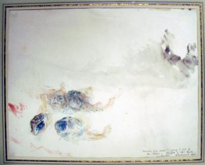
Joseph Mallord William Turner (1775-1851), First sketch of group of fish in The Slave [Ship], Robert Taylor Collection RTC01

The great English painter Joseph Mallord William Turner loved the sea. Beginning in 1829, he spent periods of time each year at the seaside house of Mrs. Sophia Booth in Margate. Later, the twice-widowed Mrs. Booth moved in with Turner in his Chelsea residence, where he enjoyed being greeted as Admiral Booth.

In 1840, at the age of 64, Turner painted Slave Ship, which received nothing but condemnation from the critics. Not only did they hate the loose brushwork and violent palette but found the scene’s shocking depiction of slaves being thrown to their death unacceptable for a public gallery. Next to the painting, Turner hung a poem he called Fallacies of Hope:

Aloft all hands, strike the top-masts and belay;
Yon angry setting sun and fierce-edged clouds
Declare the Typhoon’s coming.
Before it sweeps your decks, throw overboard
The dead and dying - ne’er heed their chains
Hope, Hope, fallacious Hope!
Where is thy market now?

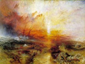
Slave Ship, 1840. Oil on canvas. Museum of Fine Arts, Boston.

One of the only voices to speak up for Turner was that of art critic John Ruskin (1819-1900), who was moved to begin writing an article about Turner and contemporary painting. This led to a lifetime work in five volumes, beginning in 1843 with the infamous volume one of Modern Painters (Ex 3915.1.3645).

Turner died eight years later at his Chelsea home with Mrs. Booth and was buried in St Paul’s Cathedral. His paintings were bequeathed to England and his fortune to a charity for male artists. Although Ruskin did not accept the offer to be an executor of Turner’s will, he did sort through the drawings in the Turner Bequest and curate an exhibition of them at Marlborough House in 1856-57.

A number of works remained with Mrs. Booth and it was from her that Ruskin purchased this watercolor study in 1880. In it, Turner worked out the fish for the lower right corner of The Slave Ship. Years later, it was purchased by Robert Hill Taylor (1908-1985), Class of 1930, and ultimately, donated to Princeton University.

BTW, the Princeton University Art Museum is the fortunate owner of a Turner sketchbook, which Ruskin purchased in 1860 and Charles J. Mosmann, Jr., Class of 1950, donated in 1957.

Kennedy's Anatomy Lesson

The graphic arts collection holds a large group of early twentieth-century gelatin silver prints by the American photographer Thomas William Kennedy (1837-1923), about whom little has been recorded. Scenes include landmarks in New York City, Washington D.C., Baltimore, New Orleans, and various European cities. Many are occupational studies, such as these two views of an autopsy or anatomy lesson, labeled only Baltimore Hospital.

The three young men pose casually around their work. Two are smoking and one even puts his foot up on the table next to the cadaver. We presume this is a classroom, given the charts on the wall and the age of the doctors. Thank goodness for modern medicine.

Thomas William Kennedy (1837-1923), Baltimore Hospital, [1910s]. Gelatin silver prints. Graphic Arts GA 2010. in process.

The Times, of 1762 and 1790

See the figure just right of center on stilts dressed as Henry III (1491-1547), King of England.

Here the same figure is now William Pitt (1708-1778), Prime Minister of Great Britain.

William Hogarth (1697-1764), The Times, plate 1, 1762. Engraving and etching. Graphic Arts GA113.

In Hogarth’s 1762 engraving, the city on fire is emblematic of the Seven Years War and King George III’s efforts to bring about peace. Note the houses in the center, one with the sign of the two-necked eagle (Germany) and another with the fleur-de-lis (France). England is on the far left and a globe on the building to the right shows the extent of the damage being done.

In the first and second states of The Times, Hogarth disguises William Pitt in a Henry VIII costume but in the final, third state, the costume is removed. Princeton is fortunate to have examples of both the second and third states. The stilts represent Pitt’s crutches he used because he suffered from gout. The millstone around his neck marked 3000 pounds per annum represents the enormous pension he accepted. While others attempt to put out the flames, Pitt has a bellows to encourage the flames.

John Bull’s House Sett in Flames, British Museum, London.

Five days before The Times was published, another print called John Bull’s House Sett in Flames was issued anonymously. This may have been the inspiration for Hogarth’s work. On the other hand, it might also have been someone copying Hogarth and trying to beat him to the public’s attention, since the second print was certainly completed with less care or iconographic detail.

Hogarth began work on a second, companion plate to The Times but peace was ratified by the Commons on December 9, 1762 and signed in February 1763. This left Hogarth’s print slightly out-of-date and so, he never printed plate two during his lifetime. According to Ronald Paulson, this copper plate was left to his widow, then to Alderman Boydell, who had it finished and published in 1790.

William Hogarth (1697-1764), The Times, plate 2, 1790. Engraving and etching. Graphic Arts GA113

Edward Lear

Edward Lear (1812-1888) was eighteen when he started work on the illustrations for The Family of Psittacidae, or Parrots. As an ornithological draughtsman, with a talent for striking colors and anatomically correct renderings, Lear found himself taking extended walking trips through Europe. By 1841, his travel had led to an interest in landscape painting and the publication of Views in Rome and its Environs followed by Illustrated Excursions in Italy.

Under the pseudonym of Derry Down Derry, Lear embarked on a separate career as humorist with the publication of A Book of Nonsense. Today, as during his own lifetime, Lear has followers who know his light verse but have no knowledge of his extensive oeuvre in landscape painting.

Lear spent the late fall and winter of 1866/67 traveling through Egypt on camel and boat, sailing down the Nile as far as Wadi Halfa, on the shores of Lake Nasser at the northern border of Sudan. He also visited Gaza and Jerusalem before returning to England. The following winter, Lear spent on the Italian Riviera and at the end of a productive year, composed The Owl and the Pussycat.

Note the lower left, where Lear records not only the date but time of day at which the sketch was made. He drew these wonderfully spontaneous pencil studies on site, leaving the color until later. This was painted in watercolor, following the instructions he wrote directly on the paper concerning hue and tone.

Edward Lear (1812-1888), [Nile scene] near Wady Halfeh [sic], 1867. Watercolor. Robert H. Taylor collection of English and American literature, [1280s]-1950. RTC01, drawer XII.

In 1887, Imre Kiralfy built an outdoor theater on Staten Island, N.Y. His first production was “Nero, or the Destruction of Rome,” which combined dance, music, visual spectacle, and mime. Reviews called it a gigantic, historical, biblical, dramatic, and musical spectacle. P.T. Barnum was in the audience one night and liked the event so much that he arranged with Kiralfy to add the show to Barnum’s upcoming tour around London. “Nero” was shortened slightly and integrated into Barnum and Bailey’s Greatest Show on Earth.

This program from the Olympia Theatre in Kensington assures the viewers that the circus will be “positively exhibiting in London only”. The Greatest Show on Earth (including “Nero”) played until 1890 and then, opened an even more lavish production in New York City. Other acts included a double drove of acting elephants (the greatest in both numbers and intelligence) and Bo Peep and her flock of trained sheep (Signora Stella’s flock of oddly trained American merinos).

For more information, see Margaret Malamud, “Roman Entertainments for the Masses in Turn-of-the-Century New York,” The Classical World 95, no. 1 (Autumn, 2001): 49-57.

Zapiski poeta (Notes of a Poet)

Ilya Selvinsky (1899-1968), Zapiski poėta: povest (Moskva: Gos. izd-vo, 1928). Graphic Arts (GAX) 2010- in process.

The Constructivist poet Selvinsky’s autobiography was published with a book wrapper by El Lissitzky (1890-1941), which features a photomontage of the German artist Hans Arp (1886-1966), set on a background of the Dada periodical 391. The portrait was created while Arp and Lissitzky were working on Die Kunstismen/The Isms of Art: 1914-1924 (Munich: Eugene Rentsch, 1925. Architecture Library (UES) N6490 .L55 1990). There is no explanation of why Arp’s picture appears on Selvinsky’s book.

Steichen's Navy Photography

Edward Steichen (1879-1973), Surrounded by Hellcat fighters, ordnancemen work on bombs on the hangar deck of the USS Yorktown. Officers and men in background are watching a movie, ca. 1944. Gelatin silver print. Graphic Arts GC131.

Photographer Edward Steichen was thirty-eight when he joined the U.S. Army’s photography division during World War I. Specializing in aerial reconnaissance, Steichen finished his commission with the rank of Colonel. When the United States entered World War II, Steichen tried to reenlist but, at age sixty-one, he was turned down.

Finally, in 1943, he was asked if he would like to help with the Navy’s effort to recruit young pilots. Steichen was given the title of director of the U.S. Naval Photographic Institute, working as a lieutenant commander in the Naval reserve. He and his hand-picked unit created images of good will and patriotism, with very little evidence of the actual war.

This is one example of his work, depicting soldiers at work making bombs while others watch a movie. For more, see: http://www.archives.gov/research/ww2/photos/

The Doctor Dismissing Death

The Doctor Dismissing Death, 1785. Designed by Thomas Rowlandson (1756-1827), engraved by P. Simon, aquatinted by Francis Jukes (1747-1812). GC112 Thomas Rowlandson Collection. Gift of Dickson Q. Brown, Class of 1895.

In this print, not included in the British Museum’s collection, a skeleton representing death is entering through a cottage window and being driven back by the doctor’s syringe (an enima?). The print’s young designer, Thomas Rowlandson, had only recently begun painting with watercolor. He was assisted in the printing of the delicate design by Francis Jukes, who specialized in aquatint, a new intaglio process used to add tone and color to an image.

The first French prints with aquatint ground were probably those made around 1761 by François-Philippe Charpentier (1734-1817) and his Swedish pupil Per Gustaf Floding (1731-1791). Another method of aquatinting was invented independently by Jean-Baptiste Le Prince (1734-1781) in 1769. A few years later, Peter Perez Burdett (died 1793) brought the process to England, where Jukes was another early master of the technique. Thomas Gainsborough, Paul Sandby, and Goya were among the many others who used the aquatint process to enhance their fine art prints.

For a complete history, see MoMA’s excellent descriptions of printing processes: http://www.moma.org/collection/details.php?themeid=10452&sectionid=T003497

Celestial Eyes

| 4 Comments

Charles Scribner III, Class of 1973, writing in the Princeton University Library Chronicle 53, no.2 (Winter 1992): 141-155, explains how he came to own the original dust jacket design for The Great Gatsby by F. Scott Fitzgerald (1896-1940). Scribner’s cousin, George Schieffelin discovered the gouache sketch, painted in 1924 by Francis Cugat (1893-1981), in a trash can of publishing “dead matter” and took it home. Eventually Scribner inherited the painting, enjoyed it at home for several years, and then donated it to the Princeton University Library for the Graphic Arts collection (GA 2006.02659).

According to Scribner’s research, Francis Cugat was born in Spain and raised in Cuba. His brother, Xavier Cugat, became a musician and an orchestra leader. Francis worked as an illustrator in the 1920s, performed in New York City in the 1940s, and then moved to Hollywood, where he is credited as technical color consultant on sixty-eight films from 1948 to 1955.

Cugat received the commission for the Fitzgerald dusk jacket in 1924, while the book was still unfinished. Originally titled “Among the Ash Heaps and Millionaires,” Fitzgerald also toyed with calling it “Trimalchio in West Egg,” “On the Road to West Egg,” and “Gold-hatted Gatsby.” The author liked the design Cugat proposed (for which he was paid $100) and wrote to his publisher, “For Christs sake don’t give anyone that jacket you’re saving for me. I’ve written it into the book.” Cugat called his design “Celestial Eyes.”

The novel was first published with this jacket in 1925 and again in 1979 for the Scribner Library paperback edition. See: F. Scott Fitzgerald, The Great Gatsby (New York: C. Scribner’s sons, 1925). Rare Books (Ex) Behrman American: Fitzgerald no. 1

Hogarth's Four Groups of Heads

| 1 Comment

Scholars at a Lecture

Chorus of Singers

Laughting Audience

Company of Undertakers

William Hogarth (1697-1764), Four Groups of Heads (Scholars at a Lecture, Chorus of Singers, Laughting Audience, and Company of Undertakers), 1737. Engravings. Graphic Arts, GC113 William Hogarth Collection. Gift of Dickson Q. Brown, Class of 1895.

Two of these four engravings by William Hogarth began as subscription tickets for the sale of other prints or groups of prints. Each were printed and sold separately but after a few years, Hogarth cut off the bottom of the plate (where the text about the sale was engraved), reprinted them, and bound them with two additional prints. The four small sheets were then sold under the title Four Groups of Heads. Princeton is fortunate to have both the later printing (1737) and, in some cases, impressions of the original prints.

A Chorus of Singers (also known as Rehearsal of the Oratorio of Judith), was originally a subscription ticket for Midnight Modern Conversation. The print shows a rehearsal of the oratorio Judith, written by William Huggins with music by William Defesch. It was performed February 16, 1733, at Lincoln’s Inn Fields, after a postponement due to the misconduct and pretended sickness of Cecilia Young, who had engaged for the part of Judith.

The Laughing Audience, was originally a subscription ticket for Southward Fair and The Rake’s Progress. Note that only one man is not laughing. He is usually identified as the critic, who were always made to stand in the pit of the theater.

In Scholars at a Lecture the open book reads “Datur Vacumm” (Leisure time is given for…), which according to Ronald Paulson is a pun on ‘vacumm,’ carried out in the expressions of the various auditors. These are scholars at Oxford, wearing square-topped cloth and felt hats, which were worn by all undergraduates and graduates except Doctors of Law, Medicine, and Music.

For more see Ronald Paulson Hogarth’s Graphic Works (London: Print Room, 1989). GARF ND497.H7 A35 1989Q

Recent Comments

  • Howard Coblentz: I have a round seal shaped like a pear a read more
  • John Overholt: Wikipedia's entry for Sir Francis says: "Throughout Baring's lifetime his read more
  • Serge Rodrigue: It is a precious thing you have a book from read more
  • Colin Wicks: I have a copy of “A Round Game.” And it read more
  • Laurence Hilonowitz: I was a Customer, Friend of Bob Wilson. I Live read more
  • allen scheuch: Absolutely STUNNING! Those colors, those designs made my day! Thanks, read more
  • Olivier: Hello Diane, If you are still looking for an examplare read more
  • Stella Jackson-Smith: I have a framed picture by A.Brouet, signed with the read more
  • John Podeschi: I remember Dale fondly from my days at Yale (1971-1980). read more
  • Joyce Barth: I have some or all of this same poem. I read more