September 2010 Archives

Four Prints of an Election 1758, in honor of upcoming elections

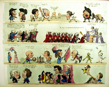
William Hogarth (1697-1764), Four Prints of an Election, 1755-58. Graphic Arts, GC113 William Hogarth Collection

hogarth election4.jpg

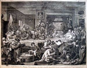
Plate I: An Election Entertainment, February 1755. Fourth state.

The Whigs are inside with a banner inscribed ‘Liberty and Loyalty’ and the Tories are parading outside with their own banner ‘Liberty and Property.’ Hogarth does not take sides. The print is dedicated to Henry Fox (Baron Holland 1705-1775), who was the first person to pay his money for the print. The man by the bottle of Burgundy, making a face with his napkin, is Sir John Parnell, nephew of the poet Thomas Parnell, who persuaded Hogarth to include him by arguing that it would help sell copies in Dublin.

hogarth election3.jpg

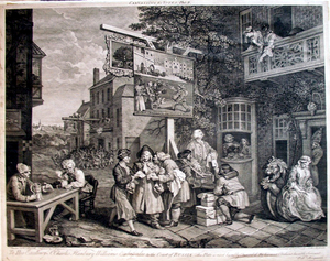
Plate II: Canvassing for Votes, 1758? Sixth state.

Here the Tories are in the foreground and the Whigs in the background. The man in the middle is being bribed by each party. The ale house at the left is the [Por]tobello, named after the British naval victory over the French. Paulson suggests that Hogarth wants our sympathies to be with the pair at the table, reliving a heroic memory, and not with the politicians across the way.

hogarth election2.jpg

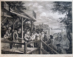
Plate III: The Polling, February 1758. Third state.

Here is a polling booth on election day. All classes of men are being led up to cast a vote, described as an imbecile, a prisoner, and so on. Britannia is seen in her coach on the right, about to turn over because her coachmen are playing cards. All the nation’s efforts are directed to bribery and gambling, rather than for the good of the people.

hogarth election.jpg

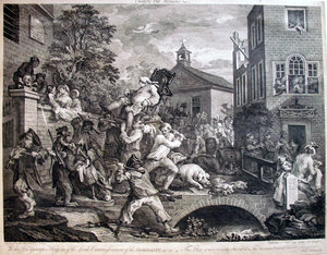
Plate IV: Chairing the Members. January 1758. Third state.

Hogarth has the winners being carried on chairs but in fact, there was no “chairing” of the Oxfordshire election since the results were immediately referred to Parliament for scrutiny. The central man who is about to fall off his chair is George Bubb Dodington, the only prominent politician who went down to defeat in the election.

hogarth humours.jpg
British Museum

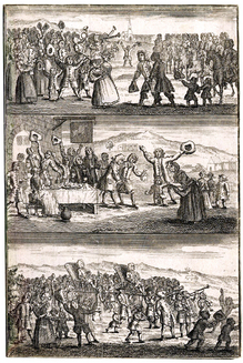
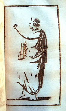
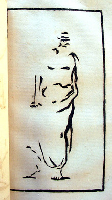
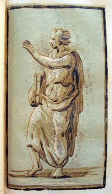
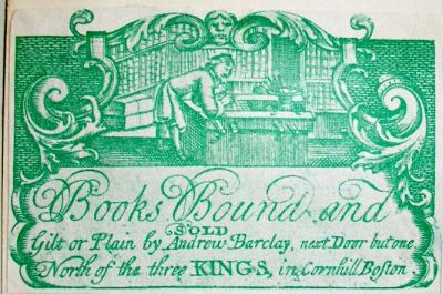
It has been suggested that Hogarth’s Election series was inspired by the frontispiece to The Humours of a Country Election (London: printed for J. Roberts, 1734), seen on the left. The Oxfordshire election of 1754 might have been inspiration enough, with its unprecedented levels of bribery and corruption. In any case, the series was a tremendous success. David Bindman writes “Hogarth’s Election paintings and the prints he made after them are the most sustained achievement of the artist’s later years.”


These notes come from: Hogarth’s Graphic Works, compiled and with a commentary by Ronald Paulson. 3rd rev. ed. London: Print Room, 1989. Graphic Arts: Reference Collection (GARF) Oversize ND497.H7 A35 1989q

Congratulations to type designer Matthew Carter

“Matthew Carter is often described as the most widely read man in the world,” begins Carter’s 2005 New Yorker profile (http://www.newyorker.com/archive/2005/12/05/051205fafactwilkinson). “He is universally acknowledged as the most significant designer of type in America, and as having only one or two peers in Europe. A well regarded type designer [once said], ‘There’s Matthew Carter, and then there’s the rest of us.’”

On Tuesday, another honor was added to Carter’s extensive resume when he received a MacArthur “Genius” award. “Matthew Carter … crafts letterforms of unequaled elegance and precision for a seemingly limitless range of applications and media,” states the MacArthur’s press release. “Throughout his career, which spans the migration of text from the printed page to the computer screen, he has pursued typographic solutions for the rapidly changing landscape of text-based communications.” http://www.macfound.org/site/c.lkLXJ8MQKrH/b.6241247/k.898C/Matthew_Carter.htm

Here at Princeton, we know Carter as the designer of Princeton Monticello, the typeface responsible for updating Princeton’s graphic identity in 2008. The original Monticello font dates back to America’s first successful type foundry, which was established by Archibald Binny and James Ronaldson in Philadelphia in 1796.

For more, see Margaret Re, Typographically Speaking: the Art of Matthew Carter (New York: Princeton Architectural Press, 2003). Graphic Arts Collection (GA) Oversize 2004-1089Q

Charles Creesy, Monticello: The History of a Typeface. http://press.princeton.edu/Monticello/

"Irish" in six translations

celan6.jpg


celan1.jpg

Irish. Designed by Sol LeWitt (1928-2007); written by Paul Celan; translated by Pierre Joris, Harry Gilonis, Jerome Rothenberg, Edwin Morgan, Anselm Hollo, and Nuala Ní Dhomhnill. Edinburgh: Morning Star, 1977. Celan’s poem in German, with five English translations and one Irish translation. Copy 61 of 100. Graphic Arts (GAX) 2010- in process.

celan2.jpg
celan3.jpg
celan4.jpg
celan5.jpg
celan7.jpg
celan8.jpg

Henry J. Finn, educated at Princeton College

finn's5.jpg

“By Peabody & Co. New-York ; Finn’s Comic Sketch Book, for 1832: to be published in the style of Johnston’s celebrated Scraps, consisting of four large sheets, exclusive of a humorous cover, all designed and drawn by Henry J. Finn. Price not to exceed $1.” from New England Magazine 1831

finn's2.jpg
finn's.jpg

“Henry J. Finn was born in the city of New York, in the year 1782. When a boy he sailed for England, on the invitation of a rich uncle resident there. The vessel sunk at sea, and the passengers and crew were for many days exposed in small boats until they were picked up by a ship which landed them at Falmouth. Finn resided in London until the death of his uncle, who made no mention of him in his will. He then returned to New York in 1799, studied law for two years, —became tired of the profession, returned to London, and made his first appearance at the Haymarket Theatre “in the little part of Thomas in the Sleep Walker.” He continued on the stage with success … and accumulating a handsome fortune….”

“Finn [was] celebrated as a comic writer as well as a comic actor. He published a Comic Annual, and a number of articles in various periodicals. …He wrote occasional pathetic pieces, which possess much feeling and beauty, and left behind him a MS. tragedy, portions of which were published in the New York Mirror, to which he was a contributor in 1839.” From Cyclopaedia of American literature, v.2.

finn's4.jpg
finn's3.jpg

Before Blake there was L'Héritier

heritier10.jpg
Alexandre Joseph L’Héritier, La messe pascale, poëme du Sr. Alexandre Joseph L’Heritier…. (Paris, 1772). Graphic Arts Collection (GAX) 2007-1139N
heritier9.jpg
heritier4.jpg
heritier7.jpg
heritier5.jpg
heritier8.jpg
Nearly twenty years before William Blake’s first illuminated book, Alexandre Joseph L’Héritier produced a volume in a similar style and format. There is no listing for L’Héritier in standard French biographical dictionaries or in art historical sources. This appears to be his only work or the only one so far attributed to him. Unlike Blake, who printed from metal relief plates, L’Héritier used intaglio plates, etching the text in reverse and leaving clear plate marks on each page. Hand-printed in a small edition, the plates are of irregular sizes and shapes, sometimes printed directly on top of the other.

heritier3.jpg
heritier2.jpg
heritier1.jpg

L’Héritier used the Latin liturgical text (Ordinary of the Mass with Easter proper) as basis for his imagery, paraphrasing the text in French on opposite pages. Parts of the liturgical text (introit Christus surrexit, et al.) are at variance with the Roman missal. Approbation by ecclesiastical censor (p. 124) is included dated 3 Apr. 1770.

The botanist, magistrate, and bibliophile Charles Louis L’Héritier de Brutelle (1746-1800) came from a large aristocratic French family and it is possible that Alexandre was a relation. Charles had a large library and published several beautifully illustrated books, working closely with the prolific engraver Pierre Joseph Redouté (1759-1840). Is it possible that Alexandre collected the discarded plate fragments and used them to publish a book of his own? Pure speculation.

See also Charles Louis L’Héritier de Brutelle (1746-1800), Cornus. Specimen botanicum sistens descriptiones et icones specierum corni minus cogitarum (Paris: Didot, 1788). Rare Books Oversize QK495.C785 L53e

An Art Deco Song of Solomon

cantique7.jpg
cantique4.jpg

Le Cantique des cantiques [The Song of Songs] (Paris: La Belle Edition, 1914). Pochoir plates by George Barbier (1882-1932). Copy no. 201 of 175 copies, numbered 66-240. Graphic Arts Collection (GAX) NK8667.B37 B524

cantique3.jpg
cantique6.jpg
cantique5.jpg

Revolving Doors

revolving doors2.jpg
revolving doors3.jpg

In 1919, Man Ray (born Emmanuel Radnitzky, 1890-1976) had his third solo exhibition at the Daniel Gallery, run by a former saloon owner Charles Daniel (1878-1971) and the poet Alanson Hartpence (1883-1946). By this time, Man Ray was losing interest in oil painting and the show featured airbrush drawings (called aerographs) and several installations.

revolving doors4.jpg
revolving doors5.jpg

One of these, called Revolving Doors, featured ten collages made from colorful construction paper cut-up and pasted onto white cardboard. Each collage was framed and hinged onto a rotating support, so that the entire ensemble could be spun like a revolving door. When Daniel asked the artist to give the audience an explanation, Man Ray wrote long labels for each panel. For instance, the Dragonfly label read in part: “The lozenges of different colored wills to ascension are a fairly accurate record of the creature’s struggles.”

revolving doors.jpg
revolving doors6.jpg


Man Ray moved to Paris in the 1920s but continued to explore this series in a variety of mediums, including a pochoir edition published by Editions Surréalistes in 1926. The following year, Man Ray gave a copy to Henri Pierre Roché (1879-1959, who would later write Jules et Jim.) This made its way into the Charles Rahn Fry Pochoir Collection, and ultimately to Princeton University.

Man Ray (1890-1976), Revolving Doors, 1916-1917 (Paris: Editions Surréalistes, 1926). Copy 71 of 105. Graphic Arts Collection (GAX) Oversize 2004-0007E

Polyorama Panoptique

| 1 Comment
polyorama
polyorama3
polyorama
polyorama


The polyorama panoptique was first sold in 1822 as a souvenir to visitors of the auditorium-size diorama designed by Louis Jacques Mandé Daguerre (1787-1851). Janet Buerger credits the French optician Lemaire with the invention of the toy viewing device. Simply constructed with a wooden frame and paper bellows, the box holds a single hand-colored lithographic slide that has been pierced with small holes and hidden additions of color, which are illuminated when the light source moves from the front to the back.

megalethoscope.jpg

In the 1870s, the Italian opitian Carlo Ponti adapted the device for the viewing of photographic slides. Unlike Lemaire’s simple boxes, Ponti’s megalethoscopes were often resting on elaborate, carved tables or figures, like our winged lion.

Polyorama Panoptique, Paris, ca. 1850. Graphic Arts (GAX) 2010- in process

DiY woodcut in 1766

| 1 Comment
papillon5.jpg

Jean-Michel Papillon (1698-1776), Traité historique et pratique de la gravure en bois [Historical and Practical Treatise on the Printing from Wood] (Paris: Pierre Guillaume Simon …, 1766). Gift of Elmer Adler (1884-1962). Graphic Arts Collection (GAX) 2005-0081N

Papillon’s manual offers instruction in the making of a woodcut. Chapters include information on the cutting of the block, inking and printing, artists’ monograms, xylography and block books, cutter’s tools, and chiaroscuro prints. Below is one of his examples of an image printed from three blocks.

If you are interested in seeing Papillon’s original wood blocks, they can be found at the Cabinet des Estampes at the Louvre.

papillon4.jpg
1
papillon3.jpg

2

papillon1.jpg
3
papillon2.jpg

4

Barbier's Falbalas & fanfreluches [Ruffles & Frills]

barbier5.jpg
barbier12.jpg
barbier11.jpg

George Barbier (1882-1932), Falbalas & fanfreluches: almanach des modes, présentes, passées et futures [Ruffles & Frills: Almanach of Style, Present, Past, and Future] (Paris: Meynial, 1922-1926). Charles Rahn Fry Pochoir Collection. Graphic Arts (GAX) Oversize 2004-0920Q

The French artist George Barbier (1882-1932) designed costumes for the Folies Bergeres, for the Ballets Russes, and for Rodolfo Valentino in the film Monsieur Beaucaire (1924). He also designed textiles, wallpaper, and jewelry, illustrated books and fashion periodicals, and is responsible for Cartier’s black panther logo. Albert Flament referred to him as “one of the most precious and significant artists of our era.”

barbier6.jpg
barbier4.jpg
barbier3.jpg
barbier7.jpg

Barbier designed plates for various fashion albums and almanacs, including Modes et manières d’aujourd’hui (1912-1923), La Guirlande des mois (1917-1920), Le Bonheur du jour (1920-1924), and finally, his own publication Falbalas et fanfreluches (1922-1926). The final title was published in a limited edition of 600 copies with twelve plates in each annual hand-colored by pochoir, using up to thirty stencils per images. The text of 1922 is by comtesse Mathieu de Noailles; 1923 by Colette; 1924 by Cécil Soral; 1925 by Gérard d’Houville; and 1926 by the baronne de Brimont.

Interestingly, Barbier first exhibited at the Salon des Humoristes in 1910 under the name Edward William Larry and often published articles under other pen names.

barbier9.jpg
barbier8.jpg
barbier1.jpg
barbier13.jpg

Exposition of 1844

burat3

Jules Burat (1807-1885), Exposition de l’industrie française année 1844. Description méthodique accompagnée d’un grand nombre de planches et de vignettes (Paris: Challamel, [1844]). One of 50 copies. Graphic Arts (GAX) in process

“One of the most remarkable and valuable exposition publications I have ever seen,” writes antiquarian Charles Wood III, “primarily due to the ninety full-page plates.”

burat8
burat2
burat7
burat1
burat4

Jules Burat (1807-1885), professor of the School of Arts and Sciences, journalist, and fine art collector, wrote the texts for this catalogue of the 1844 exposition of French industries. Originally published in two volumes (ours rebound in one), the texts are divided into five parts: 1. métaux (metals); 2. machines (machines); 3. tissus (fabrics); 4. application des beaux-arts (applied arts); 5. industries diverses (various industries). Exhibits include porcelains, crystal, bronzes, and much more.

One section outlines the printing techniques available in 1844. Plates include a lithographic view of the Tuileries after a daguerreotype; early color lithography by Godefroy Engelmann (1788-1839); early phototypies or collotypes by Rose-Joseph Lemercier (1807-1887); and early chromolithography by the Strasbourg printer G. Silbermann. Also one of the few discussions of tissierographie (lithographic engraving) and pianographie (printed music) anywhere.

burat6
burat5

Graphodromie. Etching the sound of the word.

cursive3

F. J. Astier (active 1800s), Graphodromie, ou Écriture cursive applicable à tous les idiomes… inventée et adaptée à la langue française. Etchings by Ambroise Tardieu (1788-1841). (Paris: [Pillet for] the author, Pillet, Tardieu, Mme Vve Courcier, 1816). Graphic Arts (GAX) 2010- in process

cursive
cursive5
cursive2

F.J. Astier, the French Minister of the Interior, wrote this treatise on a new form of shorthand or phonetic writing, in which one records the sound of the word rather than transcribing the letters. In theory, this allowed those who could not read or write to copy spoken sentences. He asserts that the system can be learned in less than a month, would increase the amount of work accomplished, and would drastically cut down on administrative paper.

“Astier’s system resembles a printing method elaborated a few years later by Comte de Lasteyrie (1759-1849), who developed a system of printing for the masses that eliminated capital letters, accented vowels, and other ‘unnecessary sorts’ (described in Lasteyrie’s 1837 Typographie économique).” See René Havette, Bibliographie de la Stenographie Française (Paris 1906).

Peter Behrens' book design

expo st4
expo st6

German architect, painter, and typographer Peter Behrens (1868-1940) was a leading voice in development of modern German culture, designing monumental buildings as well as everyday commercial products. He was also a talented graphic designer.

As a member of the progressive Darmstadt Artists’ Colony, Behrens developed his architectural and industrial design aesthetic with sympathy to the arts and crafts movement but a definite modern view. Under his hand, geometric cubes and cylinders eventually replace the amorphic turn-of-the-century swirl. In 1902, Behrens was chosen to design the Jugendstil pavilion at the International Exhibition of Applied Art in Turin, receiving great acclaim. His aesthetic vision was now in demand. The next year he accepted the directorship of the Kunstgewerbeschule (School of Arts & Crafts) in Düsseldorf and began to spread his architectural theory to the next generation of artisans.

expo6
expo5

In 1904, sixty-two countries were invited to display their greatest industrial achievements at the St. Louis World’s Fair, converting the city into the “World’s University.” Behrens was the obvious choice to design Germany’s official catalogue, presenting the contemporary German aesthetic to the world. The credits on the title page verso are very specific: “Decorative designs and artistic supervision of printing, Professor Peter Behrens, Düsseldorf.”

expo st
expo st3

Behrens went on to serve as artistic adviser to AEG (Allgemeine Elektricitäts Gesellschaft), one of the largest manufacturers in the world. He supervised the graphic design of catalogues, stationery, and typographic presentation while also designing electric fans, street lamps, and entire factories. Walter Gropius, Ludwig Mies van der Rohe, and Le Corbusier all worked under Behrens early in their careers and credit him as a major influence.

expo st7
International Exposition St. Louis 1904. Official Catalogue. Exhibition of the German Empire. Designer Peter Behrens. (Berlin: G. Stilke [1904]). Edition of 300. Graphic Arts GAX in process

The Dog Barber. La Francia

family3

James Bretherton (active 1770-1781) after a design by Henry William Bunbury (1750-1811), The Dog Barber. La Francia, 1772. Etching with added color. Graphic Arts GC021. Gift of Dickson Q. Brown, Class of 1895.

family1

William Dickinson (1747-1823) after a design by Henry William Bunbury (1750-1811), A Family Piece, 1781. Stipple engraving and etching. Graphic Arts GC021. Gift of Dickson Q. Brown, Class of 1895.

family2

James Bretherton (active 1770-1781) after a design by Henry William Bunbury (1750-1811), Mutual Accusation, 1774. Etching. Graphic Arts GC021. Gift of Dickson Q. Brown, Class of 1895.

“When once you’ve told & cant recall a Lye
Boldly persist in’t or your Fame will die.
Learn this ye Wives, with unrelenting Claws
Or right or wrong, Assert your husbands cause.”

The British artist Henry Bunbury has been called the Raphael of Caricaturists. A member of a landed family, Bunbury traveled in the elite circles of London, exhibiting at the Royal Academy and honored with an obituary in Gentleman’s Magazine at his death.

“His pencil never transgresses the limits of good taste and delicacy, and had he been under the necessity of pursuing art for profit, instead of amusement and pleasure only, he would probably have made a great fortune by the produce of his genius.”

For more information, see Hugh Belsey, Henry William Bunbury 1750-1811 (1983). Graphic arts (GA) Oversize NC 1479.B89 B45 1983Q.

Les jardins precieux (Precious Gardens)

jardins2
jardins4
jardins6
jardins3
Raymond Charmaison (1876-1955), Les jardins précieux. Preface by Henri de Régnier (1864-1936). ([Paris]: Meynial, [1919]). Copy 184 of 300. Charles Rahn Fry Pochoir Collection. Graphic Arts (GAX) Oversize 2003-0020E.

G.D. Groening wrote, “Only civilization creates gardens. Those who garden express a sensitivity, which has been generated, promoted, and communicated as a result of cognitive achievement. Gardens first emerge as human ideas, which then become implemented in a myriad of culturally coined ways of which the spatial arrangement is one of many only.”

The French landscape painter Raymond Charmaison worked with master pochoir stenciller Jean Saudé to create the eight color plates for this book of “precious gardens.” Printed in a limited edition, the book was published by Jules Meynial, who specialized in luxurious plate books of Paris fashion, under the care of Mrs. Nicole Pierre Corrard (wife of the poet/publisher Pierre Corrard).

A Caricature Assemblage of Oddities, Whimsicalities & Extravaganzas!!

| 1 Comment
gillray bor
George Moutard Woodward (1760-1809), Grotesque Borders for Screens, Billiard Rooms, Dressing Rooms, &c., &c., Forming a Caricature Assemblage of Oddities, Whimsicalities & Extravaganzas!! (London: R. Ackermann [1799]). Graphic Arts Collection (GAX) Oversize 2007-0006E

These grotesques (figures with large heads) were invented by George Woodward (1760-1809) and etched by Thomas Rowlandson (1756-1827) for the publisher Rudolph Ackermann. Several times Woodward refers to the caricatures as Lilliputians, referencing the small people of Lilliput in Swift’s Gulliver’s Travels. The forty-six horizontal strips mounted on twelve plates were meant to be cut apart and used, literally, as border designs in your home. According to Greco, the partnership created twenty-four sheets in total. The Princeton copy includes an additional sheet of smaller sketches in 6 vertical strips, dated May 20, 1805, not a part of Grotesque Borders as originally published.

gillray bor1
gillray bor2


gillray bor5
gillray bor3

Not long after Woodward and Rowlandson finished publishing their caricatures, Charles Baudelaire (1821-1867) wrote an insightful essay entitled, De l’essence du rire et généralement du comique dans les arts plastiques, in which he differentiates between the uses of grotesque comic figures. For an English language translation, see Charles Baudelaire, The Painter of Modern Life and Other Essays (New York: Garland Pub., 1978). Firestone Library (F) NX65 .B38213 1978

Binder's Tickets in P.J. Conkwright's Collection

In 2009, Ms. Jan Lilly graciously donated a collection of bookseller and bookbinder tickets to the graphic arts collection. They came with extraordinary provenance, being the collection of P.J. Conkwright (1905-1986). Ms. Lilly told us that

“many from books being rebound by Earl Smith—head of handbindery at PUP [Princeton University Press]—years ago. They used to bind things—and rebind—for the university.”
Some, like this one, are reproductions of the original. Some are originals. Perhaps Conkwright made a copy and put the original back? The ones he kept were glued to an index card and filed occording to city and occupation.

“P. J. Conkwright came to the Princeton University Press in 1939 from the University of Oklahoma, from which he had received a masters degree and at whose press he had worked as a book designer. In the following decades, his work as a typographer and book designer became nationally known, particularly in the annual exhibitions of the best fifty books produced in the U.S. held by the American Institute of Graphic Art. Many of the books he designed were honored there, and in 1955 the AIGA awarded him its gold medal. Perhaps the best known work credited to his skills is the multi-volume set of the Jefferson papers, which the Press began issuing in 1950”. From Princeton’s Conkwright finding aid.

For more information on this ticket of Andrew Barclay in particular, see Hannah D. French, “The Amazing Career of Andrew Barclay, Scottish Bookbinder, of. Boston,” Studies in Bibliography XIV (1961): 143-62. It’s onlne at http://etext.virginia.edu/bsuva/sb/. Click on 14, on the left, and you’ll see it in the contents list.

French Sign Painter's Pattern Book

signs2
Sign painter’s pattern book. France, ca. 1880-90. Graphic Arts 2010- in process
signs5
signs4
signs1
signs3
signs7
signs6

A large folio pattern book/trade catalogue of signs and labels for clothing shops has been acquired, holding approximately 205 printed examples on 53 stiff-card leaves, each with a dust sheet. The first 13 signs are double page spreads (20 x 25”); the next 17 are single-page (20 x 13”) and the remainder, mostly three to a page or more, are smaller. They appear to have been printed lithographically and in most cases are varnished. Many incorporate gold printing either in borders or letters. All of the signs in one way or another pertain to clothing (vetements), both in styles Français and Anglais.

Each sign is numbered in pencil along with the price, to facilitate ordering. While the designs are not signed, there is one clue. Both covers, front and rear, are decorated with two large initials, an “A” on the upper cover, and an “L” on the lower cover. Thus the maker’s initials were probably ‘AL.’

Recent Comments

  • Howard Coblentz: I have a round seal shaped like a pear a read more
  • John Overholt: Wikipedia's entry for Sir Francis says: "Throughout Baring's lifetime his read more
  • Serge Rodrigue: It is a precious thing you have a book from read more
  • Colin Wicks: I have a copy of “A Round Game.” And it read more
  • Laurence Hilonowitz: I was a Customer, Friend of Bob Wilson. I Live read more
  • allen scheuch: Absolutely STUNNING! Those colors, those designs made my day! Thanks, read more
  • Olivier: Hello Diane, If you are still looking for an examplare read more
  • Stella Jackson-Smith: I have a framed picture by A.Brouet, signed with the read more
  • John Podeschi: I remember Dale fondly from my days at Yale (1971-1980). read more
  • Joyce Barth: I have some or all of this same poem. I read more