Recently in Ephemera Category

The Gelber-Lilienthal Book Shop of San Francisco

angelo1.jpg
Valenti Angelo (1897-1982), Gelber, Lilienthal Inc. Books, [1920s]. Woodcut. 19/50. Graphic Arts GA 2007.03742.

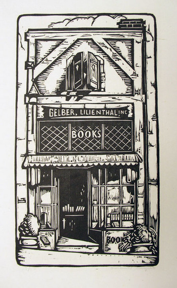
In 1924, antiquarian Leon Gelber joined with businessman Theodore Max Lilienthal (1893-1972) to establish the Gelber-Lilienthal Book Shop at 336 Sutter Street in San Francisco. As recalled by James Hart in Rare Book Stores in San Francisco Fifty Years Ago, “That shop…was given character by an ingenious false front of a manufactured appearance, a pseudo half-timbered building with a projecting shingled and slanting roof … A small hallway led to a lofty ceiling, in old-English style and great rows of shelves for rare books. …They were two attractive, charming, and witty men, quite without the pressure of salesmanship ….”

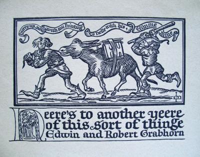
The partners also established a publishing company under the imprint Lantern Press. Many of their editions were printed at Grabhorn Press, beginning with Hildegard Flanner’s A Tree in Bloom and Other Verses (1924). Graphic Arts Collection (GAX) PS3511.L28 T7 1924.

It was the Grabhorn Brothers who first introduced them to the illustrator and printmaker Valenti Angelo (1897-1982). Angelo moved to San Francisco when he was nineteen-years-old and ten years later, began cutting and printing book plates. In 1927, Angelo illustrated For Whispers & Chants by Jake Zeitlin, printed by Grabhorn Press and published by Lantern Press (Graphic Arts GAX 2007-1271N).

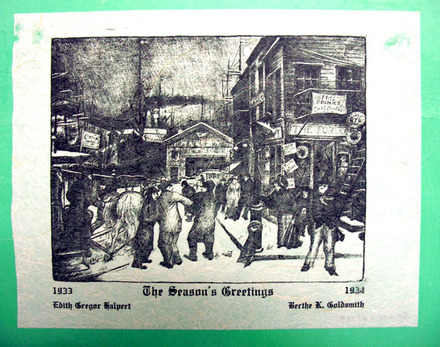
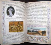
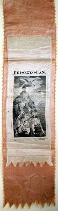
Throughout his long career, Angelo illustrated roughly 250 books, of which Princeton owns fifty-four. Above is his woodcut of the Gelber-Lilienthal Shop.

See more: Valenti Angelo: Author, Illustrator, Printer (San Francisco: Book Club of California, 1976). Rare Books (Ex) Oversize Z8036.483 .V34qr

See also: Robinson Jeffers (1887-1962), Theodore Max Lilienthal ([San Francisco: F. B. Lilienthal, Grabhorn Press], 1953).

Special thanks to Alastair Johnston of Poltroon Press for his help researching this post. http://www.poltroonpress.com/about.html

Beatrice Coron, paper engineer

coron1.jpg
coron2.jpg

Beatrice Coron, Central Park Story, 1994. Pochoir print and stencil. Graphic Arts GA 2007.02453 and 02452. Gift of Beatrice Coron.

coron3.jpg
coron4.jpg

left: Beatrice Coron, Last Leaf of Central Park, 1990s. Stencil for pochoir print. Graphic Arts GA 2007.02453. Gift of Beatrice Coron.

right: Beatrice Coron, Lust, 1990s. Pochoir print. Graphic Arts FA 2007.02455. Gift of Beatrice Coron.

Over ten years ago, Graphic Arts was the fortunate recipient of a gift of art from the French paper architect Beatrice Coron, who has been living in New York City since 1984. Those who have ridden the subways in New York will recognize her black paper work from the poster “All Around Town” featured in the cars of the E, F, and 6 trains.

Her website http://www.beatricecoron.com offers additional images as well as a personal statement, which begins: “My work tells stories. I invent situations, cities and worlds. These compositions include memories, associations of words, ideas, observations and thoughts that unfold in improbable juxtapositions. These invented worlds have their own logic and patterns. Images are conveyed through words, whether automatic writing or premeditated scenes. My creative inspiration comes from a text, a poem, the news or from a philosophical concept that can be reduced to a mere title. I research collective memories and myths, questioning the notions of identity and belonging. For each theme, I explore various narratives: one story leads to the next, and the creation process weaves different layers of our relations to the world.”

Beatrice Coron will teach a class in paper cutting at the Center for Book Arts on March 26-27, 2011. For information, see: http://www.centerforbookarts.org/

Google's new word count and graphic arts

written.bmp
pencil.bmp
rare.bmp
blake.bmp
blake2.bmp

Seasons Greetings

Be careful what you throw away after the holidays, it might be a great work of art. Here are some we have kept.

coleman1.jpg

Glenn O. Coleman (1887-1932), The Season’s Greetings, 1933. Lithograph. Graphic Arts GA 2007.01009.

dwight1.jpg

Mabel Dwight (1876-1955), Greetings from the House of Weyhe, 1928. Lithograph. Graphic Arts GA 2007.01212. Interior of Weyhe gallery in New York City with its director Carl Zigrosser.

gag1.jpg

Wanda Gag (1893-1946), Greetings from the House of Weyhe, 1927. Lithograph. Graphic Arts GA 2007.01313.

ward33.jpg

Lynd Ward (1905-1985), Greetings for the New Year from May McNeer and Lynd Ward, 1948. Woodcut. Graphic Arts GA 2007.02671.

Bookplate collection of C.N. Carver, Class of 1913

bookplates40.jpg
Clifford Nickels Carver (1891-1965), Princeton Class of 1913, served as secretary (1914-1915) to Walter H. Page, the American ambassador in London, as secretary (1915) to Edward Mandell House in Europe, and as assistant to Bernard M. Baruch working for the War Industries Board, and to his commission in the U.S. Navy attached to the Office of Naval Intelligence (1917-1918). His papers in the Mudd Library archive (MC010) also highlight another facet of Carver’s interests, that of bookplate collecting.

His papers include bookplates by well-known Americans, Princetonians, and Europeans, with related correspondence and articles including “Modern American Book-plates” and “Three Victorian Book-plates.” We recently discovered nine additional leather bound volumes, each one dedicated to a single bookplate engraver with individual examples Carver trimmed and glued one per page. These volumes are on their way to MC010, where they will join the others in Carver’s archive.

Here are a few examples, first of Carver’s own bookplate and then, several from the volume dedicated to Charles William Sherborn (1831-1912), who specialized in heraldic designs.


bookplates41.jpg
bookplates36.jpg
bookplates39.jpg
bookplates34.jpg


bookplates33.jpg
bookplates38.jpg

Stop smoking and send your cigarettes to Princeton

| 1 Comment
packaging2.jpg
packaging3.jpg

Within GC149 Ephemera, graphic arts has a small collection of cigarette packages. Some are full and some are not. I think it would be a nice new years resolution for you to stop smoking and instead, send your cigarette packages to the collection at Princeton University. Clean, dry candy packaging and wine labels are also appreciated.

packaging6.jpg
packaging5.jpg
nast4.jpg

Bernard Reilly, in his catalogue American Political Prints, 1766-1876, describes this Thomas Nast broadside as “a searing, election-year indictment of four prominent figures in the democratic party.” He continues:

“Former New York governor and democratic presidential nominee Horatio Seymour is portrayed as a ‘rioter.’ Standing in a burning city, he waves his hat in the air while he steps on the back of a crawling figure. In the background a corpse hangs from a lamppost. Between 1862 and 1964 Seymour had opposed Lincoln’s was policies, and he was branded as instigator of the 1863 New York draft riots.”

“Tennessee general Nathan Bedford Forrest, the founder of the Ku Klux Klan, and infamous for his role in the massacre of surrendered Union troops at Fort Pillow, is called ‘The Butcher Forrest.’ He waves a flag labeled ‘No Quarter’ and fires a pistol.”

“Confederate Admiral Raphael Semmes is portrayed as a pirate, wielding a knife in one hand and holding a flaming torch in the other … . Semmes was the scourge of Union shipping during the Civil War. Under his command the Alabama, a British-built ship, captured sixty-two merchant vessels, most of which were burned. An excerpt from Semmes’s July 1868 speech at Mobile, Alabama, appears below this image.”

“Confederate cavalry officer Wade Hampton appears as a hangman. He holds his plumed hat at his side and wears inscribed ‘C.S.A.’ (Confederate States of America). In the distance three Yankee soldiers hang from a gallows.”

Thomas Nast (1840-1902), Leaders of the Democratic Party, 1868. 38 x 24 inches (96 x 61 cm). Wood engraved broadside. Graphic arts GA2010- in process.

Bernard Reilly, American Political Prints, 1766-1876 (Boston, Mass.: G.K. Hall, 1991). Graphic Arts Collection (GA) Oversize E183.3 .R45 1991q.

Tobacco packaging papers


tobacco3.jpg
tobacco4.jpg
tobacco2.jpg

“Tobacco was among the first commodities to be sold in printed paper wrappers,” writes Michael Twyman, in his Enclyclopedia of Ephemera.

“The design element of tobacco papers was normally confined to the centre of the printed sheet, which was large enough to accommodate varying quantities of tobacco. The earliest designs were in the tradition of the bookplate, but later they took on the characteristics of the trade card and were often printed from plates actually designed as trade cards. Engraved pictorial designs were common in Germany, Holland, and France; although almost everywhere they gave way to the crude woodcuts that were to remain the common denominator….”

Here are three recently acquired nineteenth-century examples from Amsterdam.

Maurice Rickards, The Encyclopedia of Ephemera; edited and completed by Michael Twyman, with the assistance of Sally De Beaumont and Amoret Tanner (New York: Routledge, 2000). Graphic Arts: Reference Collection (GARF), Oversize NC1280 .R52 2000q

Binder's Tickets in P.J. Conkwright's Collection

In 2009, Ms. Jan Lilly graciously donated a collection of bookseller and bookbinder tickets to the graphic arts collection. They came with extraordinary provenance, being the collection of P.J. Conkwright (1905-1986). Ms. Lilly told us that

“many from books being rebound by Earl Smith—head of handbindery at PUP [Princeton University Press]—years ago. They used to bind things—and rebind—for the university.”
Some, like this one, are reproductions of the original. Some are originals. Perhaps Conkwright made a copy and put the original back? The ones he kept were glued to an index card and filed occording to city and occupation.

“P. J. Conkwright came to the Princeton University Press in 1939 from the University of Oklahoma, from which he had received a masters degree and at whose press he had worked as a book designer. In the following decades, his work as a typographer and book designer became nationally known, particularly in the annual exhibitions of the best fifty books produced in the U.S. held by the American Institute of Graphic Art. Many of the books he designed were honored there, and in 1955 the AIGA awarded him its gold medal. Perhaps the best known work credited to his skills is the multi-volume set of the Jefferson papers, which the Press began issuing in 1950”. From Princeton’s Conkwright finding aid.

For more information on this ticket of Andrew Barclay in particular, see Hannah D. French, “The Amazing Career of Andrew Barclay, Scottish Bookbinder, of. Boston,” Studies in Bibliography XIV (1961): 143-62. It’s onlne at http://etext.virginia.edu/bsuva/sb/. Click on 14, on the left, and you’ll see it in the contents list.

Soft reading, with a fringe

In 1897, the Aldershot Cottage Hospital (approximately thirty-five miles from London) finally opened with beds for ten patients. Every fall, the town of Aldershot had been holding a carnival or park fête to raise money in order to build a hospital. Special cloth programs and issues of the Aldershot newspaper were printed on colorful silk/satin and sold as souvenirs. Several of these from the first and second carnivals have been acquired by graphic arts. Note the advertisement on the front page for a typewriter offering visible writing.

The Aldershot News. No. 72, Saturday, November 2, 1895 (Aldershot: printed and published by the Proprietors, Gale and Polden, Ltd., Wellington Works, 1895). Printed on yellow silk. Graphic Arts (GAX) 2010- in process.

The First Aldershot Cyclists and Tradesmen’s Carnival in Aid of the Proposed Cottage Hospital for Aldershot … November 5th, 1894. Official programme. 10 leaves printed on pink silk. Graphic Arts (GAX) 2010- in process.

Official Programme of the Second Annual Hospital Carnival … Wednesday, October 30, 1895. (Aldershot: J. May, Steam Printer, 1895). 10 leaves printed on yellow silk. Graphic Arts (GAX) 2010- in process.

Roman diptych and stylus

| 2 Comments
diptych
diptych

“A diptych is a sort of notebook, formed by the union of two tablets, placed one upon the other and united by rings or by a hinge. These tablets were made of wood, ivory, bone, or metal. Their inner surfaces had ordinarily a raised frame and were covered with wax, upon which characters were scratched by means of a stylus. Diptychs were known among the Greeks from the sixth century before Christ. They served as copy-books for the exercise of penmanship, for correspondence, and various other uses”. (See the Catholic Encyclopedia entry: [http://www.newadvent.org/cathen/05022a.htm])

Wax coated tablets (either singularly or in bound diptyches) provided an inexpensive, portable, and reusable writing surface. Today, we say “start with a clean slate,” after the clerics who would clear the wax surface of their tablets using the flat top of the writing stylus.

The wood diptych and bronze stylus in graphic arts measures 9.5 x 17 x 9.5 x 2 cm with four holes in each tablet bound together with a leather strap. It is assumed that our first curator, Elmer Adler, had this made for teaching.

For more on the history of writing, see Bernhard Bischoff (died 1991), Latin Palaeography: Antiquity and the Middle Ages (Cambridge; New York: Cambridge University Press, 1990). Firestone Z114 .B5713 1990

Louis Prang, 1824-1909

Between 1864 and 1876, the American printmaker Louis Prang (born in Poland, 1824-1909) issued a series of collectable albums, offering examples of his company’s brilliant chromolithographs, or Prang’s Chromos, as they were called. The cards were issued in sets of twelve, presented together on double page spreads as seen here. This album contains twelve scenes each of the Hudson River, Central Park, birds, ferns and mosses, leaves, roses, butterflies, fruit blossoms, wild flowers, and pansies.

Chiaroscuro watermark

This sheet of handmade paper comes from the Fabriano Paper Mill in Milan. In regular light, it looks like a blank sheet but when you hold it to the light, the watermark becomes visible. The image, which is a reproduction of Gentile da Fabriano’s “Coronation of the Virgin,” comes from the variations in thinness or thickness in the paper.

The watermark begins with the Italian artisan Annarita Librari carving the engraving in wax; a process that may take from five months to a year to complete. Copper dies (positive & negative) are made from the wax sculpture. The dies are pressed into a brass screen, which will form the papermaking mould. Then, tiny wads of screen must be stuffed and stitched invisibly into the mould as reinforcements in all the cavities, such as the forehead or cheeks.

We are fortunate to have acquired two examples of Ms. Librari’s work, one of which is seen here. To see Gentile da Fabriano’s original tempera and gold leaf panel, see: http://www.getty.edu/art/gettyguide/artObjectDetails?artobj=736

Light-and-shade watermark depicting the “Coronation of the Virgin” by the Renaissance painter Gentile da Fabriano (Milan, Fabriano Paper Mill, 2006). Graphic Arts GAX 2010- in process.

Grabhorn Press ephemera

This new years card turned up in our collection of fine printing and ephemera from Grabhorn Press. Note the text: Hurry up now with my Printing. To helle with his, Gimme mine. Heere’s to another yeere of this sort of thinge.

The Grabhorns—Edwin, Robert, Jane, and Mary—moved from Indianapolis to San Francisco in 1919 where they renamed their printing shop “Grabhorn Press”. They produced a wide variety of materials, including limited edition books, pamphlets, cards, and any other type of letterpress printing their customers ordered. The most famous project may have been a handset edition of Walt Whitman’s Leaves of Grass, published by Random House in 1930 (Graphic Arts GAX Oversize 2007-0343Q). Grabhorn Press officially closed in 1965.

Fine Press Printing Ephemera Collection, 1898-2010 (bulk 1924-1948): Finding Aid GC186, Box 2. From the Grabhorn Press collection of Myles Standish Slocum, class of 1909, presented by Isabel Shaw Slocum.

Reference book with added decoration

These are pages from a reprint of the Roman part of the History and Biography section of the Encyclopaedia Metropolitana, published in Glasgow 1853. A dry book? This copy has been carefully decorated by a reader in the early twentieth century with original borders and illustrations on more than fifty of its pages.

Encyclopaedia Metropolitana or System of Universal Knowledge... (Glasgow: Richard Griffin and Co., 1853). Graphic Arts GAX 2010 -in process.

Is Your Dance Card Full?

Here are a few examples of nineteenth- and early twentieth-century dance cards from our ephemera collection.

Advertise with blotter paper

Many years ago, when writing was done with a pen and liquid ink, soft sheets of unsized paper were used to blot the excess ink from the page. During the nineteenth century, the ubiquitous blotter packet was quickly recognized as an advertising opportunity for local companies. Michael Twyman writes “The advertising blotter, effectively a desk-top trade card and year-round promotion piece, remained in general use until the advent of the ball point pen, which in the period 1945 to 1960 progressively replaced the steel rib and liquid inks” (Encyclopedia of Ephemera, 2000).

Early blotting paper was grey and coarse but during the nineteenth century, a higher quality paper was used in a variety of colors. Pink was most common due to the use of turkey and cotton rags, which resisted bleaching. Queen Victoria is said to have used a red blotting paper but we don’t know for sure because each sheet was carefully destroyed. Graphic Arts, Ephemera Collection.

Stitched silk bookmarks or Stevengraphs

Sewing Machines and the World's Fair

All Over the World: Singer, the Universal Sewing Machine (New York?: Singer Manfg Co., 1901). Graphic Arts GC149 Ephemera Collection, Booklets

For the Pan-American Exposition of 1901 in Buffalo, New York, the Singer Manufacturing Company printed this eight page booklet to advertise their products. Scenes from the World’s Fair were interspersed with vignettes featuring sewing machines. Here are a few of the photo-lithographed pages.

Printed by the weird sisters

In 1902, the Irish carpet designer Evelyn Gleeson (1855-1944) wrote to Elizabeth Yeats (1868-1940) and her sister Lily (1866-1949) in London. She persuaded them to return to Dublin and join her new women’s arts and crafts cooperative. Evelyn taught girls to weave tapestries and rugs, Lily oversaw embroidery, and Elizabeth established a fine press. They named it the Dun Emer Guild, after the nearby village of Dundrum.

Elizabeth’s first book was a collection of poems by her brother, William Butler Yeats, entitled In the Seven Woods. W.B. wrote an introduction mentioning that the book was “finished the sixteenth day of July, in the year of the big wind, 1903.”

When James Joyce wrote Ulysses (1920), he commented on the Yeats family business and the weird sisters:
Haines sat down to pour out the tea.
—I’m giving you two lumps each, he said. But, I say, Mulligan, you do make strong tea, don’t you?
Buck Mulligan, hewing thick slices from the loaf, said in an old woman’s wheedling voice:
—When I makes tea I makes tea, as old mother Grogan said. And when I makes water I makes water.
—By Jove, it is tea, Haines said.
Buck Mulligan went on hewing and wheedling:
—SO I DO, MRS CAHILL, says she. BEGOB, MA’AM, says Mrs Cahill, GOD SEND YOU DON’T MAKE THEM IN THE ONE POT.
He lunged towards his messmates in turn a thick slice of bread, impaled on his knife.
—That’s folk, he said very earnestly, for your book, Haines. Five lines of text and ten pages of notes about the folk and the fishgods of Dundrum. Printed by the weird sisters in the year of the big wind.

The Yeats sisters eventually split from Gleeson, renaming their operation Cuala Press (pronounced Cool-a), which continued until 1946. Besides the books, Cuala also printed ephemera including Christmas cards, Easter cards, bookplates, calling cards and broadsides. These are a few examples from graphic arts collection.

For more information, try Boston College’s website: http://www.bc.edu/libraries/newsletter/2008fall/cuala/index.html ;
Gifford Lewis, The Yeats Sisters and the Cuala (Blackrock, Co. Dublin: Irish Academic Press, 1994). Firestone Library Z232.C962 L49 1994
and the RBSC exhibition Unseen Hands: Women Printers Binders and Book Designers: http://infoshare1.princeton.edu/rbsc2/ga/unseenhands/printers/yeats.html

1 2 3 4 5 6 7

Recent Comments

  • Howard Coblentz: I have a round seal shaped like a pear a read more
  • John Overholt: Wikipedia's entry for Sir Francis says: "Throughout Baring's lifetime his read more
  • Serge Rodrigue: It is a precious thing you have a book from read more
  • Colin Wicks: I have a copy of “A Round Game.” And it read more
  • Laurence Hilonowitz: I was a Customer, Friend of Bob Wilson. I Live read more
  • allen scheuch: Absolutely STUNNING! Those colors, those designs made my day! Thanks, read more
  • Olivier: Hello Diane, If you are still looking for an examplare read more
  • Stella Jackson-Smith: I have a framed picture by A.Brouet, signed with the read more
  • John Podeschi: I remember Dale fondly from my days at Yale (1971-1980). read more
  • Joyce Barth: I have some or all of this same poem. I read more