Recently in Illustrated books Category

Exposition of 1844

burat3

Jules Burat (1807-1885), Exposition de l’industrie française année 1844. Description méthodique accompagnée d’un grand nombre de planches et de vignettes (Paris: Challamel, [1844]). One of 50 copies. Graphic Arts (GAX) in process

“One of the most remarkable and valuable exposition publications I have ever seen,” writes antiquarian Charles Wood III, “primarily due to the ninety full-page plates.”

burat8
burat2
burat7
burat1
burat4

Jules Burat (1807-1885), professor of the School of Arts and Sciences, journalist, and fine art collector, wrote the texts for this catalogue of the 1844 exposition of French industries. Originally published in two volumes (ours rebound in one), the texts are divided into five parts: 1. métaux (metals); 2. machines (machines); 3. tissus (fabrics); 4. application des beaux-arts (applied arts); 5. industries diverses (various industries). Exhibits include porcelains, crystal, bronzes, and much more.

One section outlines the printing techniques available in 1844. Plates include a lithographic view of the Tuileries after a daguerreotype; early color lithography by Godefroy Engelmann (1788-1839); early phototypies or collotypes by Rose-Joseph Lemercier (1807-1887); and early chromolithography by the Strasbourg printer G. Silbermann. Also one of the few discussions of tissierographie (lithographic engraving) and pianographie (printed music) anywhere.

burat6
burat5

Peter Behrens' book design

expo st4
expo st6

German architect, painter, and typographer Peter Behrens (1868-1940) was a leading voice in development of modern German culture, designing monumental buildings as well as everyday commercial products. He was also a talented graphic designer.

As a member of the progressive Darmstadt Artists’ Colony, Behrens developed his architectural and industrial design aesthetic with sympathy to the arts and crafts movement but a definite modern view. Under his hand, geometric cubes and cylinders eventually replace the amorphic turn-of-the-century swirl. In 1902, Behrens was chosen to design the Jugendstil pavilion at the International Exhibition of Applied Art in Turin, receiving great acclaim. His aesthetic vision was now in demand. The next year he accepted the directorship of the Kunstgewerbeschule (School of Arts & Crafts) in Düsseldorf and began to spread his architectural theory to the next generation of artisans.

expo6
expo5

In 1904, sixty-two countries were invited to display their greatest industrial achievements at the St. Louis World’s Fair, converting the city into the “World’s University.” Behrens was the obvious choice to design Germany’s official catalogue, presenting the contemporary German aesthetic to the world. The credits on the title page verso are very specific: “Decorative designs and artistic supervision of printing, Professor Peter Behrens, Düsseldorf.”

expo st
expo st3

Behrens went on to serve as artistic adviser to AEG (Allgemeine Elektricitäts Gesellschaft), one of the largest manufacturers in the world. He supervised the graphic design of catalogues, stationery, and typographic presentation while also designing electric fans, street lamps, and entire factories. Walter Gropius, Ludwig Mies van der Rohe, and Le Corbusier all worked under Behrens early in their careers and credit him as a major influence.

expo st7
International Exposition St. Louis 1904. Official Catalogue. Exhibition of the German Empire. Designer Peter Behrens. (Berlin: G. Stilke [1904]). Edition of 300. Graphic Arts GAX in process

Les jardins precieux (Precious Gardens)

jardins2
jardins4
jardins6
jardins3
Raymond Charmaison (1876-1955), Les jardins précieux. Preface by Henri de Régnier (1864-1936). ([Paris]: Meynial, [1919]). Copy 184 of 300. Charles Rahn Fry Pochoir Collection. Graphic Arts (GAX) Oversize 2003-0020E.

G.D. Groening wrote, “Only civilization creates gardens. Those who garden express a sensitivity, which has been generated, promoted, and communicated as a result of cognitive achievement. Gardens first emerge as human ideas, which then become implemented in a myriad of culturally coined ways of which the spatial arrangement is one of many only.”

The French landscape painter Raymond Charmaison worked with master pochoir stenciller Jean Saudé to create the eight color plates for this book of “precious gardens.” Printed in a limited edition, the book was published by Jules Meynial, who specialized in luxurious plate books of Paris fashion, under the care of Mrs. Nicole Pierre Corrard (wife of the poet/publisher Pierre Corrard).

Fantastical Portraits of Engravers, Illustrators, & Binders

| 1 Comment

Leonard Baskin (1922-2000), Icones Librorum Artifices: Being Actual, Putative, Fugative & Fantastical Portraits of Engravers, Illustrators & Binders (Leeds, Mass.: Gehenna Press, 1988). Composition and presswork are by Arthur Larson. Copy 36 of 40. Graphic Arts Collection (GAX) Oversize Z232.G2956 B37 1988f

baskin4
baskin

Leonard Baskin established the Gehenna imprint in 1942, while he was a student at the Yale School of Art. Some people name Icones Librorum Artifices as one of the Gehenna masterpieces. The volume offers thirty-two portraits drawn by Baskin and printed by D. R. Wakefield, along with biographical text written by Baskin and imaginatively set in Arrighi and Centaur type. The subjects of the portraits are both real and imagined, well known and unheard of, including men and women from the last five centuries.

baskin2
baskin3
baskin5
baskin6

L'Album, not for the meek

lalbum2

At the turn of the last century, the development of color lithography led to the emergence of many French periodicals. Gil Blas illustré, Le Rire, L’Assiette au Beurre and Le Figaro are some of the best. My favorite, L’Assiette was loosely based on the German magazine Simplicissimus and devoted each issue to a single topic.

The French publishing house of Jules Taillandier decided to get into the game and issued the short-lived periodical titled simply: L’Album. Each issue was devoted to the work of an individual artist, with a centerfold section offering several double-page spreads and commentary by Lucien Puech. The imagery was uncommonly graphic and sexual in nature, possibly the reason it did not last very long. The work of painters Adolphe-Léon Willette (1857- 1926) and Jean-Louis Forain (1852-1931) was featured, along with Emmanuel Barcet, Marcel Capy, Jacques Villon, and many other.

lalbum7
lalbum6
lalbum3
lalbum4

lalbum1
lalbum5

L’Album. Paris: Montgredien et Cie., no. 1-[18]; [1 juin 1901]-[1 nov. 1902]. Graphic Arts Collection (GAX) Oversize 2005-0585

Frith's Holy Bible

firth holy.jpg

Frith's Holy Bibl

The Holy Bible … Illustrated with Photographs by [Francis] Frith. Glasgow: Printed and published by William Mackenzie, 1862-1863. Albumen silver print. Graphic Arts Collection. Purchased in 2002 with assistance from the Friends of the Princeton University Library in honor of Peter Curtis Bunnell upon the occasion of his retirement as the David Hunter McAlpin Professor of the History of Photography and Modern Art and Faculty Curator for Photography at the Princeton University Art Museum.

Frith's Holy Bible

This is the deluxe (one of three editions) illustrated Holy Bible published by William Mackenzie with fifty-six photographs taken by the British artist and publisher Francis Frith (1822-1898). Our copy is specially bound in red morocco with gilt and blind stamped decorations, and brass mounts and clasps.

A devout Quaker and a successful grocer, Frith sold his business in 1855 to devote himself to photography. Between 1856 and 1860, he traveled extensively in Egypt, Sinai, Ethiopia, and Jerusalem, documenting Middle Eastern architecture and culture. For these Bibles, the titles of the photographs were changed slightly to better associate them with a particular chapter and verse of the King James text. Because this lavish publication was dedicated to Queen Victoria, who was an amateur photographer and enthusiast, it has become known as the Queen’s Bible.

Frith's Holy Bible

Frith's Holy Bible

Frith’s photographic work is important in both technique and methodology. In the first instance, he used the new wet collodion process that had replaced the paper-based calotype used by earlier travel photographers. The wet plate negatives rendered rich detail and broad tones, and the resulting contact prints on albumen paper rival even today’s gelatin silver papers. Frith’s method was meticulous and thorough; he photographed most of the major monuments several times, and combined general views with close studies of their significant details.

The acquisition of the Queen’s Bible makes Princeton’s collection of Frith’s photographically-illustrated books one of the most outstanding and complete in the United States. It joins Frith’s works: Egypt, Sinai and Jerusalem; Egypt and Palestine; Cairo, Sinai, Jerusalem, and the Pyramids of Egypt; and Upper Egypt and Ethiopia, held by Graphic Arts and his Lower Egypt, Thebes, and the Pyramids, held by the University Art Museum.

The Adventures of Peregrine Pickle

| 1 Comment

pickle8.jpg

Scottish author Tobias Smollett (1721-1771) first published The Adventures of Peregrine Pickle in 1751. The popular story of Hawser Trunnion, a retired naval officer, went through three editions until one was published with illustrations.

Peregrine Pickle

Peregrine Pickle


Swiss artist Henry Fuseli (1741-1825) created a frontispiece for the fourth edition in 1768 and many other illustrated editions followed designed by Thomas Stothard (1755-1834), Robert Dodd, (1748-1815), and Richard Corbould (1757-1831) among others. In 1805, Thomas Rowlandson (1756-1827) took on the project and add two color plates to Smollett’s story. Graphic Arts (GA) Rowlandson 1805

Peregrine Pickle

peregrine pickle

peregrine pickle

Peregrine Pickle

The Graphic Arts collection also holds the rare volume Rowlandson’s Humorous Illustrations of the Works of Fielding and Smollett, consisting of forty etchings by Rowlandson, [George Moutard] Woodward, &c. (GA) Rowlandson 1808.8. Among these forty prints are six designed by various artists for editions of the Peregrine Pickle. Rowlandson’s are seen above on the right.

Le Theatre Alfred Jarry de l'Hostilite Publique

| 1 Comment

In 1925, the French playwright Roger Vitrac (1899-1952) and artist/director Antonin Artaud (1896-1948) were expelled from the surrealists by André Breton (1896-1966). Together, they conceived and established the Théatre Alfred-Jarry, named in honor of Alfred Jarry (1873-1907) author of Ubu trilogy and inventor of pataphysics. The theater presented radically innovative productions over four seasons, from 1926 to 1929.


Le Theatre Alfred Jarry et l’Hostilite Publique (Paris: Antonin Artaud and Roger Vitrac, 1930). Photomontages by Eli Lotar. Illustrated wrappers by G.L. Roux. Graphic Arts GAX 2010-in process

This small volume offers an overview of the coming season (which was never realized). To illustrate the pamphlet, they hired Romanian photographer Eli Lotar (born Eliazar Lotar Teodoresco, 1905-1969) who prepared nine photomontages, superimposing multiple posed images of the actress Josette Lusson, Vitrac, and Artaud. These are not scenes from a particular play but images directed by Artaud from his imagination.

Susan Sontag wrote a biography of Artaud, noting that his

"work denies that there is any difference between art and thought, between poetry and truth. Despite the breaks in exposition and the varying of "forms" within each work, everything he wrote advances a line of argument. Artaud is always didactic… Artaud is someone who has made a spiritual trip for us—a shaman. It would be presumptuous to reduce the geography of Artaud’s trip to what can be colonized. Its authority lies in the parts that yield nothing for the reader except intense discomfort of the imagination."

A Peep at the Creed-Worshippers

| 1 Comment

Bruce Dorsey writes

“At the end of the 1820s, American Quakers suffered a bitter and long-term division known as the Hicksite schism. Following a … Yearly Meeting in April 1827, a group of Quaker reformers separated themselves from the main body of Friends, and formed their own independent meeting. The schism in the Philadelphia meeting spread rapidly outward in concentric circles disrupting other Quaker meetings throughout North America. By the end of the decade, Philadelphia Quakers had divided into two distinct and hostile factions.” (“Friends Becoming Enemies: Philadelphia Benevolence and the Neglected Era of American Quaker History,” Journal of the Early Republic, 18, no. 3 (Autumn 1998)).

The reformers or Hicksite Quakers thought Orthodox publications linking the Friends with traditional Protestant doctrines were attempts to impose a creed on Quakerism, “an engine of oppression and restraint against the freedom of mind….” They responded with their own publications, of which this is one. Published anonymously, the “hole in the wall” refers to James Parnell, a Quaker martyr, who was jailed and forced to sleep in a hole far up on the cell wall. One day, while climbing up he fell and died.

The leader of the reform movement and their namesake was Elias Hicks (1748-1830). Hicks preached obedience to the light within, a phrase used in Hole in the Wall, leading some to believe the anonymous author was Hicks. The book is surprisingly illustrated with three copper plate engravings, rather than the customary wood engravings. Hicks’s cousin painter Edward Hicks (1780-1849) was also a member of the Hicksite Quakers and may have helped Elias with the creation of these naïve works.

Hole in the Wall: or a Peep at the Creed-Worshippers. Embellished with cuts by the author. [S.l.: s.n.], 1828. Graphic Arts GAX 2010- in process. Gift of David B. Long, in honor of Gillett G. Griffin.

John Baptist Jackson (1701-1780?), An Essay on the Invention of Engraving and Printing in Chiaro Oscuro, as Practised by Albert Durer, Hugo di Carpi, &c., and the Application of It to the Making Paper Hangings of Taste, Duration, and Elegance (London, 1754). Graphic Arts GAX 2010- in process.

In 1745, the English chiaroscuro printer John Baptist Jackson (1701-1780?) returned to London and found work designing calico cloth. After six years, he saved enough money to established a wallpaper manufacturing company hoping to revolutionize the industry. To help promote his work, Jackson published two books on printing: Enquiry into the Origin of Printing in Europe (London, 1752) and Essay on the Invention of Engraving and Printing in Chiaro Oscuro (London, 1754).

The latter has an eight page essay and eight color plates (with desciption), printed from multiple woodblocks with oil-based inks. It sold for two shillings and sixpence. On the title page Jackson printed his favorite passage from Pascal’s Thoughts: “Ceux qui sont capables d’inventer sont rares: ceux qui n’inventent point sont en plus grand nombre, et par conséquent les plus forts.” This has been very loosely translated as “For those who are capable of originality are few; the greater number will only follow and refuse glory to those inventors who seek it by their inventions.” Unfortunately, Jackson’s business was forced to close shortly after the volume was published.

For more on Jackson, see an earlier post: John Baptist Jackson

The Tools of Arts and Industry

The Austrian tool manufacturer Franz Freiherr von Wertheim (1814-1883) was born in Krems and received international recognition for his knives and axes made from Styrian steel. He first exhibited his tools at the 1845 World’s Fair and continued to present bigger and better displays every few years. This cabinet of his firm’s hand tools was at the Paris Exposition of 1867. The following year, Wertheim published a sumptuous trade catalogue with forty-five lithographed plates of tools. According to OCLC, Princeton University holds the only copy in North America.

Franz Freiherr von Wertheim (1814-1883), Manuel de l’outillage des arts et métiers: à l’usage des écoles techniques, compagnies de chemins de fer et de navigation[Handbook of the Tools of Arts and Industry: For the Use of Technical Schools, Railroad Companies, and Navigation]. Portfolio has title proper: Recueil des outils et machines. (Vienne [Vienna]: Charles Gerold fils, Libraire-Éditeur, 1869). Graphic Arts Collection (GAX) Oversize 2005-0002E

For more on the Wertheim company see: http://www.wertheim.at/0e_Biografie.htm

Zweite Enzyklopädie von Tlön

Ines von Ketelhodt and Peter Malutzki, Zweite Enzyklopädie von Tlön [Lahnstein, Oberursel and Flörsheim: von Ketelhodt and Malutzki, 1997-2006]. 50 volumes. Graphic Arts GAX 2010- in process

“If our foresight is not mistaken, a hundred years from now someone will discover the hundred volumes of the Second Encyclopedia of Tlön,” wrote Jorge Luis Borges (1899-1986) in the epilogue to his 1941 story Tlön, Uqbar, Orbis Tertius. Borges’ words led the German artists Peter Malutzki and Ines von Ketelhodt to work from 1997 to 2006 (re)constructing the Second Encyclopedia of Tlön in a fifty volume, limited edition set. Each volume, although uniform in format, is unique in concept and execution. Even the bindings vary in material and printing, while each spine is labeled with the first four letters of its keyword from A to Z.

The artists write,

“Because our system of order was the alphabet, we of course wanted all letters to be represented in the end. We did realize that we could only do justice to our presumptuous ambition of packing the whole world into fifty volumes in details and fragments; but we hoped the found shards would give a notion of the whole structure.”

“Borges’ story, to which we owed the encyclopedia’s title, played an important role as a source of inspiration, but we could present the idealistic world of Tlön only mirrored on our own world. Already in the first volumes quotes from Borges’ had sporadically flowed in. But only after some years did we realize that … a substantial part of the Tlön-text, distributed over the various volumes, had found its way into the encyclopedia, and we then decided to gradually incorporate the complete text in the encyclopedia; like a red thread, so to speak, that winds its way through the project in intricate paths.”

For more information, see their website: http://www.tloen-enzyklopaedie.de/e_texts/index_texts.htm

Not all the cataloguing records in OCLC are correct in their details and so, the artists have written us a note to set the record straight, which I share with their permission:

“The project was done and published equal by Ines von Ketelhodt and Peter Malutzki from 1997 to 2006. Each one of us did 24 volumes, two volumes are collaborations of the two of us. The colophons of the single volumes will tell you who did it, where, in which year.”

“Although Ines was member of the group Unica T for many years as Peter was of the FlugBlatt-Presse these groups or presses have nothing to do with the publication of the encyclopedia. At the beginning we decided to publish the project under the name Zweite Enzyklopädie von Tlön, nothing else you’ll find in any colophon of any volume.”

“Concerning the place of publishing there are three: Peter worked from 1997 til 2003 in Lahnstein, Ines from 1997 til 2001 in Oberursel, later we both moved to Flörsheim so the last volumes until 2006 were produced in Flörsheim. So one can say Lahnstein, Oberursel and Flörsheim are the places where we produced the encyclopedia.”

Along with the fifty volume Enzyklopädie, the artists have prepared a separate exhibition catalogue offering information on the history, development and production of the project. Each volume is described in detail with its theme, imagery, and texts. Note to collectors, if you can’t purchase the entire set, the exhibition catalogue can be purchased separately.

Peter Malutzki and Ines von Ketelhodt, Zweite Enzyklopädie von Tlön: ein Buchkunstprojekt von Ines von Ketelhodt und Peter Malutzki 1997-2006 ([Flörsheim am Main: the artists, 2007). Exhibition catalogue published to accompany exhibitions of the Zweite Enzyklopädie von Tlön project. Graphic Arts GAX 2010- in process

Special thanks to Ben Primer, David Magier, and Patty Gaspari-Bridges who helped make this acquisition possible.

Fiddler D.D. and Scraps Magazine

D.C. Johnston (1799-1865), Scraps (Boston: D.C. Johnston, [1830?]-1849). Some issues include separate titles such as no. 4 for the year 1833: Trollopania; no. 5 for 1834: Fiddle,-D.D.; no. 7: Phrenology exemplified and illustrated. Designed, etched and published by Johnston. Sinclair Hamilton Collection of American Illustrated Books, GAX Oversize Hamilton 938Q

Look closely, see the title in the hair.

David Claypoole Johnston gave up acting after only a few years to pursue a career in engraving, both on copper and wood. He started one of the earliest comic magazines in the United States, called Scraps, which was printed from engraved copper plates and included four pages of cartoons in each issue. Some frames are sequential and some frames stand alone. Here are a few examples.

Zapiski poeta (Notes of a Poet)

Ilya Selvinsky (1899-1968), Zapiski poėta: povest (Moskva: Gos. izd-vo, 1928). Graphic Arts (GAX) 2010- in process.

The Constructivist poet Selvinsky’s autobiography was published with a book wrapper by El Lissitzky (1890-1941), which features a photomontage of the German artist Hans Arp (1886-1966), set on a background of the Dada periodical 391. The portrait was created while Arp and Lissitzky were working on Die Kunstismen/The Isms of Art: 1914-1924 (Munich: Eugene Rentsch, 1925. Architecture Library (UES) N6490 .L55 1990). There is no explanation of why Arp’s picture appears on Selvinsky’s book.

Yan Bernard Dyl

Yan Bernard Dyl. La Petite ville (The Small Town). Simon Kra, editor. Paris: Ateliers D. Jacomet, [192?]. Copy 74 of 175. Gift of Charles Rahn Fry. Graphic Arts Collection (GAX) Oversize 2003-0379Q.

This remarkable story and twenty-one pochoir illustrations are the work of Yan Bernard Dyl (dates unknown). He printed them from pochoir stencil at the Jacomet Studio, Paris, under the sponsorship of the print publisher Daniel Kahnweiler (1884-1976). Fearing the anti-German sentiment in Paris, Kahnweiler changed the name of his gallery and publishing house to Simon Kra in order to continue publishing uninterrupted.


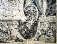
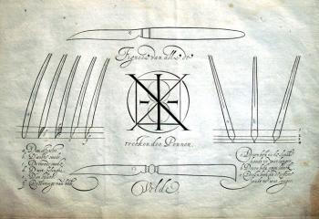
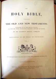
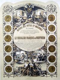
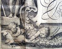
Jan van den Velde I (1568-1623), Spieghel der schrijfkonste (Mirror of the Art of Writing): in den welcken ghesien worden veelderhande gheschriften met hare Fondementen ende onderrichtinghe Wtghegeven (Amsterdam: Willem Iansz, inde vergulde Zonnewyser, 1609). 25 x 34 cm (oblong folio). Fifty-seven engravings including the engraved title page, an engraved portrait, and fifty-five leaves of calligraphic samples. *Note the putti pulling goose feathers to make writing pens.

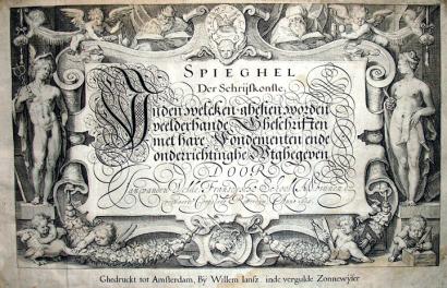
Thanks to the assistance of the Friends of the Princeton University Library, graphic arts recently acquired a rare, complete third edition of this important Schrijfmeesterboek (writing-master’s book) from the Golden Age of Dutch art. Written and designed by Jan van den Velde I, this edition was printed by cartographic publisher Willem Janszoon Blaeu (1571-1638) with a title page cartouche designed by the artist and art historian Carel (Karel) van Mander (1548-1606) and engraved by the engraver and publisher Jacob Matham (1571-1631), along with fifty-five sample plates engraved by Simon Wynhoutsz Frisius (also written Vries, ca. 1580-1629).

The first edition appeared in 1605 published by van den Velde’s brother-in-law, Jan van Waesberghe II, in Rotterdam. The same year a second edition was published in Amsterdam by the printer and publisher Cornelis Claesz. The third edition was published by the no less famous printer Willem Janszoon Blaeu, after Blaeu acquired the original plates from the Claesz heirs. For an unknown reason, an extra plate by van den Velde has been added to this particular copy.

From the sixteenth to the eighteenth centuries, two types of writing books predominated in Europe: the writing manual to offer instruction in how to make, space, and join letters as well as how to choose paper, cut quills, and make ink; and the copybook with engraved plates of writing models to be copied. Writing manuals and copy books are a top priority for library graphic arts collections, including Princeton University, to serve as a resource for the international study of letterforms.

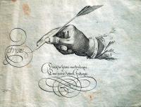
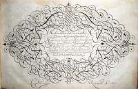
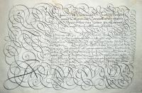
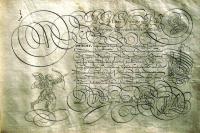
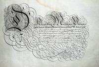
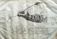
Van den Velde’s volume is both a writing manual and a copy book, offering instructional texts as well as an extensive set of model plates with examples of all the different hands in use throughout Europe at that time. Written in Dutch, German, French, English, Italian, Spanish, and Latin, van den Velde not only covers the alphabets but also includes ornamental penwork confirming his dazzling mastery in the fusion of script with the calligraphic decoration.

As with many of these beautiful writing books, Spieghel is at once an artifact offering exceptional examples of high Dutch engraving and a research tool for undergraduate and post-graduate instruction in the history of letterform.

To his credit, van den Velde himself provides analysis as to the type of study his book would or should receive. In part three, he begins with a sustained discussion of the national hands that function both as treatise and manual, defining the criteria of mastering penmanship and diagramming, stroke by stroke, how different alphabets are formed. He justifies his reputation by noting that mastery consists not in specialization but in the ability of wield multifarious hands “I know well that what I teach here will be examined scrupulously by many fastidious souls, who will gravely proof my writing specimens as well, preferring to find fault rather than improve; I pray them to observe the good differentiation of hands before blaming the liberality of my pen, for though there will be those who have flown beyond the limits of my instruction, so they will find my book well governed, containing neither confusion nor scandal. Poets have their license, philosophers their exceptions, and painters their ornaments, so too with the pen, by degrees the quick and supple hand spreads its wings wider than that hand which writes an upright or heavy letter.” (Translated by historian Walter Melion in his wonderful article “Memory and the Kinship of Writing and Picturing in the Early Seventeenth-Century Netherlands,” Word & Image 8, no. 1 (January-March 1992))

Stanley Morison, writing in Calligraphy 1535-1885, commented, “The Spieghel’s format is of exceptional size. Van den Velde’s book is a magnificent specimen, not only with regard to the specific period it represents, but also in relationship to the entire history of calligraphy as an art. Of special note are the plates containing the Gothic letters, showing unique mastery in the fusion of the script with the calligraphic decoration.” Walter Melion wrote, “In scale, richness of ornamentation, and sheer number of specimens, the Spieghel is the most elaborate of these exemplaer-boechen.” Victor I. Carlson, in his essay for the Baltimore Museum’s 2000 Years of Calligraphy summed it up, “Van den Velde’s copy-book … is usually considered the most important work on calligraphy to be printed in Holland.”

Toward the Infinite White

| 1 Comment

Jean Arp (1886-1966), Vers le blanc infini [Toward the Infinite White] (Lausanne, Paris: La Rose des Vents, 1960). Eight etchings with aquatint printed by Georges Leblanc; letterpress poems printed by Féquet et Baudier. Copy 395 of 499, signed by the artist. Graphic Arts GAX 2010- in process

In the last years of Arp’s life, he created two beautiful livres de peintres. Ver le blanc infini begins with an etching, followed by a poem, followed by an etching, and so on. Eight poems interspersed with eight prints. Neither is the print an illustration of the poem, nor is the poem a reaction to the print. The works were created by the same man and represent his late period art, but are in no way an integration of image and text. In this way, Arp obstructs the convention of the livre de peintre just as the prints and poems confound his self-defined practiced of automatic (free-conscious) writing and drawing.

A Warning Against American Cocktails

Blanc et rouge. Design by Paul Iribe (1883-1935) and text by Georges Montorgueil (1857-1933). (Paris: Draeger frères, 1930). Graphic Arts GAX2001 -in process.

Graphic Arts recently acquired three rare promotional wine catalogues from the Parisian merchant Nicolas. Each is beautifully designed by Paul Iribe, who was best known for his Art Deco costume, furniture, and fabric designs. Iribe began his career as a cartoonist and humorist. Work as an illustrator for French periodicals such as Le Temps, Rire, Sourire, and L’assiette au beurre, led to commissions in fashion illustration, most notably designing for Paul Poiret and his 1908 Les Robes de Paul Poiret.

These wine advertisements were done shortly after Iribe returned to Paris after working in Hollywood from 1914 to 1929, where Cecil B. De Mille is quoted as saying Iribe was the best Art Director he ever worked with.

The first catalogue, Blanc et Rouge, is set in a Paris jazz club and written entirely in dialogue, instructing the consumer to choose a French wine and stay away from other drinks.

Rose et noir. Design by Paul Iribe (1883-1935) and text by René Benjamin (1885-1948). ([Paris]: Etablissements Nicolas, 1931). Edition of 500. Graphic Arts GAX2010 -in process.


The second catalogue, Rose et Noir, has an odd storyline for a wine advertisement. Its narrative follows newlyweds through a downward spiral, brought on by the effects of too many American cocktails (and not enough French wine). Laid in is a booklet written by René Benjamin entitled, “Dialogue moderne en trois temps et trois cocktails” (Modern Dialogue in Three Time and Three Cocktails).


Bleu blanc rouge. Design by Paul Iribe (1883-1935). ([Paris]: Etablissements Nicolas, Draeger Frères, 1932). Edition of 520. Graphic Arts GAX2010 -in process.

The final volume, Bleu Blanc Rouge, has a cover printed in the colors of the French flag. Large folding plates with striking black and white designs argue against foreign drinks such as Russian vodka, German beer, British whiskey, and American Blue Rock mineral water. French wine again comes to the rescue in the end.

Pierre Belon's Early Natural History of Birds

Pierre Belon (1517-1564), L’histoire de la natvre des oyseavx, avec levrs descriptions, & naÏfs portraicts retirez du naturel: escrite en sept livres (Paris: Gilles Corrozet, 1555). Seven parts in one volume with 161 woodcuts, including a portrait of Belon, two skeletons used as diagrams to compare the structure of man and bird (seen below), and 158 large cuts of birds. It has a contemporary calf binding with fillets and decorative roll tools, and a fore-margin with contemporary manuscript title “P. BE / LON / L.HIS / TOIRE / DES / OISEA / UX. Graphic Arts GAX 2010- in process. Purchased with funds from the Henry Matthews Zeiss Memorial Book Fund.

Pierre Belon studied medicine in Paris and became the pupil of the botanist Valerius Cordus at Wittenberg. When Cordus died in 1544, Belon returned to Paris and came under the patronage of François de Tournon, who subsidized his study and extensive travel. With this support, Belon prepared a book on fish in 1551, trees in 1553, and this bird study in 1555.

According to Ruth Mortimer, “Belon’s text, as one of the first of its time to be based on direct observation and original drawings, is a major work in the field of natural history…” A pioneer in comparative anatomy, Belon attempted to match the names of birds used by Aristotle and Pliny with the species then in France (hence the captions in Greek). The book is one of the first ornithological compendiums to be based, in part, on field observations and many of the woodcut bird portraits were taken from actual specimens.


There were two issues of this book in 1555, divided between publishers Gilles Corrozet, who held the privilege, and Guillaume Cavellat. Belon, in his address to the reader, states that various artists contributed to the illustrations, although he names only Pierre Goudet (i.e. Pierre Gourdel). Blocks from this work were used again in 1557 for the first part of Belon’s Portraits d’oyseavx, animavx, serpens, …, also published by Cavellat.

Octave Uzanne's "Dictionnaire bibliophilosophique"

Double wrappers from Octave Uzanne (1852-1931), Dictionnaire bibliophilosophique, typologique, iconophilesque, bibliopégique et bibliotechnique à l’usage des bibliognostes, des bibliomanes et des bibliophilistins par Octave Uzanne, polybibliographe et philologue (Paris: Imprimé pour les sociétaires de l’Académie des beaux livres, Bibliophiles contemporains, en l’an de grace bibliomaniaque, 1896). Copy 89 of 176. Graphic Arts Collection (GAX) Z992 .U93 1896.

Octave Uzanne (1851-1931) loved books. Long before Forest Gump, Uzanne compared a good book to a superb box of chocolates. He read them; he wrote, edited, and designed them; and he collected them. Uzanne founded several small literary magazines including L’Art et l’idée and Le Livre moderne as well as founding the Société des Bibliophiles Contemporaines (followed later by the Société des Bibliophiles Indépendants).

When he was forty-five, he prepared this dictionary to all aspects of the book world, including authors, illustrations, bindings, paper, and much more. Note below right “Un Auteur qui désire garder l’anonyme” (the author who wishes to remain anonymous), which is a portrait of Uzanne.

1 2 3 4 5 6 7 8 9 10 11 12 13 14

Recent Comments

  • Howard Coblentz: I have a round seal shaped like a pear a read more
  • John Overholt: Wikipedia's entry for Sir Francis says: "Throughout Baring's lifetime his read more
  • Serge Rodrigue: It is a precious thing you have a book from read more
  • Colin Wicks: I have a copy of “A Round Game.” And it read more
  • Laurence Hilonowitz: I was a Customer, Friend of Bob Wilson. I Live read more
  • allen scheuch: Absolutely STUNNING! Those colors, those designs made my day! Thanks, read more
  • Olivier: Hello Diane, If you are still looking for an examplare read more
  • Stella Jackson-Smith: I have a framed picture by A.Brouet, signed with the read more
  • John Podeschi: I remember Dale fondly from my days at Yale (1971-1980). read more
  • Joyce Barth: I have some or all of this same poem. I read more