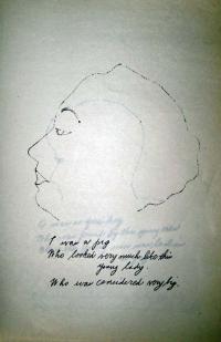
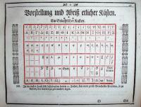
Figure 1
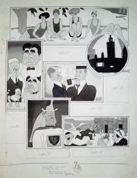
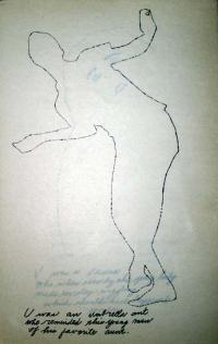
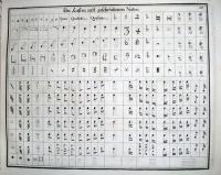
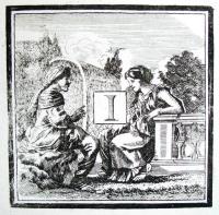
Figure 2
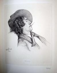
In 1924, Ralph Waldo Emerson Barton (1891-1931) was asked to serve as an advisory editor to Harold Ross for his new magazine The New Yorker, along with Marc Connelly, George Kaufman, Rea Irvin, Alice Duer Miller, Dorothy Parker, and Alexander Woollcott. These artists and writers were expected to contribute material to be printed anonymously, in exchange for stock, while retaining rights for reprints themselves. In one week alone, in the late 1924s, Barton completed eighty-five drawings. He was at the height of his career and one of the highest paid artists working in New York City. His drawings are, for many, synonymous with the 1920s.
Hundreds, if not thousands, of Barton’s drawings were published unsigned and few survive in their original format. Besides The New Yorker, he worked for Collier’s, The Delineator, Everybody’s magazine, Harper’s Bazaar, Hearst’s International, Judge, Leslie’s Weekly, Liberty, New York Herald Tribune, Photoplay, Puck, Satire, Shadowland, Vanity Fair, and many more. He illustrated many books, including Droll Stories by Honoré de Balzac, Gentlemen Prefer Blondes and But Gentlemen Marry Brunettes by Anita Loos, The Tattooed Countess by Carl Van Vechten, and his own God’s Country. He also made one film, at the urging of his friend Charlie Chaplin, entitled Camille: The Fate of a Coquette, starring Paul Robeson, Sinclair Lewis, George Jean Nathan, Theodore Dreiser, Sherwood Anderson, Alfred Knopf, Ethel Barrymore, Somerset Maugham, and many of his other friends.
The drawings in the Graphic Arts Division were published in Judge under the section “Judge’s Rotogravure section; The News of the Globe in Pictures by Ralph Barton”. They are not included in any published listing of Barton’s work. We can only assume they are from the 1920s.
When Barton shot himself in 1931, he left two notes. The first, titled “Obit,” was an explanation of his suicide, which he attributed to melancholia. Barton wrote, “No one thing is responsible for this and no one person—except myself. If the gossips insist on something more definite and thrilling as a reason, let them choose my pending appointment with the dentist or the fact that I happened to be painfully short of cash at the moment.” The second note was to his housekeeper, leaving her $35 and an apology that it was all he had left.
John Updike (1932-2009) selected only a few, favorite artists to write about in The New Yorker, later republished in Just Looking, and one was Ralph Barton. “Barton’s caricatures are not idignant, like Daumier’s, or frenzied, like Gerald Scarfe’s,” he wrote, “they are decoratively descriptive.” Then, Updike quoted Barton speaking of his own work, “It is not the caricaturist’s business to be penetrating; it is his job to put down the figure a man cuts before his fellows in his attempt to conceal the writhings of his soul.”
Later, in a foreword to Bruce Kellner’s biography on Barton, Updike wrote
“In the fury of his life and career Barton was careless of his work; most of his originals are lost, destroyed by him or by the engravers whose indifferent, coarsely screened reproductions are all we have left. …A lost Manhattan and a lost decade live again in the particulars of Barton’s hectic career. The life was less happy than it should have been, considering its achievement; the best of Barton’s art is like a perfect flower, wiry and fluent, blooming in the wilderness of his era’s commercial art.”
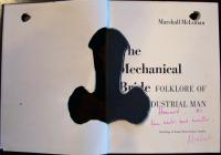
Bruce Kellner, The Last Dandy, Ralph Barton: American Artist, 1891-1931 (Columbia: University of Missouri Press, c1991) Firestone Library (F) NC139.B36 K45 1991
John Updike (1932-2009), Just Looking: Essays on Art (New York: Knopf; Distributed by Random House, 1989) Rare Books (Ex) N71 .U64 1989
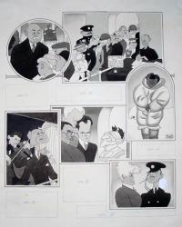
Figure 3
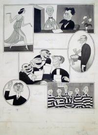
Figure 4
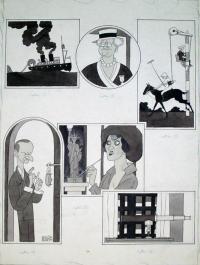
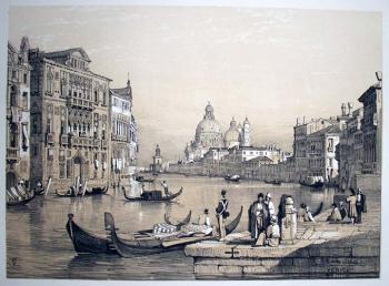
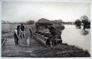
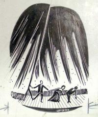
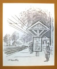
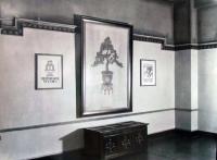
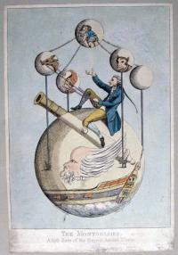
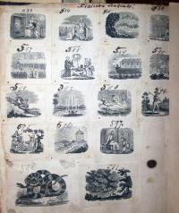
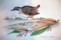
Fig. 1: Ralph Barton (1891-1931), The News of the Globe in Pictures (Judge, no date). Pen and ink, wash on paper. Frame 1—4,000 miles of 20-inch reinforced rubber tubing. Frame 2—Mss Carrie Wardrobe. Frame 3—Training polo ponies at Meadowbrook. Frame 4—Silent Cal. Frame 5—Mis Gloria Swanson. Frame 6—Device to let rooms on courts at seaside hotels. Graphic Arts division GA 2006.02584
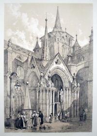
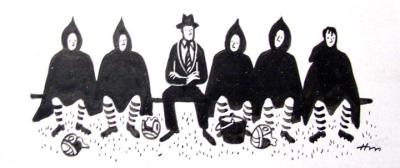
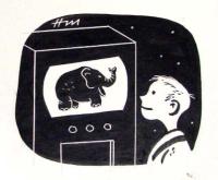
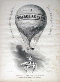
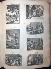
Fig. 2: Ralph Barton (1891-1931), The News of the Globe in Pictures (Judge, July 12, 192?). Pen and ink, wash on paper. Frame 1—Water sprites at a limpid woodland pool. Frame 2—William Jennings Bryan. Frame 3—A modern Jean Bart. Frame 4—Senatorial entries. Frame 5—Staunch champion of the principles of democracy. Frame 6—Playtime for Americans in Europe. Graphic Arts division GA 2006.01928
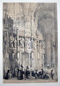
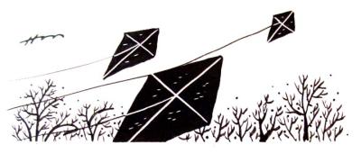
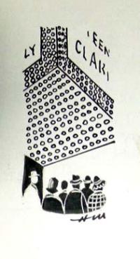
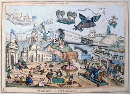
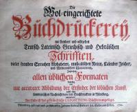
Fig. 3: Ralph Barton (1891-1931), The News of the Globe in Pictures (Judge, May 31, 192?). Pen and ink, wash on paper. Frame 1—College prexy in hot water; Dr. Nicholas Murray Butler, of Columbia University being pressed by reporters to back up his recent allegation that several congressmen habitually appear on the floor of the House sober enough to stand alone. Frame 2—The blessings of liberty at the White House; Though denied the ecstasy of shaking their President by the hand, a new ruling at the executive mansion still permits 1,450,000 citizens daily to feast their eyes on him as he works at his desk. Frame 3—Crazy Ik, village idiot of Pt. Barrow, Alaska; said to be the only American citizen who still believes that the Income Tax will be reduced. Frame 4—Borrowing an idea from Hollywood; William Gibbs McAdoo carries a small orchestra as a part of his touring equipment to aid him in working himself up to the proper emotional pitch to make his campaign speeches more effective. Frame 5—Joseph Hergesheimer, Carl Van Vechten, and James Branch Cabell; The only American authors who have never acted in amateur theatricals, honor the bust of Joseph Conrad, the only British author who has never lectured in America. Frame 6—The latest in feminism; New York’s police commissioner, Richard Enright (left) welcomes “Copperette” Sarah Jones (right) head of the Liverpool policewomen who has gone her London sister-officer one better in smart turn-outs by raising a mustache. Graphic Arts division GA 2006.01927
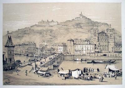
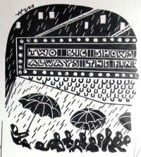
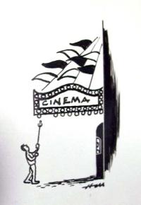
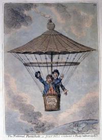
Fig. 4: Ralph Barton (1891-1931), Camera Shots by Ralph Barton (Judge, April 12, 192?). Pen and ink, wash on paper. Frame 1—Reincarnation of Sappho? Sadie Snipt, whose dance recitals have startled Omaha, claims the Greek poetess is re-born in her. Frame 2—America’s premiere showman again turns to Europe for talent; Morris Gest signs the Prince of Wales for eight matinees of his great equestrian act at Madison Square Garden. Frame 3—A gift for the president; Calvin Coolidge receives a mother-of-pearl colander full of brass cole-slaw from an admirer. Frame 4—In training for the White House; Wm.G. McAddo, in Apring Training Camp, learning to throw out the first ball of the season. Frame 5—Playtime at the Capital; Senators and Representatives enjoy a few letters from constituents demanding Income Tax reduction. Frame 6—Notable gathering of leading American reformers; Photographed at a banquet given last month to celebrate Anthony Comstock. Graphic Arts division GA 2009.00076


Recent Comments