
Observations
My COS583 professor, before class, arrives to the classroom ten minutes early. She prepares for the class by writing everything she wants to be on the board to use during class discussion. Looking at her notes, she sees all the diagrams and illustrations she wants to copy on the board.
To prepare for class, my ENG321 preceptor has several pages of printed notes of where to lead the precept in conversation. Before class, she reviews her notes and greets everyone into the class. She almost always seems very prepared and only gives her notes a very cursory glance.
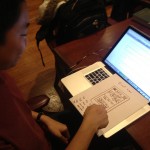
Before lecture in COS 436, very few people are reviewing notes. The majority of people, including one senior I observed, simply try to kill time by talking to the people sitting next to them or browsing the internet. This senior in particular was reading TechCrunch, Facebook and Reddit. A few people pull up assignments from other classes or prepare their word processor for the lecture.
That’s a big change from a precept style class. In COS583, students are asked to read a seminal paper of computer science and discuss it in class. Before class, half the participants (including another senior I observed) will flip through the assigned paper and review the highlighting/notes they scribbled on the side of the paper. Some of these people are reviewing it to be studious and others simply haven’t read the paper and are trying to catch up. The other half of the class will kill time by talking to others or browsing the internet.
Talking to students who review their notes before class reveals that they often prepared for class a long time ago. Some of them read the paper a couple days back and need a refresher on the material.
Another interesting observation: students who come late have a harder time than you would expect finding a seat with certain classroom layouts. If either the layout was improved or if students were encouraged to sit more efficiently, this problem would be avoided.
Brainstormed ideas
1. Attach sensors and lights to seats to make sure students choose the most efficient seating pattern in lecture.
2. A platform for prepared students to sell summaries of readings to unprepared students.
3. Placards that allow students to find seats more easily and that allow the teacher to more adequately control discussion.
4. Integrate word processors inside desks to make sure no students are using their computers for the wrong purposes.
5. Allow teachers to upload a layout to a board with the click of a button
6. Allow student computers to take screenshots of what will be on the board/slides before class
7. A door to the lecture hall that locks from the outside immediately when class is supposed to start.
8. A web application that gives students a one-minute refresher of the last lecture to prepare them.
9. A mobile application that knows when you should leave for your next appointment based on the distance you must cover
10. A class instant message board, that allows students to ask questions to others or the lecturer before/during class.
11. A desktop application that will prepare your other desktop applications for class (open word processor, browser to certain tabs, etc.).
12. A mobile application that will tally up the total minutes of class missed by being late and donate money to charity proportional to that amount
13. An e-book platform that crowdsources highlighting and sidenotes.
14. A quick survey for students to show which topic they want the lecture to cover
15. A big screen in lecture that will show the faces of late students
16. Make the projector in lecture play the same games of an NBA big screen before class (find the people, kiss cam, etc).
Ideas Chosen
In this project, I will be exploring ideas 9 and 13. Idea 9 would be very useful to me personally, because I have a very bad sense of how long it takes me to get to places and truly smart alarm clocks should take distance to destination into consideration. Idea 13 would be a more natural way of having discussion in a book – as you read the content, you see what other people thought was important and what insights they may have.
SmartGo
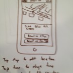
For idea 9, I envision an app named SmartGo. SmartGo starts off very simple and allows users to import calendars from different sources (Google, Apple, etc). This events are then visible in a simple list “home screen” that is the default view for the app.
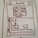
Each event can be opened by touching its row in the list. Once in the event view, users can edit the information of the event and when they should be reminded to leave. Users can drag/tap the map to change location or click the magnifying glass to search for a completely different map segment.
Adding an event is very simple – only three fields are needed in the beginning: time, description and location. Once a location is entered, a map is generated to allow the user to specify the exact destination of the event.
The app routinely checks the background to see the user’s location and once it realizes that the user needs to leave to arrive in a destination at the right time, it sends a push notification. Simple map APIs can allow the app to accomplish this.
-
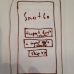
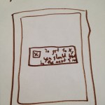
- SmartGo start screen
-

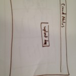
- SmartGo home screen
-
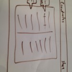
- SmartGo event screen
-
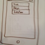
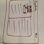
- SmartGo Add Event screen 1
-
- SmartGo ADd Event screen 2
-
- SmartGo push notification
CrowdNotes
CrowdNotes is a simple browser based eBook platform that allows users to share eBooks with groups and allow others to comment/highlight them. The home screen is very simple and consists of only an upload button. Ideally, the uploader would accept various types of eBook file extensions and PDFs.
-
- CrowdNotes home page
-
- Browsing a book
-
- Adding a highlight or sidenote
Next, users can share the file with the friends by clicking the share button in the top bar. Ideally, users can share with email addresses or social media and they can even share by giving the URL away. Visitors can see the notes of previous readers and the most highlighted phrases within the book.
When users highlight a portion of the text with their cursor, a tooltip appears with two options: sidenote and highlight. Sidenotes appear in the margin of the screen once inputted and highlights are simply highlights.
User testing
-

- Tester 1 points to how she wants to see the names and pictures of the commenters in CrowdNotes
-

- Tester 2 is confused by adding the submit button dynamically in the add event view of SmartGo
-
- Tester 3 taps the “Remind me in 24 hours” row, hoping that it will open an edit screen
For the most parts each of the three testers enjoyed the apps they saw. The majority of their confusion resulted from my poor handwriting, but the “flow” of both GUIs seemed to work fine. Many of them requested new features to make the apps more useful to them.
Our first tester enjoyed the SmartGo app, but believed it would be arduous to update the app regularly. While she appreciated that the application would have live updates from other calendar applications, she did not like that she needed to choose parameters like “mode of transportation” every time. She requested that the app’s settings page allow her to choose defaults like “remind me so I will get to my events five minutes before starting time” and “I have a car that I can use to get there”.
This tester also liked CrowdNotes, saying “it could be useful for reading heavy classes”. However, she had some concerns about the usability of the app once it had a large number of people sharing one document. She wants to see what person made what comment to be able to determine its relevancy and the reliability of the commenter. Highlighting with the cursor was also not explicitly obvious, so maybe a first-run tutorial would be useful for users.
Our second tester is a designer herself. She appreciated the purpose of SmartGo, but commented that she “never really uses calendars anyway”. The biggest insight I got from this test was that the dynamically updating add event view was confusing to some because the submit button only appeared when the user filled out the other fields. Users want to immediately understand how something will work and having the submit button there, even if it is not a valid submission yet, reassures the user.
This user also had scaling concerns with CrowdNotes, asking me how text will appear if multiple people highlight the same text. There are only so many colors to assign, so perhaps there needs to be a better way to see the most highlighted text. Her suggestion was to highlight only the most overall highlighted text and when a user clicks it, they can see each user that used it.
Our last tester is an avid calendar user and appreciates the purpose of SmartGo. The import functionality was complimented because this tester uses Google Calendars religiously. They asked if they can add the location of an event via Google Calendars, so they could avoid using the app as much as possible – I didn’t know the answer to that question. Alternatively, this tester suggested that SmartGo could sync with Google Calendar so the updating could go in both directions. This tester had difficulty choosing when the application should remind them about the event and how they could edit those options.
This tester had the same problems with highlighting the text in CrowdNotes. It was not implicit that highlighting with the cursor would lead to comments and that would be made more easily understandable.
Insights
For SmartGo, I had the following insights:
- Default settings are important. The app should take into consideration whether a user has a car, whether they like taking public transportation and how early they like to go to events.
- It is important for a user to clearly understand the flow of submissions – hiding the submission button until the submission is valid is an easy way to confuse users.
- The app shouldn’t just import to other calendar applications – it should sync to make it more useful.
- “Tap to edit” should be written somewhere if it’s true.
- My handwriting is terrible.
For CrowdNotes, I had the following insights:
- An actual user authentication system would be useful to more accurately share eBooks with others. Sharing just a URL may not be private enough.
- It is difficult to show how many people highlighted an area given how few colors can be used for it. A number near the highlighting may be used to do that, or even better, the highlighting can be brighter for the larger the ratio of people who saw it and highlighted it.
- Some people highlight the dumbest things. Eventually, with enough users, anything could be highlighted. It would be good for the application to discern what was and what wasn’t highlighted.
- Making the platform browser based would get the most users, but platforms with touch capabilities – tablets, phones, etc. – would provide a better user experience.
- The margins will get cluttered from number of sidenotes. A reputation system or Facebook integration to heavily weigh the submissions of friends could increase relevancy.
I was pleasantly surprised at the quality of feedback received. The majority of collected responses resulted in actionable information to make the products more intuitive and easily understood.