
Names: Colleen, Vivian, Alan
1. What were the most severe problems with the app/site? How do these problems fit into Nielsen’s heuristic categories? What are some suggestions to fix the UI, and how do your proposed changes relate to the heuristic categories?
- Most severe problems:
- No documentation (or tutorial) for how to use it
- Not intuitive (have to switch between tabs)
- No consistency across different platforms (Android/iPhone)
- Can’t choose a stop and have to choose a route
- Not useful for planning travel, can only pick one transit system
- Really hard to figure out stops (on Android, can’t even see route intially, don’t know you can click on it)
- Multiple routes were in the same color.
- This application violates almost all Nielson’s categories except:
- Doesn’t violate “Aesthetic design and Simplicity” (H8) but the simplicity comes at a sacrifice of functionality and instruction.
- Also doesn’t violate “Match between system and real world” (H2) because its mostly based off of conventions from other technologies, and it relies on understood icons used already in Google maps and other technologies.
- Did not violate “Help users recognize, diagnose, and recover from errors” (H9) because there were no error messages.
- Suggestions to fix UI:
- Make stops more visible (H6/H7)
- Make specific stops searchable (H7)
- Have all the routes initially selected so that the user doesn’t have to click and extra button when the map loads and nothing shows up (iPhone version) (H7)
- Some sort of tutorial about how to get important information (H10)
- Make sure routes are all different colors (H4) and that the routes are clearly distinguishable (H5)
-
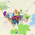
- Extremely cluttered and unhelpful
-
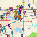
- Still confusing
-
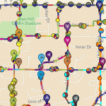
- And even confusing when you zoom in more
- Make changing the transit system easier, instead of needing to switch to the “Settings” tab (iPhone) (H3)
-
- Need to visit “Settings” panel to change transit agency
- Doesn’t save previous states (which routes already selected) when switching between tabs or transit systems (H6/H7)
- Doesn’t notify user when the times until the bus arrives at stop are updated (H1)
- Announcements aren’t reflected in the route data or on the map (H5/H7)
2. Which problems, if any, were made easier to find (or potentially easier to correct) by the list of Nielsen’s heuristics?
- Would not noticed the problems with loading data looking error (H5) and wouldn’t have been as bothered by lack of documentation (H10). Overall, the problems with the interface were pretty obvious and glaring. Without Nielson’s heuristics, probably would not have tried to access other transit systems (maybe would have just looked at Princeton ones) which helped identify user control and freedom (H3), recognition and recall (H6), and consistency and standards (H4).
3. Did anyone encounter usability problems that seemed to not be included under any of Nielsen’s heuristics? If so, what additional heuristics might you propose for this type of application or site?
- Speed factor (each tab needs to load) is not included in the user heuristics but is kind of annoying for the user and definitely affects your experience (esp. on Android). For any time-relevant application, need to consider performance time.
- For mobile, efficiency of interaction space (phone is considerably smaller than desktop) and should be considered. For example, choosing all routes clutters small screen with many colors/dots/icons (confusing). Can be considered part of Aesthetics (H8), but maybe should be a separate heuristic.
4. What might be some useful class discussion questions—or final exam questions— related to heuristic evaluation?
- What would be most important heuristics to prioritize?
- Would the important heuristics change depending platform (mobile vs. computer)?
- Would the way you evaluate these heuristics differently depending on the time period (now vs. 1980)?
- Should there be any heuristics added (like speed of interface)?
Individual Heuristic Evaluation:
View Vivian’s observations here.
View Colleen & Alan’s (worked together due to lack of computer) observations here.