Basic Information (a,b,c)
Group Number: 4
Group Name: Team TFCS
Group Members: Collin, Dale, Farhan, Raymond
Summary: We are making a hardware platform which receives and tracks data from sensors that users attach to objects around them, and sends them notifications e.g. to build and reinforce habits.
Introduction (d)
We are evaluating the user interface of an iOS application for setting up and managing sensors. (From a design perspective, this is the most design-dependent part of the project, in which we construct the appropriate affordances and mental models for users to interact with our sensors.) Our app uses Bluetooth Low Energy (BLE) to connect to physical sensors which users attach to everyday objects. Each sensor is associated with a task when it is set up within the app. Then, the app logs when the task is performed, sends reminders when the task is not performed, and displays to the user their history in completing the task – and by extension, how successful they have been at maintaining a habit or behavior. Our P6 experiment is targeted towards evaluating the intuitiveness and accessibility of the sensor setup user interface, and gaining a better understanding of what tasks users would track using our app. This builds upon our P4 evaluation, which revealed several problems with the reminder model we presented to users, motivating us to rethink and simplify how sensors are set up.
Implementation and Improvements (e)
There were some changes made to the prototype since P5:
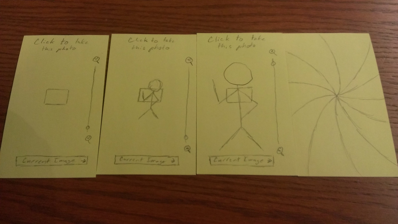
– A view to add new tasks was added. This view allows users to choose a sensor tag and then specify the task they are trying to monitor, and the frequency with which they want to use it.
– A webview for viewing statistics on tasks was added. This view is used to show the logs of tasks completed/missed by the user as graphs and charts. This helps the user track their progress in creating the habit and performing the task.
– Our backend server uses Twilio’s text service instead of APNS to send reminder notifications to the user. This is a simplification that lets us get by without an Apple developer account.
– In addition to sending alerts when a task is ignored, our backend tracks how frequently the user does complete tasks. We hope to use this data in the future for a proof-of-concept gamification feature.
Method (f)
Participants: Our participants were students who came to the Terrace library on the night of our test. There was a large number of students of different demographics present at the time of our test, and choosing one location enabled us to maintain a more consistent testing environment. Additionally, we found that the library was an excellent setting for finding target users, busy students who must maintain a consistent schedule amidst chaotic demands (see P4). To conduct the tests, we matched each task with a participant who expressed interest in developing a routine around that task. We found one participant who wanted to make a habit of going to the gym, another participant wanted to do a better job of reading books on a regular basis, and a final participant who was selected randomly, since we did not find an appropriate way to ask students about their medication usage before asking them to be participants in our study. Two were club members and one was independent.
Apparatus: We conducted all tests on the large table in the Terrace library. Our equipment included:
– An iPhone with the app installed
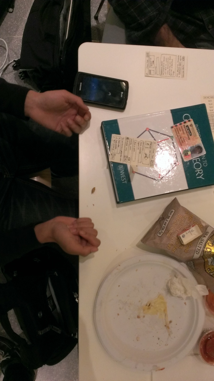
– Three sensor tags
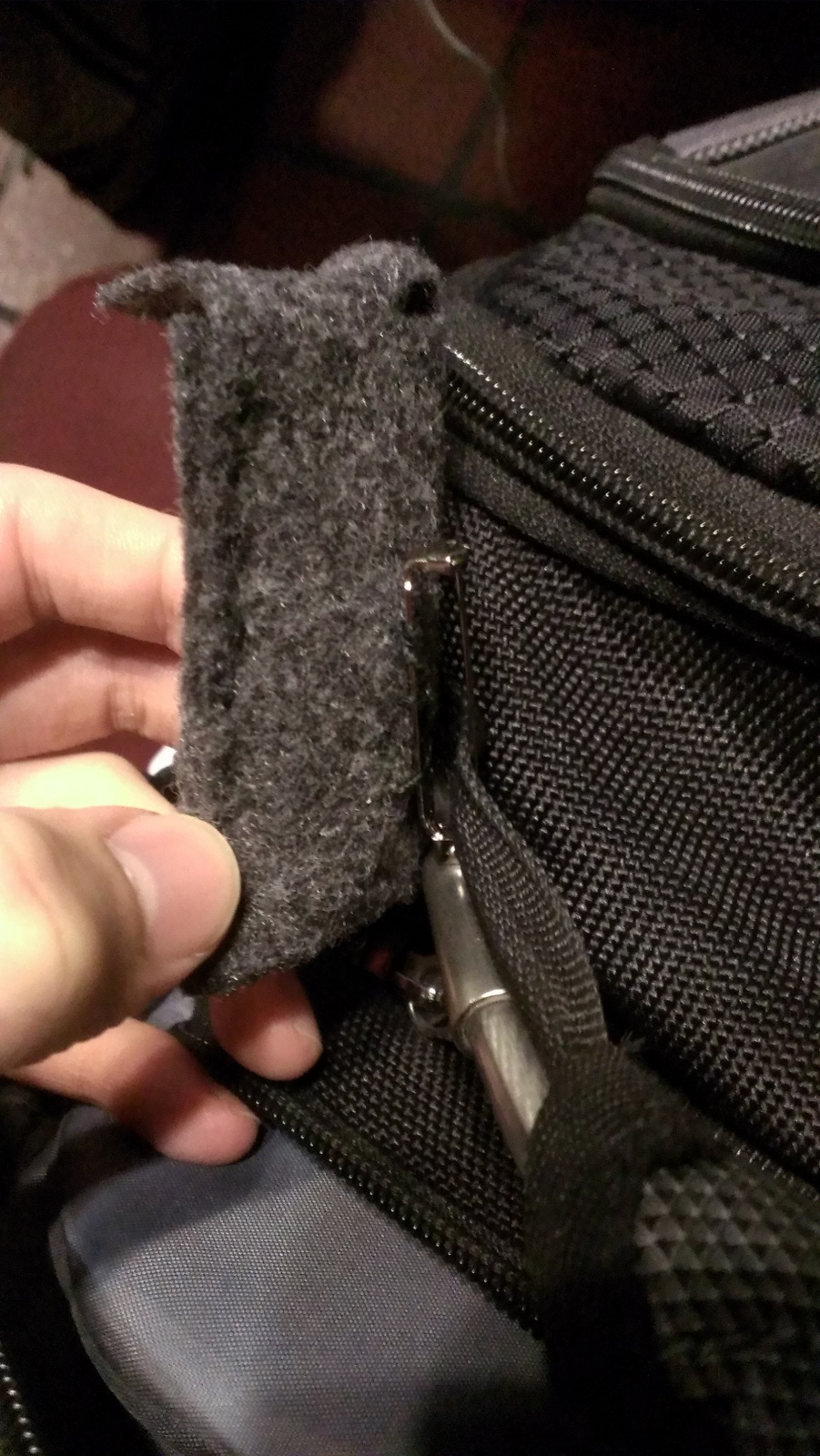
– Three custom-made enclosures for the sensor tags, one for connecting the tag to a book, another for clipping to a bag, and a third similar one for sticking onto a pill box
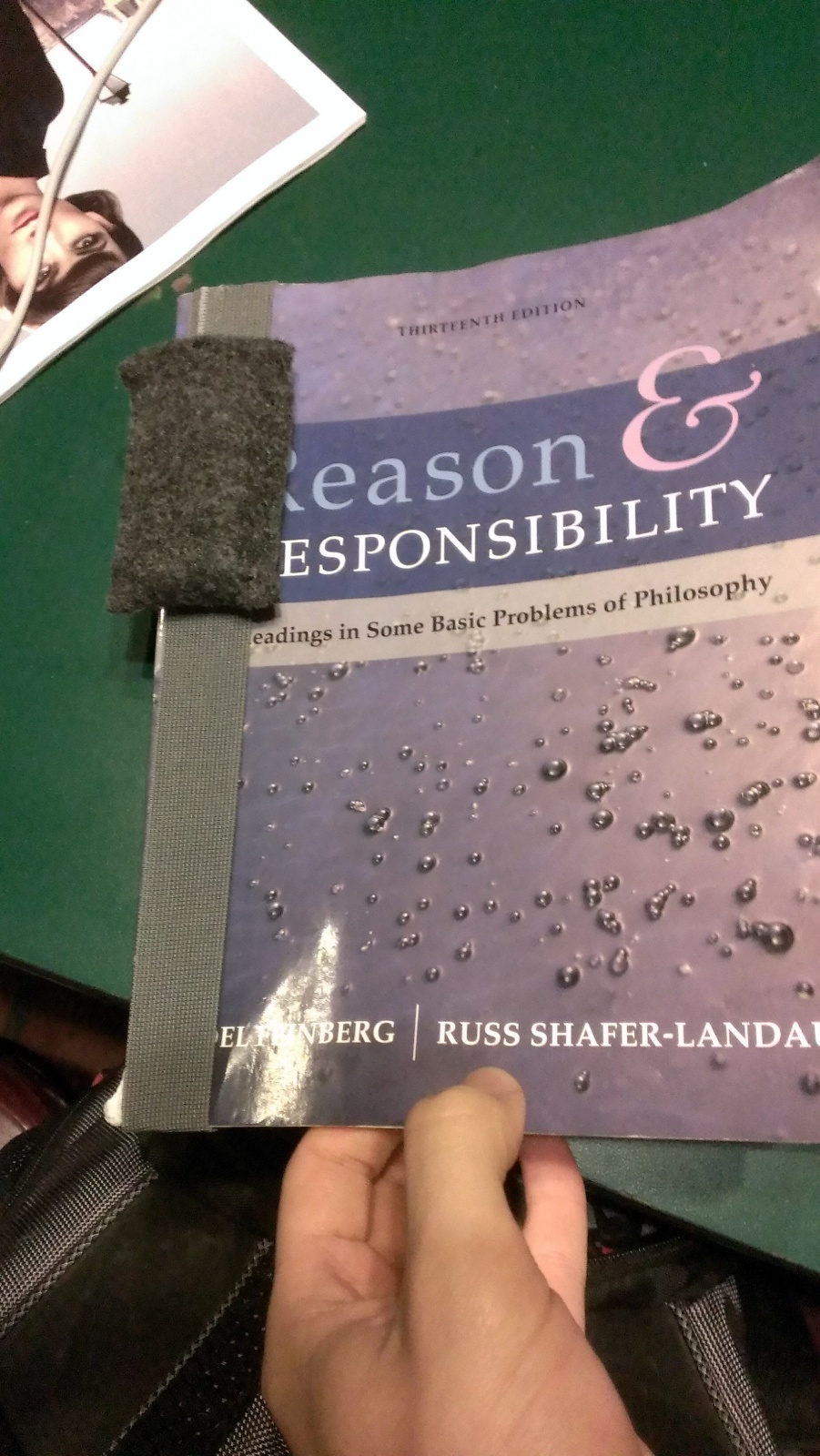
Custom-made enclosure for attaching sensor tag to a textbook.
Custom-made sensor tag enclosure to attach to bags.
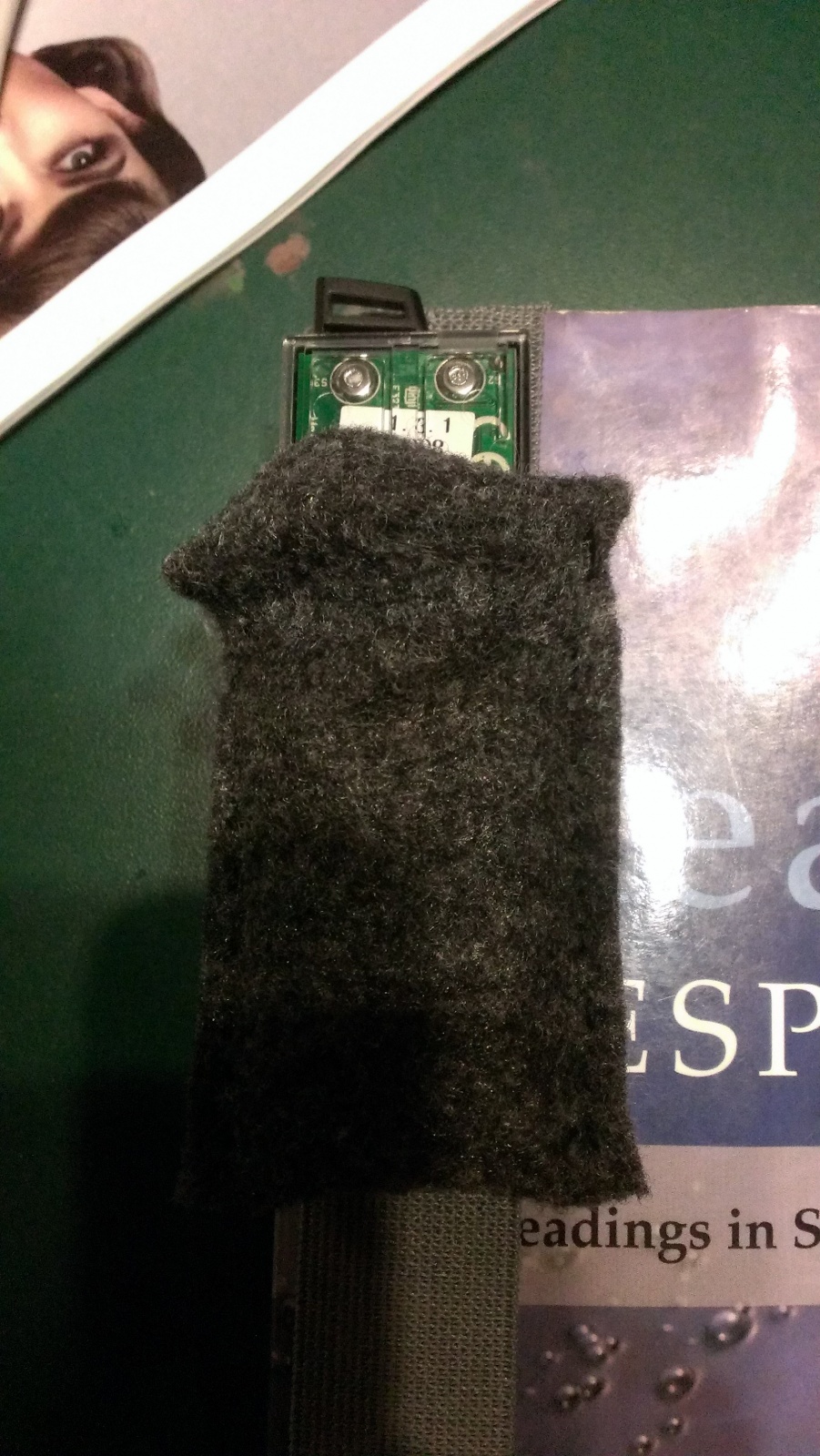
The sensor tag is protected within the felt pouch.
– A textbook for our textbook tracking task
– A pencil case representing a pill box
– A computer which volunteers used to fill out our survey
Tasks: Our easy task tracks trips to the gym using the accelerometer built into our sensor tags. This task is relatively easy because the tracker only needs to be left in a gym bag, and it uses accelerometer motion to trigger an event. For our medium task, we track a user’s medication usage by tagging a pill box. This task is of medium difficulty because only certain changes in measured data actually correspond to task-related events; we have to filter our data to find out when events have really occurred, introducing ambiguity in the user experience. Finally, for our hard task, we track the user’s reading habits by tagging textbooks. This is the hardest task for us to implement because of the complexity of connecting a sensor tag to an arbitrary book in a way that is intuitive to the user. We also have to filter our data to trigger events only in the appropriate cases, just as in our medium task.
These three tasks are worth testing because they require different enclosures and setup procedures for pairing a sensor tag to the object of interest. Since each task’s setup process involves the same UI, we expected to learn something about the comparative difficulty of each physical sensor enclosure and physical interface, in addition to how intuitive users found the setup process and reminder model. (These tasks remain unchanged from P5.)
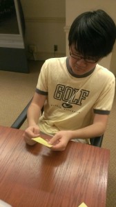
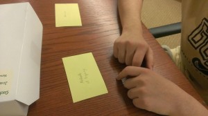
Procedure: Our testing process followed the script we provide in the appendix. First, we explain the experiment to the user and obtain consent for their participation and using video recording. Then we ask them to sign our consent form and take a brief demographic survey. Next, one of the team members explains what the app tries to accomplish and introduces the user to the physical sensor tags. Then the user goes through the three tasks outlined above. For each task, we explain the objective – for example “the next task is to try and track how often you go to the gym by tracking movement of your gym bag”. The user is then given the sensor tags, the appropriate item (gym bag, book) and the iPhone with the app loaded. We then observe and record the user’s interaction with the system as they attach the sensor tag to the object, pair it with the app and add a new task. Because the users were not told exactly how to use the app or setup the tags, we noted how their actions differed from what we expected as they went through the setup stages. To simulate receiving a notification, we allowed the user to leave and sent them a notification in a 20 minute time window and used that as a reference point to get feedback about the notification system. Finally, we gave users a post-evaluation survey as linked in the index.
Test Measures (g)
Our dependent variables originated from two parts of our test – timing of user interaction during the evaluation, and user-reported difficulty in the post-evaluation survey.
– Time taken by users to complete setup of sensor tag through iPhone app (but not to physically attach the sensor tags)
– Time taken by users to attach sensortag (NB: users attached/set up tags in different orders for counterbalancing purposes)
– Setup accuracy. We broke down the process of tracking a task into 8/5 stages as follows:
Step 1: Begin Pairing Screen
Step 2: Enable Bluetooth Screen
Step 3: Check Bluetooth is Enabled (only on first task)
Step 4: Navigate Back to Taskly (only on first task)
Step 5: Pair sensor
Step 6: Select sensor (sensor succeeded in pairing)
Step 7: Complete new task screen
Step 8: Actually attach sensor
We then gave each user an “accuracy” rating, which was the ratio of (correct actions taken over all steps)/(total actions). This became a useful measurement in telling us which setup stages users found most confusing.
– Satisfaction with physical form and attachment of the sensor tags (were they too intrusive?).
– Satisfaction with the notification system. Specifically, we wanted to measure what users felt about the intrusiveness or non-noticeability of the notifications when they forgot to do a task.
– The difficulty in setting up different tasks, as surveyed. It was important to test if the process of setting up tasks and attaching physical sensors was too complicated, since that was an issue we ran into during P4.
Video: http://youtu.be/aJ6ZIN6jzLc
Results and Discussion (h)
– We found the time it took for users to set up each sensor to be within our desired ranges. Users took an average of 51.33 seconds to go through the iPhone application and set up tracking of a single task, with a standard deviation of 14.72 seconds. We also observe that the average setup time decreased with each task the user setup. Users took on average 64 seconds to set up a task the first time, compared to 39.3 seconds on the third time through. Regardless of which task the user started their test with, the average time taken to setup the tasks decreases from the first task to the third. This reinforces our hypothesis from P5 that our application interface should be agnostic to different tasks or actions being created. This was a change from P4 which had interface elements specific to each task, as opposed to P5 where we tried to create a unified interface for creating any task.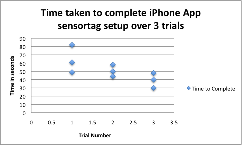
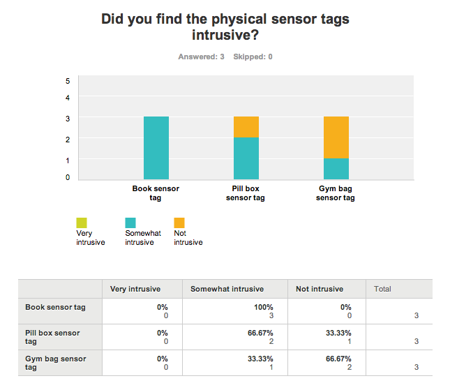
– To physically attach sensor tags, users took an average of 35.33 seconds (with a standard deviation of 12.91 seconds) to attach a tag over all tasks. We found, however, that while users very quickly set up the sensor tag to track reading a book, they often did so incorrectly. We gave users an elastic band enclosure that was designed to keep the sensor tag attached to the cover of the book, but users were confused and slipped the tags around the entire book. Most users said they would have prefered attaching the book sensor with a double-sided sticker, as they had with the pill box sensor. This was confirmed in the survey, when all users indicated the book sensor tag was “Slightly Intrusive.”
– The notion of using different sensors on each tag to track individual tasks was confusing to most people; this was indicated in the “What did you find hardest to accomplish?” section of the survey. They were unable to understand what each individual option meant, since we only provided the name of the sensor (accelerometer, gyroscope, or magnetometer) and asked the user to choose from them. Based on the results, we will simplify the motion-tracking sensors, combining use of the accelerometer and gyroscope into the rough class of motion-triggered sensors, and offering the user the choice of motion-triggered and magnet-triggered sensor. We will also provide the user with approximately one sentence explaining the difference. A more advanced way to do this would be to allow the user to train a machine learning algorithm by performing the action to be tracked several times. Then, we could learn what sensor values corresponds to each task. We could also allow the user to specify types of tasks, to make training more effective, e.g. moving bags, book openings, etc. However, this introduces significant complexity and relatively little benefit for our project.
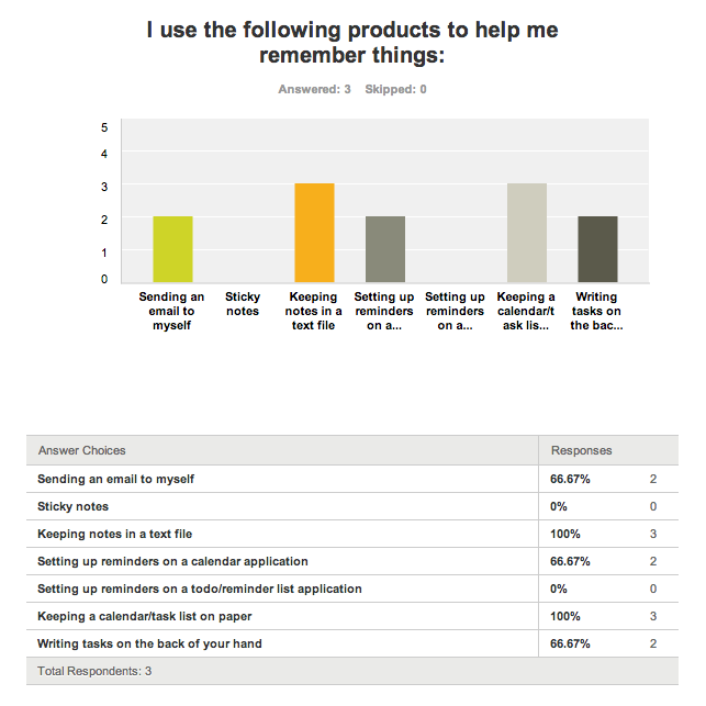
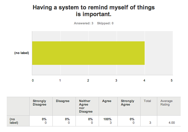
– Users found the physical tags to be generally unintrusive. One of the things we were trying to test was how comfortable people were with using these not-so-small tags on everyday objects, and the general consensus on this question reinforces that users are willing to accommodate these tags despite their size and clunkiness. This might also be a result of the preference of the users we tested on; most of them currently use text files, the backs of their hands, and email as task reminder systems. Those are the lowest-friction and more primitive task reminder systems that we asked about, which suggests that users would be interested in a low-friction system in which objects themselves remind the user that they have not been used.
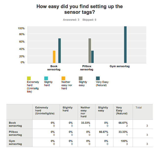
– Almost everyone was confused by the physical setup process in which the sensor tag was attached to the book. We intended for users to wrap the tag enclosure’s band around the outer cover of the book. People responded that they found setting up each tag on a book very easy, but performed the setup incorrectly, putting the band around the whole book, so that they had to remove the band in order to read the book. Two did so vertically, and one horizontally; this suggests that users did not go through our thought process of determining how the sensor tag would be used while reading the book. This could indicate a disparity in their understanding of how the system works and what they were using it for, but from observations during the tests, we found it more likely that users were not maintaining a high level of attention towards the task. The result could be that users would fix the sensor attachment upon actually reading their books, or it could be that they would remove the sensor enclosure when reading and forget to replace it. After the test, users suggested that we should allow them to stick the tag on the book instead of the band. Based on this recommendation, and the fact that users set up the other two tasks exactly as expected, we will focus on lighter and simpler stick-on/clip-on enclosures for future applications. (This was one of the dependent variables we set out to measure.)
– No users indicated the setup process was “slightly hard” or “extremely hard”. However, users only indicated that their likelihood of using our system is “somewhat likely” or “not likely”. We would have benefited from offering a broader spectrum of choices on both of these questions. However, the results that we gathered suggest that we are close to providing a significant benefit to users, and that we no longer need to make significant changes to the premise of our system or our reminder model; we are now at a point where we should focus on increasing the overall ease of use of the application and sensors, and making the utility of individual use cases more apparent.
– Notification system
Another aspect of the product that we set out to test was the notification system. We asked users to respond about how intrusive they felt the reminders were or if they weren’t noticeable enough.
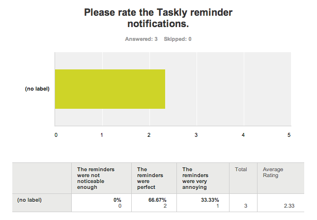
These survey responses indicated that people were generally satisfied with the information they received in reminders. One good suggestion was to include the time since the user’s last activity in the notification. Finally, the user who rated receiving reminders as “annoying” suggested that we use push notifications for reminders, since they did not expect to receive reminders in text messages. This is a change we plan on making for the final product. The notification system will have the same information, but be sent to the users iPhone as a notification (using the iPhone’s APNS system) instead of a text message.
– Further tasks to incorporate
Finally, we tried to gain insight into additional use cases for our system. Users provided several good suggestions, including instrument cases and household appliances (e.g. lawnmowers). These could form the basis for future tasks that we could present as use cases for the application.
Appendix (I)
Consent Form
Demo Script
Raw Data
Demographic Survey
Post-Evaluation Survey