Group Number and Name
Group 14, Team Chewbacca
Group Members
Eugene, Jean, Karena, Stephen
Project Summary
Our project is a system consisting of a bowl, dog collar, and mobile app that helps busy owners take care of their dog by collecting and analyzing data about the dog’s diet and fitness, and optionally sending the owner notifications when they should feed or exercise their dog.
Introduction
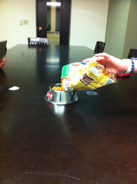
This is a system consisting of a bowl, dog collar, and mobile app that helps busy dog-owners take care of their dog. The bowl tracks when and how much your dog is fed, and sends that data to the mobile app. The collar tracks the dog’s activity level over time, and sends pedometer data to the mobile app. You can also check your dog’s general health, and suggestions will be given for when it is imperative to either feed or walk your dog. The mobile app links the two parts together and provides a hub of information. This data can be easily accessed and shared with people such as family members and veterinarians. The purpose of the experiment is to assess the ease of usage of the application, bowl, and collar system, and to identify critical changes that must be made for its potential success.
Implementation and Improvements
- Covered up the graph on the activities page, instead just simply displaying a total recommended number of steps a dog should take in a day, and presetting the number of steps already taken to 2585, 15 steps below the ‘recommended level’. We did this so that the user could assume their dog has already taken steps throughout the day, and it would be simpler for us to test if the user could successfully register 15 steps that the dog has taken.Overall, besides the above modification our application was suitably prepared for the pilot usability test.
Link to P5: https://blogs.princeton.edu/humancomputerinterface/2013/04/22/p5-group-14-team-chewbacca/
Method
Participants
Three participants tested our prototype. Master Michael Hecht is an academic advisor for Forbes Residential College, as well as a Professor in the Chemistry Department. He owns Caspian, a poodle. He was selected because he frequently brings Caspian to Forbes as a therapy dog and was willing to bring Caspian in to test our system. He also fit our target user group of “busy dog owners”. Emily Hogan is a Princeton sophomore student studying Politics. She owns a beagle named Shiloh. She was selected because she reported sharing responsibility for her Shiloh with her family when she is at home. Christine Chien is a Princeton sophomore studying Computer Science. She owns a small maltese poodle mix. She was selected because she was responsible for taking care of her dog at home, and, as a computer science major, was familiar with new technologies and Android apps. We chose both male and female participants of varying ages, areas of study, and levels of comfort with technology (particularly Android applications), which allowed us to gain diverse perspectives and see how different groups of users might react to our system.
Apparatus
We conducted our test with Master Hecht in the Forbes common room, and with Christine and Emily in a Butler common room. We did not use any special equipment apart from the bowl and collar in our system. We recorded critical incidents on a laptop during testing, and had users fill out an online questionnaire before and after the prototype test.
Tasks
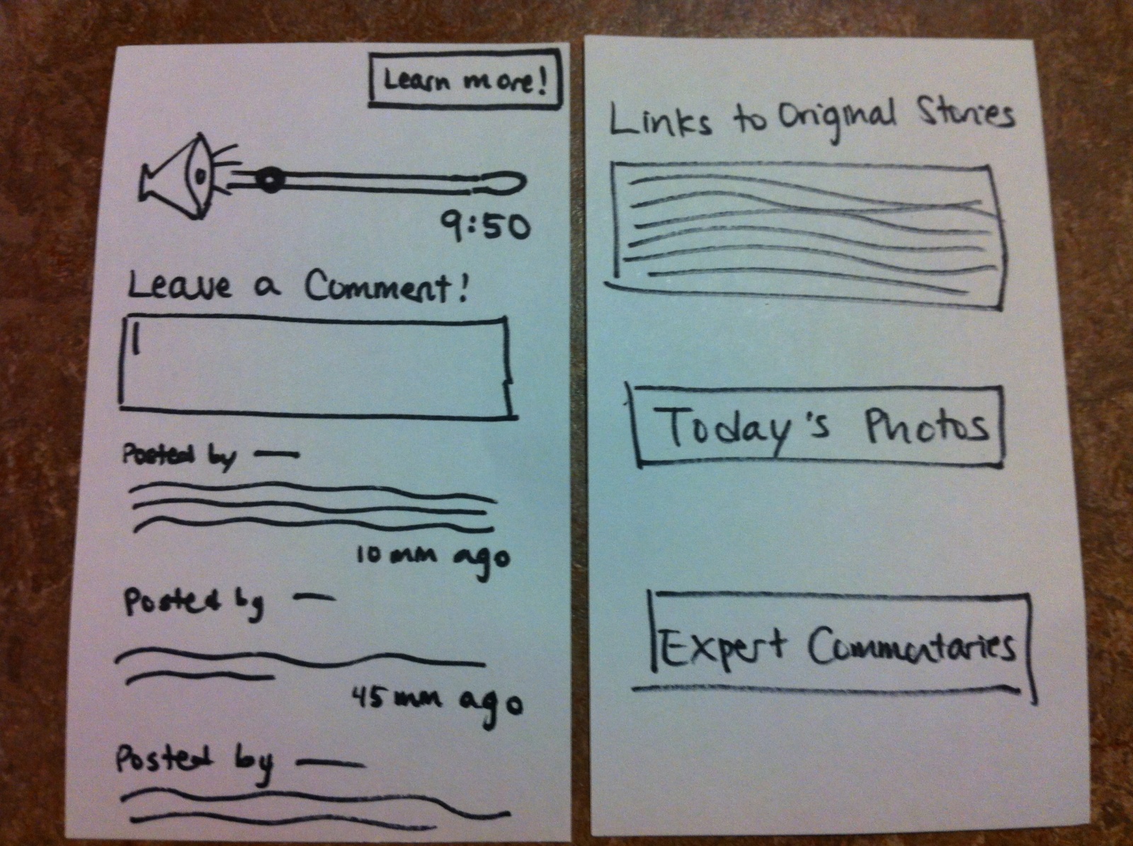
Task 1: Exporting Data to a Veterinarian
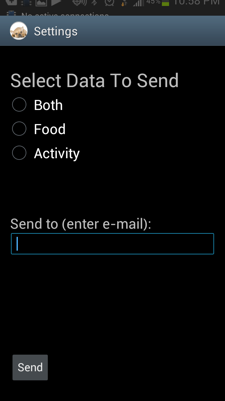
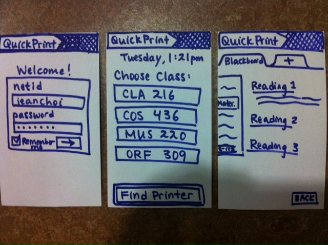
This prototype allows users to send either the mobile app’s collected diet data, activity data, or both via email. This functionality is intended to be used primarily to send data to veterinarians This is an easy task, as users need only to enter the “Generate Data” screen, select which type(s) of data they wish to send, enter an email address to which to send it, and press the “Send” button to complete the task.
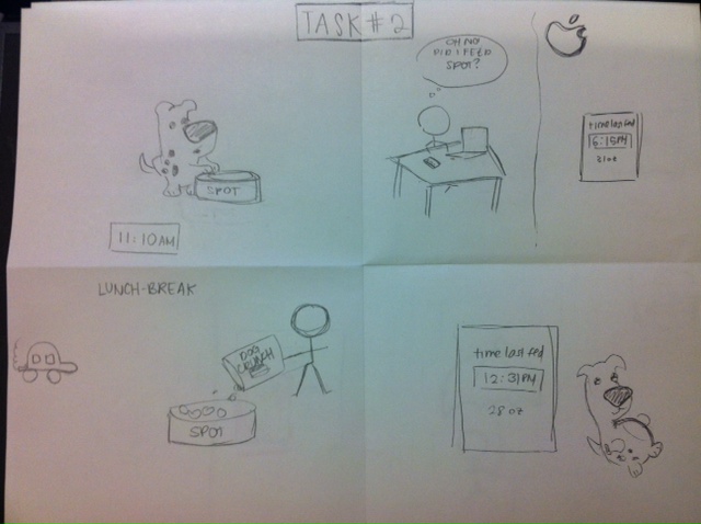
Task 2: Monitoring a Dog’s Diet
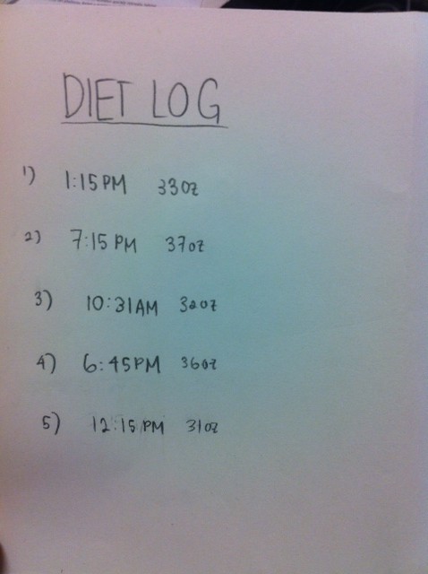
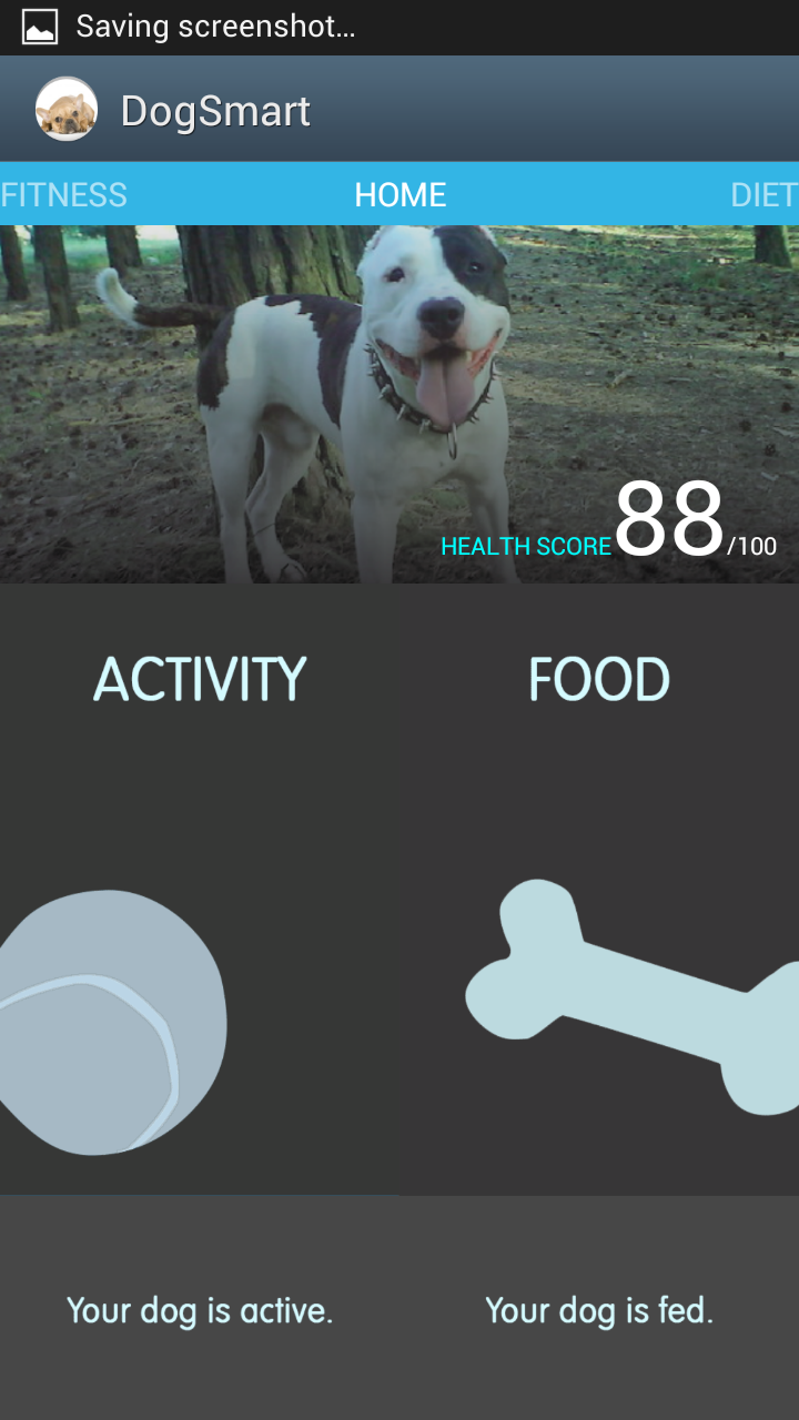
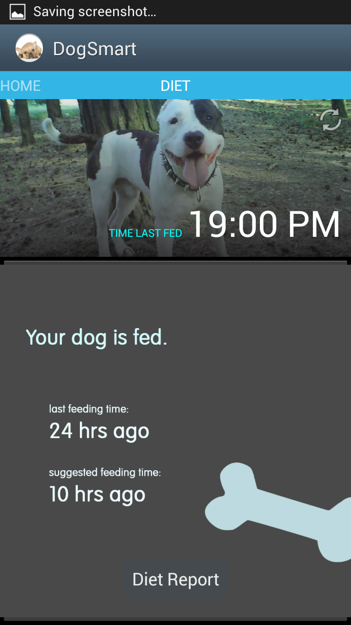
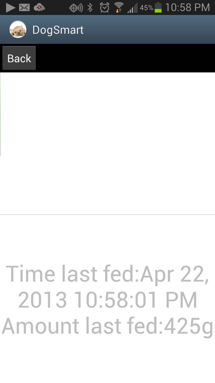
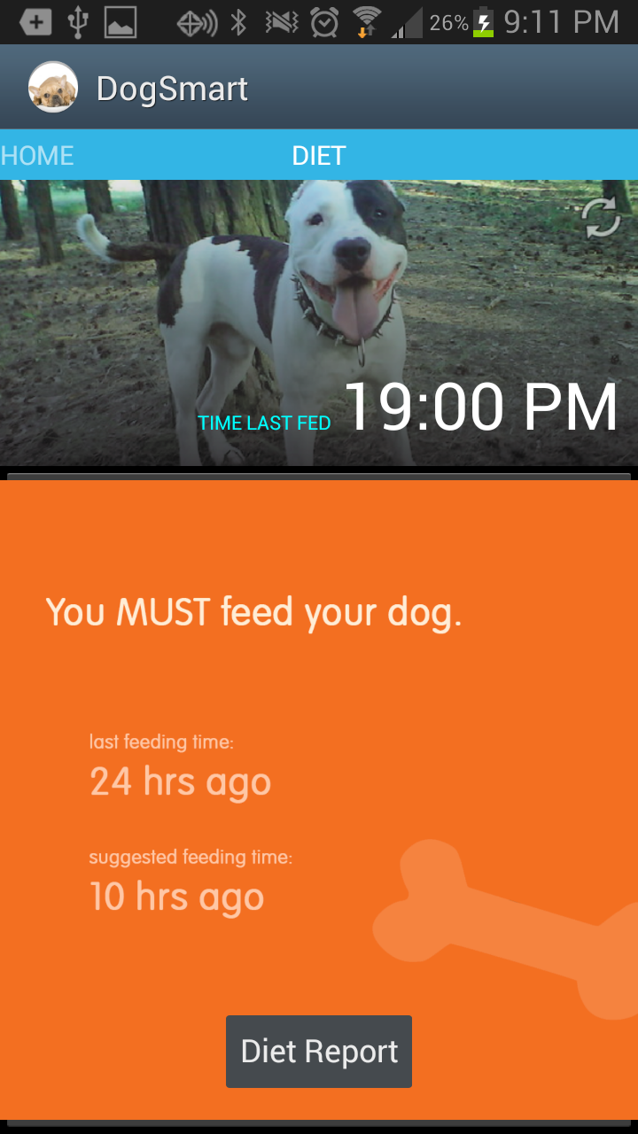
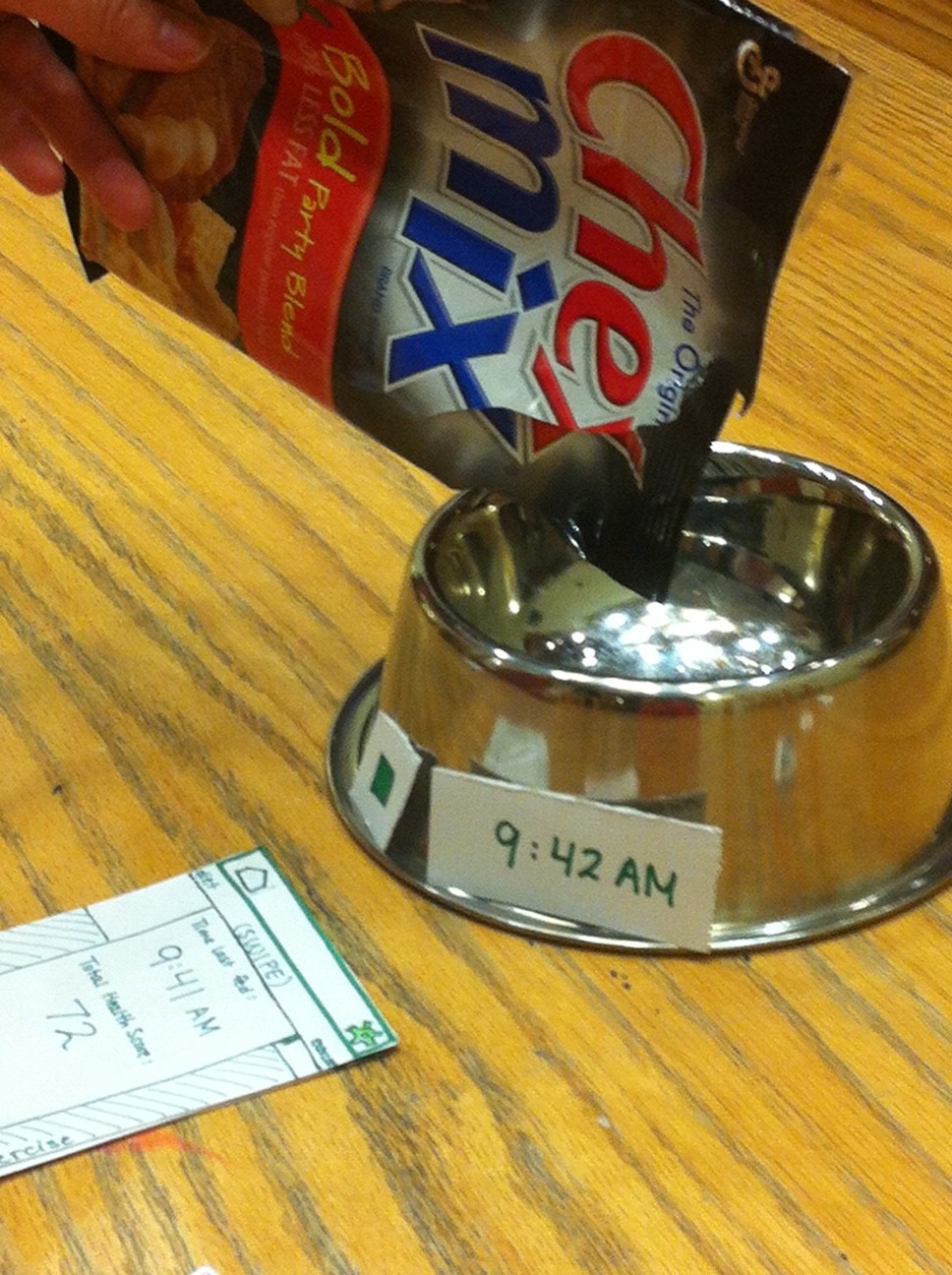
Our working prototype allows users to check whether or not they need to feed their dog based on when and how much their dog has been fed. They can view the time their dog was last fed as well as the weight of the food given at that time. This is a medium-difficulty task, as the user needs to interact with the dog bowl (but only by feeding their dog as they usually do), then interpret the data and suggestions given to them by the mobile app.
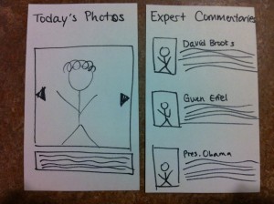
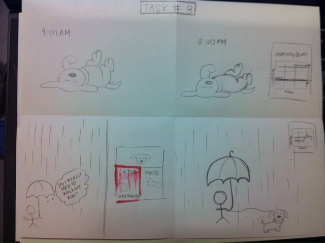
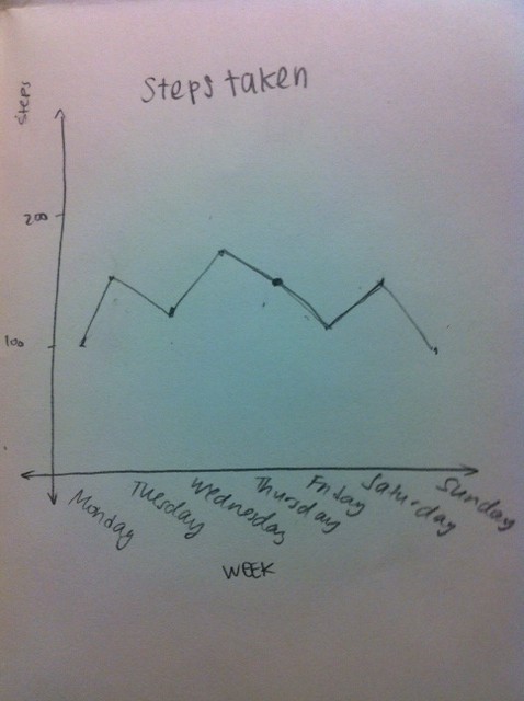
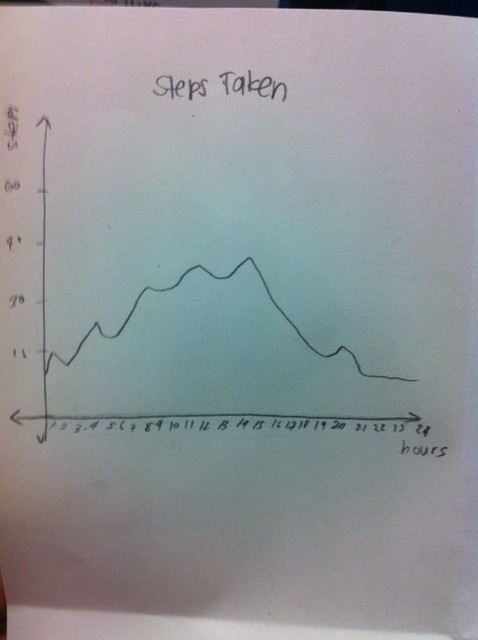
Task 3: Tracking a Dog’s Activity Level
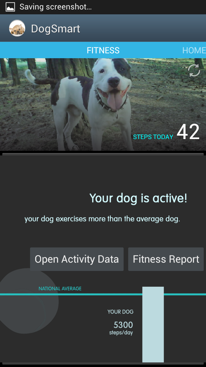
This working prototype allows users to track the number of steps their dog has taken over the course of a day, compare that value with a recommended number of daily steps, and view long-term aggregated activity data. In order to carry out this task, they must put our dog collar on their dog so that the collar can send data to our mobile app via bluetooth. This is a hard task for the user, as they must properly attach the dog-collar and interact with the live feedback given by the mobile app.
We have chosen these tasks because they are the primary tasks that we would like users to be able to complete using our finished system. The three tasks (communicating with a veterinarian, monitoring a dog’s diet, monitoring a dog’s activity/fitness level) are tasks that all dog-owners carry out to make sure their dog is healthy, and we wish to simplify these essential tasks while increasing their accuracy and scope. For example, while dog-owners already monitor a dog’s diet and activity by communicating with a dog’s other caretakers and using habit and short-term memory, we wish to simplify these tasks by putting the required data onto a mobile app, using quantitative measures, outputting simple suggestions based on quantitative analysis, and allowing long-term data storage. We relied heavily on interviews with dog-owners in choosing these tasks.
Procedure
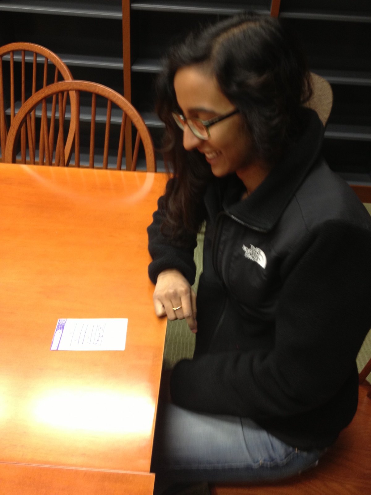
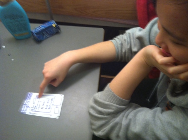
We conducted this study with three participants in the settings described above (see “Apparatus” section). We first had each participant sign a consent form and fill out a short questionnaire that asked for basic demographic information. Then, we read a scripted introduction to our system. After this introduction, we gave a short demonstration of our mobile app that involved sliding to each of the major pages and viewing the long-term activity level graphs. We then read from the Task scripts, which required users to interact with all parts of our system and give us spoken answers to prompted questions. During these tasks, we took notes on critical incidents. After the tasks were completed, we asked for general thoughts and feedback from the participants, then asked them to complete a questionnaire that measured satisfaction and included space for open-ended feedback.
Test Measures
- critical incidents: Critical incidents allowed us to see what parts of the system were unintuitive or difficult to use, what parts participants liked, if anything in our system might lead participants to make mistakes, etc. It allowed us to see how participants might interact with our system for the first time, and how they adjusted to the system over a short period of time.
- difficulty of each task (scale of 1-10): This allowed us to identify what parts of our system participants found most difficult to use, and whether we could simplify the procedure required to carry out these tasks.
- usefulness of mobile app in accomplishing each task compared to usual procedure (scale of 1-10): This allowed us to measure whether and how much our system improved upon current task procedures, and identify areas for improvement/simplification.
- relevancy of task to daily life (whether or not they perform this task as a dog owner): This allowed us to see whether any part of our system was superfluous, and which parts were essential. This would allow us to decide whether to eliminate or improve certain parts of our system.
- general feedback: This allowed users to give us feedback that might not be elicited by the specific questions in our questionnaire. It allowed us to collect more qualitative data about general opinions about the system as a whole, and also gave us insight into possible improvements or new features that participants might like to see in the next version of our system.
Results and Discussion
Participant 1 (Master Hecht), had never used an Android phone so he was unfamiliar with the swiping functionality of the home page, and was unsure how to access the settings page that helped to generate the report. He even mentioned how he would have spend about 1 minute learning the system if he was given an iPhone app, and maybe about 3 minutes since it was an Android app. Our user was really excited about the idea of tracking the dog as opposed to tracking the number of steps that his dog was taking. He thought that the data should be continuous as opposed to binary because it would provide greater functionality for the user–and be more interesting in general. He thought the dog feeding data that told him whether or not the dog had been fed wasn’t as useful as it could be. When he learned that the data actually had higher resolution (we could report the weight of the food in the bowl as well), he thought it would be more useful. In the post-questionnaire, our user said that the tasks were generally pretty easy, and the only trouble came from navigating through the pages of the app. He also mentioned how he would probably not use the export feature (task 1) simply because he, as a pet owner, didn’t have too much interaction with his veterinarian since his dog was normally healthy. When we applied the device to the actual dog, the accelerometer recorded the steps pretty accurately. The only problem was that the physical device was pretty bulky and provided a lot of weight to the little dog.
Participant 2 (Christine), an Android user, easily navigated the mobile application and completed all of the tasks in little time. For task 1, she had some trouble finding the “export data” popup, and felt that a non-Android user might not know where to find this button. For task 2, she pressed the “diet” and “food” columns on the homepage instead of swiping, which she said she found confusing. She easily interpreted the suggestion on the homepage that the dog should be walked. However, at first she misinterpreted the “already walked” step count with the recommended step count, though she quickly corrected her error. For task 3, she quickly interpreted the homepage alert that her dog needed to be fed, easily found the time last fed, and successfully used the dog bowl so that this time updated. In the post-task questionnaire, she reported that the tasks were all easy and that the app was useful in accomplishing all of the tasks. However, she said that Task 3 was not a task she would actually perform. She also suggested that if one of the diet or activity columns on the homepage is “lit up” because your dog should be fed/exercised, a click should take the user to the appropriate page. She thought that exporting data from the homepage was unintuitive, and that data should be exported from the page that displays that data. She reported that a useful feature would be allowing users to set up alarms for feeding, as that’s what she would use the app for. Overall, she thought the health score was not well explained, and that the “eating” functionality of the app was more useful to her.
Participant 3 (Emily), had little to no experience with the Android interface, and overall had more difficulties using the device. She commented that overall the android device interface was very difficult and non-intuitive. In Task 2, we noticed that the pedometer was more sensitive than it should have been, as it continued to increase in number even when it was barely moving. In Task 3 she had a bit of difficulty interpreting the time, since it was placed in military time. Overall, in the post-questionnaire she reported that she felt Task 1 wasn’t as important as Tasks 2 and 3, and she said that they were generally easy to perform. She noted, “If I knew more about using an Android it would have been much easier.” She felt that she would use the diet component of the device far more than the activity component, since she often must collaborate with her siblings and parents to figure out if the dog has already been fed. She also explained that she could benefit from notifications and calendar reminders, since she often relies on those for her daily routines.
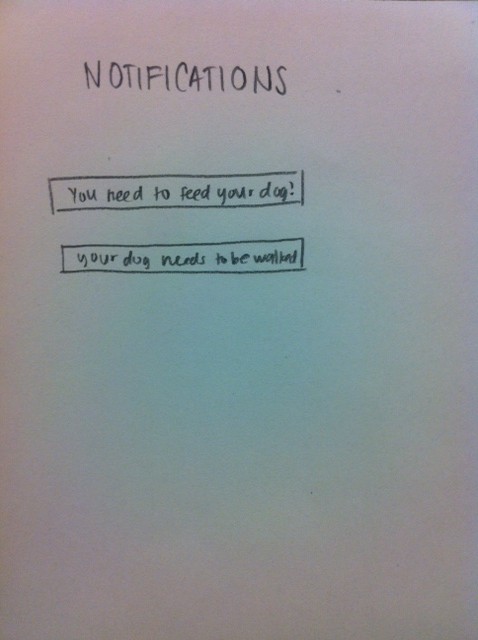
Overall, our users offered us valuable input that could prompt changes in the structuring of our prototype. We definitely need to make the “generate report” option in a more visible location, possibly already apparent on the home screen, or include in our demo a demonstration of how to use the menu option. In addition, allowing users to navigate to the “diet” and “activity” pages by clicking buttons on the home screen (in addition to, or perhaps in place of swiping) would make our mobile application interface more intuitive, as all of our users commented on this aspect of our interface. We could also develop our prototype to be accessible on both Android and IOS devices, so that users would feel more comfortable with the interface, given their previous experience. We might also incorporate more data about the weight of food placed in the bowl – for example, having a growing list of all times the dog has been fed the weight of the food at each time. This data could then be used to give the user more relevant information about their dog’s diet, so they could check when they missed a feeding, and if their dog is eating more/less than usual. Following suggestions given by both Emily and Christine, we are also considering adding a notification/alert system. Finally, as the pedometer was a little more sensitive than expected when testing with a real dog, and was also a little heavy for the small frame of our test dog (Caspian), we hope to update the pedometer and increase its accuracy by updating the threshold and compacting the device.
Appendices
Consent form:
https://docs.google.com/document/d/1FK5_7VmPZ3os32Q3CmF_3rFTRB_H8OUPCLy7xBNQ26k/edit?usp=sharing
Demographic Questionnaire:
https://docs.google.com/forms/d/1Cujqbl2Q_7GA9PFGzrrYe83vKs-CAeJY1Qso5g5WHuY/viewform
Demo Script:
https://docs.google.com/document/d/1W8unBcnXdMdZxjiDg7FT-lADs9LcMw_aOve7ByvXfi8/edit?usp=sharing
Raw Data
Critical Incident Logs:
https://docs.google.com/document/d/1Nzn7i44Cz2lIhsteAuCyvUOuY1HuCOEzsg17reM3GPM/edit?usp=sharing
https://docs.google.com/document/d/1hIF7L-jMsIHH6_Askf-Yz04eAQ4i4sPR3Ltu_DIaJoU/edit?usp=sharing
https://docs.google.com/document/d/1aNa13LMWkd9lv0nK7VLrjnOWwVPH3vR9l0fikY071hs/edit?usp=sharing
Questionnaire
https://docs.google.com/forms/d/138hWAz_omSI9VxOTm9TTANcGSCIwtzWcIX03HaKWMIQ/viewform
Questionnaire Responses
https://docs.google.com/spreadsheet/ccc?key=0AvIsHnhsuA4QdENhY1B3RlJPVFlGdzZYWENwalpJcnc&usp=sharing
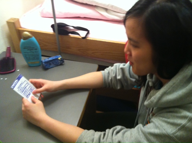
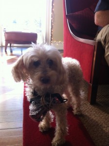
Pictures:


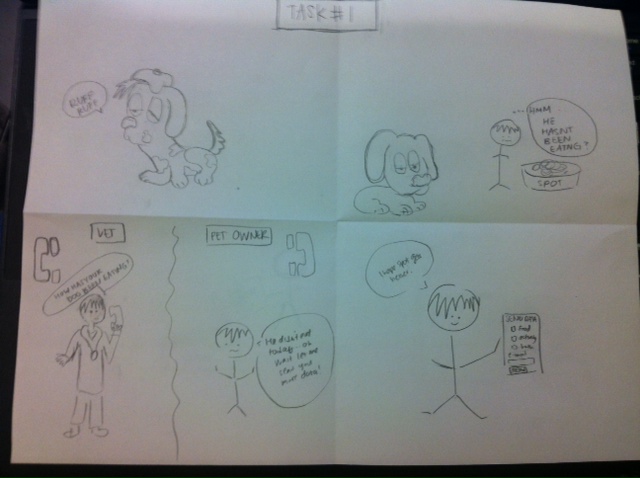


 3.
3. 
 2.
2.