Group 11 – Don’t worry about it.
Amy, Daniel, Krithin, Jonathan, Thomas
Project Summary
The NavBelt will help navigating around unfamiliar places safer and more convenient.
Introduction
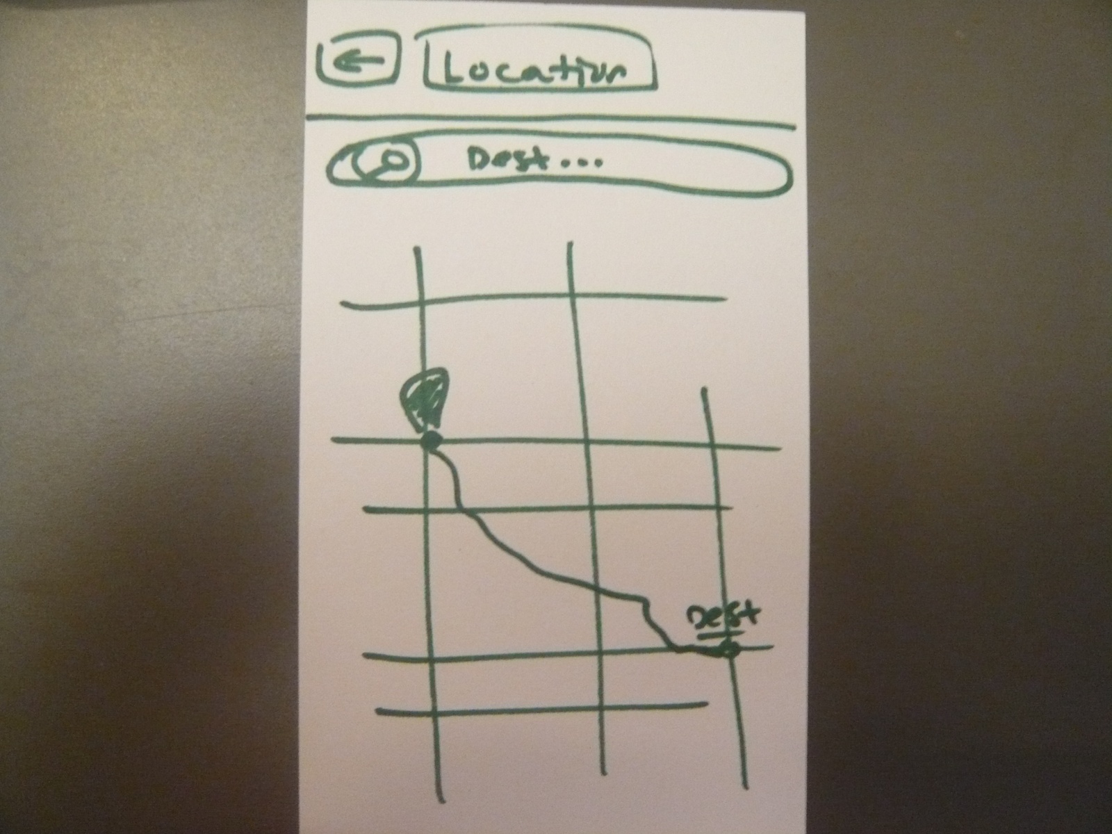
The NavBelt is a system for discreetly providing directions to its wearer. It comprises a belt with four embedded vibrating motors (‘buzzers’), an electronic compass, and a connection to a GPS-enabled smartphone. The phone computes a walking route (including intermediate waypoints) to a destination specified by the user on a familiar map interface, and, based on real-time location information obtained from the GPS, sends a signal to the Arduino indicating the direction the user needs to move to the next waypoint; the Arduino then measures the user’s current orientation using the electronic compass and activates the appropriate buzzer to let the user know which direction to move. The experiment will test how intuitive and effective our system is to use by testing a user’s ability to input directions into the interface, follow the directions with minimal reference to the map, and know when they’ve arrived at the destination.
Implementation and Improvements
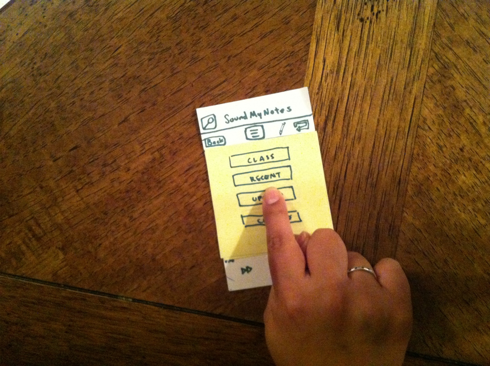
The link to our P5 submission is: http://blogs.princeton.edu/humancomputerinterface/2013/04/22/p5-expressive-navbelt-working-prototype/. The changes we made to the prototype since P5 include:
-
More durable construction of belt. The wires and buzzers are sewn into place, and now all four buzzers’ leads are soldered to a single four-pin connector which can be plugged directly into the Arduino. The Arduino and battery pack are also attached to the sides of the belt.
-
The phone component uses GPS to find the user’s current location and computes the absolute bearing along which the user should move to the next waypoint.
-
Our prototype now includes a compass module, and the Arduino uses that to compensate for the user’s orientation to calculate the relative bearing that the user should move along.
-
We preprogrammed a route for a tester to complete; this eliminates much of the wizard-of-Oz control from the P5 as we no longer signal each turn manually.
-
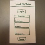
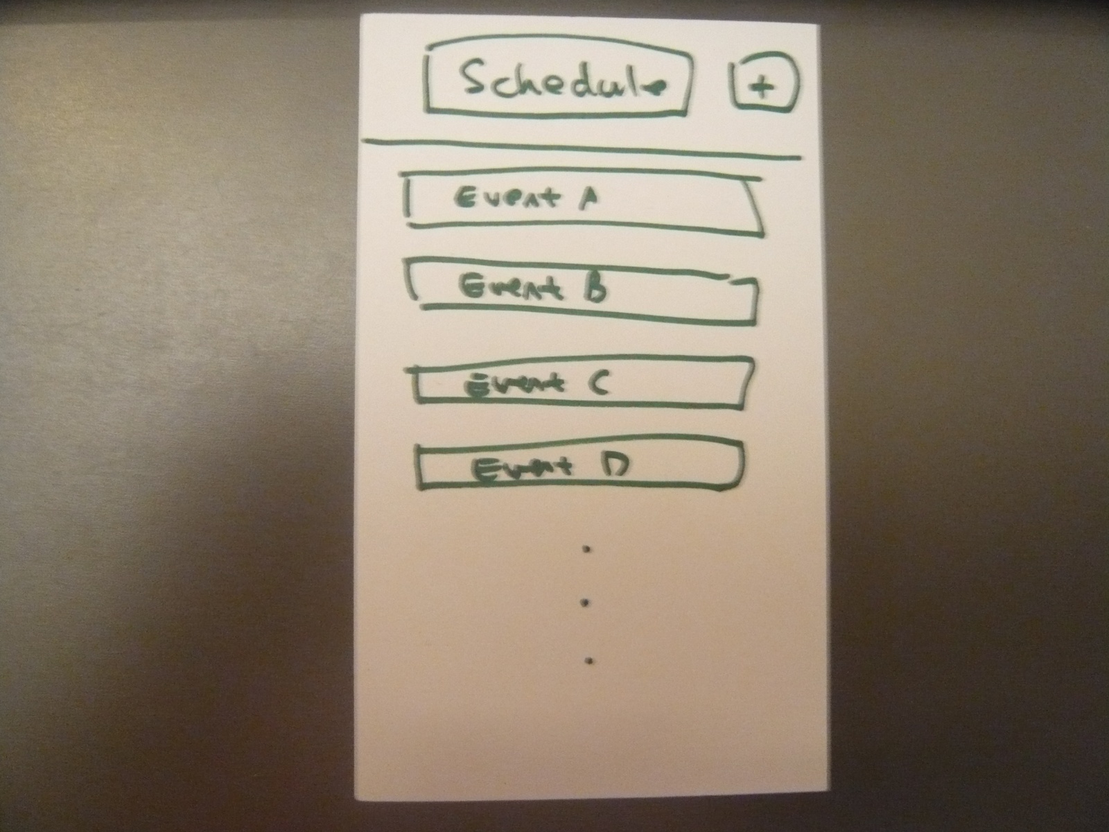
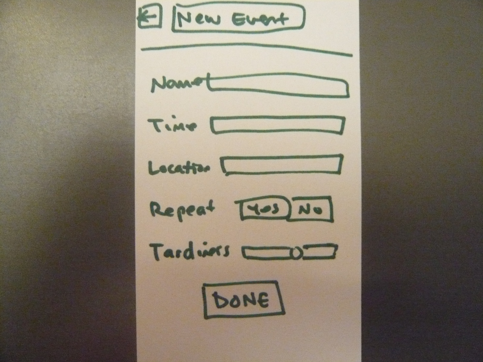
The phone UI is no longer a paper prototype. A tester enters a destination into Google Maps on an actual phone.
Method
Participants
We e-mailed listservs in search of interested participants. Our three testers are non-international Princeton students who had never been to the target destination, the Davis International Center. They are:
-
Helen Yang ‘14 – AB English
-
Marjorie Lam ‘13 – AB Psychology
-
Shawn Du ‘14 – AB Economics
Apparatus
Our apparatus includes a belt attached with four buzzers, an Arduino and an Android smartphone (along with a GPS), a battery pack, and a breadboard containing the compass and all the wires. The user wears the belt such that the buckle is near the user’s left hip, and the Arduino and breadboard are attached to the buckle; the battery pack is attached to the belt along the back. The user could either hold the phone upright or leave it in his/her pocket while traveling. This time, we held our tests outdoors. We mapped out a route from Friend Center to Davis International Center (78 Prospect Avenue), a location that many students are not familiar with. We recorded the route’s GPS coordinates using MyTrack.
Tasks
Our tasks have not changed from P5:
Task 1. Hard: Choose the destination and start the navigation system.
It should be obvious to the user when the belt “knows” where they want to go and they can start walking. For this task, we use Google Maps and wizard-of-oz the transition between choosing the destination and beginning their journey, since we currently have hardcoded the route and there is no way for the user to change it.
Task 2. Medium: Figure out when to turn.
When the user reaches a waypoint on the route, the phone vibrates and the buzzers start guiding the user to the next waypoint. The user’s goal is to notice these signals, understand them, and translate the buzzing signals into a new revised heading.
Task 3. Easy: Know when you’ve reached the destination and should stop walking.
This is signalled by all four buzzers vibrating, and then no vibrating thereafter.
We chose to keep our tasks the same because we think they are very appropriate gauges of the ease/difficulty of our system’s usability and a good measure of how intuitive/non-intuitive our system is to first-time users.
Procedure
We gave each user-tester a “pre-test demographic survey”, obtained their consent, and read to them the demo and interview scripts. We broke up our procedure for the users and us in the following table:
| Procedure for User | Procedure for Testers |
|---|---|
| Task 1 | |
| Start outside entrance to Friend Center | |
| Provide user with address | |
| Key in “78 Prospect Ave” in Google Maps | |
| Switch to prerecorded route map in MyTracks app. | |
| Observe route on map | Provide any clarification re. route as required |
| Switch to NavBelt app, with predefined waypoints | |
| Task 2 | |
| Observe buzzers start to buzz. Buzzer check: slowly turn on the spot and verify that they feel each buzzer in turn | Tell them to do that check. |
| Proceed to walk, following buzzers to make turns as appropriate | Explain the “think-aloud” process and video-record the user, staying behind them as to not inadvertently guide them to the destination. Maintain critical incident log. Try to stay slightly behind user, following their lead instead of inadvertently giving them directions. Intervene only to clear up some confusion or when something unexpected has gone wrong (e.g. phone app crashing) |
| Task 3 | |
| On observing phone vibration and all four belt buzzers go off at the same time: stop (at destination) | |
Test Measures
Task 1:
We did not make detailed observations here, because there is still a significant wizard-of-oz component to this task in our prototype. This happens because we chose to leave most of the functionality relating to this task unimplemented, as it is a purely software problem, and is the component furthest removed from the interesting HCI problem we’re trying to solve.
Task 2:
-
Task time – how long it takes to complete each route segment
-
rationale: To know how much longer it takes to use our belt versus a map on a phone. We can also use it as a proxy measure for confusion, because confused people walk more slowly.
-
In measuring this we took the time it took the user to travel from one waypoint to the next and subtracted the time spent on direct interactions with the experimenters, since we occasionally had to step in to correct for e.g. accidental user presses on the phone app that we know are going to be impossible in a production version.
-
-
Number of errors – coded by humans watching the video
-
rationale: To know how accurately a user can follow a GPS route using the belt.
-
We had to be careful in distinguishing between three types of errors:
-
trivial errors (phone screen reorientation, phone app restarting, accidental user taps on the debug controls in the phone app, etc)
-
inherent errors in our system leading to poor directions for the user (e.g. issues relating to discretization error in the direction signal from the phone)
-
errors from external conditions (poor GPS signals near trees and buildings).
-
-
We only count the latter two kinds of errors, since the first set can be trivially eliminated by making changes in the phone application, which we already know will need an overhaul to better support task 1.
-
-
Self-reported measures of satisfaction or dissatisfaction
-
rationale: in addition to how well the belt works, we want to know how intuitive the feedback system is to a user and whether it’s physically comfortable, things that are hard for us to measure externally.
-
Task 3:
-
Whether user noticed the three-buzzer signal at end of route and stopped
-
rationale: Simplest way to measure if the users were able to perform the task or not.
-
-
Self-reported measure of how easy that task was
-
rationale: So we can measure whether or not a user stopped because the user realized s/he has reached the destination and not from confusion.
-
Results and Discussion
All three participants successfully arrived at the destination, using only the belt for guidance. However, they moved much more slowly than they would have if they had known the route. A member of our team who knew the route (control group), walking at a comfortable pace, completed the journey in 5:51 minutes without the NavBelt. Excluding false starts and delays, our testers took an average of twice that amount of time; including those increased the duration by about 5 minutes more. We observed that our users seemed to spend some time at the start getting comfortable with the belt, but they seemed to overcome this learning curve fairly fast, since the ratio of the average user’s time to control time in the second path segment (2.80, excluding the third user, who was an outlier since he walked that segment twice) was much higher than that percentage excess in the fifth segment (1.35), even though these segments were of similar length.
| Finding initial waypoint | Walking south down Olden street | Crossing Olden | Crossing Prospect | Walking east along Prospect | Walking south to Davis Center | |||
| -1 -> 0 | 0 -> 1 | 1 -> 2 | 2 -> 3 | 3 -> 4 | 4 -> 5 | |||
| Krithin times | 1:15:00 | 1:22:00 | 0:10:00 | 0:14:00 | 1:38:00 | 1:12:00 | ||
| Helen times | 2:24:00 | 3:29:00 | 0:21:00 | 0:21:00 | 2:01:00 | 2:21:00 | ||
| Marjie times | 1:58:00 | 4:11:00 | 0:58:00 | 0:21:00 | 2:48:00 | ??? | ||
| Shawn | 2:13:00 | 1:29:00 | 0:12:00 | 0:18:00 | 1:48:00 | 2:22:00 | ||
Although we originally had concerns that crossing streets could be problematic, as there were several turns in close succession there, all of our users did not encounter problematic signals from the belt and consistently crossed those waypoints relatively quickly. From our data table, it looks like Marjie (our second tester) was an outlier here, but she was the exception that proves the rule – the video transcript shows that she was aware of which way the belt indicated she should go, but from her memory of the map knew that there was an alternative route as well, and took that time to point it out to us. It was also good to note that they incorporated the belt’s buzzing as just one signal instead of an absolute mandate – they still remembered to look and wait for vehicles to pass before crossing.
We learned during this study that our navbelt is a feasible way of guiding a person from one place to another. However, it is not yet the most intuitive way to convey directions to a user. We also learned that having a more robust prototype makes all of the tasks significantly easier. In earlier lo-fi tests, we had problems with users receiving signals intermittently or even losing connection to a buzzer altogether, which caused major confusion as they missed turns or got lost. However, during our hi-fi prototype testing we ascertained that even with functioning electronics, the system can still be confusing, and that this is due to design choices, not the hardware problems we experienced in the low-fi testing. For example, the NavBelt gave confusing signals because of environmental factors from trees and buildings.
Ideally, we would also change the form factor of the belt to make the compass more robust. Most of the components (the buzzers and the wires connecting them to the Arduino) were sewn onto the fabric of the belt, but the Arduino itself, the breadboard, and the battery pack were attached using only electrical tape. One of our testers kept hitting the compass with her elbow, leading to it being potentially jostled out of position and giving incorrect readings. This user also asked if she could wear her jacket over the belt, which would be nice but is currently impossible due to the fragility of the setup and technical limitations of the compass.
Appendices
Demographic questionnaire, scripts, consent forms, and post-test questionnaire are included here: https://docs.google.com/document/d/1Oac209Ao0ppf9nADVIFVcyrarSpfRdbEhgtbsLaYB4A/edit
Full logs of time taken to arrive at each waypoint are at:
https://docs.google.com/spreadsheet/ccc?key=0AlJC48ZIQyGidFBXRnhyYmRIY0NZbTF3dUJGSkJ2dXc#gid=0