Final Project Team Chewbacca

Group Number and Name
Group 14, Team Chewbacca

Eugene, Stephen, Jean, Karena

Description
Our project is a sys­tem con­sist­ing of a bowl, dog col­lar, and mobile app that helps busy own­ers take care of their dog by col­lect­ing and ana­lyz­ing data about the dog’s diet and fit­ness, and option­ally send­ing the owner noti­fi­ca­tions when they should feed or exer­cise their dog.

Projects
P1: Group Brainstorming
http://blogs.princeton.edu/humancomputerinterface/2013/02/22/p1-team-chewbacca/
P2: Contextual Inquiry and Task Analysis
http://blogs.princeton.edu/humancomputerinterface/2013/03/12/p2chewbacca/
P3: Low-Fidelity Prototype
http://blogs.princeton.edu/humancomputerinterface/2013/03/29/p3-lab-group-14/
P4: Usability Test with Lo-Fi Prototype
http://blogs.princeton.edu/humancomputerinterface/2013/04/08/p4-team-chewbacca/
P5: Working Prototype
http://blogs.princeton.edu/humancomputerinterface/2013/04/22/p5-group-14-team-chewbacca/
P6: Pilot Usability Study
http://blogs.princeton.edu/humancomputerinterface/2013/05/06/p6-team-chewbacca/

Project Video
http://www.youtube.com/watch?v=b1t13_luvkc&feature=em-upload_owner

Changes

1. Added the “generate report” button to the top “action bar” of the application. This way, users can see the button much more easily. We found in our testing that this was a significant problem for users who were inexperienced with the hardware of the Samsung Galaxy S3, where the settings button appears on the top right in that position.

2. Changed the home screen panels to actual buttons that would automate a swipe motion instead of doing nothing upon clicking. This makes it all right if the user identifies one of the panels as a button instead of swiping, since both actions will lead to the same place.

3. Instead of automating the “Wizard of Oz” functionality by pressing the panels five times, we changed it to the settings menu

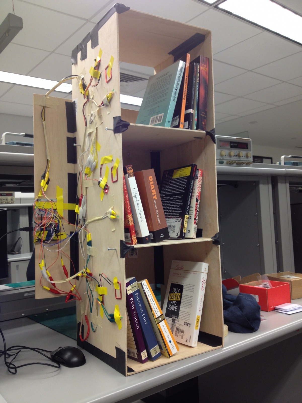
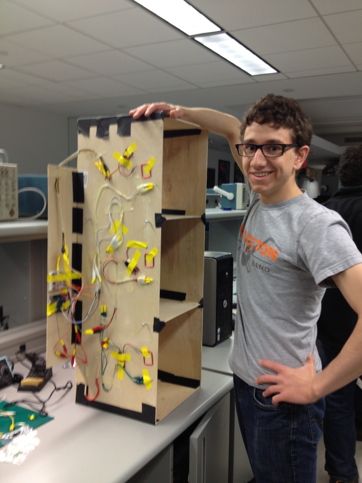
4. Redesigned collar for more compact design

Evolution of Goals/Design

Overall goal
When we began brainstorming the design of our system, we thought about making a convenient pet owner system that would integrate any feature related to owning a pet. This included adding features like  a GPS tracking device to detect the location of the dog, and a physical dog feeder that would release food at certain times in the day. As we began developing our project, we realized that we should make our app a lot more focused, and not just add any feature related to pet-owning. As we started performing contextual analysis and interviews with our users, busy dog owners, we realized maintaining the dog’s health should be our primary focus because they were too busy to keep track of their dog’s activity and health habits on a day-to-day basis-but also that they did not want to be overwhelmed with so much data. Therefore, our overall goal for the pet-owner system transformed from making pet-owning more convenient for the dog-owner, to allowing the user to maintain the dog’s health with three different tasks: tracking the dog’s diet pattern (how much it has eaten every day), tracking the dog’s activity level (how many steps it has taken every day), and being able to send the data to a veterinarian who can add further insight on the dog’s behavior.

Design changes to system
The design of our project also evolved considerably over the course of the semester.  In our initial sketches and prototypes, our mobile app functioned more as a data log than as a tool for data interpretation.  For example, in our paper prototype in P3, the homepage of our mobile app only included a “total health score” and the time the dog bowl was last filled.  It did not include suggestions about how to respond to or improve the health score, or provide feedback to the user about whether or not they should feed or walk their dog.  During our prototype testing in P4, this limitation of our system was brought to our attention by the feedback we received from users, as they expressed that they wanted direct, actionable feedback and recommendations from the mobile app.  Another major design change we made to our mobile app was to “hide” our more detailed data in separate pages that were linked from the main diet and activity pages, as prototype testers expressed being overwhelmed by the long-term data, and said that they would not access this data very often.  This also helped us to keep the most relevant information “above the fold” in keeping with Nielsen’s Heuristics (H8: Aesthetic and Minimalist Design).  Finally, we made changed the initial designs of both the dog bowl and collar by eliminating the time display panel on the dog bowl and the LEDs on both the bowl and collar.  We made this change because it did not communicate much information to the user, and we felt that this created a more minimalist design.

Critical Evaluation
As our system is currently implemented, there are several design obstacles that we need to address in order to turn this final prototype into a useful real-world system.  First, we need to fully integrate bluetooth into the functionality of our app, as we currently signal another application, Amarino, to run in the background and connect to bluetooth instead of handing this in the DogSmart application. We also must consider the scalability of this device to multiple users – our current system only accounts for one smartphone to control the device, but in the future we want users to access the data from their computers and also have other caretakers view and manage this data. We can also consider how we might adapt the device for other pets, such as cats, and what other constraints we might need to our app to make including other animals feasible.

However, we believe that these design changes are all feasible, and that with a reasonable amount of further iteration we could turn DogSmart into a real-world system.  At Communiversity, we spoke with a woman who runs a small dog-care business. We asked her a few questions, and gained some important pieces of information from her. Firstly, she commented that our system could be very useful for detecting sickness of dogs, since usually one can determine if a dog is sick by checking their health habits over an extended period of time. Additionally, she noted that this device could be very popular with dog owners, since they are often people who care very much about their dogs and are willing to purchase a variety of products to help their dog stay happy and healthy.

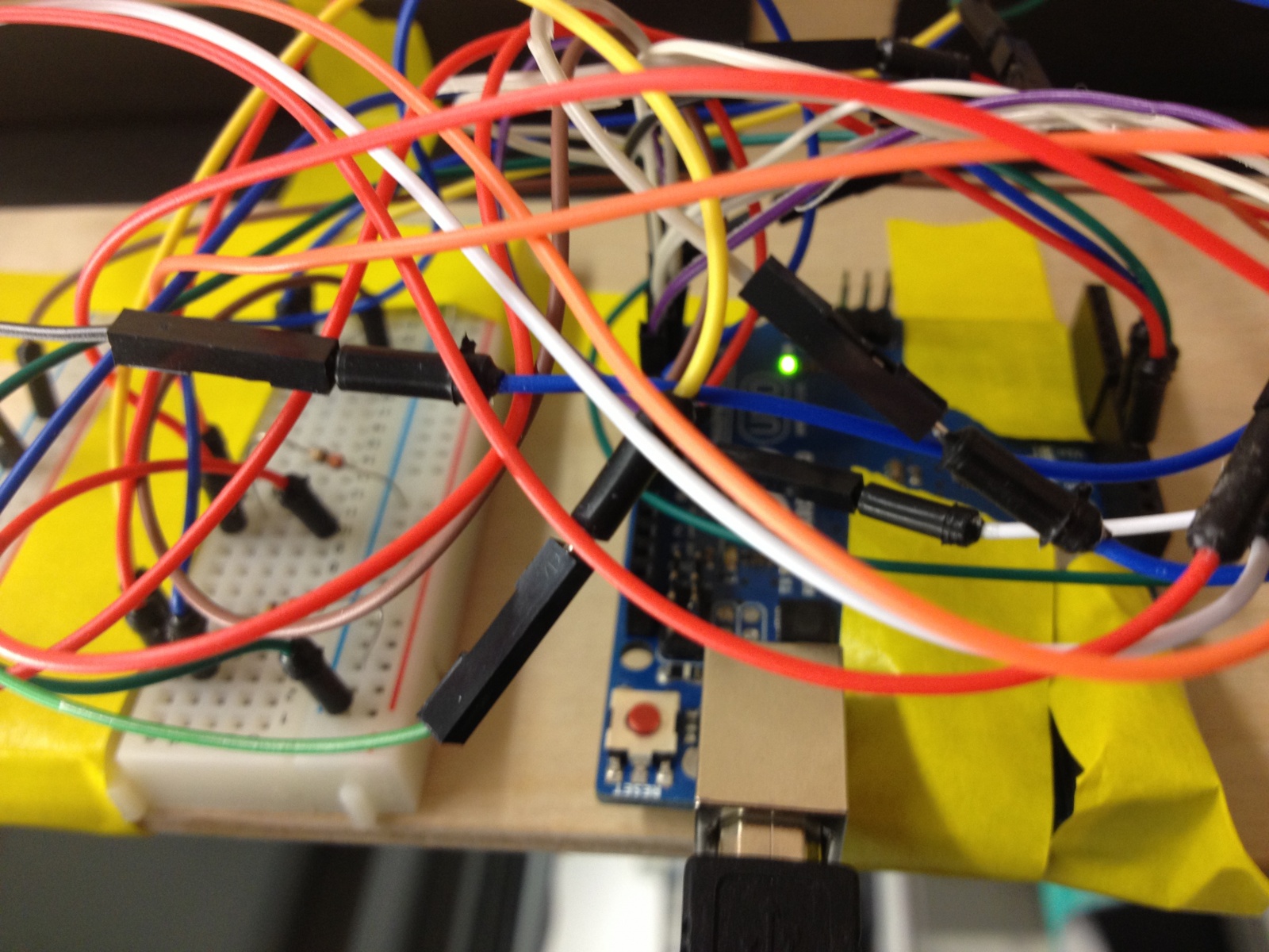
The process of creating and testing low- and high-fidelity prototypes has taught us a lot about both dog care and the technology requirements of this application space.  For example, by interviewing dog-owners through contextual inquiry and prototype testing we learned that dog care is mostly completed by habit and routine, so any application or system being implemented in this space must integrate seamlessly into the user’s everyday life, running in the background and enhancing their normal routine without being an intrusive presence.  Thus, this application space is an appropriate environment for ubiquitous computing systems, and throughout the development process for DogSmart we have worked to fit our system to this model of computing.  In addition, the process of developing our system taught us about how to integrate several different hardware/software systems together; this included using bluetooth communication to connect data from Arduino hardware/software to an Android app. During this process, we also realized the limitations of using Bluetooth and the complications that arise from these limitations. The Bluetooth device only has a limited range, meaning the data can only be transferred when the Bluetooth device is in the vicinity of the Android app. This meant we had to either ensure the dog was always in the range of the Android app, or configure a database in the Arduino software so the data stored in the Arduino could be transferred to the Android app.

Moving Forward
If we had more time, we would definitely focus on giving our mobile app the capacity to handle memory. Our app is currently only running in real-time, and outputs are based on sensor data that occurs during an event in real-time. If we were to incorporate a database into our mobile app, we would have the option of using the EEPROM database in Arduino or the SQLITE software in Android. We would also focus on incorporating real-world data about dog health into the program. This would mean identifying important measures of dog health including the recommended level of exercise for different dogs, and the corresponding amount of food they should eat based on their exercise level. If this data did not exist, we would likely have to talk to veterinarians or experts in animal health who could give reasonable answers. This data would allow us to give more accurate feedback to the user about their dog’s overall health, and to give more accurate recommendations. Alternatively, we could also establish a “baseline testing” period of using the system, where the device would collect data about the dog’s movement and eating levels, and then incorporate this into a baseline measurement. When the dog deviates from this baseline, the device could report it as non-healthy behavior.

More specifically, we would need to change all the features of our app for which we are currently using “Wizard-of-Oz” techniques. This includes having actual graphs for activity level and amounts of food that correspond to data that has actually been collected over time. This also means having the color changes corresponding to how urgent the situation is; how dire the situation is based on data collected over time (the last time the dog was fed and the dog’s activity level). We would also like to have a valid way of assessing the dog’s health and calculating the health score. This is related to having real-world data stored in our app or a “baseline” data set,, as mentioned above. In the future, we would like our generate report to compile a nicely formatted pdf of the data collected over time, and be able to e-mail the pdf to the veterinarian. Currently, it does not have the data, and therefore, we could not actually implement this feature. We would also like to be able to send reminder notifications to the user, telling them that their dog needs to be fed. This could be done either as a text message, or an Android reminder message. Finally, we would like the app to be customized to different types of dogs.. We would like the user to be able to enter the type of dog they have, and have the threshold for steps, and the recommended food and activity levels calibrated accordingly. Finally, we would like to make the picture on the home screen of the app customizable. This means enabling the user to upload a picture of their own dog. If we were to test users in the future, we would like to test several types of dogs with our app to see how it responds to different dogs. Furthermore, we would get feedback from users on how they might actually use the long term data, and from testing, identify how we would like to display the data collected. Lastly, we would likely talk to dog experts who could possibly help with the back-end analysis of data, and identify what features are useful for a veterinarian versus which features are not as useful. 

Source Code
https://dl.dropboxusercontent.com/u/85418085/CanineCare.zip

Third Party Code

Arduino
MeetAndroid.h library
http://code.google.com/p/amarino/source/browse/trunk/arduino_library/MeetAndroid/MeetAndroid.h?r=14
helps establish the bluetooth connection between the Arduino and the Android

Time.h library
http://playground.arduino.cc/Code/time
allows us to get the current time reading for the dog bowl updates

Android
Amarino libraries
http://www.amarino-toolkit.net
code that allows Android to establish bluetooth connection with the Arduino

SensorGraph
http://www.amarino-toolkit.net/index.php/download
part of the Amarino library that graphs real-time data collected via Bluetooth

GraphView
https://github.com/jjoe64/GraphView
a library that is used by the Sensor Graph code in the Amarino library

Date Format Library
http://developer.android.com/reference/java/text/DateFormat.html
a library that allows the date printed on the screen to be formatted

Date library
http://developer.android.com/reference/java/util/Date.html
allows the date to be read in as an object, and then manipulated easily

Tutorial for Sensor Graph
http://www.bygriz.com/portfolio/sensor-graph/#more-1344

Tutorial for Android Begin­ners
http://developer.android.com/guide/topics/ui/controls.html

Presentation Information

Click to access Poster.pdf


BlueCane Final Project Report

Group 17 Members: Evan, Jacob, Joseph, Xin Yang

Project Sum­mary: Our prototype is a navigational device for blind users that enables them to receive route-guided instructions via Blue­tooth and cardinal directions using hap­tic feedback.

Previous Project Posts
P1 — Brainstorming
P2 — Interviews and Storyboards
P3 — Prototyping!
P4 — User Testing
P5 — Working Prototype!
P6 — Testing with Target Users

Video

Changes to the Prototype

  • Added accelerometer: In order to get more accurate compass readings, we made use of an accelerometer to compensate for tilt of the magnetometer. With these changes, we are able to provide a more predictable experience for the user in the compass and navigation modes.

Evolution

The drastic evolution of our designs reveals a humbling lesson in the importance of truly understanding one’s users and their tasks before attempting to propose a solution. Our first design took the form of a “sonar glove” which would use distance detection to help the blind navigate their environments. Though we guessed that asking the blind to set aside their familiar canes to adopt such a system would require a fair amount of adjustment on their parts, we hardly began to understand the actual problems that they faced. Thus, when we finally got the chance to study cane travel and speak with blind users, we realized that the few advantages sonar could provide paled in comparison to the benefits that the standard cane already provided. Once we better understood the all issues that new technologies could address, we poured over our options and eventually to focus on enhancing cane travel both with and without GPS navigation.

Surprisingly, though the form and function of our design changed a great deal in a short time, our overall goal did not. We chose our first design idea because it seemed like a “cool” project, yet once we delved into user interviews and task analysis, we found that we had instead grown attached to the possibility of helping this group of people who so desperately needed better technologies to improve their quality of life. Thus, even when it seemed like we needed to throw out all of our ideas and start over, we remained true to the original intent of the project.

Critical Evaluation

Through the process of prototyping and receiving feedback on our device this semester, we definitely learned a lot about the problem we set out to solve. After talking with blind people in the community, it became clear that there’s room for improvement in the space of blind navigation technology. The people with whom we talked were especially concerned about affordable devices, since most existing technology comes in the form of highly-priced standalone hardware or software—little to none of which is covered by health insurance. On the other hand, we were surprised to learn that many blind people have taken to using smartphone apps. In its ideal form, our product would interact with the user’s phone and accomplish what neither an app nor a standalone piece of hardware could do by itself. In this sense, we believe our prototype could lead to a real-world, practical product and fill a substantial gap in the current market.

That being said, we have concerns about how accurately the prototype could deliver navigation instructions in its present form, and whether the current interface between phone and cane can be improved. Given that the iPhone and similar devices have built-in accelerometers, magnetometers, and vibration capability, we could feasibly develop a cane that attaches and holds the user’s phone instead of creating a redundant piece of hardware. This would be more affordable and provide a more reliable connection than Bluetooth has shown to provide. It would also allow the user to receive audible feedback in addition to tactile directions, which some users indicated that they would prefer. If we were to continue developing the product, we would explore these alternative designs and form factors to create the most flexible and accessible device for blind users.

Moving Forward

Moving forward, we’d focus on further refining the way information is transmitted through the ridges on the cane. Much of our feedback indicates that the two ridges the cane currently has are inconveniently located, making it easy to miss a turn signal. While we feel that ridges or a similar touch-based system can be an effective navigation aide, more work is required to determine an arrangement that is both ergonomic and informative. Reaching this configuration would require further testing with users, since we’d need an accurate indication of how the average blind user holds their cane. We’d need a larger number of test subjects to get an accurate cross-section of the blind population, and would likely need to test several different arrangements in parallel.

We’d also work on developing an intuitive GPS interface for the iPhone that would use our cane, and eventually an API that could be used by third party application and GPS developers. These could largely be based on existing GPS apps, but would still require some amount of user testing. Mechanically, we’d need to research further whether the device would work better as an integrated component of a full cane or as an attachment to other cane devices. Business and distribution models would probably play prominently in this decision, but we’d also need feedback from users to determine what they would prefer. This would likely take a form similar to our testing so far, but on a larger scale.

Codebase

Dropbox Link

Libraries Used
• ADXL345 Library-used to communicate with accelerometer: https://github.com/jenschr/Arduino-libraries/tree/master/ADXL345
• Arduino Servo Library-used to command servo for ridges: http://arduino.cc/en/Reference/Servo
• Magnetometer example code-used to communicate with magnetometer: http://dlnmh9ip6v2uc.cloudfront.net/datasheets/BreakoutBoards/Mag3110_v10.pde
• Arduino Wire Library-used to communicate with magnetometer: http://arduino.cc/de/Reference/Wire
• Bluetooth Shield example code-used to communicate with Bluetooth shield: http://www.seeedstudio.com/wiki/Bluetooth_Shield
• Arduino SoftwareSerial Library-used to communicate with Bluetooth shield: http://arduino.cc/en/Reference/SoftwareSerial
• Tilt compensation example code-used in tilt compensation calculations for compass: https://www.loveelectronics.co.uk/Tutorials/13/tilt-compensated-compass-arduino-tutorial
• Arduino Math Library-used in tilt compensation calculations for compass: http://arduino.cc/en/Math/H?from=Reference.Mathh

Poster Material
Dropbox Link

Oz Final Project

Group #21

  • David Dohan

  • Miles Yucht

  • Andrew Cheong

  • Shubhro Saha

Oz authenticates individuals into computer systems using sequences of basic hand gestures.

Links to previous blog posts:

Link to P1 Submission

Link to P2 Submission

Link to P3 Submission

Link to P4 Submission

Link to P5 Submission

Link to P6 Submission

Videos:

First trial: Video Demo

Sample use + voiceover:Video with voiceover

The key components of Oz are a webcam, browser plugin, and gesture recognition engine. We also use a black glove ease recognition in the prototype. When a user is on a login page (specifically Facebook for our prototype), they can select the Oz browser plugin and add a user to the system. After a user has been added, they may be selected in the plugin, and authenticated by entering their series of hand gestures. The chrome plugin uses a python script to handle acquiring and classifying the hand image from the webcam. The system is fully integrated into the browser.

Changes since P6:

  • Previously, all of the gesture acquisition was completed in Python code, as we thought that Oz would basically provide a simple API and take care of all of the image acquisition, simply handing the username/password (or a corresponding hash) to the browser. In this iteration, we developed a Chrome extension that dynamically interacts with the user and masks all of the low-level text interface that we used in P6.

  • In order to make the browser plugin more interactive and responsive to the user, the gesture acquisition code is now done in Javascript in the plugin.  This is the most visible change to the user.  This involved a significant rewrite of our plugin/script communication architecture.  The plugin includes interfaces to select the user, add new users, reset password, and login.

  • In moving user interaction into the plugin, we made several changes to the user interaction:

    • There is now explicit feedback to the user when a gesture is read in.  This is indicated by a graphic similar to the following one:

    • The user can select a recently used profile without any typing (by tapping it on a touch screen or clicking it with a mouse).  This means there is no need for keyboard interaction in many cases.

  • We made additional changes that are less obvious on the user-facing side in security.  We have modified our program so user information is encrypted using the series of gestures as a key for secure storage.

How our goals have changed since P1:

Over the course of the semester, we realized that although LEAP is a really cool and useful technology, it is rather tricky to use for hand pose recognition because it isn’t able to identify which finger is which, instead identifying fingers that are present and providing data about their position, width, length, direction, and other features. It was exceedingly difficult to accurately determine fingers based on just this information. Consequently, we moved from this approach to using a webcam, which provides much more raw data about the location of the hand, although only in 2 dimensions. However, using the OpenCV library, we were able to select out the hand from the image and pass the isolated hand features to an SVM. This produced much more reliable results and was much easier for us to use, with the downside of occasional confusion of similar gestures (for example, “peace-sign” vs “trigger”). However, by limiting the set of similar gestures and gathering a large amount of training data, the system now reports the correct gesture much more often.

Previously, we intended to incorporate facial recognition as a task completed by Oz during the user registration process. While the use of facial recognition is interesting and could be implemented for later versions of Oz, we as a group realized that acquiring training data and refining the hand gesture recognition algorithm was more significant. Since the current method of selecting the user profile accomplishes the same goal as facial recognition—minimizing keyboard interaction—we shifted our priorities away from facial recognition.

Critical evaluation of the project:

Obviously one of the goals of Oz is to supplant manual username/password entry with a keyboard, so in designing Oz, we must always be asking the question “How much does Oz improve the experience of logging into websites?” Heuristics to measure this include speed, reliability, and user enjoyment when compared to using the keyboard. Interestingly, though users seemed to have a difficult time using Oz, overall they rated the experience as highly enjoyable, perhaps due to the novelty of a contact-free gesture-based interface, even though Oz performed significantly more poorly than simply typing in a password. However, with further practice and refinement of gesture recognition, we suspect that it could easily compete with the speed that users enter in passwords using a keyboard, and if we were to include our original plans for facial recognition, the overall login process could possibly be faster than using the keyboard at all. However, any claim such as this needs to be verified through experiment before one can extrapolate to future performance of any product, Oz included.

The types of technology used in Oz are relatively inexpensive and widespread. We used a Microsoft Lifecam Cinema webcam in our prototype, but simpler, less expensive webcams would probably work just as well. The resolution of low- to mid-range webcams can probably resolve enough of the hand that they could work as a drop-in replacement for this webcam. Other materials used include a box and green paper (which are really inexpensive). Hence, from a cost-prohibitive standpoint, Oz (nearly) passes with flying colors; all that remains is to test it out with a lower cost webcam. That said, the actual apparatus box and all is rather bulky and at the moment remains somewhat nonintuitive for most users, as in, it doesn’t suggest the appropriate way to use the device, so different users made similar mistakes in using the device (one of the most common errors was the user not putting their hand far enough into the box).

Obviously, security is another serious concern when dealing with user credentials. There are two main fronts which Oz could be susceptible to attack: an attacker could either try to feign to be a user and imitate the hand gesture of another user, or he could also try to extract the password from the encrypted version stored in Oz. In the current implementation, the first method is actually quite feasible in the same way that an attacker could type in another user’s credentials to gain access to the user’s account, but with facial recognition to determine the user this becomes less trivial. As for the second concern, the current implementation of the program would be relatively easy for a skilled hacker to extract a password, but we saw the challenge in this project as building a device that interprets hand gestures, and making a working user authentication system is simply icing on the cake.

How could we move forward:

One of the biggest problems with Oz is the accuracy of recognizing gestures. One of the motivations behind Oz was that the space of hand gestures is larger than the space of characters in a password, but as we try to utilize more and more of this space, the error rate of misinterpreting a gesture as one nearby in the gesture space increases. For this to work as a reliable system, we need to ensure that this error rate is really low, so one step is to expand the set of usable, recognizable gestures while maintaining a low error rate. One possible way of addressing this issue is by using a depth camera, such as that in the Xbox Kinect camera. This would provide more information about the image to the SVM, and recent research in computer vision has made pose estimation using depth cameras more feasible for systems such as Oz.  Another plausible technique is using multiple camera from different perspective instead of only a top down view.  There are also many potential methods for choosing features to train on, but prototyping and testing each of these methods would have taken a prohibitively long time during the semester. Additionally, being able to take into account rotation and shadows in the Box would certainly enhance the accuracy of Oz, as would increasing the training data.

There are several other possible approaches to hand gesture authentication, each with its own set of tradeoffs on security versus robustness.  One such approach is to store a series of hand pose skeletons for each password.  When authenticating, Oz would check the total error between each gesture and the stored password.  If the total error is sufficiently small, then the password is accepted and the user authenticated.  Such a technique, however, doesn’t allow us to encrypt the user’s account passwords as we do in our current implementation.

One related issue is that different people have different understandings of what a gesture is, having different ways of . We could certainly write a tutorial to show users how to make the different gestures, but we could augment this by creating a new classifier for each user and having each user train their own classifier. The advantage of this is that Oz would be tolerant to between-user variation in gestures, as each user would provide their own training data for Oz (rather than use a default SVM that is the same for everyone). This also would make the system more sensitive to biometric differences between users.

Source code:

The source code is available on Github at http://github.com/dmrd/oz.git. The link for the final commit is https://github.com/dmrd/oz/commit/f252e70a5a434aeca28509e8d3dea9087b89ca84. If you really want a zip, you can get it at https://www.dropbox.com/s/9pmwwawrprnee4r/oz.zip.

Third-party code used:

  • The sklearn module: this module provides several machine-learning algorithms for use in Python. Specifically, we use the LinearSVC class which provides support-vector machine functionality.

  • The OpenCV (cv2)module: this module provides Python bindings to obtain images from the webcam and to preprocess those images in preparation for the machine learning step, including contour-finding and thresholding. Additionally, we use the numpy module because opencv internally represents arrays as numpy objects.

  • The slurpy module: this module provides a method for registering Python functions with and instance of a slurpy server which can then be called as normal functions from javascript.  We used this module to allow our Chrome plugin, which in written in Javascript, to call the gesture recognition code written in Python.

Links to printed materials at Demo day

https://www.dropbox.com/s/po5wnbmnxu0g6qv/poster.jpg is the link to our poster.


Lifehackers Final Project

Group 15: Lifehackers
Colleen, Gabriel, Prakhar

One-sentence description of your project

Our project is a glove that allows us to con­trol (sim­u­lated) phone actions by sens­ing var­i­ous hand gestures.

Hyperlinks to your blog posts for all previous project assignments (P1 to P6)

P1:
https://blogs.princeton.edu/humancomputerinterface/2013/02/22/life-hackers-p1/
P2:
https://blogs.princeton.edu/humancomputerinterface/2013/03/14/p2-life-hackers/
P3:
https://blogs.princeton.edu/humancomputerinterface/2013/03/29/p3-life-hackers/
P4:
https://blogs.princeton.edu/humancomputerinterface/2013/04/08/group-15-p4-lo-fi-user-testing/
P5:
https://blogs.princeton.edu/humancomputerinterface/2013/04/29/group-15-p5-working-prototype/
P6:
https://blogs.princeton.edu/humancomputerinterface/2013/05/06/p6-user-testing-of-gesture-glove/

Videos

Answering a call:

Playing Music:

Setting a Password and Unlocking the Phone:

List of Changes Implemented Since P6

  • Updating the unlock sketch to make it more intuitive and efficient. Now, instead of holding each gesture for 3 seconds, the sequence proceeds automatically when a user gets the correct gesture. The 3 second limit is still present for security purposes.
    This change was made because some users from P6 complained that the unlocking process was too long; they pointed out that unlocking should not be such a hassle.

  • The music player application code is updated to read gestures more frequently but register gestures only once if they are pressed and held.
    This was done because those who tested the application had difficulty using the music player because it was either too sensitive or not sensitive enough based on how the delay between readings was set. This allows us to keep a healthy level of responsiveness while removing the associated negative side effects.

Evolution of Goals and Design through the Semester

Our goals for this project evolved dramatically over the course of the semester. The original idea for our design came from an idea to play a game on your phone while running on a treadmill, in order to encourage users exercise. In an attempt to make it more practical, we then thought to generalize the idea for all types of interaction on a treadmill, instead of limiting it to a game. Then, for the contextual inquiries in the second project assignment, we realized that we could expand the target user group. We decided that it didn’t make sense for us to limit the application to users running on a treadmill, and that off screen interaction could be useful in other situations as well. Thus, we arrived at the idea to generalize off screen interaction with a phone for people going to class in cold weather; the medium that we chose for this was a glove, which is an article that currently interferes with smartphone interaction, but is also necessary to wear in cold weather.

After deciding on this idea, we had a lot more confidence in our project and its practical implications. However, when we approached the working prototype assignment, we hit another roadblock. We realized the difficulties involved in developing an application that alters native functionality of smart phones. This infeasibility led us to modify our goals of designing a smartphone application; thus, we changed our design so that it works on a series of Processing applications instead, on the computer. With further iteration and collaboration with mobile operating systems designers, our system can be developed into a true mobile application.

Critical Evaluation of Project

While developing our prototype, we came across a number of design difficulties that we would need to overcome before our project could become a real-world system. First of all, the glove would need to waterproof. We have proposed our system for use in the cold, which could mean precipitation and other elements of nature. This could be a problem for an electronic system which is sensitive to water. Along the same lines, our product is a pair of gloves, and people use their hands very often for all sorts of tasks. In our very first paper prototype, a cardboard “sensor” of the glove came off while a user was attempting to open a door while wearing it. We realized just how robust our gloves would need to be to withstand everyday use. However, waterproofing and strengthening our system could potentially add a fair amount of bulk to the gloves. We already found that sometimes it could be hard to move certain fingers because of the bulk, so a lot of work would have to go into considering these trade-offs and finding or developing materials that meet all of the gloves requirements.

One of the most important drawbacks of our current system is that it does not actually work on a phone. This is because smartphones do not allow 3rd party apps to access functionality such as picking up a phone. For our system to be viable, we would most likely need to have Apple and Google either enable use of it themselves, as a built in function for the phone, as can be done when controlling the phone with bluetooth or voice. We also found that such applications that control native functionality are also possible to implement on a rooted or jailbroken device. For instance, the application CallController lets iPhone owners use the accelerometer to answer calls. However, this obviously limits our potential user base. Finally, we can see making a system that works for people with different hand shapes, sizes and flexibilities being a huge challenge. People’s hands and the way that they make gestures can be very different. We need to develop a calibration mechanism to learn the threshold reading for when a user is flexing or pressing a sensor, and might even need to rely on machine learning to make the system truly adaptable to the variations in users.

With all this said, we do believe that the gesture glove could be a real world system. We learned a lot about the challenges of gesture interactions and gloves controllers, but none of the obstacles, as listed above, are impossible to overcome. We would mainly need to focus on making them suitable for the way users handle their gloves and make gestures, as well as partnering with smartphone companies. There is definitely a need for a better alternative for controlling smartphones outdoors or in the cold. With more cycles of redesigning and testing,  we imagine that our glove could be this alternative.

Future Steps

As mentioned above, one of the the main issues with our prototype currently is that the tasks are done on simplified simulations of a phone that we have created using Processing. We would solve this by approaching Apple and Android to discuss becoming partners on the project. We anticipate that this is not difficult to implement; this is more of a business problem. some of our main implementation problems are in waterproofing and strengthening the gloves. To solve this problem, without creating an overly bulky glove, we would want to use smaller sensors and integrate them into the gloves fabric. The outside of the glove would be made of a waterproof material. We would then test the product by allowing users with various lifestyles use the gloves for some period of time, say a month, and then see what condition the gloves are in and for what reason. We could then improve on the resilience of our gloves and do another round of testing until we are satisfied with the robustness of the gloves.

The main challenge in user-interaction with our system are creating gestures that work for everyone. The first step in solving this issue is to implement a calibration system. The user could open and close a fist and then press each of their fingers to their thumb. This would allow us to quickly determine custom threshold values for a particular user and set of sensors so that the program will from then on be able to tell when a user is flexing or pressing a sensor. Secondly, we would need to user-test the gestures we have chosen for the existing tasks and any more that we may choose to implement. We found that many users had issues with the gestures that we had chosen for our system. However, there was a lot of variation in the particular complaint they had–which gesture they were unhappy with and for what reason. This suggests to us that we will need a to test many different options for gestures with a much larger sample size of users. We may also experiment with different ways to make a more customizable system, either by offering different sets of gestures to choose from or allowing a user to make up their own gestures. We imagine that this would be the most difficult problem to solve.

Source Code

Source Code: https://www.dropbox.com/s/o6tqo7axfxsvlgp/FinalCode.zip

README: https://www.dropbox.com/s/ksej59d360c1t9b/README.txt?n=5352256

Third-Party Code Used

Demo Printed Materials

https://www.dropbox.com/sh/ang9lxss5ok4dx4/m7LcaaOP14

Final Blog Post – Group 11

Group 11: Don’t Worry About It

Amy

Daniel

Jonathan

Krithin

Thomas


A one-sentence description of your project:

The Nav­Belt will help nav­i­gat­ing around unfa­mil­iar places safer and more convenient.


Hyper-links to all previous project assignment blog posts:

P1 – http://amyzhou.ca/wordpress/?p=5

P2 – https://blogs.princeton.edu/humancomputerinterface/2013/03/11/p2-group-11-dont-worry-about-it-navbelt/

P3 – http://blogs.princeton.edu/humancomputerinterface/2013/03/27/p3-navbelt/

P4 – http://blogs.princeton.edu/humancomputerinterface/2013/04/08/p4-navbelt-lo-fidelity-testing/

P5 – http://blogs.princeton.edu/humancomputerinterface/2013/04/22/p5-expressive-navbelt-working-prototype/

(also with P5) – http://www.youtube.com/watch?v=dc86q3wBKvI&feature=youtu.be

P6 – http://blogs.princeton.edu/humancomputerinterface/2013/05/07/p6-navbelt-pilot-usability-test/


Video Demo:

 – http://www.youtube.com/watch?v=NJAR1AaNVUA&feature=em-share_video_user


Bullet list of changes since P6:

  • We changed the signalling protocol between the phone and the the Arduino

    • We used to signal 8 discrete desired heading, at 8 different specific frequencies, but have changed that to a continuous mapping between heading and frequency.

    • This allows the app to specify directions much more accurately.

  • We added a compass calibration routine, activated via a button in the phone UI.

    • This turned out to limit the accuracy of the directions we produced earlier.


How and why our goals/design evolved over the semester:

Our overall goal — to allow the user to navigate without constantly looking at a phone screen — has remained the same. However, we realized in the course of our testing that it is better for us to aim to complement the use of a visual map on the phone screen than to completely replace it. This is because some users still would like the map for information about their absolute position and the remaining distance to their destination, which is not easily learned through a tactile interface. In addition, we changed our final task from “reassure user that they’re on the right path” to “know when you’ve arrived”, because this was more concrete and far more measurable.

We have also made some concessions to practicality over the course of the semester. For instance, while we originally intended to use a BlueTooth connection between the Arduino and the phone, using an audio cable proved to be feasible and cheaper, and after realizing how much work installing each vibrating motor was going to involve, we ended up using only four buzzers instead of eight.

    We also flirted with a few changes that we did not stick with. For a while we considered building a web app rather than an Android app, an idea which we discarded because of the difficulty in playing audio from a web page on the fly with low enough latency. We also considered building a induction coil for bidirectional communication between the Arduino and phone, but this turned out to be both impractical and unnecessary.

Critical evaluation of our project:

    With further iteration, the NavBelt can definitely be a useful real-world system. There is a clear use case for this device, as it provides directions to a user while being less demanding of the user’s attention, and our testers appreciated that aspect of the system. Users testing the last iteration of our prototype were able to follow its directions with just a few seconds of explanation and very minimal intervention from us, indicating that we have tackled most of the major usability hurdles at this point. One of the as-yet untested aspects of the system is whether users will be able to put on and take off the belt themselves, since we always helped them with this in testing, but we expect that with a slightly more robust version of the belt users will be able to quickly learn to do this right.

    In addition, we were able to build this very cheaply, even though we were building a first prototype and therefore were prioritizing speed of prototyping over budget. The main expenses are the compass and the Arduino; if we were to produce this commercially we could use a simpler (and cheaper) chip than the Arduino. With economies of scale, we would probably be able to produce this for under $50, which is not bad for cool new tech.

    We have learned several things about the application space as a result of this project. One thing we learned is that obtaining accurate geo-location data is a challenge, as the resolution of the co-ordinates obtained through tools like Google maps is only good enough for navigation in a vehicle, not fine-grained enough to give accurate turning directions for a user on foot. We had to manually measure the coordinates of our waypoints using a phone GPS to get around this.

From the user testing of our implementations and our post-testing evaluations, we learned that the users tended to rely purely and completely on the belt readings. Perhaps because of the haptic nature of the belt, some users tended to treat its directions as though there were absolutely no uncertainties in the readings. We found this led to somewhat bizarre behavior, such as users wondering if they should go into or through a hedge bush versus an adjacent walking path, simply because the belt signaled them to turn slightly early – even though if they had been verbally told to turn right they would have applied a little more common sense and walked along the path. We believe this should be surmountable with both more highly accurate direction signaling and some habituation on the users’ part as they learn to interpret the signals from the belt.


Specific proposals for moving forward:

    If we had more time, we would consider setting up more buzzers on the NavBelt, to provide more fine-grained turning directions to the wearer. Of course, we would require further testing with users to determine whether or not this design would improve usability. Repeating our tests and data analysis from P6, which involved analyzing the completion times, the amount of time spent paused, and the number of navigation errors made, we are confident we would be able to easily gauge whether having more buzzers on the NavBelt would improve usability or not.

We also have the leftover challenge of implementing a slick map user-interface, one with a simple design and intuitive enough for anyone to learn and use quickly with ease. Ideally, a user would input a target destination in this interface, which would then generate a route towards the target. Currently, we hardcoded a series of waypoints, but a more complete design would calculate any path to any location in real-time. We plan to use Bing Maps API to implement turn-by-turn navigation and to use those coordinates as waypoints for the NavBelt. With further user testing we could observe and definitively test how long it takes user-testers to input a destination, start the belt, and begin the trek.


Link to .zip file – source code + readme file:

https://github.com/cadaeib/navbelt/archive/master.zip
https://github.com/munkeeboi/arduinoNavBelt/archive/master.zip

Third-party code used:

  • FFT code on the Arduino – to receive and translate tones from the Android
    ~ From the provided library


Links to PDF versions of all demo-session printed material:

PDF of poster: http://www.princeton.edu/~amyzhou/evolution_of_the_navbelt.pdf


Grupo Naidy Final Post

Group Name: Grupo Naidy

Group Number: 1

Group Members: Kuni Nagakura, Avneesh Sarwate, John Subosits, Joe Turchiano, Yaared Al-Mehairi

Project Summary: Our project is a serv­ing sys­tem for restau­rants, called Ser­vice­Center, that allows wait­ers to effi­ciently man­age orders and tasks by dis­play­ing infor­ma­tion about their tables.

All Previous Posts:

P1: http://blogs.princeton.edu/humancomputerinterface/2013/02/22/grupo-naidy-p1-brainstorming/

P2: http://blogs.princeton.edu/humancomputerinterface/2013/03/11/p2-grupo-naidy/

P3: http://blogs.princeton.edu/humancomputerinterface/2013/03/29/p3-groupo-naidy-group-1/

P4: http://blogs.princeton.edu/humancomputerinterface/2013/04/08/p4-grupo-naidy/

P5: http://blogs.princeton.edu/humancomputerinterface/2013/04/22/p5-grupo-naidy/

P6: http://blogs.princeton.edu/humancomputerinterface/2013/05/06/p6-grupo-naidy/


Our System :

Meet Joe. He’s a server at a restaurant, who takes orders from patrons. Using ServiceCenter, he can input orders into the system and can check cup statuses at his tables. When orders are ready, the members of the kitchen staff indicate that the orders need to be delivered. Joe must deliver orders to the table when they turn red on the motherboard.

Written Explanation:

Our prototype in the video above consists of a set of pressure-sensing coasters, a laptop, an HDMI cable, and a projector. Our pressure-sensing coasters are made out of plexiglass and aluminum sheets with FSRs attached, all hooked up to an arduino. The laptop is the central part of our system–it acts as both an interface for order input and a data collector for the Motherboard. We communicate data from the coasters (level of drinks) to the central part of our system via py.serial (creating a channel between the arduino and laptop) and OSC (for interdevice communication). We communicate the order inputs to the central part of our system via wifi to better simulate the interaction between the order device and central part of our system (i.e., we send information input to the laptop back to its online self because in the final prototype we envision having two pieces of hardware).  We communicate order status to the central part of our system similarly via wifi for identical reasons – order status is updated by the kitchen staff when an order is done and ready to be served. We communicate all table information from the laptop to the projector via HDMI cable. The projector, our Motherboard, displays a restaurant layout divided into sections and tables. Each table is a visual model that tells information about the levels of drinks and status of orders. The Motherboard centralizes any information required by a server and displays it in an intuitive format. Therefore servers need not worry about management of tasks, and only about completion of tasks, thus streamlining the service process.


Changes Since P6:

  • Include table number in Motherboard – This acts as a unique ID so all servers know which tables to looks at on the visual display when completing tasks.
  • Change colors to better reflect statuses and keep things consistent – Red alerts the server that a task needs attention immediately; yellow suggests that a task will require attention soon; green tells the server that a task does not require attention (it is less confusing to have the color coding be consistent across kinds of tasks).
  • Remove help button – We found in testing that the help button was not actually so useful; in particular, test users felt that in times of real need, verbal communication would be the easiest and most efficient means of server communication.
  • Turn input interface into a button + text box instead of just text box – Before, we had servers type in an order and command, but it is easier and more intuitive for a server to type in an order and just press a button (which simulates the effect of typing in the command)

 Evolution of goals:

Over the course of the semester the design and goals of our system has evolved and changed to a certain degree. In our initial brainstorming sessions, we first approached the problem as improving the experience of customers waiting for refills at bars/restaurants. However, as we began the design process, we quickly shifted towards aiding the actual servers in the restaurants (and through them, the customers). At first, we wanted our ServiceCenter system to consist of many different hardware devices. We wanted to have touch screen interfaces for both the servers to input orders and the kitchen staff to update order statuses that talked to a central computer feeding our Motherboard (just a large screen) table information to display. Early into the design, we realized that rather than worrying about obtaining the necessary hardware for such a plan, it would make much more sense to simulate the communication between these various hardware devices on as little hardware as possible, so as to ensure the functionality of our system (so that we could test the right aspects), but also at the same time guarantee the possible future step of bringing in newer and slicker hardware devices (which is easier with a working prototype).

Furthermore, initially we had planned for servers to have access to a simple ServiceCenter mobile app. The mobile app would allow logged-in servers to request help from other servers on the team at the click of a button. This would then appear as a universal notification on the Motherboard, alerting servers in the waiting area of their colleague’s request. This app we hoped would help servers at peak hours when work becomes more high-stressed due to the number of tasks to manage and complete. What we found in our testing was that in times of high stress like these, servers typically prefer to verbally communicate and pass messages along through colleagues. When asked, test users felt it was both inefficient and unnatural to ask for help using this app. One thing we may say is given that our tests were conducted in environments only similar to restaurants like dining halls/eating clubs, but not in actual eatery businesses, it could be the case that in real, busy restaurants an app to call for assistance could be useful. However, another thing to note is that in our field research, it was made clear to us that it is not necessarily appealing to customers to see their waiters using cellphones while serving them. So, this was another point we took into consideration. Thus, what began as a project to improve customer experience quickly changed into a system that helps servers/kitchen staff manage their tasks. As our project evolved, we decided to cut out certain features that we had originally thought would be useful, but upon testing found to be unnecessary.


Critical Evaluation of Project: 

The interface could certainly be made to be cleaner and easier to initialize. Currently, tables are positioned through center coordinates — a GUI that would let users set up their own table configuration. We also want to design a better way to sense the cup levels, since many restaurants don’t use coasters. However, in implementing and testing the basic functionality of our idea (a motherboard that conveys the status of orders and cups and an input system that lets you enter your table’s orders), we feel that with further refinement, it is very likely that this system would be useful in the real world.   Our usability testing and the feedback we received from it as well as the responses we have received when describing the project in casual conversation both indicate that people think that this system could improve the restaurant experience.

Our system was designed to address concerns and difficulties elicited during contextual interviews from people who work as servers in restaurants.  All three of our usability testers believed that they could complete their jobs with this new system more effectively than traditional ordering methods given that they had time to practice with it.  The tester who pointed out the most shortcomings to be improved, ended his review with “Great idea and beginning though! My dad owns a restaurant and his employees often are not highly skilled/trained and could benefit greatly from a system like this.” Upon hearing a description of the system, a friend remarked “So, it keeps waiters from coming over to your table and interrupting your meal.” Another colleague responded, “That’s pretty neat.  I could actually see that being used.”  While it is more difficult to predict profitability or how widely adopted the technology would be, it seems likely this system would be useful to some, if not many, restaurants.

We have learned a little bit about the application space of assistance hardware and software for restaurants.  Servers that we talked to said that the tasks that must be done as a waiter are not particularly difficult.  However, during busy rush times, the workload can become overwhelming.  In addition, prioritizing the different tasks that need to be accomplished can be difficult although this gets easier with experience.  Our system aims to mitigate this by presenting all the relevant information in one place.  While errors in delivering orders are rare, they do occur and can be bad for customer satisfaction, so our system helps to reduce their occurrence by making communication between servers and cooks permanent and reminding servers which table ordered each dish.  We also learned that the existing software for restaurants are clunky to use and have outdated appearances.  Potentially there is an opportunity for someone to improve the quality of available products by taking advantage of relatively inexpensive widely used technology such as the iPad instead of using lower resolution, proprietary displays.


Future Steps: 

There is plenty of room for improvement from the current version of our system. First, the display screen could be made more customizable. Currently it is possible to draw rectangular tables of any size in any place on the screen, but the way to do so is through directly programming the client to the display screen’s code. The display screen could be updated into an interactive GUI that allows for the creation of new tables of any shape, with the ability to drag them to any place on the screen.

The interface used for adding and deleting orders (on the server side) and updating orders (on the kitchen side) could also be improved. Currently all functionality is in place, but we might want to make it look more sleek and user-friendly. In addition, it only supports the three standard tables at the moment, but it could be easily updated to have a variable amount of tables.

Finally the actual hardware (and its casing) could be improved. The fidelity of the sensors are actually pretty reliable – and flexible according to the weight and size of the glass. The “coasters” that they fit in could be made to look as if they actually belong in a restaurant, though, and there may be some waterproofing issues that would need to be addressed for an object whose purpose is seemingly to keep the table from getting wet. Eventually we might want to replace the Arduino altogether with a dedicated device specifically made for the coasters; this would also presumably make it more compact.

We were also unable to test in the most ideal environment for our system–an actual restaurant. Based on our testing procedures, it seemed that the help button was not particularly useful to our users–we noticed that most people relied on verbal communication if they wanted assistance of any sort. If verbal communication is, indeed, sufficient for help requests even in a larger restaurant setting, then the help button unnecessary. Furthermore, having servers pull out a cell phone to call for help may not be the most ideal form of customer service–patrons are more used to verbal communication/signaling between servers. Thus, testing in a real restaurant environment would definitely help us further assess our design and functionality.

A Zip file of All Source Code is here.

Third Party Code:

  • PyGame–All of our graphics for the Motherboard were rendered using PyGame, an open source python videogame library: http://pygame.org/news.html
  •  Portions of Kuni’s Fall Independent Work Code were used on top of PyGame to make the rendering process easier.
  •  WxPython: Used to render the input system: http://www.wxpython.org/.
  • pyOSC: Used to communicate between python modules: https://trac.v2.nl/wiki/pyOSC
  • Arduino: Arduinos and FSRs were used for the hardware: http://www.arduino.cc/
  • pySerial–used to communicate between the Arduino and the python modules: http://pyserial.sourceforge.net/

Printed Materials for Demo Session:

Here is our Poster.

Runway – Natural & Intuitive 3D Modelling

Group number and name: #13, Team CAKE
Team members: Connie, Angie, Kiran, Edward

Project Summary

Run­way is a 3D mod­el­ling appli­ca­tion that makes 3D manip­u­la­tion more intu­itive by bring­ing vir­tual objects into the real world, allow­ing nat­ural 3D inter­ac­tion with mod­els using gestures.

Previous Blog Posts

P1: Group Brainstorming
P2: Contextual Inquiry and Task Analysis
P3: Low-Fidelity Prototype
P4: Usability Test with Lo-Fi Prototype
P5: Working Prototype
P6: Pilot Usability Study

Demo Video

In this video, we use augmented reality technologies to show the virtual 3D scenes floating in midair where the user sees them. These were produced in realtime – the images were not overlaid after the fact. Sometimes, you may notice that the user’s hand passes in front of where one of the objects appears to be located, and yet the object blocks the user’s hand. This is simply because the camera used to record the video has no depth sensor – it does not have any way of knowing that the virtual objects should appear in a location further from the camera than the user’s hand.

Changes since P6

  • Implemented third-person video capture: This allows us to take demo videos that show the objects floating in front of the user, as they see them. Previously, only the active user could see the objects, whereas a camera would just see two images on the screen
  • Implemented object creation: We added another operation mode that allows the user to create primitives at specified locations in the scene
  • Implemented object scaling: We added gestures to the object manipulation mode so that users could also scale objects. Inserting two fingers into an object activates scaling, while having one finger within the object and one outside of it activates rotation.
  • Improved performance: We implemented spatial partitioning data structures to improve the efficiency of several operations, allowing us to include more complicated meshes in our scenes

Evolution of Goals and Design

Our project goal has not changed significantly over the course of the semester, although our design focus has shifted from providing intuitive gestures to providing a usable system. Our goal has always been to provide a natural and intuitive user interface for 3D modeling by uniting a 3D workspace with a real-world interaction space. Because much of the core functionality of our application would be provided by existing hardware (e.g. 3D views from a 3D monitor and 3D gesture data from the Leap) the focus of our project design was originally to come up with an intuitive set of gestures to use for performing various 3D modeling tasks. As such, we used P4 to refine our gesture set based on how a user tends to act with a real, physical object. However, we found ourselves somewhat restricted while implementing these gestures (e.g. rotation especially), as we were limited to gestures that were easily recognizable by the hardware. As we attempted to refine the usability of our system, we began to focus more and more on dealing with aspects like stability and performance, which we found hindered users in P6 more than the gesture set itself. Thus, our focus has become much more myopic as we’ve realized that the basic usability of our application strongly affects the average user’s experience.

Our conception of our user base has also changed in light of the usability barriers we have come against. Originally, we targeted experienced 3D modelers who could make the most effective use of the functionality we provided; however, as we pared down our functionality to the scope of a semester-long project, we began to realize that 3D modelers would be using such an application at a much finer and much more sophisticated level than we could manage. Furthermore, as we struggled with the stability and performance of our implementation, we came to realize that it would take some time for modern hardware to catch up to the accuracy needed for 3D modeling. As a result, we began to focus more on making the application accessible to an average, inexperienced user who could give us more of an idea of how the typical user would approach a 3D modeling task, rather than observing the habitual methods of experienced 3D modelers. In this way, we could gain more insight into the system’s usability for general 3D interactions.

Critical Evaluation of System

Our work suggests that, with further iteration, Runway could definitely be turned into a useful real-world system. Our users found the system intuitive and relatively easy to use. They found the system to be more compelling than traditional 2D systems for 3D modelling, even with our small set of prototype functionality. The most interesting development for Runway would be to integrate our interaction paradigm of aligned gesture and stereoscopic display space with existing 3D modelling systems, which would take full advantage of these existing systems while providing the intuitive interface for interacting with 3D data that Runway provides.

Unfortunately, our users were at times greatly hindered by the instability of gesture detection with a Leap (in particular, detecting and distinguishing between clenched fists and pointing fingers). This could be improved in future iterations in both software (with control theory to stabilize gesture detection) and hardware (with more advanced sensors). The usability bottleneck is our hardware tracking robustness. The Leap Motion sensor is not sufficiently reliable and accurate, which causes frustration for our users. We could also improve the believability of the 3D representation. In order for the 3D display to be completely convincing, there should be face-tracking, so that the scene appears stationary as you move your head around. As hardware and algorithms improve, this type of interface will become more and more feasible.

In our application, the most task that users picked up most quickly on was the 3D painting task, for which the gesture seemed to be the most intuitive, as there was a direct analogue to finger painting on a physical object. This suggests that with the right gestures, this type of interface for 3D modelling would be intuitive and quick to pick up on. In the space of 3D modelling, the current applications are very complex and generally have tutorials and hints in the application as to what functions the user may want to access and how to access them. This was something that we lacked in our application, as well as something users commented on — the gestures may be more intuitive, but still require some memorisation, and could use some form of prompting in the background of the application. In addition, current 3D modelling systems allow for a significant degree of precision, which is lost with our current level of gestures and hand-tracking.

Further Work

Extending the functionality of our core application would be first priority in our subsequent work. This includes:

  • More robust and sophisticated gestures The inconsistency between the gestures users made and the interpreted command significantly hindered user experience with the application. To ameliorate this problem, we would like to integrate more robust gesture detection through software, and through hardware if possible. We would also like to further explore the possible gesture set to integrate more sophisticated gestures: in particular, rotation was something that users found difficult, and the gesture could likely be improved to be both more intuitive for the user and more robustly detected.
  • A gesture tutorial, along with better onscreen feedback on currently available gestures. During our user studies, we found that users commonly misunderstood or forgot the relevant gestures to achieve their goals. To mitigate this problem, we want to include not only a thorough demo and tutorial, but also a way to suggest and/or remind users of the available gestures within a mode. It would also be beneficial to have more useful feedback about gesture recognition and tracking state, for example having something pop up whenever users performed a gesture wrong or including a simple indicator for how many hands are currently being tracked.
  • Additional modelling operations commonly used in existing 3D modelling systems. Obviously, our system is not a fully fledged 3D modelling application yet. To become more useful, we want to implement more features that are commonly used in Maya or Blender, such as rigging, keyframing, as well as more complicated mesh manipulations such as face extrusion and mesh subdivision

In terms of additional functionality, we would love to include

  • Haptic feedback is another way that we can increase the believability of our system, as well as improve our understanding of how users perceive the stereoscopic objects. Something as simple as having vibrating actuators on a glove that buzz when the user touches an object will provide them with valuable feedback and intuition. This is also important to help perceptual ambiguities with stereoscopic objects, especially since the brain often cannot fuse the two images forming an object into a single virtual 3D object. Haptic feedback will augment the spatial output of the system so if spatio-visual output is unreliable, spatio-haptic output will suffice
  • Face-tracking is important for the believability of the stereoscopically rendered objects. Currently, if the user moves their head, the objects will appear to drift along with them instead of remaining stationary as if they were really floating in space. The easiest way to perform this is to put a fiducial marker (which looks like a barcode) on the 3D glasses, and use another webcam to track the position of that marker.

We would like to perform further testing with users in a more directed fashion to understand several of the issues we have noticed with our system that we did not specifically address in our hi-fi prototype. For example, because of the first-person nature of our system, it is difficult to assess how accurate our spatial calibration of gesture and display space is; in our current system we have a pointer element that follows the user’s fingertips, but we could perhaps study how easily users perform tasks without such a feedback element. Haptic feedback would also be helpful in this regard. We also did not perform long tests to assess the effects of gorilla arm, but we know that gorilla arm fatigue is a common problem with gestural systems. We could experiment with allowing users to rest their elbows on the table, and determine the effects of this on gestural stability and fatigue. Finally, once our system is more refined and more fundamental operations are available, we would like to test our system with experienced 3D modellers to see if they approach the task of 3D modelling the same way inexperienced users do. This would also help us determine if our system would be truly useful as an application.

Source Code

The source code for our project is available here (Dropbox)

Third Party Code

  • Unity3D: We are using the Unity Game Engine as the core of our application.
  • Leap Motion: We use the Leap Motion SDK to perform our hand-tracking and gesture recognition.
  • DotNumerics: We use the DotNumerics Linear Algebra C# Library for some of our calibration code
  • NYARToolkit: The NYARToolkit is an Augmented Reality C# library that we use to localize our third-person view webcam to record our demo videos
  • .NET Framework: Since our code was written exclusively in C# for Unity3D, we made ample use of Microsoft’s .NET framework
  • Although not used as source, we used ffmpeg as an integral component of our third-person video recording.

We did not directly use code that we had previously written, although the calibration process code was a direct extension of research performed in Edward’s Fall 2012 Independent Work.

Demo Session Materials

Our PDF presentation is available here

Biblio-File Final Post

a. Group information

Group num­ber: 18
Group name: %eiip
Erica (eportnoy@), Mario (mmcgil@), Bon­nie (bmeisenm@), Valya (vbarboy@)

b. Project description

Our project is a smart book­shelf sys­tem that keeps track of which books are in it.

c. Previous blog posts

P1: https://blogs.princeton.edu/humancomputerinterface/2013/02/19/biblio-file/
P2: https://blogs.princeton.edu/humancomputerinterface/2013/03/11/eiip-p2-interviews/
P3: https://blogs.princeton.edu/humancomputerinterface/2013/03/27/eiip-p3-low-fidelity-prototype/
P4: https://blogs.princeton.edu/humancomputerinterface/2013/04/07/eiip-p4-usability-testing/
P5: https://blogs.princeton.edu/humancomputerinterface/2013/04/22/biblio-file-p5/
P6: https://blogs.princeton.edu/humancomputerinterface/2013/05/06/biblio-file-p6/

d. Video

Here is a video demonstration of our final project and its capabilities.

Our final system, wired and ready to go!

This is our entire bookshelf, stocked with books, and ready to use.

Mario with Biblio-File. Success!!

e. List of changes since P6

  • We made the tag-query code on the Arduino interruptible, so that we can command a shelf LED to light up without waiting for the query to finish. This allows the shelf to respond more quickly to user requests to light up a shelf.
  • We were able to get the third RFID scanner working. It wasn’t working at the time of our P6 blog post, but after replacing some wires it is now functioning.
  • We cached the database to help our web application load faster.

f. How our goals and design evolved

Over the course of the semester, we revised our design to take into account the technical limitations of our hardware. For instance, we had originally envisioned having a setup in which each bookshelf’s RFID reader would statically sense the books on the shelf, and be able to report a change in the set of books it detected. This would have made the shelf somewhat more convenient to use, but it turned out to be impossible with the RFID readers we had (they had too short of a range and could only detect one ID at a time). We also added features, such as the system beeping when a book was successfully read, that gave the user more feedback, making the system more responsive. Many of these sorts of usability changes evolved from feedback from our user tests; our web-interface, especially, was refined and simplified greatly over the course of the semester, in response to tests which revealed overly complex or counterintuitive aspects of the interface.

Though our design changed greatly over the semester in response to technical limitations and user feedback, our design goals have remained basically the same: to create an intuitive, usable bookshelf to help users keep track of their books without getting in their way. The user-driven changes we made were all informed by this desire for simplicity and usability, and our final design reflects our constant pursuit of these design goals. Throughout our user tests with different iterations of our project, we found that our design goals resonated with users.

g. Critical evaluation of our project

Our final project is in some respects a success. Our user testing showed that users enjoyed interacting with it, and didn’t find the time constraints induced by the “tap-in, tap-out” system of RFID readers too annoying. We saw some exciting moments of “joy” as our users realized how the bookshelf worked, which was very gratifying. However, we’d be worried about the ability to scale our current system, and about the impacts of long-term use, which we weren’t able to effectively user-test. Because users have to tap in and tap out, it’s likely that over time, the database would become incomplete, and if the user ever decides not to wait to tap out books it’s hard for the database to recover enough to be useful again in the future.  Still, with further iterations, more involved user testing, and more exploration of available technologies, we think that our product definitely has the potential to become a useful real-world item.

From our project, we’ve learned a lot about the constraints of this space. Users we interviewed have a very emotional attachment to their books, which spurs dislike of systems that force constraints on them. Additionally, we’ve learned a lot about the technical constraints of RFID chips and scanners. Originally we believed that scanners would have a longer range and, more critically, that we would be able to read multiple RFID tags if multiple tags were present in the scanner range. We’ve since found that both these assumptions, at least when dealing with consumer-priced RFID tags and scanners, are false. Implementing the scanning software was also an interesting exercise; for example, we learned that we needed to power-cycle the RFID scanners in order for tag reading to effectively work.

h. Moving forward

Our first step in moving forward with this system would be to invest in higher-quality RFID readers; as mentioned above, readers that could passively sense the presence of multiple books at a longer range (say, about two feet) would make the system easier to use by eliminating the need to tap in and tap out. If we make this critical improvement, it will be necessary to conduct further user-testing to see how this change affects the system’s overall usability, and whether it introduces unexpected usability bugs. We would also invest in a real bookshelf to replace our plywood frame; while the shelf we currently have certainly works, it’s not pretty and is somewhat fragile. Having a nicer-looking and more solid shelf is also necessary for our system to be pleasant and usable.

In conducting further usability tests, we would stick to the same general scheme and set of tasks we used in previous tests, since the key tasks and goals of our system will not have changed. The main difference would be that the tasks would involve just putting the book on the shelf or taking it off (rather than tapping in and tapping out); this is a relatively minor change.

i. Source code

Our code is stored in a git repository which can be found here. You can use this to download and view all of our source code. There is also a README, which we linked to again for your convenience.

j. Third party code

  • pic2shop: A free smartphone app and API that provided us with ISBN barcode reading.
  • Google Books API: We used this API to obtain information such as book title, author, and cover image given the ISBN number extracted with pic2shop.
  • Heroku: We did not use Heroku code per se, but this is where our web app is hosted.
  • flask: flask is a Python-based web micro-framework. We wrote our web app using flask.
  • flaskr: An example flask app (a simple blog) which served as the foundation for our web app code.
  • Twitter Bootstrap (css library) and jQuery (js library): We utilize these in the frontend for our web app.
  • redis: We use redis, a simple key-value store database, for storing book information.
  • RFID Seeedstudio Library: This library provides the basis for our RFID reading. However, it only supports a single scanner at once, so we had to make significant edits to this code.

k. Materials for demo session

Everything that we will be presenting is saved here!