A3–Transloc

Group Members: Brian Huang, Krithin Sitaram, Prerna Ramachandra`

What were the most severe problems with the app/site? How do these problems fit
into Nielsen’s heuristic categories? What are some suggestions to fix the UI, and
how do your proposed changes relate to the heuristic categories?

  • No easy way to check when the next bus arrives (Android)–H7
    • After the first half hour we found such functionality does exist, but it involves clicking on a marker in the overlay that disappears when the screen is touched

→ Fix by having show/hide option

  • When multiple routes are selected, the map is too confusing to navigate–H8

→ Fix by displaying a message warning the user about cluttering the map

→ Having a legend to tell the user what each color code stands for.

  • Colour codes for routes not listed on the map–H6
    • And toggling to the routes list to figure out the colours takes too long because of data loading time

→ List color codes on the map

  • Cluttered UI, because current locations of buses always displayed (Android)–H8
    • This is distinct from the second criticism, but certainly is exacerbated. This is concerned with the fact that the large pins (representing buses) also clutters the interface.

→ Have an option to show/hide bus pins so map can be more easily navigated

  • No list of stops for each route (Android)–H6
    • Not what you’d expect of a transit app; it requires that you know which route you need before you use the app, which is detrimental to first-time users of the transit system.

→ Add list of stops when route is tapped on

  • ‘No route selected’ when you open the app / switch between agencies
  • No one uses Transloc to look at no routes, so this default is counterintuitive.

→ Use a smarter default, like displaying all routes

ii. Which problems, if any, were made easier to find (or potentially easier to correct)
by the list of Nielsen’s heuristics? (That is, if we had asked you to perform a
usability evaluation of the app/site without first discussing heuristics, what might
you have overlooked?)

  1. Flexibility and Efficiency of Use (H7): Transloc by default displays no routes on the map.  In order to view the status of any buses, the user must manually select them all (and on the Android does not even have a “select all” button).  This problem was easily recognized and corrected in light of the concern of H7 with efficiency of use by means of good defaults.
  2. User Control and Freedom (H3): Forcing the user to switch between route list and map reduces user control on the map and was made more obvious through H3
  3. Aesthetic and Minimalist Design (H8): Thinking about signal-to-noise ratios helped us realize that the clutter from displaying all routes was detrimental to the overall design and the efficiency of information communication.

iii. Did anyone encounter usability problems that seemed to not be included under
any of Nielsen’s heuristics? If so, what additional heuristics might you propose
for this type of application or site?

This was more of a general observation, in which some of the UI problems arose from have smaller buttons to click on, and not having an intuitively navigable interface. The problem of size of buttons, etc. seem to be specific to touchscreen interfaces like the iPhone/Android and having a heuristic specific for that might be helpful.

A useful heuristic for cross-platform applications (Transloc is available on Android, iPhone, and on the web) might ask whether features are consistent between platforms.  With respect to the Transloc app, the iPhone version seemed to be much more refined than the Android version, and both had some significant differences from the desktop version

iv. What might be some useful class discussion questions—or final exam questions—
related to heuristic evaluation?

Certain systems are aimed at a large body of users that are uninterested in reading documentation (example: Microsoft Word).  In such a case, what are some clever ways to embed documentation without giving the user a large body of text (that he/she will likely not read), while still conveying relevant information?

Individual Links:

Prerna Ramachandra (pramacha):
https://www.dropbox.com/s/as8qh90xtaz23vn/HCI_A3.pdf
Brian Huang (bwhuang):
https://www.dropbox.com/s/qeel7yige967898/HCI%20A3.pdf
Krithin Sitaram (krithin):
http://www.princeton.edu/~krithin/hci/A3.html

A3 – Score


Names: Adam Suczewski, Matt Drabick, Eugene Lee, Green Choi
I.

  • “Other Academics”
    • This seems like a violation of “recognition rather than recall.” This principle states that the interface should minimize the user’s memory load by making information visible. The “other academics” tab contains some of the most important on the page yet it is extremely difficult and unintuitive to find.
    • One way to fix this would be to rearrange the home page in order to showcase the most important information. Making important links for grades and enrollment more prominent would improve
  • Information overly pagified
    • This is a severe Efficiency of Use issue, information is broken up into too many pages, and in a non intuitive way. It’s seems like information such as grades or quintile information would intuitively be found on the “My Academics” tab. Instead it is a link on the enrollment->term information tab. The ‘term information’ subtab is not visible when the user is on the “My Academics” tab, where they would expect to find such information
    • Tabs could be merged together to display more information at once. For example, the ‘My Academics’ tab is just a single page, while ‘Enroll’ has several subtabs. Therefore, all of these tabs could be placed in one row, with My Academics highlighted to show its greater importance
    • Term information and My Academics could also be merged together. They are closely related by purpose.
    • While minimalism is important, it is equally important to not hide relevant information
  • Favorites doesn’t work
    • When you click the ‘add to favorites’ button (located in two places), on a subpage of the Student Center, it adds the Student Center main page to favorites.
    • Making pages like ‘My Grades’ able to be linked from favorites would provide a quick way to provide increased navigation efficiency without changing the underlying design.
  • “My Class Schedule”
    • The user is not given access to their own course schedule, while the front page shows a list of classes and times.
    • This seems to violate H9: Help users recognize, diagnose and recover from errors
    • It seems like the only way to fix this would be to actually allow access to the class schedule it shows during an enrollment period.
  • Enrollment appointments
    • When you click “View my enrollment dates” on “Term Information” in “Enroll” is displays an error message “You do not have access to enrollment at this time.”
    • This would again be a violation of H9: Help users recognize, diagnose and recover from errors
    • Instead it could actually tell you your valid enrollment dates or direct you to a Princeton website that shows when you can enroll in classes.


  • Lack of User Control and Freedom/Recovering from Errors
    • SCORE very frequently lacked simple, intuitive options for returning to previous menus or the main “Student Center” menu, especially when user interaction flow came to a halt in the case of errors or invalid requests.
      • This could be easily solved with simple “Return” or “Back” buttons on error screens or halts in user interaction stages.

II. Nielsen’s Heuristics

– The Help and Documentation problem was made much easier to find by Nielsen’s heuristics. We would probably not have thought to analyse this aspect were it not for Nielsen’s guidelines. We are all very accustomed to seeing unclear error messages on Score so we may not have second guessed them.


– Nielsen’s heuristics on Error Prevention as well as Recognition, Diagnosis, and Recovery in handling errors addressed issues that we may have easily overlooked, such as the ease of recovering from an error or issue on the site and the ease returning to normal interaction.

III. Non-Nielsen Problems
Privacy of information did not seem to really fall under any of the 10 heuristics. It seems like sensitive information (like SSN) was displayed on pages where the user would not expect that type of information to be displayed.

Likewise, the fact that Score is closed every night between 2am and 7am is not something a user should expect from a convenience store, not a website.

The site often has trouble allowing users to log in, giving the error message: “You are not authorized to log in to PeopleSoft HCM/CS”. This doesn’t seem to fit into an exact category, as one expects a website to give them consistent results when they try to log in and they are authorized.

IV. Useful Heuristic Questions
– A discussion of the most common and the most easy to fix heuristic problems may be useful. It may be useful to compile a sort of FAQ document for website projects, etc.
– A good final exam question may be to provide a screenshot of a website/app with some obvious and not-so-obvious heuristic errors, allowing students to highlight and explain them using Nielsen’s heuristics.
– Non-Nielsen problems may also be added for additional credit.
– A final exam question may be to provide improvable examples of interfaces and to ask for easy or creative ways to improve them given background knowledge of the user base and the nature of the service.

Links to our blogs:
Adam Suczewski: www.princeton.edu/~asuczews/A3.pdf
Green Choi: https://dl.dropbox.com/u/34418361/greenheuristics.pdf
Matthew Drabick: https://www.dropbox.com/s/8ozjibpzpdzq9y1/mdrabick%20-%20A3.pdf
Eugene Lee: http://www.princeton.edu/~eugenel/eugenel_A3.pdf

A3 — Blackboard

Jeff Snyder
Clayton Whetung
Peter Grabowski
Tae Jun Ham (tae)

  1. Most Severe Problems
    1. H8. Aesthetic and minimalist design / H7. Efficiency of use
      1. There is too much useless information on nearly every page. Consider, for example, the home page. There are links in the form of tabs across the top of every page (BookBag, EdTech services, etc.) that are rarely or never used by most users. Most of the screen real-estate is devoted to blank space or non-Blackboard links. In order to find desired information (course grades), the user must click through several long menus with many non-functional and useless options. We suggest removing unnecessary/rarely used information from the UI to enhance signal-to-noise ratio.
    2. H3. User Control and Freedom
      1. Blackboard presents the user with several situations where it is hard to exit or return to where you want to be. For example, when you start watching a video on video reserves, the back arrow (mysteriously) reloads the page.
    3. H4. Consistency and Standards
      1. There is no clear convention on where specific course items should be located, causing important information to be located in different locations for each course. For example it is very unclear where lecture slides should be posted on the course page, and their location varies from class to class. This makes it very difficult to find what is needed on the course page. In many situations, this results in a system where finding what you need consists of basic guess-and-check. On the video reserves page, Blackboard displays “start, end, and duration” with an unlabelled number after them. The purpose of this number is unclear — we believe it’s the amount of time in seconds for each of the categories.
  1. How did the heuristics help you?
    1. The heuristics were a useful guide throughout the process. We began by reading the list of heuristics, and used it as a “cheat sheet” of common design mistakes to watch out for. The heuristics helped frame our search for design mistakes, and gave us a common language with which to discuss them.
    2. There were also situations where we knew some element of the UI was frustrating to use, awkward, or poorly designed, yet we couldn’t find the words to describe exactly why. The heuristic categories helped us define the issues in a manner that is much easier to communicate to others (potentially including the site’s designers)


  1. Usability problems that didn’t fit into his heuristics
    1. Some basic errors were difficult to categorize. For example, in some places on the site (such as the course guide), there’s broken javascript. The “+” indicator will occasionally simply disappear. Similarly, the “back button” was broken on the video reserves page. Instead of taking you back to the last page, it simply reloaded the page. These could be potentially “jammed’ into one of the above heuristics, but in many cases were too simple a mistake to fit cleanly into a category.
    2. In many cases, the Blackboard interface allows users to customize the interface, hiding and showing certain parts, changing the appearance of objects, and adding and removing widgets. The amount of options provided to the user is large, but the changes made have minimal effect.


  1. Useful class discussion questions
    1. Is there ever a case where having copious text on the screen is useful? Compare craigslist vs. blackboard.
    2. Users may use their browser’s find function (Ctrl+F) to locate desired information. Should we incorporate this consideration when designing interfaces?
    3. Do these heuristics have a high enough fidelity? That is, do they represent specific enough categories for UI problems, or should they be more refined in order to effectively communicate problems? Is the opposite true, i.e. are they too specific?
    4. The disabilities information is displayed front and center for all students. This may be useful for blind students, as many web browsers offer the capability to read the web page to the user. However, this information occupies valuable screen real estate for all other users. Is this a good design decision? In general, do large benefits for a small group of users outweigh minor inconveniences for large groups of users? Is there another way this could have been designed that would optimize the experience for all users?
    5. What would make the best UI for class website / class blackboard page?
    6. How much customization is too much? At what point does giving the user interface options become problematic or lazy design?
    7. How can you make it clear to users what customization options are available?
    8. How do you strike the right balance between too little customization options and way too many?


Links to PDFs of each person’s individual heuristic evaluation

Tae Jun Ham : https://www.dropbox.com/s/ncysr627gnrh0s7/A3_TaeJunHam.pdf

Jeff Snyder : https://dl.dropbox.com/u/22057334/a3%20notes.pdf

Clayton Whetung : https://www.dropbox.com/s/4crnmhifsvxgl4y/Clayton%20Whetung%20-%20Heuristic%20Evaluation.pdf

Peter Grabowski : https://www.dropbox.com/s/4ncswkd8zvyqvsl/HCIA3.pdf


Lab 2 – Group 16

Group Members
Andrew Boik (aboik@)
Brian Huang (bwhuang@)
Kevin Lee (kevinlee@)
Saswathi Natta (snatta@)

Group 16

Description

We built three instruments: Instrument of Light, a light detecting theremin from a photo resistor); Lollipop (it kind of looks like one), a proximity theremin using a capacitive proximity sensor; and La Tromba, a trumpet from three FSRs (for valves) and a flex sensor with wind sail attachment (for simulating airflow). All three worked fairly well, except the trumpet was a little difficult to control and the proximity sensor didn’t have a very wide range. In all three, we used a buzzer for sound, except for the trumpet which used a piezo element initially and then a buzzer in the final version. We ultimately decided to develop the trumpet into our final instrument. We were motivated to build this instrument because one of our group members plays trumpet, and we thought it would be interesting to create an electronic version of the instrument. Our final version featured a buzzer instead of piezo element, and we tuned our flex sensor thresholds so less blowing/bending would be required. The combination of FSRs held down is mapped to actual trumpet notes, and the signal from the flex sensor simulates the partial, so bending it further will result in a higher pitch. Overall we think the final result was a success. We liked that we could actually kind of play a scale and go through the trumpet’s full range with it. Our attachment to the FSR was a little bit of a disappointment because it was nearly impossible to control the sound by blowing on it like you would on a real trumpet, so we ended up manually bending the flex sensor instead.

Video

La Tromba (initial)
Use FSR sensors as 3 buttons for the trumpet and the flex sensors to sense when user blows into the trumpet. Sound is only generated when the flex sensor is bent and certain FSR sensors are pressed

La Tromba (initial) Video

Instrument of Light
Depending on the value that the photo resistor outputs, the tone that the buzzer plays will change.

Instrument of Light Video

Lollipop
Music by proximity: Using a capacitive proximity sensor to moderate which pitch that the buzzer plays. The pitch is higher if a person is closer to the sensor.

Lollipop Video

La Tromba (final)

La Tromba (final) Video

Instructions

Instrument of Light (Photo resistor theremin) – Wire a photocell with a voltage divider, using a 10k resistor to ground, between one pin connected to 5V power and the other pin connected to a Arduino analog input pin to detect the resistance.  Wire a buzzer to a chosen Arduino digital output pin and the shorter end to ground.

La Tromba (FSR and flex sensor trumpet) – Wire 3 FSR sensors using 10k pull down resistors for each. Each combination of buttons will produce a different tone. Wire a flex sensor with a 10K pull down resistor inside a hollow tube and when it is bent by wind being blown, it will allow the buzzer to sound a tone.

Lollipop (Capacitive proximity sensor theremin) Wire a capacitive proximity sensor, which is essentially a bit of aluminum just as in http://playground.arduino.cc//Main/CapacitiveSensor?from=Main.CapSense and connect a buzzer to the arduino to output sound depending on the proximity of the person


Materials Used in Final Instrument

1 Arduino
1 Small breadboard
3 FSRs
1 Buzzer
1 Flex sensor
1 Paper wind sensor attachment to flex sensor
4 10K resistors


Code

La Tromba

Source Code Here

Instrument of Light

int light_pin = A0;

int speaker_pin = 8;
void setup() {
 Serial.begin(9600);
 pinMode(8, OUTPUT);
}
void loop() {
 while(1) {
 int reading = analogRead(light_pin);
 Serial.println(reading);
 tone(speaker_pin, reading);
 }
}

Lollipop

#include <CapacitiveSensor.h>
/*
 * CapacitiveSense Library Demo Sketch
 * Paul Badger 2008 edited 2013 by Princeton HCI lab group 16
 * Uses a high value resistor e.g. 10 megohm between send pin and receive pin
 * Resistor effects sensitivity, experiment with values, 50 kilohm - 50 megohm. Larger resistor values yield larger sensor values.
 * Receive pin is the sensor pin - try different amounts of foil/metal on this pin
 * Best results are obtained if sensor foil and wire is covered with an insulator such as paper or plastic sheet
 */
/* Modified by Lab Group 16 COS 436 HCI Spring 2013 */
CapacitiveSensor cs_4_2 = CapacitiveSensor(4,2); // 1 megohm resistor between pins 4 & 2, pin 2 is sensor pin, add wire, foil
long sensorValue;
long sensorHigh = 0;
long sensorLow = 2000;
void setup() 
{
 cs_4_2.set_CS_AutocaL_Millis(0xFFFFFFFF); // turn off autocalibra- //te on channel 1 - just as an example
 Serial.begin(9600);

 // upon starting, we have five seconds to give the proximity
 // detector an upper and lower bound
 while (millis() < 5000) {
 sensorValue = cs_4_2.capacitiveSensor(30);
 if (sensorValue > sensorHigh) {
 sensorHigh = sensorValue;
 }
 if (sensorValue < sensorLow) {
 sensorLow = sensorValue;
 }
 }
 Serial.print("sensorHigh = ");
 Serial.println(sensorHigh);
 Serial.print("sensorLow = ");
 Serial.println(sensorLow);
}
void loop() 
{
 sensorValue = cs_4_2.capacitiveSensor(30);

 // map the sensor values to a wide range of pitches
 int pitch = map(sensorValue, sensorLow, sensorHigh, 1047, 131);

 // play the tone for [duration] ms on pin 8
 tone(8, pitch);
}


A3 – iTunes Group

Sam, Yared, Connie, Alejandro

i. Major problems that we found include:

  • Inconsistencies in the left-hand menus (H4). We can fix this by keeping a left-hand menu present the whole time, rather than changing it constantly (this would also be consistent with the Finder).
  • Difficulty finding the Help file in Windows, and Help doesn’t occur while not online (H10). Have a question mark icon in the upper left-hand bar.
  • Inconsistency between top-bar menus (Music, Videos, etc.) (H4). Have “List” do the same thing in both, add an “Unplayed” option under Music, parallel to “Unwatched”.
  • The status window is used for all statuses, and will block out other information (H1). This can be fixed by splitting the status window into  several windows with specific purposes.
  • The user’s can’t stop the “Up Next” playlist from by default adding the next songs on a list to it. (H3). We could simply have this be something that the user can deactivate through the Preferences menu.

ii.

  • We wouldn’t necessarily have looked for “help” if we hadn’t been told to.
  • Most of the problems we found were issues that we encountered throughout extended use of the program in a normal setting. The challenge was then to see under which Nielsen heuristic these issues fit. In that sense, the Nielsen heuristics made us think more about what category these problems fit under and how we could change them.

iii.

  • Many users found “problems” related to the system changing form generation to generation. These are more about getting used to the changes than real “problems”, and do not fit within the Nielsen heuristics.
  • A heuristic we could use is “Generational Consistency” and “Cross-Platform Consistency”. 

iv.

  • Name five Nielsen heuristics.
  • How important do you think it is to keep programs consistent from one generation to the next? Should this be considered when judging the heuristics of a program?

Links to our PDFs:

Alejandro: https://www.dropbox.com/s/qobyn9i3zmoe59k/av_notes.pdf

Connie: https://docs.google.com/file/d/0B6ZddJLaXAx7N3duWUx5WVhRVTQ/edit?usp=sharing

Yared: https://www.dropbox.com/s/9g7frrclv2wc9hi/Heuristic%20Evaluation.pdf

Sam Payne: https://www.dropbox.com/s/9qgkodjdrnasy9u/SamPayneA3.pdf

A3 heuristic evaluation

Craigslist Evaluation

by Andrew Ferg, Ryan Soussan, John Subosits – aferg, rsoussan, subosits

aferg: https://www.dropbox.com/s/iao1pr387b4fagv/A3.pdf

rsoussan: https://www.dropbox.com/s/e1mk3oq5j647g5t/HCIIn_ClassAssignment.pdf

subosits: https://www.dropbox.com/s/tj3sb4ghyaiqhhg/Craigslist.docx

i) The most severe problem with the site in our opinion was the complete lack of regular structure to users posts. when seraching for a gig pr product, cost/pay is often not included, and the title of the post (which is all you see before clicking on the post for more info) has information in a random order (and occasionally tells you NOTHING useful about the product or event. Our suggested fixes included a more structured posting system, perhaps one with more guidelines, perhaps more categories in which to post, and certainly making price a required field for all posts, unless posting in the “free” category.

ii) Nielsen’s heuristics did not really seem to help a tin for this. A large deal of the hueristics were actually folowed, or were not very relevant to the context of the site, and the large overarching problems with craigslist were apparent from the beginning. However, it did help a bit to have the “Consistency and standards” and “error prevention” heuristics clearly stated.

iii) Since craigslist is a search-heavy site, it would be very useful to add more filtering criteria in order to improve the search function, and find other ways to improve the searching experiece (e.g. return related searches when there are no/few results, rather than just displaying a “nothing found” message.

iv)

1. Match prototyping example, including heuristic evaluation to a picture or example of them in use, or a situation in which they are being iplemented effectively.

2. Match each of the 10 heuristics to a picture or example of it being very well or very poorly used.

P2: Contextual Inquiry and Task Analysis

Group 24:
Bereket Abraham
Andrew Ferg
Lauren Berdick
Ryan Soussan

P2: Contextual Inquiry and Task Analysis
The Cereal Killers

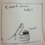
Brisq: A Gesture Control Device
cereal_logo

Problem: Current WIMP and touchscreen interfaces force you to constantly use your hands in order to interact with a computer.
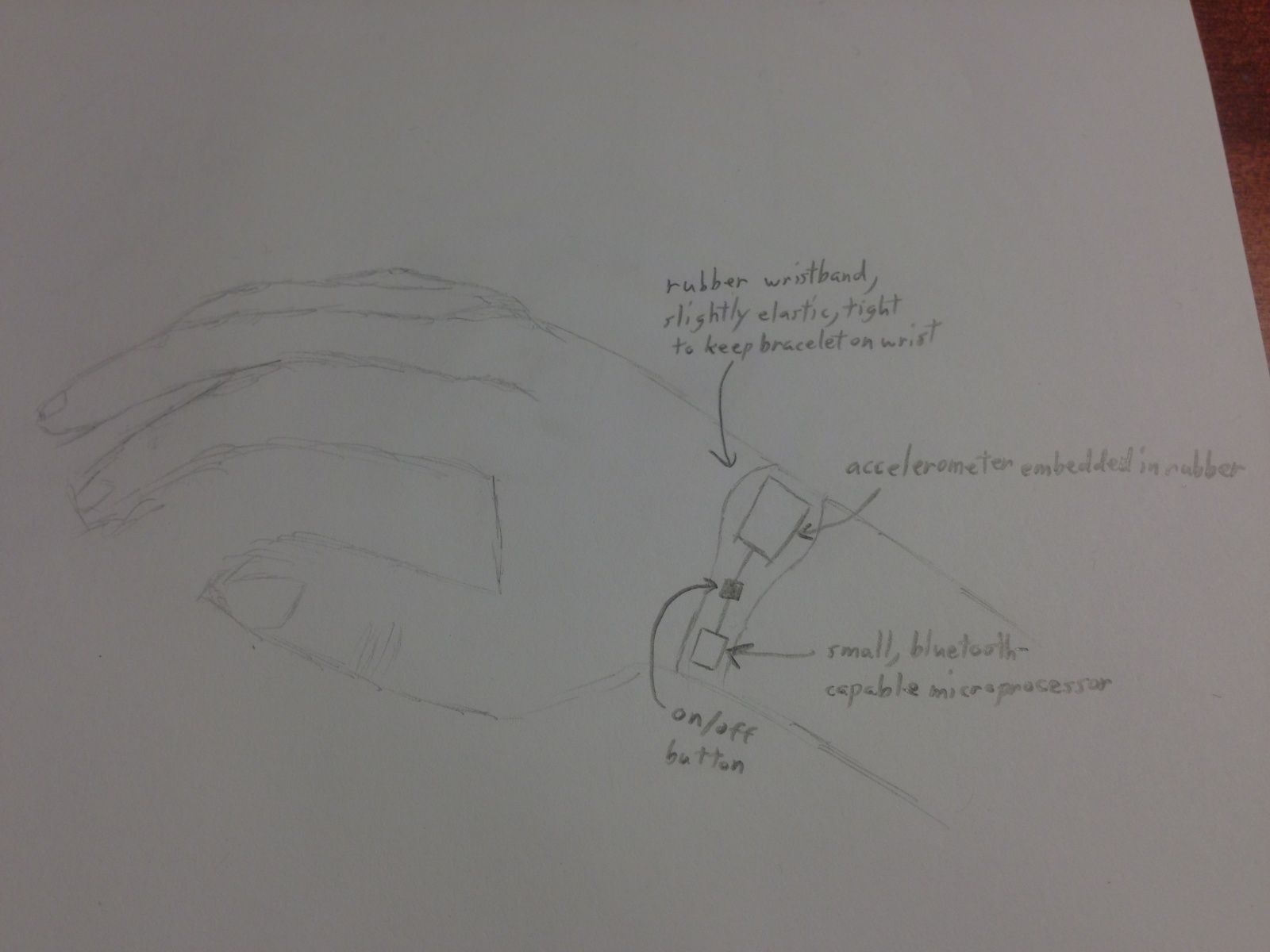
Solution: We want to create a wristband that allows you to map hand and arm motions to computer commands. We also want to create software that allows the user to create the commands/routines and map gestures on their own.

1. Interviews
We have a couple of target groups for the app, each that can benefit in a different way. The main ones we identified were housewives who would need to interact with their computer when their hands were dirty cooking, amputees who have trouble interacting with computers, heavy computer users who would like to make their computing experience more efficient, and DJ’s that would like to add a more fluid control of their music. Housewives are relevant since cooking can be messy, and often times they enjoy trying new recipes which nowadays are being accessed with digital devices. If they could scroll through their recipes without actually touching the device, it would keep them clean, out of danger, and would save paper. For amputees, we felt that gestures could enhance their computing experience, such as someone missing a hand could put on the bracelet and no longer have to rely solely on their one available hand. For heavy computer users, we felt there were many programs, games, and shortcuts that could be programmed with gestures that would save heavy computer users time and make them quicker with their computers. Repetitive tasks such as going to the desktop, opening a web browser, and change a song could be done with a gesture. Finally, we thought DJ’s could use the device since gestures would give them a new way to control their devices which could be more fluid and fun. We interviewed four people from 3 different target groups.

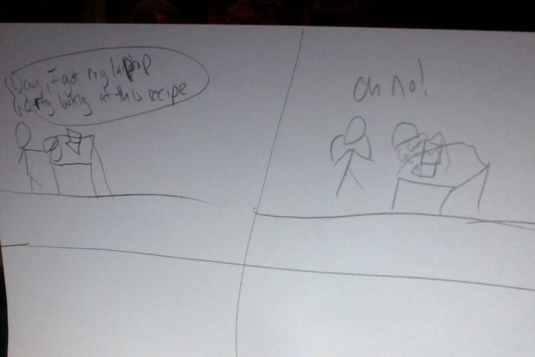
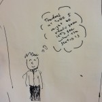
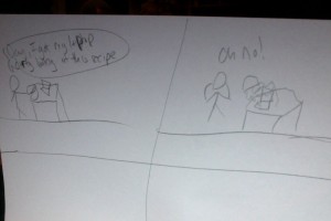
The first person we interviewed was a housewife. We interviewed her over the phone around 8:00 pm. She is 52 years old and lives with her husband and two children, aged 11 and 15. She enjoys being with her family. We asked her some questions about her daily routine before introducing our device to her. She is a stay at home mom, and runs errands and does chores until she has to pick up her kids from school. She starts cooking dinner around 5:30 so that they can eat as a family when her husband arrives home at 6:30. When asked about cooking, she said she has a set of meals she switches between for dinner. We asked if she ever tries new meals, and she said she does occasionally, maybe once every week or two. When asked where she gets her new recipes, she said the internet. She normally prints out the recipes and follows them then. She does have a laptop though, so when introduced of the idea of being able to scroll down with a gesture bracelet while cooking, she immediately thought it would be nice to save paper and eliminate the hassle of running out/low on paper and ink. She said she would consider using her laptop as a cooking aid if she had the bracelet, but wasn’t sure if she would like wearing a bracelet while cooking. She was also worried it would get damaged while she cooked. Overall, she had mixed feelings towards the idea, and wasn’t sure if she would use it.

The next person we interviewed was a DJ. We interviewed him while he was setting up for a party at an eating club. He works for various clubs, parties, and bars and we met him when he came to DJ for an eating club. He was concerned with getting more gigs, and having a very responsive turntable system. when we asked if he felt his controls could be helped with a gesture option, he was excited by the idea but was worried about the delay. He thought it wouldn’t be that helpful if he had to spend time initiating a gesture, and wasn’t sure what specifically it would be used for since his DJ equipment was analog so that it was respond quickly to his changes. He thought it might be useful as a novelty item, or in slower sections or when he was talking on the microphone.

The next target group we interviewed was heavy computer users that were more tech savy. We will call the first interviewee “Steve”.

We interview Steve in the Frist Gallery. Steve is a heavy computer user and multi-tasker. He really enjoys video games. He would definitely consider using our product. Steve once had carpal tunnel after using his computer way too often, and he had to stop using the mouse. He was left with no alternative which made it very difficult for him to use his computer and he had to limit his use of the machine. He feels he would have probably used a gesture controller like ours had it been available and it would have made his computer use much more painless and comfortable.

He says gesture control would make simple shortcuts for him – he would love to see anything with multiple steps reduced into one thing. When he first gets up, he has a routine with his computer, opening his favourite tabs and websites like Facebook, mail, YouTube. It would be great for him if with one swipe of his hand from his bed he could start those up. If he could just open the browser and then swipe his hand to get his favourites that would make his life easier. Conversely, it would also work for a shutdown procedure: if with one hand gesture he could save all his documents instead of having to go through all the windows and then turn off the computer.

Steve would like to see in the future the hand gesture extended into finger motion as well, to make more precise movements. If sensitivity could spread to the fingers without making the device bulky, it would definitely make the product even more useful.
Most importantly, he states that you need a way to activate the gesture control device. He would like to see us put some kind of switch or button on the gesture bracelet so that normal actions are not confused with gestures.

Last, we interviewed “Michael”.

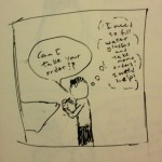
We interviewed Michael in Frist at a first floor table. Michael is also a heavy computer user. He considers himself a multi-tasker. He thinks this would be a product that he would use, because he thinks the idea of being able to control the computer even when he is not right there would be useful. His pet peeve with the mouse is clicking, dragging and resizing windows. He really gets annoyed with the little pointer. He feels that gesture control would just make that part of his computer use a lot easier.

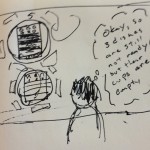
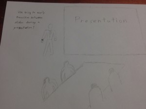
Michael has also had to use Smart Boards from some of his many presentations. But he has had to be right next to these boards. Even though the board is quite advanced, he still feels being able to be away from the board would make presentations more effortless and would also add grandeur to it, if he could swipe along the slides. He says this idea reminds him of Iron Man movies.

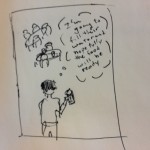
There are also more common tasks for which he would want to use gesture control. For example, skipping songs when you are not on the computer. Perhaps you are playing music with your computer on your desk, but you are all set up in your bed studying. Being able to manipulate the computer from far away is the main point that he likes about this idea.

He thinks it would be interesting if this could be used for art projects. If gestures could control a design program, and the hand could be used to trace or paint something. He would also find it useful if there could be a gesture for each website that he generally visits.

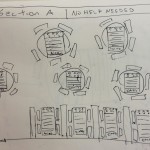
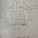
To conduct the interviews we asked interviewees first to describe themselves, their daily routines, and their interactions with computers. Based on those questions or how they were sought out, we then asked more specifically about a task that was specific to their target group. We asked them about the task, and if they felt gestures would improve the task. We observed people in various environments: over the phone, before an eating club party, and in Frist.

Common themes we noted we people excited by the idea of a gesture device and immediately had an idea or two of where it could be useful. There was a lot of talk about using it to aid home media, for computer actions that get tedious, and for video games. People often did not understand the limitations of the device, and sometimes proposed suggestions such as moving workout equipment with a gesture or controlling sports balls that were not feasible with a simple computer program. We noticed that heavy computer users seemed to have more ideas for its application, and the housewife and DJ were more concerned with it for their main objective. This is probably since computers are a significant part of heavy computer user’s lives, so they had already been annoyed with some of their shortcomings. We really liked some of the ideas Steve had, including an aid for carpal tunnel syndrome and gestures for opening and switching between common programs.

2. Task Analysis

1. The main users for our gesture bracelet fall into specific groups for specific tasks and a more general range for people seeking to add gesture functionality to computer programs by their choice. Our target groups are housewives, heavy computer users, DJ’s, amputees, and computer users that rely on their computers for home media.

2. Housewives currently cook while following online recipes. Heavy computer users are always interacting with their computers. DJ’s use turntables to play music at parties and amputees use computers for everyday functions.

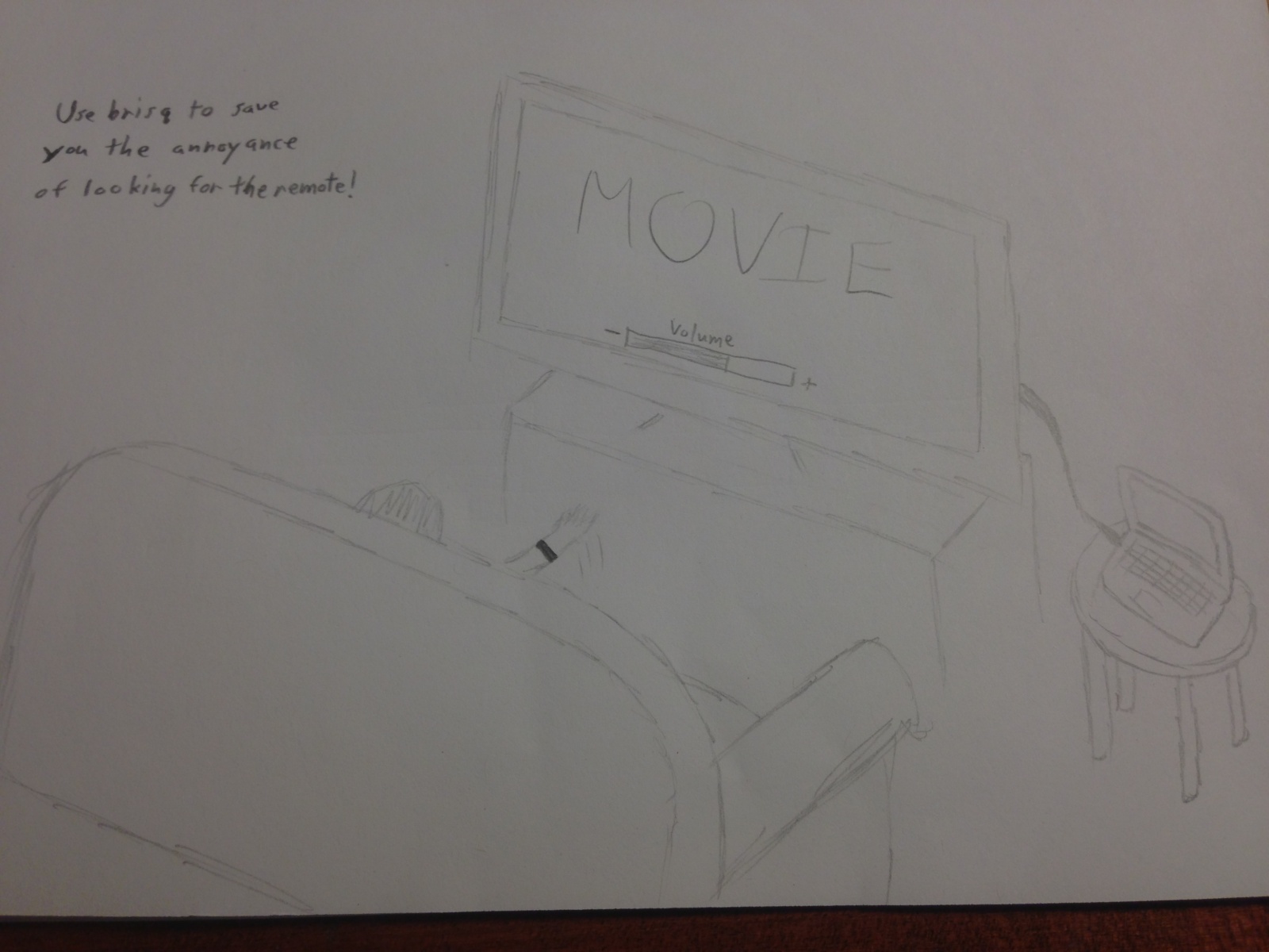
3. Housewives would like to flip through their online recipes without getting their computer dirty, For general use, computer users would like to add gestures to programs where they make the action more natural, or enable them to interact with a computer at a distance. These interactions include giving a slideshow presentation or watching a movie with your computer hooked up to the TV. TV controls could include changing the volume, pausing, playing etc. without getting up from the couch. Heavy computer users would like to reduce repetitive mouse clicks to relieve carpal tunnel syndrome. Finally, amputees would like a better computing experience and the ability to type emails, browse the web, chat, and more faster.

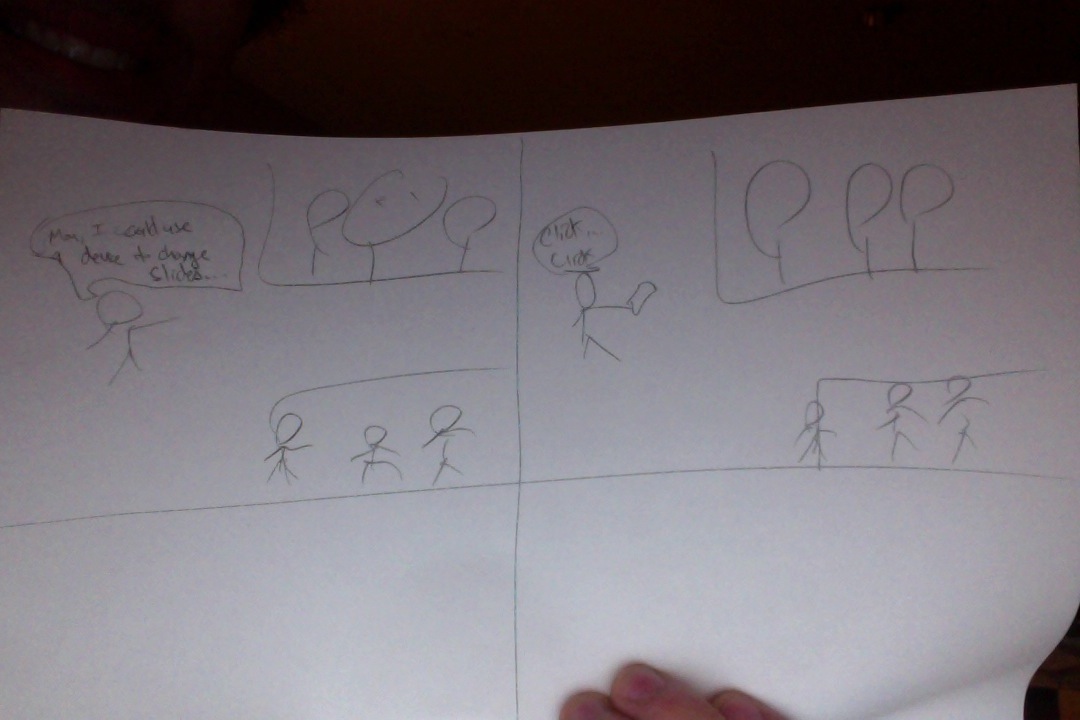
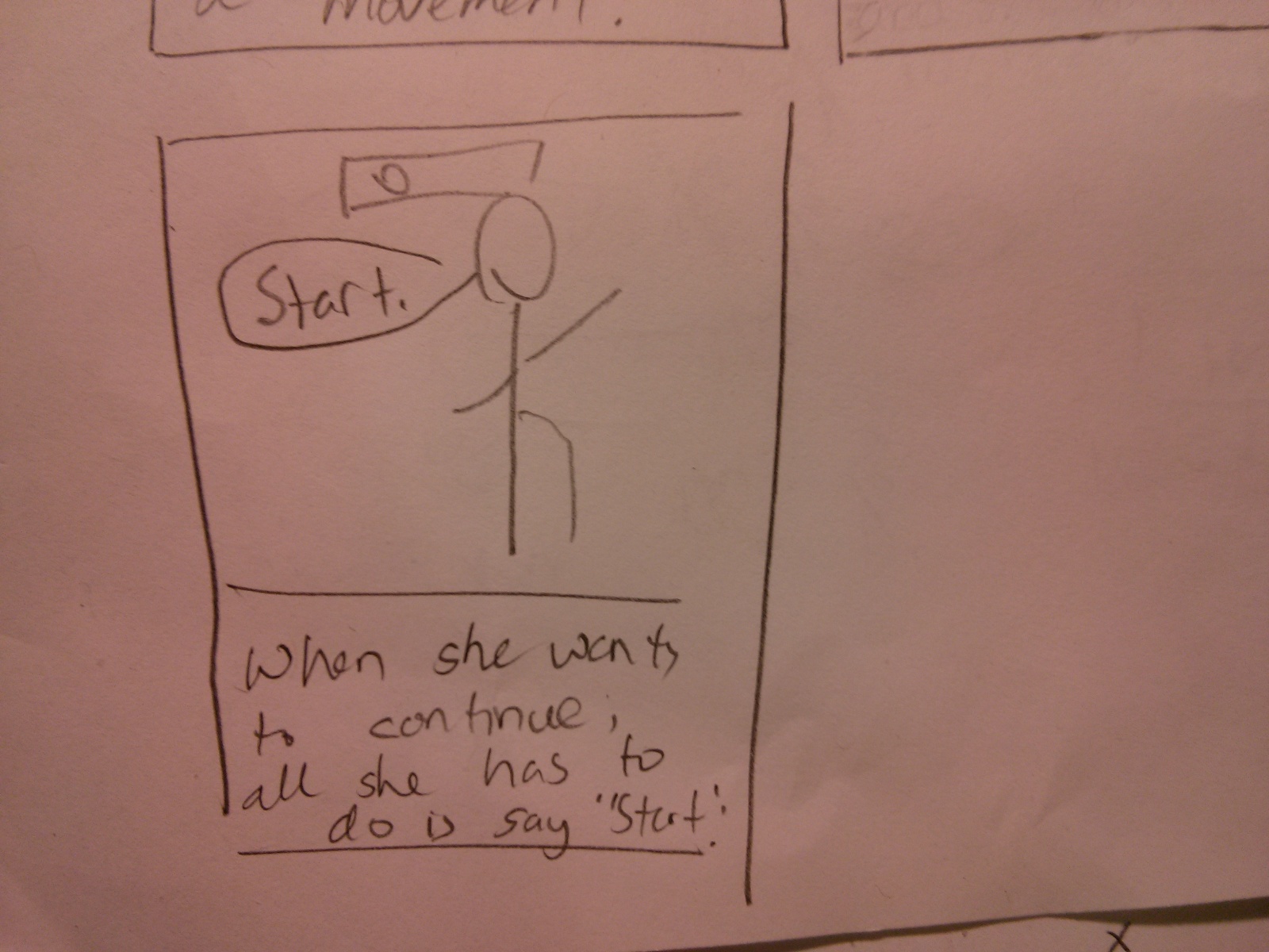
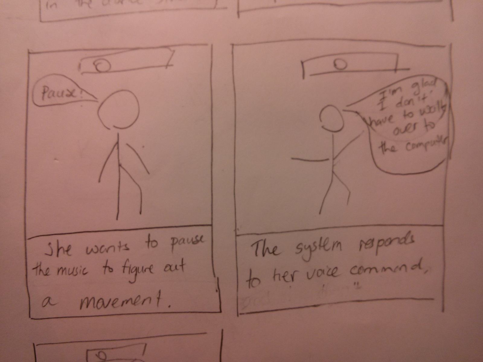
4. Users set the tasks themselves, and use buttons and a computer program to pair them. The user turns the bracelet to a “make gesture” setting and performs the gesture with the bracelet on their wrist. To exit the “make gesture” mode, the user will either perform another gesture or wait a few seconds. The user then uses the computer program to listen to the following keyboard inputs and perform the input sequence. Both of these are repeated, and the user can then pair gestures with computer shortcuts. For example, the housewife could move her wrist up and down, record the gesture, then with her web browser and gesture program open she would press listen and then scroll down in the browser. Last, she would go to a gesture list and drag the up and down movement to the scroll command. Now when she wants to scroll while she is cooking, all she has to do is shake the bracelet, moves her hand up and down, and shake the bracelet again. Without having to move or touch anything, the page will have scrolled down.

5. Wherever the person happens to be – in the kitchen, bedroom, living room, etc. The bracelet frees the user from the need to be physically close to the computer. All they have to do is stay within range of Bluetooth / WiFi.

6. Because users set the gestures to fit their specific needs, the only data we need is the shape and form of their hand and arm gestures. An important problem we need to solve is how to recognize these gestures based on sensor data from the bracelet. Thus, we will need to monitor their arm / hand movements and compare them to a history or previous such movements in some sort of algorithm.
The only time users will have to interact directly with their data is when they have to initiate set up and record the hand gestures. After that, the system should operate smoothly, with minimal input from the user.

7. Within our system, users have the bracelet and attached computer program to work with. Outside of our system, people can use traditional methods to interact with their computers, such as a mouse and keyboard (like with pc gamers). Media center enthusiasts often have a complicated remote or a set of remotes to control their system. Office workers giving presentations can use special clickers or simply the arrow keys on their computer. Amputees, especially those with part or all of their arm, could probably still navigate a computer. However, their experience will be slow and difficult, because almost all input devices (mouse, keyboard, touchpad, joystick) are designed for skilled and continual hand use. Finally, people trying to look at recipes while cooking don’t really have a good alternative tool. The next best thing would probably be voice activated commands, which are notoriously unreliable.

8. Users could chat in an online forum. There, they could help each other or swap ideas for cool applications.

9. For people within a specific usage group, Brisq will be used almost continuously for a short period of time. For example, while cooking a meal you will be flipping to the next instruction fairly often. Amputees and computer gamers will probably be the highest frequency users, continually clicking on a link or shooting the next alien. Casual users in engage the system a lot less often but over a much wider time scale. While watching a movie, you may change the volume only once or twice. But, being able to do that with the wave or your hand will save a lot of effort.

10. For any task, the bracelet will have to respond accurately and with no noticeable delay in order to avoid annoying the customer. While cooking, you usually have some leeway but there are times when 20 seconds is the difference between browned and burnt. Slideshow presentations are a prime example of need for accurate, reliable technology. Beforehand, you don’t want to keep your audience waiting while you set up. During the presentation, a few misinterpreted clicks can completely disrupt your flow and distract audience members. For amputees and pc gamers, speed is absolutely essential. A lot of games are reaction based, where you have to outdraw your opponents. In our software’s gesture recognition algorithm, we will have to make tradeoffs between accuracy and speed. Because of the different needs, it might make sense to allow users to choose how much of one they want, at the expense of the other.

11. When things go wrong, either a false positive or a false negative is triggered. A false positive is when the user engages in an arbitrary hand-arm motion that is incorrectly interpreted as a gesture. Thus, things would happen for seemingly no reason. We try to counteract this by creating a “make gesture” mode that you would have to enter by shaking or twisting the bracelet. This is hopefully a unique gesture that would not happen normally. A false negative is when you attempt to perform a gesture but it is not recognized a part of your library of gestures. Or the wrong gesture would be recognized and trigger the wrong command. This also needs to be avoided, because it will lead to user frustration and eventually abandonment of our product. We will fight this threat by improving our gesture recognition algorithm and by continuing to train it with every new gesture formed.

3. Three Tasks
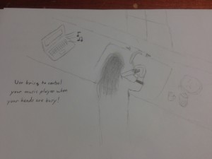
1. People in the kitchen
People listen to music and use online recipes on their computer while cooking. They will wear the bracelet on their wrist, engage it for a gesture and gesture to scroll down or change the song, all without having to clean their hands. This is an easier task since there is only one gesture to recognize, so there will be a practically zero chance of misinterpreting the gesture.
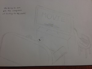
Photo on 3-11-13 at 11.59 PM

cereal 3

2. Couch Control
User will change volume, play, pause, and change the volume on a computer movie which is hooked up to a tv, all without leaving the couch. We will need around 4-6 gestures to recognize here, for increasing and decreasing volume, playing and pausing, etc. This will make the task moderately difficulty, but 4-6 gestures should have a high success rate (i.e. over 95% based on research papers).

Photo on 3-12-13 at 12.04 AM

cereal 4

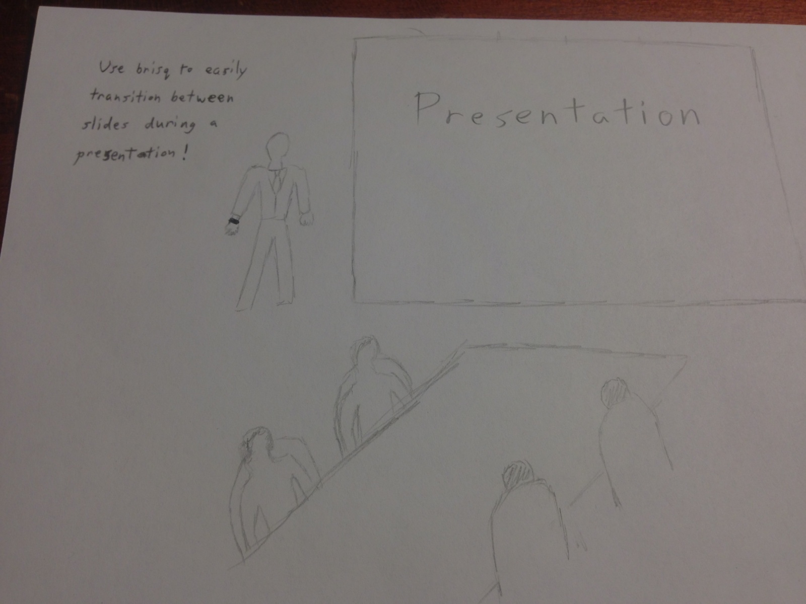
3. Giving Presentations
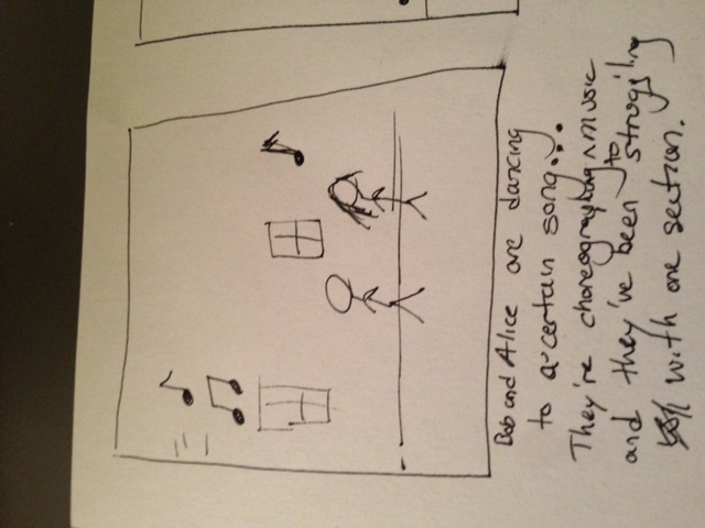
Users can use the bracelet during presentation for a variety of tasks. Swipe left and right to change slides, twist to switch programs and start playing a short video that you wanted to include. twist the other way to pause it and return to your slideshow, and more. This task could range from a simple 1 or 2 gesture interaction (changing slides) to potentially something much more diverse and complex (maybe even 8 gestures) for a long and interactive presentation.

Photo on 3-11-13 at 11.59 PM #2

cereal5

Interface Design:

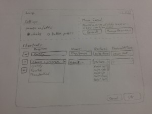
Brisq aims to make common secondary computer tasks simple and streamlined. People listen to music while cleaning the house, look up recipes on an on-screen cookbook while cooking, stream movies from laptops to their TVs (because who still uses DVDs?), and integrate their computers into their lives in all sorts of ways. But no one wants to have to dry off their hands just to change the volume on their computer, no one wants to wash their hands just to flip the page of their e-cookbook. Our users will be anyone and everyone who regularly uses their computers to complement their day to day lives. Enable Bluetooth on your computer, and use our program to easily map a sequence of keyboard presses or mouse clicks to one of 8 pre-programmed gestures that brisq can recognize; then put the brisq bracelet on your wrist and go! The small, stylish bracelet will communicate with your computer whenever it is in Bluetooth range. Shake brisq to turn it on, then swipe right to skip a song while you’re barbecuing; twist to crank up the bass at your party when theres a dancing crowd around your speakers; change the volume up on your movie without leaving the couch, or even looking for the remote. Simplify your life. Be brisq.

cereal1

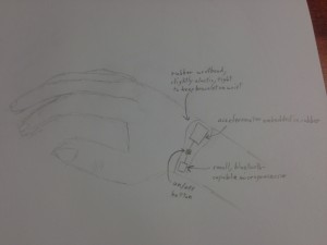
Users can program gestures and map them to computer inputs. They will do a predefined gesture, and brisq will send the signal captured from an accelerometer to a computer via bluetooth. On the accompanying GUI, users can enter and save keyboard and mouse inputs for specific computer programs, and match them up with gestures. Later, they just shake brisq (or press the small on/off button), then do a gesture to have your computer execute the command saved for the open program. Users can thus substitute simple and intuitive movements for keyboard and mouse inputs that may be long, repetitive, inconvenient, and more. Existing “smart” bracelets monitor heart rate, act as pedometers, and perform other simple functions but do not serve as a universal, customizable interface you your computer. Additionally, we are not aware of programs to set shortcuts by “listening” to keyboard and mouse inputs and saving them in a bank; we believe this we make the act of setting shortcuts very simple and intuitive for everyone.

cereal 2

P2 — TFCS

Group 4: Raymond Zhong (task analysis, descriptions, and interface design), Farhan Abrol (design and two interviews), Dale Markowitz (overall design), Collin Stedman (one interview and interview writeups)

Problem/Solution

We’re addressing the difficulty of acquiring and maintaining habits and routines. Our solution involves embedding sensors in everyday objects that detect and report when they are used, either on the object itself (e.g. through color) or to a central server. Thus a user can receive notifications and reminders and observe feedback on how well they are completing their resolutions. Our solution takes advantage of the decreasing cost and power consumption of microcontrollers, and can potentially become a more general habit-tracking platform or a way to more effectively embed human-computer interaction into our daily lives.

Interviews

Our product is intended for use by individuals who are looking to develop new habits, hoping to reinforce old habits, or trying to decrease the current amount of stress that they feel as a result of habit maintenance. The high-stress, crunched-time environment of Princeton makes it difficult for students to keep track of their progress in acquiring habits. Furthermore, many students would benefit from and attempt to achieve aquisition of habits, and thus think Princeton students would be prime candidates for this product. Lastly, since Princeton students are easy to come by, we have access to plenty of data and test users we know well, which is clearly of practical benefit to our group. They share motivations and demographic characteristics with other affluent technology users who are plausible early adopters of a product coming out of an HCI class.

We started by focusing on athletes. Our first user was an athlete on a varsity team at Princeton, currently on his off season and trying to maintain his regimen without regular practice. We observed him in his room after a workout session, which is the ideal time to take supplements. He hoped to keep track of how often he worked out, what he does before and after his workouts, as well as track his eating habits and how often he takes supplements. His priorities seemed closely tied to his teammates and maintaining a strict routine, with little room for disruption or experimentation. We thought, considering how especially busy the lives of varsity athletes are at Princeton that he would be a candidate we could particularly help with our product, as it could keep track of all of the abovementioned tasks.

The second potential user we observed was a female student who needed to remember to take birth control medication at the right time intervals. She expressed frustration with her inability to remember to take the medication appropriately. Her preferences were for a product that fit into her schedule and did not feel invasive, which would operate in a predictable way.

Interviewee three was a sophomore student and athlete at Princeton. We met with her at breakfast in one of the residential colleges. While her needs were similar to both of the other two students interviewed, she was notably more on top of her routine. However, she mentioned the stress that she felt as a result of maintaining her habits, work, and assignments, due dates, etc. We observed that her priorities were more ambitious and work-oriented, and she would use a tool if it promised to be useful and effective.

Methodology

Collin interviewed one student in the morning on a week day before class. It is difficult for users to talk about tacit knowledge, so Collin thought it would be a good idea to conduct an interview about daily routine when most students are carrying out their morning routines, and more cognizant of what it is. He observed people in his residential college dining hall and along the walkways heading to class. His process was to ask his respondent to describe her daily routine, learn some specifics, and then ask about how that routine could break down. Farhan, on the other hand, observed and talked to students in their rooms. He also tried to catch people at points during the day when they were engaging in some part of a daily routine. In fact, one of his interviews began entirely without planning when he noticed his acquaintance taking medication. His other interview was with an athlete who had just come back from the gym. Finding himself in a position to observe respondent behavior directly, Farhan was more direct in interviews; he asked his respondents to talk about why they were doing the things they were doing at the time of the interview.

Results

The two athlete respondents both mentioned having difficulties maintaining their (impressive) workout routines in the face of academics and extracurricular activities. One mentioned having this same problem even during the summer, attributing his gym irregularity to laziness. The other student athlete, in turn, mentioned finding it hard to motivate herself to go back to the gym despite her guilty feelings. Both athletes also alluded to the importance of consistent meals; one made sure to get breakfast every single day, and the other mentioned feeling limited by sources of food, relying frequently upon supplements. Coincidentally, our group noticed a similarity between the male athlete’s need to take consistent supplements and one female respondent’s need to take birth control at consistent, carefully timed intervals. Both of these respondents admitted to having difficulties taking their respective supplements at the correct times. We think these similarities all point to the universal difficulty of developing new routines in demanding environments such as Princeton. When people find themselves pressed for time, they find it difficult to keep consistent schedules. This difficultly, in turn, causes people to exhibit “spottiness” in their routines, ultimately leading to frustration or resignation with the corresponding element of the routine.

One interviewee was notably different from the other two in terms of the consistency of her routine. Initially, our team thought that we might have to exclude her from our target audience of people who are looking to develop new routines or reinforce spotty routines. However, we realized that this respondent found her routine so essential that it was actually a source of stress in her life. We found that people like this respondent still (barely) fall within the realm of our audience, as our product could certain improve the quality of their lives by making maintaining existing routines less stressful.

Task Analysis

Who is going to use the system?

Our users are a cross-section of several groups: people who would like to acquire new habits, people who need to maintain health or medical regimens, and (marginally) people who are interested in self-tracking. For this project, we are most interested in the intersection of the first two groups: Princeton students who are acquiring or maintaining fitness- and health-related habits. This includes athletes with diet/fitness requirements and students acquiring or maintaining habits such as taking vitamins, using birth control, or working out.

What tasks do they now perform?

Many athletes organize with their teammates to go to the gym or track together, especially during the off-season. Since they often room with each other, it’s easy for them to coordinate and help each other stay on track in their workouts. For serious athletes, maintaining workout and diet habits is not as hard as remembering to take supplements, especially when their schedule changes.

Girls using birth control almost always set reminders on their phone to take the pill at a certain time. Often, they get reminders to take the pill from their partners. Their pillboxes are designed to dispense one pill every day, and placebos on days when active pills are not necessary.

Pill boxes are a common device used to maintain medication schedules. In a few rare cases, people also use applications like Medisafe to track their medicine usage.

What tasks are desired?

  • Setting up objects (installing sensors, defining a schedule/expectations)
  • Recording object usage (through sensor triggers or check-ins)
  • Monitoring object usage (through mobile dashboard, push notifications, or direct feedback)
  • Resetting object usage (removing sensors, removing object from software)

How are the tasks learned?

People usually get habit tracking ideas from friends, media, or blogs like Lifehacker. The Seinfeld calendar, where people cross out days on a wall calendar, is a popular way to track habits spread almost entirely by word of mouth and television.

For our system, setting up objects can rely on a simple walkthrough, on a mobile app, website, or labeled on the sensor. Recording, monitoring, and resetting should be intuitive. Recording object usage should happen automatically, when an object is moved or used, and monitoring and resetting should use common affordances in mobile apps (swipe right to delete on iOS, etc.).

Where are the tasks performed?

Most tasks will be performed at home, either in an apartment or dorm room or around the house. Some tasks could be performed on the computer or mobile device, such as using an eBook reader or reaching Inbox Zero in one’s email.

What’s the relationship between user & data?

We will track the activity of objects. For containers, a one-shot sensor will record when the container is opened, and those dates and times will be recorded and displayed on a calendar as well as a list. For objects that are actively used, such as books, durations will be recorded and displayed as well as usage date/times.

What other tools does the user have?

Other tool include habit tracking products like Beeminder and Lift and Quantified Self products like Fitbit and Tictrac. People also commonly keep track of their habits on calendars or agendas, using pen and paper.

How do users communicate with each other?

Users don’t have to communicate with each other. If they would like to, they can share a task with someone else, which allows them to see the sensor data for that specific task, and opt in to receiving notifications for when the habit lapses. This could be done inside our application or outside of it (through emails and a link to a web dashboard).

How often are the tasks performed?

Tasks that are tracked could be performed anywhere from daily to monthly. They should be performed on either a regular schedule, or an irregular schedule in which the time between two tasks should never exceed a maximum. The user can check up on the status of their tasks as often or as little as they want; we will send them notifications when their habits lapse.

What are the time constraints on the tasks?

A few seconds. Checking up on the status of one’s tasks should be possible to do as quickly as possible — at a glance in the ideal case. Tracking tasks should also be frictionless: either using the object will naturally trigger its sensor, or in the worst case briefly holding a phone up to an RF tag attached to the object should trigger a one-shot task.

What happens when things go wrong?

Replacing the batteries on sensors should be done as rarely as possible. Battery life of months to years should be achievable. Since powered sensors will be Internet-connected, the user should be able to get notifications when the sensor has low battery or is offline. This should also handle the case where the sensor loses Internet connectivity.

The user can also decide to stop tracking a habit. In that case, it is up to us to make disabling tracking for a given task simple.

Task Descriptions

Reminders to read a textbook (previously medium, now easy): A flex sensor tapes to the spine of the book and wraps around the cover; when they open the book, a beep sounds and the sensor tracks when the book is open or moved. The user sets a minimum number of days that must go by without having opened the book, for example 1 week, and an interval at which they want to be notified. After leaving the book closed for long enough, they will receive push notifications on their phone or by email at the indicated interval. An indicator on the sensor can also change color, indicating how long ago a book was used. At the end of a semester, they remove the sensor from the book and remove the task from our system. (This is something that students typically do not track because it involves significant friction beyond opening the book; solutions include tracking one’s work on Google Calendar and putting reading as a recurring task on to-do lists.)

Reminders to take supplements after exercise (previously hard, now easy-medium): An accelerometer is strapped to a whey protein bottle; when it is moved, a long beep sounds. The user, an athlete who already has a regular workout schedule, has the option of pressing an “X” button to clear the current update, in case they have accidentally disturbed the bottle. They set up their supplements schedule to be the same as their workout schedule. When the miss taking a supplement, they receive a notification within hours, and they can choose to skip that time or check in later. When their schedule changes or they go on vacation, they can turn off the task for a given amount of time, disabling tracking and notifications. (This used to be hard because of the difficulty of handling exceptions like traveling, breaks, and injury.)

Reminders to practice a musical instrument without schedule (previously hard, now easy-medium): An accelerometer is attached to an instrument or its case; when the instrument is moved, the sensor emits a long beep. In the event of a false alarm (perhaps a guitar was nudged on its stand by mistake), the owner of the instrument may choose to cancel this detected usage by pressing an “X” button on the sensor. Otherwise, the sensor saves a report of instrument usage, by measuring when the instrument stops moving, and then sends a report to the central server via Wi-Fi. The user does not have a schedule for practicing, but will receive reminders when they do not practice for a preset number of days. While it used to be difficult to remind oneself to practice without establishing a schedule, our system solves that problem and makes spontaneous practice easier. We can also easily handle schedule changes and holidays by turning off tracking for the particular task for a certain number of days or weeks.

Full List

  • Home: laundry basket, watering cans, garden equipment
  • Home: car maintenance, home maintenance, etc.
  • Exercise: use of bikes/skateboards/etc., gym equipment, bike helmets
  • Exercise: nutritional supplements
  • Practice: skills, musical instruments, etc.
  • Medical: pill boxes
  • Medical: pill bottles
  • Medical: contact lenses/solution
  • Food: freshness of groceries
  • Food: freshness of take-out boxes
  • Books: notebooks
  • Books: textbooks
  • Books: long-term reading, Bible, etc.
  • Check-ins at specific locations
  • Check-ins using NFC for specific items

Interface Design

We embed sensors in everyday objects that track when they are used. These sensors indicate how long ago the object was used, both on a dashboard and possibly on the object itself. The dashboard allows one to track when and how long an object is used over time, going back over weeks or months. In addition to aggregating data, the system can send notifications to the user’s mobile devices, either through push notifications or through email. The user can customize when they want to be notified, deciding to ignore or defer a reminder, or turn off notifications for a given amount of time. Finally, the user can gain a top-down view of many of the things they do in their daily life, either as a calendar or a dashboard displaying the current status of their habits. Unlike existing systems, which are primarily software-based, our system eliminates the friction of entering data into a phone or computer, and can provide feedback on the object itself (e.g. through a color changing skin or indicator light).

Storyboards

Right-click and select “Open in New Tab” to view sketches at full size.

Left: Deciding to acquire a new habit.
Middle: Installing a sensor.
Right: Setting up a new task.

Items provide feedback on when they have been used.

Left: Being notified after missing a task.
Middle: Completing the task anyway.
Right: Reviewing status of tasks and regularity of habits.

Sketches

Workflow GUI

Left: Setting up a new task.
Middle: Task setup screen.
Right: Task successfully added!

Dashboard GUI

Left: A list of all tasks.
Middle: A single task’s progress.
Right: A calendar of success rates.

P2 – Team X

Group 10:  “Team X”

Osman Khwaja (okhwaja)
Junjun Chen (junjunc)
Igor Zabukovec (iz)
(av)

Group Members:

We all observed dance rehearsals together, and afterwards met and discussed what features we’d want our project to have. Alejandro did some more in depth interviews of dancers, Junjun and Osman took care of the storyboarding part, Igor sketched out a user interface.

Problem and Solution Overview

We are addressing the problem of a dancer having to go back and forth to whatever device they are using to play music while practicing or choreographing, which results in inefficiency. Our system will recognized user-defined gestures to start or stop the music, to loop a section of the music, and to speed it up or down, so that they can control these parameters remotely, while retaining complete control over their movement.

Users Observed in Contextual Inquiry

Our target user group is dancers who practice or choreograph using previously recorded music. Obviously, if dancers do not use recorded music, then they do not need to control it. Furthermore, we did not feel the need to limit our system to specific styles of dance, because it can apply to all dance where recorded music is used. We conducted contextual inquiry on three different dancers. Dancers 1 and 2 are seniors in the Comparative Literature department and both are pursuing Certificates in Dance. They both do contemporary styles of dance and Dancer 2 also works as a choreographer. Dancer 1 is interested in the relationship between dance, theatre and music.  Dancer 3 is a graduate student in political economy who danced professionally for several years before going to college, primarily hip hop and some contemporary, and continues to dance for her own enjoyment. All three seem very interested in improvised dance and contemporary choreography, and as described they have different levels of commitment to dance.

Interview Descriptions

We observed Dancer 2 in rehearsals in New South Dance Studios for a thesis production, Dancer 3 practicing and improvising to music by herself, and Dancer 1 practicing for a dance sequence in a play. We watched these rehearsals taking place, asked the dancers how they felt that their movements connected to the music that they were using, watched how often they felt the need to change how the music was playing, and watched how they undertook that task. We interviewed them about their general practice routine, with a variety of questions that aimed to have them propose ways in which they thought it could be improved. We then described our design idea to them and asked them more specifically what they thought of it and how they thought it might fit into their practice and choreographing routines.

A lot of what we observed and were told by the dancers was fairly unexpected. Although it was clear that starting/stopping music was necessary, overall it seemed that they used those moments to rest or think more carefully about their moves, or to discuss what they were doing with someone else if they were not dancing alone. Furthermore, when asking them they said they felt that this was only somewhat annoying, and that it was a natural and important part of their practice routine. It seemed obvious to us that, although the system might improve efficiency, this wasn’t something crucial for dancers and therefore would not necessarily interesting them enough in order to have them adopt a new system.

When we explicitly discussed the system with them, all three of the dancers agreed that it would be a useful and interesting system to use. However, they seemed to be interested in using it in different ways. Dancer 1 thought that it would be most interesting as an actual performance tool, something with which a dancer would interact with in a live setting, rather than a practice setting. Dancer 2 thought it would a good tool for practicing but did not think it would be interesting for choreographing, as she prefers to choreograph without music, and then see how the music will fit with the dance (this is the same that we observed when watching her rehearsal: it was clear that the music was added afterward, and it didn’t seem like our system would be particularly applicable in that case). Like Dancer 1, she thought it would be most interesting when applied to a live setting, which would allow for dancers to interact with a computer playing recorded sound in a similar way that they could interact with live musicians. Dancer 3 suggested that it would be good both as a both a practice and choreographing tool, and thought that it could even be extended to be used to edit music on the fly when trying to develop both the dance and musical aspects of a performance.

In conclusion, these observations led us to see our project’s development in the following way: we will start from a practical perspective, where a dancer can use the system to practice, and the system will accomplish the very specific tasks that we will describe later. However, we hope that this will be the basis of what can then become an interactive system which can be introduced into improvised dance performances, allowing dancers to interact with the music on the fly, something that they seemed to think would be even more valuable than the improvement of the practice routine that we have in mind as a starting point.

Task Analysis Questions

  1. Who is going to use system?
    Dancers and people who are trying to teach dancers who are trying to practice or choreograph their dance to a recorded song.
  2. What tasks do they now perform?
    Currently, dancers use some sort of jukebox/stereo/computer to play their recording. They start the song from the beginning or some relevant point and then get into position. The music plays at its normal pace and they dance. When they mess up, they have to head over to the computer and start it again. This process repeats
  3. What tasks are desired?
    Dancers want to be able to play a relevant part of music that they’re trying to learn and practice until they mess up. If they do, they want an easy way to go back and restart the music from that point. Additionally, if the music or moves are too fast to learn at the normal pace, they could use some way to slow down the music.
  4. How are the tasks learned?
    The process of creating a methodology of learning how to dance basically comes down to one’s personal experience trying to learn dances. There isn’t a formalized approach that all dancers adhere to.
  5. Where are the tasks performed?
    Normally performed in a dance studio
  6. What’s the relationship between user & data?
    There isn’t necessarily user data created by the process of learning to dance. Optionally, one can create a video of the dance and watch it, but that’s not always necessary because dance studios usually have mirrors
  7. What other tools does the user have?
    Normally the user has a stereo, iPod, computer, or something that can play music and allows them to start and restart it
  8. How do users communicate with each other?
    There isn’t a relevant user to user interaction that needs to be addressed
  9. How often are the tasks performed?
    Normally, Dancers practice dances with a show upcoming. Often, they also just do it for fun. Dancers practice as often as necessary to learn the dance.
  10. What are the time constraints on the tasks?
    Dancers normally have a limited amount of time to learn a dance (before a show or something) so they want to have the most efficient practice.
  11. What happens when things go wrong? (Pretty sure this question is not relevant)
    It is rarely the case that there is some sort of problem with the music playing that causes the dance practice to come to a halt. I guess if something happens, then they have to reboot, find a new way to play music, or just reschedule the dance practice. I don’t think this question is very relevant to our specific inquiry

 Description of three tasks

  1. (Easy) The user would be able to stop and start the music. Currently, the user would have to either: have someone else control the music, walk over to a computer or other sound system and push start/stop (with a delay to get into back into position), or control the music with a remote (which they would have to carry with them, hindering their movements). With our system, there would be gesture and voice commands for pause and play. Ideally, the system would also know to pause the music when the user stops dancing, and start when the user starts. This would make this task incredibly easy with the proposed system, as user would not have to think about the task at all.
  2. (Medium) The user would be able to repeat sections of the music. When practicing anything, repetition is key, and dancers often have to repeat sections of a dance to learn it. Currently, to go back to a section, the user would need to press buttons to skip to the proper section, or if the music isn’t divided into sections, they may have to fast forward or backward to seek to the proper place in the song. It is difficult to stop the music, seek to the right place, and then start it. With our proposed system, the dancer would be able to set “breakpoints” in the music with gestures while running through it, and then go back to that point later. This would make the process much easier.
  3. (Hard) The speed of the music would change to follow the dancer.  Currently, there is no way to do this on the spot. Either the speed has to be changed beforehand, with some software, or the dancer has to follow the music (perhaps stopping and rewinding a section many times until they can follow that tempo). With our system, the speed of the music would changed based on the dancer. This would give dancers who are just learning the choreography an easier, and perhaps less frustrating, way of practicing with music, and it would give a dancer who knows the choreography more freedom of expression. It would be very easy to do on our system, as it could happen automatically (the user would indicate beforehand whether they want this to happen).

Interface Design

TEXT DESCRIPTION

Our system would provide a way for dancers to interact with music without having to think about it. The system would provide defined gesture and voice commands for the user to use to stop, start, and repeat a section of music, but additionally, system would also try to automatically follow the dancer’s intentions without additional gestures (the music will stop when the dancer stops moving, etc). The system would also allow the user to set the pace of the music, by following the dancer’s steps. All the user would have to do is tell the system to enter this “follow” mode, and the rest would be automatic. This allows the user to basically focus on their practice without having to think about the technology. There are existing systems for interacting with music, including keys on a computer, remotes, and even voice commands, but what makes our idea different it would be more “intelligent” and responsive, making the routine more fluid and efficent. Some others systems similar to ours are those which use the connect to interact with music. One example is a system that translates a user’s moves into music (http://www.mendeley.com/catalog/creating-musical-expression-using-kinect/). Our system would be different in that it focuses on practicing: the user group and aim is different.

STORYBOARDS

TASK 1:

IMG_20130311_154800 IMG_20130311_154756 IMG_20130311_154750_1


TASK 2:

photo 1 photo 2 photo 3 photo 4 photo 5

TASK 3:

photo 1 photo 2 photo 3 photo 4 photo 5

SKETCHES

photo photo2 photo3

P2 Grupo Naidy

Group Number: 1

Group Mates: Kuni Nagakura, Avneesh Sarwate, Yaared Al-Maheiri, Joe Turchiano, John Subosits. All group members were involved with the interviews and design. Avneesh and John worked on the task analysis questions, Kuni worked on the sketches and storyboard, and Yaared and Joe answered the Contextual Inquiry.

Problem and Solution Overview:

Servers and restaurant staff tend to be over tasked at busy times, which leads to unhappy customers, overworked staff, and decrease in revenue. Our solution a system that passively gathers low-level information (ex. Status of food, drinks, etc.), and displays it in a way that allows the restaurant staff to make high level decisions more quickly and effectively.

Description of Users in Contextual Inquiry:

As our system affects both patrons and servers in restaurants, we decided to focus primarily on the servers for the majority of our interviews. We made this decision because putting more control in the hands of the patrons may exacerbate the issue of overworked waiters. Focusing on the servers, we concluded, would not only decrease their workload and reduce any inefficiency, but it would also improve the quality of service for the patrons. Thus, our target user group for our system is servers and restaurant staff (waiters, bus boys, managers, etc.). We observed and interviewed four different users from this target group. Our first user was a middle-aged waitress at Zorba’s Restaurant, who served us while we ate lunch. When we interviewed her, she had no major complaints and seemed satisfied with her job. Our second user was a young waiter at Zorba’s Restaurant, who had just gotten off his shift. He emphasized the teamwork that is necessary in an effective waiting staff and complained about large parties that demand all available staff. Our third user was a Princeton student who has waitressed for numerous summers at an upscale Country Club.  Our final user was a young manager at Triumph. As a manager, she focuses on efficiency and customer satisfaction of the whole restaurant, not simply specific sections or tables.

Contextual Inquiry Interview Descriptions:

We prepared a set of questions before each interview. The first set of interviews/observations was performed while our group sat down to eat lunch at Zorba’s Restaurant on Nassau St. We spent most of our meal observing and taking down notes on the movement/activities of the waiting staff. Afterwards, we interviewed two waiters—one that was directly serving us, and another who had just gotten off his shift. We asked them both about the range of tasks that they perform and how they perform it on a daily basis. The interview with the student was performed in an informal setting, and we asked her to recount her past summer experiences as a waitress. We met with a manager at Triumph at around 5:00 before the bar got too busy. She was still on her shift but was able to answer our questions for a couple minutes.

Most of the people we spoke to agreed that time management and balance, especially during busy hours, was the key to good service. Teamwork and covering for each other’s tasks also seemed to be a prominent component of making it work.  It seemed that the tasks themselves were not especially difficult, but during peak hours, the sheer number of simple tasks to be completed and the difficulty of organizing those tasks led to poor service. Most of our interviewees mentioned that a key part of the job was balancing the ability to provide for patrons as soon as possible but without being overbearing. We found that in all three settings, there was a clear division of labor in place between management, service, and bus boys, but there was usually some degree of overlap between the positions.

In each interview, we did pick up a few pieces of unique information that other interviews did not provide. Our first two interviews took place at Zorba’s Restaurant on Nassau Street, a small family restaurant. We interviewed both the waitress who served us and another waiter on staff at the time. These two emphasized the need to always be keeping an eye on every table they were staffing; in retrospect this sort of tactic is probably only possible at a smaller restaurant like Zorba’s. Otherwise, they seemed to have very little to complain about.  Next, we interviewed a student waitress in an informal setting. She, by virtue of having worked at a country club, had a different experience from the rest. The focus of her customers tended to be on alcoholic beverages (especially wine), and her major problems arose from trying to coordinate bringing out food for one table while having to refill drinks at another. She also mentioned that it was difficult to determine when to take food or drinks away when different people at the same table ate and drank at different paces. She also mentioned that, because the country club was divided into several segments, she was not always able to check on all tables as she moved around the floor. She also mentioned that not letting food get cold while refilling drinks was another big issues that she often faced. The final interview was with a manager at Triumph Bar, also on Nassau Street. Our questions for her were therefore more geared toward a management perspective rather than that of small-scale waiting. Since Triumph is a large establishment with multiple levels and a bar, the manager stressed that coordination and division of labor was especially important to her success. We found that the Triumph staff had been using a service called Digital Dining – which didn’t work especially well and actually turned into a bottleneck-point when waiters had to manually input orders to the service after first writing them up.

11 Task Analysis Questions:

1. Who is going to use system?

Servers, managers, and kitchen staff at large/busy sit down restaurants would be
the target users of our system. Servers would be the primary users, and would
benefit most using it during “rush” periods where many parties come in, or during
times where particularly large parties unexpectedly come in. The kitchen staff
would use the system to provide information to the servers to make their work
more efficient.
2. What tasks do they now perform?

Servers must (roughly in order of increasing difficulty) refill drinks, clear plates,
refill condiments/coffee/napkin dispensers, bring food from the kitchen in a
timely manner, take and send orders to the kitchen, bring the bill at the right time,
determine what order to perform the previous tasks.
3. What tasks are desired?

Waiters want an efficient way to transfer orders from waiter to kitchen and would
like to know when food is ready in the kitchen. They would also like to know when
tables are “antsy” and impatient. They would like a way that helps them minimize
mistakes in taking down and delivering orders. They’d also like to know when
customers’ drinks are low.
4. How are the tasks learned?

Waiters either learn tasks by serving as a busboy first, or shadowing another waiter
for a day. More experienced waiters are given more tables to handle, while less
experienced waiters are given fewer tables.
5. Where are the tasks performed?

The tasks occur mainly on the restaurant floor and the “waiter’s area” where the
waiters pick up food from the kitchen or congregate for other tasks.
6. What’s the relationship between user & data?

Users must be attentive in collecting data themselves and must make real time/
online decisions on how to act. There is a lack of quantitative data – the only well-
specified type of data is orders and check amounts; everything else must be guessed
or estimated. The sharing of data between servers and kitchen is fairly structured
(notes passed about what orders to cook), and there is some sharing of data
between servers to help each other out, but this is incidental and always verbal.
7. What other tools does the user have?

Paper and notepad are used to remember orders, which are often written in
shorthand. Some (very few) use mobile devices for this instead. There are
sometimes computer-scheduling systems, but not often. At Triumph, “Digital
Dining” is used, a system that supposedly helps waiters perform some of the
previously mentioned activities (but the waiters are dissatisfied with it).
8. How do users communicate with each other?

Servers communicate almost exclusively verbally, some body language/implicit
communication or inference occurs when a server tries to discern a customer’s
mood. Between the servers and the kitchen, communication is generally written,
maybe with verbal emphasis for some unusual aspect.
9. How often are the tasks performed?

Each waiter can be assigned up to 5-6 tables at the same time. Tasks in general are
being performed all the time, it depends on server how they are ordered/scheduled.
10. What are the time constraints on the tasks?

There are no explicit time limits on tasks, but in general all individual tasks are
completed as fast as possible and the “optimization” comes with deciding what
order to perform tasks in as to minimize “lateness” across the entire set of tasks.
11. What happens when things go wrong?

This depends on how wrong things go. For small delays, customers may simply
shrug it off, or become slightly grumpy. For larger delays customers may cut back
on the tip or complain to a manager. For meal mix-ups, users may again complain to
a manager or cutback tip. Depending on how angry customers are, they may refuse
payment. In some restaurants, servers are granted authority to make concessions to
customers (i.e, free deserts) to make up for mistakes.

Description of 3 tasks:

1. Checking customer status
This task involves checking to see what tables have drinks that need refilling, what
tables are waiting on orders, and what tables are requesting attention. Currently
this task is of medium difficulty, but can be quite difficult when things are busy.
Some information, such as how long tables have been waiting for food, are not at all
currently available. Using our system, this task should be very easy, as the server
would only have to look at a screen to see the status of all their tables.
2. Determine task order
This task involves deciding what to do first, for example, whether to make a
round of filling drinks before checking the kitchen to see if food is out. This task is
currently the hardest task for servers because of the lack of information available
in making the decision. Servers do not always know the status of all of their
tables and generally do not have data on whether their orders to the kitchen are
finished or not. Combined with the solution to task 1, incorporating kitchen data
into the system makes this task much easier, as with a single glance servers will
have customer data and kitchen data, which will help servers determine the most
“urgent” tasks to complete.
3. Signal for help
This task is generally easy, but during busy times it can become difficult. Servers
generally verbally ask other servers/busboys nearby for help if they need another
hand to bring food or quickly fill a glass. However, during really busy times it might
be the case that a server can’t immediately find a free hand for a task. In this case,
pressing a button or sending some signal to a central area could alert all servers that
a free hand is needed in a certain area.

Interface Design:

Our system works over two “layers” of interaction. The interaction between the waiters and the customers, and the interaction between the waiters and the kitchen. The central unit of the system is a set of screens in the waiter’s area that displays the floorplan of the restaurant and displays the status of each table. For each table, the screen lists the number of empty, half empty, and full cups, the list of dishes ordered by that table, and how long it has been since the table placed their order (if the table has their food delivered, the time display shows the text DELIVERED, if the table is not occupied, the time display shows EMPTY). Each screen represents a section of the restaurant that a waiter or small group of waiters is responsible for. On the table, there are pressure sensitive coasters that can detect how full a glass is. These send the information on the state of the glasses to the main screens. Waiters also have a “help” button on their belts. If a waiter cannot solicit help from a nearby waiter, they can press their help button, causing their section’s screen in the waiter’s area to flash, alerting any free waiters that assistance is required in a particular section.The screen displays the list of food items that have been ordered by each table. Each item in the list is displayed in red, and its color changes to green when it is finished by the kitchen. If a finished item has been sitting for some specified amount of time (which can be set for the user) the table that ordered it flashes red as a warning that an item at that table may be getting cold, and the table should be served.

Storyboards

Task 1: Checking customer status

Task 2: Determine task order

Task 3: Signal for help

Sketches of System: