
Title in Japanese: Kokugo nyüshi mondai hisshöhö
or in German: Sichere Anleitung zum Bestehen jeder Universitäts-aufnahmeprüfung im Fach Japanish
or in English: A Safe Method to Pass University Entrance Exams in the Subject of Japanese
An artists’ book by Veronika Schäpers, story by Shimizu Yoshinori (Tokyo: [Schäpers], 2003). GAX 2010 -in process. Copy 28 of 40.
The black letterpress text is printed by zinc-clichees in German and Japanese. Japanese rubber stamps for school marks are printed by hand various colors on Mitsumata paper. The book has a Japanese binding with twisted paper cord and cover made of Kozo Ganpi cardboard. Its padded case is made of cotton fabrics in the shape of a Japanese Omamori-charm, with the Japanese title embroidered in ivory.

In his short story, Shimizu Yoshinori (born 1947) describes the Japanese system of entrance examinations. This procedure (also known as the “examination hell”) is not only applied to universities but, depending to the status and type of school, also to high schools, elementary schools, and even Kindergartens. To prepare there are many cram schools, each specializing in a particular exam since every school is different. The public interest is so great that newspapers publish parts of the examinations and reports are broadcast on television.
Veronika Schäpers (born 1969) writes that she
“read Shimizu Yoshinori’s text for the first time when I was preparing for a Japanese proficiency test for foreigners which is held once a year by the Japanese Ministry of Education. Talking about this to Japanese friends, I recognized that almost everyone had experienced the ‘examination hell’ and understands the situation of the protagonist Asaka Ichiro very well. In the book I printed the Japanese original as well as the translation into German by Katja Cassing. As the German and Japanese way of reading differ (German: left - right, Japanese: right - left) the book has two beginnings: the German text starts in ‘front’, the Japanese in the ‘back’. Both of them meet in the middle with the imprint.”

“In addition to this each page of the German translation refers in color and content to its Japanese counterpart. The fonts I’ve used are Transit and Kozuka Gothic, both sans-serif fonts that are plain but not stiff. The continuous text is interrupted by examples of examination questions in a bold font. The text was printed by zinc-clichés in letterpress printing.”
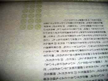
“Each double-spread page is under-layed with a pattern of stamps that in Japan are usually used to mark student homework. These marks range from ‘Done very well’ to ‘Normal’ up to ‘Try harder’. I’ve reduced the original stamps so much that on the very first glimpse they give the impression of a wallpaper-like pattern and even the Japanese reader has to watch carefully to recognize the well-known stamps.”
“Because of the thin Mitsumata paper the marks shine through the pages. Every single page is stamped by hand. To get the colors I had in mind, I mixed them from lithograph printing ink. The book is stitched with a Japanese binding and as a cord I used a twisted paper strip. The cover consists of Kozo cardboard with a thin layer of Ganpi paper giving a fine shine. I printed a pattern of one single stamp in the original size on it saying: ‘You have to try harder’. This stamp is the worst mark you can get in Japan and stands in contrast to the one I’ve used at the end of the text for the imprint (good).”
Schäpers was born in Gescher (Westphalia) Germany and moved to Japan in 1998, where she has been working ever since. There is a good video of Schäpers speaking about this and her other artists’ books at: http://www.nypl.org/audiovideo/veronika-sch%C3%A4pers-book-artist