July 2012 Archives

Reflex camera

| 1 Comment
reflexcamera3.jpg
Reflex camera, ca. 1905. Made by the Reflex Camera Company,
Newark, New Jersey. Adjustable lens by Voigtländer & Sohn, Braunschweig, Germany. Gift of anonymous donor.
reflexcamera2.jpg


reflexcamera1.jpg

On December 4, 1942, The New York Times posted an obituary for Louis Borsum (1856-1942), who “developed the Reflex Camera and Metal Polish.” Borsum died at the age of 88, a retired inventor living in East Orange, New Jersey. Originally from Germany, Borsum was a pioneer in the development of photography equipment. His first patent was filed in 1891 and a later variation on the Reflex camera, shown here, was patented in 1895. Unfortunately, the business did not last long and the development of a single reflex camera was left to others.

Not much information on Borsum has been recorded. A small notice was published in a 1906 Photo-Era magazine and then, picked up in Camera: a Practical Magazine for Photographers, stating “A new aspirant for honors, in the convention this year, was the Borsum Camera Co., Jersey City, N. J., manufacturers of the Reflex Camera. The new Reflex has been much improved; it is lighter and simpler than ever before, and the sale promises to be large, as was demonstrated at the convention, where Messrs. Borsum and Fiedler made many friends.”

See where this camera stands within a timeline of photographic equipment, as shown in: Douglas B. Tubbs, The Illustrated History of the Camera from 1839 to the Present (New York Graphic Society, 1975). Marquand Library (SA) Oversize TR250 .T82 1975q

reflexcamera history page.jpg

Dante Gabriel Rossetti

rosetti.jpg

Death mask of Dante Gabriel Rossetti (1828-1882), from the original by Domenico Brucciani (1815/18-1880) in possession of W. M. Rossetti. Previously owned by Janet Camp Troxell. Referenced in Princeton University Library Chronicle vol. 33, no. 3, p. 173.

The English poet and painter Dante Gabriel Rossetti (1828-1882) was in poor health during the last years of his life, particularly after being cut-out of the Kelmscott decorative arts firm by William Morris (1834-1896). He was addicted to chloral hydarate, which he had begun taking to cure insomnia. In December of 1881 Rossetti suffered a mild stroke that left him largely paralyzed and on Easter Sunday, April 9, 1882 he died. The cause was listed as Brights Disease (kidney failure).

His friends not only had a death mask made by the leading plaster caster of the time, Domenico Brucciani, but also a cast of his right hand. A directory of British bronze sculpture founders and plaster figure makers has been mounted by the National Portrait Gallery, London. Under “B” you will find a complete history of the Brucciani family’s plaster cast business and Domenico’s work as a Formatore or modeller for what is now the Victoria and Albert Museum and the British Museum.
http://www.npg.org.uk/research/programmes/british-bronze-founders-and-plaster-figure-makers-1800-1980-1/

Où diable l'amour va-t-il se nicher!

ou diable lamour.jpg
Photographer unknown, after a painting by Édouard de Beaumont (1821-1888) after a photograph by Charles Nègre (1820-1880), Où diable l’amour va-t-il se nicher! 1873. Albumen silver print. Graphic Arts GA2012- in process

376px-Henri_Le_Secq_near_a_Gargoyle.jpgCharles Nègre (1820-1880) The Vampire, 1853 (c) Musée d’Orsay
1940.889.jpgCharles Meryon (1821-1868), Le Stryge, 1853. (c) Cleveland Museum of Art
318-02c45db35d.jpg Joseph Pennell, Le Stryge, 1893.
(c) Art Institute of Chicago
354-191145a9d0.jpgEdward Frascino, “Come on Harve. Do your Quasimodo for us!” 15 July 1972. (c) The New Yorker

In 1844, Édouard de Beaumont (1821-1888) was one of several artists asked to illustrate a new edition of the novel Notre-Dame de Paris by Victor Hugo (1802-1885). First published in 1831, the book was an enormous success and the 1844 edition was to be a sumptuous new printing with two dozen new engravings.

The popularity of Hugo’s book not only resulted in multiple editions in many languages but also in the restoration of the Cathedral of Notre Dame itself. Beginning in 1845 and lasting for twenty-five years, the controversial rebuilding included the addition of the gargoyles on the Galerie des Chimères.

Many visual artists were inspired to create images of the structure, using in particular the gargoyles as romantic icons. Charles Nègre (1820-1880) and Henri Le Secq (1818-1882) playfully photographed each other on the north tower in 1853 and Nègre’s image remains a favorite in museum collections around the world. Views of “The Vampire” looking out over the city of Paris turned up everywhere, including an etching by Charles Meryon and later, a painting by Winslow Homer.

Twenty years after Nègre made his photograph, Beaumont was inspired to revisit the theme in a painting he called “Où diable l’amour va-t-il se nicher!” Historians have translated this enigmatic title several ways, offering “Where the devil will love nest,” “Where will Devil Love nest,” or “Where the hell is love going to nest!” among other variations. Rather than drag his easel up all those stairs, Beaumont simply copied the major portion of the photograph exactly, substituting only the portrait Le Secq for a couple in love (the woman in a startlingly green dress).

Beaumont’s painting was not only accepted into the Salon of 1873 but won second prize. An engraving of the painting was made by Léon Gaucherel and the French firm Goupil et Cie. had both an albumen photograph and a woodburytype created. They first sold them as part of their series Galerie photographique and then, published the woodburytype in their sumptuous journal Galerie contemporaine littéraire, artistique (v. 8, 1884) along with a portrait of the artist and several other paintings.

For more variations on the Vampire theme, see the wonderful study by Michael Camille, Gargoyles of Notre Dame: Medievalism and the Monsters of Modernity (Chicago: University of Chicago Press, 2009). Marquand SA NA3549.P2 C36 2009


Stones given to Firestone Library

signage.jpg
signage2.jpg

From Pembroke College, Oxford, founded 1624. The College of Doctor Johnson.

signage4.jpg
signage3.jpg

This stone from the Houses of Parliament was presented to Princeton University by His Britannic Majesty’s Government in grateful recognition of the hospitality shown by the University to the British Service Mission in the U.S. A.

Margaret Armstrong

| 1 Comment
van dyke ryling.jpg

American publishers’ trade bindings are a popular topic in book collecting. One of the best designers of this genre was Margaret Neilson Armstrong (1867-1944). She worked primarily for Scribner’s, completing at least 270 books for the publisher. Henry Van Dyke (1852-1933) was one of the authors whose novels were all originally bound with Armstrong’s decorative gold stamping. Here are a few, but for a complete inventory see the database mounted in 2003 by The University of Alabama, University Libraries, in partnership with the University of Wisconsin-Madison Libraries. http://digicoll.library.wisc.edu/WebZ/SearchOrBrowse?sessionid=01-62870-520831238

van dyke valley.jpg
van dyke days.jpg
van dyke golden.jpg

See also: Charles B. Gullans, A Checklist of Trade Bindings Designed by Margaret Armstrong (Los Angeles: University of California Library, 1968). Graphic Arts Collection (GA) Oversize Z269.2.A75 G84 1968q

Jean-Martin Charcot's Visual Psychology

iconographie14.jpg
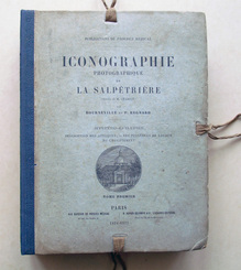
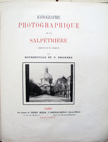
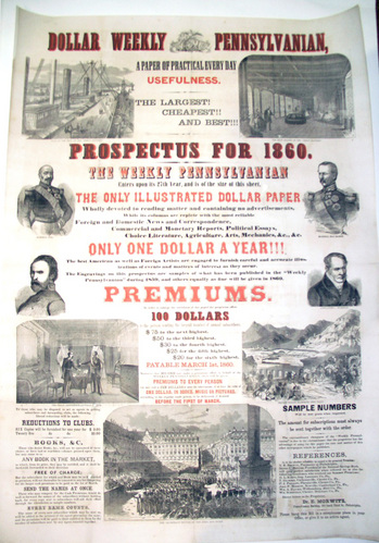
Désiré Magloire Bourneville (1840-1909) and Paul Regnard (1850-1927), Iconographie photographique de la Salpêtrière. Service de M. Charcot (Paris: Adrien Delahaye & Co., 1876-1877, 1878). Graphic Arts Collection GAX 2012- in process

iconographie1.jpg
iconographie11.jpg

As a young professional Jean-Martin Charcot (1825-1893) served his internship at Salpêtrière, a women’s hospital in Paris used as more of “a warehouse for female outcasts: women who were mad, violent, crippled, chronically ill, mentally retarded, unmarried and pregnant, or simply old and poor.” Charcot called it “that grand asylum of human misery.” [Medical Muses, 2011]

In 1862, Charcot returned to Salpêtrière as chief physician of medical services and transformed it. During his tenure, the hospital grew to house more than 5,000 patients in 100 buildings; the largest institution of its kind in Europe. It had its own farm, bakery, and by 1878, a well-equipped photography studio. (Bellevue Hospital in New York City also had a full photography department.)


iconographie2.jpg
iconographie10.jpg
iconographie7.jpg

Asti Hustvedt writes, “Charcot … brought hysteria, hitherto marginal, into the mainstream. He legitimized the disease by defining it as an inherited neurological disorder, not madness or malingering.” Martin Kemp noted that the doctor’s work was “an unrivaled attempt to create what may be called ‘visual psychology’ —in which imagery and environments played a central role in diagnosis, recording, clinical suggestion, treatment and the design of the patients’ surroundings.”

Charcot was deeply influenced by his predecessor at Salpêtrière, Guillaume-Benjamin Duchenne de Boulogne who published his treatise Mécanisme de la physionomie humaine in 1862. Six years earlier, Duchenne had begun photographing his patients, thanks to the help of Adrien Tournachon (Nadar’s brother), as a form of “orthography of the physiognomy in motion.” Charcot began to do the same.

iconographie3.jpg

In 1875, he selected as an intern a young psychiatry student named Désiré-Magloire Bourneville, who was also a journalist. Bourneville wrote extensively for medical journals and eventually, published two of his own. Under Charcot, he learned to keep extensive medical histories on the patients, many of which were later published in Iconographie. It is thanks to Bourneville that Charcot’s many accomplishments became known both in his own time and today.

iconographie8.jpg
iconographie4.jpg

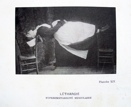
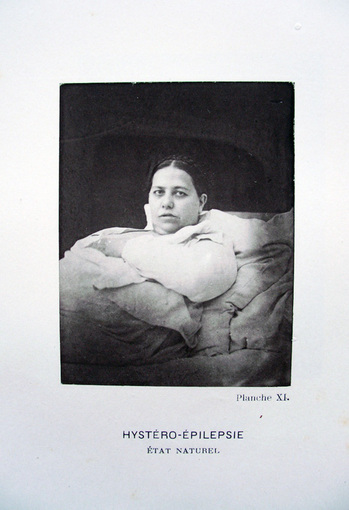
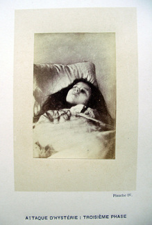
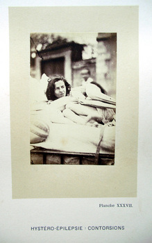
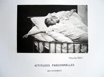
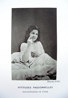
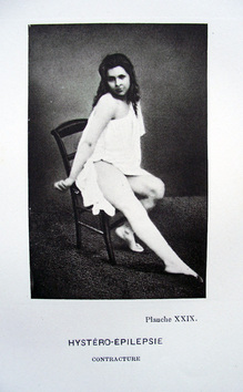
Another intern, Paul Regnard, was hired, in part, for his ability to make photographs. Charcot hoped these would provide visual evidence to support his conviction that hysteria was a real organic disease with particular symptoms. In 1882, photographer Albert Londe (1858-1917) was hired as a chemistry assistant and before long, took over the running of the photography laboratory. Londe published his own study in 1893 entitled La photographie médicale: application aux sciences médicales et physiologiques, dedicated to Charcot.

iconographie9.jpg

“The photographs in the Iconographie haunt its pages,” writes Hustvedt, “[they are] the ghosts of women who refuse to be reduced to medical illustrations.”


See also:
Asti Hustvedt, Medical Muses: Hysteria in Nineteenth-Century Paris (New York: W.W. Norton & Co., 2011). Firestone RC339.52.C453 H87 2011

Ann Thomas, Beauty of Another Order: Photography in Science (New Haven, CT: Yale University Press in association with the National Gallery of Canada, Ottawa, 1997). Marquand Library (SAPH): TR692 .T466 1997

Noah Webster

noah webster.jpg

Yale graduate Noah Webster, Jr. (1758-1843) is responsible for changing the word “colour” to “color” and “musick” to “music.” Webster wrote the first American dictionary, entitled A Compendious Dictionary of the English Language (1806) and followed it with An American Dictionary of the English Language (1828).

Before the age thirty, Webster had already published a three volume study: A Grammatical Institute of the English Language, including a speller (1783), a grammar (1784), and a reader (1785).

In its first fifty years in print, the speller sold 15 million copies.

Not all his ideas were accepted. In “An Essay on the Necessity, Advantages, and Practicality of Reforming the Mode of Spelling …”, Webster described the alterations he wished to make. Here are a few:

1. The omission of all superfluous or silent letters; as a in bread. Thus bread, head, give, breast, built, meant, realm, friend, would be spelt, bred, hed, giv, brest, bilt, ment, relm, frend.

2. A substitution of a character that has a certain definite sound, for one that is more vague and indeterminate. Thus by putting ee instead of ea or ie, the words mean, near, speak grieve, zeal, would become meen, neer, speek, greev, zeel.

3. Thus ch in French derivatives should be changed into sh; machine, chaise, chevalier, should be written masheen, shaze, shevaleer; and pique, tour, oblique, should be written peek, toor, obleek.


Attributed to John Henri Isaac Browere (1792-1834), Bust of Noah Webster, no date. Casting plaster. Gift of Mrs. Theodore L. Bailey. Ex 4766

The Original Writing Machine: The Remington Type-writer

remington.jpg

Rare Books and Special Collection at Princeton, holds a Model No. 1 Remington Type-writer from 1874. The manufacture of this machine began at the gun works of Eliphalet Remington (1793-1861) in 1873 but the first sales were not made until the following year. Remington called his machine a Type-writer and it wrote capital letters only. Demand for a greater variety of fonts led to a second model in 1878.

The young Remington began working as a blacksmith in Kinne Corners, New York, where he invented a new barrel for an hunting rifle. Its success led Remington to build a factory, where he could manufacture the guns himself. Remington & Sons also produced and sold bicycles, farm ploy blades, and sewing machines but it is the type-writers for which they had their greatest success.

Reason Speaks and Pleasure Carries One Away

rogers.jpg
Barthélemy Roger (1767-1840) after a drawing by Pierre-Paul Prud’hon (1758-1823), La raison parle, et le plaisir entraîne (Reason Speaks and Pleasure Carries One Away), ca. 1796-1799. Stipple engraving. Goncourt 78.ii; Laveissière 80-81.36; Beraldi XI.229. Graphic Arts Collection. GA2012-02315. Gift of Mary M. Schmidt.

“In order to succeed in what was for printmakers a perilous period, Prud’hon had to have more than sensitivity to contemporary taste,” notes Elizabeth Guffey. “Prud’hon’s print Love Reduced to Reason, which went on sale in later 1793 … was an unqualified success… . [The artist] followed it up with a series of similar projects, including Virtue Struggling with Vice: Reason Speaks, Pleasure Entraps; Love Caresses Before It Wounds; Innocence Prefers Love to Wealth; and Love Seduces Innocence, Pleasure Entraps, Remorse Follows.

Unlike many artists who allowed the publisher to handle the printing, publication, and sale of their work, Prud’hon kept a hand in every aspect of the process. His prints sold for as much as 7 livres (compared to the 3 livres charged for prints by Jacques-Louis David, 1748-1825). The investment and the sale of Prud’hon’s work was shared between his publisher and friend Constantin, the engraver (in this case Roger), and the artist.

For this print, Reason Speaks and Pleasure Carries One Away (also translated Pleasure Entraps), Prud’hon made two drawings, one ink and the other in two colors of chalk. Both are in the collection of the Fogg Art Museum. It may be that the artist and the engraver were considering a two color engraving, although no example of this has been found. Also shown below is the similar Virtue Struggles with Vice.

urn-3 HUAM 50735_dynmc.jpg(c) Fogg Art Museum
urn-3 HUAM 50734_dynmc.jpg(c) Fogg Art Museum

[left]: Prud’hon, La Raison parle et le Plaisir entraîne (Reason Speaks and Pleasure Carries One Away), ca. 1795-1799. Chalk drawing. Harvard Art Museums/Fogg Museum, Bequest of Grenville L. Winthrop, 1943.888
[right]: Prud’hon, La Vertu aux prises avec le Vice (Virtue Struggle with Vice), ca. 1795. Chalk drawing. Harvard Art Museums/Fogg Museum, Bequest of Grenville L. Winthrop, 1943.884

See also:
Elizabeth E. Guffey, Drawing an Elusive Line (Newark, Del.: University of Delaware Press, 2001). Marquand Library ND 553.P9G83 2001

Books During Prohibition

kessler3.jpg

Camillus Kessler (active 1920s), When We Get a Censorship of Books, no date [ca. 1925]. Pen and ink drawing. Graphic Arts Collection GA 2012.02310. Gift of Charles Rose, Princeton University Class of 1950, P77, P80.

kessler2.jpg

Camillus Kessler (active 1920s), Once Upon A Time: The Library, no date [ca. 1925]. Pen and ink drawing. Graphic Arts Collection GA 2012.02282. Gift of Charles Rose, Princeton University Class of 1950, P77, P80.


A Typewriter for Every Nation, for Every Tongue

typewriter2.jpg

On February 12, 1892, the Princetonian published this notice: “Mr. Barton Cruikshank has resigned the instructorship in Graphics to become superintendent of the Hammond Typewriter Co. Mr. F. C. Torrey, of the Electrical School, will succeed him for the remainder of the year.” Cruikshank had only just accepted the position of assistant professor the previous fall, teaching a “course of graphics” at the John C. Green School of Science, Princeton College.

The Hammond typewriter was still a fairly new machine, having been introduced in 1884 at the New Orleans Centennial Exposition. It differed from the Remington typewriter in its round, rotating type shuttle. To change fonts or languages, the owner purchased separate shuttles and switched between them as needed. The Hammond Company slogan was: “For every nation, for every tongue.”

Princeton’s Hammond is a variation on the Hammond No.1. The Hammond No. 2 was introduced in 1895 and No. 3 in 1896. The machines sold well into the 1920s, when the name was changed to the Varityper and continued for another fifty years.

See also: Darren Sean Wershler-Henry, The Iron Whim: a Fragmented History of Typewriting (Ithaca: Cornell University Press, 2007). Firestone Library (F) Z49.A1 W47 2007
Wilfred A. Beeching, Century of the Typewriter (London: Heinemann, 1974). Graphic Arts Collection (GA) Z49.A1 B43 1974

typewriter3.jpg

Hammond typewriter, 1880s. Museum objects collection.

dollar2.jpg
Prospectus for the Dollar Weekly Pennsylvanian, 1860. Two-color broadside. 42 x 29 1/2 inches (106.7 x 74.9 cm.). Graphic Arts Collection GAX 2012- in process

The Dollar Weekly Pennsylvanian ran from 1854 to 1861 under the editorial control of Dr. Edward Morwitz (1815-1893), a physician turned newspaper publisher. Morwitz also ran the German-language newspaper Demokrat and the weekly Vereinigte Staaten Zeitung (United States Journal), using all his papers to advocate for his political views.

There were many other papers run by Morwitz. This broadside mentions the reuse of “cuts” and stories from his five other newspapers. Biographer Henry Samuel Morais writes that Morwitz “controlled, perhaps, more newspapers than any other man, having under his management at one time as many as three hundred of these, and among them eight dailies…”


dollar4.jpg
dollar1.jpg

The large wood engravings on this sheet illustrate the newspaper’s extensive coverage of foreign news, offering scenes of the Second Italian War for Independence (also called the Franco-Austrian War). There are also portraits of Giuseppe Garibaldi, Adolphe Niel, Patrice MacMahon, and Alexander von Humboldt.

See also: Henry S. Marais (1860-1935), The Jews of Philadelphia (Philadelphia: Levytype Co., 1894). Firestone Library (F) F158.9.J5 M8 1894

dollar5.jpg

Lucretia Mott "Deeds Not Words"

mott.jpg
Leopold Grozelier (1830-1865), Lucretia Mott, 1853. Lithograph. Graphic Arts Collection, GA 2012- in process

The Quaker minister Lucretia Mott (1793-1880) fought for the rights of women and of African Americans. A mother of six, Mott traveled and preached throughout the Eastern United States in front of both Black and White, both male and female organizations. She helped found the Philadelphia Female Anti-Slavery Society and attended the World’s Anti-Slavery Convention in 1840. Together with twenty-five year old Elizabeth Stanton, Mott organized the first women’s rights convention held in Seneca Falls, New York in 1848.

Here is a video of the honorable senator from New York Hilary Clinton’s speech on August 26, 2008, honoring Mott, Stanton, and the other women who fought for their rights.

See also: Lucretia Mott (1793-1880), Discourse on Woman (Philadelphia: T. B. Peterson, 1850). Rare Books: Miriam Y. Holden Collection (ExHolden) HQ1423 .M9

Nauvoo Legion

| 1 Comment
smith3.jpg
After John Hafen (1856-1910), Last Public Address of Lieut. Gen. Joseph Smith,
no date, original 1888. Albumen silver print of a lithograph. Graphic Arts Collection. GA 2012- in process

When he was five years old, the Swiss-born artist John Hafen (1856-1910) was brought to Salt Lake City by his family, where they all became members of The Church of Jesus Christ of Latter-day Saints (LDS Church). As an adult, Hafen helped found the Utah Art Association and established the art department at the Brigham Young Academy. He often chose to paint Mormon subject matter, such as these portraits of Joseph Smith (1805-1844).

smith2.jpg
After John Hafen (1856-1910), Lieutenant-General Joseph Smith. First Commander of the Nauvoo Legion, 1888, original painting 1887. Graphic Arts GA 2008.00903

Joseph Smith was only twenty-four years old when he wrote and published The Book of Mormon, an Account Written by the Hand of Mormon upon Plates Taken from the Plates of Nephi [(WA) 2005-0197]. He became the leader of the LDS community, which settled in Commerce, Illinois. They renamed the town Nauvoo (meaning “to be beautiful”) and formed the Nauvoo Legion.

On June 7, 1844, the first and only issue of The Nauvoo Expositor was published by several disenfranchised members of the Legion, criticizing Smith and his beliefs [(WA) F549.N37 xN34ae]. Four days later, Smith ordered the paper to be stopped and their press destroyed. He then assembled the men of the Nauvoo Legion and declared martial law.

According to legend, Smith said: “I call upon God and angels to witness that I have unsheathed my sword with a firm and unalterable determination that this people shall have their legal rights.” [quoted in the scene above]

smith4.jpg

Unidentified artist, Martyrdom of Prophet Joseph Smith, 1890. Lithograph. Graphic Arts Collection GA 2008.00904

Smith was arrested for treason and was taken to Carthage jail but on June 27, 1844, an angry mob stormed the jail. They killed both Joseph and his brother Hiram Smith. The remaining LDS Church followers united behind Brigham Young, who moved them to Utah, centered in Salt Lake City. This is where the artist John Hafen joined them in 1860s.

Night Shadows

hopper1.jpg
Edward Hopper (1882-1967), Night Shadows, 1921. Drypoint. Graphic Arts Collection GA 2007.01456

In October 1924, after ten years as the leading progressive American weekly, The New Republic magazine filed for bankruptcy. Founded in 1914 under the editorial leadership of Herbert Croly (1869-1930) and Walter Lippmann (1889-1974), the magazine was losing subscribers, Lippmann and other writers were being lured away by other publications, and The New Republic desperately needed a plan.

In December of the same year, the magazine ran an advertisement announcing a subscription bargain: if you purchase a two-year subscription to The New Republic, you will also receive a portfolio of six etchings by the American artists Peggy Bacon (1895-1987), Ernest Haskell (1876-1925), Edward Hopper (1882-1967), John Marin (1870-1953), Kenneth Hayes Miller (1876-1952), and John Sloan (1871-1951). The price was $12 (a regular one-year subscription was $5). They had no idea what a bargain this would be.

Hopper’s Night Shadows was completed at the beginning of 1921, just in time for the January 25 opening of the Chicago Exhibition of Etchings sponsored by the Chicago Society of Etchers. The drypoint was seen again that year in the National Academy of Design’s winter exhibition and in 1922 at the First International Exhibition of Etchings, organized by the Brooklyn Society of Etchers and held at the Anderson Galleries in New York City.

Hopper’s friend, Louis Bouché and manager of the Belmaison Gallery inside the Wanamaker Department Store, chose Night Shadows for a show in May of 1922 and again in May of 1923. It was easily Hopper’s best-known and best-loved print.

Surprisingly in 1923, Hopper stopped making prints and when The New Republic asked for a printing plate, he happily offered them one of his best. Most collections hold the 1924 reprinting, but the sheet in Princeton’s Graphic Arts collection is from 1921, printed by Hopper himself.

The collection holds one other print by Hopper, seen below.

hopper2.jpg
Edward Hopper (1882-1967), Eastside Interior, 1922. Etching. Graphic Arts Collection GA 2007.01455

Historical Bookbinding Models

teachingbindings2.jpg
teachingbindings3.jpg
teachingbindings1.jpg

Graphic Arts now holds a 2012 Teaching Set of Historical Bookbinding Models, thanks to Iowa Book Works, a small enterprise founded by Joyce Miller and Gary Frost that specializes in production of book craft kits. http://iowabookworks.bookways.com/?page_id=34

Included in an enormous clamshell box are ten model bindings, along with two instruction booklets. The history and culture of each binding is described, followed by notes on the “handling and action” of each volume (how it feels in your hand, how it opens, etc.). In this way, the student not only learns the definition of a book structure but how to recognize it when they hold one.

“These bookbindings illustrate the appearance and structure of common books in different cultures and across time,” writes Frost. “As you read the descriptions for the individual types investigate their physical features and mechanical actions. Handling of these model bookbindings will provide a lasting impression of the innovations and changes in the mechanism of the codex book. Each bookbinding model exemplifies specific attributes of the codex structure, and the array of books together tells a story of a persistent mechanism for reading.”

Samples include:
1. Papyrus book
2. Ethiopian book
3. Account book
4. Wooden board book
5. Vellum binding
6. Leather binding
7. Paper case binding
8. In-boards cloth binding
9. Cased cloth binding
10. Contemporary binding

Nassau Hall around 1859

nassau hall2.jpg

Attributed to Frank Childs, [View of Nassau Hall, Princeton, New Jersey], ca. 1859. Oil on canvas. Graphic Arts American Paintings

“On the night of Saturday, March 10, 1855, Nassau Hall was destroyed by fire,” writes Robert C. Smith. “At precisely half past eight, as the Philadelphian Society was ending its meeting on the fourth floor of the building, the cry of fire was heard from below. ‘Every effort,’ President Maclean later told the Trustees, ‘was made to subdue the flames but without success.’ As soon as it was realized that the firemen, without sufficient water to prime their noses, were powerless to stop the flames, whipped to the roof by a strong wind, the work of salvaging began.”

“‘The students and professors worked finely at the fire,’ one student wrote, ‘and all distinction seemed to be lost in the general confusion.’ Henry C. Cameron, Tutor in Greek, and a student named Gilchrist ‘burst open’ the door of the picture gallery and began handing the portraits to safety. George Musgrave Giger, Professor of Latin, and his colleagues Professors Duffield and Alexander forced their way through the blaze to rescue papers and other valuable property. The old bust of Homer was hauled down from over the center door, while ‘General’ Perrine, a Princeton character of the time, rode up to direct the evacuation.”

“By midnight all was over and everything of moment to the College had been saved, except the bell, which had survived the earlier fire of 1802. Some students had lost all they possessed, but no one was hurt save James Bayles of Kingston, who fell and broke his leg.” From Robert C. Smith, “John Notman’s Nassau Hall,” in Princeton University Library Chronicle XIV, no. 3 (spring 1953). http://libweb5.princeton.edu/visualmaterials/pulc/pulcv14n_3.pdf

This painting depicts Nassau Hall (built in 1756) after it was restored and revised by the architect John Notman (1810-1865). Notman made a number of exterior changes to the building, including the staircases at the ends of the building and the arched front doorway.

Ecstatic Alphabets / Heaps of Language

| 1 Comment
00087.jpg

“In 2004, The Museum of Modern Art approached typographer Matthew Carter about “refreshing” their icon MoMA, set in Franklin Gothic. Carter said it was, ‘like asking an architect to design an exact replica of a building.’ The result: The new logo - rechristened MoMA Gothic - looks just like the old one, but stretched vertically one eight-hundredth of an inch… . Will anyone notice? Glenn D. Lowry stated: ‘I suspect that if we’re really successful the public won’t really notice the difference, it will just feel right.’”

If I understand the evolution correctly, this text is a portion of an essay by Andrew Blum, originally published in The New York Times, July 21, 2003, as “The Modern’s Other Renovation.” In the winter of 2011-12, it became part of Identity, a wonderful exhibition video prepared by Dexter Sinister (Princeton University lecturer in graphic design David Reinfurt and Stuart Bailey) at The Artists’ Space in New York City. Most recently, it is part of The Serving Library’s 3rd issue and the exhibition catalogue for Ecstatic Alphabets/Heaps of Language at the Museum of Modern Art until August 27, 2012.

Bulletins of the Serving Library (Berlin, Germany: Sternberg Press; New York, NY: Dexter Sinister, 2011- ). Electronic resource http://servinglibrary.org/

Complete Identity catalogue: http://artistsspace.org/aspace/wp-content/files_mf/identitybookletdigital.pdf

Ecstatic Alphabets/Heaps of Language brings together historical and contemporary works of art that treat language not merely as a system of communication governed by grammatical rules and assigned meanings, but as a material that can be manipulated with creative freedom, like paint, clay, or any other artistic medium.”—MoMA press release http://www.moma.org/interactives/exhibitions/2012/ecstaticalphabets/

Le pavillon sur l'eau

| 2 Comments
pavill 2.jpg
pavill 7.jpg
pavill 1.jpg

Le pavillon sur l’eau (The Water Pavillion). Translated by Théophile Gautier (1811-1872). Illustrated by Henri Caruchet. Preface by Camille Mauclair (1872-1945). Paris: A. Ferroud, 1900. One of 80 large paper copies. Graphic Arts GAX 2012-0243N

pavill 6.jpg
Gautier’s translation of The Water Pavillion from Chinese to French wasn’t the first. Jean-Pierre Abel-Remusat (1788-1832), a Chinese literature scholar, published a translation of the folktale in 1827. Gautier followed with his own version in 1846, and included it in his 1852 compilation La Peau de tigre (The Tiger Skin). Paris art publisher Ferroud used the last for his 1900 limited edition.

pavill 5.jpg
pavill 4.jpg
pavill 3.jpg

The Effects of Unco Gede Living

| 1 Comment
looking glass1.jpg

Robert Seymour (1798-1836), Returning Fra the North, or, The Effects of Unco Gede Living, [November 1, 1834]. Lithograph with hand coloring. Published in McLean’s Monthly Sheet of Caricatures or The Looking Glass, no. 58. Graphic Arts 2012- in process

The Looking Glass was originally drawn by William Heath (ca. 1795-1840) while based in Glasgow from 1825 to 1826. The satirical newspaper was revived in 1830 by publisher Thomas McLean (1788-1875) under the title McLean’s Monthly Sheet of Caricatures or The Looking Glass.

Artist Robert Seymour (1798-1836) replaced Heath as the chief contributor and turned out hundreds of caricatures, large and small, colored and uncolored, to meet the ridged monthly deadlines for the next six years. Working primarily in lithography, Seymour was also producing weekly drawings for Figaro in London, edited by Abbott à Beckett and later, Henry Mayhew.

The caricature depicts Scottish judge and publisher Lord Jeffrey (1773-1850) who edited the Edinburgh Review from 1802 to 1829. Jeffrey was elected to parliament in 1831, living primarily in London, and introduced the Scottish Reform Bill in 1832. Two years later, not long before Seymour drew this image, Jeffrey was named Lord Jeffrey and returned to Scotland to served as a judge.

The words “Unco Gede” are a Scottish term for exceptionally good or strictly moral. Jeffrey had a reputation for his strict morality, which may account for the reference.

For the complete story of McLean’s magazine, through various titles and formats, see: http://special.lib.gla.ac.uk/exhibns/month/june2005.html


Recent Comments

  • Howard Coblentz: I have a round seal shaped like a pear a read more
  • John Overholt: Wikipedia's entry for Sir Francis says: "Throughout Baring's lifetime his read more
  • Serge Rodrigue: It is a precious thing you have a book from read more
  • Colin Wicks: I have a copy of “A Round Game.” And it read more
  • Laurence Hilonowitz: I was a Customer, Friend of Bob Wilson. I Live read more
  • allen scheuch: Absolutely STUNNING! Those colors, those designs made my day! Thanks, read more
  • Olivier: Hello Diane, If you are still looking for an examplare read more
  • Stella Jackson-Smith: I have a framed picture by A.Brouet, signed with the read more
  • John Podeschi: I remember Dale fondly from my days at Yale (1971-1980). read more
  • Joyce Barth: I have some or all of this same poem. I read more