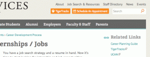
This year, Career Services has launched a new website. This new design combines state of the art technology and advice into one place. It’s easy to navigate, aesthetically sleek, and still your trusty career toolbox.
Okay, great. Now how do I use it?
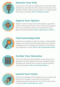
Simple: Just start clicking. One of the features of the website is easy navigability. Resources are organized largely by stages in the career journey. Just look to these new icons to guide you:
Then, as you start your search, pay close attention to the sidebars. On the left you’ll find an outline of resources that expand when you click on the page, offering more subcategories to search. On the right sidebar, you’ll find suggestions for further research: keep your eyes peeled for tips, videos, related links, and quotes from the Princeton community—just like these below.
Additionally, check out the new one-stop for job search databases in the top right-hand corner. If you’ve already been to the end of TigerTracks and back, these resources might help you refine your focus or broaden your horizons.
 Finally, since the dawn of the Internet, organizing has never been quicker. Think ICE schedules. Career Services’ website design also includes an easy-to-read calendar of events. And (get this) you can import them directly onto you iCal. It’s never been easier.
Don’t take my word for it though—check it out for yourself. If you feel so inclined, give us your feedback on the website, too!


