Group Number: 1
Group Members: Kuni Nagakura, Avneesh Sarwate, John Subosits, Joe Turchiano, Yaared Al-Mehairi
Project Summary: Our project is a serving system for restaurants, called ServiceCenter, that allows waiters to efficiently manage orders and tasks by displaying information about their tables.
Introduction:
Here, we describe the methods and rationale behind a user study geared to aid us in the design of our serving system. The goal of our system is to present pertinent information to servers in restaurants that allow them to task manage more efficiently. The prototype being evaluated is a single laptop connected to a display projector, which serves as the motherboard. The laptop acts as both an order input interface for the servers and a kitchen-side order status interface for the kitchen staff (this task was performed by a group member). We chose to use a laptop as the basis of our hardware because the primary purpose of our testing was for functionality and usability, and any interaction with a device in our system is a mouse-screen interaction, which a laptop provides well. Furthermore, the laptop allowed us to display customer information on a large screen, which is how we envision our motherboard should look like in our final design. As we have discussed, the purpose of our user testing was to gain insight in future design improvements. This being the case, our user study consisted of three tasks, ranging from easy to hard that covered the main actions that a server would perform using our system, described in the sections below.
Implementation and Improvements:
Our P5 post can be found here: http://blogs.princeton.edu/humancomputerinterface/2013/04/22/p5-grupo-naidy/
We do not have any new changes to our implementation, as we were preparing for P6.
Participants:
The participants in our research and testing were all members of the university community. They were selected purely on a volunteer basis without any specific requirements; we did give them a quick demographic survey in order to gain a deeper perspective on who we were working with and how they would relate to our target audience. All of our test subjects were familiar with computers and used them regularly; one of our test subjects had some prior experience working at a restaurant. Overall, we found our participants to be related only tangentially to the target user group, but since the primary purpose of our testing was for functionality and the tasks were relatively simple, we found this was sufficient. In particular, we had one user who had experience in the service industry–his post-testing interviews were incredibly helpful. Otherwise, our subjects did not have waiting experience.
Apparatus:
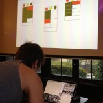
The testing was conducted in the dining room of one of Princeton’s eating clubs, at times when meals were not being served. We found this setting to be ideal, since it nearly replicated the environment of a restaurant and provided the necessary equipment (plates, glasses, a pitcher) without having to impose on any third party. A laptop computer was used to run the prototype system, and it was connected to a projector to show the order display on a large, highly visible screen – more or less how we imagine the final product to be used. The computer ran both the order display interface, into which the test subject entered new orders, as well as the “kitchen staff” interface, which was used to update the orders. The kitchen interface’s data was sent over a simulated wireless connection to better replicated intended use circumstances.
Tasks:
In our working prototype, we have chosen to support an easy, medium, and hard task. For the easy task, users are simply asked to request help if they ever feel overwhelmed or need any assistance. This task is important to our system, because one of our functionalities is the ability to request assistance from waiters who may have a minute to spare and are watching the motherboard.
For our medium task, we ask users to input order information into the system for their table. Once users input orders, the motherboard will be populated with orders and the kitchen will also be notified of the orders. This is a medium task since this is simply inputting information.
Finally, for our hard task, we ask our users to utilize customer statuses (ie. cup statuses, food orders) to determining task orders. This task covers both ensuring that cups are always full and that the prepared food is not left out for too long. The motherboard’s main functionality is to gather all this information in an easy to read manner, allowing waiters to simply glance at the customer status to determine what order they should do things.
Procedure:
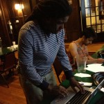
The testing procedure was designed to place the test subject in as accurate a simulated restaurant environment as was possible. The tasks that can be accomplished with the system were required to be performed interspersed with each other, as they would be in a real restaurant, rather than completely divorced from each other. Three of the group members sat at different tables and each played the part of 3 to 4 customers. The tester acted as the waiter for about 15 minutes while the customers ordered a standard, prescribed combination of appetizers, entrees, and deserts. The tester was responsible for entering the orders into the system and for bringing the “food” (actually paper labels) to the table after it had been prepared and plated. Each dish took a specific length of time before it was ready. Periodically, generally about twice a test, the tester would have to fill the water glasses at each table since the motherboard indicated that they were empty. Participants generally did a good job of announcing both what they were doing, ex. “I am refilling the water glasses,” and what they were thinking, ex. “It’s confusing that red means the water glasses need to be refilled but that the food isn’t ready yet, so I don’t have to do anything.”
Test Measures:
“Turn around time’” – time between dish being put out by kitchen and being delivered. This was measured by hand – electronic measurements were dependent on users correctly using the system, making the metric interdependent on other variable factors (discussed later)
Post-Test ratings by users (Self reported Likert scale 1-5. The results of these questionnaires are provided in the Appendix):
- “Recoverability” – Whether the system made it easy to recover from mistakes. We felt that this was important because in a system where “online” decisions are being made, the system must be especially robust to user error.
- “Easiness to Learn” – Since this system would be deployed in existing restaurants, the restaurants would want to minimize the time that users (waiters) would take to adapt to the new system and start working at their maximum efficiency. Thus, we felt this an important metric to measure.
Results and Discussion:
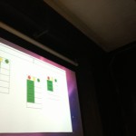
Testers had some trouble interpreting the graphical display on the motherboard. In particular, they suggested that the color coding of various events could be made more intuitive and that the presence of empty water glasses could be indicated in a more obvious way than the number of full or half-empty ones. Basically, the display of things that need to be urgently addressed should grab the user’s attention and colors should be consistent. If red is to indicate attention for cups, it should not indicate “not ready” (and thus requiring no attention) for orders. Perhaps in the future, the red circle that contains the number of empty water glasses can be made to flash. On the bright side, users seemed to have a fairly easy time entering orders into the terminal for the kitchen to prepare. One thing that we were interested in seeing was whether or not order input would be a hinderance to servers.
Overall, the testers were fairly efficient in the use of the system. We had wanted to put a “heavy load” on the testers to see how they would respond to a lot of activity, and we did this by scheduling what we thought was a high number of orders (9 “orders” comprising of about 25 dishes) over the course of 10-12 minutes. The average “turn around time” of the users was quite low. We decided to split the data into instances where the waiter was in the “kitchen” area when the dish came out and when the waiter was not. Unsurprisingly, when the waiter was around, the average turn around time was negligible. When the user was not in the kitchen, the average across users was about 30 seconds per order.
However, we realized after the fact that we did not have a “control set” of turnover times, which would ideally be turnover times from waiters working in a real restaurant environment. We noticed that waiters had the most trouble when sets of orders from different tables came out at the same time, and in a real restaurant setting, there could be more tables, and thus more of these challenging situations. Our setup used only 3 “tables” of guests placing orders, but it may have been more accurate to have a larger number of tables placing orders with a lower frequency. We also noticed that none of the users decided to call for help in this trial. This is most likely because we used paper plates during the trial, which allowed users to pick up as many plates as needed when delivering orders. The physical space we were using to test was also quite small, allowing users to move back and forth between patrons and the “kitchen” very quickly, allowing them to deliver a large amount of plates quickly without too much delay. Since this system is meant to help with actions whose durations are very short, environmental influence on action time can be proportionally very significant, and care must be taken to recreate an accurate environment to get meaningful data.
Users seemed to figure out very quickly how to enter the data into the interface for a new order, and by the time they were entering their second or third full order they had become quite efficient with the system. However, we noticed that several test subjects seemed to forget about the requirement to delete the orders after they were ready and delivered. Since there are a limited amount of order slots for each table, any order input on a full table would not go through. This resulted in at least one mistake where an order was lost in translation from paper to prototype when the user did not look up at the screen immediately to check that the data had been entered successfully. We have also considered making the ready orders disappear automatically to avoid this problem, but this raises the additional problem of the system needing to know when the plate has been taken out. In this case, at the very least a warning to tell the user that a table is full of orders would be a good addition to the prototype.
- Subject 1 updates orders.
- Subject 2 inputs orders
- Subject 3 glances at the Motherboard to check the status of his tables
Appendix:
All surveys, forms, and scripts are located in this dropbox folder. All the collected raw data is also located in this folder.


