Netid
- kyal@
Observations
I conducted my observations during the 10 minutes before COS 333 (11:00 – 12:20pm) on Tuesday February 19th, PHI 322 (1:30 – 2:50pm) on Thursday February 21st, and COS 340 (3:00 – 4:20pm) on Monday February 25th. I arrived early to these classes on said days and noted the behavior of my fellow students and professors. In the process, I was able to interview a number of students.
General Activities
- Students talking amongst themselves
- Professor playing classical music and taking pictures (B.W.K.)
- Students checking and responding to email
- Professors trying to set up equipment/distribute materials for lecture
- Students getting out notebooks and pens for lecture
- Students sleeping
- Students staring into space (i.e. relaxing)
- Students listening to music
- Students texting/making phone calls
- Students doing/reviewing homework
- Students surfing the web (on laptops and phones)
- Students shopping online (mostly female students)
- Students and professors reading (academic/non-academic materials)
- Students drinking coffee/eating snacks
- Students eating meals (mostly graduate students)
- Students charging phones/laptops
- Students checking dining hall/eating club menus
- Students playing games (on laptops and phones)
Subject Interviews
- Student 1 arrived early to COS 333. When I asked Student 1 what he/she did during 10 minutes before class, he/she indicated, “Not much apart from checking emails and surfing the internet.”
- Student 2 arrived late to PHI 322. When I asked Student 2 (after lecture) what he/she did during 10 minutes before class, he/she indicated, “Nothing, usually it is hard to utilize the 10 minutes before 1:30 class because it is lunch time, there is much dining hall/eating club traffic and it takes some time to get from dining halls/eating clubs to class buildings.”
- I passed Student 3 (whom I know is in COS 340) on the way to COS 340. Student 3 was a smoking a cigarette outside the lecture building. When I asked Student 3 what he/she did during 10 minutes before class, he/she indicated, “I usually require the 10 minutes to get to my next class, but sometimes I smoke a cigarette on the way.”
Review
From these observations, it is evident that people like to spend the 10 minutes before lecture in one of three ways: socializing, entertaining themselves, or working (in some fashion). Therefore, my design should look to cater to those who are looking to socialize, those who are simply bored, and those who are trying to be productive. Furthermore, my design should improve their lives by enhancing such kinds of activities.
Brainstorm Ideas (collaborated with Kuni Nagakura and McLean Shaw)
- “Tracktor” – An app that integrates with your music library and chooses a customizable playlist, whose duration is less than or equal to a specified length of time (perfect for your walk to/wait for class).
- “CourseView” – An app that integrates with ICE and offers students high-level summaries of past lectures/materials and upcoming course deadlines.
- “PitStop” – An app that finds food/drink (e.g. coffee shops, fast-food restaurants, vending machines) on your way to class based on tank status, which is user specified.
- “The Outside Initiative” – A proposal to introduce more outdoor social spaces on campus. A greater number of benches and trash cans outside (of which there are very few) on campus, for example, would allow more opportunity for socializing outside the classroom (something that is pretty tough to do in the school week).
- “Flag-A-Friend” – An app that integrates with ICE and your contacts so that users can let their friends know when and where they get out of class, thus enabling you to run into your friends even when swamped with class.
- “Docket” – An interactive device with both multiple sockets and screen interfaces that serves as both a charging dock for mobile devices (e.g. cell phones, laptops) and an info center for campus activities and schedules (e.g. dining hall/eating club menus, facility closing times, conference times, social events, student performances and so on).
- “BrownSound” – An app that generates brown noise (deep ambient rumble) that serves as a sleeping aid for those looking to catch some shut-eye before class.
- “Achilles” – An app that finds the most efficient routes from source to destination on campus including routes through buildings taking into account any congestion.
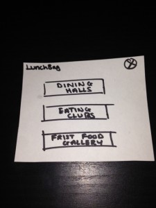
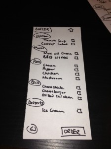
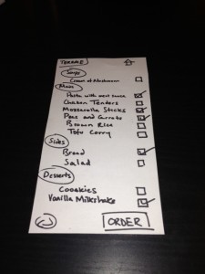
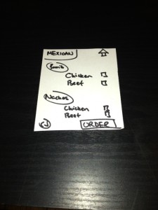
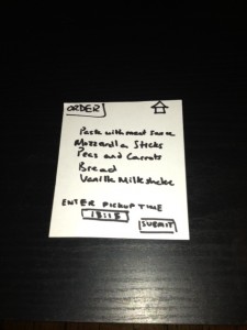
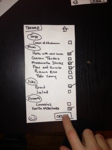
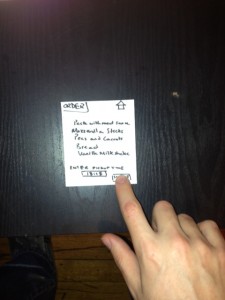
- “LunchBag” – An app that allows you to order meals-to-go from dining halls/Frist food gallery/eating clubs for pickup at a user specified time for students in a rush.
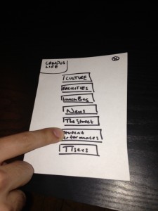
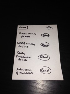
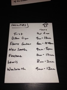
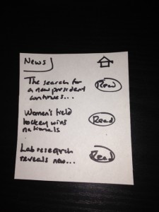
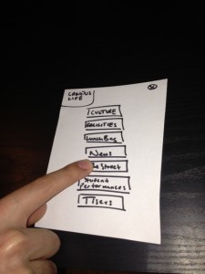
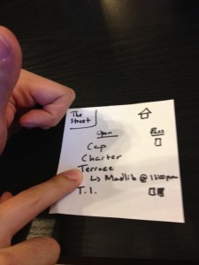
- “CampusLife” – An app that serves an info center for campus activities and schedules (e.g. dining hall/eating club menus, facility closing times, conference times, social events, student performances and so on).
- “ResourceFinder” – An app that finds the nearest restrooms, printers, scanners, computer clusters, convenient stores, coffee shops, vending machines, prox scanners (for updating prox privileges) and so on.
- “PrincetonTrivia” – A gaming app that quizes users on Princeton trivia.
- “PresenterFace” – An intuitive presentation interface for lecturers and preceptors that allows hassle-free pre-lecture/precept setup.
- “GymTime” – An app that offers 5-10 minute simple workouts that can be done in any environment.
- “CourseQuiz” – An app that integrates with ICE and offers multiple choice quiz questions on course material.
Favorite Ideas
My favorite ideas were “LunchBag” and “CampusLife” (#9 and #10 respectively). I chose “LunchBag” because I think, based on my observations not only for this assignment, but also in general, a to-go food service at dining halls and eating clubs would greatly benefit students. Due to large queues and limited time, it is hard for a lot of students to get meals and to class on time. Students shouldn’t have to make this choice (especially when the majority of meal plans are paid upfront). I chose “CampusLife” because I think such an app would both serve as an extremely useful centralized resource for students and faculty alike and help to instill a greater sense of community on campus, since if people are aware of what’s going on, people are more likely to get together. Furthermore, both these apps can benefit from the student prox/netid system, thus making them rather simple to implement.
Prototypes
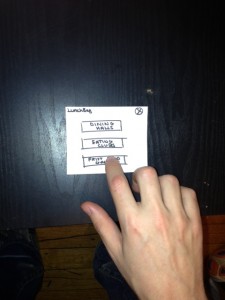
LunchBag
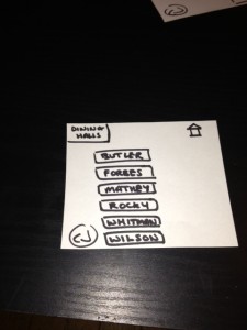
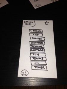
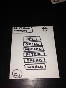
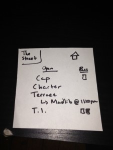
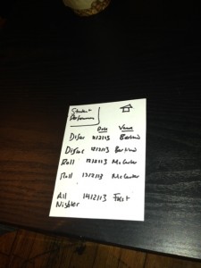
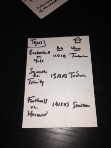
CampusLife
Feedback
I completed user testing with 3 different people.
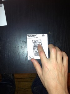
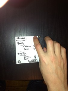
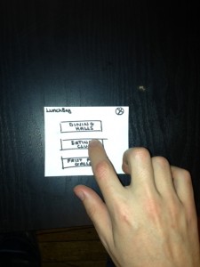
LunchBag Photos
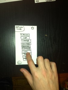
CampusLife Photos
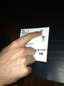
Users who tested “LunchBag” and “CampusLife” found the interfaces extremely simple and very easy to use. One user at first was unsure of how to go back a page on “CampusLife”, but shortly after discovered the “home” button (prototype is one level deep). Users in general remarked that they thought both apps would be extremely useful. Specifically, users indicated that “LunchBag” would be of great help to students in a rush and were confident that students would use it. In addition, users indicated that “CampusLife” could be the kind of fluid centralized service for campus activities and news in general that students are really looking for. Users also like the idea that “CampusLife” could integrate with “LunchBag”. One improvement suggested with regards to “CampusLife” was to allow users to purchase/reserve tickets for student performances and sports events. What’s more, generally users indicated that they would prefer more visually pleasing interfaces.
Insights
From the user testing, it is evident that clear layout and simple symbolization is key to the intuitiveness of a design, and therefore its accessibility. In general, users commented that both apps were successful because of their ease of use. Neither idea was particularly innovative, yet the ease of use coupled with clear organization of information seems to be of great value to the user.
Given the suggestion to allow users to purchase/reserve tickets for student performances and sports events through “CampusLife” (which I think is most definitely a good one), another point to take away from the user testing is to always remember who you are designing for. In my Brainstorm Ideas, I envisioned “CampusLife” being a kind of campus info center and as a result unknowingly narrowed the scope of the app’s functionality from an app that could provide users information and ways to use that information to an app that simply could provide users information. In any revision of “CampusLife, I would certainly add ticket purchase/reserve functionality for student performances and sports events.
Lastly, the user testing illuminated that even when using paper prototypes the aesthetics of an interface should not be completely ignored. People in general like to use things that are easy to use but also things that look nice. While, of course, when in the paper prototype stage, functionality is a designer’s primary concern, aesthetics is always a concern for the user.

