Observations:
I did most of my observations before COM 313, Monday 1:30. I arrived 15 minutes early, to an empty classroom. The first person arrived around 1:20. She got out her tablet and checked her email for a couple minutes. Then, she opened the readings we had for this class, and flipped through that for the rest of the time. More people started arriving around 1:25. (A couple students arrived with headphones on.) One girl got out her laptop, and continued a readings she had open. She would occasionally switch tabs to browse the web: facebook, tumblr. Another girl had her calendar open (as well as many other windows). After checking her schedule, she opened a reading for another class, then switched to her email. She started writing an email, referencing her schedule occasionally.
Several other people also checked email/schedules, then opened up their notes for this class, started a new heading, and waited. Several read back over readings they had for this class, as well as the notes they had taken from last week. Most students arrived within a couple minutes of 1:30, which seems in line with what most people I’ve talked to have told me: that there is really not much time between classes, and it often takes the whole 10 minutes to get from one class to the next.
The professor came in right around 1:30 and passed out notes. Then he started an attendance sign-in sheet.
Brainstorming:
- An app to submit comments/questions on the lecture to the professor.
- An app that shows highlights from the previous lecture.
- A way to help organize windows/notes/browser tabs for a class and open/close them together.
- An app that breaks readings into small chunks that you can read in spare minutes.
- An app that makes group scheduling easier/more automatic by syncing with your calendar.
- An app that helps that tells you which friends are in classes close by so you can get together for lunch.
- App for ordering food from late meal.
- An app that calculates the time it would take to get from your current location to your next class, and tells you when it’s time to leave.
- An app to find an open seat (least disruptive) for the late student.
- An app that finds the shortest path to class from current location.
- A way for professors to save their settings for lights/projector.
- An app that lets you check in to class for attendance/sign in.
- An app that plays 5 minute clips of audio to learn a foreign language on the way to class (Alex Zhao).
- An app that reads your readings to you (text to speech), so you can listen as you’re walking to class.
- An app that makes it easier to add events from your email to your calendar.
Favorite Ideas:
1. Number 8: There are a lot of people who are early to class and don’t have anything to do, as well as late to class, suggesting that it is difficult for some people, including myself, to judge how long it takes to get from one location to another.
2. Number 14: It takes advantage of the time students spend walking to class (which takes up most of the 10 minutes), and breaking down a week’s readings into 10 minute segments helps prevent procrastination.
Prototypes:
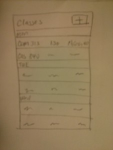
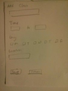
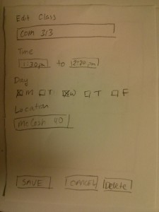
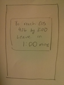
Number 8: An app that calculates the time it would take to get from your current location to your next class, and tells you when it’s time to leave.
A screen showing your classes.
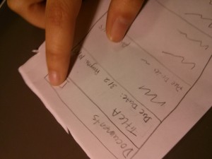
Add a class: Class Name, Date, Time, Location.
Edit a class: Class Name, Date, Time, Location.
An alert will show up on your phone when it’s time to go.
Number 14: An app that reads your readings to you (text to speech), so you can listen as you’re walking to class.
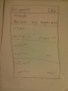
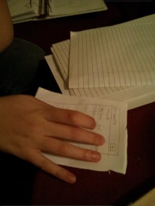
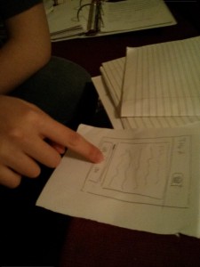
A screen of your current documents. (Main page)
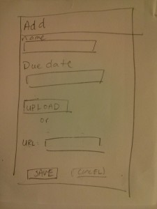
Add a new document. (New Document page)
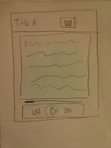
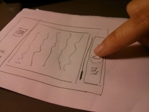
Choose one to read. (Page 2)
Testing/Feedback:
I tested the prototype for idea #14 on three students. I first gave each user the prototype (starting on the Main page), explained the purpose of the app, and had them navigate freely through the app. Then, I asked each of them complete the following tasks on the prototype: 1. Select a document and play it. 2. Skip to the next section. 3. Add a new document. 4. Delete a document. I observed that all of the users had little trouble completing most of the tasks, and their feedback confirmed this.
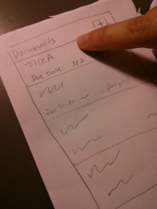
Select reading (users 2 and 3):
Play the current selection (users 2 and 3):
Add a new paper/document (user 2):
The first thing I realized with the first user was that I needed a back button from Page 2 back to the Main page. I added this before testing with users 2 and 3. Before I gave them specific tasks, only one user pressed the ‘+’ button on the Main page; the others just clicked on an individual document, which took them to Page 2.
Insights:
The delete button placment: The second user had some trouble deleting a document, as she didn’t see the delete button. The third user also commented on the delete button placement as not what she expected. Perhaps having a delete button on the Main page (instead of having it on Page 2) would be more intuitive. Also, the delete button should have a prompt, asking if the user really wants to delete the document.
Some general points:
Adding a document may be difficult, if the users don’t have it on their phones (and they are not very likely to). It would be a hassle to download the paper onto the phone or find the url of the paper. Perhaps it would be better to have a web interface for managing papers.
The first student, a psychology major, brought up the point that many scientific papers come with graphs/pictures, which the current prototype wouldn’t handle very well. It would be better if the graph was shown on the screen when it is reference.

