Observations
Student 1: Xavier treks to Algorithms
Friend Center is a good walk from most of the rest of campus, so Xavier needs about seven or so minutes — five if walking quickly and looking a little silly — to make it to 11 am class on time. This isn’t really helped by the fact that the 10 am class often overruns its lecture time, so by the time Xavier is out the door of Frist it’s already 10:56 and he’s going to be a little late no matter what. There is no listening to music, checking mail, or talking to friends. There is only speedwalking like an Olympic speedwalker (sorry) to get to class just as lecture begins. I noticed that this sort of thing happens a lot, especially with unfortunately spaced out classes across campus, so far from having the time to do things between classes, most people are just rushing not to be late.
Student 2: Yancey waits for Graphics
Yancey gets to class a good 15 minutes early, mostly because the classroom is close to lunch. Sits down, pulls out laptop, starts looking through emails. Writes one and sends it. Deletes a bunch, sorts a bunch more. Checks out Hacker News for the latest buzz. Yancey is going to pay attention in lecture, so when the class starts the laptop closes. Triaging email seems to be a pretty popular task to do in the ten or fifteen minutes before class starts; since everyone seems to get 50-60 emails a day, triaging between classes is generally a good idea to avoid an inbox explosion later on.
Student 3: Zeus shows up to Sociology
Xavier gets to a 10 am class at 9:59, looking tired but not rushed. Probably didn’t have a class at 9. Probably just woke up ten minutes ago, actually. Flips open laptop, gets out notebook, starts looking at a problem set that has maths on it and is therefore probably not sociology related. Has a minute to ask a neighbor about one of the problems, but then the professor starts teaching on time and Xavier turns back to work. Appears to only marginally be paying attention to the sociology lecture, is mostly working on his work for another class. This happens quite a lot in this large lecture, which has material that is either uninteresting or identical to the assigned readings.
15 ideas
- Mailfree: an app that delays delivery of email, text messages, Facebook notifications, and anything else that rings or buzzes during lectures, to reduce distraction. It delivers them all in a bunch right after class ends, to allow students to triage between classes.
- Something that lets friends coordinate walking schedules to make those ten minute walks a little more interesting. If friends are both going from Lewis to EQuad, the app might suggest being walking buddies.
- Optimization of walking routes in order to figure out the fastest way to get from one building to another.
- Database of times it takes to go from buildings to other buildings, socially sourced from experience. Gets more accurate over time and tailors itself to your walking pace.
- Something to set an x-minute reminder that lets you know when to leave lunch in order to get to class on time.
- A visualization app for the professor, displaying how many people are going to be late to their next class if the lecture runs over. Knows student schedules.
- A way for friends who have a few bikes between them to coordinate bike sharing in order to cover long distances between classes more efficiently with fewer bikes.
- An app to help students who have no time for lunch and students coming from lunch to coordinate bringing bagged lunches to class.
- A social tool that rates classes for usefulness in order to enable students to make informed decisions about whether to attend lecture.
- A collaborative synopsis and summary of each lecture that students write up after class, to aid in review.
- An app that updates students on the latest and upcoming campus events and happenings, to add a more modern way of advertising to students than posters on lampposts.
- An attendance utility for the professor that scans the seats in an auditorium and tallies how many people attended lecture
- A questions tool, so that students can immediately write down a bunch of questions from lecture before forgetting so that they can later ask them either on Piazza or office hours.
- Announcement time – before relevant classes (WWS for a politics talk, COS for NVidia, for example), students promoting these events can give a 30-second spiel on each event in the front of the room.
- A way for students to provide feedback on workloads to the professor, so that assignments and due dates can be tweaked if the professor sees heavy imbalances.
Mailfree:
Mailfree (which probably shouldn’t be called that, since it handles more than just mail) is an app that delays delivery of email, text messages, Facebook notifications, and anything else that rings or buzzes, until after lecture is over. It delivers them all in a bunch right after class ends, to allow students to triage between classes — and the schedule is ideally pulled from Google Calendar or ICE, so the user won’t even have to worry about inputting schedules manually. Exceptions can be made for certain people, from whom you’d want to receive notifications regardless of whether you were in class. This would dramatically cut down on the amount of buzzing in classes, which — despite not making as much noise as ringtones — is still distracting.
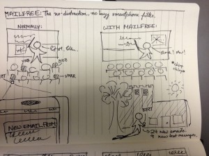
Left: what we have now. Lots of bzz and vrrrm and so on in lecture, and people being distracted by various Facebook messages and so on. Right: with mailfree, you could hear a cricket in the classroom (not that there would be one, that would be weird). Since students use in-between time for triaging emails anyway, why not just dump the previous hours’ worth of emails and messages at the end of lecture, and keep silent during class?
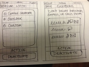
Mailfree is meant to be invisible — it recedes into the background, automating everything, so there is no daily user interface. This is the settings panel, from which users can add calendars for Mailfree to use to determine whether it should delay notifications, and it also allows for setting exceptions (calls, emails, messages for each contact) so that if you don’t want to miss a call from your summer internship recruiter offering you a job, you can set that. There’s also a big button that’s always present in the settings that allows you to either activate or deactivate it. The hope is, of course, that you’ll leave it activated most of the time.
Deduprinceton:
This is an app meant to optimize the time students spend working and in lecture. Using data collected from previous years a course is offered, Deduprinceton compiles data on whether a lecture is redundant (repeats a lot of the same stuff in the assigned reading), interesting or not, and possibly other factors that determine whether a student on the fence about attending lecture (for any number of reasons — a lot of other work, boring lectures, did the reading, or just plain lazy) should go to a particular lecture. After lecture, students can give their take immediately by dragging a few sliders and optionally adding a couple comments, while the content is still fresh in mind. Professors could potentially also see the aggregate data, in order to see if lectures are effective or not and possibly to adjust future years’ curriculums to better engage with students and boost lecture attendance.
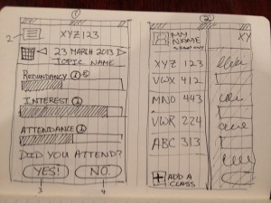
(1) This is the main interface you look at when deciding whether to attend lecture or not. Afterwards, you click the appropriate button to give feedback about the lecture. (2) The flyout menu gives a list of all the classes you’re taking, pulled from SCORE and authenticated. If you’re just sitting in or auditing classes, or if you don’t want to give feedback, you can delete or add more classes, but your results won’t be aggregated with the authenticated students’ results for accuracy purposes.
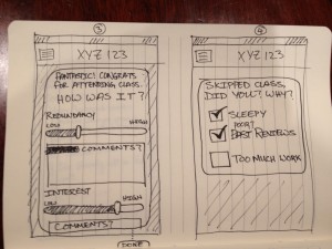
(1) You attended lecture! Therefore, you know how it went: was it a repeat of what was in the book? Was it super interesting and engaging? Was it new material, but so boring that you fell asleep? Drag the sliders to match, and optionally add a comment. (2) You didn’t go. But that’s still useful data — why didn’t you go? If it was just because you overslept because you were too tired, that may not be a negative for the lecture itself. If, on the other hand, you didn’t attend because the previous reviews were poor, then that says something else.
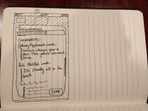
Sometimes, a few numbers and bar charts just won’t cut it. A comment or two can go a long way in detailing exactly what was great (or what wasn’t) during lecture.
User testing
Users AA and SY just finished up with lunch, and is off to class in the EQuad. She always goes to this particular class, but pretended that it was a class that she might consider skipping.

As it turns out, she would also ask her friend (who’s going to the same class) whether it’s worth going. Suggestion: Maybe a realtime updating chart of who’s going or not might help, especially if the course is significantly different from previous offerings (different professor, different schedule of topics) and some students are aware of that.
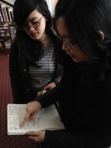
The bar chart format appeared to be quite effective at visualizing the various parameters, although sometimes they looked a little bit like they should also be sliders. After finding the slider interface, it was noted that the mirroring of the sliders and the bars for viewing and adjusting the ratings helped a lot in allowing for accurate feedback.
User NP also goes to just about every class, but tried it out anyway.
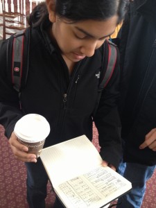
While she probably wouldn’t actively use the app all that much, since she goes to class, she noted that it would make sense for those who treat lectures as optional. Also, the information provided does give a good overview of whether the lecture will be interesting or engaging, which is a good indicator of whether it is a class in which homework can be done without missing any of the material. The interface didn’t provide any significant struggle, and navigation (designed to be similar to most iPhone apps) was fairly easy and discovered without much explanation.
User AS tried out the app while heading to class in Friend.
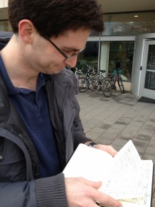
AS got quite confused about why the “Did you attend?” Yes/No” was presented on the same screen as the ratings. I hadn’t thought of that, and he’s completely right — you’d want to present the ratings before class, and the “Did you attend?” screen after class.
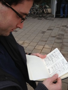
AS also cited an incentive issue: at the beginning, there will be very little data in the app, so people won’t be inclined to contribute. One way to perhaps increase user engagement and input is to not show the ratings for the next class until the user rates the current one (either rating the class if attended, or explaining why if did not attend). Still doesn’t quite solve the bootstrapping issue, but over time, this will become quite useful in keeping user engagement and input high.

A disembodied hand (belonging to KO) has just pressed the “More information” button next to “Redundancy” for class XYZ123, at which point we are now examining comments from previous years. Since comment threads can get very long and annoying to look through quickly, an upvote system or some way of promoting useful comments was suggested to only show the top few, most accurate comments. Also, this once again demonstrates that students trust each others’ judgment regarding whether to attend class or not; a common situation that was mentioned was the text – “Are you going to XYZ 123 tomorrow?” which influences whether the asker decides to attend as well.
Distilled insights:
- Social does work in the context of attending class. If a bunch of people didn’t attend a previous year, there was probably a good reason for it, and ratings help elucidate that. Comments provide the nuance that is sometimes missing from a number.
- Comments get really overwhelming really quickly. They need to be limited to only the most important, most relevant, most accurate few. This requires the creation of a very robust reputation system and a good recommendation system.
- A lot of people always try to attend class. This is a very good thing, but it doesn’t really bode well for incentivizing the use of this app; those who go all the time probably don’t see a good reason to use it, so those who don’t go won’t have as much data off of which to base their decisions.
- The temporal factor is confusing. Since comments and ratings made this year will be seen by students next semester or next year, it is unclear in the current interface what lecture I’m looking at and which year rated it this way. This also raises issues when classes are taught by different professors, or the syllabus is changed, or the professor updates the lecture material in response to user feedback. There needs to be an accurate way to account for all this without getting too complicated; otherwise, this app will just be very unreliable for any class that isn’t exactly the same every single year (at which point conventional wisdom and word of mouth work quite well also).
- The original idea was to allow students to add/drop classes to rate without authentication, which was quickly pointed out as a horrible idea. There needs to be some sort of authentication with SCORE, so that you can only rate classes you’re actually enrolled in. You should, however, be able to view ratings for other classes, but at this point functionality starts to overlap with ICE and course ratings done by the registrar, so that isn’t really the main focus of this app.
