Observations
I conducted my observations from the perspective of a student who arrived to class on time. To get a full picture of what happened in the minutes before class, I sat to the back of lecture halls and observed the teacher, waiting students, and late students.
I noticed that the teacher spent the time before class standing around unproductively waiting for the class to fill. Perhaps they want to appear available in case students have questions before lecture. However, it seems as though they are just waiting awkwardly to start the lecture after the class has been filled with an arbitrary threshold of students.
Some of my favorite observations were about students who showed up just before class started or slightly later. These students would have to climb over students to get to an open seat. This was disruptive and a hassle for the seated and on-time students, the teacher and the late students.
Brainstorming Ideas
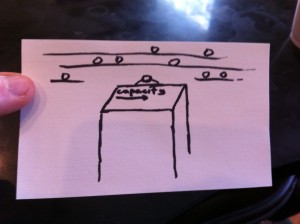
- A device that counts the number of heads and moving bodies in the classroom and alerts the teacher when the capacity has reached a threshold so that he or she can start the lecture.
- An LED meter on each seat aisle that displays how many seats are available in each aisle.
- An auditorium structure that adds seats to the side of previous seats as seats get filled. This ensures that there are no gaps in seats and people climbing over as class starts.
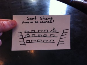
- A display on the screen that visually maps the seats to a virtual seating chart. If students are using chairs inefficiently they show up as red on the screen (prompts them to move to a place where students won’t have to climb over them later).
- Don’t allow seats to fold down until middle seats in aisles are taken.
- People swipe their prox on their seat when they get to their seat. Ensures attendance and quick arrival since the teacher can track perpetually late students.
- People touch their prox to their seat once they sit and, along with the above point, their face goes on the screen if he or she is seated efficiently (people will have to climb over).
- Proxes unlock seats (they unfold). Can only unlock seats with seats with green lights (start from middle of aisles for efficiency).
- Seats use weight sensors to detect if someone is sitting in them (user experience doesn’t change). This can give the teacher knowledge about class capacity.
- Visual display on the projected screen with class student count over capacity and a visual proximity to the needed threshold to start class. Students will be able to identify the people come in last and it will encourage students to be there on time.
- Seats vibrate for a few seconds when a student sits inefficiently (people will have to climb over them).
- Combination of ideas: camera mounted on podium that tracks which seats are taken. Minimal installation, can still display students who are sitting inefficiently.
Chosen Ideas
Brainstorming Idea 1
The confusion and awkwardness surrounding the idea of when to start class could be relieved, which may allow classes to start earlier.
Brainstorming Idea 12
This would incentivize people to sit more efficiently so that the lecturer and students wouldn’t be disrupted.
Prototypes
Brainstorming Idea 1
Podium camera tracks student count (number of heads) and moving bodies to determine when class is ready to start.
Brainstorming Idea 12
Initial screen that shows classroom seating. Gives inefficient seaters notice before shaming them.
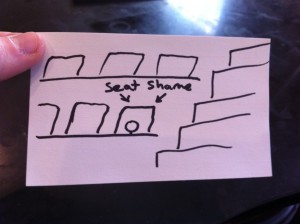
Close up on student sitting inefficiently.
Super close up of student sitting inefficiently.
In the Field
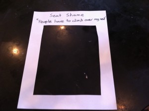
I ended up using the screens I developed for Brainstorming Idea 12, calling the prototype Seat Shame
The idea of being shamed resonates with people. All three users quickly picked up the Seat Shame picture frame and put their face in the middle.
What ended up not being so clear was that there was a transition from each screen to the next. After having a user sit in an aisle seat I would flash the screen that said “Move or be shamed”. People understood from the diagram of the lecture hall and the statement that they needed to move. However, people didn’t understand where they needed to move in order to not be shamed. They would often just move one seat over, which would have resulted in another shame warning.
Insights
The product needs to display a clearer shame warning. I think it would be useful for the projected screen to say something like the following: “Student sitting here, you have 15 seconds before you will be shamed.” Additionally, there may need to be more explanation about what shaming is before it happens. I’m not sure if this is more of an explanation that should be expressed by the lecturer or by the product.
There also needs to be some visual cue for users to go to the open middle seats in a row. Perhaps these seats could be colored green on the screen, while aisle seats could be colored red.


