1. Observations
I made my observations in various locations on campus: Frist Campus Center, the Friend Center Engineering Library, and the McCosh 50 lecture hall. In Frist, I observed individuals who were waiting in the TV lounge outside of the C Store and not in transit to another location. In the Engineering Library, I observed individuals who were at the computer clusters and the couches in the library, as well as those sitting outside at the tables near the vending machines. In McCosh 50, I arrived a few minutes early to observe other early arrivals. My notes on these experiences, from both passive observation and contextual interviews, are as follows:
Frist Campus Center (Thursday, 2:30pm-3:00pm):
Observations:
– Over half (4-5 of 8) of the students in the TV lounge only remained seated for less than 10 minutes, leading me to believe that they were students waiting for class.
– Of those that stayed very shortly, many stayed in the building itself, leading me to believe that they were in fact waiting for a class in Frist.
– It seemed as if those who stayed only shortly glanced only temporarily at the TV, as opposed to those who either slept or watched the program being screened.
– Many students had their computers with them and were checking emails, doing course readings, or visiting Facebook.
Interviews (conducted while leaving):
– KJ Park, 2016: KJ Park was in the TV lounge on his laptop. When asked what he was doing there, he stated that he was planning on securing a study location in a booth or table before going to precept.
– Krishna Kulkarni, 2013: Krishna was not waiting for class, but was taking a break after having finished his classes for the day. His next location was the dining hall (unspecified) for dinner. Krishna was also there to promote his Nacho show this week.
Engineering Library (Tuesday, 1:20pm-1:30pm):
Observations:
– Couches: A surprising number of students on the library couches were napping, leading me to believe that they were waiting longer than 10 minutes before their next class. These students were not interviewed due to fear of disturbance and empathy for need of sleep.
– Computer clusters: Most students were, like those in the Frist TV lounge, checking emails, doing course readings, or checking their Facebook.
– Vending machine tables: None of the two students sitting at the tables left during the 10-15 minutes I spent observing the Engineering Library area.
– Only one of the four observed students (computer cluster) left the library in under 10 minutes of my arrival. This leads me to believe that students waiting in the Engineering Library may be waiting for a non-10 minute interlude reason, such as to avoid the inconvenience of traveling from central campus to the engineering area in between more spread out classes.
Interviews (conducted while leaving)
– No interviews could be completed, as the students were sleeping or occupied. The one candidate in the computer cluster left in a particularly hurried fashion, and I could not bring myself to the required awkward acceleration needed to catch her. This leads me to believe that she was, in fact, a student in transit because she only briefly used the computer cluster to check her email.
McCosh 50 (Wednesday, 12:15pm-12:30pm):
Observations:
– There were only three students (of around 50) that arrived before me and were waiting in the lecture hall. These students were all on their computers. Two were on their Facebook accounts, while one was simultaneously checking his email and doing a class reading for that day. The remaining student had a Word document opened in anticipation of taking notes and was conversing with one of the Facebook using students. Three of the four students periodically checked their phones during the observation.
Interviews (conducted before lecture):
– Allan Jabri, 2015: Allan had arrived early to class to speak with the professor. He was not able to do so, however, because the professor was occupied until the start of class. Allan was one of the students who was continuously on his Facebook.
2. Brainstorm
1. App calculates shortest route to a certain location on campus by bus, bike, foot.
2. App pulls up and inputs personal notes/observations from past lectures.
3. App to input, view, and vote on a cloud of ideas and thoughts posted by students
5. App shows the closest bathroom, water fountain, store, food source, etc.
6. App shows the closest friend, as well as where they’re going and if they’re busy.
7. App reminds you of upcoming homework assignments.
8. App displays birthdays, significant events, historical tidbits, etc. of that date.
9. App displays project ideas/assignments to promote brainstorming or reflection.
10. App lists emails or phone calls that you need to make, and links to appropriate tools.
11. App suggests apps for you to download based on your preferences/app history.
12. App matches you with a random user to meet and eat lunch or dinner with.
13. App notifies you of relevant events/activities on that day.
14. App suggests dining hall menus of the day based on chosen taste type.
3. Final Ideas
Idea 2: Lecture Boss
– I chose the lecture note idea because it would be simple to implement and would be useful for day-to-day lecture preparation as well as testing review (such as storing small in-lecture details known to be important or on the exam)
Idea 14: EZ-Menu
– I chose the dining hall suggestion idea because it would be easy to extract menu data from existing web services, and because I have both experienced and observed the inconvenience of manually reviewing the daily menus on the food services site.
4. Prototypes
Idea 2: Lecture Boss
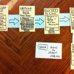
My Lecture Boss prototype is a paper prototype of a mobile application. Users begin at a start screen, where they select from their enrolled courses. This will lead them to a calendar view, where they will select the date on which they wish to view or input personal lecture notes. Once there, they may either simply view the current notes for that day, or use a simple text input to edit and save the notes. From this screen, they can also choose to return to the main course selection menu or export the notes to an email address.
Idea 14: EZ-Menu
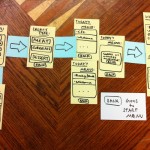
My EZ-Menu prototype is also a paper prototype of a mobile application. Users begin at a start screen, where they select from different types or genres of food. This leads to a list of dining halls that have similar or related food items on their menus, or a message indicating no matches. Making a selection from this list leads to the more detailed menu listings provided by the food services website. From all of these screens there is an option to return to the start screen.
5. User Testing: EZ-Menu
– User complaints addressed in Testing Insights below.
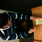
User 1: Mitchell Vollger
– User picked the following options: European, Dessert, Whitman, Back
– User seemed pleased with the layout, asked no questions about how to use the app.
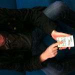
User 2: June Chang
– User picked the following options: Asian, Meat, Whitman, Back
– User seemed at ease, found the usage of the app easy.
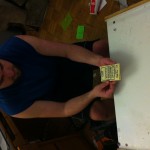
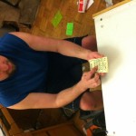
User 3: John Richards
– User picked the following options: European, Greens, , Back
– User was confused when no matches arose.
6. Testing Insights
Confusions/Problems:
– User 1 suggested that users may not have a preference for any of the food categories listed.
– User 1 suggested that the categories be vegan/alternative friendly.
– User 2 complained that the menu results would still be too vague given the current options.
– User 3 complained that the categories were not customizable.
– User 3 suggested that categories be added for religious restrictions.
– User 3 was sad that his choices did not return results.
Positive Feedback:
– User 1 appreciated the simplicity of the app scheme.
– User 2 appreciated the complete touch-based nature of the app.
– User 2 appreciated the simplicity of the interface.
– User 3 appreciated the touch-based nature of the app.
– User 3 appreciated the potential convenience of the app.
Possible Improvements:
– Adding a simple voting function for the various entrees would provide even more utility, accuracy, and user satisfaction.
– Adding a choice history would allow the app to recommend certain menus or specific entrees that the user has enjoyed in the past.
– Making the categories customizable would create a more personalized, accurate experience.
– Category selection may be streamlined by more efficient categories (i.e. initial menu for dietary restrictions, second menu for types and genres, etc).
– Adding filter options () may improve accuracy and customer satisfaction.

