Recently in Ephemera Category

Raymond Pettibon's "Captive Chains"

| No Comments

Raymond Pettibon (born 1957), Captive Chains (Lawndale, Ca.: SST Publications, 1978). Graphic Arts GAX 2010- in process.

California artist Raymond Pettibon has published forty-four zines, 120 fliers, and a variety of album covers, as documented in the 2008 exhibition organized by David Platzker at Specific Object. http://www.specificobject.com/projects/pettibon/index.cfm?project_id=18

The first, entitled Captive Chains (1978) has also been labeled an artists’ book and/or a graphic novel, depending on who is reviewing the material. Pettibon’s early work was published and distributed by SST Records, an imprint established by his brother, Greg Ginn, the guitarist for the punk band Black Flag. The band also used Pettibon’s art for their fliers, album covers and T-shirts, as did other bands that joined the label, including the Minutemen, Hüsker Dü, the Meat Puppets and Sonic Youth.


Since that period, Pettibon has gone on to make a career for himself and his art apart from the California punk scene, including important exhibitions at The Renaissance Society at The University of Chicago, the Philadelphia Museum of Art, and the Whitney Museum of American Art.

“But my drawing also came out of editorial-style cartoons I was doing at the time. Music was one thing and art was another, and there weren’t really any standards for my art. If you look at old punk album covers they were mainly Russian constructivist or Heartsfield [sic] collages. There was no defined punk look or style. Not in art at least. Maybe in fashion. My work was just drawings, and basically drawings just as I would do now. They weren’t done with any aspirations of becoming a part of that scene.”

See the catalogue raisonné of Pettibon’s artists’ books: Raymond Pettibon: the Books 1978-1998 (New York: D.A.P. Distributed Art Publishers, c2000) Marquand Library (SA) N6537.P393 O3713 2000

and

Joel J. Rane, Scream at the Librarian: Sketches of Our Patrons in Downtown Los Angeles. Illustrations by Raymond Pettibon and Cristin Sheehan Sullivan ([Brooklyn]: Booklyn Artists Alliance, 2007). Graphic Arts Collection (GAX), 2008-0124N

“This is not autobiographical work, by any means. Even the emotions involved. If someone thinks they understand me and disagree, then okay. But there’s something in the nature of comedy and especially in the element of caricature and cartoons that my work retains. An editorial cartoon is trying to be positive. It’s usually really very cloying and sappy and there’s no hook to it at all. I also don’t like my humor to be in the service of making fun of people based on superficialities. People get picked on or looked down at. I’m conscious about that as a problem.”

Kineographs

| 2 Comments

The Kineograph (later called flip book) was patented in 1868 by John Barnes Linnett. Graphic Arts holds eleven modern and historical examples. For over 5,000 examples see http://www.flipbook.info/index_en.php


Fatima moving picture dance book: the Maxixe ([S.l.]: Liggett & Myers Tobacco Company, [1914]); 50 x 65 mm. Graphic Arts Collection (GAX) 2007-0082S


The Liggett & Myers Tobacco Company (better known as L&M) produced a brand of Turkish cigarettes under the name Fatima. L&M marketed Fatimas through magazines, radio, television, and much more. In 1914, L&M released ten flipbooks under the theme of modern dance. “These moving picture booklets on the Dances of to-day … make it possible for all to know what the latest accepted dances are and how to dance them.” The flipbook shown here offers a Russian dance called the Maxixe, with images and step-by-step instructions.


Season’s greetings from Solomon & Gelman ([S.l. : s.n., 19—]). 51 x 82 mm. Graphic Arts Collection (GAX) 2007-0081S


The cartooning team of Woody Gelman (1915-1978) and Ben Solomon (active 1930s-1950s), working for Max Fleischer Studios, created the first animated versions of Popeye (1930s) and Superman (1940s), and the original Bazooka Joe for Bazooka bubble gum (1953). In addition, they published a series of juvenile novelettes called Triple Nickel books because they sold for three nickels (15 cents).

One year, as a Christmastime treat, the team created this flip book showing two men wearing Santa Claus masks on the back of their heads. As the pages flip, the heads slowly turn and we see their real faces along with their names.

Victorian Grave Decoration

| No Comments

C.F. Bridgman, Monumenta (Lewes, ca. 1880). Red and black ink and watercolor wash. Graphic Arts GA2010- in process

This pattern book for Victorian grave stone designs and stone roundels for grave ornaments contains eighty miniture designs with twelve large relief roundels. According to the antiquarian dealer Charles Wood, C.F. Bridgman was a well-known firm. Mr. Wood found this entry for them: http://www.rootschat.com/history/hastings/content/view/78/29/

The records of C.F.Bridgman, a firm of Stonemasons (formerly Parsons) based in Lewes from the early 18th century, were deposited in the East Sussex Records Office in 1965 by Hillman Sons, Vinall and Carter, Solicitors of Lewes, and consists of some 98 volumes of Ledgers, Day Books, Letter Books, Wage and Cash Books together with Classified Accounts which cover the period 1834-1959…

Book Jacket Papers

| No Comments

Alling & Cory Company, Book Jacket Papers (New York: Alling & Cory Co., [19—?]). [24] pages with 28 sample booklets. Graphic Arts Collection (GAX) 2010- in process

Charles J. Ross's Stipple Paper Company

| 2 Comments

Two scrapbooks documenting the hand stipple paper business of Charles J. Ross of Burlington County, New Jersey and Philadelphia. Graphic Arts GA 2010- in process.

The U.S. Geological Survey’s Preparation of Illustrations pamphlet (1920) suggests “For relief shading on small black and white maps Ross’s hand-stipple drawing paper may be used. By rubbing a black wax crayon or pencil over the surface of the paper the desired effect is produced in fine dots or in stipple, which may be varied in density of shade at the will of the draftsman.”

The inventor and distributor of these papers or scratch boards that helped commercial artists add shade and dimension to their illustrations was Charles J. Ross. According to Peterson’s Entomological Techniques (1953), “we find little on Ross’s company, which apparently operated in both New Jersey and at the “Ross House” in North Philadelphia. As late as 1959, we find that company was apparently still active servicing the medical illustrator/graphic artist community and operating as C.J. Ross at 1925 Fairmount Avenue, Philadelphia.”

These two scrapbooks, now in the graphic arts collection, provide a concentrated overview of Ross’s activities in the late 1880’s. Included is correspondence with artists, publishers, booksellers, lithographers, photography suppliers, zinc etchers, art stores, paper suppliers, and so on. There are also pricelists and paper samples demonstrating the variety of effects that were possible with variations of dots, horizontal lines, diagonal lines, and an overall pattern similar to an aquatint.

A U.S. government patent for his “relief stipple paper” was granted on October 3, 1882. In it Ross states “The object of my invention is the production of a drawing paper or equivalent material having a surface of fine uniform dotted stipple-points in relief, on which drawings in crayon or ink may be made, more especially for reproduction by photolithographic or phototypographic processes …”

He continued to work on new methods of drawing and reproducing images, such as these directions for the placing and management of the line-ruling machine below:

Cigar label art

| No Comments

A. D. Faber, Cigar Label Art (Watkins Glen, N.Y.: Century House, 1949). Limited edition of 500 copies. Graphic Arts GAX in process.

This unusual reference book, compiled by the collector A.D. Faber, was issued in a facsimile cigar box. In his introduction, Faber writes “My collection of cigarania and cigar label art started rather casually. It seemed at first that I was the only person interested in preserving such reminders of a bygone age. Lately, however, I have been urged to tell others something of what I have discovered. The result is given herein.”

“The thing that distinguishes Cigar Label Art (and also accounts for its higher price) is the inclusion of a number of original cigar box labels and edgings as tip-in’s. These examples of early lithographic art are already collector’s items, far more interesting and valuable than are the old trade cards now collected so avidly by many. Naturally in a book of this size, there are limitations on the number of items that can be shown. But I have kept my story down as much as possible, letting the old labels and top-brand dies speak mainly for themselves.”

A. D. Faber. Ithaca, N.Y., Sept. 15, 1949.

New Year's resolutions are coming

| No Comments

St. Michael’s Temperance Diploma (New York: printed by Major & Knapp, 186?). Chromolithograph. Graphic Arts GC179 broadside collection.

“I promise with the Divine Assistance, to Abstain from All Intoxicating Liquors, except in case of Sickness, and to Prevent by Advice and Example, Intemperance in Others.”

The Edison Mimeograph

| 3 Comments


Before the laser printer, before the Xerox, and before the carbon copy, there was the mimeograph machine. In 1876, Thomas A. Edison (1847-1931) filed a United States patent for autographic printing by means of an electric pen. A second patent further developed his system to “prepare autographic stencils for printing.”

Albert Blake Dick (1856-1934) licensed the patent and began manufacturing equipment to make stencils for the reproduction of hand-written text. In 1887, the A.B. Dick Company released the model “0” flatbed duplicator selling for $12. It was an immediate success. Dick named the machine The Edison Mimeograph.

Dick’s hinged, wooden box, measuring 13 x 10 ¾ x 4 ½ inches, has a large stenciled label on the top reading “The Edison Mimeograph invented by Thomas A. Edison, made by A.B. Dick Company, Chicago, Ill.” A series of patents are noted on the label, the last dated 1890. Inside the box are a printing frame (missing the screen), inking plate, ink roller, a tube of ink, and a tube of waxed wrapping paper. One container is empty, perhaps for a stylus and/or other writing tools.

A description of the process reads: “To prepare a handwritten stencil, a sheet of mimeograph stencil paper is placed over the finely grooved steel plate and written upon with a smooth pointed steel stylus, and in the line of the writing so made, the stencil paper will be perforated from the under side with minute holes, in such close proximity to each other that the dividing fibers of paper are scarcely perceptible.” This stencil was placed in the frame and when inked, produced a copy of the hand-written text on paper below.

The Edison Mimeograph Machine (Chicago, Ill.: A.B. Dick Company, ca.1890). Gift of Douglas F. Bauer, Class of 1964. Graphic Arts GA 2009. In process

Heartfield's "Money Writes!" censored and uncensored

| No Comments

Upton Sinclair (1878-1968), Das Geld schreibt. Eine Studie über die amerikanische Literatur (Money Writes! A Study of American Literature, originally published 1927) (Berlin: Malik-Verlag 1930). Graphic Arts (GAX) 2009- in process

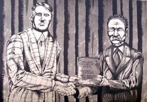
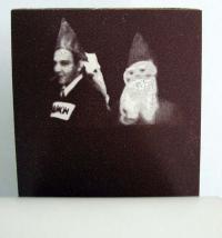
The German artist-activist John Heartfield (born Helmut Herzfelde, 1891-1968), created images in photomontage using labels, newspaper ads, photographs, and engravings. These were cut, assembled, and re-photographed (by Janos Reisman) for half-tone reproduction. Heartfield himself was not a photographer but a collage artist who prepared the work for commercial reproduction. George Grosz said he and Heartfield invented photomontage “in my South End studio at five o’clock on a May morning in 1916.” (George Grosz, “Randzeichnungen zum Thema,” Blätter der Piscatorbühne, Berlin 1928). Unlike other reproductive work, the published half-tones are usually bought and sold as Heartfield originals.

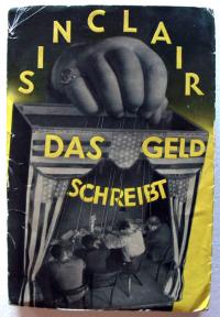
Heartfield joined the German Communist Party in 1918 and remained sympathetic to these ideals throughout his life. His younger brother, Wieland Herzfelde, founded the publishing house of Malik Verlag where leftist writers were championed, such as American Upton Sinclair who sought to expose social injustice and economic exploitation through his writing. Heartfield created many of the dust jackets for his brother’s publications.

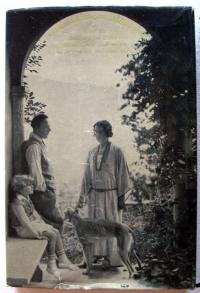
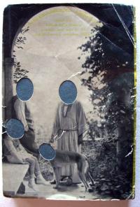
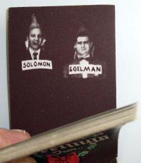
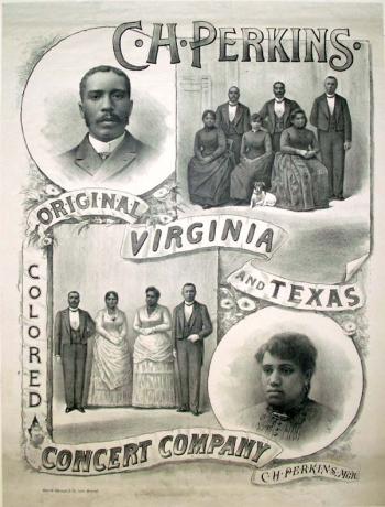
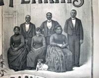
Heartfield’s cover designs involved two images, one for the front cover and one the back, interrupted by a separate spine element. The two images for Sinclair’s Das Geld schreibt depict a group of writers as puppets of the state on the front and the family of German writer Emil Ludwig (1881-1948) on the back. Ludwig, who was himself persecuted by the National Socialist Party, threatened to sue Malik for defamation of character. As a result, the faces of the Ludwig family, including the dog, were punched out on all unsold copies. Princeton now owns both the censored and the original uncensored copies.

Heartfield was eventually forced to leave Germany in the 1930s but thanks in part to Berthold Brecht, was able to return in 1950 when he worked primarily in theater design.

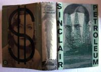
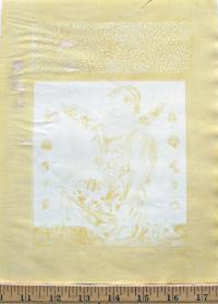
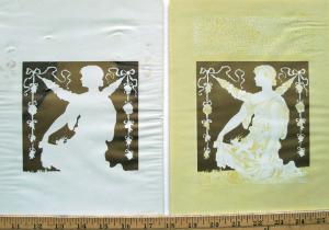
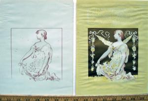
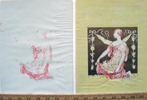
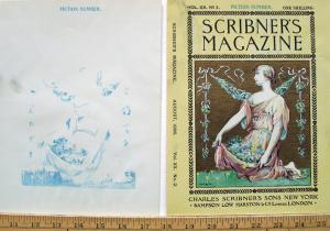
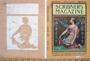
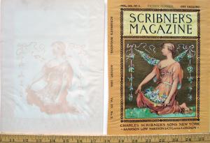
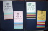
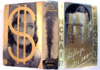
Below, see two of the color variations Heartfield created for Oil! (Petroleum), Sinclair’s novel recently translated to film as There will be Blood, by Paul Thomas Anderson, starring Daniel Day Lewis. Heartfield tried the design both in green and in gold, representing both paper money and hard currency.

For more, try this volume on bindings and dust jackets of Berlin Publishing Houses: Blickfang: Bucheinbände und Schutzumschläge Berliner Verlage 1919-1933 by Jürgen Holstein (2005).

Magdalena Dabrowski, “Photomonteur: John Heartfield,” MoMA magazine no.13 (Winter/Sprint 1993): 12-15.

Peter Selz, “John Heartfield’s ‘Photomontages’,” The Massachusetts Review 4, no. 2 (Winter 1963): 309-36.

Reese's New Patent Adjustable Stencil Letters

| No Comments

Samples of Reese’s New Patent Adjustable Stencil Letters and Figures, Stamps, Seals, Brands, of Every Description [Chicago: Samuel W. Reese, ca. 1880]. Three-tiered box of over 200 letters, numbers and ornaments. Graphic Arts GA2009-00444

The first U.S. patent (no. 1,767) for “settable-unit stencils” was filed in 1840 by Edwin Allen, who designed stencils of individual letters that could be joined together to form words. This and other U.S. patents can be read at www.uspto.gov.

Samuel Widdows Reese (1843-1913) was a veteran, who served in the 1st Pennsylvania Reserve Cavalry. After the war, he moved to Chicago where he is listed in the city directory as a stencil cutter. Reese filed his first patent for a series of adjustable stencil letters in June 1873 (no. 148,087) and filed a second in 1876 for stencils with an S-fold on one edge to lock together with adjacent letters. The stencils were “machine-cut in spring brass with steel dies”. A broadside advertised Reese’s stencils

for shippers in marking merchandise and produce … manufacturers for labelling contents on boxes … merchants and real estate men in making signs and bulletin boards … cheese factors for dating cheese … in fact nearly all classes find them useful, profitable and desirable.

1876 was also the year his firm S.W. Reese and Company opened in Chicago, where one could buy stencils, badges, and other sign-making equipment. Although the company continued to operate under Reese’s name, he left it in the hands of his partner Christian Hanson (1843-1914) and moved to New York City. A second business called Reese and Company was established on Pearl Street in Manhattan, where it remained until late in the twentieth-century. So successful was the Reese interlocking stencil design that it is still used today.

See Eric Kindle, “Patents Progress: the Adjustable Stencil,” Journal of the Printing Historical Society no. 9 (Spring 2006): 65-93
and
Eric Kindle “Recollecting Stencil Letters,” Typography Papers 5 (Reading, 2003)

George Herriman's "Krazy Kat"

| No Comments
George Herriman (1881-1944), Krazy Kat: A Wail in the Night. A Watch in the Night. Pen and ink drawing, April 21, 1940. GA 2006.01942
George Herriman (1881-1944), Krazy Kat: [Krazy Kat follows Kitten, fends off Mouse], Pen and ink drawing on board, October 17, 1943. GA 2006.01941

George Herriman (1881-1944), Krazy Kat: [Echoes of yodeling], Pen and ink drawing on board, May 17, 194?, GA 2006.01940

Cartoonist George Herriman had a number of early comic strips before he found characters that clicked, including Major Ozone, Musical Mose, Acrobatic Archie, Professor Otto and his Auto, Two Jolly Jackies, Goosebury Sprig, and The Dingbat Family. In the last strip, he began a subplot in the margins of the main story, which involve the family’s cat and mouse. By 1913, the black cat and white mouse got their own strip called Krazy Kat. The cartoon ran for over thirty years and was going to continue after Herriman’s death but when William Randolph Hearst saw the work of the new artists, Krazy Kat came to an end.

There were a number of spin-offs. Herriman partnered with the composer John Carpenter to create Krazy Kat: A Jazz-Pantomime, which opened at New York’s Town Hall in January 1922. Herriman not only wrote the scenario but also designed the scenery and costumes.

Princeton is fortunate to hold several of Herriman’s original Krazy Kat panels in the graphic arts collection. Mendel Music Library has the score for his Jazz-Pantomime, along with a DVD of Carpenter’s score.


John Alden Carpenter (1876-1951), Krazy Kat; A Jazz Pantomime (New York, G. Schirmer [c1922]). Mendel Music Library (MUS) Oversize M33.C3K7q


John Alden Carpenter (1876-1951), Krazy Kat [sound recording] … (New York, NY : New World Records, [199-?]) Recorded at UCLA’s Royce Hall Auditorium. Mendel Music Library (MUS), A-302 N 228

From the box marked "Celebrity Bookplates"

| 1 Comment


C. H. Perkins' Colored Concert Company

| No Comments

C.H. Perkins’ Original Virginia and Texas Colored Concert Company, ca. 1882. Lithographic poster. Graphic Arts GC2009- in process

In researching our new poster for The Colored Concert Company we found one article by Josephine Wright, “Songs of Remembrance” from the Journal of African American History 91:4 [Fall 2006] p.413-424rs that mentioned the group in a footnote:

Three other African American musicians besides Robert Hamilton compiled and published text and music anthologies of Negro spirituals in the early 1880s: M. G. Slayton, ed.. Jubilee Songs, as Sung by Slayton’s Jubilee Singers (Chicago, 1882), 14 songs; Marshall W. Taylor, comp., A Collection of Revival Hymns and Plantation Melodies, Composition by Miss Josephine Robinson… (Cincinnati, 1882), 64 plantation songs; and Jacob J. Sawyer, air., Jubilee Songs and Plantation Melodies (Words and Music), as Sung by the Original Nashville Students, the Celebrated Colored Concert Company (N.p., 1884), 12 songs. Jacob J. Sawyer served ca. 1882 as pianist for Slayton’s Jubilee Singe

Otherwise, this celebrated organization is not mentioned in any of the major newspapers or magazines of the period. Not mentioned in the International Index to Black Periodicals; African American Music Reference http://aamr.alexanderstreet.com/; African American Newspapers: The 19th Century (1827-1882); the archives of the Center for Black Music Research, Columbia College, Chicago, http://www.colum.edu/cbmr/; or the The Harvard Guide to African-American History.

We did however have luck with the dating by matching the clothing in the index: http://www.marquise.de/en/1800/index.shtml).

Souvenir serviettes

| 1 Comment


Graphic Arts holds a small collection of souvenir serviettes (paper napkins), chiefly from the 1902 coronation of Edward VII. The ceremony was originally scheduled for June 26, but two days before on June 24, Edward had to undergo an emergency appendectomy (at the time a dangerous operation). He recovered beautifully and the ceremony was rescheduled for August 9. However, this meant the napkin vendors had to purchase and reprint a completely new set of serviettes with the correct date.

As noted in Michael Twyman’s Encyclopedia of Ephemera (GARF Oversize NC 1280.R52 2000Q), the first appearance in Britain of the printed souvenir table napkin was in July 1887 when a quantity of decorated blanks, brought from Japan, were overprinted by John Dickinson Ltd. for their annual dinner. The fashion caught on and before long large quantities of the flimsy squares were being imported. They carried a decorative border, which was printed in up to five colors in Japan; the locally printed commemorative message and image occupied the centre area, often overlapping the color border. The printing was done by a few London firms who specialized in this genre, including S. Burgess of the Strand and Mathews of Hoxton. These napkins, along with other souvenirs, would have been sold by street vendors on ceremonial and processional occasions.

Anthony Morris Family Tree

| 3 Comments

Anthony Morris Family Tree, compiled by Anthony Saunders Morris, lithographed by L. Haugg, 1861. Graphic Arts division (GA) 2009- in process

Anthony Saunders Morris (1803-1885) must have had great interest in the history of his family because in the 1860s, he began compiling a complete Morris family tree. When he succeeded in documenting nine generations of male decedents, he hired lithographer Louis Haugg (1856-1894), one of Philadelphia’s leading printmakers, to draw the family tree in its entirety.

The result is this massive sixteen-plate panorama of an actual tree (approximately six by five feet), which holds all the names of the Morris family. Note that the men are the branches that continue the lineage and the women the foliage, only good for decoration.

Printed by F. Bourquin and Company on Chestnut Street, it is unclear how large an edition Morris commissioned. No other copy of this print is currently recorded.

American Sunday School Union

Unpublished album containing 1000 wood engravings. Graphic Arts Collection (GAX) Oversize Hamilton 1674q

This album holds a collection of wood engravings used in books published by the American Sunday School Union (ASSU) of Philadelphia. Judging from the dates which occasionally occur, the period covered is from the early 1820s to 1831. All the cuts have been carefully organized chronologically and numbered in pen. Over 70 are by George Gilbert, along with designs by Reuben S. Gilbert, Christian F. Gobrecht (1785-1844), Alexander Anderson (1775-1870), and John Warner Barber (1798-1885).

This is book one of two volumes. The second album, beginning with 1831, is held by the Library Company of Philadelphia. Special thanks go to their rare book curator Cornelia King for her research on these sample books.

The ASSU was founded in 1824 in Philadelphia, Pennsylvania to promote early literacy and spiritual development of children, teaching them to read through the use of booklets published by the Union. The ASSU continued its publication program until l960 and some time later changed its name to the American Missionary Fellowship, which is how we know them today. Although the publications were meant to be nondenominational, many of the images tell biblical stories with a conservative leaning. No. 608 shows Adam and Eve in the Garden of Eden with a note below: "Not to be used unless clothed."

Negro Suffrage 1866

| No Comments
Graphic Arts Broadside Collection

In 1866, the two candidates running for governor of Pennsylvania were Democrat Hiester Clymer (1827-1884), who ran on a white-supremacy platform, and Republican James White Geary (1819-1873), who supported Negro suffrage. This was a poster created by the Clymer campaign to discredit the Republicans.

Clymer spoke to a Philadelphia audience shortly before the election:

“Everywhere I beheld not only Democrats but Conservatives who had joined hands with us, and who had declared that the integrity of the American Union should be actually as well as in theory preserved. My fellow-citizens, the clouds of darkness are disappearing. Upon every hill-top and in every valley the watchfires of conservatism are burning brightly; and by the 9th of October I predict the glorious sun of victory will arise to shine upon the peace and happiness of our distracted country.”

The official voted was Geary: 307,274 and Clymer: 290,096. Geary served two terms as the governor of Pennsylvania from 1867 to 1873.

Face powder and cold cream

| 2 Comments

Jarden Lithographing Company, Catalogue and price list of original label designs, talcum wraps, and sachet envelopes in stock (Philadelphia: Jarden Lithographing Company, no date). Graphic Arts (GAX) 2008- in process

This sales catalogue from the Jarden company of Philadelphia offers 60 leaves of chromolithographic plates presenting 181 labels for hair tonic, face powder, cold cream, perfume, and more. The images are not pasted in but printed directly onto the pages.

Lithography was perfected in Europe during the 1790s but it was in American printing companies, such as Jarden in Philadelphia, where the commercial use of color printing really evolved in the second half of the 1800s. For the first time, relatively cheap color images became possible, surpassing the use of stencil or hand-applied color for commercial applications. Up to two dozen oil-based color inks might be used, each from a separate printing stone in perfect registration, to achieve a density and richness of tone. The integration of golds and silvers heighten the metallic shine of the final chromolithograph.

Graphic Candy

| 1 Comment

On Thursday, November 11, 1971, The Daily Princetonian ran a story about an exhibition of candy wrappers at the Firestone Library. “As a boy,” the story begins, “Ephraim di Kahble, an elusive member of the Class of 1939, had a tremendous sweet tooth.” The reporter goes on to recount how Kahble’s father had encouraged the young boy to write to candy companies and collect their wrappers. A sizable collection resulted, despite an incident during World War II in which Kahble was almost court-martialed for impersonating a candy inspector and stealing chocolate from European factories. This collection was ultimately donated to the graphic arts collection.

In fact, Kahble was a fictitious student, whose exploits turn up in a variety of printed stories and Princeton records. He was the invention of Frederick E. Fox, class of 1939, who did indeed write to candy companies as a Princeton freshman and gathered a collection of wrappers.

The letterhead on the stationery from the companies who responded to Fox is almost as intriguing as the candy wrappers themselves. Happily, many of these letters have been preserved along with company ephemera in GC149: Printed Ephemera, Candy

Life and Death Masks

| 2 Comments
Lincoln Franklin Mendelson

Laurence Hutton was the dramatic critic for the New York Evening Mail from 1872 to 1874 and literary editor of Harper’s Magazine from 1886 to 1898. In 1897, he received the degree of A.M. from Princeton and presented the University with “a collection of over sixty death masks of distinguished men.”

“Mr. Hutton has been at infinite pains to make this collection as complete as possible,” reported The New York Times, “It represents the researches [sic] and untiring labor of over thirty years.” Hutton traveled around the world to collect these plaster casts, looking in obscure curiosity shops and major museums, where many curators granted Hutton permission to have copies made from their masks.

A complete set of digital images of these masks can be found at: http://libweb.princeton.edu/libraries
/firestone/rbsc/aids/C0770/

The collection began almost by accident while shopping in New York City. Hutton was interrupted by a ragged boy trying to sell a cast of a human face, unquestionably that of Benjamin Franklin. He purchased it for two shillings and offered another quarter if the boy showed him where he found it. In a couple of ash-barrels on Second Street were dozens of casts of Washington, Sheridan, Cromwell, and many others, which Hutton carted home.

Some years later, Hutton read an illustrated volume of lectures by the well-known phrenologist George Combe and was surprised to see reproductions of many of these same masks. Combe had come to the United States in 1838-39 and Hutton concluded that his collection had either been left behind or given to someone and then, years later, was discarded on the Lower East Side.

Hutton went to great lengths to gather historical documentation on his masks and wrote about the collection in articles, lectures, and a book entitled Portraits in Plaster. In his Talks in a Library he confirmed that, “with the exception of the cast of Shakespeare, the only cast in the collection which is not from nature is that of Elizabeth of England; and these two are preserved only because they are both supposed and believed to have been based upon masks from death.”

When Hutton died of pneumonia in 1904, his obituary in The New York Times, remarked once again on his death mask collection but did not mention whether provisions had been made to take a death mask of Hutton himself.

For a bibliography on Hutton and his collection, continue below.

1 2 3 4 5 6 7

Recent Comments

  • Matt SCOVILL: I have the complete "bookplates in Japan" box. I am read more
  • Daniel Joseph Bobroff: April 30, 2013 To Princeton University: This is a Plaintiff read more
  • Ana Paula: Nice! I wish I could be there to enjoy it! read more
  • Nora Lin: What a shame! Those rooms were inspirational, not only on read more
  • pepesel: Why did they have to close it? That seems shortsighted. read more
  • Joshua: This man is my great-great grandfather. I hope to visit read more
  • Lewis Jaffe: You can also see a wide range of bookplate styles read more
  • Elizabeth Van Riper: Thank you for sharing this wonderful tribute to Ulli Steltzer. read more
  • Jonathan Greene: I am trying to reach any member of Eric Sackheim's read more
  • eric adler: I am interested in the issue #2 31 Aug 1919. read more