By Tara M. McGowan
In folklore and legend, dating back to at least the Kamakura period (1185-1333), the tanuki “raccoon dog”[1] was believed to have the supernatural ability to transform itself and its surroundings, often duping unsuspecting humans. In recent years, such tanuki lore has been transported into 20th century popular media, notably in Studio Ghibli’s animated film Pom Poko (1994) directed by Isao Takahata. Set during the 1960’s housing development boom, a group of young tanuki (Fig. 1), who have fallen sadly out of touch with their folkloric traditions, receives training from their elders in the shape-shifting arts. The story centers on this new generation, as they attempt to use their legendary haunting powers to spook modern suburban developers into abandoning plans to destroy their natural habitat.
 Fig. 1: A tanuki “raccoon dog” depicted in its animal form in Pom Poko (Studio Ghibli, 1994)
At one point in the film, the old tanuki priest gathers a group of adolescent male tanuki onto a large mat, only to suddenly reveal that the mat they are sitting on is, in fact, his kintama (scrotum or testicles). The whole group topples off the mat as the priest’s scrotum returns to its original size, while he matter-of-factly instructs them, “The tanuki’s kintama has the capacity to expand to the size of 8 tatami mats.”
Such overt references to genitalia in media designed for family audiences may alarm some western viewers, but tanuki kintama continue to be prominently displayed in Japan, where, even today, ceramic tanuki statues with that part of their anatomy accentuated are often placed outside restaurants and other kinds of businesses in the belief that they bring wealth and prosperity, the word kintama being a homophone for “gold” (kin) and “jewels” (tama) (Fig. 2).
 Fig. 2: A Shigaraki-ware, ceramic tanuki statue
Director Takahata was by no means the first to use the tanuki’s special transformational talents to satirize modernity in media for family audiences. This is the particular theme of two Meiji-period (1868-1912) woodblock prints currently housed in the Cotsen Children’s Library. The Meiji restoration began with the opening of Japan’s doors to the West after almost two centuries of relative seclusion, and the rapid rate of change in custom and dress was a constant source of new material for woodblock print artists of the period, especially in a genre for young audiences known as “toy prints” (omocha-e). These cheap, usually single-sheet, woodblock prints were ostensibly for children but were most likely enjoyed by people of all ages. Like the magazine tabloids of today, they claimed to share the “latest” (shinpan) knowledge or gossip about any given subject; thus the titles of these prints: “The latest tanuki entertainments” (Shinpan tanuki asobi, 1884. Cotsen 45036) and “Compendium of the latest tanuki amusements” (Shinpan tanuki tawamure zukushi, 1883. Cotsen 101874). Both of these prints, published a year apart, depict an exhaustive series (zukushi) of variations on the theme of tanuki kintama transformations.
 Fig. 3: “The latest tanuki entertainments” (Shinpan tanuki asobi) by Kobayashi Eijirō, 1884 (Cotsen 45036; high-resolution view)
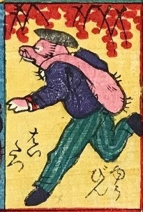
In “The latest tanuki entertainments” (Fig. 3), two images immediately alert the viewer that this is a Meiji-period print: the tanuki as postman and the tanuki playing the drum in a military marching band (Fig. 4).

 Fig. 4: “Postal delivery” (Yūbin haitatsu) and “Musical marching band” (Teroren gakutai)
In both cases, the tanuki are wearing similarly rumpled western-style uniforms, and the institutions with which they are associated—the postal service and military—only came officially into being during the Meiji restoration.
Although claiming to be presenting the “latest edition,” artist Kobayashi Eijirō, much like Takahata in the Pom Poko film, actually draws most of his inspiration for these transformations from earlier Edo-period (1603-1868) examples. The Edo-period saw a tremendous flowering of woodblock prints in general, and renowned artist Utagawa Kuniyoshi (1798-1861), in particular, popularized testicular tanuki transformations, coming up with numerous variations on the theme (see The Kuniyoshi Project). One theme Kuniyoshi made famous was the kintama transformed into a gourd to suppress (or catch) the catfish (Fig. 5).
 Fig. 5: Utagawa Kuniyoshi’s print, titled “Catfish gourd kintama” (Namazu hyōtan kintama)
This image is a play on the Zen Buddhist kōan, “How do you catch a catfish with a gourd?” and also the belief that a giant mythological catfish thought to cause earthquakes under the islands of Japan could only be controlled when the god Kashima placed a giant rock on its head to suppress it. In Kuniyoshi’s print, the gourd is clearly the transformed kintama of the tanuki standing on the right-hand side, and the catfish is the kintama of the tanuki flattened beneath it on the left.
No doubt relying on his audiences’ familiarity with these earlier prints, the artist of “The latest tanuki entertainments” (hereafter, Tanuki asobi), borrows these ideas in separate images in his compendium and gives them both nearly the same title “Catfish suppressed” (Namazu [o] osaeta) (Fig. 6).

 Fig. 6: “Catfish suppressed” (Namazu [o] osaeta)
Whereas Kuniyoshi’s complex designs involve several tanuki, sometimes working together to create one illusion, the artist of Tanuki asobi usually comes up with ways for one tanuki to execute each transformation so that he can achieve a grand total of 36 transformations on the one printed sheet. For example, the Tanuki asobi print depicts variations on Kuniyoshi’s transformations of tanuki kintama into “Dharma” (daruma), “Long-nosed goblin” (tengu), and as the features and accoutrements of the seven gods of good fortune (shichi fukujin), in this case, Daikoku, god of wealth and prosperity with his characteristic sack and magic mallet, and Fukurokuju, god of wisdom and happiness with his distinctive bald forehead (Fig. 7).


 Fig. 7: “Great teacher Dharma” (Daruma daishi), “Long-nosed goblin” (Tengu), “God of wealth” (Daikoku), and “God of wisdom and happiness” (Fukurokuju)
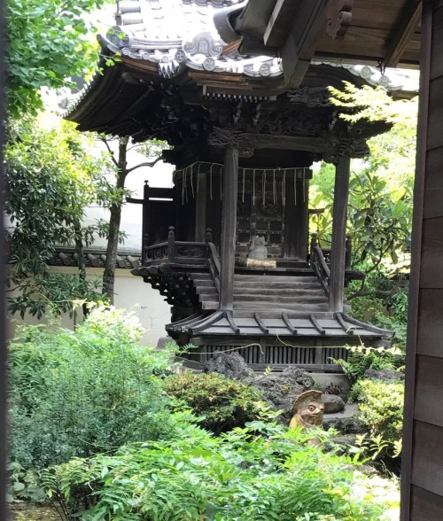
As tricksters, tanuki occupy a liminal space, freely crossing boundaries between the sacred and profane. As bumbling and bawdy creatures, with a penchant for overindulging in saké, tanuki are often used to parody religious figures, as seen in the old priest in the Pom Poko film. As supernatural beings (yōkai), they can also become figures of reverence in their own right. In some parts of Japan, they have attained, much like foxes, the level of deities (kamisama) or immortals (sennin). In fact, on a recent visit to Asakusa in Tokyo, which coincidentally happens to be the address of the artist of this print, I recently stumbled upon a tanuki temple called Ching ōdō (Fig. 8). According to the explanation at the site, this tanuki deity was enshrined in 1872 during the Meiji period to protect against fire and robbery and to ensure that business would flourish. It was moved to Asakusa’s entertainment district (perhaps not so coincidentally) in 1883, around the time these prints were published. That tanuki, with their shape-shifting talents, should serve as the patron deity of actors seems particularly fitting.
 Fig. 8: The Tanuki Temple Ching ōdō in Asakusa, Tokyo, Japan (photo by the author)
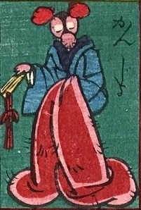
The ambivalence of the tanuki’s role in relation to folk religion is a fascinating topic unto itself, deserving a more in-depth treatment elsewhere. For our purposes here, I will focus instead on the more straightforward uses of tanuki for satirizing any kind of hierarchical class affectation. In Tanuki asobi, there are several such examples. For instance, there is the tanuki as a court nobleman and, in a rare example of a tanuki transforming into a woman, as a lady-in-waiting (Fig. 9).

 Fig. 9: “Court noble or minister” (Okugesama) and “Lady-in-waiting” (Kanjo)
A third example is the dapper gentleman with a kintama muffler around his neck, which dates the image to the Meiji period because of the gentleman’s western-style top hat, even though in all other respects, he appears to be dressed in Japanese garb (Fig. 10).
 Fig. 10: “Gentleman with a muffler” (Erimaki no danna)
In Tanuki asobi, parody of the upper classes is outweighed by images of tanuki—again mostly borrowed from Edo examples—enjoying more plebeian pleasures, such as tanuki fishermen casting a kintama net, sailing a kintama boat with a kintama sail, or using a kintama poncho to avoid a sudden rain storm (Fig. 11).
 Fig. 11: “River fishing” (Kawagari), “Sailboat” (Hokake fune), and “Rainstorm” (Yūdachi)
It is important to remember that the audience for these kinds of popular “play prints” would not have been of the nobility nor of the wealthy, foreign-educated classes, who were—outside of uniformed soldiers or postal carriers—the most likely in this period to assume western dress. The tanuki nobility and gentry here are meant to satirize human pretensions, excesses, and foolish aspirations to an elegant lifestyle that is in more than one sense a sham.
The idea of modernizing the tanuki’s shape-shifting abilities for satiric effect is taken to even greater extremes in “Compendium of the latest tanuki amusements” (hereafter, Tanuki tawamure zukushi) (Fig. 12). Here, the older-style images of the tanuki priest praying before a tanuki Buddha or a tanuki geisha out on the town, accompanied by a tanuki musician, are also present, but what is striking is how the print celebrates the westernization of the tanuki’s talents.
 Fig. 12: “Compendium of the latest tanuki amusements” (Shinpan tanuki tawamure zukushi, Kuniaki, 1883) (Cotsen 101874; high-resolution view)
Claiming to be an exhaustive list or compendium (zukushi), this print actually offers only eight scenes to Tanuki asobi’s 36, but because each of its scenes generally contains several tanuki, the total number of transformations is closer to 15. Although providing fewer overall transformations, the ones on view in Tanuki tawamure zukushi are in many ways more innovative. There is, for example, a western-style tanuki riding a kintama unicycle (Fig. 13).
 Fig. 13: Tanuki on a unicycle
Unlike Tanuki asobi, the individual scenes in this print are not given their own titles so reading them involves more guesswork, but the Chinese characters in red on the flag in the background of this particular scene are 牛肉 (gyūniku, meaning “beef”). This may be a reference to tanuki’s well-known penchant for craving human delicacies (in Pom Poko, they feast on tempura and hamburgers!), and here, the tanuki on the unicycle in western-style garb may be on an outing to eat expensive beef that most common people could hardly afford.
In another example, we see several tanuki, sitting on western-style chairs, drinking cocktails (Fig. 14). One lower-ranking tanuki provides the kintama table, while the other two—no doubt of higher position—each sit on their own kintama-upholstered chairs.
 Fig. 14: Tanuki cocktail party
In yet another instance, a gentleman tanuki provides his own kintama arm rest, while posing for a tanuki photographer using a kintama dark cloth to shut out the light (Fig. 15).
 Fig.15: Professional tanuki photographer
Unlike the colorful flamboyance of Tanuki asobi, this print is distinguished by its subdued sobriety, which actually makes it more humorous. The viewer is lulled by the tanuki’s debonair cosmopolitanism into forgetting momentarily that the source of all their accoutrements is anything but elegant! Instead of the bright pink flesh tone that distinguishes all of the kintama guises in Tanuki asobi, in Tanuki tawamure zukushi, the kintama are consistently an unassuming gray or off-white that more easily translates visually into a variety of materials, from cloth to stone to rubber in the case of the unicycle. It is also worth noting that children tanuki appear in two of the images, but neither of them is engaged in kintama transformations, suggesting that this is only an ability that tanuki develop in maturity.
Play prints such as these were designed with family audiences in mind, and there is plenty of whimsical scatological humor in both of these prints to delight children of any age. My personal favorite in Tanuki asobi is the kintama transformed into a cat, being coaxed by its “owner” to chase a mouse, although the kintama as hot-air balloon—extending above the frame—comes in a close second (Fig. 16).

 Fig. 16: “Cat” (Neko) and “Balloon” (Fusen)
Though these play prints may give children the opportunity to revel in social taboo, they offer adult audiences an added level of pleasure; a safe haven from which to openly thumb their noses at their betters and, in some cases, resist the tide of westernization that was being forced on them by the Meiji government. As Tanuki no tawamure suggests, poking fun at tanuki indulging in a sham western lifestyle might also have served as a balm to sooth those who in reality could not acquire the more elegant luxuries westernization afforded.
In “Haunting Modernity: Tanuki, Trains, and Transformation in Japan,” Michael Dylan Foster (2012) provides evidence of how both of these sensibilities were at work during the Meiji period through a particular genre of oral lore: legends about deadly clashes between tanuki and steam engines. In many parts of Japan during the Meiji period, stories emerged about train operators who claimed to hear the whistle of oncoming trains, only to find that the train would suddenly disappear at the moment of contact. When these instances were investigated, there were almost invariably one or more dead tanuki on the tracks. As Foster writes:
If we listen carefully to a cycle of tanuki legends that circulated at this time, we hear a counter-narrative to the hegemonic story of progress and modernity: through the din of industrialization, urbanization, and modern science, tales of tanuki voice a subtle ideological resistance. (6)
This is certainly the case with Takahata’s Pom Poko film where the ill-fated tanuki clash with modern developers, not only to ultimately lose their natural habitat but in many cases their lives, as well. In a particularly dark moment of the film, a frustrated group of adolescent male tanuki breaks off from the peaceful protests of their elders, suicide-bombing the construction site by flying down to their deaths on kintama parachutes! The remaining tanuki join forces in a futile, albeit visually stunning, attempt to turn back time by using their transformational powers to fleetingly resurrect the landscape of their youth.
The existence of tanuki train legends, if they were as prevalent as Foster argues during the Meiji period, was no doubt familiar to the artists and consumers of the prints Tanuki asobi and Tanuki tawamure zukushi. In a less tragic version of the tanuki train story, however—one that was apparently recounted on a small, trainless island off the coast of Kagoshima—Foster tells of a young man, who gets on a train that mystically appears at night, only to find himself the next morning in an entirely different part of the island with no train tracks in sight. To account for this unexpected twist, Foster asserts: “…in times of rapid flux and cultural change, it is not only the past that haunts the present. The desire for the future, for an impossible modernity, can be just as disorienting” (Foster 18). Like the story of the young man on the island, the popular toy prints in the Cotsen Children’s Library were designed for audiences that were unlikely to be living a western lifestyle during this period. As single-sheet prints, they were also light and transportable, easily disseminated to even the remotest parts of Japan, far from the rapidly modernizing metropolitan centers. These prints remind us, much like Foster’s tales, that history has anything but a linear trajectory, as changes—however rapid—do not always trickle down or out to everyone equally. But the ribald humor in these prints is of a much lighter and more joyful strain than the train legends and seems to contain an added twist. These prints may be read as both a resistance to and a desire for the upward mobility that only a tanuki could effortlessly achieve out of nothing but its own physical resources. In this sense, these prints offer, not only “a counter-narrative to the glorious and romantic official story of modernity” (Foster 12), but also a vicarious celebration of the inexhaustibly creative and exuberant tanuki’s illicit methods of partaking in it.
Note
[1] The word tanuki is somewhat misleadingly translated “raccoon dog” because of their resemblance to raccoons. Tanuki (Nyctereutes procyonoides) are not actually related to raccoons; they are canids, indigenous to East Asia. For this reason, I use the Japanese word throughout without italics, and I follow the Japanese convention of using the word tanuki for both singular and plural forms.
Reference
Foster, M. D. (2012). Haunting modernity: Tanuki, trains, and transformation in Japan. Asian Ethnology, 71(1), 3-29.
 The rather prim illustrated masthead for the French children’s periodical, Le bon genie, gives little indication that nearly every number contained a luminous lithographic plate by Jean-Henri Marlet (1774-1847) during its run between 1824 and 1829. In 1824, Marlet demonstrated the artistic potential of lithography in an ambitious suite of seventy-two hand-colored plates about all aspects of life in Paris. He likewise documented French childhood high and low of the late 1820s as the house artist for Le bon genie.


