
 Type two words—“creativity” and “children”—into the search bar, hit the magnifying glass icon, and watch the results cascade down the screen. The tenor of all these hits to scholarly articles in psychology, curriculum on public television for carers, websites devoted to child development, Ideas.Ted.com, etc. is unlocking every child’s imaginative potential is crucial to their intellectual and emotional progress.
Art instruction emphasizing creative self-expression through craft projects is believed to be among the best ways of opening up children’s minds to this process. The idea that children should be inspired to discover within the seeds of creativity and to release their individuality through art for its own sake rather than to prepare for careers dates back to early twentieth-century Vienna. Franz Cizek (1765-1943), the most celebrated professor of art education of his generation, promoted a method which encouraged pupils to teach themselves, discarding the traditional formal study of technique for the exploration of a wide variety of media.
Cizek’s course inaugurated in 1903 at the School of Applied Arts, with its strong ties to the Viennese Sezession, was not the only place in Austria where boys and girls were taught according to this philosophy. Emmy Zweybrück-Prochaska (1890-1956) opened a school just for girls in 1915. nfluenced by Cizek’s progressive, “permissive” methods, she brought deep interests in applied design, and the so-called naïve design language of indigenous peoples, and women’s handwork in the textile arts. Zweybruck parted company from Cizek in her practice in bringing out self-expressive potential through achievement of technical proficiency and her dedication to training both amateurs and young women aspiring to careers as artists.
A sample of work by some of Zweybruck’s students has been preserved in the Cotsen collection. Among the most delightful are the hand-drawn postcards. The assignment seems to have been to illustrate the front of a commercially printed card and write a message to their teacher. The illustration shown below is signed “E. C.” and the signature is “your Evelyn.” The back is postmarked “1916.” 
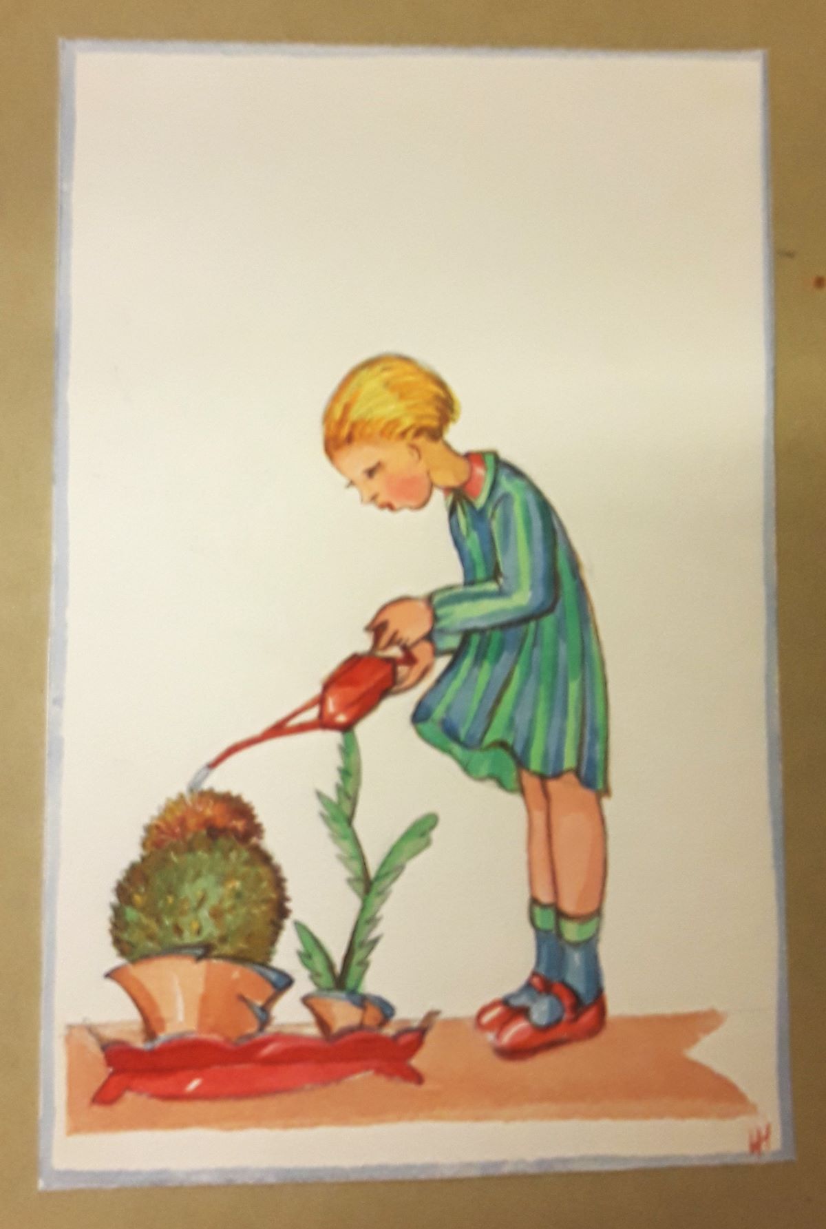
 Lisbeth Haase is one of the most accomplished artists in the archive. Here is her design of a girl watering a cactus for a postcard. The black and white drawing is the right-hand half of a frame for a double-page spread in a book. The third is a clever jumble perhaps of Lisbeth’s favorite things or an assortment of subjects Zweybruck suggested be incorporated into some kind of picture.

 The largest group reflects the method’s foundational principle of letting children try their hands at different media and includes linocuts, collages, papercuts, and drawings, some signed by the young creators. One of Zweybruck’s techniques was to read aloud detailed descriptions or little stories lasting around 5 minutes and allowed the students “to find their way as best they can and will” in their responses. One day’s project must have been based on the legend of St. George and the dragon and it’s fascinating to notice the differences between these two attempts. Unfortunately they are both anonymous designs.
 Perhaps this whimsical collage of an elephant by “N. J.” was a design for a toy or figurine. N. J. used silver paper and sequins in addition to different colored papers.
 The horizontal borders in watercolor or cut papers are unsigned, but the linocut of the fence is credited to Zviki Abramowicz. The unsigned designs for borders range from abstraction to the highly stylized “primitive.
 It’s also possible to compare two versions of the same image within the archive. This design was executed in black and white and in full color. The black and white version of the Virgin and Christ Child was mounted on the same sheet as a quick sketch of several faces. This ambitious image is also unsigned.
 In the coming months, all the materials by Zweybruck’s students in the collection will be reorganized so they will be more accessible to researchers. The names of all the students who signed their work will also be recorded. Perhaps someone some day will try to identify the girls who studied with Zweybruck and establish how many went on to be artists.


