March 2013 Archives

Government as a Bed of Roses

williams reposing 2.jpg
williams reposing 1.jpg

This scene features members of the newly installed ‘ministry of all the talents,’ following the death of prime minister William Pitt (1759-1806). Playwright and statesman Richard Brinsley Sheridan (1775-1816) can be seen reclining at the center, talking with his ally Charles James Fox (1749-1806). Fox had just been named Foreign Secretary and Sheridan treasurer of the navy. Rigidly upright behind Fox is Francis Rawdon-Hastings (1754-1826), known as The Earl of Moira at this time and master-general of the Ordnance.

They are all laying in a bed of roses, as the Fox administration was described in April 1806 by Robert Stewart, known as Lord Castlereagh (1769-1822). Fox replied, “Really it is insulting, to tell me I am on a bed of roses, when I feel myself torn and stung by brambles and nettles, whichever way I turn.”

williams reposing 3.jpg
Charles Williams (1797-1830), Reposing on a Bed of Roses, April 1806. Hand colored etching. Published by John Walker (1789-1813 flourished).
Graphic Arts GA 2013- in process

Charles Williams wasn’t the only British caricaturist to pick up on the symbolism (Williams made three caricatures on the subject). James Gillray (1756-1815) completed a print the same month, followed by one by Thomas Rowlandson (1757-1827) in May.

AN01030396_001_l.jpg
Thomas Rowlandson (1757-1827), The Bed of Roses, 1806. Etching.
Gift of Dickson Q. Brown, Class of 1895.

AN00790665_001_l.jpg
James Gillray (1756-1815), Comfort’s of a Bed of Roses, 1806. Etching.
GA 2006.01395

AN00081595_001_l.jpg
Charles Williams, The Full-Blown-Rose and Petty Mushroom!!, 1806. Etching. British Museum

Le petit journal des refusées

petit journal5.jpg
petit journal1.jpg

Thanks to the wonderful lecture by Johanna Drucker last night at the Grolier Club, entitled “Graphic Hijinks in Gelett Burgess’s 1896 Le Petit Journal des Refusées,” we now know more about this unique magazine in Princeton University Library.

petit journal6.jpg

Printed on oddly cut pieces of wallpaper, the journal was edited by Gelett Burgess (1866-1951) under the pseudonym James Marrion. Not content with one or two copies of this extraordinarily rare single issue magazine, Princeton owns three. Because each was hand printed, all three copies are slightly different.

To be considered for the journal, each poem or essay had to have been rejected by at least three other magazines. Drucker pointed to the advertisement in Burgess’s other magazine, The Lark, soliciting authors for Petit journal: “The Century is Coming to a Close! Hurry Up and Get Your Name in Print or You’ll be Left. There are 63,250,000 people in the United States. 50,000 have suffered amputation of both hands. For the remaining 63,200,000 writers, there are only 7000 periodicals.”

“It will be the smallest and most extraordinary magazine in existence. It will be printed on Black Paper with Yellow ink. The margins will be very wide, the cover almost impossible. The rates for insertion of prose articles will be only five dollars a page; poetry, ten dollars a page, but no manuscript will be accepted unless accompanied by a letter of regret at not being able to find the same available from some leading magazine. No manuscripts will be refused. Terms are cast, invariably, in advance. Each article in every paper will be blue penciled, and the author’s signature underlined. Each contributor will be allowed one hundred free copies of the number in which his article appears. Subscription to the Petit Journal de Refusées will be five dollars a year, single copies, ten cents.”

petit journal3.jpg

Le petit journal des refusées (San Francisco : James Marrion, No. 1, July 1st, 1896). Only issue published.Cotsen Children’s Library (CTSN) Pams / Eng 19 / Box 080 11405 Rare Books (Ex) 0901.612; Rare Books: Robert Metzdorf Collection (ExMe) 0901.612

See also Johanna Drucker, “Bohemian by Design: Gelett Burgess and Le Petit Journal des Refusées,” Connexions. 1 June 2009.

and
Johanna Drucker, “Le Petit Journal des Refusées: A Graphical Reading,” Victorian Poetry 48.1 (2010): 137- 169.


Chapel Cupola at the Château de Sceaux

cupula1.jpg

Owners of this rare set of seventeenth-century French engravings are encouraged to cut them up. Once carefully trimmed, four prints link together to form a circle, approximately 46 inches in diameter, with the final plate dropped into the center to complete the picture.

cupula2.jpg

Engraved by Gérard Audran (1640-1703), these scenes from the old and new testament were designed and frescoed by Charles Le Brun (1619-1690) on the cupola of the chapel at the Château de Sceaux. The house was built in 1670, not far from Paris by the French minister of finance Jean-Baptiste Colbert (1619-1683) inside a park laid out by André Le Nôtre (1613-1700). Fifty-five year old Le Brun finished two frescos in 1674.

Seven years later, Audran engraving, printing, and published Le Brun’s circular design. The title in the Inventaire du fonds français (17e - vol. 1) reads Coupole de la Chapelle de Sceaux. Triumphe du Nouveau Testament sur l’Ancien (Triumph of the New Testament over the Old Testament or Triumph of the New Law.)

cupula3.jpg
cupula4.jpg
cupula5.jpg

Gérard Audran (1640-1703) after Charles Le Brun (1619-1690), Set of five plates, known as Triumph of the New Testament over the Old Testament, 1681. Etching and engraving. GA 2012.01256-01260.
1. “Car. Le Brun Regis Pictor primarius, udo tectorio pinxit in Capella Castelli vulgo de Seaux, Girardus Audran aeri incidit, 1681.” Depicts angels bearing the Ark of the Covenant.
2. “Le Pere Eternel porte sur les ailes des Anges, prononeant ces paroles au baptesme de Iesus Christ, voicy mon fils bien aime &c.” Depicts God the Father on the wings of angels.
3. “Peint a fraisque dans la voute de la Chapelle du Chasteaux de Sceaux.” Depicts the adoring angels.
4. “Pater Aeternus sedens super pennas Angelorum, haec verba in Baptismate Iesu Christi proferens, Hic est Filius meus dilectus &c.” Depicts the baptism of Jesus Christ.
5. Untitled [center section was perhaps not meant to be cut apart]

cupula6.jpg
cupula8.jpg
cupula9.jpg


Distinguished Men of Science of Great Britain
Living in 1807-8

walker distinguished7.jpg
“Lives of great men all remind us we may make our lives sublime.”—Robert Hunt

Print:
Designed by Sir John Gilbert (1817-1897); Drawn by Frederick John Skill (1824-1881) and William Walker the Younger (1791-1867); Engraved by William Walker and Georg Zobel (1810-1881); Printed by J. Brooker. The Distinguished Men of Science of Great Britain Living in the Years 1807-8. Published by William Walker, London. 4 June 1862. Stipple engraving. 65 x 111 cm (25 ½ x 44 in). Graphic Arts Collection GA2013- in process.

Book:
William Walker (1791-1867), Memoirs of the Distinguished Men of Science of Great Britain living in the years 1807-08 (London: W. Walker & Son, 1862). “Originally compiled for the purpose of accompanying the engraving of The Distinguished Men of Science of Great Britain Living in 1807-8, assembled at the Royal Institution, to which the outline at the commencement of this work is intended to serve as a key.” Graphic Arts Collection GAX 2013- in process

walker distinguished4.jpg
Spoiler: this scene never happened

walker distinguished6.jpg
walker distinguished5.jpg
walker distinguished3.jpg

“We are glad to be able to inform our readers, that a large engraving has just been completed by Mr. Walker, of 64, Margaret-street, Cavendishsquare, in honour of the men of science who have done so much towards the establishment of our present commercial prosperity.”

“This work, which may well be called historical, represents fifty-one illustrious men, living in the early part of the present century, assembled in the Upper Library of the Royal Institution. The picture is divided into three groups, and comprises authentic portraits of our greatest inventors and discoverers in astronomy, chemistry, engineering machinery, and other departments of science.”

“The grouping of so large a number of figures must have been a difficult task; this has, however, been successfully accomplished by John Gilbert, the designer of the original picture, who, by a skilful combination of various attitudes, has given both grace and ease to the figures represented.”

“Among those present are Henry Cavendish (1731-1810), discoverer of hydrogen and the decomposition of water; John Dalton (1766-1844), discoverer of atomic theory; Humphry Davy (1778-1844), discoverer of sodium, potassium, barium, and magnesium; William Herschel (1738-1822), discoverer of Uranus; Edward Jenner (1749-1823), creator of the smallpox vaccination; Count Rumford (1753-1814), the American science teacher named Benjamin Thompson, who founded the Royal Institution; and James Watt (1738-1819), inventor of the steam engine.”

See: Archibald Clow, “A Re-examination of William Walker’s ‘Distinguished Men of Science’,” Annals of Science, xi (1955), pp. 183-93
and the extended essay in Oxford Dictionary of National Biography: http://www.oxforddnb.com.ezproxy.princeton.edu/view/theme/97115?backToResults=list=yes|group=yes|feature=yes|aor=8|orderField=alpha


Philippe Pigouchet and Simon Vostre

| 2 Comments
pigouchet gc110d.jpg
pigouchet gc110c.jpg

For eighteen years, the French printer and engraver Philippe Pigouchet (active 1488-1518) and the printer Simon Vostre (active 15th century) worked together to produce hundreds of Books of Hours for the European public. According to Sandra Hindman, Parisian printers turned out more than 1,775 editions of Books of Hours from about 1475 to 1600.

Princeton University Library owns six bound copies published by Pigouchet and Vostre, with as many as 16 large metalcuts along with other illustrations. The Graphic Arts Collection holds a set of leaves, ten metalcuts, which have been removed from a 1496 edition. Here are a few examples.

pigouchet gc110h.jpg
pigouchet gc110e.jpg
pigouchet gc110b.jpg
pigouchet gc110g.jpg
Pigouchet gc110a.jpg
pigouchet gc110f.jpg

GC110 Bookleaves, 15th century. Graphic Arts Collection

Catholic Church, Ces presentes heurues a lusage de Romme (Paris: Philippe Pigouchet for Simon Vostre, August 2, 1493). Rare Books: South East (RB) EXI 5942.247

Catholic Church. Horae secundum usum Romanae Curiae (Paris: Philippe Pigouchet, for Simon Vostre, 17 Sept. 1496). Rare Books: South East (RB) EXI 5942.247.12

Catholic Church. Ces presentes heures a lusaige de Rome … (Paris: Philippe Pigouchet for Simon Vostre, 4 Nov. 1497). Rare Books: William H. Scheide Library (WHS) 5.3.4

Catholic Church. Incipiunt hore beate Marie virginis secu[n]dum vsum Sarum … (Paris: Phillipe Pigouchet for Simon Vostre [1498?]). Rare Books: South East (RB) EXI 5942.247.13

Catholic Church. Les presentes heures a lusaige de Rom[m]e fure[n]t acheuez le xvi. iour de Septembre, lan Mil LLLL.iiii.xx. et xviii. pour Simon Vostre, libraire demourant a Paris a la rue neuue nostre dame a lymage sainct Jehan leuangeliste ([Paris: Philippe Pigouchet, for Simon Vostre, 16 Sept. 1498]) Rare Books: South East (RB) EXKA Incunabula 1498 Catholic Church

Catholic Church. Ces presentes heures a lusaige de Rōme sōt au lōg sās req̄rir & ont este faictes pour Symō vostre Libraire: demourant a Paris a la rue neuue nostre dame a lenseigne sainct Jehan leuangeliste par Philippe pigouchet (Paris: P. Pigouchet [1502?]). Rare Books (Ex) BX2080 .xA2 1502

See also: Jules Renouvier (1804-1860), Des gravures sur bois dans les livres de Simon Vostre libraire d’Heures, par Jules Renouvier; avec un avant-propos par Georges Duplessis (Paris: Aubry, 1862). Marquand Library (SA) NE1200.V5 R29.

Mongolian woodblock for a Prajñāpāramitā Sutra

mongol1.jpg
Carved woodblock for the first page of a Buddhist sutra, Mongolian, no date. Graphic Arts Collection GA 2013- in process

Martin Heijdra (East Asian Library) has provided us with a title for this book: Bilig-ün činadu kürügsen ǰaγun mingγan toγ-a-tu (probably chapter 4). He goes on to mention that this is the most common Buddhist sutra, the (large version of the) Prajñāpāramitā sutra. Our woodblock has not been dated, except for a small label guessing Ming Dynasty, also called Empire of the Great Ming, which was the ruling dynasty of China for 276 years (1368-1644). The text begins with Namu Buddha, Namu… etc. (Hail the Buddha, hail the dharma, hail the sangha).


mongol5.jpg
mongol6.jpg
mongol7.jpg
mongol3.jpg
mongol8.jpg

The figure on the left might be Manjushri, a meditational deity who holds a book and a sword. Manjushri is the Bodhisattva of transcendent wisdom and the sword is used to cut through illusion. Manjushri is one of the most important of all Buddhist deities, the veritable god of wisdom and herald of emancipation.

The figure on the right might be Avalokitśvara, a Bodhisattva who embodies the compassion of all Buddhas. This figure holds a locus branch in one hand and what might be a snake in the other.

If you can add more information about this woodblock, please contact jmellby@princeton.edu. Thank you

mongol4.jpg

1913

| 1 Comment
GAX_2003_0356q_Cendras.jpg

Congratulations to our good colleagues at the Princeton University Art Museum and Efthymia Rentzou, Assistant Professor of French and Italian, who have mounted the exhibition 1913: The Year of Modernism. Their website has just been launched and can be found here: http://artmuseum.princeton.edu/art/exhibitions/1913-modernism.

The wonderful show includes many works from the Graphic Arts Collection, Rare Books, Marquand Library, and other collections, along with the holdings of the Art Museum. It’s great to see this integration of image and text, so important to the artists and writers of the period.

GAX_2004_0020e_fol_7.jpg

There will also be an important international conference entitled 1913: The Year of French Modernism (April 19-20, 2013), organized by Princeton University professors Efthymia Rentzou and André Benhaim from the Department of French and Italian. Florent Masse, director of Princeton’s French theater troupe L’Avant Scène will present Guillaume Apollinaire’s 1917 surrealist play Les Mamelles de Tirésias (the Breasts of Tirésias) on April 19.


Bookplate Design Competition

| 1 Comment
nek bookplates22.jpg
Announcing the 2013 Peter S. Firestone Society Bookplate Design Competition

In honor of the upcoming bookplate design competition, open to all Princeton University Mathey and Rocky College students, here are a few bookplates from the early 20th-century bookplate magazine Boekcier: tijdschrift van de Stichting Nederlandsche Exlibris-Kring ([Wassenaar, Holland: Nederlandsche Exlibris-kring, 1932-1961]) Graphic Arts Collection in process


nek bookplates25.jpg
nek bookplates28.jpg
nek bookplate5.jpg

Princeton’s winning design will be made into a printed bookplate and placed inside all books given to Mathey and Rocky students in the coming year. The prize for the designer of the winning bookplate will be dinner for four at Agricola, Princeton’s newest restaurant, which has just opened on Witherspoon Street. Deadline is Friday, 5 April 2013. Submissions should be sent to Christina Corsiglia, christinacorsiglia@gmail.com.


nek  bookplates23.jpg
nek bookplate.jpg

For more information about the Firestone Society, see http://www.princeton.edu/matheycollege/council-and-activities/firestone-society/

Good Luck!
nek bookates4.jpg


Miniature Prayers

mini book of common prayer3.jpg
mini book of common prayer2.jpg

The Graphic Arts Collection received several thoughtful gifts from Lawrence W. Ray in memory of Dr. Marion Brown and Myrtle (Jean) Williamson. Among them is a miniature copy of The Book of Common Prayer, and Administration of the Holy Communion: The Order of Publick Baptism of Infants; The Order of Confirmation; and Form of Solemnization of Matrimony, According To the Use of the Church of England (Oxford [England]: Printed at the University Press; London: Henry Frowde, Oxford University Press Warehouse, Amen Corner, 1900). Graphic Arts Collection GAX 2013- in process.

mini book of common prayer.jpg

Here are two explanations of Amen Corner:

Amen Court is a short distance from Paternoster Row, where monks finished their Pater Noster (a Christian prayer) on Corpus Christi Day before walking in procession to St. Paul’s Cathedral. The ritual started at Paternoster Row, with the monks reciting the Lord’s prayer in Latin to the end of the street. When they reached the corner or bottom of the Row they said ‘Amen’.

and in an history of the Oxford Press:

“The publications of the Oxford University Press are familiar in every part of the world, but only the vaguest ideas obtain as to the Institution itself. It was with the hope of gaining more information … I called upon Mr. Henry Frowde at the Warehouse, Amen Corner. … The popular publisher to the University was born in 1841. He entered the service of the Religious Tract Society in 1857, and subsequently had considerable experience in the Bible and Prayer.”

“Book business. At the close of 1873 he was invited by the Delegates of the Press to undertake the management of their London businesses, which included the Oxford University Press Warehouse, at 7 Paternoster Row, and the binding business at Barbican. He entered upon his new duties on March 25, 1874. At that time the learned and educational publications of the Clarendon Press were issued by Messrs. Macmillan, but in June 1880, the Delegates of the Press transferred them to their own warehouse at 7 Paternoster Row, and appointed Mr. Frowde “Publisher to the University.” The publishing business was subsequently removed to Amen Corner, and the binding business to Aldersgate Street, and Mr. Frowde opened wholesale branches in Edinburgh and Glasgow.”
“Publishers of To-Day, The Oxford University Press,” in The Publisher, Volume 10, Issue 63 (1895)

A Humument's 40th Anniversary

humument2.jpg(c) Tom Phillips
humument1.jpg
humument4.jpg

2013 is the 40th anniversary of The Humument by Tom Phillips. To mark the occasion, Phillips prepared a special binding of his last five copies of the book in the Tetrad Press edition of 1970 to 1973. This celebrates the final installment of the first edition of The Humument.

Phillips writes, “This is the binding that I planned right from the beginning but we never had the resources to make since the boxes were only a temporary measure and I always hated them. Now with Bookworks of London with whom I have worked many years I am having the leaves in two leather bound boxes with original Humument pieces

incorporated into the covers lined with endpapers of the editions of the original Mallock book that I used with a base incorporating the spines of two of the old boxes.” Princeton University Library is fortunate to have acquired one of these five special bindings.

humument3.jpg

$1000 and a Plot of Land in Illinois

certificate stock.jpg
certificate stock2.jpg

Two engraved certificates turned up this week in the Graphic Arts Collection. The first is a $1000 non taxable certificate, dated 17 February 1864, due from The Confederate States of America and payable two years after the ratification of a treaty of peace with the United States (we haven’t figured what the interest would be at 6% per year).

The second is a certificate granting a tract of land in the Territory of Illinois, dated 6 May 1812 and signed by James Monroe. At this time, Monroe was Secretary of State and not long after this, appointed the Secretary of War under President James Madison.


certificate stock3.jpg
certificate stock4.jpg
certificate stock5.jpg

“A similar issue of 6 % non-taxable certificates was also authorized with which to pay for government supplies, if agreeable to contractors. These were not intended for general circulation, as they were made transferable by endorsement only. The expenses of the government were further to be met out of the proceeds of a new bond issue for 500 millions bearing 6 % interest. The interest and principal of these bonds were exempt from taxation, and their payment was secured by the net receipts of any export duty hereafter to be levied upon cotton, tobacco, and naval stores, and also by the net proceeds of the import duties. The former never materialized, and the latter amounted to an insignificant sum.”

“As to the effect of the Funding Act, the popular belief that prices would fall was not realized. Immediately upon the passage of the act there were complaints of a scarcity of currency, a familiar phenomenon at the time of inflation.”
—John Christopher Schwab, The Confederate States of America, 1861-1865: A Financial and Industrial History of the South During the Civil War (1901). Firestone E487.S393 1901


Domenico Fossati Sketchbooks

fossati9.jpg
fossati10.jpg

“Perhaps the most charming objects in Professor Friend’s collection are the two sketchbooks by the Venetian artist and stage designer Domenico Fossati (1743-1784),” writes David R. Coffin, Class of 1940 for the Princeton University Library Chronicle.

“The small sketchbook … has on its first folio the date “4 Febrajo 1784,” the year of Fossati’s death, but there is evidence that it was used by him earlier. A pocketbook of thirty-eight folios, most of the sketches are hasty ones for stage sets done in ink, but scattered among the stage designs are some wonderful details of rococo ornament done in pencil or in a gray-blue wash with a brush.”


fossati1.jpg
fossati5.jpg

“The larger notebook …, with forty-two bound folios and two smaller loose sketches pasted in at the end, commences with a large series of very finished drawings, many of them magnificent in their choice of colored washes. Perhaps the most striking of these is an underworld scene, and still other designs are exotic in character, combining the wonderful curves of late rococo decoration with elements of chinoiserie.”

The scrapbooks are part of TC020, a collection of theatrical drawings given by Professor Albert M. Friend, Jr., Class of 1915 (1894-1956). The collection consists of some sixty-two single sheets of drawings and two double leaves, the latter probably from sketchbooks of the Austrian theatrical designer Josef Platzer (1751-1806). Along with the Fossati sketchbooks, there are also drawings by Juvara, Sacchetti, Bernardino Galliari, Minozzi, and others. Here is a checklist: http://libweb5.princeton.edu/visual_materials/ga_pdf/TC020checklist.pdf

fossati11.jpg
fossati7.jpg
fossati8.jpg

Albert Mathias Friend Collection of 18th-century Set Designs, 1700s. Graphic Arts Collection (GA) TC020

William Heath's print dealers


View William Heath and his Print Dealers in a larger map

In order to better understand the activities of the British caricaturist William Heath, I created a google map of his dealers from 1808 to 1840. Control/click on the link above to see a larger view. Although it is often repeated that he worked exclusively with Thomas McLean, Heath was doing business with many of the print and book shops around town.

heath good humour.jpgThomas McLean’s Shop
AN00632247_001_l.jpgSamuel William Fores’s Shop
AN00038375_001_l.jpgHannah Humphrey’s Shop
heath march of morality.jpgThomas McLean’s Shop
spectator.jpgUnidentified shop. Variation on McLean’s, see Paul Pry figure and other Heath caricatures

Kent's Cups and Saucers

kent dishes5.jpg

Around 1937, the American artist Rockwell Kent (1882-1971) was commissioned by Faye Bennison, the owner of Vernon Kilns in Vernon, California, to design several dinnerware patterns. Kent completed at least three sets, using images from two of his most popular books, Moby Dick (1930) and Salamina (1935), along with a patriotic set he called “Our America.” The Graphic Arts Collection holds a set of Salamina dishes, pictured here.

Rockwell Kent (1882-1971), Salamina (New York: Harcourt, Brace and company, 1935).Graphic Arts Collection (GAX) G750 .K4 1935

Herman Melville (1819-1891), Moby Dick; or, The Whale; illustrated by Rockwell Kent (New York: Random House, 1930). Graphic Arts Collection (GAX) PS2384 .M6 1930b

kent dishes4.jpg
kent dishes3.jpg
kent dishes2.jpg
kent dishes1.jpg

Teresia Constantia Phillips and the Shame of Publick Fame

phillips portrait.jpg

Unidentified engraver after Joseph Highmore (1692-1780), Teresia Constantia Phillips, [18th century]. Mezzotint. Sold by Robert Sayer opposite Fetter Lane Fleet Street, between 1748 and 1795. Graphic Arts Collection GA2013- in process

Teresia Constantia Phillips (1709-1765) was a notorious London courtesan who wrote several memoirs during her lifetime. A portrait painting by Joseph Highmore became the source for numerous engravings and mezzotints, published as frontispieces and sold individually with great success.

“It is probable that she commenced a life of intrigue at a very early age,” begins her biography in the DNB. “To avoid arrest for debt, on 11 Nov. 1722 she went through the form of marriage with a Mr. Devall, who had previously been married under another name, and with whom she never exchanged a word. According to the ‘apologist’ of Lord Chesterfield, although her amours were soon ‘as public as Charing Cross,’ she married, on 9 Feb. 1723, Henry Muilman, a Dutch merchant of good standing. In the following year Muilman managed to obtain from the court of arches a sentence of nullity of marriage, but he agreed to pay Constantia an annuity of 200l. This was discontinued upon her cohabitation at Paris with another admirer (Mr. B.). Henceforth the sequence of her adventures becomes bewildering.”

“…After many experiences in France, England, and the West Indies, she determined to blackmail her friends by publishing ‘An Apology for the Conduct of Mrs. Teresia Constantia Phillips, more particularly that part of it which relates to her Marriage with an eminent Dutch Merchant.’ A motto from the ‘Fair Penitent’ adorned the title-page of the book, which, in consequence of the difficulty of finding a bookseller, was printed for the author in parts, subsequently bound in three volumes, in 1748. A second edition was called for at once, a third appeared in 1750, and a fourth in 1761.”

See also:
Oxford scholar, The Parallel; or, Pilkington and Phillips Compared: Being Remarks upon the Memoirs of Those Two Celebrated Writers (London: M. Cooper, 1748). Rare Books (Ex) PR3619.P442 Z4683 1748

Teresia Constantia Muilman (1709-1765), A Letter Humbly Addressed to the Right Honourable the Earl of Chesterfield (Dublin: printed by George Faulkner, 1750). Rare Books (Ex) 2007-0519N

Lynda M. Thompson, The Scandalous Memoirists: Constantia Phillips, Laeticia Pilkington and the Shame of Publick Fame (Manchester, UK; New York: Manchester University Press; New York: Distributed exclusively in the USA by St. Martin’s Press, 2000). Firestone Library (F) PR756.W65 T48 2000


Amours de Mme de Maintenon

passe tempe royal.jpg

The Graphic Arts Collection is fortunate to have acquired a book written by Pierre Le Noble, the pseudonym for an unidentified author and published by Pierre Marteau, a fictitious publisher. Although the title page records Cologne as the place of publication, it is more likely to have been printed in Amsterdam for a French audience, to avoid trouble with the censors.

Françoise d’Aubigné marquise de Maintenon (1635-1719) married Louis XIV (1638-1715) in a private ceremony during the winter of 1685-86. It was the second marriage for both. Although morganatic marriages were not recognized in France, this was a secret, unapproved marriage between two people of uneven rank, barring the passage of the King’s titles and privileges to his wife.

The king’s (well-known) secret marriage was a sensitive topic in the seventeenth century, hence the use of a pseudonym by the author and a fictitious name for the publisher. Neither one wanted to risk their careers being connected to a potentially scandalous book.

passe tempe royal2.jpg

Le passe-temps royal de Versailles. ou, Les amours secretes de Madame de Maintenon. (The Royal Pass-times of Versailles or The Secret Loves of Madame de Maintenon) (Cologne, Pierre Marteau, 1695). Originally published under the title La cassette ouverte de l’illustre criole, ou, Les amours de madame de Maintenon (A Ville Franche [i.e. Amsterdam?]: David du Four, 1690). Graphic Arts Collection GAX 2013- in process. Purchased with funds provided by the Goreff/Neuwirth Charitable Trust in honor of Danielle D. van Jaarsveld, Class of 1995.

See also
M. de Beaumelle, (Laurent Angliviel, 1726-1773), Mémoires pour servir à l’histoire de Madame de Maintenon (Amsterdam: Aux depens de l’auteur, 1755-1756). Rare Books (Ex) DC130.M2 L18 1755

Françoise Chandernagor, The King’s Way: Recollections of Françoise d’Aubigné, Marquise de Maintenon, wife to the King of France: a novel (San Diego: Harcourt, Brace, Jovanovich, 1984). Firestone Library (F) PQ2663.H314 A7913 1984

Jeremie Benoit, Les Dames de Trianon (Paris: Berg International; Versailles: Château de Versailles, 2012). Firestone Library (F) DC801.V57 B46 2012


Vivaldi's Opus regale

vivaldi 4.jpg

Giovanni Ludovico Vivaldi (died 1540), Opus regale in quo continentur infrascripta opuscula (Regal Work in which are Contained the Following Small Works) … ([Paris]: Venu[n]da[n]tur Parisius i[n] vico Sancti Iacobi sub i[n]tersignio diui Claudij, [1511]). Inscription at foot of title: P[ro] Conventu S.S. Minorum Franciscanorum Pultariensiu[m] (The Franciscans of Pouthières, France). Graphic Arts copy is from the printing collection of Elmer Adler. Graphic Arts Collection (GAX) 2004-3499N

vivaldi 9.jpg
vivaldi12.jpg
vivaldi13.jpgParis 1511, metalcut
vivaldi14.jpg

Vivaldi, a Domincan monk and professor of theology, wrote these regal works in 1507 and they were first printed at Saluzzo by Giacomo de’ Circhi and Sisto Somasco. The following year, Étienne Gueynard (1460-1530) published a new edition in Lyon. Both are described as illustrated with large woodcuts.

In 1511, a grand third edition (held in the graphic arts collection) was printed by Jean Barbier for the Parisian publisher François Regnault. Rather than woodcuts, the book is decorated with composite metalcuts, up to a dozen small metal plates combined to form each large subject and frame.

vivaldi 1512d.jpgLyon 1512, woodcut

Just one year later, back in Lyon, a fourth edition (also at Princeton) was prepared by Gueynard, once again illustrated with woodcuts. The designs have been attributed to Guillaume Le Roy the younger (1494-1529), son of the printer by the same name who ran the first press in Lyon.

vivaldi15.jpgParis 1511, metal cuts
vivaldi 1512a.jpgLyon 1512, woodcuts
vivaldi 1512c.jpg
Giovanni Ludovico Vivaldi (died 1540), Opus regale i[n] quo continentur infrascripta opuscula …([Lyons]: Venundantur Lugduni ab Stephano Gueynard, prope Sanctum Antonium, 1512. Rare Books (Ex) BX890 .V63 1512

The Temple of Fancy

Fuller interior temple of fancy.jpgTemple of Fancy [trade advertisement]. Drawn by W. Derby and engraved in aquatint by Smart and Sutherland (London: S. & I. Fuller, ca. 1823).
Graphic Arts Collection 2013- in process
fuller interior temple of fancy 2.jpg

According to the National Portrait Gallery’s wonderful directory of British Artists’ Suppliers, 1650-1950 (http://www.npg.org.uk/research/programmes/directory-of-suppliers/f.php), “Samuel Williams Fuller (c.1777-1857) and his brother Joseph Carr Fuller (c.1783-1863) advertised the opening of their shop in Rathbone Place in 1809, stating that they had been ‘many years with Mr. Edward Orme, New Bond-street’, the print dealer and publisher. …”

“The two brothers were partners in what became one of the leading print publishing businesses of Regency and early Victorian London, producing a number of print catalogues. … Their trade as artists’ colourmen was mainly in watercolours and drawing materials.”

“Their trade card, advertising the ‘Temple of Fancy’, c.1810, focused on the market in genteel products for ladies, … while a later three-page leaflet was aimed at male customers ….”

“A leaflet, apparently from the Lady’s Magazine, August 1823, depicted Fuller’s shop interior, and gives a good idea of the product range; the business was advertised as ‘Publishers of the greatest variety of Sporting Prints…/ TEMPLE OF FANCY/ S. & I. FULLER,/ PREPARERS OF PERMANENT SUPERFINE WATER COLOURS,/…/ Wholesale Manufacturers of Bristol Boards, Ivory Paper & Cards./ Engravers, Publishers, Printsellers, & Fancy Stationers.’”

Happily, a similar advertisement as been acquired by the Graphic Arts Collection, depicting the interior of the Temple of Fancy.

Sunday Bloody Sunday

sunday bloody 5.jpg
sunday bloody 1.jpg

Sunday Bloody Sunday (Dublin: Irish Republican Socialist Party, 1978). Graphic Arts Collection GAX 2013- in process

Not all rare books are old or bound in leather. This publication from 1978 commemorated the sixth anniversary of 30 January 1972, known as Bloody Sunday. Only four copies are listed in OCLC and only two in the United States.

The foreword, written by The Chairperson, Comhairle Ceanntair, Derry City I.R.S.P., reads in part, “The pamphlet is in eight parts, and has drawn a great number of sources together to present as far as possible, the events of that date, but also the political background which led up to that march which ended in a river of blood. … Part 7, entitled, There’ll be another day, is taken from the front page of the first edition of the Starry Plough, and is believed to have been written by Nell McCafferty, a Derry journalist working with the Irish Times.

Angelique Chrisafis, writing for The Guardian said, “Nell McCafferty, a foul-mouthed and fearless social commentator, is one of the great feminist heroes of the liberalisation of Ireland. Part Germaine Greer and part Mae West, she is not a woman you should spurn.”

Part 8 offers Thomas Kinsella’s famous poem, The Butcher’s Dozen, which “expresses the anger and disgust of Ireland’s leading poet. This work, with the sub-title A Lesson for the Octave of Widgery, appeared in pamphlet form in late April 1972. …”


sunday bloody 2.jpg
sunday bloody 4.jpg

See also Thomas Kinsella, Butcher’s Dozen (Dublin, Ireland: Peppercanister: Sold by the Dolmen Press, 1972 (Printed by the Elo Press)). Gift of Leonard L. Milberg ‘53 for the Milberg Irish Poetry Collection. Rare Books (Ex) PR6021.I35 B87 1972 Milberg Irish

Frank Robbins, Under the Starry Plough: Recollections of the Irish Citizen Army (Dublin: Academy Press, 1977). Firestone DA960.R6

Samuel Dash, Justice denied: a challenge to Lord Widgery’s report on “Bloody Sunday” (New York: The Defense and Education Fund of the International League for the Rights of Man in association with the National Council for Civil Liberties, c1972). Firestone DA995.L75 D374 1972

Baron John Passmore Widgery (1911-1981), Report of the Tribunal appointed to inquire into the events on Sunday, 30th January 1972, which led to loss of life in connection with the procession in Londonderry on that day (London: H.M. Stationery Off., 1972). Firestone DA995 .L75 W5 1972

Nell McCafferty, The Best of Nell (Dublin: Attic Press, 1984). Firestone HQ1600.3 .M32

Blocks for Candide

kent candide blocks4.jpg
kent candide blocks6.jpg
The Graphic Arts Collection is fortunate to hold the metal relief blocks for the paragraph capitals designed by Rockwell Kent (1882-1971) for Candide by Voltaire (François-Marie Arouet 1694-1778). Kent created a full alphabet although only a few blocks were used in the final publication.

kent candide blocks3.jpg

In the spring of 1927, twenty-nine year-old Bennett Cerf (1898-1971) and his twenty-five year-old friend Donald Klopfer (1902-1986) established a fine press imprint called Random House, with Candide as their first book, printed by Elmer Adler’s Pynson Printers in The New York Times Annex. The edition included 1,470 black and white copies priced at fifteen dollars each and ninety-five hand-colored copies priced at seventy five dollars. The book was hand set in type designed by Adler’s partner Lucian Bernhard (1883-1972) and paragraph designs and illustrations by their friend Rockwell Kent (1882-1971), both cast by the Bauersche Giesserei, Frankfort.

kent candide blocks5.jpg
Kent had two assistants on Candide: Ione Robinson (1910-1989), who later worked with Diego Rivera, and Dehli Gág, the sister of book illustrator Wanda Gág (1893-1946).(1) In her memoir, Robinson recorded some of the diary entries she made during that project. “Rockwell Kent … offered me forty dollars a week to be his assistant,” she began on December 12, 1927, “He has so many woodcuts to cut and it is as easy as pie for me to do that.”(2) But the artist soon tired of Kent’s strict work ethic and his minuscule drawings, which were “hard to cut, the lines are so fine. I am dead tired!”

kent candide blocks.jpg

By February, Robinson was losing interest in the project. “I have had to learn to draw exactly like Mr. Kent and what’s more, to copy his handwriting, as I sign most of his work. I don’t approve of this; it makes the whole thing like a small factory, especially the work on the book Candide. There is to be a special edition, hand-colored, and I must do all of this; one hundred copies, each with one hundred drawings. That makes a thousand for me to do, and I work all day and late into the night under a strong blue light.”

One month later, Robinson was fed-up. “This house is like a three-ring circus … I don’t believe that an artists’ work should be like a factory. Mr. Kent has a system for everything … At the moment, he is planning to move to a large farm in the Adirondacks, and the book must be finished before April.” Suddenly, Kent announced that he did not want to wait for summer and so, his studio, his assistants, and his family moved to the country.(4)

Robinson still had nearly 300 watercolors to finish and when they arrived, “I simply jumped from a horse to work again on Candide. I am living in a small cabin away from the big house, and it is freezing cold. Mr. Kent likes to freeze—but not I.” May 10, 1928, Robinson wrote that Candide was finally finished and she had made enough money to resign.


  1. Carl Zigrosser, A World of Art and Museum (Philadelphia: Art Alliance Press, 1975): 134.

  2. Ione Robinson, A Wall to Paint On (New York: E.P. Dutton and Company, 1946): 29.

  3. Contrary to Kent’s description of the place as a simple farm, Country Life published a four-page article detailing the construction and decoration of Kent’s elaborate new home including farm buildings, servant’s quarters, landscaped grounds, and swimming pool. Rebecca Hourwich, “An Artist Builds a House,” Country Life (July 1929): 35-38.

The Passions, Humourously Delineated

collier passions 1.jpg
Timothy Bobbin (John Collier 1708-1786), The Passions, Humourously Delineated: containing twenty-five plates, with his portrait, title plate and poetical descriptions (London: Orme, 1810). Graphic Arts Collection 2013- in process

British satirist John Collier (1708-1786), using the pseudonym Tim Bobbin, “developed his trade as a painter … producing inn signs, painted panels, and grotesque caricatures which were widely distributed, reaching the American colonies via a Liverpool merchant. He promoted and distributed his own work, travelling all over northern England collecting and delivering orders and commissions for books and pictures and consuming the proceeds as he went.

“…In 1773 was published his Human Passions Delineated, an upmarket edition of his caricatures which acted as a catalogue, in which he described himself as the ‘Lancashire Hogarth’…The 1810 London edition of Human Passions systematically softened his caricatures… The Victorian antiquary W. E. Axon thought his pictures ‘execrable … gross and cruel’, while the Dictionary of National Biography found them ‘grotesque’ and ‘absolutely devoid of artistic merit’.”— DNB

Bond Street print publisher Edward Orme (1775-1848) resurrected Collier’s caricatures in 1810 and reissued the set on 27 leaves with the only title on a printed label pasted to the wrapper (not included with this set).

collier passions 6.jpg
collier passions 5.jpg
collier passions 4.jpg
collier passions 3.jpg
collier passions 2.jpg

Two Weeks Until Spring

snow8.jpg
snow9.jpg
snow6.jpg
snow5.jpg
snow2.jpg
snow1.jpg

Pennyroyal Caxton Bible

moser.jpg
moser bible 1.jpg

Thanks to the generous donation of Bruce and Suzie Kovner, the Princeton University Library is the proud new owner of the Pennyroyal Caxton Bible, designed and created by Barry Moser [seen above]. Moser spent four years crafting the 232 relief engravings that illustrate this Bible. Printed in a deluxe limited edition by the Pennyroyal Caxton Press, Moser’s Bible is also available in a trade edition released by Viking Studio, which can also be found in Princeton’s collection.

The Holy Bible: Containing All the Books of the Old and New Testaments. Book designed and illustrated by Barry Moser; printed by Bradley Hutchinson and Harold McGrath; bound by Claudia Cohen and Sarah Creighton; and type designed by Matthew Carter. North Hatfield, Mass.: Pennyroyal Caxton Press, 1999. Graphic Arts Collection. Limited edition, copy 142 of 400. Gift of Bruce and Suzie Kovner.

Colophon:
“The Pennyroyal Caxton Bible was designed & illustrated by Barry Moser. It was composed & printed folio by Bradley Hutchinson at his press in Austin, Texas …
The presswork commenced in the spring of 1997 and completed in the autumn of 1999. The text follows that of Frederick Scrivener’s 1873 critical edition of the Cambridge Paragraph Bible of the Authorized English (King James) version….
The paper is Zerkall Bible. The paper for the special copies was made by Kathryn and Howard Clark at Twinrocker Handmade Papers in Brookston, Indiana. The watermarks were designed by the illustrator based on 16th century French models. The illustrations were engraved in resingrave …
The blocks were cast by hand for Mr. Moser by the inventor of the medium, Richard Woodman of Redwood City, California …
The typefaces are Galliard, Mantinia, & Mantinia Greek designed by Matthew Carter of Cambridge, Massachusetts, based on models by Robert Granjon & Andrea Manmets …
The bindings are from the combined workshops of Claudia Cohen and Sarah Creighton in Easthampton, Massachusetts. The prints that accompany the special copies were printed on hand-made Japanese Kitakata by Harold McGrath.”


Watch the documentary A Thief Among the Angels, made by Doug and Jason Kessler in 2001 (Princeton University students can watch the whole film through http://catalog.princeton.edu). “The film tells the story of Barry Moser… a master book designer, illustrator, publisher and virtuoso wood engraver. Now, he has completed the project of a lifetime, a limited edition Bible. It is the only Bible of the 20th century to be illustrated by a single artist, who believes “the problems of good and evil are still to be fought today”. …After being brought up in a southern fundamentalist background, Moser became disillusioned with the church and moved north, studying printing and typography at the Gehenna Press. His own Pennyroyal Press has published books like Carroll’s Alice in Wonderland. He also designs for other publishers, such as Arion Press for whom he did Melville s Moby-Dick.”

Ulli Steltzer

| 2 Comments
steltzer 6.jpg
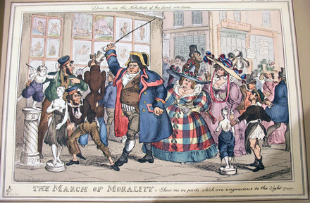
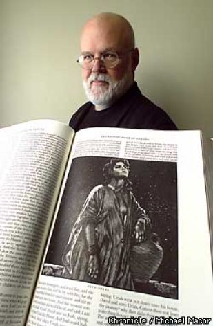
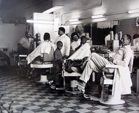
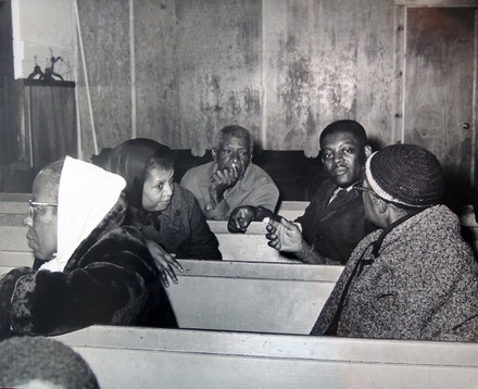
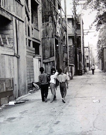
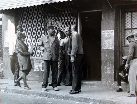
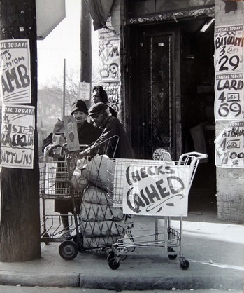
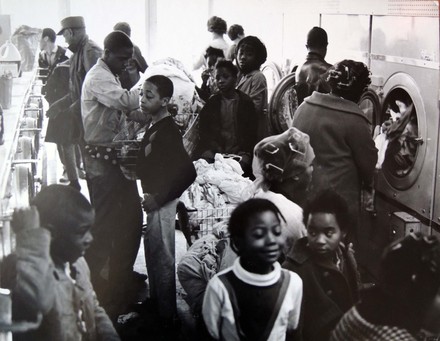
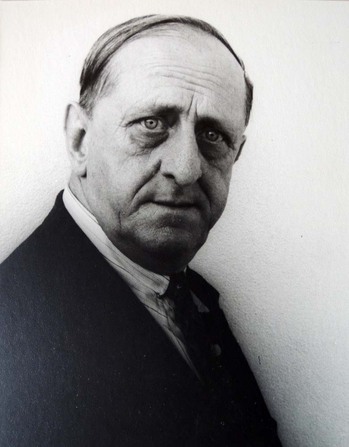
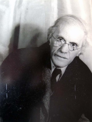
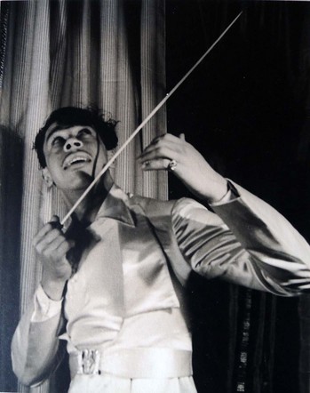
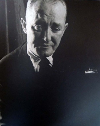
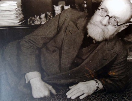
Alfred Bush writes, “Ulli Steltzer was a Gerrman born photographer who came to Princeton in the 1960s and kept a studio on Tulane Street, where she photographed most the Princeton’s famous and not so famous for many years. With a keen social conscience, in the late 1960s she made photographic forays into the American south, coming back with images to document the plight of the black population there under segregation. These comprise the photographs now in the Graphic Arts Division, the gift of Bill Scheide, a good friend of Ulli.”

steltzer 5.jpg
steltzer 4.jpg

Mr. Bush continues, “I then encouraged her to attempt to document American Indians of the Southwest. She bravely took on the Hopis, whose traditional life was then probably the least acculturated in the country, and also the tribe least tolerant of photography. Much to my surprise, after several summers living in the Hopi villages and joining in with the women’s work there, she came back with an extraordinary record of Hopi life. These photographs comprise the large body of work in the Western Americana collections.”

“Ulli subsequently moved to British Columbia and continued her photography among the native people in that area. She worked with the Tlingit and even later with the Inuit, rigging her camera to work in below zero temperatures. She produced a number of books of photography of indigenous Americans and toward the end of her photography career on the people of China. She earned many honors in Canada for her work.”


steltzer 3.jpg
steltzer 2.jpg
steltzer 1.jpg
7051658933_bf0376009b_z.jpg
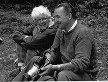
Photographers Ulli Steltzer & West County Camera (Fred) taken during a workshop in 1987. (c) West County Camera.

Listen to the artist talk about her work:


Currently at Princeton University Library:

Coast of many face / Ulli Steltzer and Catherine Kerr ; [maps by Marta Farevaag]. Seattle : University of Washington Press, 1979. xii, 212 p. : ill. ; 28 cm. Annex A, Forrestal F1087.8 .S73 1979

Davidson, Robert, 1946- Eagle transforming : the art of Robert Davidson / [photographs by] Ulli Steltzer ; [text by] Robert Davidson. Vancouver : Douglas & McIntyre ; Seattle : University of Washington Press, c1994. x, 164 p. : ill. ; 28 cm. Marquand Library (SA) E99.H2 D3929 1994

A Haida potlatch / Ulli Steltzer ; foreword by Marjorie Halpin. Seattle : University of Washington Press, 1984. xiv, 80 p. : ill. ; 27 cm. Firestone Library (F) E99.H2 S74 1984

Health in the Guatemalan highlands / Ulli Steltzer ; introduction by Carroll Behrhorst. Vancouver : Douglas & McIntyre ; Seattle : University of Washington Press, c1983. xxxv, 80 p. : ill. ; 25 cm. Firestone Library (F) RA771.7.G9 S83 1983

Indian artists at work / Ulli Steltzer. Vancouver : J. J. Douglas, c1976. 163 p. : ill. ; 26 cm. Graphic Arts Collection (GAX) Oversize 2006-0609Q

Indian artists at work / Ulli Steltzer. Seattle : University of Washington Press, 1977, c1976. 163 p. : chiefly ill. ; 25 cm. Rare Books Off-Site Storage E98.A7 S84

Inuit, the North in transition / by Ulli Steltzer. Seattle : University of Washington Press, c1982. viii, 216 p. : ill., maps, ports. ; 32 cm. Firestone Library (F) Oversize E99.E7 S824 1982q

Naanii Florence. [Vancouver, B.C.? : U. Steltzer, 1993?] 35, [1] p. : chiefly ill. ; 22 cm. Rare Books: Western Americana Collection (WA) NJPG94-B73358

The new Americans : immigrant life in Southern California / Ulli Steltzer ; introduction by Peter Marin.Edition: 1st ed. Pasadena, Calif. : New Sage Press, 1988. 175 p. : ill. ; 30 cm. Marquand Library (SAPH): Photography F867 .S83 1988

The spirit of Haida Gwaii : Bill Reid’s masterpiece / Ulli Steltzer ; foreword by Bill Reid ; introduction by Robin Laurence. Vancouver : Douglas & McIntyre ; Seattle, Wash. : University of Washington Press, c1997. 61 p. : chiefly ill. ; 22 cm. Marquand Library (SA) NB249.R44 S734 1997

Western Americana photographs collection, 1800s-1900s. Rare Books: Manuscripts Collection (MSS) WC064

Wo yan zhong he xin zhong de xing xiang : sheng huo zai Lijiang, Baidi, Yongning de ren men Sight and insight : life in Lijiang, Baidi, and Yongning / Wuli Site’erzi zhu ; Ling Man, An Li yi.Edition: Di 1 ban. Kunming Shi : Yunnan mei shu chu ban she, 2002. 142 p. : chiefly ill. ; 26 cm. Marquand Library (SA) DS793.Y8 S834 2002

The world of southwestern Indians; an exhibit of photographs by Ulli Steltzer. [Paterson, N.J.? 1970] [4] p. illus. 22 cm. Rare Books Off-Site Storage E78.S7 xW6

Les Songes drolatiques de Pantagruel

songes8.jpg
songes7.jpg
songes6.jpg
songes5.jpg
songes4.jpg
songes3.jpg

The first edition of Les Songes Drolatiques de Pantagruel, ou sont contenues plusieurs figures de l’invention de maistre François Rabelais (The Comic Dreams of Pantagruel, where several figures are contained in the invention of Master François Rabelais) was published in 1565. Since then, these curious figures have been reprinted many time, including this 1922 German edition Die trollatischen Traüme des Pantagruel (Graphic Arts Collection (GA), PQ1687 .S615 1922).


The original prints are attributed the French engraver and illustrator François Desprez, who printed and published two other sets of imaginative designs in 1567; Recueil de la diuersité des habits (A Collection of Diverse Costumes) and Recueil des effigies des roys de France (A Collection of Pictures of the Kings of France).

For a complete look at the original volume, see: http://gallica.bnf.fr/ark:/12148/btv1b8624589t/f1.image


Ulysses S. Grant broken

grant deathmask 4.jpg
After Karl Gerhardt (1853-1940), Ulysses S. Grant death mask, July 23, 1885. Plaster. Laurence Hutton Collection of Death Masks. Gift of Laurence Hutton.

grant deathmask 1.jpg
grant deathmask 3.jpg
grant deathmask 2.jpg

Our death mask of Ulysses S. Grant (1822-1885), the 18th President of the United States (1869-1877) and Major General of the Union Army during the American Civil War, was recently requested for loan. Unfortunately, a quick trip to the vault revealed that the plaster had been broken in several places, sometime in the past. It was a sad reminder of just how delicate these very heavy commemorative objects can be.

Grant’s head is framed with oak leaves on one side and laurel on the other. Oak leaves can stand for power, authority, longevity or victory. Laurel represents special achievements, distinction, success, triumph of worldly accomplishment, and heroism.


Collector and donor Laurence Hutton (1843-1904) wrote, “Two moulds from the face of General Grant, another warrior, maker of history, and leader of men, were made almost immediately after his death at Mount McGregor: one without the knowledge or consent of his family, nobody knows by whose connivance; the other, at the request of his family, by Mr. Karl Gerhardt. Both of these, or copies of them, came eventually into my collection.”

“The first is very distressing, and at the request of the present General Grant I have never exhibited it or permitted it to be reproduced in any way. The second was bequeathed to me by Mr. Arthur Dodge, although I have never learned how or from whom he obtained it. It has been put into an allegorical national frame but nothing has been added to its value or its interest thereby.” —Talks in a Library with Laurence Hutton (New York: G.P. Putnam’s Sons, 1907).

Gerhardt was introduced to Grant by Samuel Clemens (Mark Twain 1835-1910) in the last days of his life and at Clemens’ recommendation, agreed to the death mask. It is unknown how many additional copies Gerhardt had made from this original mould. Later, Clemens paid Gerhardt to return his bust, made in terra cotta, to Mrs. Grant and it is now in the collection of the Smithsonian Museum in Washington D.C.

grant deathmask 5.jpg

Elmer Adler's Accession Book

Adler_Accession_Book_opt 1.jpg

What would you buy if you wanted to start a graphic arts collection?

Elmer Adler (1884-1962) began with the Roman Alphabet of Leonardo da Vinci (1509) purchased in March 1924 from W.A. Gough for $30. This was followed a day later by Aulus Cornelius Celsus’s De re medica (1554) given to Adler as a gift from David Silva. Not bad.

Adler’s accession book has now been digitized and is available online: http://libweb5.princeton.edu/visualmaterials/EA/AdlerAccessionBookopt.1.pdf

This is the collection which, for the most part, came to Princeton University as the beginning of a Graphic Arts Collection for Firestone Library. Take a look.


A Note on Da Vinci’s Roman Capitals

“Qebastian Serlio, in 1537, Albert Durer, in 1525, and Geoffroy Tory, in 1529, designed and published Roman capitals constructed by geometrical rules following order and method, but all three had been preceded by the great Da Vinci, whose Roman alphabet appeared in 1509.”

“The magnificent Roman capitals of Leonardo Da Vinci are the results of an attempt to apply to the letters of the alphabet certain basic geometric proportions. They were composed within squares, and were engraved on wood, with the lines and circles of projection also cut on the wood blocks, as models for constructing by almost purely mechanical methods an alphabet of letters in divine proportion. They are to be found in a treatise, “Divina Proportione,” by Luca Pacioli, printed at Florence in 1509, and which existed in manuscript for some time previous.”—Printing Art, Volume 39 (University Press, 1922).

Carl Van Vechten's Third Career

vechten hartley.jpgCarl Van Vechten, Marsden Hartley June 7, 1939. Gelatin silver print. Graphic Arts Collection
vechten stieglitz.jpgCarl Van Vechten, Alfred Stieglitz April 17, 1935. Gelatin silver print. Graphic Arts Collection
vechten calloway.jpgCarl Van Vechten, Cab Calloway January 12, 1933. Gelatin silver print. Graphic Arts Collection
vechten cohen.jpgCarl Van Vechten, George M. Cohen October 23, 1933. Gelatin silver print. Graphic Arts Collection
An obituary for Carl Van Vechten (1880-1964) published in The New York Times pointed out that he had three consecutive careers (and some made him money): music critic, novelist, and finally photographer.

“Then, at the age of 52, he announced that he would never publish another word. And he didn’t with the exception of a few letters, short forewords for other people’s books, and short book reviews. That brought him to career no. 3, portrait photography, which had been a hobby for some time. Nearly all of his subjects were celebrities, and he did not charge them for his work. From time to time he would demand fees from magazines that wanted to reproduce a photo, but on the whole he gave them away.”

“‘I’ve photographed everybody from Matisse to Isamu Noguchi’ he used to say proudly. …He did his own darkroom work and was careful about it, and he always said proudly that he had never cropped a photo. Often, even into old age, he was up and in his darkroom at 6 A.M.”

“‘Mr. Van Vechten’s photography was darn good,’ Edward Steichen said last night. ‘He had a good opportunity to do the kind of work he was interested in, and he did it very well.’”— “Carl Van Vechten Is Dead at 84,” The New York Times December 22, 1964.

vechten matisse.jpgCarl Van Vechten, Henri Matisse May 30, 1933. Gelatin silver print. Graphic Arts Collection


Recent Comments

  • Howard Coblentz: I have a round seal shaped like a pear a read more
  • John Overholt: Wikipedia's entry for Sir Francis says: "Throughout Baring's lifetime his read more
  • Serge Rodrigue: It is a precious thing you have a book from read more
  • Colin Wicks: I have a copy of “A Round Game.” And it read more
  • Laurence Hilonowitz: I was a Customer, Friend of Bob Wilson. I Live read more
  • allen scheuch: Absolutely STUNNING! Those colors, those designs made my day! Thanks, read more
  • Olivier: Hello Diane, If you are still looking for an examplare read more
  • Stella Jackson-Smith: I have a framed picture by A.Brouet, signed with the read more
  • John Podeschi: I remember Dale fondly from my days at Yale (1971-1980). read more
  • Joyce Barth: I have some or all of this same poem. I read more