Recently in Ephemera Category

S.M. Spencer's $25.00 Stencil Outfit

stencil kit 19.jpg

On 15 August 1870, Mr. Chas C. Gates paid $25 for the right to sell the copyrighted stencil designs of S.M. Spencer & Co. of Brattleboro, Vermont. According to the research of Ian Brabner, Gates also received a complete S.M. Spencer & Co. Stencil Outfit, “…well packed in a neat and substantial hand trunk of oiled chestnut….”


stencil kit7.jpg

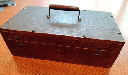
Nearly 143 years later, the Graphic Arts Collection has acquired this hand trunk and its contents (for slightly more than $25). The purchase was made in honor of Dale Roylance, former curator of the Graphic Arts Collection, thanks to the generous support of the Friends of the Princeton University Library.

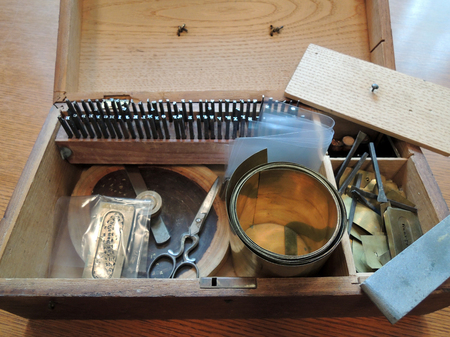
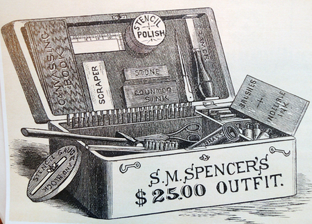
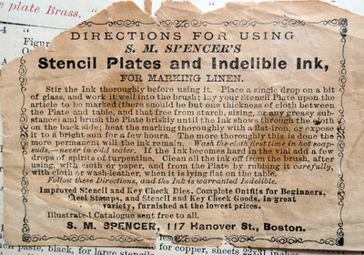
Our “S.M. Spencer’s $25.00 Outfit” includes all the tools, dies, and brass and German silver sheet stock to make small stencils for marking calling cards, books, textiles, and other objects. More importantly, the outfit included S.M. Spencer & Co.’s eight-page Confidential Pamphlet, Containing an Essay on Canvassing, Instructions in Stencil Cutting, Ink Receipts, Etc., Etc. (1870).


stencil kit4.jpg
Only a small selection of the entire kit shown.

stencil kit5.jpg


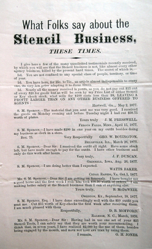
Spencer insisted this pamphlet was, “…the key to the outfit … in fact it is a complete budget of stencil information written and copyrighted by me for the exclusive use of my patrons, and it is worth the price of the outfit to any one commencing the business. In no case do I supply this pamphlet to others than those buying my complete outfit, or my dies to the amount of $25, as I paid that sum for single receipts which it contains.”


stencil kit6.jpg
stencil kit17.jpg
stencil kit2.jpg

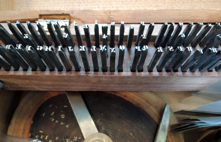
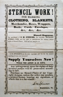
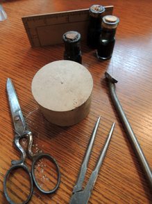
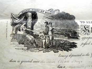
Chas. C. Gates’ stencil outfit form S.M. Spencer & Co. contains the following items: compete upper case and complete lower case alphabet dies; complete numeral dies, 0 to 8 (the numeral 9 accomplished by reversing the 6); 13 ornamenting dies, complete; a case to hold these dies (except for six of the ornamenting dies); a stencil gauge mounted to a hardwood block; a smoothing stone; a framer (lacking its handle); box of polishing powder; two finishing plates: a small pair of shears; a pair of dividers; a four-inch boxwood rule; a steel block scraper; a coil of sheet brass (approx. 3 ½ x 92 inches); some German silver strips remaining from a presumably larger initial stock; design patterns with two zinc curves form laying off the work; an advertising broadside; the aforementioned Confidential Pamphlet; a company issued, tax stamped and sealed certificate of assignment of copyright to use stencil designs dated August 15, 1879 and issued to Chas. C. Gates; and the wooden tool box or “hand-truck” to contain it all. (13 ½ x 7 x 4 ½ inches).


stencil kit14.jpg

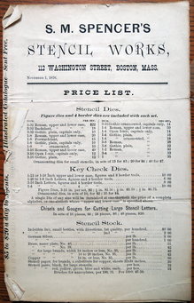
The S.M. Spencer & Company of Brattleboro, Vermont and later, Boston, Massachusetts, was established by D.L. Milliken in 1860. By 1864, Silas Metcalf Spencer (born 1842) had acquired the entire business and was running it by himself. In 1866 Spencer took on as an equal partner Mr. O. B. Douglas and the firm became S.M. Spencer & Co. by 1870, the year Chas. C. Gates purchased his outfit, the company employed 12 workmen.

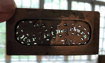
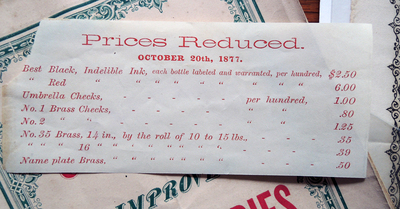
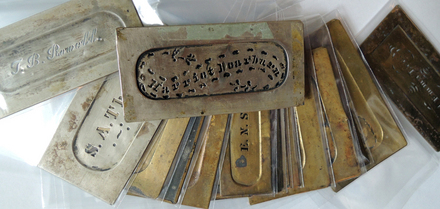
A contemporary source notes that “complete outfits,” which contain within the limits of a small hand-truck everything necessary to carry on a successful and very profitable business, are somewhat a specialty with them.” Sometime in the 1870s, at least by November 1876 based on a price list included with the present outfit, the company had removed from Brattleboro to Boston… . Of the 29 small format stencils, 19 indicate full names, the remaining stencils show only initials or initials and a surname. Interestingly, of the 19 stencils that show a full name, 15 are for women. -thanks to Brabner for this information.

stencil kit16.jpg
stencil kit18.jpg


The use of stencils to mark textiles was an important sales avenue form S.M. Spencer & Co.’s business. Their Catalogue of Improved Stencil Dies (1880) boldly states: “Ladies can make Stencil Plates, [o]ften with better success than gentlemen … the business is light and pleasant, and a new field for usefulness is opened to them, promising ample remuneration. Milliners and dress makers can ill afford to be without my stencil outfit. In marking patterns for embroidery, and copying the neat things [Louis A.] Godey and Mme. [Ellen Louise Curtis] Demorest are giving us, the dies and flowering tools are invaluable.”


stencil kit15.jpg
stencil kit13.jpg

Eden: A Ludlow Type

ludlow type archive2.jpg

In July 1929, Douglas McMurtrie, director of typography at the Ludlow Typograph Company in Chicago, wrote to Elmer Adler in New York City to say “we are sending you enclosed herewith a newly-issued booklet showing a few of the distinctive ornaments and borders in matrix form offered by the Ludlow Typography Company.”

The Ludlow Typograph Company was founded in 1906 by inventor William I. Ludlow and machinist William A. Reade. From 1912, they marketed a typecasting system called the typograph, specializing in large headline fonts. For a complete description of the company, see the wonderful article by Fred Williams.

http://www.apa-letterpress.com/T%20%26%20P%20ARTICLES/Typecasting/Ludlow%20Typograph.html

Whether Adler purchased their fonts is unknown but he carefully stored the booklet in a box with his other Ludlow type specimen books. This box turned up recently and we opened it to find a treasure-trove of type.

One of the specimen books is labeled “Eden,” here are a few pages from that booklet.

ludlow type archive3.jpg
ludlow type archive4.jpg
ludlow type archive5.jpg
ludlow type archive6.jpg


See a video of the typograph, posted by the International Printing Museum and their Ludlow Project.

Scenes on Cubes

scenes on the road1.jpg

Scenes on the Road in the Olden Time on Cubes, ca. 1850. Wood blocks with pasted paper in wood box. Graphic Arts Collection. Optical Toys

scenes on the road3.jpg

Victorian box of 30 puzzle blocks that form six complete pictures. They can be flipped and turned to change the image or make up one of your own.

scenes on the road2.jpg

Henry Pease Scrapbook

pease scrapbook2.jpg

Henry H. Pease, Class of 1899 and his son Henry H. Pease Jr., Class of 1928, are only two in a large and active Pease family of Pennsylvania. Pease Sr. is noted several times in the Daily Princetonian, particularly in June 1898, when he was appointed an usher at the graduations ceremonies that year, “requested to report at Alexander Hall at 10.15 a.m. and at the Cannon at 1.30 p. m., sharp.” Pease went on to work for the Lehigh Coal & Navigation Company and its subsidiaries.

Whether the scrapbook given to Princeton University Library was the property of Pease Sr. or Pease Jr. is unknown but we are grateful to Mrs. Pease for this donation. The volumes hold several dozen cuts, bookplates, and illuminated letters. Here are a few examples.

pease scrapbook6.jpg
pease scrapbook10.jpg
pease scrapbook4.jpg
pease scrapbook8.jpg
pease scrapbook5.jpg
pease scrapbook13.jpg
pease scrapbook12.jpg

Pease scrapbook, no date. Bookplate collection

Memorial for Visitors to Oxford

memorial for visitors3.jpg
This week thanks go to Anthony Grundy for rescuing several small items during the renovation of the second floor rooms. One is seen here.

memorial for visitors4.jpg
In The Official Illustrated Guide to the North-Western Railway (1861), George Measom notes, “No visitor to Oxford should leave the city without calling at the several shops belonging to this enterprising and most honourable firm … of Messrs. Spiers and Son. They are among the largest and most important places of business in Oxford; that in the High-street (Nos. 102 and 103), at the corner of Orielstreet, is the one by which they are best known, as few tourists visit Oxford without inspecting it.”

memorial for visitors6.jpg
“It will be recollected that this firm exhibited in the nave of the Crystal Palace in 1851, a large glass case of their papier mache manufactures, decorated with views of every building of note in and about Oxford, with other goods of a special local character. In Dublin, New York, Paris, and Sydenham, they have also exhibited, and have received the testimonials of the juries in the award of prize medals and honorary mention.”

memorial for visitors7.jpg
“The collection of articles of taste and vertu, of useful and ornamental goods, suitable for presents and memorials of Oxford, as well as of those which are interesting and serviceable to the tourist, is very large, and has made their house everywhere celebrated. A Memorial for Visitors, published by them, and presented generally to those who inspect their establishment, is quite a curiosity in its way.”

memorial for visitors2.jpg
“The enterprise of this firm is shown in another very large establishment of theirs in Cornmarket-street (Nos. 45 and 46), near the Star Hotel, which is devoted entirely to china, earthenware, and glass, of which their stock is one of the largest in the kingdom. The buildings, which occupy nearly a quarter of an acre, were erected and decorated from the designs of Mr. Bruton, a local architect of much repute, and Mr. Owen Jones; for elegance and usefulness of character, extent, variety, and for completeness of arrangement, they are perhaps unequalled.”

memorial for visitors.jpg

A Memorial for Visitors to Oxford: Containing Views, Map of the City, List of the Principal Buildings & of Distances from Oxford, with Other General Local Information Useful to the Visitor and Tourist (Oxford: Spiers & Son, 1850s). Chromolithography. Graphic Arts Collection 2013- in process

Puffs

film 006.JPG
George Cruikshank, Lottery Puffs, 1820. 20 wood engravings. Previously owned by Marshall R. Anspach. Graphic Arts Collection GAX 2013- in process

film 007.JPG
film 004.JPG
film 009.JPG
film 005.JPG

In The English Metropolis, or, London in the Year 1820: Containing Satirical Strictures on Public Manners, Morals, and Amusements, the author writes:

“…When we see persons of genius and eminence stoop to such low[s], and it may even be said such dishonest expedients to beguile the public, the evil strikes at the root of future improvement. The buffooneries of a posture-master, the capers of a dancer, and the persuasions of an auctioneer, or a vender of lottery-tickets, may require the deceptious aid of a puff; but science and native genius ought never to descend from their real elevation, to decorate themselves with the rainbow hues of evanescent glory, and purchaser able praise.”

“Yet it may be proper here to inform the young student in satirical composition, that most, if not all the pretensions of our successful versifiers, and some of our prose Writers too, depend upon the reiterated puffs by which their publications have been ushered into the world.”

film 010.JPG
film 001.JPG


Cuban Chromolithography

romeo and juliette.jpg
Romeo y Julieta, imported Havana cigars. Rodriguez, Arguelles y Ca., n.d. [after 1902]. Published by the Compania Litografica, Havana. Chromolithographic poster. 62 x 50.4 cm. Graphic Arts Collection GC149 Ephemera.

The French expatriot artist Frédéric Mialhe (1810-1881) lived and worked in Cuba from 1838 to 1854. He was brought there to be a landscape painter for the newly established lithographic press of François Cosnier and Alexandre Moreau de Jonnes under the sponsorship of the Royal Patriotic and Economic Society of Cuba. With three presses, five operators, and one master painter, it was “one of the most outstanding enterprises of its kind ever attempted in Cuba” (Cueto).

It wasn’t until 1861 that chromolithograph came to Cuba but once the technicians were trained, production was enormous. A particular relationship between the tobacco industry and the chromolithographic printers developed. Everything from the largest posters to the smallest cigar bans were printed and embossed in elaborate multicolor designs.

One example in the graphic arts collection is a vintage poster for the Romeo y Julieta Cigars. The company was established in 1875 and this print is probably from the early in the 1900s, based on the brand. For more information on Cuban lithography, see: Emilio Cueto, Mialhe’s Colonial Cuba: the Prints that Shaped the World’s View of Cuba (Miami: Historical Association of Southern Florida, c1994). Firestone Library (F) NE2325.5.M5 A4 1994

$1000 and a Plot of Land in Illinois

certificate stock.jpg
certificate stock2.jpg

Two engraved certificates turned up this week in the Graphic Arts Collection. The first is a $1000 non taxable certificate, dated 17 February 1864, due from The Confederate States of America and payable two years after the ratification of a treaty of peace with the United States (we haven’t figured what the interest would be at 6% per year).

The second is a certificate granting a tract of land in the Territory of Illinois, dated 6 May 1812 and signed by James Monroe. At this time, Monroe was Secretary of State and not long after this, appointed the Secretary of War under President James Madison.


certificate stock3.jpg
certificate stock4.jpg
certificate stock5.jpg

“A similar issue of 6 % non-taxable certificates was also authorized with which to pay for government supplies, if agreeable to contractors. These were not intended for general circulation, as they were made transferable by endorsement only. The expenses of the government were further to be met out of the proceeds of a new bond issue for 500 millions bearing 6 % interest. The interest and principal of these bonds were exempt from taxation, and their payment was secured by the net receipts of any export duty hereafter to be levied upon cotton, tobacco, and naval stores, and also by the net proceeds of the import duties. The former never materialized, and the latter amounted to an insignificant sum.”

“As to the effect of the Funding Act, the popular belief that prices would fall was not realized. Immediately upon the passage of the act there were complaints of a scarcity of currency, a familiar phenomenon at the time of inflation.”
—John Christopher Schwab, The Confederate States of America, 1861-1865: A Financial and Industrial History of the South During the Civil War (1901). Firestone E487.S393 1901


Kent's Cups and Saucers

kent dishes5.jpg

Around 1937, the American artist Rockwell Kent (1882-1971) was commissioned by Faye Bennison, the owner of Vernon Kilns in Vernon, California, to design several dinnerware patterns. Kent completed at least three sets, using images from two of his most popular books, Moby Dick (1930) and Salamina (1935), along with a patriotic set he called “Our America.” The Graphic Arts Collection holds a set of Salamina dishes, pictured here.

Rockwell Kent (1882-1971), Salamina (New York: Harcourt, Brace and company, 1935).Graphic Arts Collection (GAX) G750 .K4 1935

Herman Melville (1819-1891), Moby Dick; or, The Whale; illustrated by Rockwell Kent (New York: Random House, 1930). Graphic Arts Collection (GAX) PS2384 .M6 1930b

kent dishes4.jpg
kent dishes3.jpg
kent dishes2.jpg
kent dishes1.jpg

The Temple of Fancy

Fuller interior temple of fancy.jpgTemple of Fancy [trade advertisement]. Drawn by W. Derby and engraved in aquatint by Smart and Sutherland (London: S. & I. Fuller, ca. 1823).
Graphic Arts Collection 2013- in process
fuller interior temple of fancy 2.jpg

According to the National Portrait Gallery’s wonderful directory of British Artists’ Suppliers, 1650-1950 (http://www.npg.org.uk/research/programmes/directory-of-suppliers/f.php), “Samuel Williams Fuller (c.1777-1857) and his brother Joseph Carr Fuller (c.1783-1863) advertised the opening of their shop in Rathbone Place in 1809, stating that they had been ‘many years with Mr. Edward Orme, New Bond-street’, the print dealer and publisher. …”

“The two brothers were partners in what became one of the leading print publishing businesses of Regency and early Victorian London, producing a number of print catalogues. … Their trade as artists’ colourmen was mainly in watercolours and drawing materials.”

“Their trade card, advertising the ‘Temple of Fancy’, c.1810, focused on the market in genteel products for ladies, … while a later three-page leaflet was aimed at male customers ….”

“A leaflet, apparently from the Lady’s Magazine, August 1823, depicted Fuller’s shop interior, and gives a good idea of the product range; the business was advertised as ‘Publishers of the greatest variety of Sporting Prints…/ TEMPLE OF FANCY/ S. & I. FULLER,/ PREPARERS OF PERMANENT SUPERFINE WATER COLOURS,/…/ Wholesale Manufacturers of Bristol Boards, Ivory Paper & Cards./ Engravers, Publishers, Printsellers, & Fancy Stationers.’”

Happily, a similar advertisement as been acquired by the Graphic Arts Collection, depicting the interior of the Temple of Fancy.

Blocks for Candide

kent candide blocks4.jpg
kent candide blocks6.jpg
The Graphic Arts Collection is fortunate to hold the metal relief blocks for the paragraph capitals designed by Rockwell Kent (1882-1971) for Candide by Voltaire (François-Marie Arouet 1694-1778). Kent created a full alphabet although only a few blocks were used in the final publication.

kent candide blocks3.jpg

In the spring of 1927, twenty-nine year-old Bennett Cerf (1898-1971) and his twenty-five year-old friend Donald Klopfer (1902-1986) established a fine press imprint called Random House, with Candide as their first book, printed by Elmer Adler’s Pynson Printers in The New York Times Annex. The edition included 1,470 black and white copies priced at fifteen dollars each and ninety-five hand-colored copies priced at seventy five dollars. The book was hand set in type designed by Adler’s partner Lucian Bernhard (1883-1972) and paragraph designs and illustrations by their friend Rockwell Kent (1882-1971), both cast by the Bauersche Giesserei, Frankfort.

kent candide blocks5.jpg
Kent had two assistants on Candide: Ione Robinson (1910-1989), who later worked with Diego Rivera, and Dehli Gág, the sister of book illustrator Wanda Gág (1893-1946).(1) In her memoir, Robinson recorded some of the diary entries she made during that project. “Rockwell Kent … offered me forty dollars a week to be his assistant,” she began on December 12, 1927, “He has so many woodcuts to cut and it is as easy as pie for me to do that.”(2) But the artist soon tired of Kent’s strict work ethic and his minuscule drawings, which were “hard to cut, the lines are so fine. I am dead tired!”

kent candide blocks.jpg

By February, Robinson was losing interest in the project. “I have had to learn to draw exactly like Mr. Kent and what’s more, to copy his handwriting, as I sign most of his work. I don’t approve of this; it makes the whole thing like a small factory, especially the work on the book Candide. There is to be a special edition, hand-colored, and I must do all of this; one hundred copies, each with one hundred drawings. That makes a thousand for me to do, and I work all day and late into the night under a strong blue light.”

One month later, Robinson was fed-up. “This house is like a three-ring circus … I don’t believe that an artists’ work should be like a factory. Mr. Kent has a system for everything … At the moment, he is planning to move to a large farm in the Adirondacks, and the book must be finished before April.” Suddenly, Kent announced that he did not want to wait for summer and so, his studio, his assistants, and his family moved to the country.(4)

Robinson still had nearly 300 watercolors to finish and when they arrived, “I simply jumped from a horse to work again on Candide. I am living in a small cabin away from the big house, and it is freezing cold. Mr. Kent likes to freeze—but not I.” May 10, 1928, Robinson wrote that Candide was finally finished and she had made enough money to resign.


  1. Carl Zigrosser, A World of Art and Museum (Philadelphia: Art Alliance Press, 1975): 134.

  2. Ione Robinson, A Wall to Paint On (New York: E.P. Dutton and Company, 1946): 29.

  3. Contrary to Kent’s description of the place as a simple farm, Country Life published a four-page article detailing the construction and decoration of Kent’s elaborate new home including farm buildings, servant’s quarters, landscaped grounds, and swimming pool. Rebecca Hourwich, “An Artist Builds a House,” Country Life (July 1929): 35-38.

Bal des Barbus

bal de barbus.jpg

Raymond Savignac (1907-2002), Bal des Barbus, 1950. Published by Watelet-Arbelot in Paris. TC094 Oversize Theater Posters Collection.

Although the Bearded Balls were held in Paris throughout the 1940s and 1950s, Raymond Savignac was only responsible for one of its posters. In an obituary for the popular graphic artist, Richard Hollis writes,

“Raymond Savignac, who has died aged 94, was the last of the great Parisian poster artists. For several decades, their works lit up the métro, and those by Savignac were the most entertainingly unmissable. He claimed that his career began in 1949 with the poster, Monsavon Au Lait. ‘I simply thought of a cake of soap for Monsavon, and a cow for the milk,’ he said. With a comic picture of a cow, its udders emptying themselves into a bar of soap, he made a visual scandal - and he went on making them well into his 90s.”

“…By chance, while touring the Paris publicity agents, Savignac met Cassandre, the most celebrated of these designers, and, in 1935, became his assistant. During Cassandre’s winter absences in New York, Savignac was found a place at the smart printers, Draeger Frères, but since Draeger commissioned their more interesting work from outside designers, it was more than a disappointment: ‘Là, c’était l’horreur.’ This horror was interrupted by another - the war.”

“After demobilisation, and during the Nazi occupation of France, Savignac was again unemployed. A colleague suggested he should hold an exhibition, an unusual course of action for a commercial artist. At that time, poster designers worked by preparing a graphic idea for an imaginary brand name product, which would then be hawked around advertisers in the hope that they could match the design to a client.”

“…The style of a Savignac poster has nothing in common with Cassandre’s purist compositions. But they share the humorous single figure, as it had appeared in Cassandre’s famous “Dubo, Du bon, Dubonnet” designs. The public could identify with these recurring, isolated comic characters. With the air of put-upon, but smiling, consumers, they often have the look of Savignac self-portraits.” —Richard Hollis, “Raymond Savignac: Brilliant poster artist who brought colour, wit and style to the French advertising industry,” The Guardian, November 8, 2002.


Just Turned Up (or life as usual during renovation)

spear4.jpg
Spear, no date. Iron and wood. 104 cm (41 inches).
spear3.jpg


Pynson Printers Seal

pynson printers seal.jpg
pynson printers seal2.jpg

If there was ever any doubt that Elmer Adler (1884-1962) and his colleagues established the Pynson Printers in 1922, all questions are now answered. We just discovered the official seal for the printing business Adler opened together with designer Walter Dorwin Teague (1883-1960), production manager Hubert L. Canfield, and typographer David Silve.

They named the firm after Richard Pynson (1448-1529), one of the first printers of English books and advertised: “The Pynson Printers are at your service for the planning and production of all printing in which quality is the first consideration.”

The first office was located on the second floor of a garage on East 32 Street that belonged to wealthy socialite and financier William Goadby Loew (1876-1955). Adler had three presses but only one customer and within a year, he was the only partner left in the business.

Journeyman's Certificate

apprentice certificate3.jpg

Handwerkskundschaft. Wir dieser Zeit Geschwor[e]ne Vor und andere Meistere des Loebl. Handwerks derer Maurer, in der Kayserlichen .. (Bremen: Ernsting, 1791 [ink inscriptions 1798]. Engraved broadside. Graphic Arts Collection GA 2013- in process

A panoramic view of the city of Bremen tops this journeyman’s certificate. It is inscribed for twenty-five year old Johann Hingstmann (born 1773), who has completed his twelve year apprenticeship to reach the level of journeyman. Hingstmann now has the right to charge a fee for his own work. To reach the highest level of master craftsman, he will have to submit an example of his work to a particular guild for evaluation and hopefully, be admitted to the guild as a master.

The certificate is engraved by Daniel Albert (Albrecht) Ernsting (1749-1820), who was himself an apprentice to a Bremen printer. Ernsting then studied in Göttingen and Copenhagen before returning to Bremen and opening a shop. His name is found engraved on portraits, business cards, playing cards, and of course certificates.


Zeichnen-Apparat: The Apparatus for Drawing

| 1 Comment
writing box 3.jpg
writing box 2.jpg
writing box 1.jpg

Portable drawing box, 1800s. Hand-painted wood. Graphic Arts Collection

Tobacco wrapping papers

tobacco paper14.jpg

Graphic Arts recently acquired an album of tobacco wrapping papers from the Nuremberg firms of Ph. Casimir Krafft (P.C.K.& C.) and Georg Platner, undated but approximately from the 1780s to the 1830s. The collection may have been assembled by the printers of these papers or the manufacturers of the tobacco as a record of their advertising. The papers indicate that the two companies also had factories in London and Amsterdam.

tobacco paper8.jpg

In the 1700s printed trade cards and wrappers for tobacco, powdered medicines, health aids, and pins began to be used throughout Europe. Tobacco papers identified the retailer who blended and measured out the tobacco into the wrapper (Alec Davis, Package and Print: the Development of Container and Label Design (London: Faber and Faber, 1967). Graphic Arts Collection (GA) TS158 .D38 1967)

tobacco paper7.jpg
tobacco paper15.jpg
tobacco paper11.jpg
tobacco paper10.jpg
tobacco paper17.jpg
tobacco paper5.jpg

Etiquette der Tabak Fabriken Ph. C. Karfft und Platner [album], Nuremberg, no date [1780s-1830s]. 86 sheets engraved or lithographed, some color. Graphic Arts Collection 2013- in process

Frozen

Great Britains wonder.jpg

Great Britains Wonder: or, Londons Admiration: Being a true representation of a prodigious frost, which began about the beginning of Decemb. 1683. and continued till the fourth day of February following. And held on with such violence, that men and beasts, coaches and carts, went as frequently thereon, as boats were wont to pass before. There was also a street of booths built from the Temple to Southwark, where were sold all sorts of goods imaginable, … It being the wonder of this present age, and a great consternation to all the spectators (Printed by M. Haly, and J. Miller, and sold by Robert Walton, at the Globe on the north-side of St Pauls-Church, near that end towards Ludgate; where you may have all sorts and sizes of Maps, Coppy-Books, and Prints, not only English, but Italian, French and Dutch. And by John Sellar on the west-side of the Royal-Exchange. 1684). Broadside with woodcut. Robert H. Taylor Collection of English and American Literature

During the Great Frost in the winter of 1683/84, the Thames River was completely frozen for over two months. This wasn’t an isolated occurrence. Between 1408 and 1814, there were twenty-four winters in which the Thames was completely frozen. Venders moved in and Frost Fairs were held as soon as the ice was thick enough. Virginia Woolf recorded such a winter in Orlando:

“The Great Frost was, historians tell us, the most severe that has ever visited these islands. Birds froze in mid-air and fell like stones to the ground. At Norwich a young countrywoman started to cross the road in her usual robust health and was seen by the onlookers to turn visibly to powder and be blown in a puff of dust over the roofs as the icy blast struck her at the street corner. The mortality among sheep and cattle was enormous.” Virginia Woolf (1882-1941), Orlando: a Biography (New York: C. Gaige, 1928). Copy 597 of 800. Graphic Arts Collection (GAX) 2004-3966N


Graphic Arts Collection Scrapbooks

ga scrapbooks6.jpg
ga scrapbooks10.jpg

ga scrapbooks5.jpg
ga scrapbooks4.jpg

ga scrapbooks1.jpg
ga scrapbooks3.jpg
Pictured here are a few of the American scrapbooks recently found and catalogued in the Graphic Arts Collection. Most hold examples of chromolithographic trade cards, valentines, and pretty girls. One is filled with wood engraved cartoons and one with engraved portraits. All are available for viewing in our reading room.

ga scrapbooks6b.jpg
ga scrapbooks4c.jpg
“But those people who are choosing to print out their photos and make scrapbooks may have the last laugh because the materials they are working with now are much more [durable] than they were before. Archivists are struggling to maintain
old scrapbooks, but in 100 years these things will last, they are indestructible. There will be an entire world of material culture studies that looks at just this, these scrapbooks.” Jessica Helfand, author of Scrapbooks: an American History (New Haven: Yale University Press, 2008). Firestone Library (F) Oversize TR465 .H445 2008q

ga scrapbooks5c.jpg
ga scrapbooks5b.jpg
ga scrapbooks10c.jpg
ga scrapbooks6a.jpg
ga scrapbooks4b.jpg
ga scrapbooks4a.jpg
ga scrapbooks8c.jpg


L. Sunderland and Company trade cards

| 1 Comment
brogan trade cards1.jpg
When U.S. Navy commodore Matthew C. Perry sailed to Japan in 1853 and trade routes were opened between Japan and the United States, Americans were introduced to a new iconography from the East. Japanese designs began to find their way into all sorts of American objects.

brogan trade cards3.jpg
William L. Sunderland’s lithographic printing company in Providence R.I. was producing “all kinds of lithograph work at short notice and upon the most favorable terms,” when the craze for Japanesme hit the east coast. The firm (known as L. Sunderland Co.) quickly designed and printed a series of trade cards incorporating various Japanese themes.

brogan trade cards2.jpg
Among the businesses that purchased these eye-catching feats of artistic printing were Sapanule, makers of the celebrated Glycerine Lotion (said to cure rheumatism, neuralgia, pneumonia, diphtheria, sore throats and more); Dr. J.F. Brogan, “Operative Dentist” at 305 Fulton Street, Brooklyn; Summit Mineral Springs Water; and Harry Harper, a paper dealer and stationer at 60 Fulton Street, Brooklyn.

brogan trade cards4.jpg
japan-13.gif

Nine trade cards printed by L. Sunderland, Providence Rhode Island, 1870s-1880s. Chromolithography. Graphic Arts Collection GAX 2012- in process

<< 1 2 3 4 5 6 7

Recent Comments

  • Howard Coblentz: I have a round seal shaped like a pear a read more
  • John Overholt: Wikipedia's entry for Sir Francis says: "Throughout Baring's lifetime his read more
  • Serge Rodrigue: It is a precious thing you have a book from read more
  • Colin Wicks: I have a copy of “A Round Game.” And it read more
  • Laurence Hilonowitz: I was a Customer, Friend of Bob Wilson. I Live read more
  • allen scheuch: Absolutely STUNNING! Those colors, those designs made my day! Thanks, read more
  • Olivier: Hello Diane, If you are still looking for an examplare read more
  • Stella Jackson-Smith: I have a framed picture by A.Brouet, signed with the read more
  • John Podeschi: I remember Dale fondly from my days at Yale (1971-1980). read more
  • Joyce Barth: I have some or all of this same poem. I read more