May 2013 Archives

Preserving visions of bliss

| 1 Comment
legrand macao12.jpg
Edy-Legrand (1892-1970), Macao & Cosmage, ou, L’expérience du Bonheur [Macao & Cosmage, or The Experience of Happiness] (Paris: Éditions de la Nouvelle Revue Française, [1919]). Princeton’s copy is bound by Gérard Charrière. Gift of JoAnna Angle in memory of her husband, Charles Agle, Class of 1929. Graphic Arts Collection (GAX) Oversize NK8667.L37 L37f

legrand macao 3.jpg

Born in Bordeaux, Edy-Legrand (Édouard Léon Louis Legrand) studied at the École des Beaux Artes in Paris and the Art Academy in Munich. As an adult, he traveled extensively, living for a time in Morocco, but when this book was drawn and written, the artist was still in Paris only dreaming of exotic locations.

The story of the lovers Macao and Cosmage who lived an idyllic life on a secluded island touched many readers including E.M. Forster (1879-1970), who reviewed the book in glowing terms. Forster noted that in “the heart of each man there is contrived a magical island.” Just as Macao and Cosmage had to confront the modern world when a ship lands on their island, Forster draws a parallel in the way human beings preserve their moments and visions of bliss “from the thoughtless destructive reality.” — Abinger Harvest (1936). (Ex) 3743.5.3105

legrand macao11.jpg
legrand macao8.jpg
legrand macao5.jpg
legrand macao10.jpg
legrand macao6.jpg
legrand macao 7.jpg
legrand macao 2.jpg
legrand macao 1.jpg

Carrousel of 1662

| 1 Comment
perrault courses8.jpg
Charles Perrault (1628-1703). Courses de testes et de bague faites par le roy et par les princes et seigneurs de sa cour en l’année 1662. Paris: Imprimerie royale, Sébastien Mabre-Cramoisy, 1670. Graphic Arts Collection. Purchased with funds donated by the Friends of the Princeton University Library.

perrault courses1.jpg
perrault courses6.jpg

Thanks to the generous assistance of the Friends of the Princeton University Library, the graphic arts collection has acquired a stunning copy of the 17th-century festival book, Courses de testes et de bague documenting the Carrousel of 1662, the last fête held in Paris before Louis XIV (1638-1715) moved the court to Versailles.

The Imprimerie Royale of France published Courses de testes et de bague in the final months of 1670 as the first volume of the Cabinet du Roi (later reorganized as volume X). Seven hundred copies were printed and bound in red leather, four hundred in French and three hundred in Latin. The book records a Carrousel (also written carousel) or tournament held on June 5 and 6, 1662, organized by the twenty-four year old King. The fifty-five participants were divided into five quadrilles representing the Romans, Persians, Turks, East Indians, and Native Americans Indians, with the king and four of his highest ranking noblemen as the chiefs.

perrault courses2.jpg
perrault courses7.jpg

The acquisition is a nice complement to the seven small pamphlets already held in the rare book collection describing the Carrousel: Iorvnal historique dv grand et magnifiqve carovsel ov tovrnoy de Lovys XIV, roy de France et de Navare. Contenant ce qui s’est fait & passé les cinq & six de iuin courses de la bague (Paris: Chez I.B. Loyson, 1662). With this acquisition we not only document the event but also the beginning of the Cabinet du Roi, the first use of the icon of the sun by Louis XIV (Sun King), and the farewell to Paris by the royal court.

perrault courses4.jpg

During the eight years it took to create Courses de testes et de bague, the five men responsible for it—Charles Perrault, Esprit Fléchier, Israel Silvestre, François Chauveau, and Gilles Rousselet—became or already were members of the controlling academies of Paris. Historian Lynn Festa, writing in Empires of the Sun: Colonialism and Closure in Louis XIV’s 1662 Carrousel, comments, “What is curious about the Carrousel is the prominent place given within this closed universe to those who have no access to power within it—to images of subjugated populations, to colonial rivals, to slaves.”

“Rather than challenging Louis’s serene, absolutist order, the exotic otherness of the extravagantly costumed princes, slaves, and animals, serves to celebrate the king’s power. The potentially threatening plurality of images is enclosed in the systematic, subordinating hierarchy of the royal fete. If the first half of the Carrousel—the procession—celebrates and constructs the otherness of its exotic figures, the second half—the ritual assembly before the Louvre—rewrites the meaning of these images into a specifically French iconography that affirms the centrality of Louis XIV.”

perrault courses5.jpg

Our sincere thanks to the Friends of the Princeton University Library for making this possible!

For more information, read this Haverford senior thesis: http://thesis.haverford.edu/dspace/bitstream/handle/10066/1414/2008NelsonN.pdf


Henry Pease Scrapbook

pease scrapbook2.jpg

Henry H. Pease, Class of 1899 and his son Henry H. Pease Jr., Class of 1928, are only two in a large and active Pease family of Pennsylvania. Pease Sr. is noted several times in the Daily Princetonian, particularly in June 1898, when he was appointed an usher at the graduations ceremonies that year, “requested to report at Alexander Hall at 10.15 a.m. and at the Cannon at 1.30 p. m., sharp.” Pease went on to work for the Lehigh Coal & Navigation Company and its subsidiaries.

Whether the scrapbook given to Princeton University Library was the property of Pease Sr. or Pease Jr. is unknown but we are grateful to Mrs. Pease for this donation. The volumes hold several dozen cuts, bookplates, and illuminated letters. Here are a few examples.

pease scrapbook6.jpg
pease scrapbook10.jpg
pease scrapbook4.jpg
pease scrapbook8.jpg
pease scrapbook5.jpg
pease scrapbook13.jpg
pease scrapbook12.jpg

Pease scrapbook, no date. Bookplate collection

Oscar Cesare

cesare1.jpgOscar Edward Cesare (1885-1948), Untitled [Man sleeping in chair, woman standing beside him], ca. 1926. Watercolor and gouache on board. Signed in ink, l.r.: “For Miss Watson from Cesare ‘26”. Graphic Arts Collection 2013- in process

Do you recognize this scene?

The unidentified illustration is by the Swedish/American artist Oscar Cesare. “Born in Linkoping, Sweden, [Cesare] studied art in Paris before he came to this country when he was 18 years old,” notes the artist’s obituary in The New York Times, July 1948. “He continued his art studies in Buffalo and then went to Chicago, where he worked for many newspapers. He then came to New York, where his first political cartoons appeared in The World. His work also appeared in The Sun and The Post. He became a regular contributor to the Sunday magazine of The New York Times in 1920 …”

But the more interesting article was in the San Francisco Chronicle in 1922 with the headline “O. Henry’s Dearest Romance Goes to Smash: His Own Daughter’s Marriage, for which the Master of the Love Story So Wanted a Happy Ending.” The story chronicles the meeting of Cesare and Margaret Porter, daughter of the novelist O. Henry (William Sydney Porter, 1862-1910), their marriage, and subsequent divorce.

“…her father was about the most retiring literary celebrity America has ever known. His readers were legion, his friends he could number on his fingers. One of these was Oscar Cesare, a young artist but recently come to America from Sweden. Cesare was destined to become almost as famous in art as O. Henry in writing. His war cartoons in New York newspapers were to fire the nation. Critics were to call him “America’s ablest cartoonist,” his work “distinguished by unusual vigor and consummate assurance.”

“European newspapers were to reproduce more of his cartoons than any other artist’s in America. But, when he met Margaret Porter, he was still a struggler drawing sketches and caricatures for this newspaper and that. O. Henry and his daughter, and Oscar Cesare, became a happy trio. O. Henry quietly watched them as he watched Broadway and Bohem’s shopgirls and millionaires and all the seething panorama of New York. As he saw the budding of romance, did he, perhaps, write that charming love-story, A Service of Love?”

Memorial for Visitors to Oxford

memorial for visitors3.jpg
This week thanks go to Anthony Grundy for rescuing several small items during the renovation of the second floor rooms. One is seen here.

memorial for visitors4.jpg
In The Official Illustrated Guide to the North-Western Railway (1861), George Measom notes, “No visitor to Oxford should leave the city without calling at the several shops belonging to this enterprising and most honourable firm … of Messrs. Spiers and Son. They are among the largest and most important places of business in Oxford; that in the High-street (Nos. 102 and 103), at the corner of Orielstreet, is the one by which they are best known, as few tourists visit Oxford without inspecting it.”

memorial for visitors6.jpg
“It will be recollected that this firm exhibited in the nave of the Crystal Palace in 1851, a large glass case of their papier mache manufactures, decorated with views of every building of note in and about Oxford, with other goods of a special local character. In Dublin, New York, Paris, and Sydenham, they have also exhibited, and have received the testimonials of the juries in the award of prize medals and honorary mention.”

memorial for visitors7.jpg
“The collection of articles of taste and vertu, of useful and ornamental goods, suitable for presents and memorials of Oxford, as well as of those which are interesting and serviceable to the tourist, is very large, and has made their house everywhere celebrated. A Memorial for Visitors, published by them, and presented generally to those who inspect their establishment, is quite a curiosity in its way.”

memorial for visitors2.jpg
“The enterprise of this firm is shown in another very large establishment of theirs in Cornmarket-street (Nos. 45 and 46), near the Star Hotel, which is devoted entirely to china, earthenware, and glass, of which their stock is one of the largest in the kingdom. The buildings, which occupy nearly a quarter of an acre, were erected and decorated from the designs of Mr. Bruton, a local architect of much repute, and Mr. Owen Jones; for elegance and usefulness of character, extent, variety, and for completeness of arrangement, they are perhaps unequalled.”

memorial for visitors.jpg

A Memorial for Visitors to Oxford: Containing Views, Map of the City, List of the Principal Buildings & of Distances from Oxford, with Other General Local Information Useful to the Visitor and Tourist (Oxford: Spiers & Son, 1850s). Chromolithography. Graphic Arts Collection 2013- in process

Captain James West x 2

West portrait.jpg
west portrait2.jpg
Two years ago, thanks to the generous donation of W. Allen Scheuch II, Class of 1976, the graphic arts collection acquired a portrait of Captain James West (1808-1884) captain of the U.S. Mail Steamship “Atlantic,” which sailed between New York and Liverpool. Recently Scheuch found and donated another portrait we believe to be the same Caption James West but painted by a different artist.

On the back of the second frame is a browning sheet of paper written in a delicate hand, “Captain James West / Born / Died / My grandfather / Mary Nixon West

We believe the portrait at the top is the younger of the two. What do you think?

biffin.jpg

[above] Unidentified artist, Portrait of Captain James West (1808-1884), ca. 1840. Portrait miniature on ivory. Graphic Arts collection 2013- in process. Gift of W. Allen Scheuch II, Class of 1976

[below] Sarah Biffin (1784-1850), Portrait of Captain James West (1808-1884), 1844. Watercolor on paper. Graphic Arts. 2011- in process. Gift of W. Allen Scheuch II, Class of 1976, given in honor of Meg Whitman, Class of 1977

Dale Roylance 1924-2013

| 4 Comments
Dürer_Melancholia_I.jpg

Dale R. Roylance served as the curator of graphic art at both Yale University and Princeton University for over forty years, developing their collections, mounting exhibitions, and sharing his enthusiasm for printing and the arts of the book with generations of students. He passed away in Princeton, New Jersey, on 19 May 2013 at the age of 88.

Born on 9 December 1924 in Salt Lake City, Utah, Dale Ronald Roylance was the youngest of Kenneth and Una Roylance’s three children. Raised in a Mormon family, Dale took classes in piano and drawing, talents he continued to practice throughout his life. He enlisted in the U.S. Army in 1943 and when he was released, Dale moved to San Francisco to study art history at the University of California, Berkeley.

In 1956, Dale was hired by Firestone Library at Princeton University as a book cataloguer specializing in art history but quickly found his way to the Graphic Arts Collection, founded in 1940 by the notable printer and typographic designer Elmer Adler (1884-1962). Adler started by teaching seminars on the book arts and printing history to Princeton undergraduates in his home. The first full-time curator of the collection was Gillett G. Griffin, who moved Adler’s program into the Library proper in 1953 and established it as a permanent part of the Department of Rare Books and Special Collections.

For several years, Dale served as Griffin’s assistant, working on a variety of exhibitions and research projects. “In all that time, the influence of my first mentor, Gillett Good Griffin, was constant and inspirational,” Dale recalled. “Few people in my experience can match his enthusiasm for the arts or his discernment for quality in the visual arts.” He also continued to paint and draw, designing illustrations for The Daily Princetonian as well as posters and other campus graphics.

Transferring to Yale University’s Sterling Memorial Library in 1960, Dale began to hold seminars in graphic arts and was placed in charge of Sterling’s exhibition program. A Yale student of the 1960s noted Dale’s keen interest in the work of the presses at Jonathan Edwards College as well as at five other colleges and by the 1970s he was also overseeing the library’s bibliographical press. Speaking to the Yale Daily News, one of his students called him “a man with marvelous taste and sense of style.” Dale vigorously pursued his curatorship of the Arts of the Book Collection in Sterling, which during his first years at Yale was housed in an area in the middle of the stacks. Most notable among his collecting projects was Leonard Baskin’s Gehenna Press archives, which Dale, together with Ken Nesheim, was instrumental in bringing to Yale for safekeeping at the Beinecke Library.

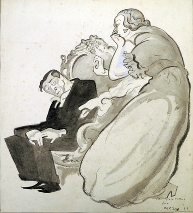
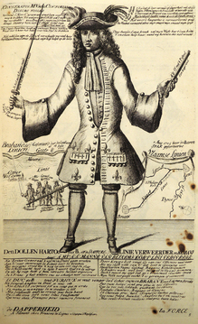
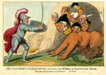
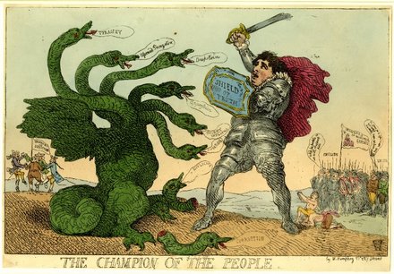
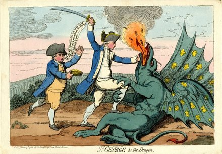
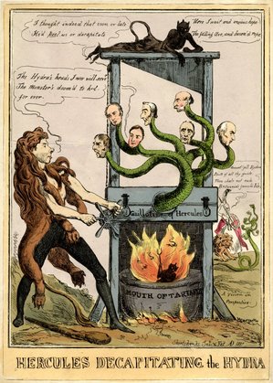
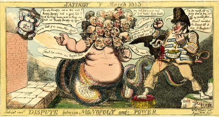
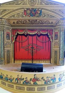
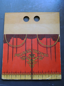
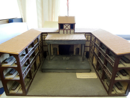
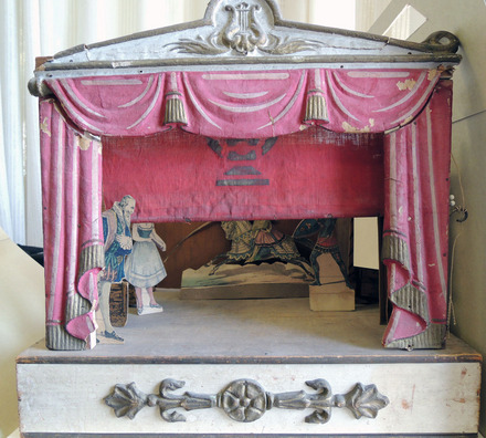
Dale’s efforts at preparing, researching, and mounting exhibitions in Sterling are well remembered. Arranged in cases on the first floor, Dale curated such exhibitions such as Life in England, 1770-1860, Illustrated in Color-Plate Books from the Library of Paul Mellon ‘29 (1965); Lively Alphabets, the Pictorial Use of Letter Forms in the Graphic Arts (1966); Illustrations to the Divine Comedy of Dante by Leonard Baskin (1970); Age of Horace Walpole in Caricature … from the Collection of W. S. Lewis, catalogue by John C. Riely (1973); Phantasmagorey, the Work of Edward Gorey, catalogue by Clifford Ross (1974); and The Graphic Art of Hnizdovsky (1977).

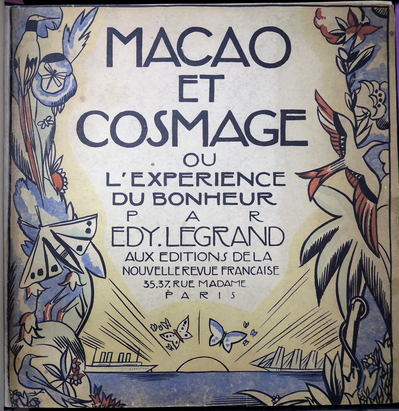
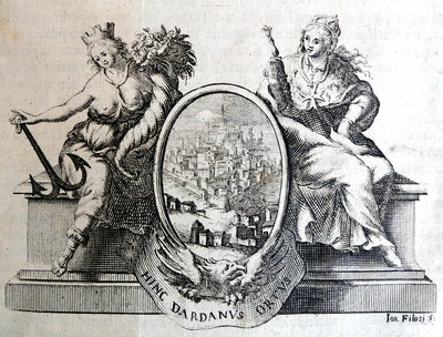
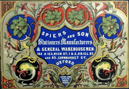
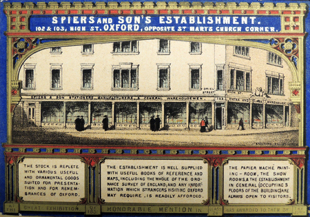
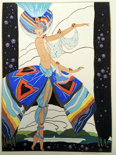
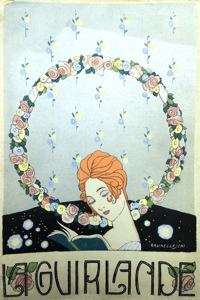
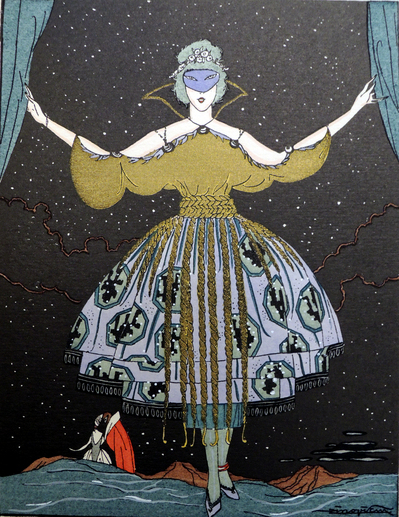
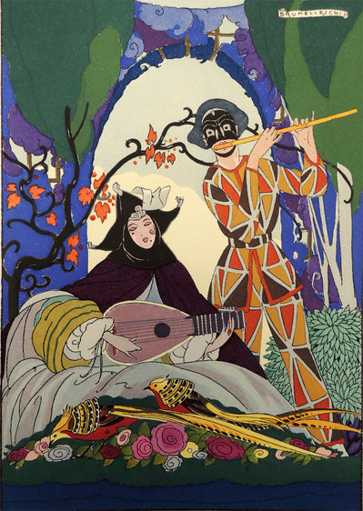
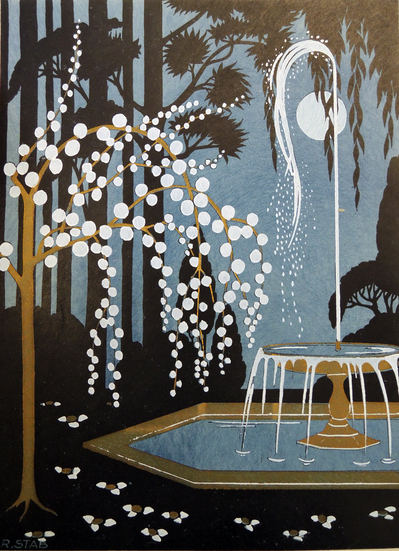
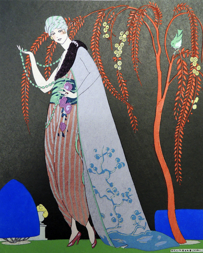
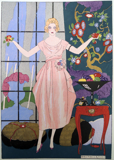
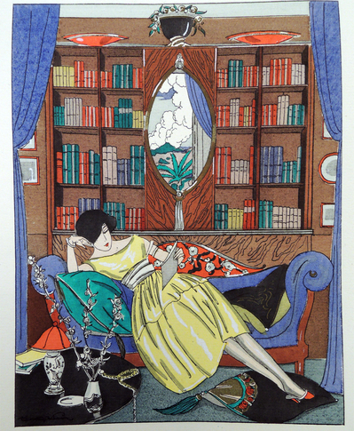
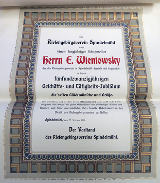
When Griffin left Firestone Library and his successor, Joseph Rothrock, resumed teaching, Dale was persuaded to return to Princeton. He held the position of curator of graphic arts from 1980 until his retirement in 1995 and even then, continued to assist with exhibitions and projects until 2001. While at Princeton, Dale and his assistant Nancy Finlay embarked on an ambitious program of exhibition, beginning with London Observed: a Graphic Arts Exhibition of Historical Prints (1982); Lorenzo Homar: a Puerto Rican Master of Calligraphy and the Graphic Arts (1983); Pride of Place: Early American Views from the Collection of Leonard L. Milberg,’53 (1983); 50 Design Bindings, 1974-1986 by Jamie Kamph (1986); European Graphic Arts: the Art of the Book from Gutenberg to Picasso (1986); American Graphic Arts: a Chronology to 1900 in Books, Prints, and Drawings (1990); Art Deco Paris 1900-1925 (1992); Graphic Americana: the Art and Technique of Printed Ephemera from Abecedaires to Zoetropes (1992); Art & Nonsense: the Work & Play of Edward Lear (1812-1888)… presented to the Library by Dr. Richard E. Buenger, Class of 1944 (1997); In Search of Art: the English Grand Tour (1999), and finally, together with Rebecca Davidson, For the Love of Books and Prints: Elmer Adler and the Graphic Arts Collection at Princeton University Library (2001).

Many of these projects succeeded thanks to the close relationship Dale developed with collector and donor Leonard L Milberg, Class of 1953, whose support continues to the present. In particular, Dale was able to renovate and open The Leonard L. Milberg Gallery for the Graphic Arts on the second floor of Firestone, which remained active from 1985 until it was closed in 2013. Many collectors appreciated Dale’s guidance and shared in his enthusiasm. Ronald Smeltzer commented, “It was Dale who gave me a strong awareness of the graphical aspects of books and who inspired me to consider collecting prints that relate to my book interests. Consequently, my collection of early scientific books developed a focus, in part, on books with unusual and special graphical features.”

Throughout his tenure, Dale taught undergraduate classes in graphic design, letterpress printing, and the history of the book, while also administering such annual programs as The Elmer Adler Undergraduate Book Collecting Prize. One of his former students, Linda Felcone remembered him as a “kind, sparkling, and witty man [with] a new and intensely beautiful mixture of the mind, the heart, and the eye.”

Newly arrived at Princeton as an undergraduate, Donald Farren, Class of 1958, remembers how Dale shared the pleasures of rare books and manuscripts with him and nourished his interests in the graphic arts. After graduating, Farren continued to thrill at Dale’s stream of exhibitions. Examples could be drawn from those at Princeton but Farren remembers particularly one at Yale in which Dale exhibited a color plate of a seashell with, on the shelf below, an actual seashell as illustrated, the loan of which Dale had secured from a scientific museum at Yale. Dale gleefully pointed out that the combination looked like the shell itself had dropped out of the book (not, as a conchologist might say, that the shell had risen into the book); an example of Dale’s perceptions as a bookman and his showmanship.

Dale was also active within the greater New York metropolitan area, assisting with the 1982 exhibition Gérard Charrière, reliures d’art in the Watson Library at the Metropolitan Museum of Art and William James Bennett: Master of the Aquatint View in 1988 at the New York Public Library, among many others projects. Endlessly supportive to the artists he admired, Dale wrote numerous introductions for their catalogues and monographs, including Leonard Baskin’s Graphic Work, 1950-1970 (1970) and John O.C. McCrillis’s ABC: Animals, Birds & Other Creatures (1979).

Following his retirement, Dale continued to commit his talents to the community, serving as a founding member of the West Windsor Arts Council and organizing the book collection in the Manor House Library at the Princeton Academy of the Sacred Heart School for Boys. He was preceded in death by his parents, Kenneth and Una Roylance, brothers Vaun and Kaye and nephew Clifford. He is survived by his niece Cheryl Helms. He will certainly be missed.

Baskin's "Man of Peace" Cleaned

baskin 6.jpg
Leonard Baskin (1922-2000), Man of Peace, 1952. Woodcut on thin cream
Japan paper. Signed, lower right. 59 5/8” x 30 7/8” (151.4 x 78.4 cm). Fern/O’Sullivan 180. Graphic Arts Collection GAX in process

How do you store fragile prints that are five or more feet long and nearly three feet wide? Unfortunately, the past solution was to roll them up and store them on top of various cabinets, in the few inches between the furniture and the ceiling. Keeping the prints “out of sight” was not the best idea, as no one was aware of the water damage being done by a leak. We have now rescued a number of these fine art prints, many by the artist Leonard Baskin, and saved them from further decay.

Thanks to our Special Collections Paper Conservator, Ted Stanley, they are being washed one-at-a-time because of their enormous size. We are rehousing them in large, flat folders stored on oversize shelves. Here’s an example of before and after.

baskin 5.jpg

The Ridicule of Louis XIV

almanac royal5.jpg
almanac royal6.jpgMadame de Maintenon with her elbow leaning against a bust of Louis XIV
almanac royal4.jpg
almanac royal1.jpg
almanac royal3.jpg

Koninglyke Almanach. Beginnende van ‘t jaar 1705 … &c. : waar in zeer duidelyk vertoond word De Loop der Zon des ongerechtigheids, Ofte Tooneel des Oorlogs in Europa, Behelzende de zinnebeelden der VII. Helde-Deugden …. = Almanac royal … Le cours du soleil d’injustice, ou, Theatre de la guerre en Europe … VII. vertus heroiques (Brussels: ten Koste de Compagnie van L.v.S. L.L.T. F.G. M.D. F.d.L. C.l.C. en L.d.D.B. &c., 1705). Series title: ‘t Lust-hof van Momus.

One of a series of satirical pamphlets ridiculing Louis XIV, King of France (1638-1715) and the role of France in the War of the Spanish Succession from 1701 to 1714. The imprint is a fake but the Dutch art dealer, cartographer, and engraver Carel Allard (1648-1709) is assumed to be the publisher. The plates are generally attributed to Allard, Abraham Allard and Balthasar Goris, although several institutions have also attributed them to Romeyn de Hooghe (1645-1708) a Dutch painter and printmaker remembered, in particular, for his political caricatures of Louis XIV.

In the first plate, [above right] Louis XIV is sitting in the middle of the sun with twenty-four rays. For each ray is a crime committed by the king, with verses and explanation in Dutch and French.

almanac royal9.jpg
almanac royal8.jpg
almanac royal7.jpg

La Guirlande

guirlande2.jpg
guirlande1.jpg
La Guirlande: album mensuel d’art et de littérature (The Garland: A Monthly Album of Art and Literature) ([Paris]: M. François Bernouard, 1919-[21]). “Sous la direction littéraire de Monsieur Jean Hermanovits. Sous la direction artistique de Monsieur Brunelleschi.” Copy 41 of 800. Charles Rahn Fry Pochoir Collection. Graphic Arts Collection (GAX) Oversize 2004-0382Q


guirlande8.jpg
guirlande7.jpg

Created under the artistic direction of Umberto Brunelleschi (1879-1949), La Guirlande is one of the rarest of the Art Deco magazines. Early in his career, Brunelleschi produced fierce caricatures for L’assiette au beurre, a satirical weekly published in Paris from 1901 to 1914. He signed his drawings Aroun-Al-Raxid.

Mainly successful as an illustrator, Brunelleschi combined elements from the eighteenth-century galanteries with the buffoonery of the Commedia dell’arte. He contributed illustrations to numerous publications including Gazette du bon ton and Le rire. Between his numerous voyages, he illustrated Goethe’s Werther, Alfred de Musset’s La nuit vénitienne, Diderot’s Les bijoux indiscrets and Hans Christian Andersen’s fairy stories, among others.—Benezit Dictionary of Artists

guirlande6.jpg
guirlande4.jpg
guirlande3.jpg
guarlande3.jpg


mr henry print.jpg
Cornelius Tiebout (ca. 1773-1832), Mr. Henry in the Character of Ephraim.
Wild Oats. Act IV,
no date [1793]. Engraving. Graphic Arts
TC096 Theater Pictures Collection.

By the time the Irish playwright John O’Keeffe (1747-1833) wrote his most famous farce Wild Oats; or, The Strolling Gentlemen in 1791, he was already a celebrated author. Within two years, the Old American Company in New York City staged a production and an American edition of the play was printed by T. and J. Swords for Manhattan bookseller and stationer John Reid. To decorate the volume, American engraver Cornelius Tiebout was commissioned to create a frontispiece (seen here).

According to the historian D. M. Stauffer, Tiebout was the “first American-born professional engraver to produce really meritorious work, …significant for his role in introducing the English method of stippled portraiture to America.” Like many early printmakers, Tiebout apprenticed to a silversmith where he learned to carve in metal. Further training with the British artist James Heath led to his expertise in stipple engraving.

It is notable that Tiebout chooses to illustrate one of the humorous supporting characters rather than the leading man. His print offers a full-length portrait of the Quaker Ephraim Smooth and quotes his lines, “Why dost thou suffer him to put into the hands of thy servants, books of tragedies, and books of comedies, prelude, interlude, yea, all lewd. My spirit doth wax wrath.— I say unto thee, a play-house is the school for the old dragon, and a playbook the primer of Belzebub.”

For a contemporary production of Wild Oats, see:

Other sources on Tiebout: W. Dunlap: A History of the Rise and Progress of the Arts of Design in the United States (New York, 1834); American Engravers upon Copper and Steel, 3 vols (i-ii, New York, 1907; iii, Philadelphia, 1917), i, pp. 271-2; ii, pp. 520-33; iii, pp. 271-84 [vols i-ii by D. M. Stauffer, vol. iii by M. Fielding]; N. E. Cunningham jr: The Image of Thomas Jefferson in the Public Eye: Portraits for the People, 1800-1809 (Charlottesville, VA, 1981) [disc. of Tiebout’s Jefferson prts, incl. newspaper advertisements and publishers’ corr.]; W. C. Wick: George Washington, an American Icon: The Eighteenth-century Graphic Portraits (Washington, DC, 1982) and G. W. R. Ward, ed.: The American Illustrated Book in the Nineteenth Century (Winterthur, DE, 1987).

Thou Art the Beast of Many Heads

AN00686650_001_l.jpg
William Heath (1794/95-1840), Modern St George Attacking the Monster of Despotism, April 6, 1810. Graphic Arts Collection British Caricature

When William Heath published a satire on Sir Francis Burdett’s opposition to Gale Jones’s imprisonment, Heath represented Spencer Perceval and his associates as a hydra or monster with multiple heads. It is a strong visual image but Heath was of course not the first to use the device. Knowing who he stole it from is complicated since the caricaturists borrowed and stole their parodies quite freely.

AN00079857_001_l.jpg
The Satirist, or Monthly Meteor. Graphic Arts Collection (GA) Cruik 1808

Surely Heath was reading Samuel Tipper’s magazine The Satirist or Monthly Meteor, in which Samuel De Wilde presented another variation of the scene in The Opposition Hydra, or Brittania’s Worst Foe. This might be the most immediate inspiration for Heath.

AN00188364_001_l.jpg
Graphic Arts Collection GC112. Gift of Dickson Q. Brown, Class of 1895

Or perhaps it Thomas Rowlandson’s The Champion of Oakhampton, Attacking the Hydra of Gloucester Place, published on March 15 1809? Especially with the subtitle he added from Horace’s Epistles, “Bellva Multorum es Capitum!!” (Thou Art the Beast of Many Heads).

AN00047389_001_l.jpg
Graphic Arts Collection GC112. Gift of Dickson Q. Brown, Class of 1895

And what about Rowlandson’s 1784 print, The Champion of the People, in combination with James Gillray’s St. George & the Dragon two years earlier?

AN00139693_001_l.jpg
British Museum


It’s hard to say.

Here are a few others.

AN00695235_001_l.jpg

Shortshanks (Robert Seymour), Hercules Decapitating the Hydra, 1831.
British Museum


AN00077034_001_l.jpg

William Henry Brooke, Dispute between Monopoly and Power, 1813. Published in The Satirist 1st March 1813. Graphic Arts Collection (GA) Cruik 1808


Austrian History as a Graphic Narrative

geigers 3.jpg

Peter Johann Nepomuk Geiger (1805-1880), Peter Joh. Nep. Geiger’s historische Original-Handzeichnungen bestehend in neunzig Blättern mit einem erklärenden Texte (Peter Joh. Nep. Geiger’s original historic drawings consisting in ninety leaves with an explanatory text) Herausgegeben von Anton Ziegler. [Vienna, 1861.] 6 vols, First edition, privately printed. Graphic Arts Collection 2013- in process

geigers 1.jpg

Using linear visual narratives, Gieger chronicles Austrian history from the Middle Ages to Archduchess Leopoldina’s 1817 arrival in Rio de Janeiro as Empress of Brazil. The work first began to appear that same year as Historische Handzeichnungen, Vienna, kaiserlich-königliche Hof- und Staatsdruckerei. Graphic Arts recently acquired a compilation of the entire set of Gieger’s history.

geigers2.jpg

Peter Geiger (1805-1880) was a respected history painter and illustrator, producing popular images based on the works of Goethe, Schiller, and Shakespeare, as well as Austrian authors such as Grillparzer and Stifter. It was his work for an earlier project, Anton Ziegler’s Vaterländische Immortellen aus dem Gebiete der österreichischen Geschichte (1838-1840), which first brought him considerable public attention. Although Princeton does not own this multi-volume work, it is available through itunes. A note of caution when searching Geiger online: aside from Royal portraiture and literary illustration, he also had a lucrative business creating erotic art.

geigers 4.jpg


Diploma Specimens

musterbuch1.jpg

The Graphic Arts Collection recently acquired sixty German diploma specimens collected and bound into an album with the gilt title Musterbuch B. Diplome (Pattern Book B. Diploma). Each sample was printed by the company Förster & Borries in Zwickau, which is south of Leipzig. The collection highlights various techniques and mediums, including chromolithographs, collotypes, wood engravings and embossing. The largest are 60 x 48 cm (or approximately 2 feet) and many offer bold art nouveau style borders. Here are a few of the samples:

musterbuch3.jpg
musterbuch7.jpg
musterbuch6.jpg
musterbuch4.jpg
musterbuch8.jpg


Current Princeton University diplomas are written in Latin and have the University seal but no border or decoration. Here is Ryan Truchelut, Class of 2008, with his official document.

IMG_7205.jpg

Picabia's Machine de bons mots

| 1 Comment
Proverbe11.jpg

In the March/April 1920 issue of Proverbe. Feuille mensuelle pour la justification des mots (Proverb. A Monthly Pamphlet for the Justification of Words), editor Paul Eluard (1895-1952) selected two works by Francis Picabia (1879-1953) for the front page. “La jeune fille” (The Young Girl) features a hole or vagina in the paper surrounded by the words “Bracelet de la vie” (Bracelet of Life) at the top left and “Machine de bons mots” (Machine of Witticisms) frames the words “Oreille fatigante” (Tiring the ear) on the bottom right.

For his own contribution, Eluard wrote:
Hoo! Que disions-nous? Que disions-nous?
Nous avons perdu la mémoire
Hoo! Que faisions-nous? Que faisions-nous?
Nous avons perdu la mémoire

Hoo! What were we saying? What were we saying?
We’ve lost the memory
Hoo! What were we doing? What were we doing?
We’ve lost the memory

Proverbe.jpg
Picabia was forty-one years old, Eluard only twenty-five but the two published and supported each other’s work throughout 1920 and beyond. With Proverbe, Eluard was equally playful, although perhaps not as cynical as Picabia, in his questioning of both the sense and nonsense of language. André Breton is quoted as saying, “Eluard always says Proverb when he means to say Shit.” (from “Artificial Hells,” translated by Matthew S. Witkovsky in October 105, Summer 2003).

Also in March of 1920, the front page of Picabia’s magazine 391 featured his manifesto on Dada, proclaiming (here translated):
Art is a pharmaceutical product for idiots.
Tables turn, thanks to the spirits; pictures and other works of art are like strong- box-tables, the spirit is within them and gets more and more inspired as the prices rise in the salerooms.
Comedy, comedy, comedy, comedy, comedy, dear friends.
…Dada, on the other hand, wants nothing, absolutely nothing, and what it does is to make the public say “We understand nothing, nothing, nothing.”
“The Dadaists are nothing, nothing, nothing and they will surely succeed in nothing, nothing, nothing.”

Both Picabia and Eluard show the influence by their colleague Guillaume Apollinaire (1880-1918), particularly the lines from his poem “Victoire”:
Ô bouches l’homme est a la recherche d’un nouveau langage
Auquel le grammairien d’aucune langue n’aura rien à dire

O mouths, humanity seeks a new language
Beyond the reach of grammarians

Our complete run of Eluard’s Proverbe has been digitized and will soon be available through Princeton Blue Mountain project. http://library.princeton.edu/projects/bluemountain/journals

Irma Boom's Rembrandt

boom rembrandt 2.jpg
Irma Boom, Rembrandt: Flipboek Zelfportretten = Flip Book Self-Portraits / Gebaseerd op Bert Haanstra’s film ‘Rembrandt, schilder van de mens’ uit 1956 (Amsterdam: Rijksmuseum, 2000s). Graphic Arts Collection GA 2013- in process. Gift of Mathieu Lommen.

“…Whenever I make a book,” said Amsterdam-based graphic designer Irma Boom, “I start by making a tiny one. Usually I make five, six or seven for each book, as filters for my ideas and to help me to see the structure clearly. I have hundreds of those small books and am so fond of them.”

Recently, Boom created a miniature flipbook for the Rijksmuseum, incorporating every self-portrait painted by Rembrandt Harmenszoon van Rijn. Is it, as Mark Lamster called one of her miniatures, “a big book that is paradoxically small.”

boom rembrandt 4.jpg

Boom established the Irma Boom Company in 1991 and the following year, joined Yale University as a Senior Critic in the School of Art. Of the 250 books she has created, approximately 70 have been acquired by the Museum of Modern Art’s Department of Architecture and Design.

boom rembrandt1.jpg

“I honor the tradition of the book,” said Boom, “but do not want to stop there. My ambition is to develop the significance and the limits of the book. Structures that come from new media, the way that text and images are treated have given the book a new impulse. It is important to experiment … the book will keep its vitality. There’s a lot to explore in a technical way and even more importantly in terms of content and form. Happily through books, the past, present and future can take on profoundly contemporary results and become part of our everyday.”

Thank you to Mathieu Lommen, curator at the Special Collections department of the Amsterdam University Library, for this rare Boom treasure.

boom rembrandt 3.jpg


To hear the designer talk about her work, see this video from the Walker Art Center in Minneapolis:


Toy Theaters

toy theaters4.jpg

The Graphic Arts Collection holds a small selection of paper and model theaters, along with sets, costumes, figures, and props. Several are particular stages, such as the Globe Theatre where William Shakespeare's plays were performed. The rest are 19th century toy theaters produced by such manufacturers as Benjamin Pollock and Skelt & Webb. A larger selection can be found in the Cotsen Children's Library.

Robert Louis Stevenson (1850-1894) was given a paper theater as a child and remembered the toy in an essay for the Magazine of Art published in April 1884 entitled, "A Penny Plain And Twopence Coloured."

"These words will be familiar to all students of Skelt's Juvenile Drama. That national monument, after having changed its name to Park's, to Webb's, to Redington's, and last of all to Pollock's, has now become, for the most part, a memory. Some of its pillars, like Stonehenge, are still afoot, the rest clean vanished. It may be the Museum numbers a full set; and Mr. Ionides perhaps, or else her gracious Majesty, may boast their great collections; but to the plain private person they are become, like Raphaels, unattainable..."

toy theaters2.jpg

"There stands, I fancy, to this day (but now how fallen!) a certain stationer's shop at a corner of the wide thoroughfare that joins the city of my childhood with the sea. When, upon any Saturday, we made a party to behold the ships, we passed that corner; and since in those days I loved a ship as a man loves Burgundy or daybreak, this of itself had been enough to hallow it. But there was more than that. In the Leith Walk window, all the year round, there stood displayed a theatre in working order, with a "forest set," a "combat," and a few "robbers carousing" in the slides; and below and about, dearer tenfold to me! the plays themselves, those budgets of romance, lay tumbled one upon another. Long and often have I lingered there with empty pockets."

toy theaters3.jpg
toy theaters1.jpg
Note the two finger holes for raising and lowering the curtain.

toy theaters5.jpg
toy theaters6.jpg
To search these and other theater resources, see the Visuals database: http://libweb5.princeton.edu/RBVisuals/index.htm

Recent Comments

  • Howard Coblentz: I have a round seal shaped like a pear a read more
  • John Overholt: Wikipedia's entry for Sir Francis says: "Throughout Baring's lifetime his read more
  • Serge Rodrigue: It is a precious thing you have a book from read more
  • Colin Wicks: I have a copy of “A Round Game.” And it read more
  • Laurence Hilonowitz: I was a Customer, Friend of Bob Wilson. I Live read more
  • allen scheuch: Absolutely STUNNING! Those colors, those designs made my day! Thanks, read more
  • Olivier: Hello Diane, If you are still looking for an examplare read more
  • Stella Jackson-Smith: I have a framed picture by A.Brouet, signed with the read more
  • John Podeschi: I remember Dale fondly from my days at Yale (1971-1980). read more
  • Joyce Barth: I have some or all of this same poem. I read more