
Evan Strasnick – Assignment 2
(view full post by clicking the “continue reading” link)
Description of observations: All my observations were performed by arriving early to most of my classes on three separate class days. I noted how fellow students were spending their “waiting time,” and occasionally asked them about how they felt about the interval. Most students, when asked, had not truly thought about the waiting period as terribly bothersome or needing a solution.
These were the main activities I noted:
- -texting
- -checking over homework
- -surfing the web/facebooking
- -responding to emails
- -preparing for the lecture (i.e. looking over printed out notes)
- -eating
- -shopping online
- -cleaning out pencil case
- -staring into space
- -congregating and speaking with the professor
- -speaking with friends, or yelling across the room at them
In reviewing these observations, I noted that the activities students chose to fill their time generally fell along a clear divide between “productive” and “entertaining.” That is, whether I were to come up with a solution that helped students fulfill a social/diversionary need, or helped them more prepared/organized, only a certain percentage of students would actually be compelled to spend their waiting time in that way. I decided to try to come up with ideas that fell on both sides of the spectrum, and even some that combined both elements.
Ideas brainstormed:
1. “Where I Left Off…” is an interface that provides students with a section corresponding to each of their classes to quickly jot down the important points at the end of their last lecture, so that before the next lecture begins, they can easily refresh themselves on the content and get right back into the swing of things.
2. “Snack Tracker” is an app that locates and lists the nearest vending machine, shop, or other food source, and tells you how approximately how long it takes to run there and back from your current location.
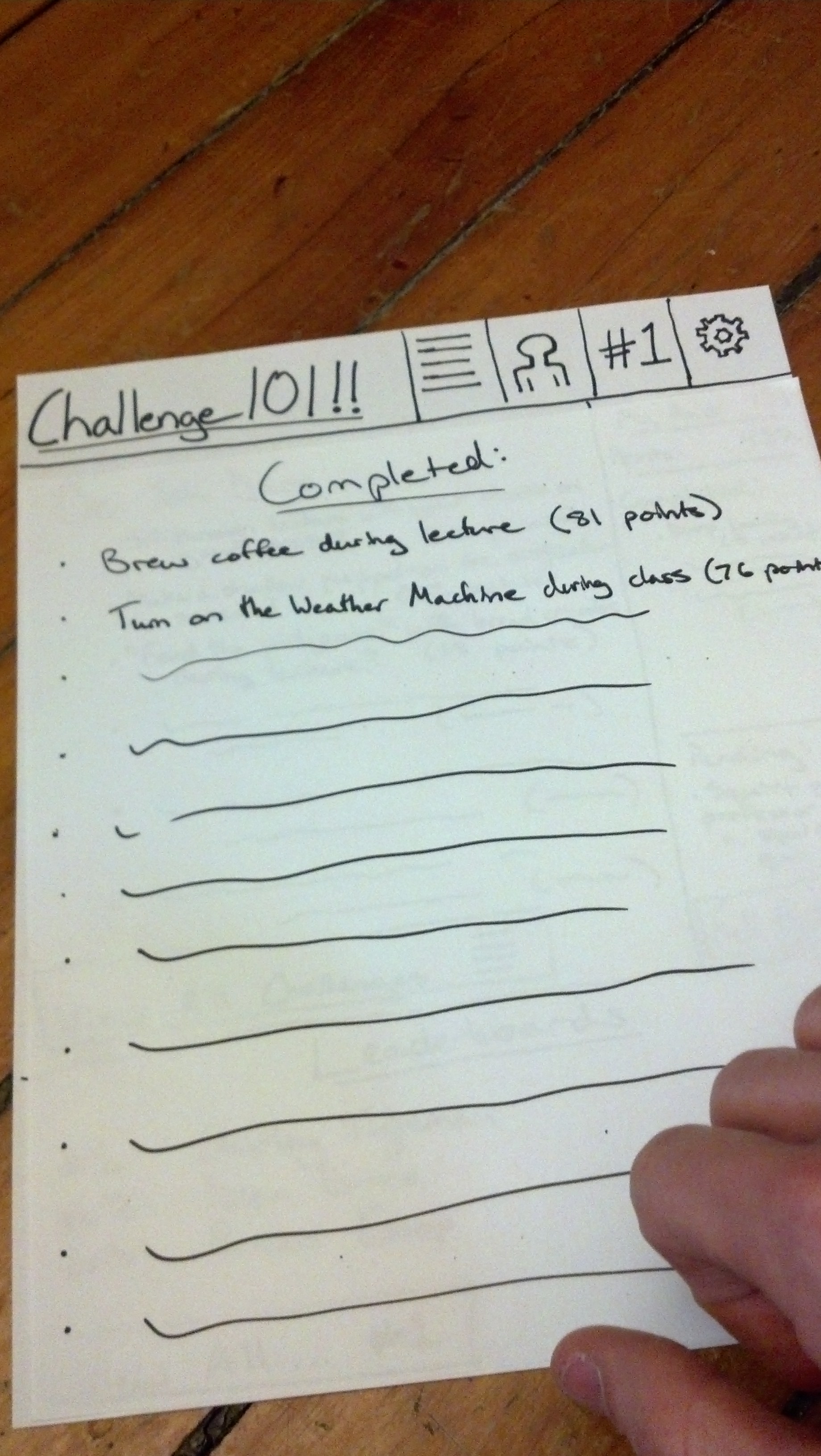
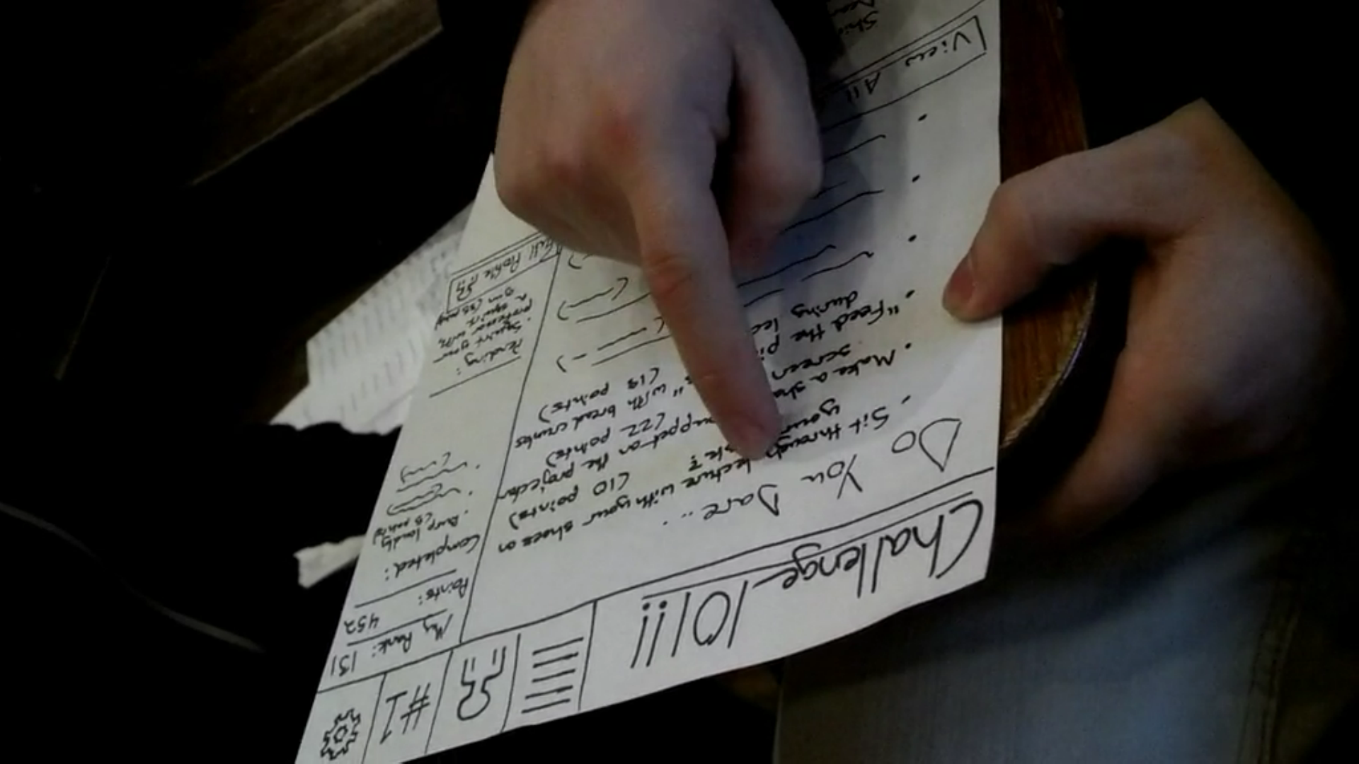
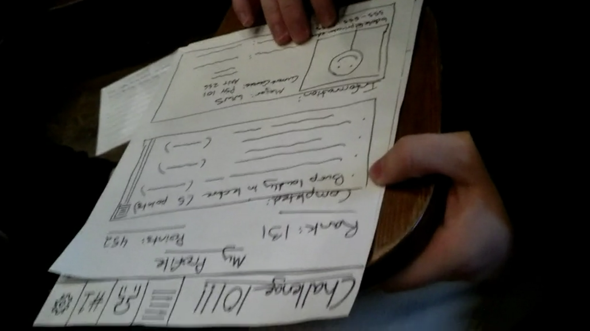
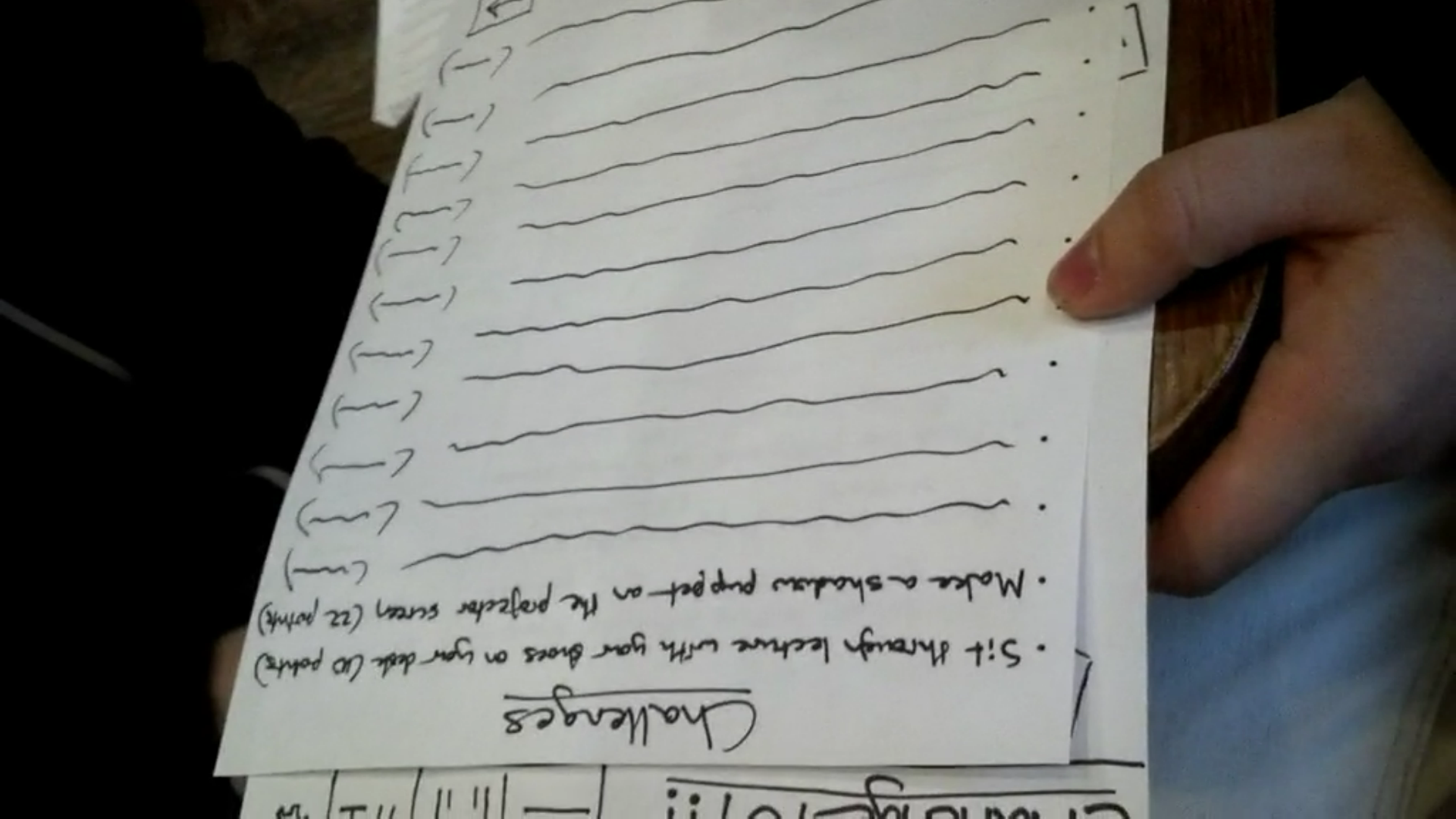
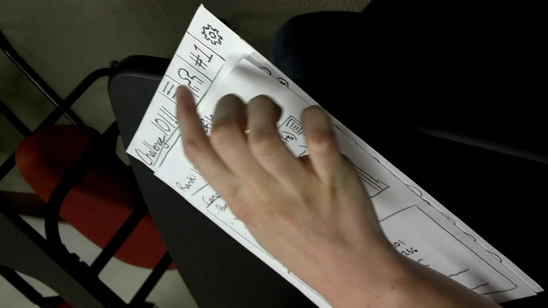
3. “Challenge 101” is an entertainment app that provides a list of dares and challenges for students to complete during lecture, awarding them points based on their boldness and allowing them to see where they rank among their fellow class clowns.
4. “5-minute Organizer” is an interface that provides students with a catalogue of tasks, each taking no more than five minutes, that will help them improve their organizational skills and better manage their work.
5. “Classassins” is an app that facilitates the “assassins” social game that is often played on campus by searching within a certain radius for other students running the app before class, and then randomly assigning targets to be neutralized over the course of that day.
6. “Need to Know” is an interface where students who have taken a certain class, lab, or precept for the week can describe what actually should be paid attention to, or whether the class even needs to be attended, and other students in the course can view these briefings.
7. “Useless Talents” is an interface that allows students to search for quick hobbies or skills that can be learned or honed in just a few minutes per day, and provides tutorials or links to get them started.
8. “Tutelage” is interface where students can post various questions related to material in each department, and students concentrating in those departments can answer those questions in their spare time.
9. “De-Stress” is an app providing a library of resources and techniques to quickly reduce stress, ranging from soothing music to helpful mantras, that students can quickly visit to help get through their days.
10. “Survey Square” is a place where users can post all of their surveys and polls (that otherwise clutter email listservs with obnoxious advertisement), so that students with a couple of free minutes can take these surveys either for compensation or just to help out.
11. “P-Lit” is an interface where students can contribute their pieces of prose, poetry, art, satire, etc. for other students to browse and read during free time.
12. “Ranter” is a variant on typical chatrooms, where users have a dedicated, non-judgmental space to collectively vent about how unfair, difficult, or boring their classes are.
13. “Journal Time” is an interface for the many people who wish to keep a diary/journal but can never remember to fulfill this task during those spare minutes before class.
14. “Mr. Philosopher” provides bored students with various philosophical prompts, interesting facts, or inspiring anecdotes on which to muse for a few minutes.
15. “Princeton Mall” is a shopping interface that shows users what items other Princeton users are buying, to help them find hot items or deals in their interests or styles.
Chosen Ideas: The ideas I selected were:
1. “Challenge 101”: I believe that this idea will not only provide entertainment for bored users during “waiting time,” but it will also form a persistent culture and something that they will consistently look forward to and use to help get through their classes.
2. “Need to Know”: Whether students are trying to maximize or minimize what they get from a class, this tool would let users consistently use their “waiting time” in a productive manner and then feel more confident about the class to come.
Prototypes:
Challenge 101: 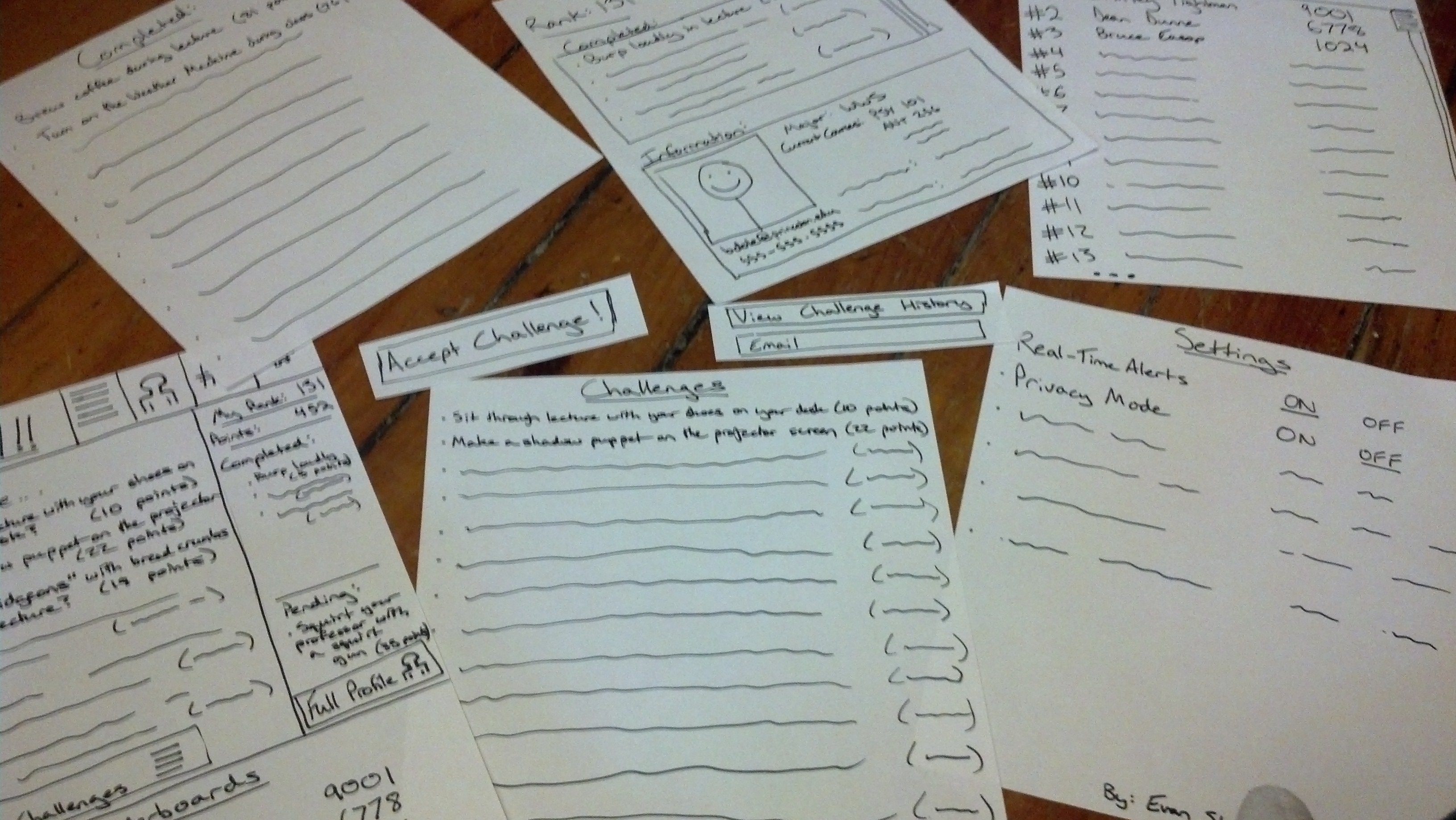 I chose to do this prototype on printer paper, because I believed that the user’s ability to actually read some example challenges was crucial to their understanding of the interface. The app opens to a homepage with a sampling of new challenges, the top leaders on the leaderboards, and a short summary of the user’s current accomplishments.
 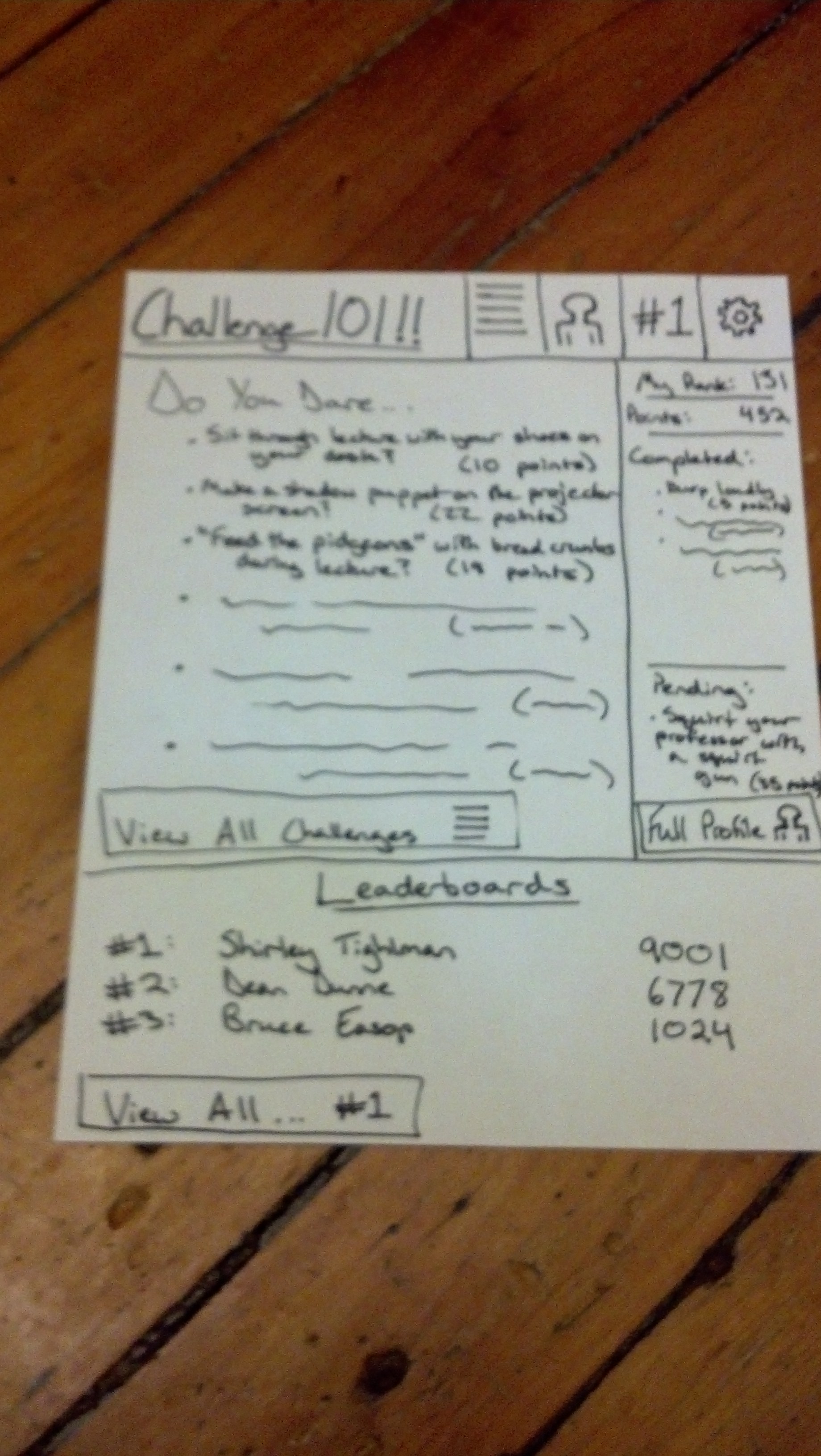 At the top is a persistent navigation bar that allows them to view a list of all challenges,
 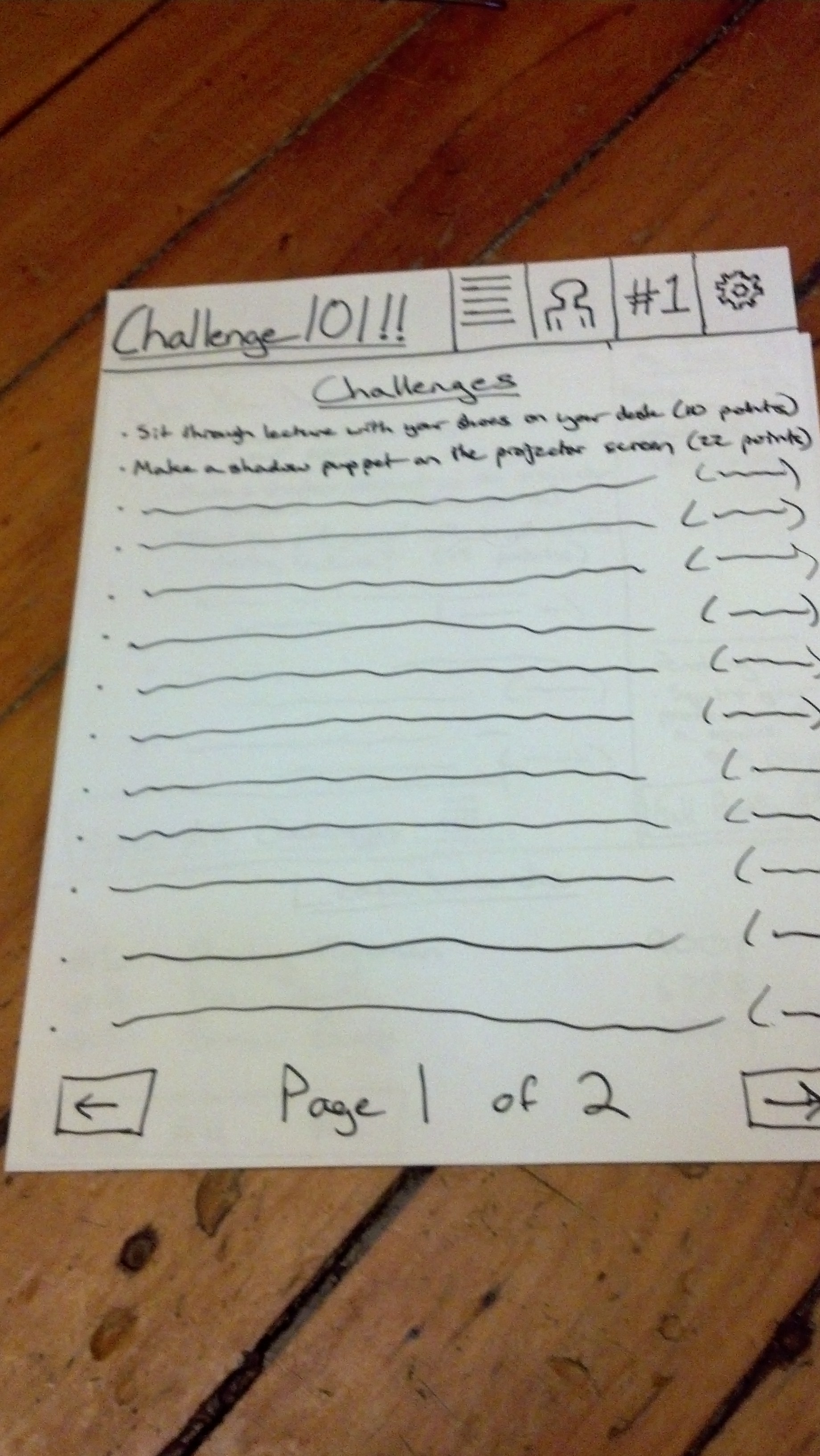 their profile,
 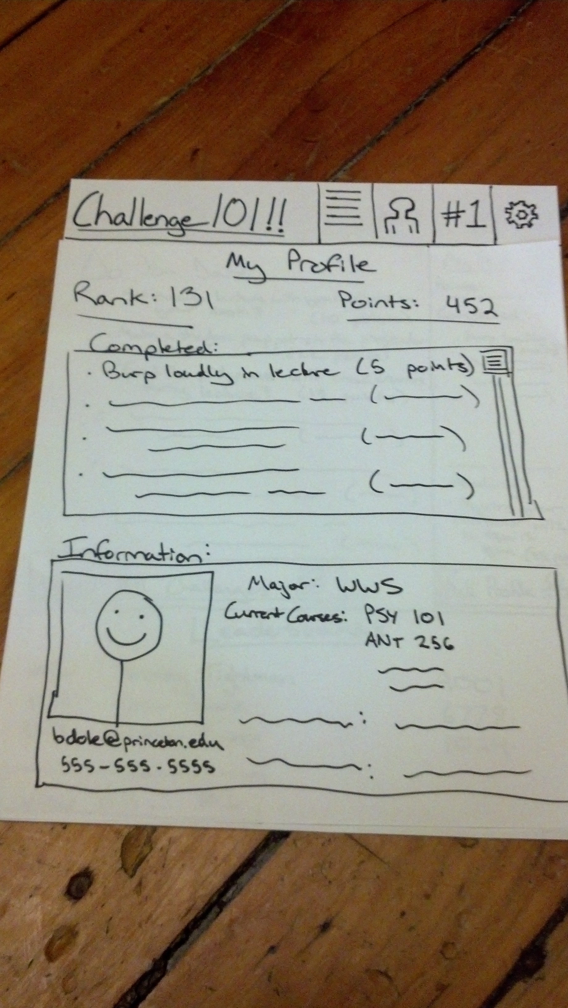 the leaderboards,
 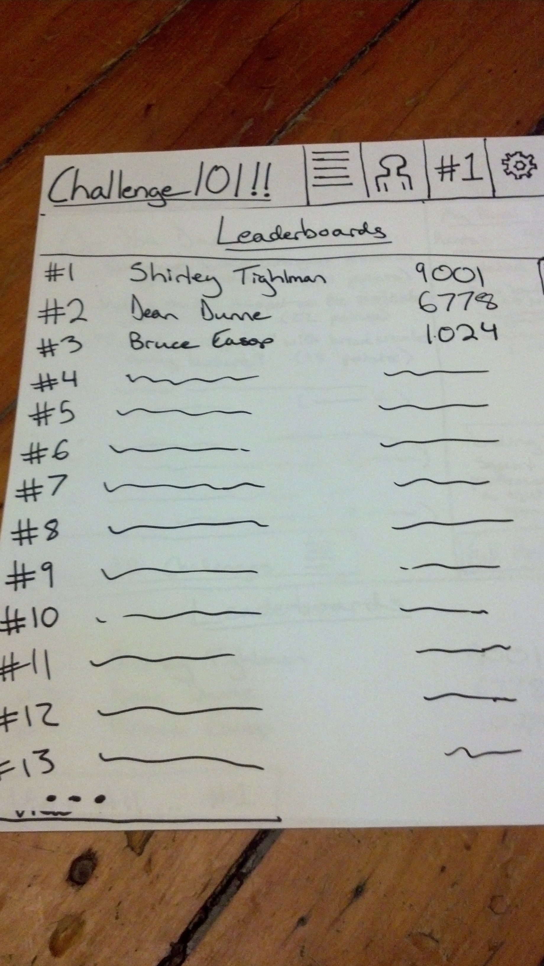 and the settings menu.
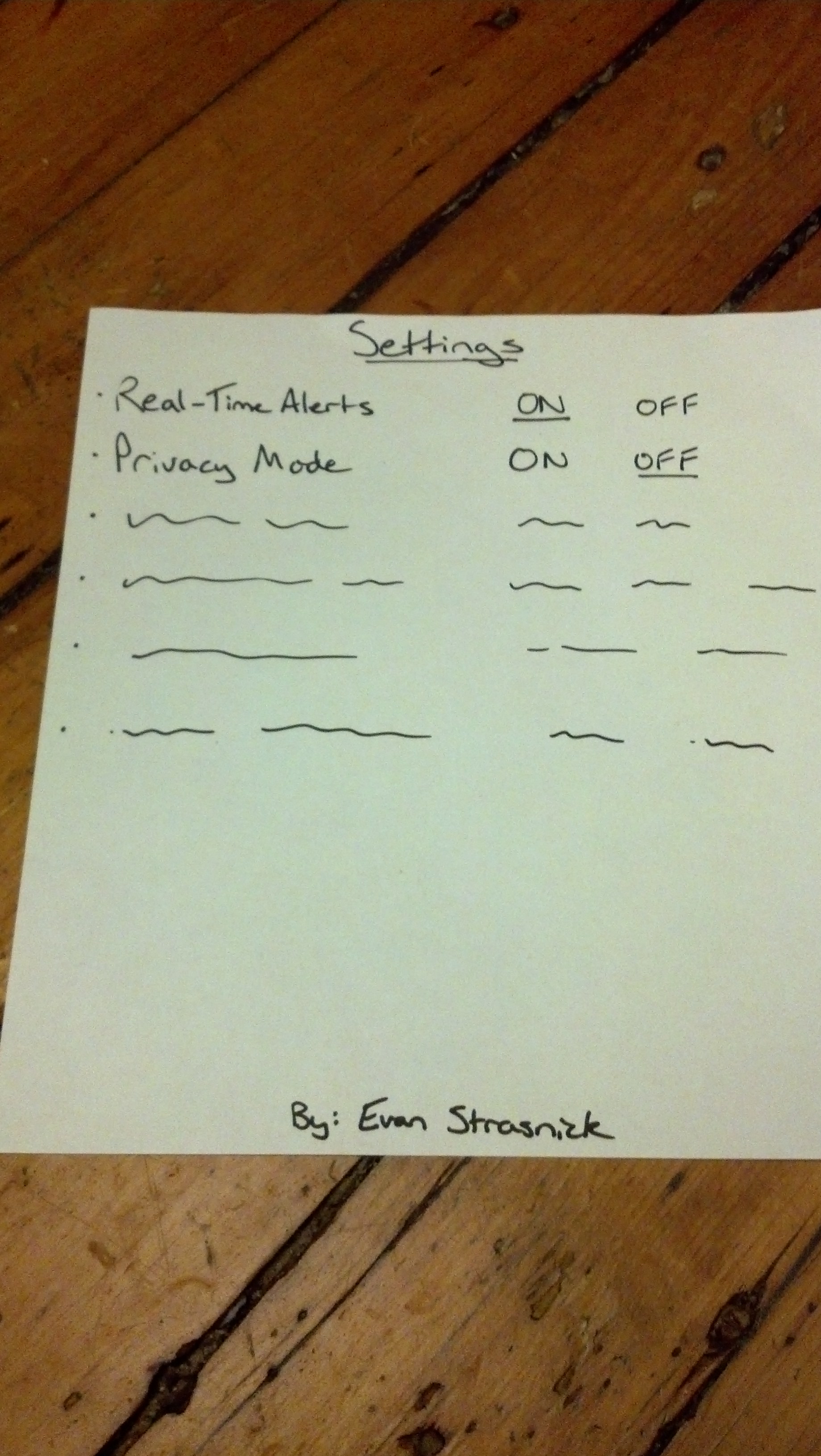 Clicking on an available challenge gives them the option to accept that challenge, to be marked complete after finishing,
 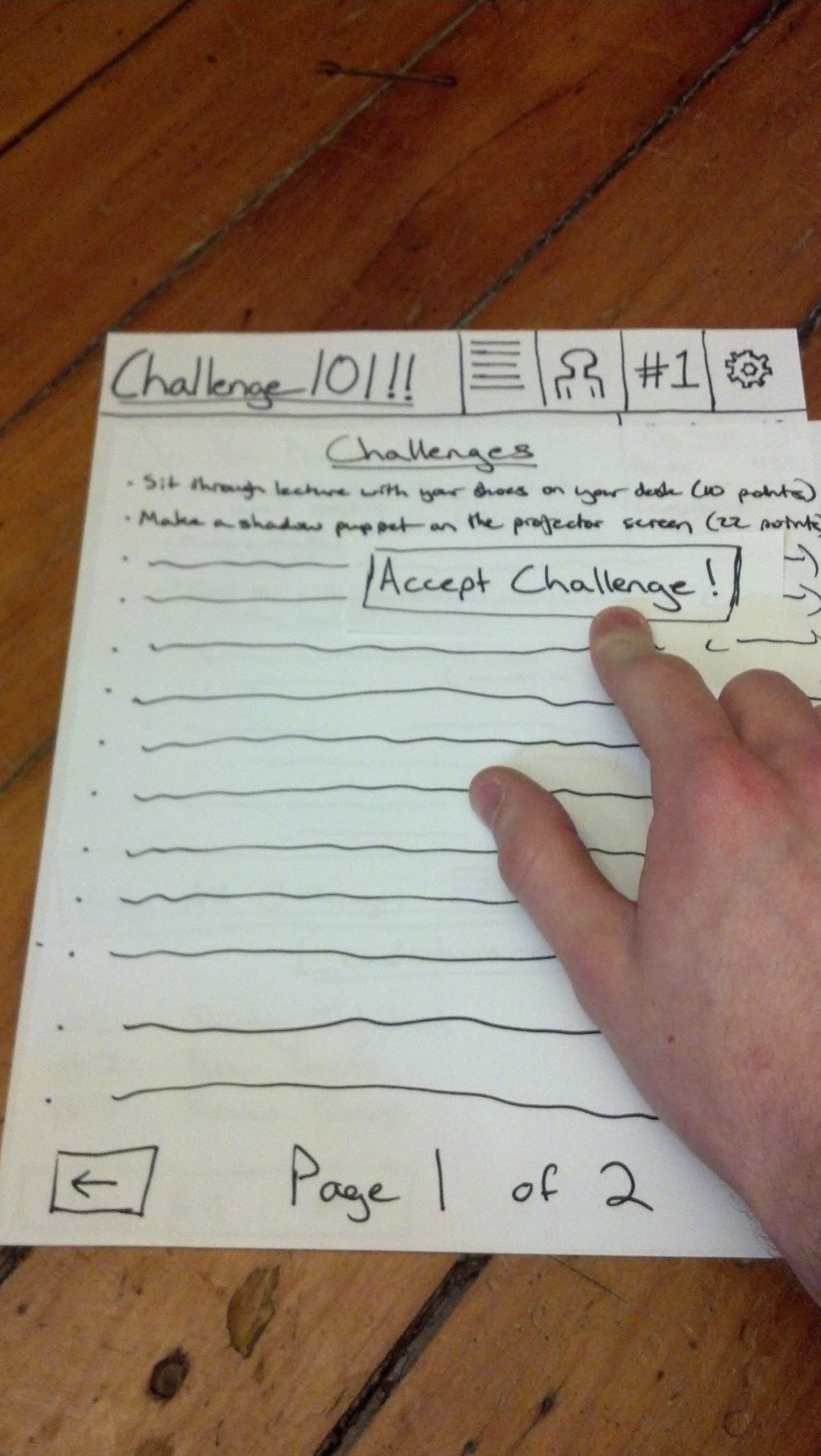 and clicking on another user’s name allows you to see that user’s completed challenges or send them a message.
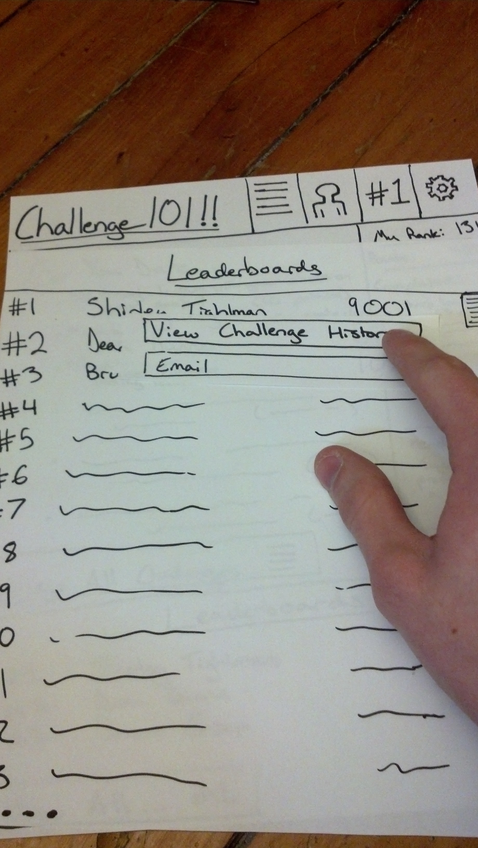
Need to Know: 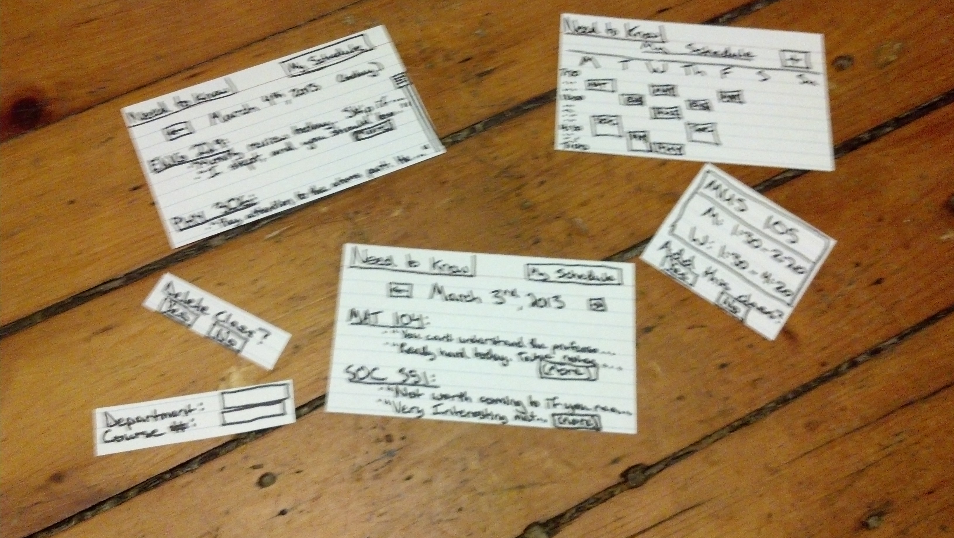 This interface was far more minimal and fit nicely in a landscape orientation of index cards. The main screen shows the current day’s classes and a preview of some of the comments on those classes by other users.
 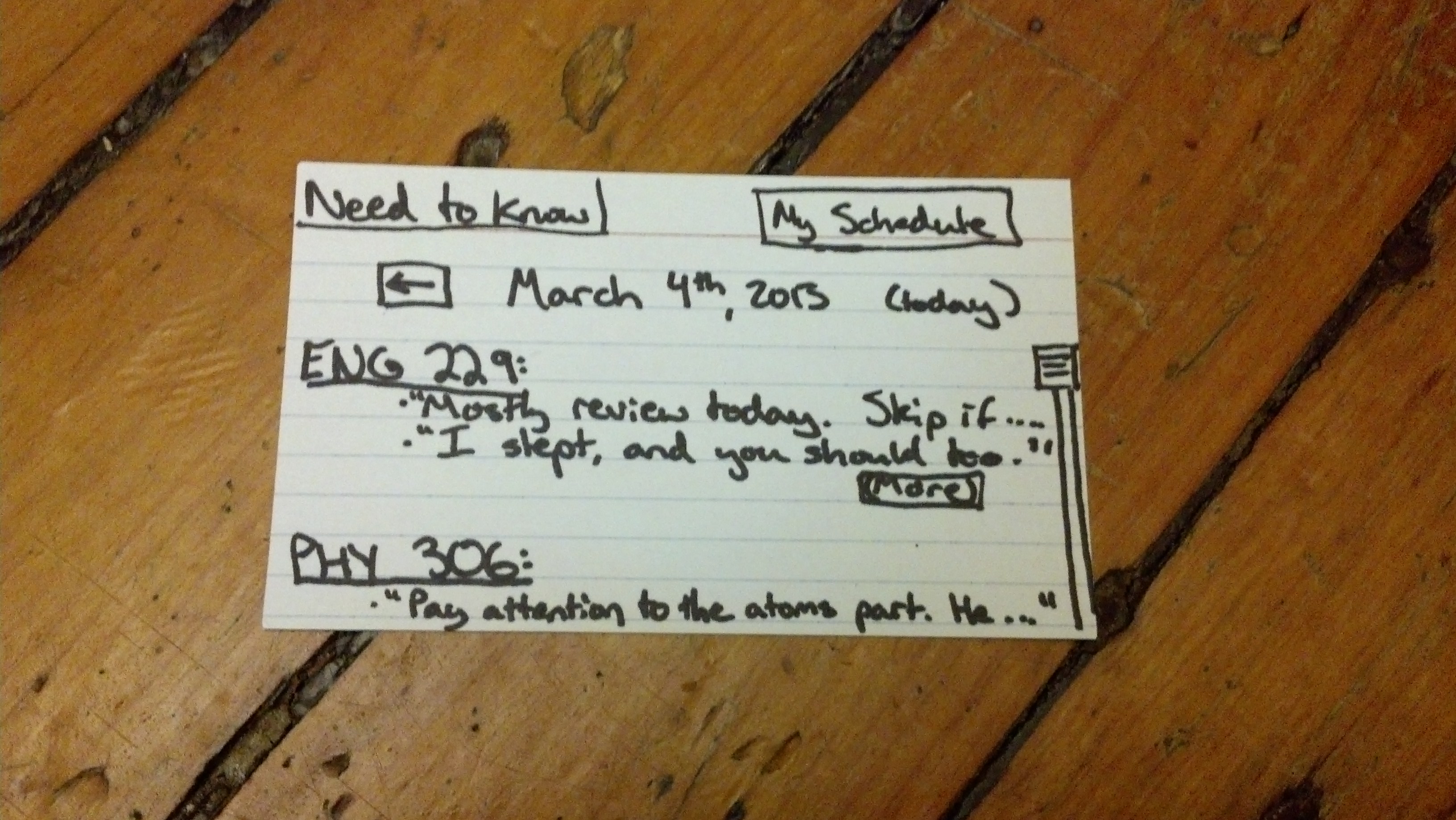 Users can scroll back to previous day’s classes as well.
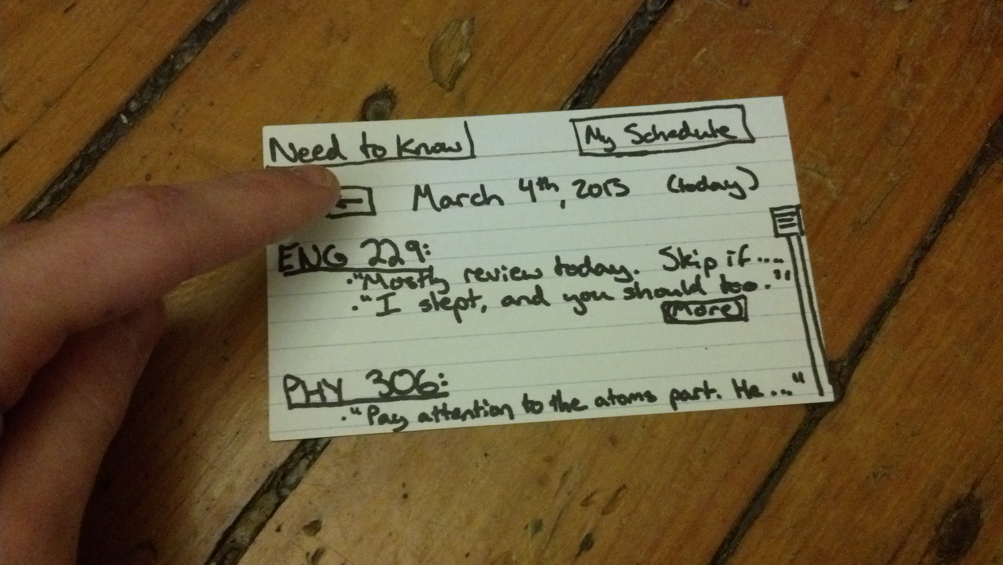
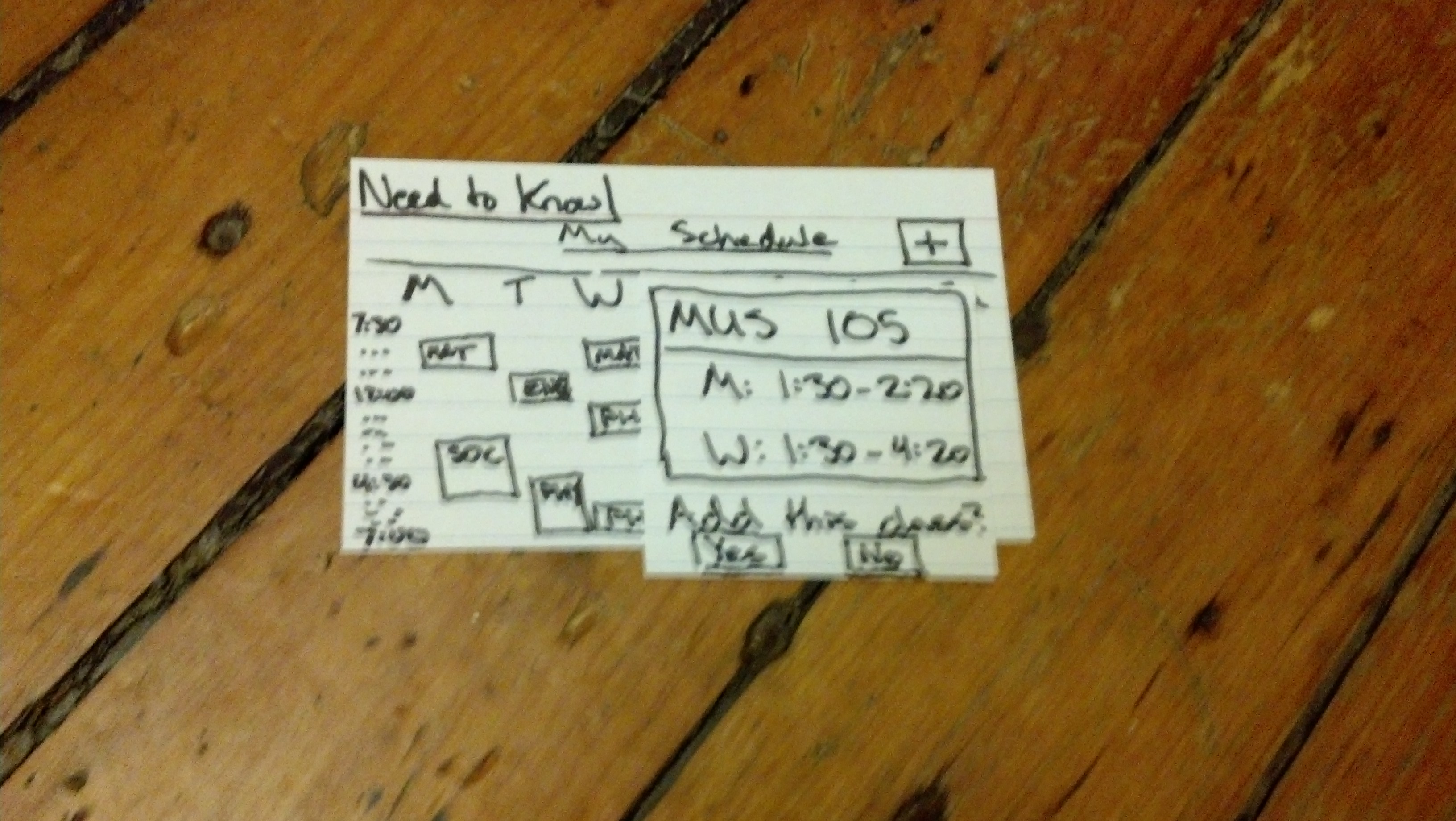
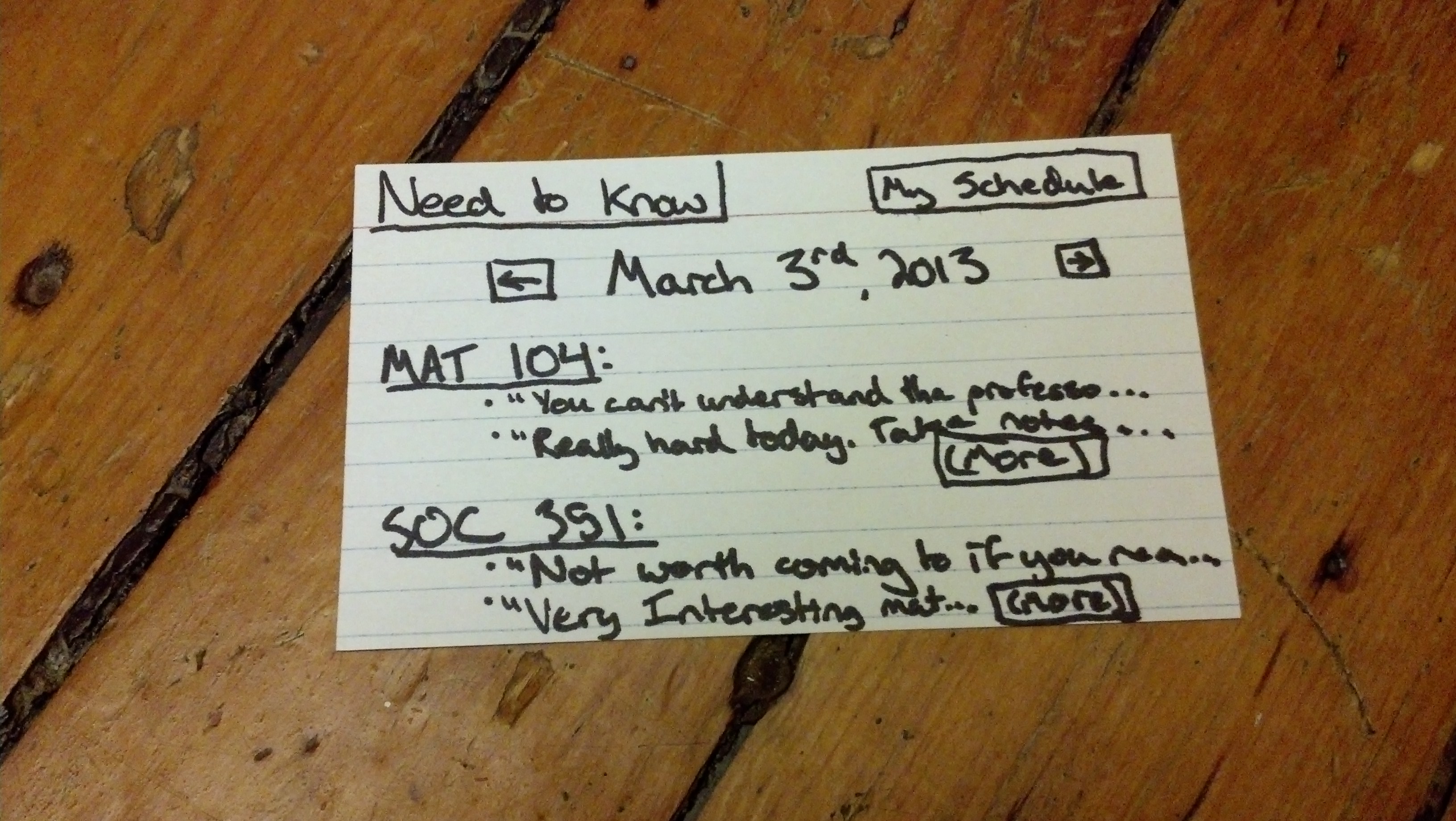 . There is a “My Schedule” button that allows users to view and edit their enrolled classes.
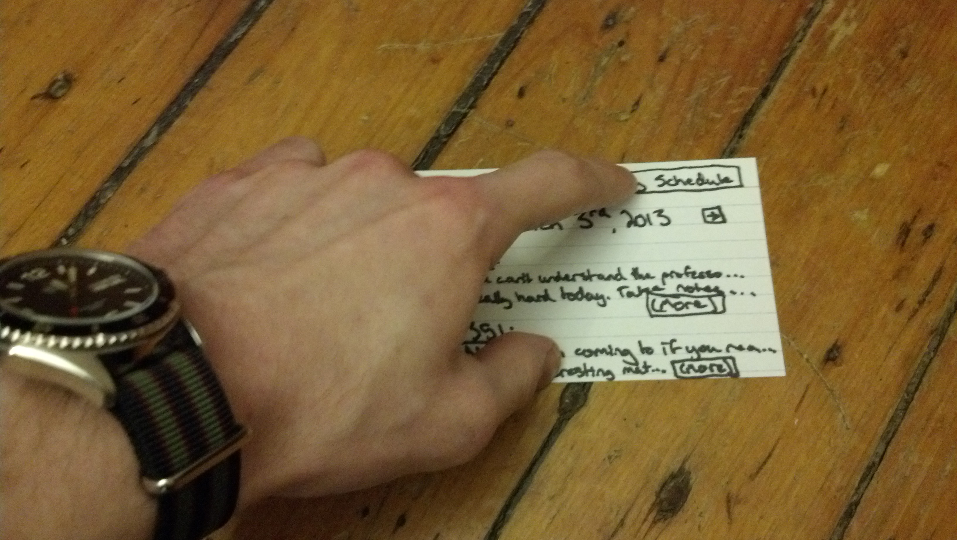
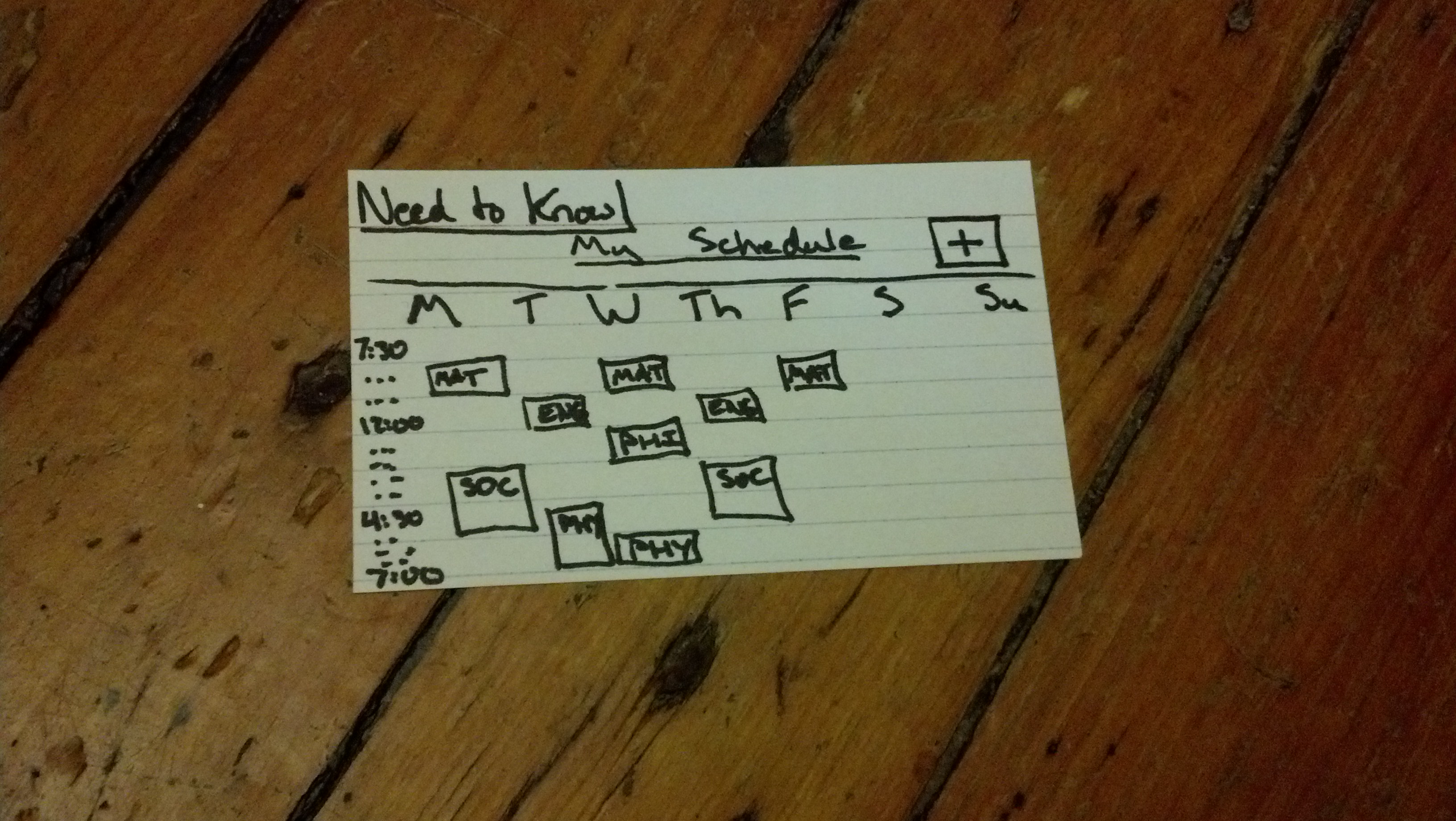 From here, users can add classes by searching
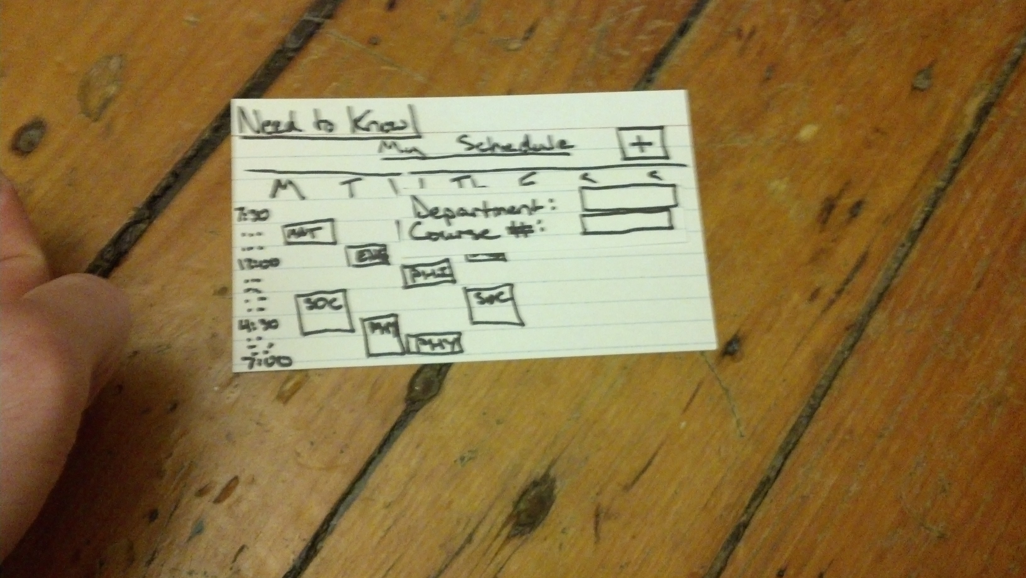
 or delete classes.
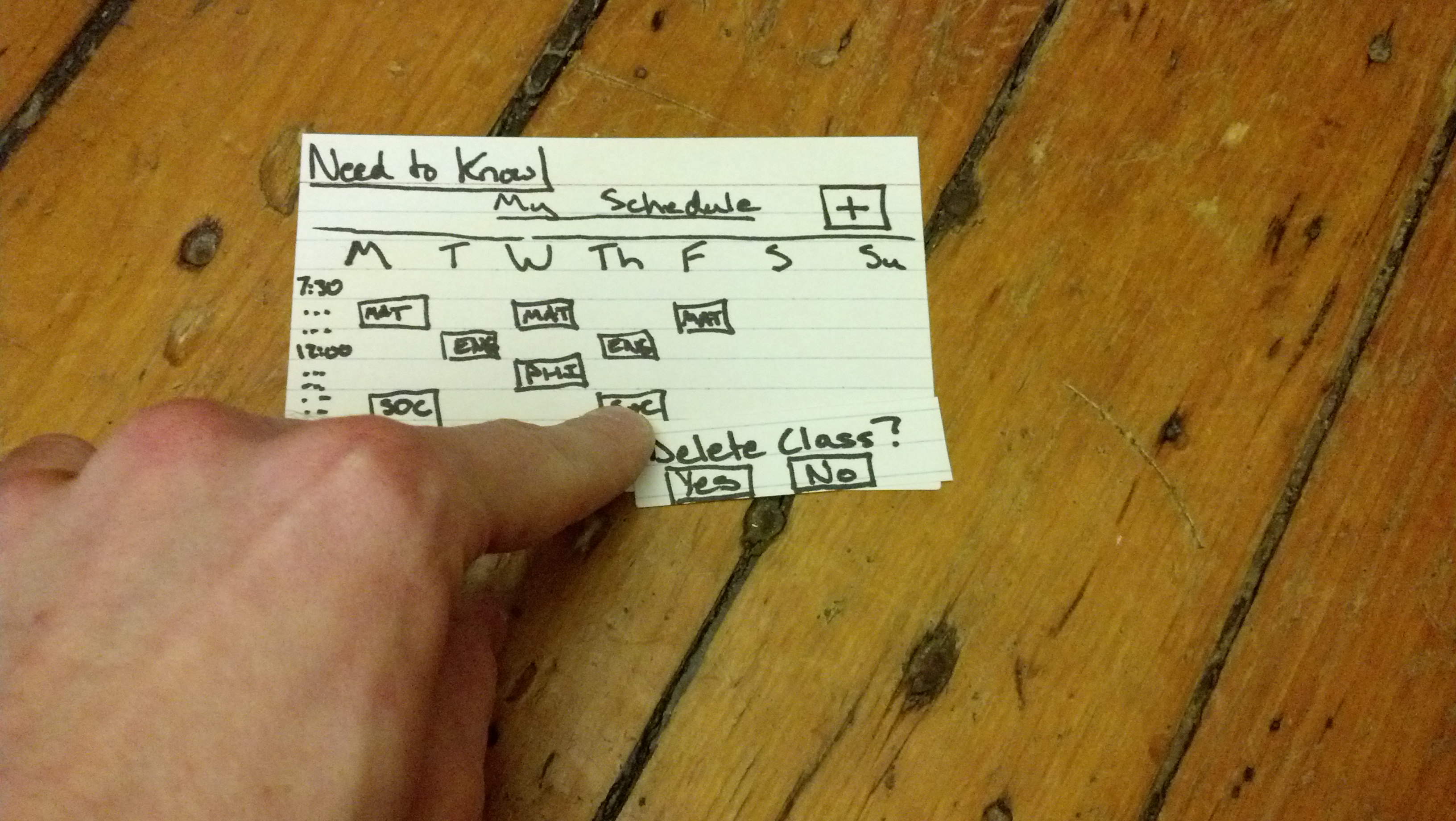
User testing: I conducted my testing with three different individuals in classroom settings, beginning by asking them if they would evaluate my prototype and provide feedback, and then recording (or having someone else record) as they did so. None of these individuals would describe themselves as particularly tech-savvy. I began by introducing them to the product and then letting them navigate around, then followed up by asking them for feedback.
A few videos of the testing and feedback can be viewed here:
Testing: http://www.youtube.com/watch?v=CHTv7YjKtAk, http://www.youtube.com/watch?v=SfTMfNDVfsw
Feedback: http://www.youtube.com/watch?v=iCMQVAOnLhA, http://www.youtube.com/watch?v=pJtOpTiimtg
Here are some photos of the testing, with a summary of the users’ comments below:

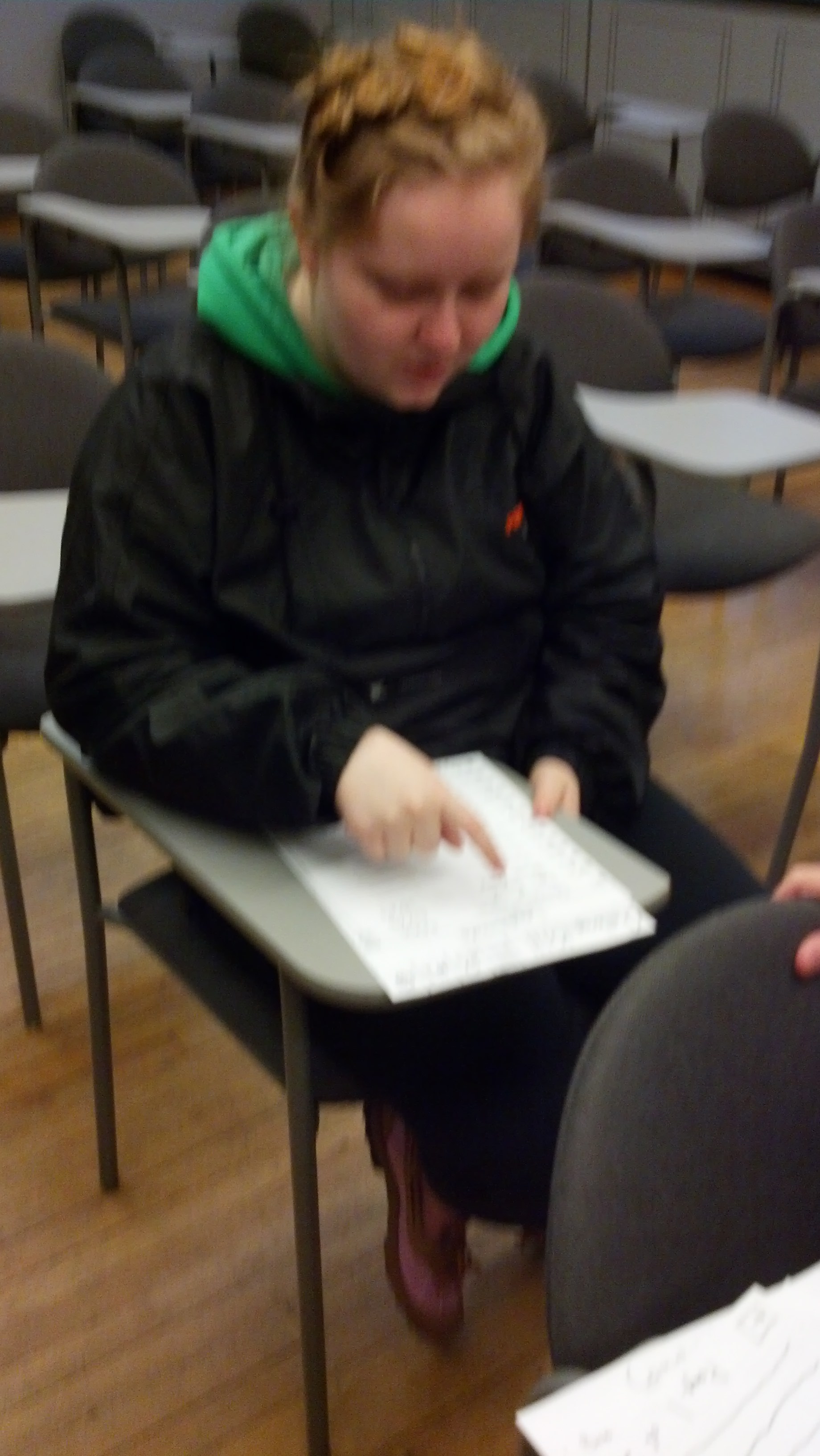
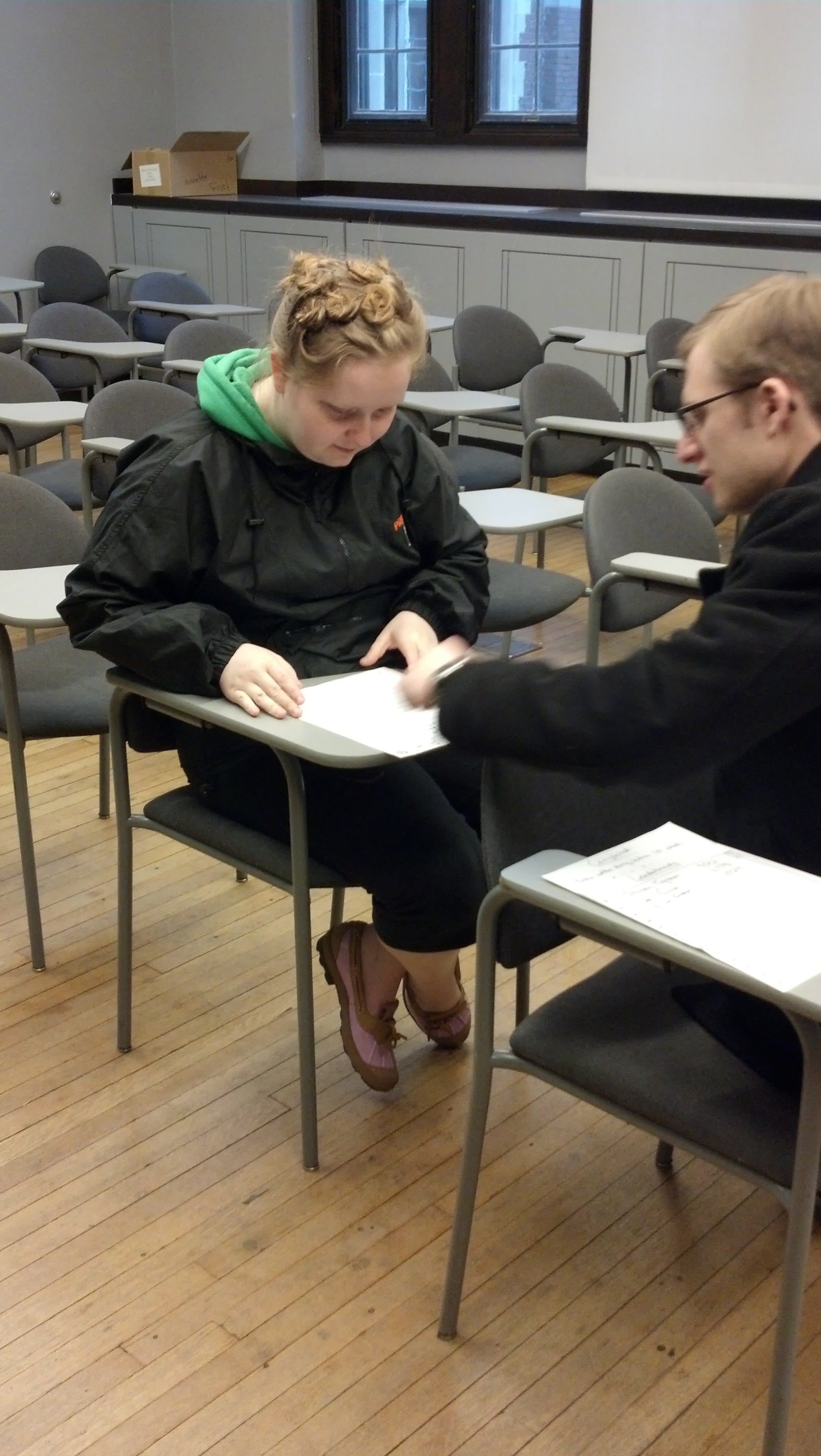
Most users navigated the UI without too much issue, although it definitely took them all some time to get oriented. Feedback touched upon the functionality of the interface, the layout of the interface, and the purpose and impact of the app as a whole. Some key takeaways:
- The homepage was “busy”
- Users wanted to see full integration of messaging features
- Users liked the point system and leaderboards
- Users wanted to be able to search the leaderboards for their friends
- Users were concerned that the app might become too disruptive to actual class
- Users suggested other features, such as “team challenges”
- Users did not know if the settings tab and settings spoke for themselves
- It was not entirely clear what was clickable and what was not
Insights: Receiving actual feedback on these ideas made a world of difference, mainly because it allowed me to see which elements of the interface were actually intuitive versus those that simply made sense to me, their creator. For example, I was very frustrated watching users fail to recognize that certain UI elements could be clicked, but then understanding that indeed they had little indication that this was possible. I noted that minimalism is definitely something I should take into consideration in the future, as I saw users being turned off by the overwhelming choices available to them. Also I noted that, in terms of the prototyping process, it is important to have all possible features integrated, even those you don’t think are central to the primary activities of the interface. Finally, I learned the lesson that you can’t please everyone, and that features which are important to some seem like a waste to others. A future revision would have: simplified and more self-explanatory UI, leaderboard search functionality, integrated emailing system, revised tabs, and team challenge features.
While the process seemed odd at the outset, creating and testing these prototypes helped greatly both in learning better design principles and also understanding better the design process. I was a non-believer at first, but I ended up with a great respect for these activities and am excited now to use them with our group project.