Observations:
On Thursday, I stood inside and around the Friend Center for two different class change periods to observe how different people use the 10 minutes. Of the various people I saw, three particular people interested me and I took their actions and generalized them to groups of people for whom I could design a product.
Candidate 1: Hurried bicyclist
This speed demon is trying to bike as fast as he can through a bunch of people who crowd the walkways during class change. He gets stuck behind a crowd of people and is forced to slow down significantly which probably bothers him. His motivation is unclear (could be late to a class, forgot something somewhere, or just has the need for speed), but his frustration with slow pedestrians isn’t. The one I saw struggled to navigate the walkway between Fisher and Friend, got stuck behind a group of walkers, and nearly hit someone trying to weave through. Maybe I could design something that allows him to navigate crowds better.
Candidate 2: The Early Bird
This individual is the one you see trying to kill time outside the classroom. The one that I observed came out of the Friend Library, went downstairs to the tables, and pulled out his phone. Eventually two students walked into one of the classrooms, and then our subject followed them a minute or two later. My guess is that he didn’t want to be the first into the classroom (it might have been a little awkward to be alone with the professor). Maybe we could design something for this candidate that lets him kill time or even let’s him know if people are in the classroom.
Candidate 3: The Kobayashi (google it if you don’t know!)
This student is the one who unfortunately scheduled class such that she can’t enjoy a proper lunch break on certain days. Walking and eating quickly proves challenging as his person struggles to juggle the bunch of things in her hands. The one I saw walking into the Friend Center was trying to eat from a takeout tray, hold a water bottle against her side with her arm, and open the door. Needless to say, she had to wait until someone came by to get into the building. Maybe there’s some tool that will better enable her to enjoy her quick lunch or receive her lunch more quickly or better interact with her surroundings hands-free.
Brainstorm:
1. Real-time pedestrian traffic monitor and route suggester
2. Bike horn that sounds when it senses proximity to pedestrian
3. Pedestrian avoidance system with sensor and intelligent controller
4. Optimal path navigator based on location and end destination
5. A handle bar shrinking system to enable better weaving
6. Fellow class student locator to see if there’s an empty classroom
7. Refresher material application based on classroom proximity
8. A betting application based on which students arrive to class earliest
9. A scenic route suggesting app to kill time walking to class
10. An estimator app that predicts time to eat given meal
11. A app to order lunch for an eating to be picked up at a given time
12. An app that can suggest how to optimize how to hold your objects
13. An automated backpack zipper opener for handsfree opening/storing
14. A help signaler device that notifies people to help open doors
15. A food carrying tray that gently heats food as you walk
Favorite Ideas:
– I chose the pedestrian avoidance system (#3) because it has the most upside (help bikers everywhere, avoid accidents, etc.) and doable given current technology (see Google cars).
– I also chose the student locator (#6) because I thought it’s pretty neat and potentially doable given the prevalence of smart phones and OIT’s registered data base of devices
Quick Prototypes:
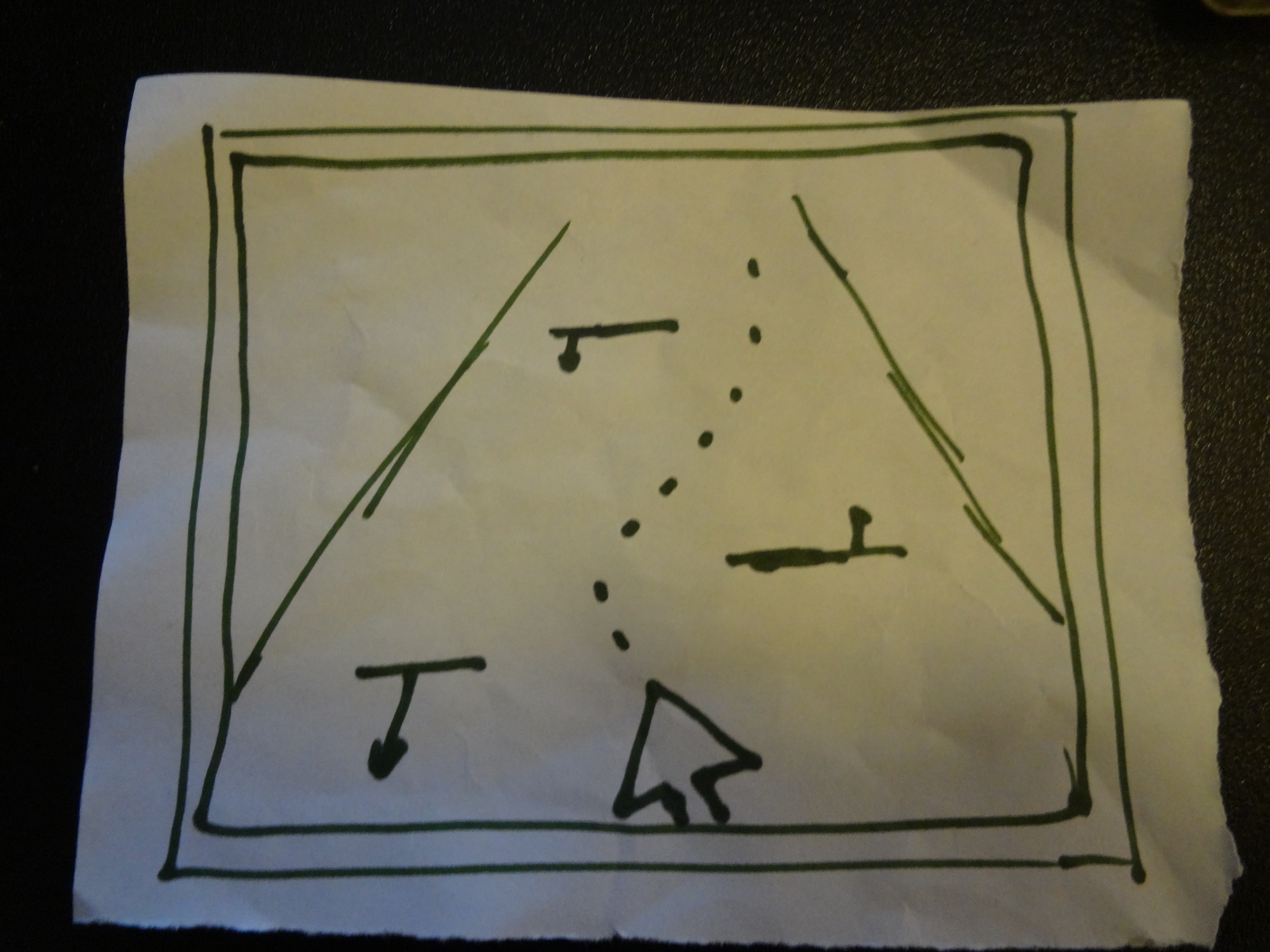
Description: The above picture shows the screen of the device that you’d attach to the front of your bike. The horizontal dashes with arrows shows the detected obstacles and their trajectories. You are represented by the arrow with your direction shown as the arrow. Using an intelligent system that takes in the velocities of the sensed obstacles, the device displays a suggested route through the crowd, signified by the dotted line.
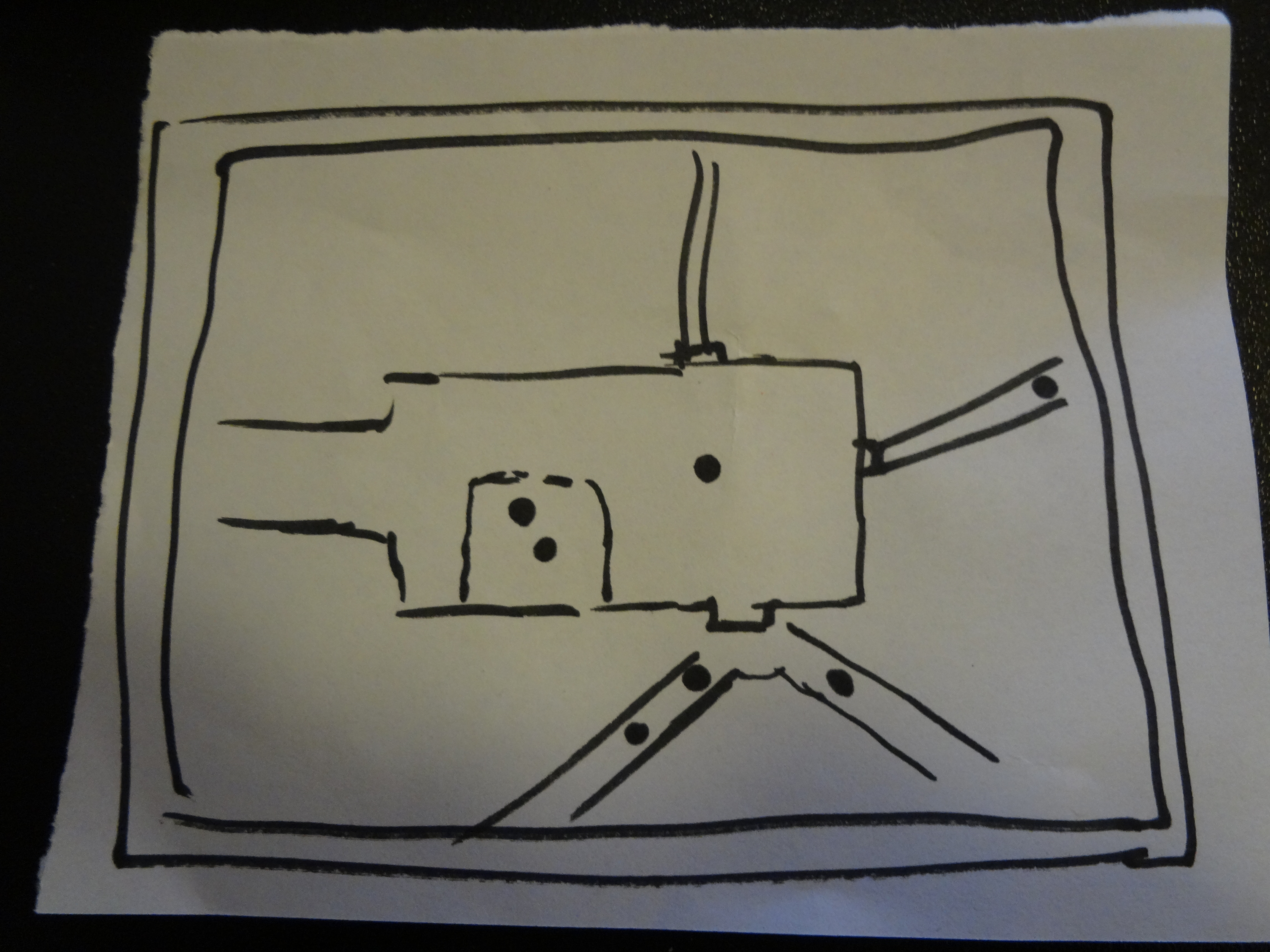
Description: The above picture shows the app interface that you’d open on your phone. People, including yourself, are represented as dots against the map layout of the building or area that you are in. By looking at the map, you can see if anybody is in the classroom or on their way to the room. In this picture, two people are already in the classroom and 4 people are on their way to the building.
Testing and Feedback:
I chose to test the pedestrian avoidance system because it’s my personal favorite and I was really interested to see what people would think of it. I managed to catch up with three people who were extremely kind and gave me 5 minutes of their time.
– Person 1: Jason – I managed to meet up with Jason in the Prospect House garden. I put the device on his bike, as shown in Picture 1, and asked him what he thought he should do. He was a little confused at first, but after I told him to imagine the horizontal lines as people, he quickly figured out that he was the arrow and he go on the projected path. Clearly, the graphic wasn’t intuitive enough for him to pick up without a simple nudging. He also said, “It looks ugly. I would throw it away”.
– Person 2: Stephen – I managed to meet up with Stephen outside Brown Hall. I put the device on his bike and asked him how he would use it. Unlike Jason, Stephen immediately knew what to do and commented that he was familiar with this type of interface from GPS devices. Unfortunately, Stephen didn’t see the need for the device, saying something to the effect of “why would I let the device guide me when I can do it better with my own eyes?” He also commented that it wasn’t pretty looking.
– Person 3: Roy – When I showed Roy the device and asked him to use it without telling how, he was initially confused. But soon figured out that he was the arrow, but couldn’t figure out what the horizontal lines were. Once I finally told him, he thought it was a cool idea and started telling me about how he could use it. He also asked some pretty insightful questions about safe this would be if multiple people were using it or whether or not this device promotes safety if it encourages weaving through traffic.
Pictures of Testing:
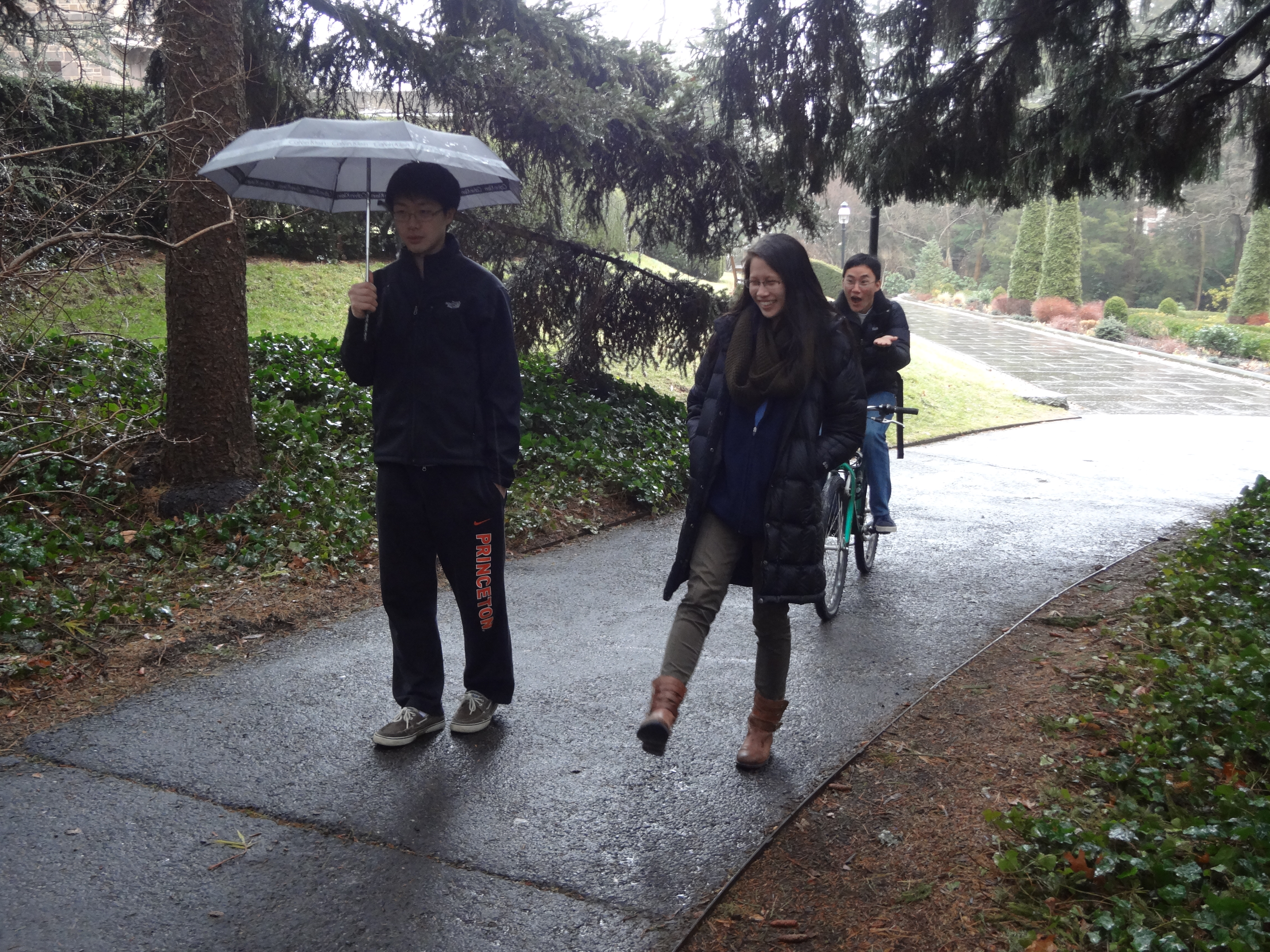
I took some pictures (some of them staged) of the user testing process to show how the testing was conducting and how the prototype was used.
This picture gets at the essence of the problem. Hurried bicyclists often struggle to navigate through pedestrians on walkways, especially when they’re crowded during class change. I designed a tool that I hoped would make that experience less frustrating.

This picture shows how I mounted the prototype to the bicycle for user testing. Typically, I had the tester sit on the bike and I held it there with my hand and asked them to interact with the device. They started to think through it, ask some questions, and eventually figured out how it worked. Then, I got their feedback.
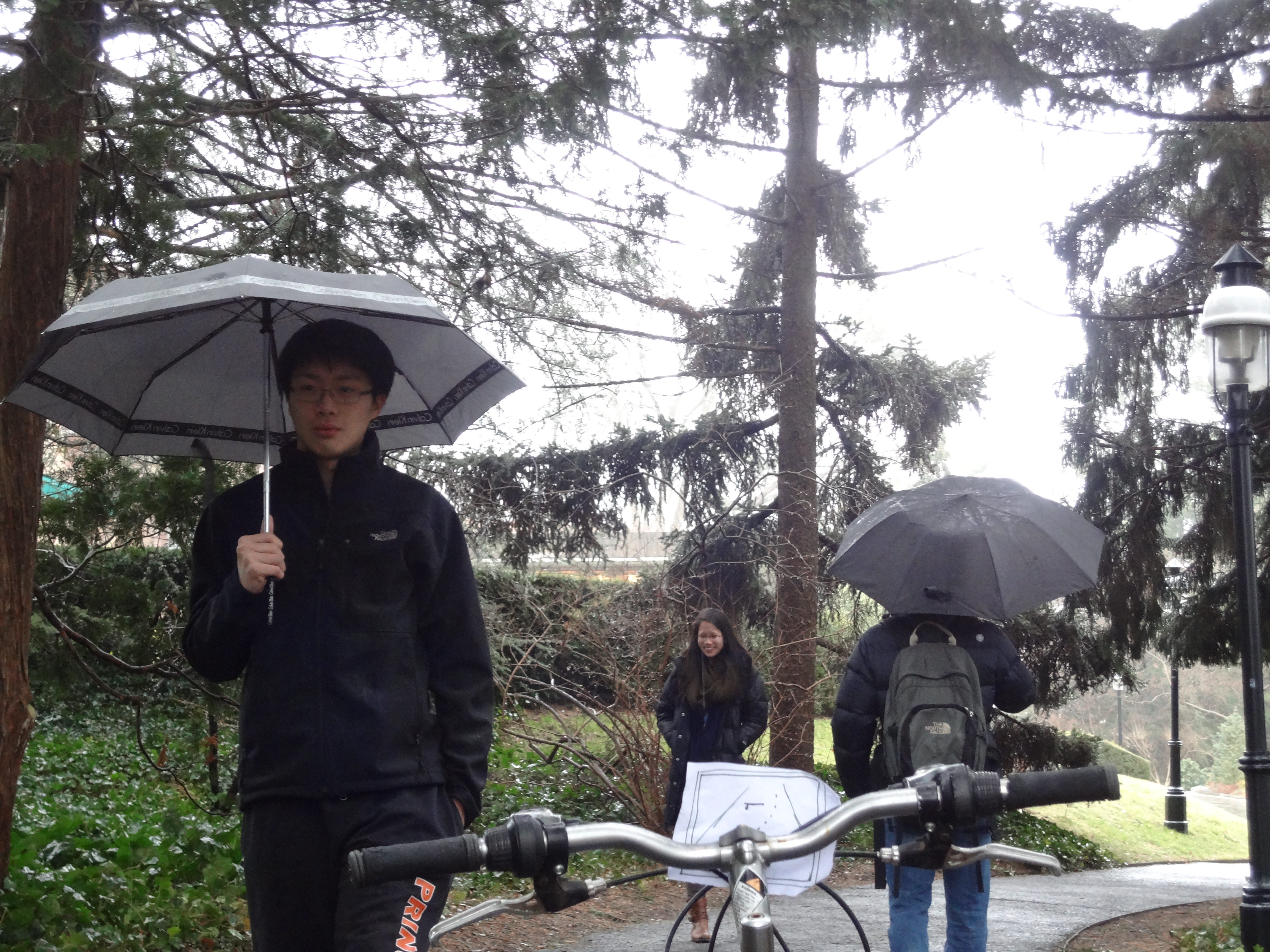
Here’s the ideal usage of the prototype in action. Given a set of obstacles, the prototype maps out an optimal course through them in real-time, and the bicyclists follows the path until he clears the obstacles. When I had my users try out the prototype, I made sure we waited until the walkway was crowded and then asked them to use the bike with the prototype.
Insights:
– Using simple symbols to represent complex objects adds a layer of abstraction that can take away from the intuitiveness of your design. In my example, using horizontal lines to represent people or objects caused two of my users to initially struggle to figure out how to use the device. In my next iteration, I could create a representative symbol, like a stick figure, to show an incoming person, and something else to show an inanimate object. Horizontal lines, while easy to draw, received pretty negative feedback.
– Aesthetics are extremely important. As two of my users noted, my device was definitely not the prettiest interface they’ve ever seen. In my next iteration, I would look to create something much more enjoyable. Color-coded objects and a 3D looking arrow are just some of the things I could use to improve how my device looks.
– Provide something unique. As Stephen pointed out, my device simply does something that a conditioned human con do pretty easily. While there is some value in that, it isn’t as likely to be as successful as a product that can produce something that humans can’t easily do. Maybe adding some small features to the device, like a flashlight, a speedometer, or a video camera to take some cool footage, could help push my device over the top. While that may stray away from the original purpose of the device, these changes could make it a great product.