Observations:
The first thing I realized when I was trying to think of whom to interview was that Computer Science undergrads are not the typical end-users and most of the Princeton undergraduate population that has Princeton Time to spare isn’t from this specific demographic. So I decided to interview people in other disciplines and majors – Economics, EEB, Politics to get a better understanding of how they utilize this time.
- Christine – At the end of previous class, find people who are in last class/who are going to similar place to walk over with. Like to get to class early , mostly play games on my phone and respond to urgent emails if I have any. More mindless the games the better.
- Estelle – Browse facebook on the walk between classes, like getting to class on time. In class, Use the time to check email for managing schedule for rest of day – tutoring students, meeting for club, dinner with friends. No facebook in class.
- Russell – On the phone while walking to class, reads news, emails (only reads, does not respond to any on my phone) Tries to find coffee/tea to pick up Get announcements/slides and reading for next lecture.When in class, respond to urgent emails, no facebook
- Adoley – Chat/text friends to relax and disengage with class for a bit. Go to the bathroom and freshen up. Try and get reading/slides in order for the next lecture, take out notebook, pdf’s, pencils, silence my phone. Get prepped and in the zone for class
These interviews gave me an idea of the kind of users and the problems that they face. I also made independent observations of people in classes –
- Reading today’s lecture, reviewing past notes
- Bringing up slides of the lecture on their computer and their note taking program, lot of people would go to the course web page/blackboard, and the syllabus, and then find what they needed for this lecture.
- Listen to music
- Browsing Facebook, Reddit, news (no active creating of content)
- Check calendars and schedule appointments
- Browse email. Not many people were actually writing emails
- Eating/drinking (mostly coffee)
- Chatting with friends in class
- Looking at flyers
- Relaxing with their eyes closed
- Playing games on cell phone or computer
- Doing homework for other classes
- Go to the restroom
Based on these interviews and observations I think i want to design an interface for the organized student who tries to prepare for lecture. I want to help this user be better prepared and organized for lecture. This is deliberately broad since this can be approached in many different ways, which will be explored in the next section –
Brainstorm Ideas: (with Kuni Nagakura)
- Meditation Helper: An application that plays soothing and calming songs to help students meditate and prepare for the class
- Brown noise emission that blocks out sounds so you can take a nap, and wakes up before lecture.
- Food/Coffee based path generator – Finds routes to next class which have coffee/free food places on the way so you can pick up on the way to class.
- Best Path Finder: Maps out the best route to the next class, looking for diversions etc. on the way
- Flashcard generating app for reviewing the material covered in last lecture and preview of concepts coming up.
- Class organizer: A simple lists of tasks you need to do before each class – call someone, open certain pdf’s, silence your phone, check laptop battery.
- Syllabus condenser – App that generates a list of all the readings for a day from the syllabi of different classes and let’s you access them quickly in one location without having to go through other places. Also print them.
- PrePrinter – Be able to send the readings for the next class to a printer cluster right at the end of the current class, and then show the nearest cluster where you can pick them up. Use 10 minutes to get your readings on the way to class.
- Outline reader – Professors create quick outlines that early students can access from mobile app.
- Survey for research, paid -Fill out quick 5-7 minute surveys and even split longer surveys across different Princeton Times and get paid for taking them.
- QuickMeetup – Find friends in other classes around you, and in your class, to walk together to your next class.
- 10 minutes around the world. an app that shows you a different country every time you’re early to class
- MealPlanner – Easily coordinate lunch/dinner plans for the week from one location with easy input for people you meet on the way and say that you should catch-up and get a meal sometime.
- Language Learner – 10 minute lessons. Listen to conversations/ lessons on handheld while waiting. Served in small bits so doesn’t get boring and still has good retention.
- Estimated Travel Time Calculator – Pools in information from number of people in class around you, construction/diversions and calculates the estimated time it will take to get to the next class. Includes maps for display
- Turntable.fm for class – Have classroom playlists that people can access and play the music on the class speakers before lecture as a community builder to meet people, and encourage not sitting with personal headphones.
- InTouch – Reminds people how much time they have gone without calling specific members of their family and helps them use the 10 minutes between class to stay in better touch with people back home.
Ideas chosen to Prototype:
- MealPlanner – This solves a very frustrating problem faced by many students, including myself and this scenario is one of the most commonly faced during the 10 minutes between class.
- Syllabus Condenser – Widespread use-case across all majors and disciplines which drastically improves and speeds up access to information used on a daily basis.
Prototypes:
Meal Planner
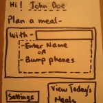
- Splash Screen – When user (John Doe) meets a friend, he has two options – either enter the Friend’s name, or bump his phone to get his information using NFC
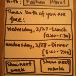
- The App identifies the friend, and then calculates which meal times both the users are free using their calendars. It displays options for moving further in the future as well.
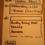
- The next screen is to decide the location for the meal. The app recommends places where both the users have recently eaten to ease the process of choosing
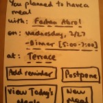
- Once the meal i set, the final screen displays a summary of the email with the option of adding a reminder and postponing the meal. The navigation options go to the view of all meals today, and back to the creation of a new meal
Syllabus Condenser
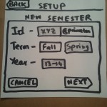
- The setup page is a one-time process at the beginning of the semester. The user logs in with their university account and selects the term and the year. The default values are the best guess made by the app.
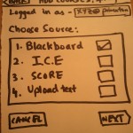
- Once authenticated and the term is selected, the user has the choice of various sources to get the course lists and syllabi. The most used are Blackboard, Integrated Course Engine (ICE) and SCORE. There is also an option to manually upload the course list.
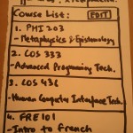
- The app scrapes the sources selected and creates a list of all the courses the user is enrolled in the current semester. There is an option to edit these as well. The navigation button moves to viewing today’s schedule.
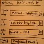
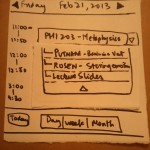
- This is the default daily view of the app. It shows all the classes that the user has in the day, with easy navigation to other days, and broader views like week and month.
- The user can click on the drop down for a class and it displays all the readings/slides assigned for today’s lecture of that class. All the reading’s are clickable.
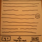
- Clicking on a reading opens it up for previewing. There is easy navigation to pages of the document by swiping left and right. To view the next reading the user can swipe down or up. The most common task – printing – is easily accessible from a button at the bottom right.
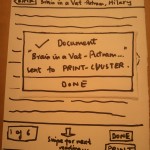
- On clicking the print button, the current document is sent to the printer cluster, and the nearest print cluster is also displayed in the dialog box. Clicking done returns to the reading.
User Testing:
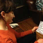
User 1: Eleanor
- Landing page for first time setup, navigated easily through login steps.
- Got confused on what the choices meant – if it was looking to get syllabi from blackboard and ICE or the schedule from ice. Decided to go with the already selected default(blackboard) and press next.
- Viewed the summary and understood that it parsed the classes right. Had concerns about how the app would actually be able to get the readings from blackboard.
- Clicked the “Go To Today” button to navigate away from the list.
- On the today page, tried navigating to other days and to the week view. Then clicked on the drop down.
- Saw the drop-down as the way to get more information about it.
- On the view for a document, tried swiping up for the next page. Then clicked on Prin
- Didn’t realize that the dialog box told her which print cluster was closes to her. Clicked done.
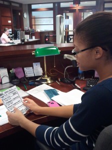
User 2 – Danielle
-> Could not understand the reason for other sources besides Blackboard.
-> Got confused about what to do after setup. Pressed the new of the class and not the Go To Today button.
-> Tried to swipe down for next page.

User 3 – Megan
-> Could not understand the options for adding courses, and faltered in choosing.
-> The Upload text option was unclear
-> Asked if ” Choose Source ” meant “import from”
-> Flicked page down to go to next page.
-> Tried to find the other readings from the current reading by looking for a small list in the botton left.
Insights:
- On the overall all users felt like the app solved a problem that they faced on a daily basis.
- There was a concern raised by some people about the source of information for the app. Some classes don’t have strict syllabi on blackboard, but a website where the professor posts readings. Revision could use webpage-scraping as well as a source for the readings instead of just Blackboard.
- The “Choose Source” page was a problem for many users. They found it hard to understand what the various choices represented since the idea of the syllabus is inherently only linked to Blackboard. The original design idea was to source the syllabus and readings from Blackboard, the schedule from ICE or SCORE, and allow for an option for the user to upload the PDF or text file for courses that didn’t have it up on the web. User feedback suggests that I should redesign this page to have a “import syllabus from” label which has Blackboard/Course Website/upload file, and a separate “import schedule from” label which has ICE/SCORE/Google Calendar option.
- On the View Courses page that comes next, one user got stuck and did not understand that the next step was to click “Go To Today”, and clicked on the class. In the revision, clicking on the class should go to the next occurrence of the class in the calendar.
- Most users (All of whom were Iphone owners and very used to the Iphone style of navigation) intuitively swiped down to go the next page of the reading. The current mapping has that swipe for going between readings and should be modified to match user intuition which has left-right swipe for navigation between documents and up-down swipes for going between pages.
- Some users also were seeking a way to jump to a certain reading when viewing another reading. The revision could have a simple pop-up list that shows the list of readings with the current reading highlighted and easy one-click navigation to any reading.

