To conduct my observations, I spent a lot of time between class observing what people did. Initially, I chose to observe and talk to people in the same classes as me but who I did not know very well – Byrd Pinkerton and Kirsten Parratt in ENG 339: Jane Austen in Context; Patience Haggin and Saahil Madge in HIS 310: Imagined Languages; Stephanie He and Sebastian Gold in COS 340: Reasoning About Computation.
I found that when people had time between class, they usually answered emails, checked the day’s lunch menu or read through the notes from the previous lecture for that class to refresh their memories.
I also interviewed acquaintances and friends to ask them what they did between classes – Izzy Kasdin, Alex Kasdin, Dillon Reisman, Erica Portnoy, Bonnie Eisenman, Mengyi Xu, Michelle Yakubisin, Ballard Metcalfe, James Bedell and Alexander Patton.
For people who were running between classes in 10 minutes, their biggest concern was being late and missing the beginning of lecture which sometimes lead them to miss important assignment information or even the base of the lecture which was hard to catch up on.
People also complained about not being able to find resources such as printers, water fountains, bathrooms, etc. in time when they had class in an unfamiliar building.
Many people merely spent time playing games on their computers or relaxing between class and said it would be fun to have more recreational games before class to rejuvenate.
I came up with the following list of ideas based on the observations I made and conversations I had.
List of Ideas
- Legos in the classroom – fun way to keep people engaged before class (add sensors to prevent students from taking them)
- Magazines and newspapers in or right outside the classrooms
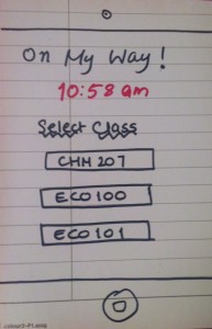
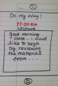
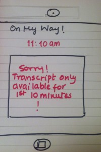
- OnMyWay: Wirelessly transcribing the first 10 minutes of lecture to your phones so you don’t miss the beginning if you’re running late
- Outline Transmitter: Transmitting lecture outlines to the phones before class so students can skim through them
- Campus wide puzzle challenge: Form teams within your class to solve a semester-wide puzzle challenge in which clues are scattered around the classroom right before the class starts
- Video monitoring for students who have experiments running in the lab – video feed sent live to phones so they can keep track right until class begins
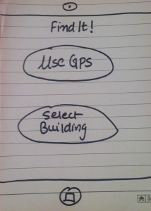
- FindIt: Compilation of locations of students necessities such as printers, water fountains, bathrooms and prox hotspots so students know where to look before class
- Email Filter: App which filters only the most important emails which must be answered urgently so students don’t have to sift through tons of emails finding the ones which must be answered before class
- Mood-based music filtering: App which selects the right music for you as you walk to class depending on your mood – happy, sad, want to workout/ race walk, etc.
- QuickSnack: Snack trucks or coffee bars right outside or near classroom for a quick hunger fix or coffee boost
- Audio feed summary of the previous lecture for the class you can listen to before the next one so it is fresh in your mind
- MoodCheck : App which posts your mood – happy, sad, stressed, etc. so your friends can see it; you can check friends’ moods and offer to chat, hang out, small gift to cheer them up if they’re sad
- LunchMenu: App which consolidates menus from various dining halls/ eating clubs for the day’s lunch so you can pick where to eat when walking from class to class
- Day Progress Report: List of tasks you need to finish for the day, and how you’re keeping up, i.e. personalized day tracker to check before class.
- Daily Calorie Intake: What did you eat (pick from d-hall menus), how many calories, track physical activity including walking, etc
- TechTracker: An app which lets students who are the first to enter the class send a complaint regarding technology in classrooms which does not function.
- Sustainability Check: An app which informs students of all the empty classrooms in which lights are on giving students near those classes to walk in and turn them off.
- Best Paths: An app which optimizes your path to class and gives you the best routes by foot and by bike (taking rain/ cold weather into account).
The two ideas I chose to prototype are:
1. OnMyWay: Wirelessly transcribing the first 10 minutes of lecture to your phones so you don’t miss the beginning if you’re running late
I chose this idea because many students, especially freshmen engineers have back to back classes and invariably miss the first five or so minutes of lecture and find it hard to catch up. They also miss important homework information which professors talk about in the beginning of lecture. An app which relays this information to them while they are walking would be very useful with a simple UI.
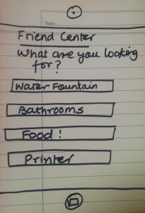
2. FindIt: Compilation of locations of students necessities such as printers, water fountains, bathrooms and prox hotspots so students know where to look before class
I feel this is an important problem because students generally use time between classes for tasks such as filling their water bottles, printing things for class, going to the bathroom, etc. but don’t find the amenities required because of being in an unfamiliar building or part of the building. An app which helps them find these things is simple to design and very useful.
Prototypes
1. On My Way!
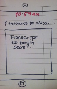
2. Second screen which displays the time and relays a message saying it is waiting for the class to begin before transcripting
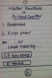
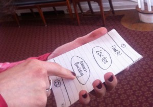
2. FindIt!
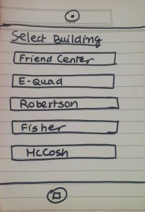
Optional second screen (only if user chooses to select building manually) to choose from list of buildings
User Testing
I decided to user test the prototype for Find It!
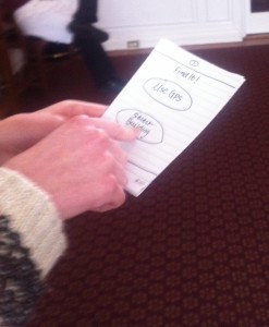
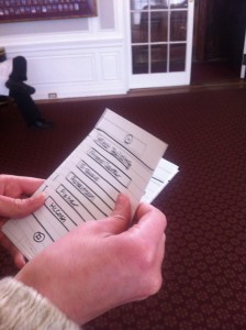
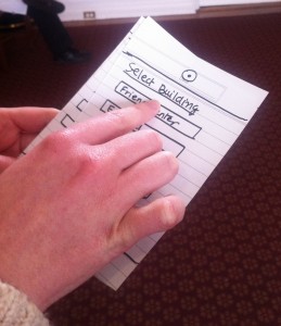
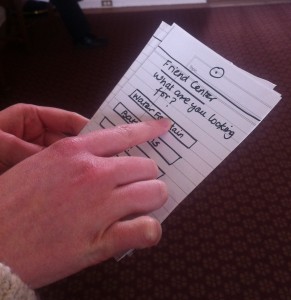
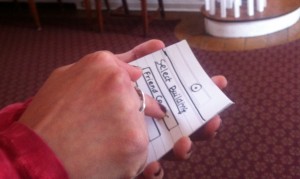
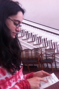
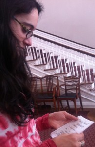
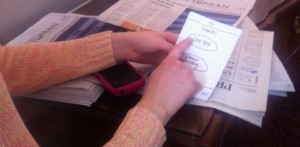
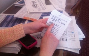
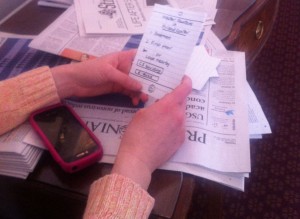
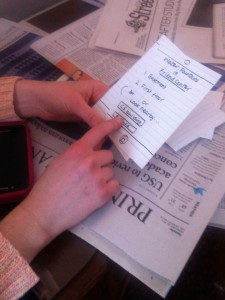
I decided that students who test my prototype would not be Computer Science students and those interested in interface design since I believe they would not give me a completely accurate picture of the regular user. Emily Wibberley, Izzy Kasdin and Temple Douglas tested my prototype, and here are the pictures from user testing:
Emily Wibberley
Izzy Kasdin
Temple Douglas
Observations and Conclusions from User Testing
The initial screens seemed to be a simple enough interface for testers to figure out, especially when they manually selected the building. However, those who used a GPS locator said it would be nice to have a confirmation screen asking them if they were actually in the location it found out, which would be useful if they were outside or near a certain building.
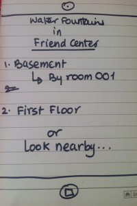
I also observed that none of the users tried to find more information about the location after the floor locations had been displayed. They were tired of clicking through too many screens, and hence it taught me a lot about simplifying the interface so necessary information is quickly and clearly displayed. Thus, I feel having the detailed location displayed next to the floor location is a better interface than waiting for the users to tap on the floor locations for more info.
One of the users also said that having a ‘nearby buildings’ options might only be necessary if the required item is not available in the building the user is in, or is hard to find (eg. the bathrooms in McCosh are extremely hard to locate). This lessens the amount of text on the screen and prevents too much confusion.
Overall, I got positive feedback about the usefulness of the app, and users testing the prototype said they would definitely use it. The functionality is simple and some minor tweaks in UI will improve usability. I am happy with the reception of the app and gained some valuable insights from user testing.

