Part 1: Observations
Who: Megan Karande
When: 1:10pm Tuesday
Where: Beginning at Frist, outside Café Viv
- Megan was working on her thesis at the tables outside of Café Viv and talking to friends who were sitting with her. She got up, and went to tower quickly to get tea.
- On the way to tower, she checked her phone while waiting for the walk signal at the stop light on Washington Rd. She said that she checks her phone a lot before her studio class at 1:30, because she can’t look at her phone during class.
- When she was getting tea, she realized that she needed to print something for a meeting after class, and sat down to get her laptop out and print it. She then asked me if I thought the Campus Club printer was working, because it had been broken for the past few days.
- She printed her sheet, and went to Campus Club to print it out. The printer was working, so from there she started walking down Washington Rd. towards Nassau St. She checked her phone again, and started to walk quickly when she realized that she only had 5 minutes to get there (her class was in the Lewis Center at 185 Nassau).
- She checked her phone again as she got to the building, realizing that she was just going to make it on time. She checked her texts and emails one last time, then went in to class.
Who: Sam Zeluck, Paige Tsai, and Megan Karande
When: 1:20pm Wednesday
Where: Beginning at Tower (eating club)
- Sam went upstairs after lunch to get her 2 coats (she said that she occasionally wears 3 when it is really cold) and her backpack.
- She checked her phone for texts from Megan (who she usually walks to class with), but didn’t have any, so she went downstairs to look for her.
- She met Megan and Paige on her way down the stairs – they were coming up to leave after getting tea. Paige had met Megan while they were getting tea, and decided to walk with her because they were going in a similar direction.
- They left Tower, and walked across Prospect Ave. to Robertson Hall. None of them had class there, and they said that they were going through there because it was warmer to walk through a building and it didn’t add time to the walk.
- They were talking about me observing them, and how Paige had been following her New Years’ resolution to drink more water and was carrying a water bottle
- They walked out the opposite door of Robertson, onto the plaza there, and then towards Washington Rd.
- They briefly walk down Washington Rd., and then Paige splits off at Green hall to go to her psychology class.
- Megan and Sam continue to walk down Washington Rd. Sam checks her phone to see the time and see if she has any texts. They speed up a little bit because they only have 2 minutes left before class.
- They enter the building (Aaron Burr Hall), and start talking about the next assignment they have due for the class (Imagined Languages). They get to class at almost exactly 1:30.
Who: Gene Merewether and Alice Fuller
When: 7:20pm Wednesday
Where: Beginning at Tower (eating club)
- I went downstairs to wake him up from a nap before class, since he had asked me to do that earlier.
- He got up, went to the coatroom for his coat and backpack, and met Alice there while she was looking for her coat. I asked if they planned to meet before going to class, and Gene said that they usually just see each other in the coat room, but that if he didn’t see Alice he would have assumed that she left already.
- They left tower, and walked down Prospect Ave. towards lab. They talked about the lab writeup and senior pub night on the way. Both mentioned how cold it was outside.
- Gene checked his texts and emails briefly during the conversation.
- Just as we were turning down the road towards the EQuad, we saw Rodrigo (our other group member) coming from Charter. We hadn’t coordinated to meet him on the way, but just got lucky in seeing him.
- Gene used his prox to open the door of the EQuad, which was locked because it was night.
- Gene was walking at the front of the group, and almost led us in the wrong direction. Alice corrected him and we went downstairs to lab.
Part 2: Brainstorming (with Gene Merewether):
- Walkshare – find out which of your friends are going to which locations and arrange to walk with them
- An app to find out which printers are working, or the hours of campus buildings
- An app to find out routes to your classes which go through buildings in order to stay warm.
- A watch / ring / other device which changes color depending on how long you have to get to class
- An app that tells you if you have time to get water / print something / get tea before class, and tells you where to go
- An app which displays friends on a map, if they want others to be able to see where they are
- An app which provides you a to-do list before class
- Time-updated frequently texted list – shows your contacts based on when you usually text them and what time it is now.
- An app that displays menus for eating clubs and dining halls, and helps friends coordinate where to go
- Easy automatic responses to emails/texts saying that you are in class
- A device that notifies you automatically when friends are nearby or are walking in a similar direction
- A way to place a lunch order while going to lunch, in order to minimize time waiting
- A calendar that gives you reminders automatically before you have things scheduled (so notifications come before class)
- An app which tells you which of your friends is in class, at lunch, etc. so you can coordinate large groups without texting
- An app which presents easily accessible syllabi and assignments pages for classes and compiles them into a calendar
- An app by which you can easily track and make record of your progress on assignments
- Surveys for students waiting before class about the
- Flashcards or review tests for students before the next class
- Shared reading notes for students to fill in gaps before class/precept
Part 3: Idea Selection
I am selecting ideas 1 and 5 for paper prototyping. I have selected idea 15 because people I was observing tended to discuss coming assignments, and several times people did not know when things were due. I chose idea 5 because it also appeared to be a major issue in my observations; the people I watched wanted to do things like get coffee or print before class, and didn’t know if they had time to make it.
Part 4: Paper Prototypes
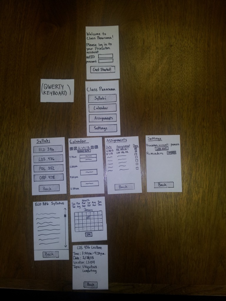
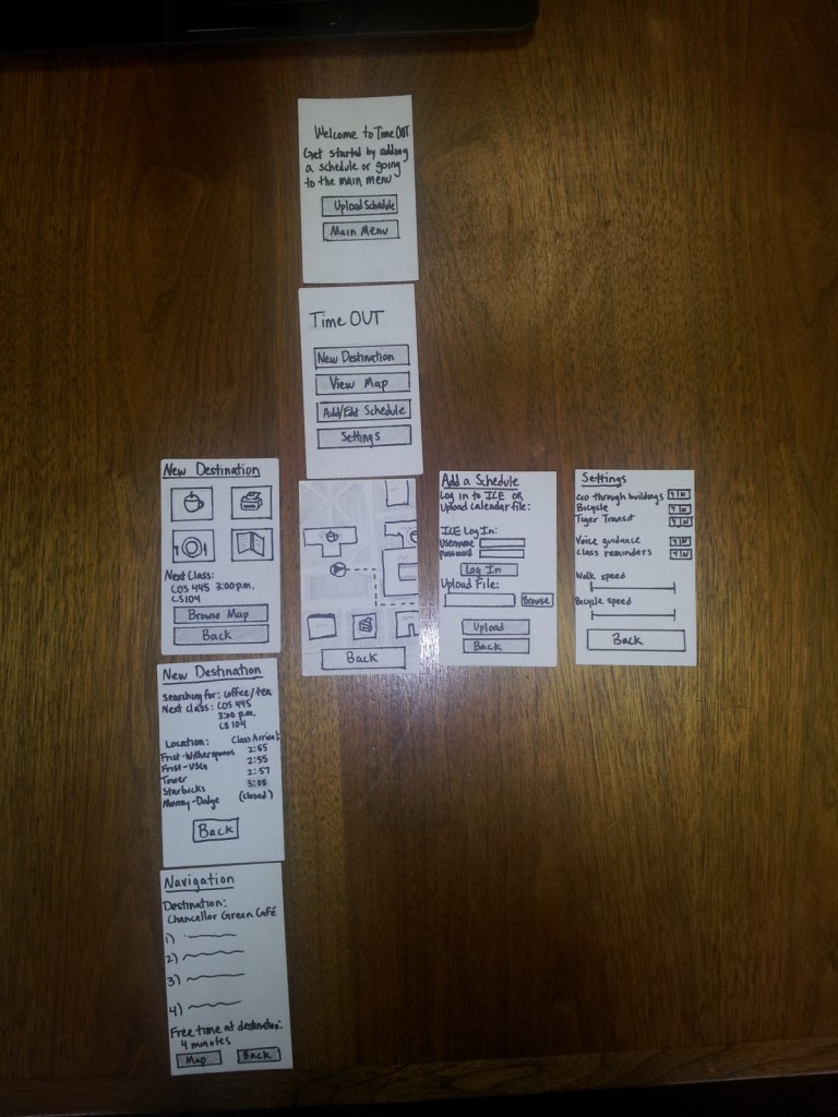
These are ordered hierarchically, so that the flow of navigation is from the top to the bottom.
Idea 15
Note that the top screen is only seen on the first use, or when you are not logged in to a Princeton account. The two screens below “Calendar” are meant to be overlays, which disappear when Ok or Back is selected. The first is triggered by hitting the “Select Dates” button, and the second is triggered by touching one of the blocked off calendar events. The keyboard appears at the bottom of the screen when a text entry box is touched/selected.
Idea 1:
Again, the first screen only appears if the user has not logged in before, or is not currently logged in. Otherwise, they will start from the Main Menu. The top New Destination screen buttons signify (clockwise from top left) coffee/tea, printers, food, and libraries. The next New Destination screen is then customized based on the item selected (the prototype just includes the screen for coffee/tea, since other options will have similar layouts and interactions. The Navigation screen can be accessed by selecting one of the options in the second New Destination screen. If Map is selected from there, it will take you to the View Map screen, which is shown under the main menu, but with the route highlighted by a dotted line. In Settings, speeds are manipulated by dragging sliders.
Part 5: Prototype Testing/Observations
Who: Tejas Sathe
When: 2:20pm Thursday
Where: Thesis room of Tower
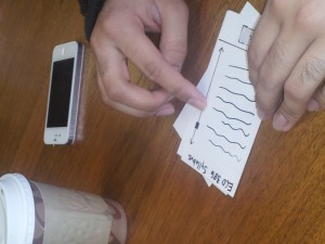
- He navigated relatively smoothly through the main menu, selecting Calendar first. He pressed on one of the event blocks, and was happy to see that more details came up. He then tried to click on the location of the event, and mentioned that he would have liked a Google Maps option. After I told him I hadn’t included it in the prototype, he said he was looking for how he could change reminders from inside the calendar interface. He went back (dismissing the event screen), and did not see any way to add/edit reminders from the calendar screen either. Finally, he mentioned that the times displayed seemed arbitrary.
- He next went to the assignments page (after going back to the main menu). He tried to click on an individual assignment, and I had not included any functionality for that in the prototype. When I asked what he was trying to access by clicking there, he said that he was hoping for a link to the actual assignment.
- He mentioned that it would be nice if he could sync it with his dropbox, where he keeps his notes. I asked what he would like if he didn’t use dropbox, and he said that it would be difficult to view class notes if they weren’t already in the cloud.
- He suggested that the assignments page include grades for assignments which were done, and responded positively when I asked if he would like a separate page for looking at past assignments
- When asked about a social aspect -such as the ability to email/text friends in the same class from inside the app, the ability to look at a friend’s schedule, or the ability to directly email a preceptor or preceptor from inside the app, he said it wasn’t necessary for a good experience (and might hurt its navigation) but that it would be a positive addition if executed well.
- When looking at the main menu, he questioned how the organizational layout, asking if there was any way to view on a class basis rather than on a topic basis. In other words, he wanted to be able to view all of the information for a single class in the same place. He suggested being able to change it on the main menu itself, but also responded positively when I asked if he would also like it in settings.
- He navigated through the interface quickly, saying that it felt like a simple organization to pick up on (aside from the above comment). After the trial, he said that the ease of use was one of the main successes, and focused much of his energy on talking about additional functionality. At the same time, he suggested integration with services such as Piazza and Coursera in order to make it easy to get help directly.
Who: David Asker
When: 12:20pm Friday
Where: Dining room of Tower
- He picked up on the navigational style relatively quickly, and went to the Assignments page first. On that page, he attempted to click on the individual assignments. When I asked what he was looking for, he said that he’d like some overview of the assignment, or possibly a link to the assignment page itself.
- He asked about a touch interface, such as swiping left and right when viewing syllabi to move between classes, or using a three-fingered closing motion to go back to the main menu. Unlike the other two testers, he was unconcerned by the lack of a back button on the Calendar, and tried to use the Apple closing gesture to move back to the main menu.
- He suggested the inclusion of a way to directly view the most urgent assignments and calendar appointments, in order to make it easier to find the most important tasks to accomplish.
- He did not have any difficulty switching days, and liked the ability to select a day from a calendar or just move forward and backward by increments.
- He suggested the ability to email or text for help from inside the Syllabus page for a class, or from the Assignments page.
- At the end of testing, he was looking for an option to log off of his Princeton account. He did not find it intuitive that it was placed in settings, but mentioned that he would be OK with that if it was on his phone. If it was on a computer or a website, he would prefer the ability to log off from the main page.
Who: Emma Fernandez
When: 1:20pm Friday
Where: Thesis room of Tower
- She wasn’t immediately sure what account she was logging in to on the first screen, and was later wondering how the app was getting her class information
- Again, when navigating to the assignments page, she requested a way to get more information about an individual assignment. She suggested that the assignment page from blackboard be shown, or drawn from the syllabus into an easily readable form.
- Again, she noticed the lack of a back button on the calendar, which created a bit of a dead end within the interface.
- She attempted to find a way to alter the calendar format to display more than one day’s information, even going back to the Main Menu to look at the Settings page. She then suggested that I include the ability to look at multiple days or even a month to make planning easier. She also suggested the ability to include a list of the next 20 or so events on the calendar, noting that she tends to only put very important deadlines and events on the calender so hers tends to be relatively sparsely populated.
- She requested the ability to look just at your course schedule for the week, in a format to what is currently provided on ICE (tigerapps).
- Like David, she also tried to log out at the end of the trial, and had similar feelings about the location of the button. As a mobile app it was acceptable, but given other access modes she would prefer that logging out was easier and didn’t require navigation away from the Main Menu.
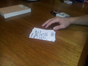
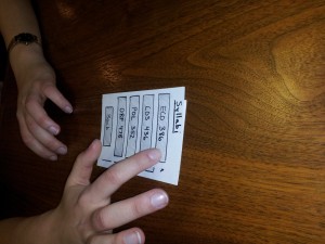
Pictures from testing:
Part 6: Reflections and Insights
- The calendar page needs a back button – this is absolutely necessary
- All users mentioned that they would like the ability to look deeper into assignments from the assignments page. In future revisions, I would likely explore the ability to view the assignment sheet, or at least some information parsed from the syllabus. Additionally, the ability to set reminders from the assignments and calendar pages would be nice – all of the users felt that that feature’s inclusion on the settings page was somewhat strange.
- One of the biggest successes for me was the navigation – the three users all seemed to have a very quick handle on how the menus and functions were laid out, and how to move between them. That being said, I was very interested by Tejas’ suggestion to include the ability to sort by class. If that could be included without making the interface messy, it would probably have a positive impact on the user experience.
- If this is being used on anything other than a personal mobile device (like a phone or iPad), it would require a logout button that is significantly easier to access.
- All user interactions were relatively quick, lasting around 5 minutes on average. This appears to be acceptable for the inter-class period, although Tejas was slightly rushed. In a real interaction, they would likely only be using one of the features at once (not exploring all of them), which could cut down on use time.
- While a social element is not crucial, it might be beneficial to integrate Piazza and Coursera support, or at least the ability to email teachers/preceptors. Since questions are likely to arise when looking at assignments and other due dates, this would be a useful addition.
- In any revisions, it would be good to keep a similarly simple layout, since that made it especially easy for users to access information quickly and efficiently.
- Gesture support would likely be a nice addition for touch screens, and could even replace back buttons.
- On the whole, the users felt that the app accomplished most of what it set out to do; It seems that the basic functionality is useful to users (and they enjoyed it), and that revisions should focus on adding a few new features along with the ability for a user to change the organizational style

