Observations:
Observation 1:
I observed Emily Rogers, a student of COS 126, in the waiting period right before COS 126 class.
-She spent the 10 minutes working on her homework assignment using her laptop.
-She asked her nearby friend for help with answering questions.
-Her friend gave what seems to have been an unsatisfactory answer on one of the questions.
-She then looked through previous lecture slides and google.
-I later confirmed that she was confused about what a library function of StdDraw did in Java.
-I asked why she didn’t post on piazza. She said she didn’t think her question was important enough to make an entire post about.
-Opportunities for improvement:
An interface through which students can ask questions without feeling guilty about bothering anyone. Something less formal than piazza.
An interface through which students can interact with all the students in the class, not just the ones they are sitting next to.
An interface that makes it easier to search past lecture slides for specific information.
Observation 2:
I observed Professor Douglas Clark, lecturer of COS 126, in the waiting period right before COS 126 class.
-He literally sat in a chair and drank water from a water bottle for 10 minutes.
-No interaction with the rest of the class.
-Classroom projector is unutilized aside from displaying the first slide of his lecture.
-Opportunities for improvement:
Huge opportunity to create an interface to get the professor engaged with the rest of the students. Perhaps a chat room or game – a way for the professor to answer questions, interacting, or supplying information that he thinks is interesting.
Observation 3:
I observered Sachin Ravi who is preceptor of COS 423 in the waiting period right before COS 423 precept.
-He spent the first four minutes preparing the blackboard by writing out problems and drawing diagrams.
-He spent the remaining six minutes looking at the COS 423 textbook.
-I later confirmed with him that when he was looking at the textbook, he was reviewing the material that he was about to teach.
-No interaction with the rest of the class
-Opportunities for improvement:
Interface to make preparing the classroom easier
Application to help review materials quickly
Application to help get preceptors get engaged with the rest of the class
Brainstormed Ideas:
1. “Previously On…” app that supplies the key points of last lecture’s material.
2. “Textbook Sparknotes” app that summarizes textbook information for students who didn’t do the required reading yet.
3. Sleep helper mobile app that plays lullabies or white noise to help you sleep and rings an alarm when class starts.
4. Class-wide online multiplayer game to help students get to know each other.
5. Free food app that provides listings of free food on campus in case one wants a quick bite.
6. Class-wide jukebox where students submit and vote on songs to be played in the classroom.
7. Practice Test mobile app game where students are drilled with previous test questions.
8. “Why am I learning this?” app where professor posts some real-world applications of lecture material.
9. Class-wide piazza style chat room for posting questions in and general chat; displayed on projector as well.
10. School-wide gossip feed for enhancing sense of student community.
11. Mobile app that finds where your friends are on campus so you can walk to class with them.
12. School-wide feed where club advertisements and activities are posted to attract participants or new members.
13. Map of campus mobile app that provides the best route to the classroom destination and estimated time to get there.
14. Class-wide penpal app that matches you up with a free student so that you can chat with each other.
15. News headline gathering app that learns what news you are interested in and gathers the latest headlines suited for you.
Selected Ideas:
1. I chose the class-wide piazza style chat room because it has appeal to students, TA’s, and professors in enhancing class community and also makes good use of the classroom projector which is often unutilized in the waiting time.
2. I also chose the sleep helper app because it is personally the one I would find most useful, as I am sleep deprived on weekdays and would love a refreshing 10 minute nap before lectures but cannot fall asleep when people are talking all around me.
Prototypes:
Chat Room Prototype:
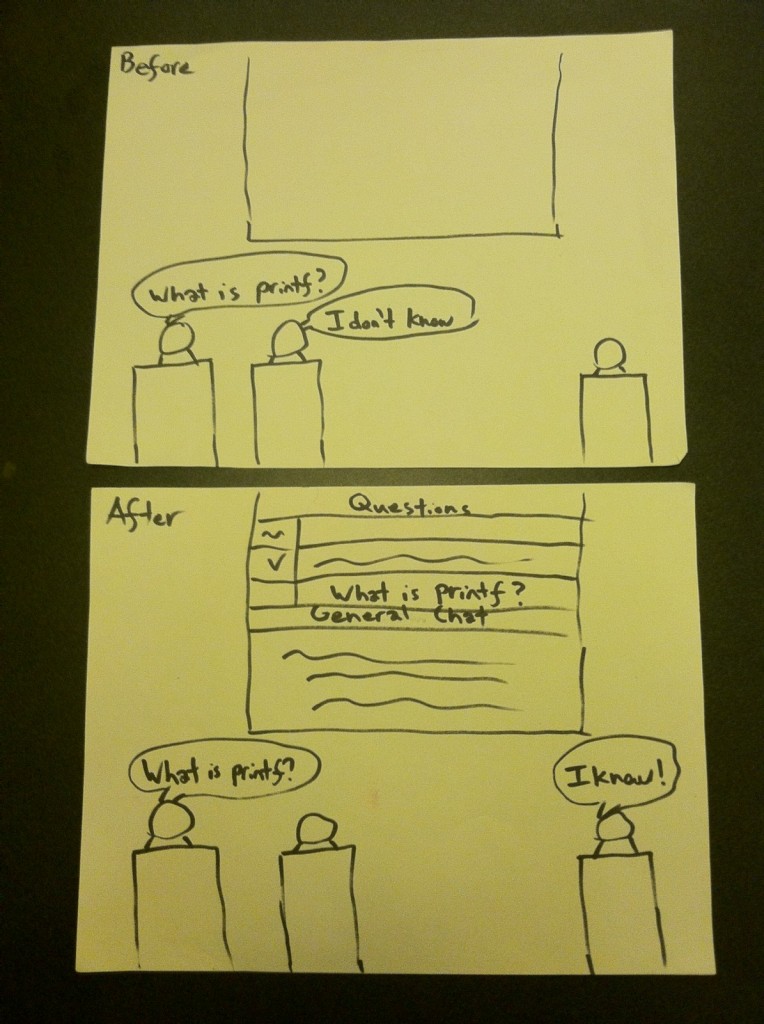
-Classroom usage of my prototype
Top Screen: classroom before my prototype is used. Student is unable to get the answer to his question. Notice projector screen displays nothing.
Bottom Screen: classroom after my prototype is used. Chat room and questions are displayed using the projector. Student is able to get the answer to his question by asking the entire class his question.
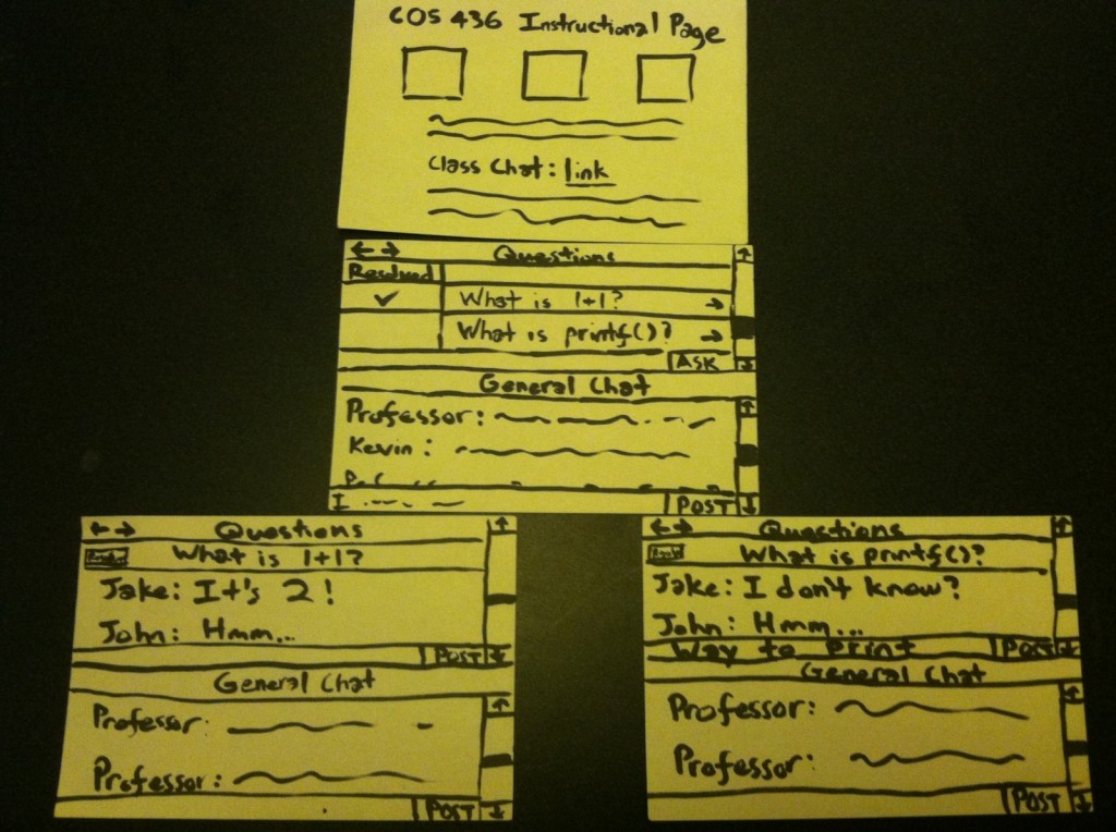
-Laptop usage of my prototype
Top Screen: anybody can use the chat room of a class by going to the instructional page and looking for the link to it.
Middle Screen: the main screen. The screen is divided into a top half and a bottom half. In the bottom half is a general chat where anyone in the class can just post at will. In the top half is a list of questions. Anyone can post a new question. Next to the questions are indicators that mark whether they are resolved or not.
Bottom Screens: resulting screens from clicking on the questions in the main screen. The top half will turn into a chat room dedicated to discussing the question that you clicked on. The asker of the question can press the “resolve” button in the top left corner (underneath the back and forward buttons) when he feels he has found a satisfactory answer. The general chat remains in the bottom half of the screen.
Sleep Helper Prototype:
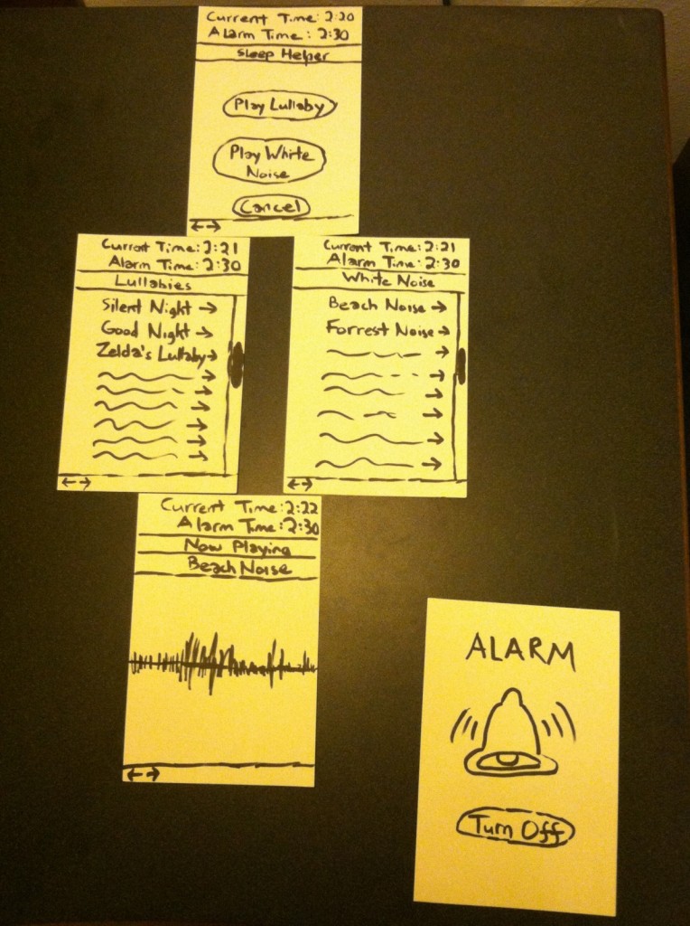
Top Screen:the main screen. When the user opens this mobile app, the app will automatically note the nearest end to a Princeton waiting time and set an alarm to go off at that time. The current time and the alarm time are both displayed at the top of the screen. The user can exit the app and cancel the alarm by pressing “cancel” button at the bottom. The user can either press “play lullaby” or “play white noise” to have the app display a list of lullabies or white noises to select.
Middle Screens:resulting screens from pressing either “play lullaby” or “play white noise” in the main screen. Displays a list of lullabies or white noises that the user can select. Current and alarm time are still displayed at top.
Bottom Screen:resulting screen from when you click on a lullaby or a white noise. The app will play the selected lullaby/white noise while showing a visualizer. The lullaby/white noise loops until alarm goes off. Current and alarm time are still displayed at top.
Bottom-Right Screen:resulting screen from when the alarm goes off. The user can turn off the alarm and exit the app by pressing the “turn off” button.
User Testing:
User Testing 1 – Brian Hwang:
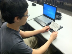
Brian Huang is initially a little confused by the layout of my interface.
Tested during Princeton waiting time. Followed the link from the instructional page. Initially confused by the main screen. First thing he said was, “what is this?” while pointing at the general chat. I then had to explain the top half was for questions and the bottom half was a general chat. He then clicked the question “What is printf?” He was a little confused again by the resulting screen. I told him that the top half was now a chat room for talking about the question, “What is printf?”, He mentioned that this design would make it hard for somebody new to enter the chat room of a resolved question and find the answer. It would also be fairly hard for the question asker to figure out what is the correct answer amongst proposed solutions.
User Testing 2 – Saswathi Natta
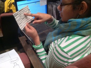
Saswathi Natta finds the navigating with my interface intuitive.
Tested during Princeton waiting time. Followed the link from the instructional page. Was also initially confused that the screen was split half into a questions section and half into a general chat. The first thing she wanted to type into General Chat was “This professor is so…”, then she stopped. She then said it will be hard to prevent students from abusing the chat rooms and misbehaving by posting nonsense or harmful words. She then considered that this probably won’t be a problem at Princeton University since all the students are upstanding citizens. She then clicked on the questions and said the rest was fine. She mentioned the navigation was intuitive and had no problems.
User Testing 3 – Reid Oda:
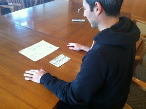
Reid Oda hanging out with the general chat. Looking at my prototype from a teaching assistant’s perspective.
Provided the view of a teaching instructor. Followed link from instructional page. He surprisingly wanted to mainly hang out in the general chat. He wanted the question and answering part of the app to be more student driven to encourage discussion. He said he would appreciate it if there were a way to see if all the students were having trouble resolving any particular question. He also mentioned it would be cool if instructors could create fake accounts and post questions to routinely poll the students’ understandings of material. He also mentioned that it will probably be essential to allow students to be anonymous to encourage free discussion. Eventually clicked on “What is printf?” question. Immediately noted that there needs to be a way to have good answers be marked.
Insight:
-There are no significant navigational problems with my interface.
-stackexchange.com mechanism of voting for an answer to a question is needed in order to allow for the correct answer to a question to be endorsed. It is also necessary for making the correct answer quickly accessible to people that have just entered the chat room.
-Some kind of filter for bad language may need to be implemented to prevent profanity. At the same time users need to have the option to post anonymously in order to encourage truly free discussion. The best way to approach this is probably to adopt piazza’s mechanism where students may be viewed as anonymous to students but not anonymous to instructors. In this manner, they can freely discuss, and there is accountability built in the case that a student misbehaves. Instructors can also post questions anonymously to poll the students’ understanding of a topic.
-There should be a mechanism to see how long a question has been unresolved for. This would then provide feedback to the teaching staff. If a question is unresolved for very long, it may reveal weaknesses in how materials are being taught. I should also have students login with their netid’s to enter the chat so only students within the class can join.
-The most common cause of confusion over my interface is the use of the top half for questions and answers and the bottom half for general chat. This should be somehow unified into a single chat room. It will, however, be hard to keep the questions from being lost in the sea of text. My next idea is, thus, to have one big chat room where there is a bot routinely reposting questions. Anyone can communicate with the bot to make a new question, view proposed answers to a question, vote for an answer to a question, and propose an answer to a question.
-More testing with my new ideas are needed.
