Team Epple Final Project – Portal

Group 16 – Epple
Andrew, Brian, Kevin, Saswathi

Project Summary:
Our project is to use Kinect to make an intuitive interface for controlling web cameras through using body orientation.

Blog post links:

P1: https://blogs.princeton.edu/humancomputerinterface/2013/02/22/p1-epple/
P2: https://blogs.princeton.edu/humancomputerinterface/2013/03/11/p2-group-epple-16/
P3: https://blogs.princeton.edu/humancomputerinterface/2013/03/29/p3-epple-group-16/
P4: https://blogs.princeton.edu/humancomputerinterface/2013/04/08/p4-epple-portal/
P5: https://blogs.princeton.edu/humancomputerinterface/2013/04/22/p5-group-16-epple/
P6: https://blogs.princeton.edu/humancomputerinterface/2013/05/06/p6-epple/

Videos and Images:

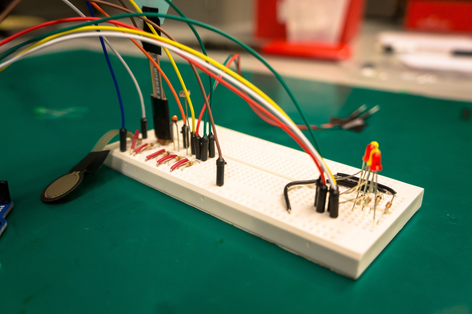
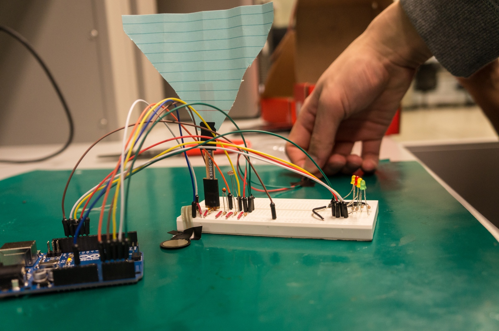
Remote webcam side of interface

Arduino controlling webcam

Team Epple with Kinect side of interface

Changes since P6:

  • Added networking code to send face tracking data from the computer attached to the Kinect to the computer attached to the Arduino/webcam. This was necessary to allow our system to work with remote webcams.
  • Mounted mobile screen on a swivel chair so that the user would not be required to hold it in front of them while changing their body orientation. This was due to comments during from P6 indicating that it was tiring and confusing to change body orientation while also moving the mobile screen into view.

Design Evolution:

Over the course of the semester, both our design and project goals have been modified. We started with an idea for a type of camera that would help us scan a public place, such as the Frist Student Center. Our initial goal was to create something where a person could remain in their room and be able to check if a person of interest was in a certain remote area without having to physically walk there. From identification of other relevant tasks, we have now modified the goal of the project to improve the web chat experience, in addition to being able to find people in a remote room. We changed this goal because we found that the one function of searching for a distant friend was too narrow and that a rotating camera could allow for completion of many other unique tasks. These tasks include having a webchat user use our product to follow a chat partner that is moving around and talk to multiple people.

On the design side, we originally envisioned that the camera would be moved by turning one’s head instead of clicking buttons. This is intended to make the interface more intuitive. The main function of turning one’s head to rotate the camera has remained the same, but through user testing, we learned that users found the act of constantly keeping a mobile screen in front of them while changing their head orientation was confusing and tiring. Most would rather have some way to automatically have the mobile screen move into view as they changed their head orientation. For this reason, we have decided to mount the mobile screen on a swivel chair so that the user can swivel to change their body orientation, to control the remote camera, while having the mobile screen constantly mounted in front of them. Also, we initially intended to implement both horizontal and vertical motion, but we decided that for the prototype, implementing only the horizontal motion would be sufficient to show a working product. This simplified our design to only needing a single motor instead of two motors attached to each other, and we also did not have to implement the vertical head motion into our code. We chose to implement only horizontal motion instead of only vertical motion because horizontal motion gives the user more of a realistic experience of how the device will be used. The user can currently use our system to swivel left or right and turn a remote camera to scan a room at a single height, allowing the user to see different people spread around the room, or moving around at the same height. Vertical motion would have restricted users to only see one person or space from top to bottom which is not as useful or representative of the product’s intended function.

Critical Evaluation:

With further iteration, our product can definitely be turned into a useful real-world system. We believe that our product serves a purpose that is currently not implemented in the mainstream web camera and video chat userspace. We know that there are some cameras that are controlled remotely through use of keys, buttons, or some sort of hand control, but we have never encountered them in the mainstream market. We also believe that our product is more intuitive, as the user simply has to turn their head to control the camera. Based on user testing, we have observed that users are able to easily master use of our product. After a small initial learning curve, users are able to accomplish tasks involving rotating a remote camera almost as easily as if they were in the remote area, in person, and turning their heads. We thus strongly believe that our product will have a user base if we choose to develop and market it further.

As a result of our design, we have learned quite a bit about this specific type of application space of detecting the movement of one’s head as well as moving a camera. We found that, in the mechanical aspect of the design, it is difficult to implement both horizontal and vertical motion for the camera. We are still trying to figure out the most effective way to combine two servo motors and a webcam into a single mechanical device. On the other hand, we found that implementing the Kinect, Processing, and Arduino code necessary in this application space was fairly straightforward, as there is an abundance of tutorials and examples for these on the internet. From evaluation, we found that computer users are very used to statically sitting in front of their computers. Changing the way they webchat to accommodate our system thus involves a small learning curve, as there is quite simply nothing similar to our system in the application space aside from the still highly-experimental Google Glass and Oculus Rift. Users are particularly not accustomed to rotating their head while keeping a mobile screen in front of their head. They instead expect that the mobile screen will automatically move on its own to be in front of their heads. One user also, for some reason, would occasionally expect that the remote camera would turn on its own, and track people on the other end without the user turning his head at all. We suspect that this may be due to the way many video game interfaces work with regards to automatic locking in first person shooters. Based on user initial reactions, we realized that if we were to market our product, we would have to work very hard to make sure users understand the intended use of the product and not see it as a breach of privacy. Users usually don’t initially see that we are trying to make an intuitive web chat experience. Instead, they suspect our system is for controlling spy cameras and invading personal spaces. A lot of what we have learned comes from user testing and interviews, so we found that the evaluation process is just as important to the development of a product, if not more important than the physical design of the product.

Future Work:

There are quite a few things that we still need to do to if we were to move forward with this project and make it into a full fledged final product. One is the implementation challenge of adding support for rotating the camera vertically, as we currently only have one motor moving the camera horizontally. Another would be to create a custom swivel chair tailored for Portal that would have a movable arm on which you could attach the mobile screen. This would keep the screen in front of the user naturally, rather than our current implementation of taping the screen onto the back of the chair. If Google Glass or Oculus Rift ever become affordable, we intend intend to explore the space of incorporating such wearable screens into Portal as a replacement to our mobile iPad screen. We could also implement 3D sound so the user actually feels like they are in a space with directional audio cues, rather than just having normal, non-directional sound coming from speakers. This would be a great addition to our custom chair design, something like a surround sound that makes the user feel transported to a different place. We might also want to implement a function that suggests the direction for the user to turn based on where a sound is coming from. We also should make the packaging for the product much more robust.

In addition, not just at the design end, we also expect that further user testing would help us evaluate how users would react to living with a moving camera in their rooms and spaces. If necessary, we could implement a function for people on the remote side to prevent camera motion if they so choose to due to reasons such as privacy concerns. Most of the suggestions on this list for future work, such as the chair, sound system, and the screen were brought to our attention through user evaluations, and our future work would definitely benefit from more user evaluations. These user evaluations would be focused on how users react to actually living with the system, what they find inconvenient, unintuitive and how to improve these aspect of the system.

.zip File:
https://dl.dropboxusercontent.com/u/801068/HCI%20final%20code.zip

Third-Party Code:

Printed Materials:
https://www.dropbox.com/s/r9337w7ycnwu01r/FinalDocumentationPics.pdf

A3: SCORE

Kevin Lee
Collin Stedman

i. Most severe problems:
-There is little consistency and high redundancy with navigation options.  Score presents you with an array of different links, tabs, dropdown menus, buttons, and expandables as navigate options.  Some two navigation options lead to the same page.  We even found a page that had two buttons that led to the same page.  Other pages are exclusively opened through a single navigation option.  Some links open pages while others open pop-ups.  The meaning of various buttons was frequently unclear, as the designers of SCORE would often fall back on such options as “OK” and “Cancel” when more expressive options were appropriate. The result is an extremely confusing experience due to violation of H4, consistency and standards, and frequent cases of nonessential, redundant features due to violation of H8, aesthetic and minimalist design.
-It is very hard to find what you want in Score.  This is because, in addition to issues with navigation options as previously mentioned, some features are often hidden or placed in very unintuitive places.  This is terrible design and a violation of H7, which calls for designing with efficiency of use in mind.  There are also frequent cases of mismatch between the users’ language and Score’s chosen vocabulary.  It, for example chooses terms such as “quintile ranking” and “BIP,” thus a violation of H2.  This problem is magnified with the lack of any useful help and documentation which is a violation of H10.  Ultimately, SCORE relies on its users to remember how to navigate through its unintuitive interface, thus violating H6.

Fixes:
-Place features in intuitive places.  It would be much easier to navigate Score if cases like GPA being in “course history” instead of “grades” did not happen.  This would improve the website based on H7, efficiency of use.
-Change the text of various buttons in SCORE to make their functionality more immediately obvious. This would improve the website based on H1, visibility of system status, as well as H4, consistency and standards.
-Warn the user that the system will automatically log out of SCORE before it does so. Include a timer which counts down to the logout. This would improve the website based on H1, visibility of system status.
-Change the interface to fill the browser screen. This change should make SCORE much easier for the user to read and navigate. This would improve the website based on H8, aesthetic and minimalist design.

ii. Problems made easier to find through Nielsen’s heuristics:
-Would not have even thought of looking for help or documentation if it was not for Nielsen’s heuristics since usually interfaces are good enough to survive without this.
-Would not have thought of looking for mismatches between user’s language and system’s language either since terms that I don’t understand seem to be an everyday occurrence. It also wouldn’t have occurred to me that button labels need to be more expressive than “OK” and “Cancel.”
-Would not have occurred to me to critique the website for its lack of minimalist design. I see confusing interfaces all the time, but I am taught to justify their complicated nature by expecting that it is an unavoidable side-effect of complicated functionality. For example, people who use GIMP likely ignore the poor interface because they know that GIMP is very powerful and rich in features.

iii. Problems that are not included in Nielsen’s heuristics:
-Availability is an important system heuristic that Nielson does not cover.  Score is not available from 2AM to 7AM and often has certain pages returning a “This page is no longer available” message.  Log in problems are also notoriously common with Score.

iv. Discussion Questions:
-Can somebody make the perfect interface just by following these Nielsen’s heuristics, or is there something else that is important?
-What is the priority ranking of each of Nielsen’s heuristics?
-What would Nielsen make of systems and interfaces which intentionally hide expert-level features and implementation details from the user? Think of command-line tools for databases with GUIs.

Exam Questions:
-Provide an example violation of a heuristic and ask the student to categorize the violation.
-Give three suggestions for how to improve the interface seen below.

PDF’s:
Kevin:
http://dl.dropbox.com/u/801068/Kevin%20A3.pdf
Collin:
http://dl.dropbox.com/u/52417178/Collin%20Stedman%20A3.pdf

Lab1 – Weather Detector

COS436 – Lab 1 Blog

COS436 – Human computer Interface

Lab 1 – Resistance is Not Futile Blog

Kevin Lee, Saswathi Natta, Andrew S. Boik, Brian W. Huang

Group Number 16

Description:

We built a weather detector using various sensors to detect different weather conditions. We use a flex sensor for detecting wind as it blows on it, an FSR for detecting hail as it hits it, a photocell for detecting sunlight, a Variable You-sistor for detecting rain when electricity is conducted between the two bare ends of the jumper wires through water on the ground, and a thermistor for detecting temperature. The temperature is printed to the screen, while the other sensors have LEDs that correspond to them. The LED will turn on if the corresponding sensor reads a value that exceeds a threshold, in which case, the appropriate weather condition has been detected. We selected this project because we believe each sensor naturally has a corresponding component of weather that it is suited for detecting, and being able to detect weather conditions is a very useful, practical application of the tools provided in this lab.  In our opinion, the project was largely a success. We liked how our light sensor, flex sensor, photocell, and themistor all detect their weather components accurately. We however think that our FSR is not well suited as a hail sensor. This is because it seems to require a fair bit of weight to be on top of it to register any significant readings, so it is uncertain whether ice will be detected on top of it.. Realistically, the FSR would also probably break if hail were to fall directly on top of it. Had we had time, we also would have designed a container for our device so that the device doesn’t become damaged under intense weather conditions.

Sketches of Early Ideas

A weather detector that detects various weather conditions.

A weather detector that detects various weather conditions.

A primitive instrument with continuously changing pitch and volume.

A primitive instrument with continuously changing pitch and volume.

A version of the bop-it game.

A version of the bop-it game.

Storyboard for Weather Detector:

Storyboard for weather detector.

Storyboard for weather detector.

Final System – Weather Detector:

Our weather detector with design sketch in view.

Our weather detector with design sketch in view.

Close up view of our weather detector.

Close up view of our weather detector.

Photo of our weather detector with sail for wind detection in view.

Photo of our weather detector with sail for wind detection in view.

List of parts:

– Arduino

– 4 LEDs

– 9 10k Resistors

– FSR

– Flex Sensor

– Thermistor

– Photocell

– Cardboard and paper

– Jumper wires

Instructions:

1. Setup LEDs and sensors

-Place the long end of each of the 4 LEDs to the chosen Arduino digital output pin and the shorter end to ground through 10k resistor

-Setup FSR, Flex sensor, Thermistor, Photocell, and Variable You-sistor (two jumper wires). All sensors are wired with a voltage divider, using 10k resistor to ground, between one pin connected to 5V power and the other pin connected to an Arduino analog input pin to detect the resistance. Each sensor gets its own analog input. Tape cardboard to the base of the flex sensor for flexibility and a paper sail to the top of it to make it sensitive to wind.

2. Test baseline for sensors and adjust thresholds as necessary

-Once the sensors are connected, with the proper (~10K) voltage divider connected to power on one pin and the other pin connected to the Arduino, the Arduino software will display it’s reading of the input. For each sensor, test it with appropriate weather conditions to see how the readings change to determine appropriate thresholds.

-FSR, Flex sensor, Photocell, and Variable You-sistor all have corresponding LEDs that will turn on when threshold is passed. FSR LED signifies hail, flex sensor LED signifies wind, photocell LED signifies sunlight, and Variable You-sistor LED signifies rain.

Code:

/* Weather sensor for L2
 * Lab Group 16 (old 21):
 * Andrew Boik (aboik@)
 * Brian Huang (bwhuang@)
 * Kevin Lee (kevinlee@)
 * Saswathi Natta (snatta@)
 */

// pin inputs
int thermistor_pin = A0;
int flex_pin = A1;
int photo_pin = A2;
int fsr_pin = A3;
int wet_pin = A4;

// led outputs
int wind_led = 13;
int sunny_led = 12;
int hail_led = 11;
int rain_led = 10;

// thresholds for led light-up
int wind_thresh = 300;
int sunny_thresh = 800;
int hail_thresh = 10;
int rain_thresh = 10;

// led max brightness
int led_max_val = 255;
// led min brightness
int led_min_val = 0;
// delay time
int delay_time = 500;

// timeouts for hail/rain and time since last event
unsigned long hail_timeout = 5000;
unsigned long rain_timeout = 5000;
unsigned long time_since_last_rain;
unsigned long time_since_last_hail;

void setup(void) {

 time_since_last_rain = rain_timeout;
 time_since_last_hail = hail_timeout;

 Serial.begin(9600); 
 pinMode(wind_led, OUTPUT);
 pinMode(sunny_led, OUTPUT);
 pinMode(hail_led, OUTPUT);
 pinMode(rain_led, OUTPUT);
}

void loop(void) {

  // get readings
 int temperature = analogRead(thermistor_pin);
 double true_temp = (temperature - 345.684) / 5.878;
 int wind = analogRead(flex_pin);
 int sunny = analogRead(photo_pin);
 int hail = analogRead(fsr_pin);
 int rain = analogRead(wet_pin);

// print out vals from sensors
 Serial.print("Temperature = ");
 Serial.println(true_temp);
 Serial.print("Wind = ");
 Serial.println(wind);
 Serial.print("Sunny = ");
 Serial.println(sunny);
 Serial.print("Hail reading = ");
 Serial.println(hail);
 Serial.print("Rain reading = ");
 Serial.println(rain);
 Serial.println();

 // led light-up
 if (wind > wind_thresh)
   digitalWrite(wind_led, led_max_val);
 else
   digitalWrite(wind_led, led_min_val);
 if (sunny > sunny_thresh)
   digitalWrite(sunny_led, led_max_val);
 else
   digitalWrite(sunny_led, led_min_val);
 if (hail > hail_thresh) {
   time_since_last_hail = 0;
   analogWrite(hail_led, 255);
 }
 else if (time_since_last_hail < hail_timeout) {    Serial.print("time_since_last_hail = ");    Serial.println(time_since_last_hail);    time_since_last_hail += delay_time;    analogWrite(hail_led, 255);  }  else {    time_since_last_hail += delay_time;    analogWrite(hail_led, 0);  }  if (rain > rain_thresh) {
   time_since_last_rain = 0;
   analogWrite(rain_led, 255);
 }
 else if (time_since_last_rain < rain_timeout) {
   Serial.print("time_since_last_rain = ");
   Serial.println(time_since_last_rain);
   Serial.println();
   time_since_last_rain += delay_time;
   analogWrite(rain_led, 255);
 }
 else {
   time_since_last_rain += delay_time;
   analogWrite(rain_led, 0);
 }

 delay(delay_time);
}

A2 Kevin Lee

Observations:
Observation 1:

I observed Emily Rogers, a student of COS 126, in the waiting period right before COS 126 class.
-She spent the 10 minutes working on her homework assignment using her laptop.
-She asked her nearby friend for help with answering questions.
-Her friend gave what seems to have been an unsatisfactory answer on one of the questions.
-She then looked through previous lecture slides and google.
-I later confirmed that she was confused about what a library function of StdDraw did in Java.
-I asked why she didn’t post on piazza. She said she didn’t think her question was important enough to make an entire post about.
-Opportunities for improvement:
An interface through which students can ask questions without feeling guilty about bothering anyone. Something less formal than piazza.
An interface through which students can interact with all the students in the class, not just the ones they are sitting next to.
An interface that makes it easier to search past lecture slides for specific information.

Observation 2:
I observed Professor Douglas Clark, lecturer of COS 126, in the waiting period right before COS 126 class.
-He literally sat in a chair and drank water from a water bottle for 10 minutes.
-No interaction with the rest of the class.
-Classroom projector is unutilized aside from displaying the first slide of his lecture.
-Opportunities for improvement:
Huge opportunity to create an interface to get the professor engaged with the rest of the students. Perhaps a chat room or game – a way for the professor to answer questions, interacting, or supplying information that he thinks is interesting.

Observation 3:
I observered Sachin Ravi who is preceptor of COS 423 in the waiting period right before COS 423 precept.
-He spent the first four minutes preparing the blackboard by writing out problems and drawing diagrams.
-He spent the remaining six minutes looking at the COS 423 textbook.
-I later confirmed with him that when he was looking at the textbook, he was reviewing the material that he was about to teach.
-No interaction with the rest of the class
-Opportunities for improvement:
Interface to make preparing the classroom easier
Application to help review materials quickly
Application to help get preceptors get engaged with the rest of the class

Brainstormed Ideas:
1. “Previously On…” app that supplies the key points of last lecture’s material.
2. “Textbook Sparknotes” app that summarizes textbook information for students who didn’t do the required reading yet.
3. Sleep helper mobile app that plays lullabies or white noise to help you sleep and rings an alarm when class starts.
4. Class-wide online multiplayer game to help students get to know each other.
5. Free food app that provides listings of free food on campus in case one wants a quick bite.
6. Class-wide jukebox where students submit and vote on songs to be played in the classroom.
7. Practice Test mobile app game where students are drilled with previous test questions.
8. “Why am I learning this?” app where professor posts some real-world applications of lecture material.
9. Class-wide piazza style chat room for posting questions in and general chat; displayed on projector as well.
10. School-wide gossip feed for enhancing sense of student community.
11. Mobile app that finds where your friends are on campus so you can walk to class with them.
12. School-wide feed where club advertisements and activities are posted to attract participants or new members.
13. Map of campus mobile app that provides the best route to the classroom destination and estimated time to get there.
14. Class-wide penpal app that matches you up with a free student so that you can chat with each other.
15. News headline gathering app that learns what news you are interested in and gathers the latest headlines suited for you.

Selected Ideas:
1. I chose the class-wide piazza style chat room because it has appeal to students, TA’s, and professors in enhancing class community and also makes good use of the classroom projector which is often unutilized in the waiting time.
2. I also chose the sleep helper app because it is personally the one I would find most useful, as I am sleep deprived on weekdays and would love a refreshing 10 minute nap before lectures but cannot fall asleep when people are talking all around me.

Prototypes:
Chat Room Prototype:
IMG_0856
-Classroom usage of my prototype
Top Screen: classroom before my prototype is used. Student is unable to get the answer to his question. Notice projector screen displays nothing.
Bottom Screen: classroom after my prototype is used. Chat room and questions are displayed using the projector. Student is able to get the answer to his question by asking the entire class his question.

IMG_0847
-Laptop usage of my prototype
Top Screen: anybody can use the chat room of a class by going to the instructional page and looking for the link to it.
Middle Screen: the main screen. The screen is divided into a top half and a bottom half. In the bottom half is a general chat where anyone in the class can just post at will. In the top half is a list of questions. Anyone can post a new question. Next to the questions are indicators that mark whether they are resolved or not.
Bottom Screens: resulting screens from clicking on the questions in the main screen. The top half will turn into a chat room dedicated to discussing the question that you clicked on. The asker of the question can press the “resolve” button in the top left corner (underneath the back and forward buttons) when he feels he has found a satisfactory answer. The general chat remains in the bottom half of the screen.

Sleep Helper Prototype:
IMG_0853
Top Screen:the main screen. When the user opens this mobile app, the app will automatically note the nearest end to a Princeton waiting time and set an alarm to go off at that time. The current time and the alarm time are both displayed at the top of the screen. The user can exit the app and cancel the alarm by pressing “cancel” button at the bottom. The user can either press “play lullaby” or “play white noise” to have the app display a list of lullabies or white noises to select.
Middle Screens:resulting screens from pressing either “play lullaby” or “play white noise” in the main screen. Displays a list of lullabies or white noises that the user can select. Current and alarm time are still displayed at top.
Bottom Screen:resulting screen from when you click on a lullaby or a white noise. The app will play the selected lullaby/white noise while showing a visualizer. The lullaby/white noise loops until alarm goes off. Current and alarm time are still displayed at top.
Bottom-Right Screen:resulting screen from when the alarm goes off. The user can turn off the alarm and exit the app by pressing the “turn off” button.

User Testing:
User Testing 1 – Brian Hwang:

IMG_0846
Brian Huang is initially a little confused by the layout of my interface.

Tested during Princeton waiting time. Followed the link from the instructional page. Initially confused by the main screen. First thing he said was, “what is this?” while pointing at the general chat. I then had to explain the top half was for questions and the bottom half was a general chat. He then clicked the question “What is printf?” He was a little confused again by the resulting screen. I told him that the top half was now a chat room for talking about the question, “What is printf?”, He mentioned that this design would make it hard for somebody new to enter the chat room of a resolved question and find the answer. It would also be fairly hard for the question asker to figure out what is the correct answer amongst proposed solutions.

User Testing 2 – Saswathi Natta
IMG_0844
Saswathi Natta finds the navigating with my interface intuitive.

Tested during Princeton waiting time. Followed the link from the instructional page. Was also initially confused that the screen was split half into a questions section and half into a general chat. The first thing she wanted to type into General Chat was “This professor is so…”, then she stopped. She then said it will be hard to prevent students from abusing the chat rooms and misbehaving by posting nonsense or harmful words. She then considered that this probably won’t be a problem at Princeton University since all the students are upstanding citizens. She then clicked on the questions and said the rest was fine. She mentioned the navigation was intuitive and had no problems.

User Testing 3 – Reid Oda:
IMG_0841
Reid Oda hanging out with the general chat. Looking at my prototype from a teaching assistant’s perspective.

Provided the view of a teaching instructor. Followed link from instructional page. He surprisingly wanted to mainly hang out in the general chat. He wanted the question and answering part of the app to be more student driven to encourage discussion. He said he would appreciate it if there were a way to see if all the students were having trouble resolving any particular question. He also mentioned it would be cool if instructors could create fake accounts and post questions to routinely poll the students’ understandings of material. He also mentioned that it will probably be essential to allow students to be anonymous to encourage free discussion. Eventually clicked on “What is printf?” question. Immediately noted that there needs to be a way to have good answers be marked.

Insight:
-There are no significant navigational problems with my interface.
-stackexchange.com mechanism of voting for an answer to a question is needed in order to allow for the correct answer to a question to be endorsed. It is also necessary for making the correct answer quickly accessible to people that have just entered the chat room.
-Some kind of filter for bad language may need to be implemented to prevent profanity. At the same time users need to have the option to post anonymously in order to encourage truly free discussion. The best way to approach this is probably to adopt piazza’s mechanism where students may be viewed as anonymous to students but not anonymous to instructors. In this manner, they can freely discuss, and there is accountability built in the case that a student misbehaves. Instructors can also post questions anonymously to poll the students’ understanding of a topic.
-There should be a mechanism to see how long a question has been unresolved for. This would then provide feedback to the teaching staff. If a question is unresolved for very long, it may reveal weaknesses in how materials are being taught. I should also have students login with their netid’s to enter the chat so only students within the class can join.
-The most common cause of confusion over my interface is the use of the top half for questions and answers and the bottom half for general chat. This should be somehow unified into a single chat room. It will, however, be hard to keep the questions from being lost in the sea of text. My next idea is, thus, to have one big chat room where there is a bot routinely reposting questions. Anyone can communicate with the bot to make a new question, view proposed answers to a question, vote for an answer to a question, and propose an answer to a question.
-More testing with my new ideas are needed.