Observation
For my observations, I used several locations and several different classes. I think that it was important to observe different types of students, as it is possible that their habits might vary, especially between sciences and humanities students. Here is what I observed:
- Before SOC 242 – McCosh 46 – One girl was entering events from her laptop into her phone. I think it was into Google calendar, though I couldn’t be certain. She caught me looking at her phone, so I had to be less obvious and get more of a sweeping view of the room. I saw another student (male) just finish up the header for his notes today and begin playing with his phone. He was behind me so I couldn’t see what he was doing, though I am assuming it wasn’t work (he didn’t look terribly focused on it).
- Before CLA 216 – McCosh 28 – I observed two students sitting and talking to each other. Both were holding cups of coffee (Small World) and had their notebooks out. Each notebook had been titled for the day’s notes.
- Before COS 226 (Precept) – McCosh 62 – I saw one guy just sitting and staring aimlessly with his notebook out. He looked prepared for class, but did not appear to have anything to do. Another student (male) was reading a webcomic on his laptop and definitely seemed engaged in it. I saw an open Word document on his taskbar, which I thought might be his notes for the class. This was confirmed when he switched to it when the teacher came in and went to the front of the class.
- When late for one of my own classes (I was biking), I passed another student biking along at high speeds in the opposite direction. I assume that he was also late. It was then that I began thinking about how much more dangerous biking became when you were in a hurry.
Brainstorming
I did most of my brainstorming on my own. However, thanks go to Deanna Zhu and Zak Yaffe for help with some of the ideas. They were working (on other assignments) when I was doing this, but provided some ideas when I prompted them with questions about what they would like to do between class. Here are the ideas I came up with:
- A free daily song download for students on campus to listen to and talk about
- App for students to sign-in to at lecture that matches them with somebody random to talk to
- A Princeton trivia game that you can accumulate points in for prizes
- An app that calculates your position and how long it will take to get to the next class
- An auto-header for notes – maybe some kind of label maker
- A collapsible clip-on warming holder for coffee cups on those tiny McCosh desks via USB
- Princeton-themed coloring sheets + crayons in classrooms – students upload designs
- Add-on to the P-meals app that allows you to check-in where/when you are going to a meal
- A four-square type app for areas around campus
- A Sporcle app for important terms in a class. You enter them, then it quizzes you before class.
- A collaborative game that people play against others in class w/ results on a projector
- A quick exercise program app, core exercises, push-ups – target muscles without sweating
- In the vein of the above – a stretching routine/yoga app customized for short durations < 5 minutes
- An app that automated your laptop routine for class – turn off wifi, open preferred note app, etc.
- A thesis research app – limits survey length to ~5 minutes, makes it easy to do between classes
- For teachers – an app that identifies students when they come in the classroom
Chosen Ideas
I really like the Sporcle app idea (10) because it will help students learn key terms for their class with quick, repeated memorization, while taking a minimum amount of otherwise wasted time.
I also like the Sign-in app (2) because it will connect students and encourage them to talk before class starts and can help people (especially freshmen) make new friends.
Prototypes
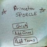
I first prototyped the Princeton Sporcle App. Basically, it allowed you to set up classes and fill them with a list of terms, which you could then be quizzed on. Below is a picture of the first version.
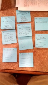
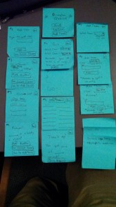
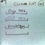
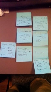
This is an overview of the app layout. The main screen is at the top with three rows that are the three paths through the app.
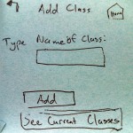
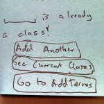
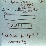
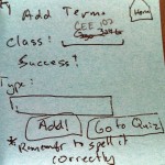
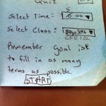
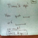
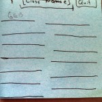
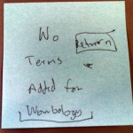
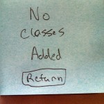
I used post-it notes so that I could stick them to a phone screen for the demos. After my first two demos with this one, I had some time so I added a few of the features that the my first two users requested, as well as some error screens to account for situations that I hadn’t thought of at first. First is the enhanced layout, then a gallery of the different individual screens:
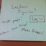
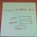
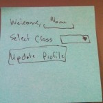
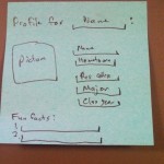
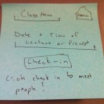
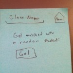
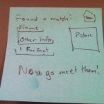
Here is my other prototype. This is of the sign-in and meet other people in your class app.
Here are the close-ups of the screens:
Demo Responses
I first tried out my application on Deanna Zhu ’15, who is undecided, but on the pre-med track. She was able to use it, with some prompting from me as well as some delays as I filled in some information that she “entered”. Deanna questioned the point of the application. Essentially, she didn’t think it would be all that useful for students to just memorize lists of terms for a class. She would prefer to use an app (like the many already out there) that would utilize do-it-yourself flashcards. When I asked for criticism directed at the user interface and layout, Deanna provided some very helpful feedback. A list of problems and possibilities:
- No home button
- “Type Name:” – should say something more descriptive
- Could possibly link it to blackboard – allow students to share lists and terms
- Create sub-topics for the various classes
- Show a timer on the quiz function
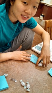
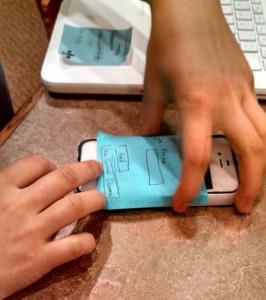
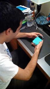
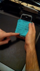
Some pictures of her using the app:
My next user was Kevin Zhang ’15, who undecided, but considering a COS certificate. He was very enthusiastic about using the app, patiently waiting as I added text to some of the screens based on his input and working through the somewhat cumbersome navigation my app had. I saw even more need for the home button that Deanna suggested in my first demo. When prompted for feedback, he said he liked the simple, clean interface that it was currently laid out in. There was nothing to distract the user, even though some things were a bit ambiguous or confusing. He appreciated the ease of set-up and how it didn’t require much of a time investment to have a list ready to be quizzed on. This contrasted a bit with Deanna who thought that it was too simple and didn’t do enough, which would increase the time investment necessary to begin using it. His suggestions included:
- A home button
- More navigation buttons – one to take you from the Add Class page to the Add Terms page and one to take you from the Add Terms page to the Quiz setup page.
- A finish button for the Quiz page
My final user was Zak Yaffe ’15, who was a chemistry pre-med student. He also was enthusiastic about testing the app, even though he had studying to do. He seemed to have the easiest time using the app, probably because of the improvements I made to it after the last demo. His most important suggestion was to make a database of everyone’s lists, which would allow everyone to immediately begin using it. In this scenario he would like to be able to rate lists and find them by navigating through categories – like “Sciences” or “Chemistry”. Zak’s overall impression was that he would use it if there were lists available to download, but he was not sure how much he would use it if he had to make the lists himself. He also suggested the following:
- Suggested that the Word Added Success screen include the word that you added
- The “Time” selector needs to be more clearly marked as a timer for the quiz
- Also thought sub-classes would be a good idea
Insights
I learned a lot by having other users try out my app. One of the biggest problems my first two users had was navigating through the screens. I improved this with my enhanced version by adding a home button and the “Add Terms” and “Start Quiz” buttons to the relevant screens. Another important problem I didn’t think about was how clear (or unclear!) the titles and instructions for various functions were. Some were less than ideal and would need to be improved greatly for my next version of this product. I also learned that not everyone will like your idea or will think that it is useful. Deanna’s very critical feedback made me reconsider how usable or influential this app would be on studying habits. I would now think that it would be important to add a definition feature, so you could remind yourself of what particular terms mean when you forget the definition, but not the term. Zak’s idea for making a larger database with user-uploaded content seemed to have a lot of potential and I would definitely try to make that happen for my next version. Overall, I believe that this app has potential and would not be terribly difficult to implement successfully.

