P6 – Group 12 – Do You Even Lift?

a. Your group number and name.

Group Number: 12

Group Name: Do You Even Lift?

b. First names of everyone in your group.

Adam, Andrew, Matt, Peter.

c. A 1-sentence project summary.

Our project is a Kinect based system that watches people lift weights and gives instructional feedback to help people lift more safely and effectively.

d. Introduction

We have designed a Kinect-based virtual lifting coach. The system has a “TeachMe” mode, where it provides step-by-step instruction in how to perform a lift with proper technique, along with real time feedback on the user’s form. It also has a “JustLift” mode, where more experienced users can quickly begin a lifting session, taking advantage of the Kinect to track their reps and evaluate their form. Information about the set is tracked for each user. We will run a series of three experiments, with one experiment to evaluate each of the above tasks. To test TeachMe, we will have users perform squats before and after using the TeachMe feature, and e evaluate the form of their squats before and after. The purpose of the TeachMe functionality is to quickly improve a user’s form, so we will expect to see an improvement in their form after TeachMe. To evaluate the JustLift functionality, we will have the users perform a quick lift session. The primary feature of JustLift is how quickly a user is able to begin a lifting session. A secondary feature is seamless, unobtrusive feedback. To evaluate these, we will time how long it takes the user to begin a JustLift, then assess the quality of JustLift’s feedback using a post-hoc usability survey. Finally, to evaluate the session tracker, we will provide users with a “fake” dataset and ask them to perform specific tasks, then assess the functionality using a post-hoc usability survey.

e. Implementation and Improvements

Link to p5: https://blogs.princeton.edu/humancomputerinterface/2013/04/22/do-you-even-lift-p5/

  • Created a graph view for data on the “My Progress” Section of the application

  • Created a place for users to input login information

  • Write user data to logs after each set of exercises in “Just Lift”

  • Added voice commands to progress through the “TeachMe” section

f. Method 

i. Participants:

We selected three participants, with a variety of experience and backgrounds. We tried to find users who had had different types of instruction previously, as well as both male and female users. We also selected users from different majors, (Psychology, English, and Computer Science) to cover a wide range of technical experience. All users were in the same age range, as we selected users from the pool of college students around us. If we had had more participants in the study, we would have selected participants from broader range of ages, as well as those who had never lifted before.
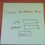
ii. Apparatus: 

We used a Kinect for Windows, driven an HP Pavillion dv6000 laptop. We conducted the test in an empty room at Terrace, to maximize convenience for our selected participants.

iii. Tasks:

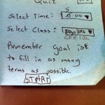
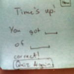
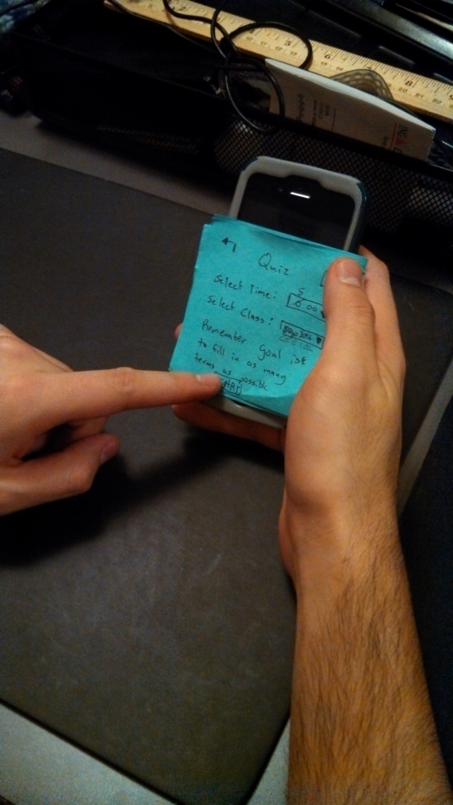
Our first task is to provide users with feedback on their lifting technique. In the current iteration, this functionality comprised the “Just Lift” mode for the back squat. Here, the user performs a set of exercises and the system will give them feedback about their performance on each repetition.

Our second task is to create a guided tutorial for new lifters. In this prototype, we implemented this in the “Teach Me” mode for the back squat. Here, the system takes the user through each step of the exercise  The user demonstrated is required to perform each step correctly before they are able to learn the next one.

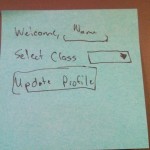
Our third task is to track users between sessions  Our system stores data and feedback from the user’s lifts and allows them to view their data in the “My Progress” page. We created a fake data set to use while testing with users, as they will not have the opportunity to generate their own data for multiple workouts over the course of several days.

iv. Procedure

We first asked the user to perform several squats to establish a baseline for comparison. Next, we asked the user to navigate through the “Teach Me” progression and then perform three more back squats (again without the Kinect).Next, we had the user leverage the “Just Lift” section of the application by performing three sets of three squats each, and then use the interface to learn about flaws in their form.Lastly, the user used the “My Progress” section of the application to answer questions about past performance using a set of pre-fabricated data. These questions were in the form of “How much weight did you lift on the first set?” and “What advice was recommended for rep X of set Y?”

g. Test Measures

  • Teach me

    • We asked the user to perform three squats before and after completing the “TeachMe” component. We noted problems in the users technique before using the system, then looked to see if the problems were still present after instruction

      • The primary function of the “TeachMe” page is to teach users how to correctly do a squat, including fixing pre-existing problems with their form. If our system is successful in teaching them how to do a squat and fixing problems with their form, we shouldn’t observe these problems after they have used “TeachMe”

    • We recorded the time it took for the user to navigate through the “Teach Me” progression.

      • The time it took will give insight into how easy it was for the user.

  • Just Lift

    • We asked the user survey questions related to how useful the data from “Just Lift” was and how easy it was to access.

      • We measured this because we wanted to better understand if the user thought the system met its goals of providing useful, easy to understand lifting feedback.

    • We asked the user to complete a variety of tasks, which encompassed many of the most common features a real user of the system might use. We noted mistakes that they made, as well as tasks that the user found difficult

      • We designed the tasks to cover many common real world use cases. If users had problems with these tasks in the study, it’s likely that users would have difficulty with them in the real world.

  • My Progress

    • We asked the user survey questions related to how easy it was to accomplish tasks related to data retrieval and how useful the data was.

      • Easy of use and usefulness of data are two of the most important metrics for evaluating this section of the interface

    • We recorded the time it took for the user to look up data.

      • The time it took will give insight into how easy it was for the user.

    • We asked the user to complete a variety of tasks, which encompassed many of the most common features a real user of the system might use. We noted mistakes that they made, as well as tasks that the user found difficult

      • We designed the tasks to cover many common real world use cases. If users had problems with these tasks in the study, it’s likely that users

h. Results and Discussion

Survey Results*

Format: Value – (Mean, Std Dev)

Age – (21.666, 0.577)

Ease of Feedback Navigation – (3.666, 1.52)

Usefulness of Feedback – (4, 1)

Helpfulness of feedback – (4, 0)

Likelihood of Use – (4.3333, 0.577)

Usefulness of Data Tracking –  (3.666, 0.577)

Ease of Data Tracking Navigation – (4.555, 0.577)

* Note these numbers came from a sample size of three, and thus cannot be taken with any statistical significance

In our first test, the user performed 3 squats and had good form. During the “Teach Me“ progression, he encountered some bugs with the voice control but was able to get through and finish the tutorial. When he performed several squats after the “Teach Me” progression, he said “Shoulder width apart, knees out, hips back” before squatting, an indication that our system had made an impression even on an experienced lifter. In the “Just Lift” test, the user was not sure how to end a set (this is done by walking out of the Kinect frame). In the “My Progress” page, he did not realize that we could display advice about a repetition by clicking the colored tabs.

In our second test, when the user performed his 3 initial squats, his knees were very close together. During the “Teach Me” he said, “my knees are too close together, that’s interesting.” In his squats after the “Teach Me” progression, his knees were wider. This was exciting to see, as he had taken advice from our system and adjusted his form accordingly. Unlike our previous user, this user, clicked the colored tabs right away to show his advice/feedback in the “My Progress” page.

In our third test, our user had average knee depth and narrow knee width. Her movement was a bit restricted by jeans so she had difficulty achieving our system’s standards. Likewise, she questioned whether our advice concerning knee depth aligned with correct squat form. In her squats after the “Teach Me” progression, her knee depth was adequate and knee width was a bit wider than previously but still narrow. In the other 2 tests, “Just Lift” and “My Progress”she navigated through the tasks more quickly than the other 2 users.

Mean completion times:

Teach me – 3:40

Just Lift – 2:50

My Progress – 1:40

It was interesting watching users actually interact with our system. Certain aspects of it that we took for granted, such as how to make different sets or examine progress, were less intuitive than we hoped with one of the users. On the other hand, we had a user who flew through the menus and pages and had no trouble with the system. There are certainly improvements that we can make that would allow all users to have that same quick and easy interaction with the prototype. Based on these results and our observations, several changes are necessary. The “Teach Me” page needs some more work to make the audio cues for moving to the next step less obtrusive. We will add a page before “Just Lift” that is displayed to users who are not logged in, that will display basic instructions to the user (such as a reminder that sets are ended by walking out of the frame). We would also like to make the colored tabs on the “Just Lift” and “My Progress” page appear more interactive. Having a tips screen before the just lift page will also help alleviate these pain points. We will also improve the graphing on the Progress Page to include labels on the x-axis, as it wasn’t immediately evident to one user what they the bars represented.

i. Appendices

i. Provide all things you read or handed to the participant: consent form, demographic questionnaire, demo script, post-task questionnaire and/or interview script.

Link to Demograpic Questionaire/Post-task Questionaire : https://docs.google.com/forms/d/1xZzlkckqPsCYrMtvMhjsGpaRMbEu6Q7DTgcpefDYKLE/viewform

Link to consent form: https://www.dropbox.com/s/v7c78zbzqvk1rrk/Do%20you%20even%20lift%20–%20consent%20form.doc

Link to script: http://pastebin.com/WATL9pAV

ii. Also provide raw data (i.e., your merged critical incident logs, questionnaire responses, etc.)

Link to raw data (user notes): https://www.dropbox.com/s/n7rvhj2ccxq9i7h/HCI%20-%20P6%20-%20Group%2012%20-%20User%20observations.docx

Link to Demographic Questionnaire/Post-task Questionnaire Results :

https://docs.google.com/spreadsheet/ccc?key=0AlxVnbTYC5OJdDdIRmFLRDF3dTFuLXZmcmpXcERPY1E#gid=0

P4 – Do You Even Lift?

Group Number and Name: Group 12 – Do You Even Lift?

First names:  Adam, Matt, Peter, Andrew

Project Summary

Our project is a Kinect based system that monitors people as they lift weights and gives feedback about their technique to help them safely and effectively build fitness and good health.

Description of the Test Method

We first verbally explained the task, along with associated risks and benefits, to the users. We then presented them with the written consent form, a copy of which can be found here. Finally, we asked if the users if they had any remaining questions, and answered any they had.

Of our three participants, two were experienced lifters and one was an inexperienced lifter. We knew each of the three subjects, and picked them because they had a variety of weight-lifting experience.We tested the system with two male and one female user, again to test our system on the widest range of subject types.

We used a dorm common room to conduct the testing, after being ejected from Dillon by a staff member. Since we didn’t have a rack and bar to use, a Swiffer handle substituted for demonstration purposes. This had the benefit of reducing the risk of injury, while still allowing us to effectively test the prototype.The Kinect was placed 6 feet in front of the user, with the user facing towards it for the duration of the sets. After performing the first two tasks, which both involved lifting, the user sat a table and used our lo-fi paper prototype to complete our third task: tracking progress via the web

For our testing procedure, we will first test the full guided tutorial (task 3), then the “quick lift” mode (task 2), and then the web interface (task 1) with each user. This sequence makes sense because the user will first learn the lift, then do the lift on their own, and then view their data from that lift. All the group members were present to observe the testing. One member controlled the visual feedback being presented to the tester, including changing the pages of the paper prototype to reflect the user’s actions. A second group member was responsible for monitoring the environment for possible safety hazards. A third provided audio feedback about the lift, including things the subject performed well, and things they did incorrectly, The fourth member was responsible for recording the trial and taking notes.

Link to Script.

Results

We received a variety of feedback from our users. Overall, most seemed happy with the interface. Comments ranged from “very intuitive” to “clean design.” More importantly, by watching the users interact with the prototype, we were able to identify areas where different parts of our design were unclear. For example, the button we had labelled “What is this?” was unclear to all three of our testers – it was unclear whether the antecedent of “this” is the system or the specific exercise that the user selected. Our second tester had especially useful comments. He pointed out that “Quick Lift” sounds like it’s secondary to some more full-featured lift mode, which isn’t present. After accounting for his feedback, we will change it to “Just Lift”. These two examples highlighted an overall design concern: when attempting to design a “slick”, minimalist interface, it’s important to choose your words very carefully.

We also received useful feedback about Task 3. Many of our users expressed the desire for a hybrid between the lifting tutorial and the kinect coaching. One user suggested he would like to perform each step of the lift while the Kinect watches, providing feedback along the way. At the end, he would connect it all together, and the Kinect would either “pass” or “fail” him.

Discussion

We initially were not expecting to get too much helpful information out of the the user testing, but we actually got a lot of feedback that will inform the direction of our higher-fidelity prototype. The biggest area for improvement seems to be the tutorial mode in task 3. Our testing has given us some fresh ideas about how to best convey the information to the user. Specifically, we envision a new approach where we break the lift down into steps, teach the user each step and have him/her perform the step individually, then have him/her bring it all together until the form is satisfactory.

Further Testing

We would like to design a second iteration of task 3, incorporating the user’s suggestion to create a “virtual coach” to aid with training. We will design a new prototype to incorporate these changes. Many of these changes will enacted through the addition of audio cues. After the prototype is complete, we will test the prototype with a new set of users. We will analyze whether they were able to learn the lift more quickly than the first users, as well as if they made fewer mistakes. Finally, we will describe the original method to them, and ask which they would prefer.

Lab 3 – Do You Even Lift? – Super Mario Bros.

Names: Matthew Drabick (mdrabick), Peter Grabowski (pgrabows), Andrew Callahan (acallaha), Adam Suczewski (asuczews)

Group: 12

Description:

We built the first level of Super Mario Bros using a DC motor and a servo. The Mario figure stays fixed in the X-direction, while the DC motor drags along a printout of the first level. The servo (controlled by a push button) allows the user to jump “over” obstacles in the Y-direction. We built this because we thought it would be interesting to experiment with making our robot move with respect to a non-standard frame of reference. We felt good (not great) about our final prototype. One of the most difficult things was using the DC motor without any gears. We worked through with the use of lightweight materials like dental floss; however, the motor still did not pull as smoothly as we hoped, which you can see in the video. We really liked the “jumping ability” added by the servo, which served as an interesting way to interact with the moving level. Our initial plans too were a bit more ambitious than we were ultimately able to implement. We wanted Mario to jump automatically as obstacles approached. We wanted to do this using a light sensor scanned gray boxes at the bottom of the paper that mapped to certain height jump. In the end, we decided to focus our efforts on making the basic functionality best and put this task off to the side.

Brainstorming:

  1. Simulate a one-armed person pulling themselves forward with one large swinging arm.
  2. Car that throws a rock forward (which accelerates the car forward) then pulls itself forward toward the rock.
  3. Zeppelin with helium balloons. DC motor powers a fan, while the servo controls a fin in the airflow for direction.
  4. Helium balloons displace some of robot’s weight, and the robot jumps like an astronaut on the moon.
  5. A device that has a sign saying please move, then dispenses a hershey kiss with a servo to the person who moves it. Accelerometer detects movement.
  6. A device that walks with two suction cups (up a wall perhaps?) using servos to rotate and advance their position.
  7. Device that has a container of diet coke, which it adds mentos to (using a servo), shakes up then unscrews with a DC motor.
  8. Has a can of hairspray and a lighter (servo clicks lighter) and sprays the hairspray and lights it to create thrust.
  9. Motor contracts robot body to move like an inch worm.
  10. Modified hover craft- fan from dc motor blows at ground to reduce friction and allow car to slide.
  11. Robot is positioned on a miniature swing. We time robot movements to move in a periodic motion.
  12. Vehicle with insect-like stick legs based on servos to “row” arduino forward.
  13. DC motor charges electro magnets in order to walk up a metal wall.
  14. DC motors unravels a print out of a level of mario while a servo controls mario’s jumps.

Pictures of Sketches:

Our initial design of the system. Note how it includes two paper two rolls that scroll the paper map with DC motors, while our final design dragged it across the table.

Detailed sketch of the paper towel roll design we ultimately rejected.

A detailed sketch of the servo that controls Mario’s “jumps”. Also shows the light sensor feature that we did not end up implementing.

A sketch of our final prototype. Note the DC motors that pull the paper map along using dental floss and the servo that controls Mario.

Pictures and Video:

Mario at the completion of the level. The servo is mounted in the helping hand.

The entirety of the project. The DC motor is covered in white tape with the dental floss rolled up.

A close up of Mario at the end of the level.

A broader view of the servo set-up. The Arduino is in the background.

Parts list:

  • Servo
  • One DC motor
  • Printed out picture of level 1 of Super Mario Brothers
  • Picture of Mario
  • Helping hands
  • Assorted wires
  • Arduino
  • Breadboards
  • Alligator clips
  • Assorted resistors
  • Push button
  • Dental floss
  • Tape (Duct and electrical)
  • Cardboard

Instructions:

  1. Download and print the level and the small picture of Mario. The level should be ~3 feet long and Mario should be about 0.5 inches tall.
  2. Attach the DC motor, and Servo/push button combination to the Arduino (see these diagrams for assistance: Button, DC Motor, Servo). Tape the DC motor to the table.
  3. Attach the printed level to the DC motor with electrical tape with a piece of dental floss the length of the level plus six inches. Use tape to create two guides for the floss by folding a small piece in half, cutting it into a circle, punching a hole in it, and then sliding it onto the motor.
  4. Attach the Mario figure to a thin piece of cardboard about six inches long and attach this to the servo, which can then be secured above the beginning of the level with a helping hands. Adjust to desired position.
  5. Load the Arduino with the provided code and use the push button to jump Mario over obstacles and onto Goombas!
  6. If the dental floss is not winding up well, create a guide using a V-shaped piece of cardboard and more tape.

Code: http://pastebin.com/9q4VbgQh 

A2 – Matthew Drabick – mdrabick

Observation

For my observations, I used several locations and several different classes. I think that it was important to observe different types of students, as it is possible that their habits might vary, especially between sciences and humanities students. Here is what I observed:

  • Before SOC 242 – McCosh 46 – One girl was entering events from her laptop into her phone. I think it was into Google calendar, though I couldn’t be certain. She caught me looking at her phone, so I had to be less obvious and get more of a sweeping view of the room. I saw another student (male) just finish up the header for his notes today and begin playing with his phone. He was behind me so I couldn’t see what he was doing, though I am assuming it wasn’t work (he didn’t look terribly focused on it).
  • Before CLA 216 – McCosh 28 – I observed two students sitting and talking to each other. Both were holding cups of coffee (Small World) and had their notebooks out. Each notebook had been titled for the day’s notes.
  • Before COS 226 (Precept) – McCosh 62 – I saw one guy just sitting and staring aimlessly with his notebook out. He looked prepared for class, but did not appear to have anything to do. Another student (male) was reading a webcomic on his laptop and definitely seemed engaged in it. I saw an open Word document on his taskbar, which I thought might be his notes for the class. This was confirmed when he switched to it when the teacher came in and went to the front of the class.
  • When late for one of my own classes (I was biking), I passed another student biking along at high speeds in the opposite direction. I assume that he was also late. It was then that I began thinking about how much more dangerous biking became when you were in a hurry.

Brainstorming

I did most of my brainstorming on my own. However, thanks go to Deanna Zhu and Zak Yaffe for help with some of the ideas. They were working (on other assignments) when I was doing this, but provided some ideas when I prompted them with questions about what they would like to do between class. Here are the ideas I came up with:

  1. A free daily song download for students on campus to listen to and talk about
  2. App for students to sign-in to at lecture that matches them with somebody random to talk to
  3. A Princeton trivia game that you can accumulate points in for prizes
  4. An app that calculates your position and how long it will take to get to the next class
  5. An auto-header for notes – maybe some kind of label maker
  6. A collapsible clip-on warming holder for coffee cups on those tiny McCosh desks via USB
  7. Princeton-themed coloring sheets + crayons in classrooms – students upload designs
  8. Add-on to the P-meals app that allows you to check-in where/when you are going to a meal
  9. A four-square type app for areas around campus
  10. A Sporcle app for important terms in a class. You enter them, then it quizzes you before class.
  11. A collaborative game that people play against others in class w/ results on a projector
  12. A quick exercise program app, core exercises, push-ups – target muscles without sweating
  13. In the vein of the above – a stretching routine/yoga app customized for short durations < 5 minutes
  14. An app that automated your laptop routine for class – turn off wifi, open preferred note app, etc.
  15. A thesis research app – limits survey length to ~5 minutes, makes it easy to do between classes
  16. For teachers – an app that identifies students when they come in the classroom

Chosen Ideas

I really like the Sporcle app idea (10) because it will help students learn key terms for their class with quick, repeated memorization, while taking a minimum amount of otherwise wasted time.

I also like the Sign-in app (2) because it will connect students and encourage them to talk before class starts and can help people (especially freshmen) make new friends.

 Prototypes

I first prototyped the Princeton Sporcle App. Basically, it allowed you to set up classes and fill them with a list of terms, which you could then be quizzed on.  Below is a picture of the first version.

2013-03-01 00.41.55

This is an overview of the app layout. The main screen is at the top with three rows that are the three paths through the app.

I used post-it notes so that I could stick them to a phone screen for the demos. After my first two demos with this one, I had some time so I added a few of the features that the my first two users requested, as well as some error screens to account for situations that I hadn’t thought of at first. First is the enhanced layout, then a gallery of the different individual screens:

This my enhanced version, laid out in the same fashion as the first one.

This my enhanced version, laid out in the same fashion as the first one.

Here is my other prototype. This is of the sign-in and meet other people in your class app.

Overview of the layout of the app.

Overview of the layout of the app.

Here are the close-ups of the screens:

Demo Responses

I first tried out my application on Deanna Zhu ’15, who is undecided, but on the pre-med track. She was able to use it, with some prompting from me as well as some delays as I filled in some information that she “entered”. Deanna questioned the point of the application. Essentially, she didn’t think it would be all that useful for students to just memorize lists of terms for a class. She would prefer to use an app (like the many already out there) that would utilize do-it-yourself flashcards. When I asked for criticism directed at the user interface and layout, Deanna provided some very helpful feedback. A list of problems and possibilities:

  • No home button
  • “Type Name:” – should say something more descriptive
  • Could possibly link it to blackboard – allow students to share lists and terms
  • Create sub-topics for the various classes
  • Show a timer on the quiz function

Some pictures of her using the app:

Beginning to use my app

Beginning to use my app

2013-03-01 00.49.55

Adding a class

My next user was Kevin Zhang ’15, who undecided, but considering a COS certificate. He was very enthusiastic about using the app, patiently waiting as I added text to some of the screens based on his input and working through the somewhat cumbersome navigation my app had. I saw even more need for the home button that Deanna suggested in my first demo. When prompted for feedback, he said he liked the simple, clean interface that it was currently laid out in. There was nothing to distract the user, even though some things were a bit ambiguous or confusing. He appreciated the ease of set-up and how it didn’t require much of a time investment to have a list ready to be quizzed on. This contrasted a bit with Deanna who thought that it was too simple and didn’t do enough, which would increase the time investment necessary to begin using it. His suggestions included:

  • A home button
  • More navigation buttons – one to take you from the Add Class page to the Add Terms page and one to take you from the Add Terms page to the Quiz setup page.
  • A finish button for the Quiz page

My final user was Zak Yaffe ’15, who was a chemistry pre-med student. He also was enthusiastic about testing the app, even though he had studying to do. He seemed to have the easiest time using the app, probably because of the improvements I made to it after the last demo. His most important suggestion was to make a database of everyone’s lists, which would allow everyone to immediately begin using it. In this scenario he would like to be able to rate lists and find them by navigating through categories – like “Sciences” or “Chemistry”. Zak’s overall impression was that he would use it if there were lists available to download, but he was not sure how much he would use it if he had to make the lists himself. He also suggested the following:

  • Suggested that the Word Added Success screen include the word that you added
  • The “Time” selector needs to be more clearly marked as a timer for the quiz
  • Also thought sub-classes would be a good idea
Starting to use the app

Starting to use the app

Starting a new quiz.

Starting a new quiz.

Insights

I learned a lot by having other users try out my app. One of the biggest problems my first two users had was navigating through the screens. I improved this with my enhanced version by adding a home button and the “Add Terms” and “Start Quiz” buttons to the relevant screens. Another important problem I didn’t think about was how clear (or unclear!) the titles and instructions for various functions were. Some were less than ideal and would need to be improved greatly for my next version of this product. I also learned that not everyone will like your idea or will think that it is useful. Deanna’s very critical feedback made me reconsider how usable or influential this app would be on studying habits. I would now think that it would be important to add a definition feature, so you could remind yourself of what particular terms mean when you forget the definition, but not the term. Zak’s idea for making a larger database with user-uploaded content seemed to have a lot of potential and I would definitely try to make that happen for my next version. Overall, I believe that this app has potential and would not be terribly difficult to implement successfully.