1. Observations
Observations were conducted outside near Friend Center and the COS building, in the Architecture building while waiting for COS 461 to start, and in Woolworth 106 before the start of class.
Notes:
1. MUS314 Professor tries to hook up computer to projector and audio system – has difficulty getting everything set up correctly. This seems to be a common occurrence in many of my classes, and it seems to happen more often in specific rooms. Perhaps an app explaining with instructions and troubleshooting for A/V setup would be appropriate here.
2. Student in COS 436 spends 10 minutes checking Facebook and email. This is a pretty generic use of time. An app that could enhance this experience by combining posts from multiple social networks and email, or summarizing and condensing the content into a few blocks short enough to read in 10 minutes would be appropriate. Or perhaps the student should really be doing homework in which case an app that encourages the student to work or prevents use of certain applications might be useful.
3. Student reads slides for today’s COS 461 lecture before it begins (in Architecture N101). This may be a good way to get a head start on the day’s class, or it may be a waste of time because the student needs extra explanation from the professor to understand what he/she is reading. Perhaps a better use of time would be to review the previous lecture’s material, and an app the lets users swap notes or tests them on concepts from last lecture could be helpful.
4. Student running to Friend Center late for class. This student may have lost track of time in which case an app reminding them to go to class could be appropriate. Maybe they took an inefficient route, suggesting a use for a shortest path directions app.
2. Brainstorming
- Desktop app to swap notes with classmates and review before class
- Mobile/web app to condense overview of news stories into a specified period of reading time (e.g. 10 minutes) for quick glance
- **Mobile app to digitize book/textbook using optical character recognition for reading on-the-go (i.e. going to class/ waiting for it to start), searching for text, and sending pages to friends
- Mobile/desktop game to wake up student’s brain to concentrate better during lecture
- Mobile/desktop app to provide feedback on lectures to the professor (could use the time before class to provide feedback on the last lecture or use it interactively throughout the lecture)
- Mobile study app to review key concepts from last lecture
- *Mobile app to let student know where their friends are sitting in a crowded lecture hall
- Mobile app to let student know how many seats are left in a lecture hall (to let them know if they need to hurry up to class or if they can slow down)
- Mobile/desktop app to calculate the time it will take a student to walk to their next class at their current rate using the most efficient route, letting them know if they need to walk faster or can afford to slow down/leave their current location later
- Troubleshooting app for audio/visual setup by a lecturer
- App that tells student whether or not they should go to class based on factors such as importance of material in lecture, student’s current workload, weather, student’s ability to stay awake in class, proximity of exams etc.
- App that allows teachers to remind students of any materials they need to bring to class
- App that delivers the best cat videos of the day to students for viewing before class
- App that annoys you if you try to do anything but homework while the app is running
- Mobile app that allows you to take pictures of people around you, find their name and Facebook stalk them
3. Ideas Chosen For Prototyping
My favorite ideas were the app to digitize textbooks and the app to let students know where their friends are sitting.
I liked the textbook app idea because sometimes I wish I had my a few chapters of my textbook as a reference before or during class, but I hate having to carry a heavy textbook around.
I liked the find your friends app because a student could determine where their friends are sitting ahead of time, and if a student is late to class they can go straight to where their friend is upon entering the hall without having to spend time looking around.
4. Photos & Descriptions of Prototypes
Prototype 1 – Book Digitzer
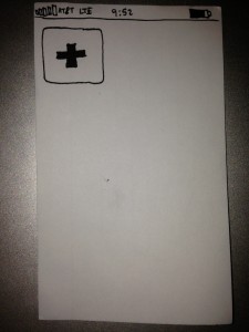
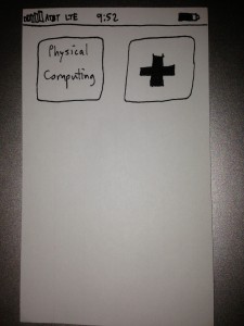
Upon opening the app, the user sees a screen with the digitized books currently stored by the app. In this case, there are none, so a button to add a new book is all that is displayed.
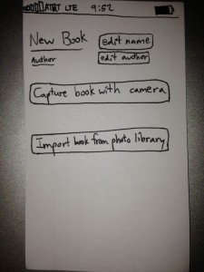
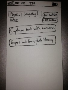
When the user presses the add button, a screen is displayed with options to edit the title and author of the new book and options to digitize the book with a smartphone camera or import it from a photo library.
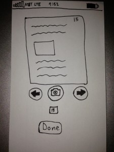
This is the screen displayed after user presses the “Capture book with camera” button. Users can use the camera display to take photos of each page. Users can also edit the page number in the box below the camera button.
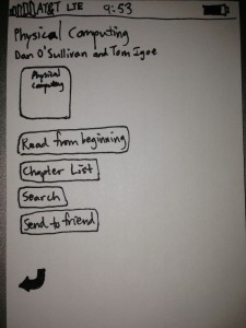
Upon pressing the book’s button, the user is presented with a book menu that has several options: read the book from the beginning, select a chapter from the chapter list if entered by user (feature not shown), search for terms, or send all or part of the book to a friend.
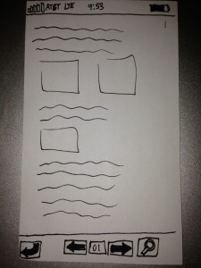
This is the book viewer screen with buttons to return to the book menu, go back a page, go forward a page, and search for terms on the page.
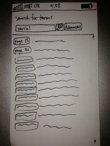
This is the search screen where the user is search for the word ‘serial’. A list of pages on which the term appears and a brief context in which it appears are displayed.
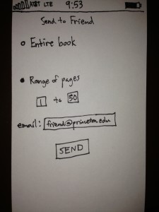
This is the sharing screen, where the user can send the entire book or a range of pages to a friend via email. Other possibilities could include sharing through social networking sites such as Facebook.
Prototype 2 – Friend Seat Finder
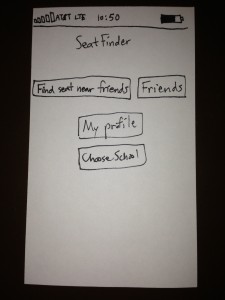
The main menu screen is displayed here. Users can press “find seat near friends” to access the primary functionality of the app, press “friends” to display a list of their friends, press “My profile” to display their profile with options for editing, and “Choose school” to select from a list of schools for which the app is designed for.
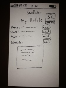
This screen displays the user’s profile with fields for name, class, major, and schedule. There is also an option to have a profile picture. Depending on the school chosen by the student, editing schedule will present a list of classes currently being offered that semester that the user can add to their schedule.
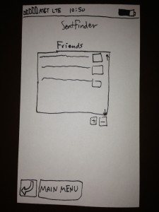
This screen displays the user’s list of friends. People in this list have installed the app on their app or desktop and have accepted the user’s friend request. Users can click on a friend to view their profile, and add/remove friends by selecting the friend from the list and pressing the ‘+’ or ‘-’ buttons, respectively.
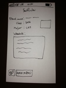
This screen displays a friends profile. The friend’s name, class, major, profile pic, and schedule are displayed.
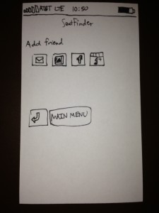
This is the add friend screen. Friends can be invited via email, selected from a list of contacts, or invited through Facebook or Google+.
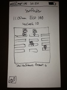
This is where the action happens! SeatFinder keeps track of your schedule, and when it is almost time for class the app will display a map of the room in which the class is being held. The user can broadcast to their friends where they are sitting by clicking on a part of the seat map. The location of their friends is represented by a pin with a picture of their friend above. The total number of friends in class is also displayed under the map.
5. User Testing
Notes:
User testing was done with the textbook digitizing app.
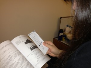
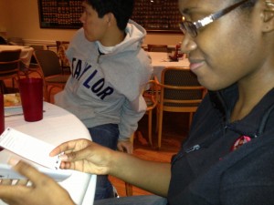
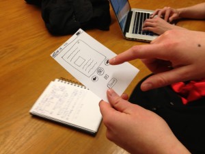
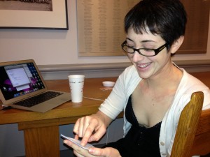
Testing was conducted with four users in various locations: two eating clubs, a room in Frist, and a dorm room. Users were all seniors majoring in Physics, Computer Science, or Ecology and Evolutionary Biology. Users were given a brief description of the app’s purpose, but no instructions on navigating the interface.
One user noted that there are apps similar to this, such as Genius Scan. However, it was noted that this app would also do optical character recognition and index terms to allow for advanced search capabilities.
Overall, users navigated successfully through the interface and used the prototype for its given purpose. Some users were confused as to what some of the screens were – for example, the screen that allows users to read through the textbook.
One user was confused by one of the buttons – the add new book button in the first screen – saying the design reminded them of the Red Cross.
Pictures:
6. Insights
Most of the confusions regarding the screens of the prototype seemed to be limitations of the prototype as opposed to a flaw in the app design itself. Perhaps text labels for each of the different screens will make it clearer to the user what the desired purpose of the particular screen is, although if used in an actual app I believe the screen’s purpose would be readily apparent.
The confusion over the button design may stem from the low-fidelity of the drawing and could possibly be mediated by ensuring there is corresponding text with every button.
A tutorial may also be helpful in reducing confusion of the user.
Most of the interface of the prototype is similar to countless other apps. The target market for this app, college students, are mostly familiar with smartphone apps. The test users are all college seniors from a variety of majors, so they are most likely a good representation of the target demographic. Their success in using the app shows there is a high probability that the target demographic will be able to successfully use the app.

