Observations
I observed students and professors before class over a two week span, focusing on MUS103, SOC204, and COS340.
- MUS103 lecture
- Most people on laptops – lots of email clients open
- People beeline to clusters of friends / just talk
- Others read over the class handouts for the day
- See several reddit windows open
- Handful of people shuffling through handouts from past weeks
- Observed one student playing Tetris, another was reading manga
- COS340
- Extremely sparse until 5 minutes before class – most people talking to friends
- Many people discussing pset with their group / talking with friends
- SOC204 – 10am class – few people arrive early
- Very few people arrive early for morning class
- See two people reading news
- One on a kindle reading a book
- Several attempting to cram the assigned reading
- Professor arrives about 5 minutes early. Lays out folders to collect homework. Spends remaining time setting up laptop, chatting with preceptors, and generally standing at front of room
- General observations
- Reading over/reviewing past lecture slides/notes
- Snacking – generally sandwiches
- Lots of people looking at their phones. Seems to be little interaction outside friend groups.
- See a few people napping right before some classes (primarily in afternoon classes)
- Lots of community auditors in the back of classes
- One or two students usually go ask the professor a question before class
- See PFML pop up a few times
- Talking to a few students showed that many were rushing between classes and did not have much free time for large blocks of the day
Brainstorming
With Shubhro Saha and Andrew Cheong
- Pair people up to review each other briefly before class
- Spaced repetition learning with flashcards tailored to collaborative card creation within a class.
- Competitive quiz app for students who arrive early.
- Class todo list that pulls due dates and readings from blackboard or course websites and presents in order of due date.
- Competitive games (e.g. speed chess/checkers/etc.) with others inside the classroom
- Order food so it is ready to pick up on way to class
- Guided meditation app tailored to time you have before class begins.
- Workout app tailored to time before class begins.
- Collaborative playlist app for students who are in the class early. Could optionally interface with classroom speakers.
- Complete psych studies a few minutes at a time instead of going in for blocks of time.
- App that takes in the free food listserv and lets you know if there is anything along your way to class
- News summary app to catch up with the outside world
- Local chatroom for students in the class
- Campus wide virtual whiteboard for chat and other interactions. Provides a forum other than pfml.
- Students can give mini lectures on topics before class (not necessarily related to class).
- Collaborative puzzles for the classroom (crosswords etc.)
- App to facilitate students answering each others questions during the time before class, and the teacher starts class with any remaining questions.
Favorite Ideas
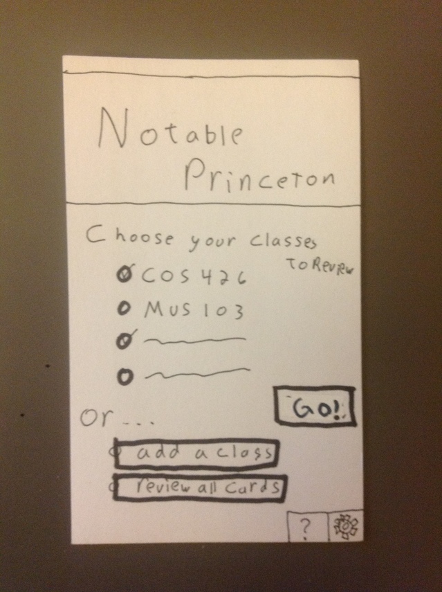
- Notable – a class review app
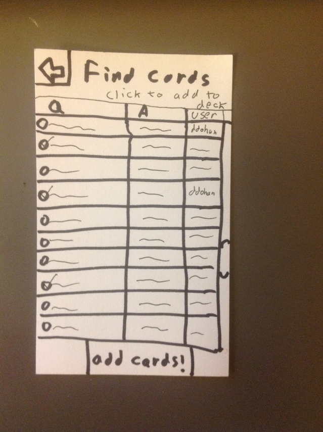
- A spaced repetition notecard app that makes it very easy to collaborate on cards within a class. Should be simple to find cards other people in the class created and share your own.
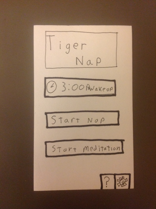
- Tiger Nap – a guided meditation app
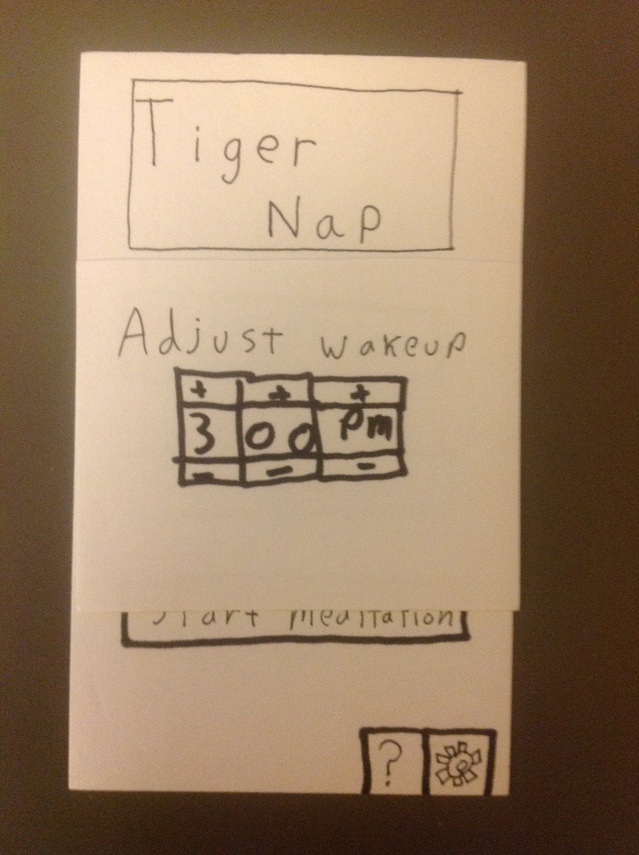
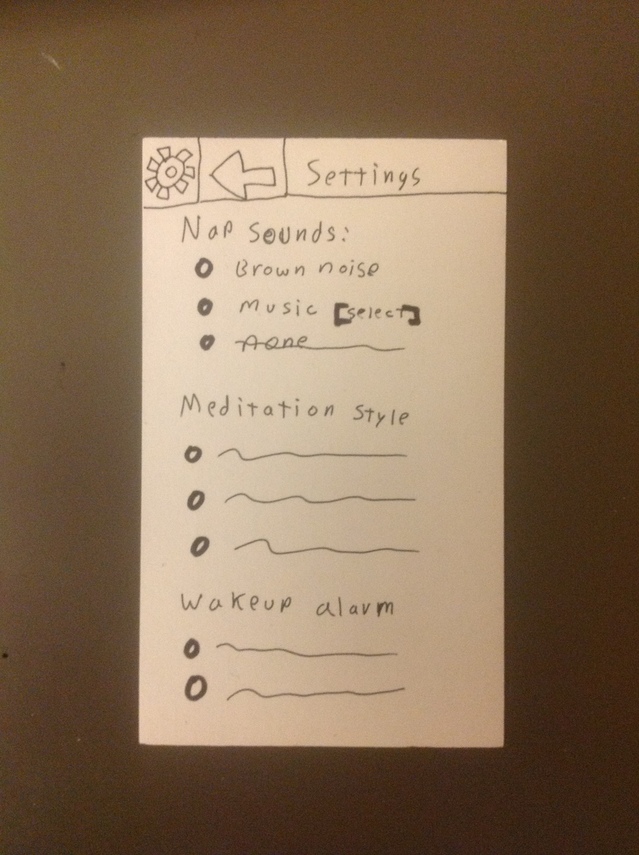
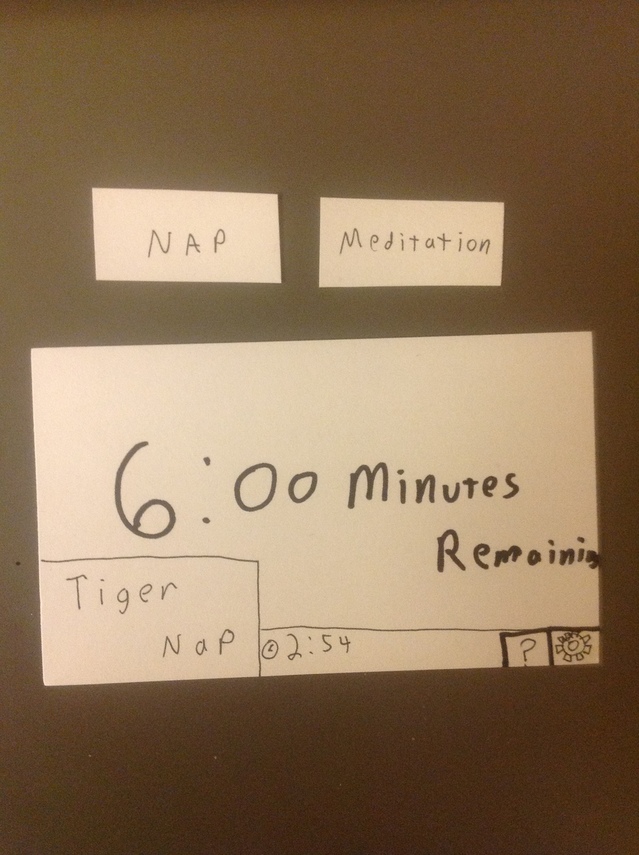
- The app provides audio for guided meditation that lasts until the class begins and slowly wakes you up. Also has a nap mode that can generate sound to drown out distracting noises. Should be as simple as possible – only needs a single button to start nap/meditation.
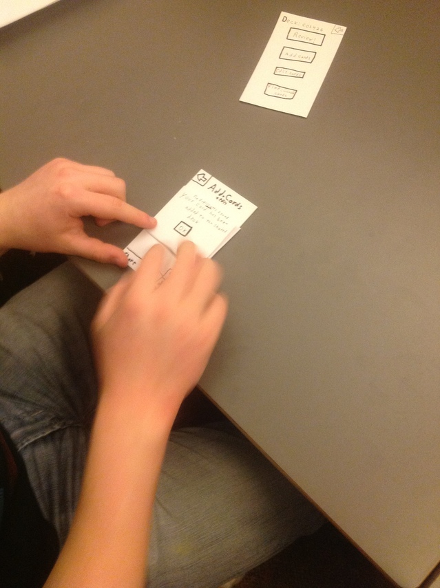
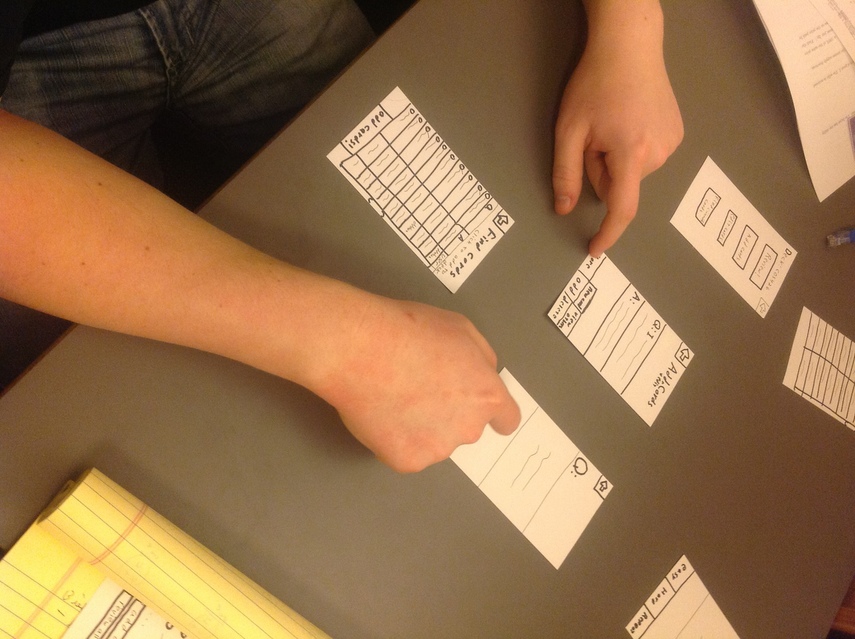
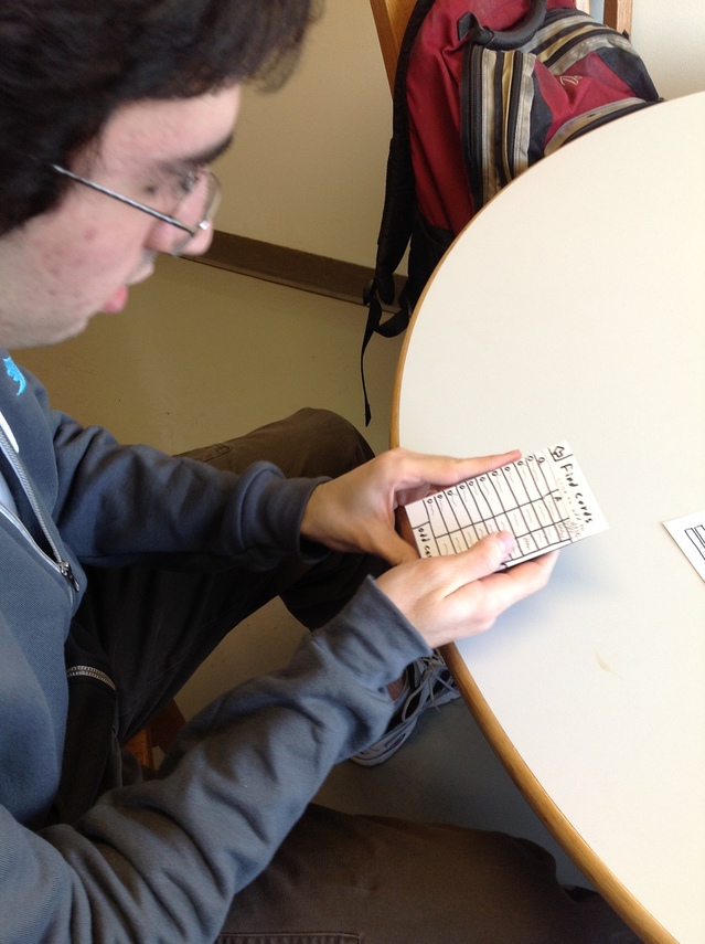
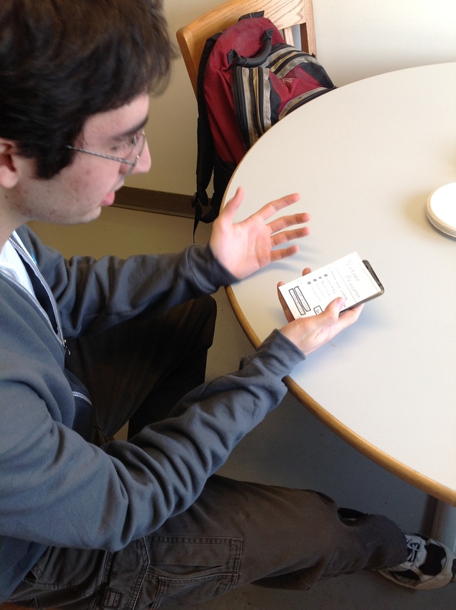
Prototype Pictures
TigerNap:
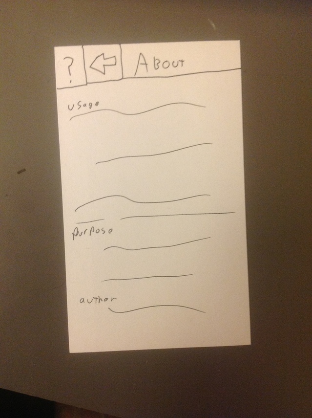
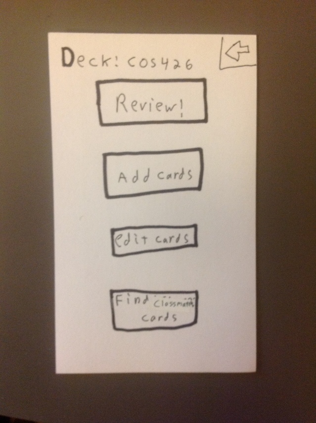
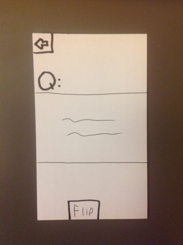
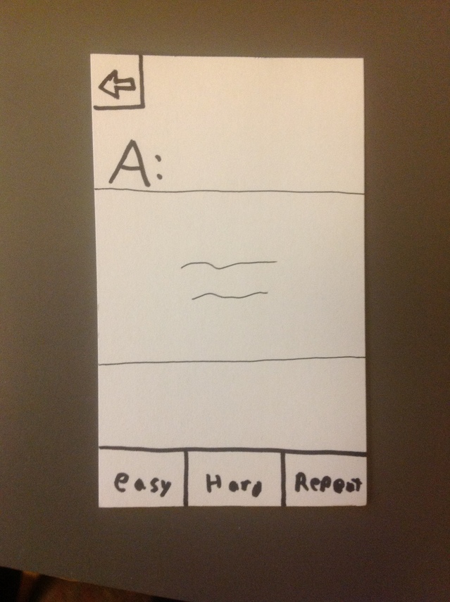
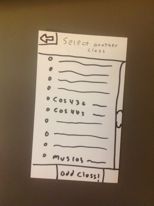
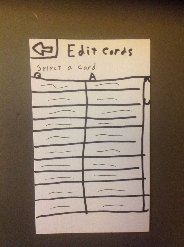
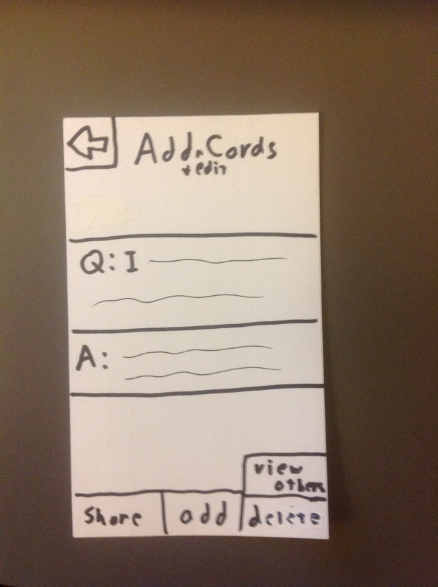
Notable:
Feedback
- David Bieber – COS ’14
- Left out back button on the “deck” page [now added]
- Need to make it clear how checks behave after going back – do they clear? Do they hold previous state?
- On the find cards page, make it clear what each column does. Does clicking the user column list all cards from a user or just select that card?
- Make it clear what a shared deck is
- Add an option to cram certain cards by categories/topic/when they were added
- Don’t mix metaphors – the Q and A on the quiz page don’t match with all card types
- Possibly auto generate cards from notes and/or syllabus
- Need a web/computer interface to make typing in cards easier if auto generation is not possible. Typing on a phone is tedious
- Add a simple way to delete cards/decks [now added]
- Harry Cape – CHM ’15
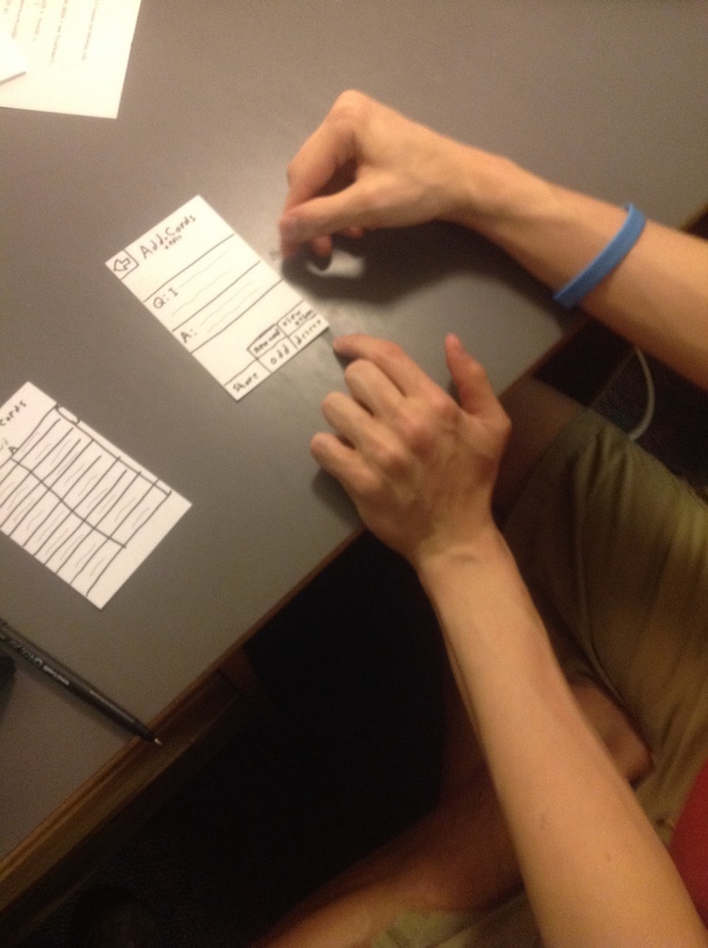
- Confusion about buttons on the add/edit page. Does share share the current card? Does adding add the current card then bring up a blank card?
- Easy/Hard/Repeat makes sense immediately
- There are multiple ways to reach some pages, which can make it very confusing.
- Find card page should allow user to ‘zoom into’ a card (pop it up in a larger size)
- Allow to sort by username on find page
- Way to share multiple cards at once
- Clayton McDonald- MAT ’15
- Like Harry, thought Easy/Hard/Repeat made intuitive sense
- The back button on “add/edit” and edit card list should always go back to the deck page. Currently defined it in such a way that loops are possible, so a user could have to press back many times to return to deck page.
- Combine add/edit into a single listing
- Review all – Should go directly to card review page instead of to deck page
- Should have a clear button on the add/edit page to immediately clear current card
- Add the ability to tag cards by keyword. This allows searching by keyword when trying to study a specific topic or finding cards from other people.
Insights
The major insight from testing is that I need to simplify my design whenever possible. While most of the buttons make sense, having multiple ways to reach the same page can be confusing for the user. Users are also conflicted in exactly what they want. Harry liked the combined add/edit pages, while Clayton suggested separating them. The 5 buttons on the add/edit page were especially confusing since there are many possible behaviors that make sense.
One feature that I would definitely want in the next iteration is the ability to tag cards and cram by tag and age. It is great to use spaced repetition techniques for people who do a little bit of studying every day (which is the main use case of the app), but the ability to concentrate studying is definitely helpful.


