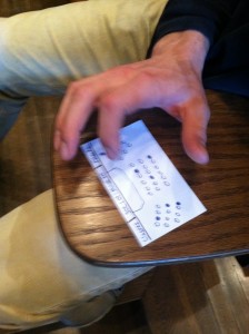
1) Observations:
For the obesrvation part of this assignment, I arrived to one of my classes (COS333 in Peyton Hall 145) 10 minutes early. This class begins at 11:00 in the morning and goes til 12:20. These were the three most interesting/helpful (in the terms of this assignment) people I observed:
Person 1: Person 1 arrived approximately 5 minutes early. He sat down in a seat near the front, and promptly began surfing the web. The first tab he opened was Facebook, and he began talking with one of his friends. In the meantime he opened a few other tabs on his computer to surf other websites on the web. I couldn’t catch what every website was but I did catch one of the tabs being opened to ESPN.com. One last important thing I noticed was that he checked the dining hall menus on his computer through the Princeton dining halls website. Immediately following this, he went back to talking with his friend, which leads to the assumption that they were discussing them.
Person 2: Person 2 arrived approximately 8-9 minutes early. They seemed either to be just coming from a class and wanted to start on the homework immediately following it or else in a hurry to finish some homework before their next class, because they immediately opened up a problem set for a class online and began working on it in their notebook. He never really surfed the web, only opening up one tab to do a google search on what I assume was part of his problem set. He did however check his phone a few times to look at notifications, which were a mixture of notifications consisting of either text messages or push notifications from applications. He continues working on the problem set for a good portion of the class only intermittently paying attention to the lecture.
Person 3: This person was about 5 minutes late to class. He came in the door, which interrupted the professor’s lecture, as the doors are located at the front of the room right where the professor is. He then had to search out an empty seat, of which there were not many, and had to make people stand up to let him through the aisle to get to the empty seat. This was definitely an interruption in the lecture, albeit a small one. After he had taken his seat and the lecture had resumed, he looked around the room and nodded at another student making eye contact with him with a little apologetic smile on his face. Presumably they were friends.
2) Ideas:
1. App that allows friends to vote on next meal venue based on menus
2. Spaced Repetition Software (flashcards) that allows students to review key terms and information about the class
3. Homework schedule organizer to manage your homework for the week
4. App that shows which seats are open/taken in the classroom so late students can find a seat quickly
5. Poll about in class issues: how hard is the workload? etc.
6. Improvement to mobile update/notification center to optionally update you only during these 10 minutes rather than during class
7. Site where students can submit questions during/about lecture, and professor will go over them before the next one
8. App with princeton map & calendar to allow groups to set next meeting place and time
9. App to reserve princeton show/movie tickets w/ netid
10. Site that allows students to surf/sign up for this week’s community service opportunities
11. USG website that hosts picture contests/t-shirt designs for students to vote on in between classes
12. Login site that tracks class attendance for competition, 100% gets a prize/reward
3) Two chosen ideas for prototyping:
1 – Idea #1 – In observations I noticed that people will check the princeton dining hall menus (which are a bit of a hassle to get to) and then discuss with their friends where they want to go, and I chose this idea to help combine these two ideas into an application that will help students stay connected to their friends and make the meal-choosing decisions easier.
2. – Idea #2 – The person I observed coming in late to class was definitely a disruption in the class, so this idea will hopefully allow people late to class to cause less of a distraction and can even help people who are early/on time find their friends and sit next to them.
4) Prototypes
1) Meal-Chooser w/friends
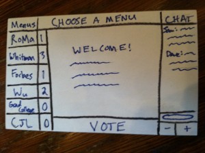
This is the welcome screen for the app. On the left side there are dining halls which the user can choose from to examine a menu with corresponding vote counts for each one. On the right side there is a chat field for the user to chat and discuss with friends.
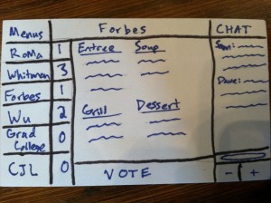
If the user selects “Forbes” from the menu choices at left, the Forbes dining menu for the next meal is brought up in the center of the screen.
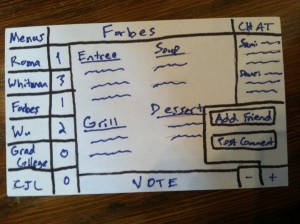
If the user selects the plus sign below the chat field, the user can then post the comment he has written (in the text bar) to the chat field, or add a friend to the group.
2) Seat-finder
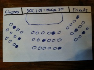
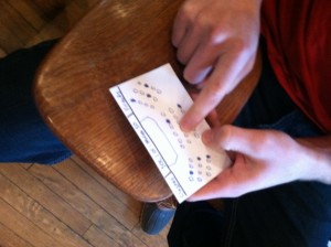
This is the opening screen to the app. SOC101 is already selected and showing the empty/open seats in the class. Empty seats are represented by a dark/filled in circle and full ones are plain white.
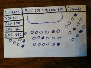
If the user clicks on the “Classes” tab, a dropdown bar appears with all of the classes the student is enrolled in. If she chooses a different class the screen and seating arrangement (and which seats are full/open) will change to reflect the class she has chosen.
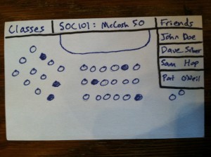
If the user selects the “Friends” tab, a dropdown box consisting of his or her friends in the class appears.
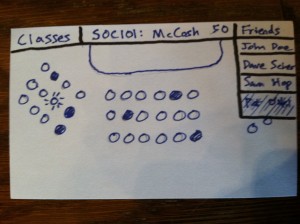
If the user selects the bottom friend, the seat he is sitting in lights up (second row on the left side).
5) User tests:
Chosen prototype: prototype #2 – Seat Finder
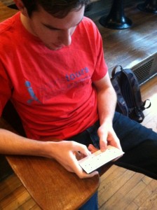
First user: Patrick (ECO Junior)
In Pat’s user test I got some really good feedback/observations:
- One of the first things Pat said when he was looking at the opening screen of the prototype was, “Are the filled in seats open or closed?”. He was confused about which one meant the seat was empty and which one meant full.
- He then tried to click on a seat to reserve the seat for class. The app was not intended to reserve seats, so nothing happened.
- He understood everything else and found the “Friend” feature helpful, also pointing out that it would be useful to possibly avoid a friend that might distract you during class.
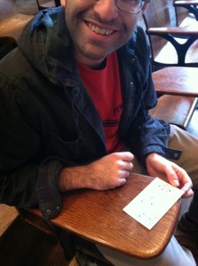
Second User: Will (English Junior)
Observations/feedback:
- Navigated the “Friends” and “Classes” tabs pretty easily.
- However, he got confused once he clicked on one of the friends names and one of the seats lit up. Instead fo thinking “oh that’s where my friend X is currently sitting”, he thought, “oh my friend X must be sitting in that filled in seat beside the lit up one and the ideal seat placement for me is that lit up seat”. This is not how the app was intended to work.
- Again, the “if the seat is filled in does that mean it’s taken?” confusion added to the above mistake.
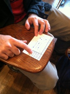
Third User: Alec (Econ Junior)
Observations/Feedback:
- Alec navigated the screen very well and understood how the app worked for the most part. He did not try to click one of the seats.
- After clicking on one of the friends in the “Friends” bar, he then asked, “Well what if one of my friends was sitting in the seats currently blocked by the ‘Friends’ bar right now?”. This is a very good point, those seats cannot be seen.
6) Insights
- Something has to be done to make sure that the user knows the difference between taken and empty seats. Maybe a legend at the bottom would help, or perhaps the opposite way (filled in seats mean that they are taken) is a more natural way of representing them and users will intuitively realize this. More testing is needed on this part.
- Also, the user needs to realize that the app is not used for reserving seats or the such. It is merely to recognize where open seats are or where your friends are sitting. Doing nothing when the user clicks on one of the seats is one way of brutely solving this. But another option would be maybe, when a user clicks on the seat, information about that seat comes up like who is currently sitting in it or, if no one is currently sitting in it, possibly information/reviews on the seat’s location could pop up. Another option to look at would be adding a seat reserver feature to the app for when users click on a certain seat.
- When the user clicks on a particular friend, the corresponding action (aka the seat he is currently in lighting up) must be more intuitive or more noticeable so that the user knows immediately when he clicks his friend which seat his friend is in. Could also add a feature that shows optimal seating location for the late-arriving student based on different factors: least disruptive (aka aisle seats), where friends are sitting or alternatively not sitting, etc.
- The menus do obscure some of the seats. This is not as much a problem with the “Classes” tab as the “Friends” tab, because when you’re trying to find out where your friends are sitting some of the seats can be obscured by the “Friends” tab. It needs to either be moved to a better location or maybe turned transparent? Or maybe it is put into a separate screen to the right and make the classroom picture smaller. Something different needs to be designed.

