
Observations:
Student 1: This student was observed from the completion of one course until the beginning of his following course. Both course were CS course and were in the same building so there was very little transport time. At the completion of the first course, the student walked to the front of the lecture. He waited in line to ask a question of the professor about an upcoming problem set. The student was engaged in the professors conversation even when he wasn’t asking his question and waited while other students asked questions in order to hear the answers given. After everyone had asked their questions, the student packed up their belongings and walked the short distance to the next class. In the next classroom, he found a seat toward the back of the following lecture, removed a laptop from his backpack and opened up to the assignment for that he had asked his question on. He looked through that assignment until class began
Professor 1: This professor was observed at the beginning of giving a lecture. He arrived about 5 minutes before lecture was scheduled to begin. This lecture has a technical assistant who runs the presentations so he did not need to prepare anything for the lecture. He instead took the opportunity to have a conversation with a preceptor for the course. Many of the preceptors gathered around the professor. Topics of conversation ranged from course material to casual digressions.
Professor 2: This professor was observed at the beginning of a precept. She was in the classroom prior to my arrival about 8 minutes before class. She was checking something on her phone. She then got out a sheet of handwritten notes from her bag and began to translate them to the blackboard behind her. As each of the students walked into the classroom, she engaged them. Asking a specific question and saying “good evening” to them by name
Student 2 and 3: Two students were observed leaving a class at 11 AM. They packed up their bags together and walked back from Frist toward prospect avenue. While walking, they talked casually.
Brainstorm:
Social: Students use the 10 minutes as an opportunity to catch up with friends.
- An application that schedules and connects you with friends for a 10 minute phone conversation.
- An application that facilitates the organization of text messages from the previous hour.
- Application that organizes campus news for the past hour and uses social sharing.
- Better content delivery system for campus notifications from administration replacing mass emails.
- Mapping application that helps friends in nearby class connect and walk together.
Mental: Students use that 10 minute to debrief the previous class and get ready for the next one.
- Trivia game that juxtaposes content from many course: acting like a mental palate cleanser.
- Reminder platform that helps your organize thoughts about previous class to remember later.
- Application that jogs your memory about readings you did and homework assignments to be brought in.
Student – Professor Interaction:
- Allow students who have to run to class the opportunity to ask questions while they walk of professors and get immediate answers.
- Students ask questions before entering the class which can be read and answered in the first 5 minutes of class.
- Professors can give a short notes page that can be read by either students or preceptors to prepare them for class.
- Platform for anonymous feedback on the lecture and readings for the class.
Break: Students take the opportunity to take a mental break between draining classes.
- Short games that tell stories in the small provided time: bringing the student out of reality for a break.
- Mapping application that maps your route to the next class through a nearby coffee spot.
- Short video clips that help you get to know a student group or activity going on that week.
- Application that uses social and genre matching to connect you with a new song to listen to.
- Make the walk a game: give students incentives to perform actions or make a friend.
Shortlist:
- Platform for anonymous feedback on the lecture and readings for the class.
- I choose this idea because I think that constructive feedback from lectures is missing in Princeton education and the current system only allows for feedback at the end of the year.
- Trivia game that juxtaposes content from many course: acting like a mental palate cleanser.
- I liked the idea of a mental palate cleanser because it seemed very original but at the same time, I felt it would have appeal for Princeton students.
Prototype:
Quest:
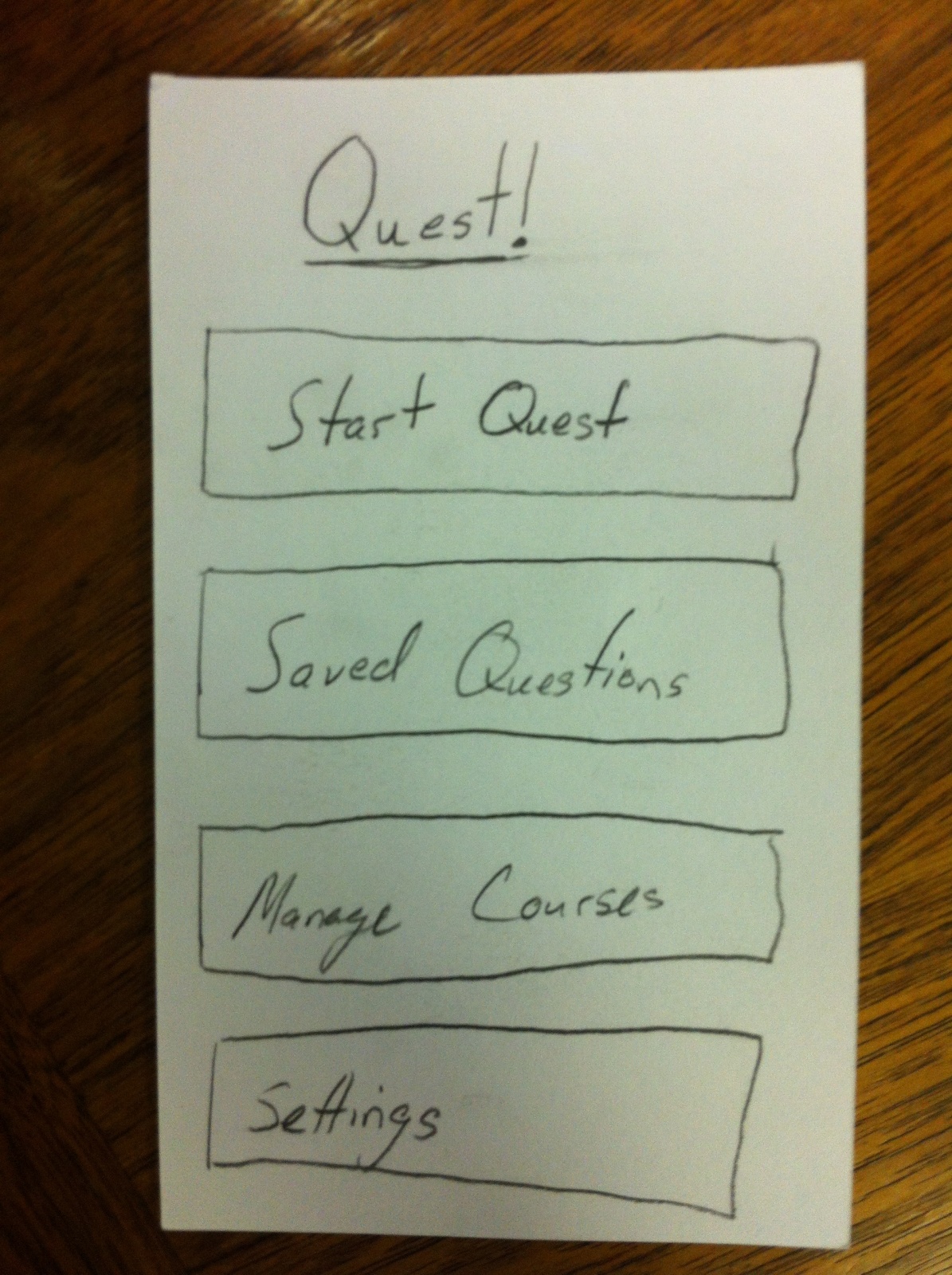
Opening screen:
This is the screen the user sees when first opening the application. It allows them to do four different major tasks: Start a new quest, review questions that they marked “save for later,” manage the courses they are in, and manage other settings.
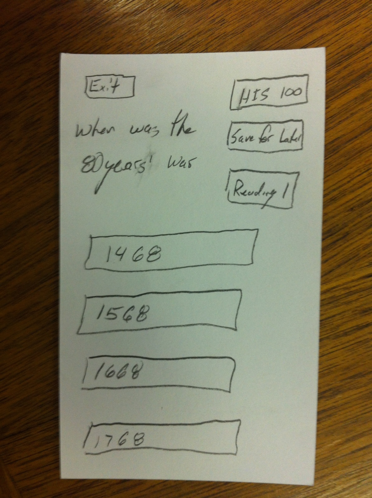
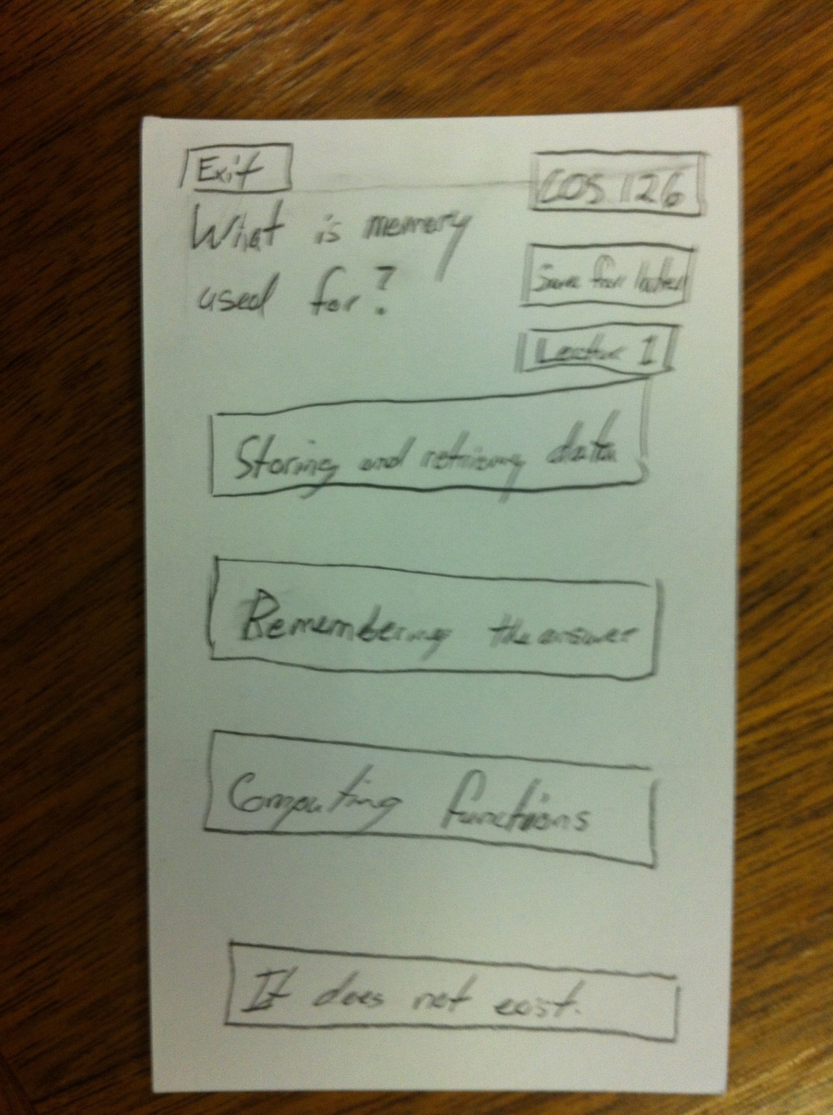
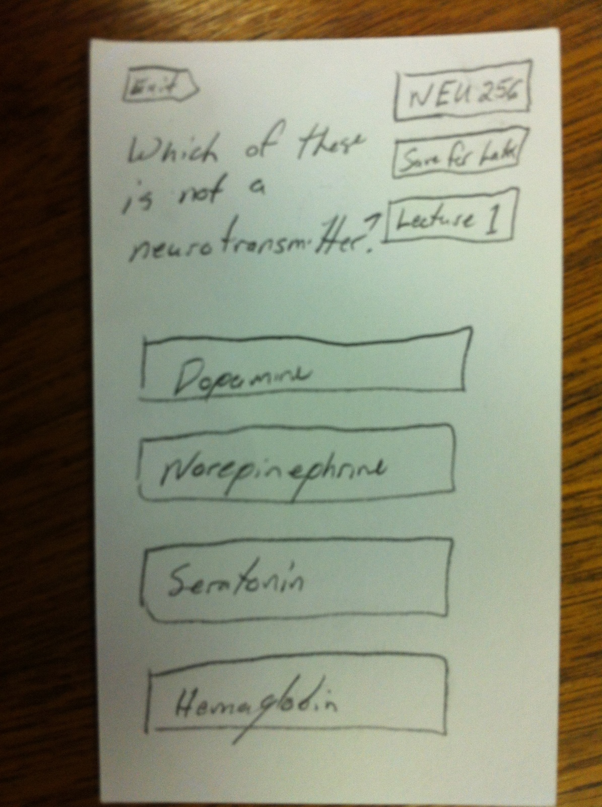
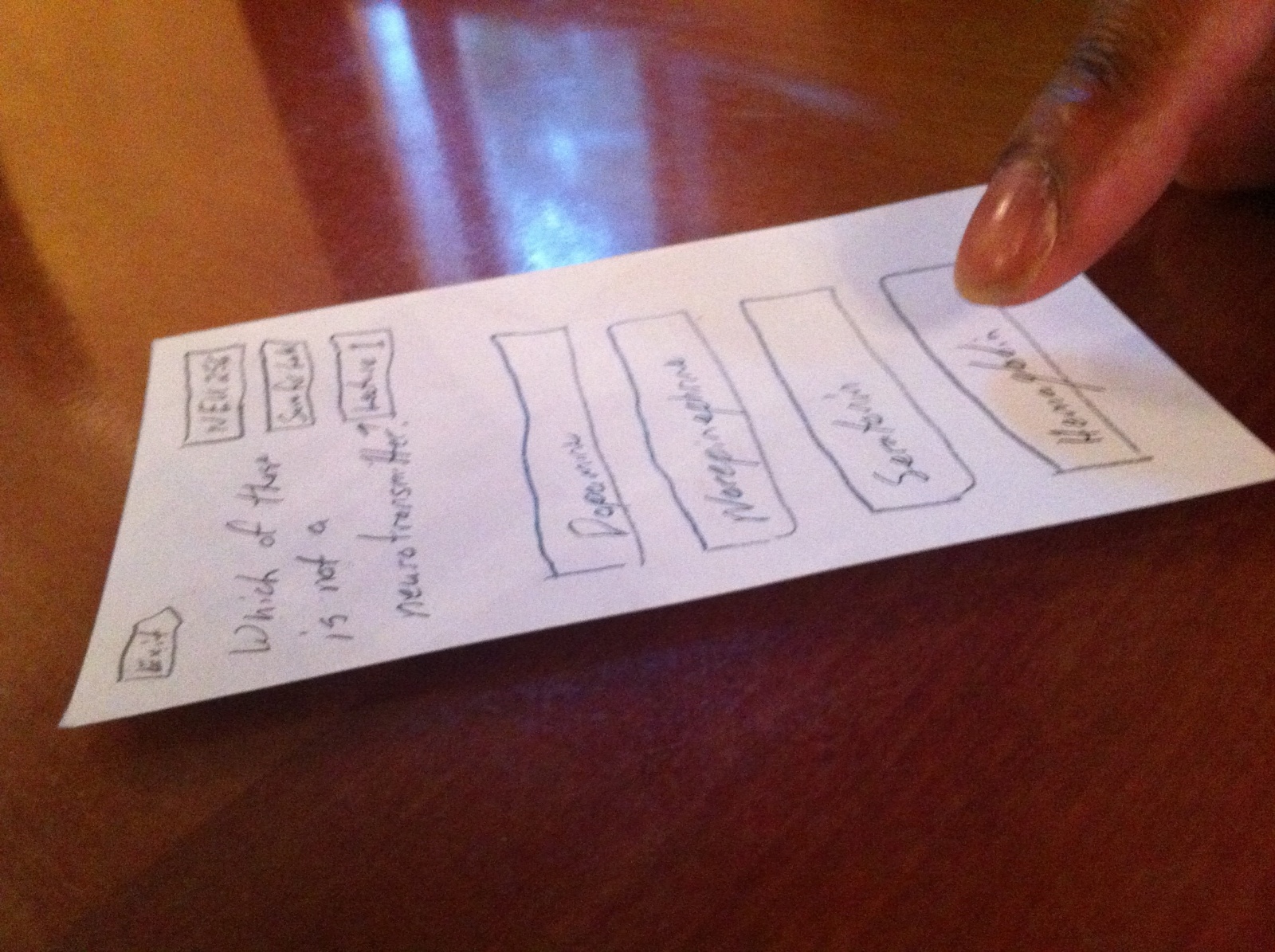
Question Screen:
I created 3 different examples of questions. Each has the same structure. The question is at the top, results are shown. (I started with just multiple choice questions however you could imagine this extending to more complex answers.) Each question is assigned not only to a specific course but also a specific lecture, reading, seminar, or precept within that course. Questions can be saved for later.
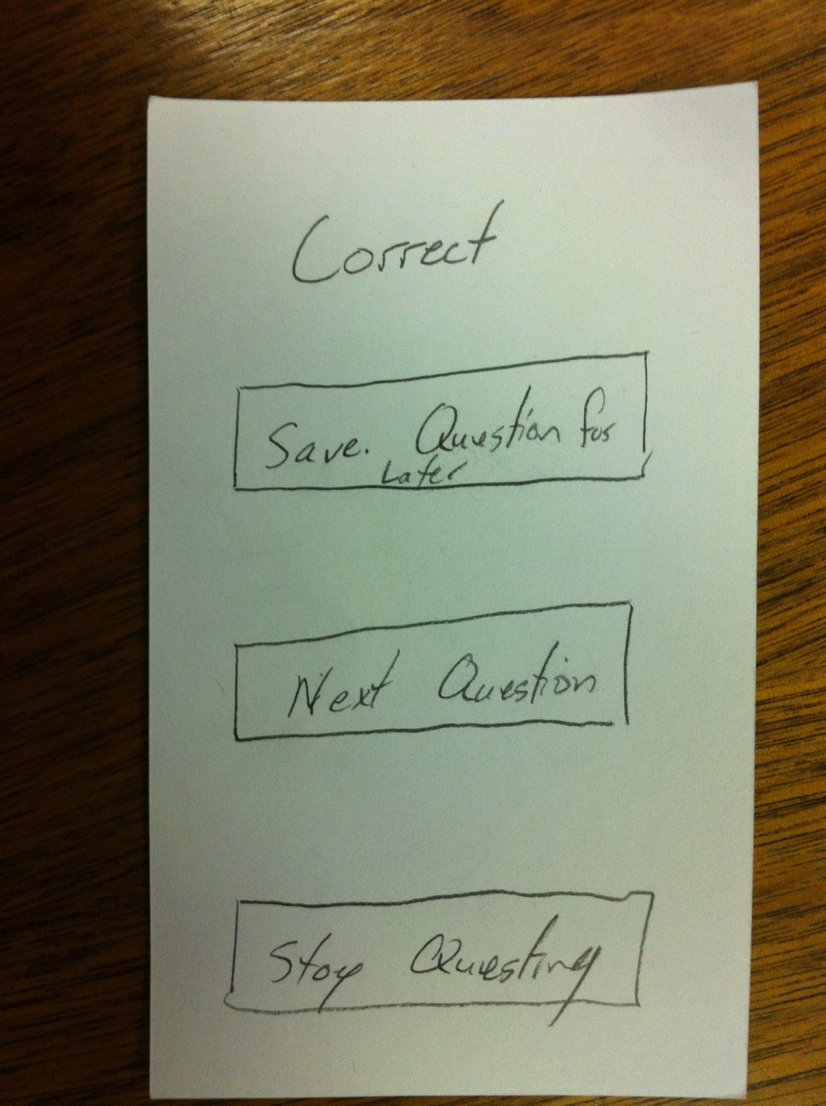
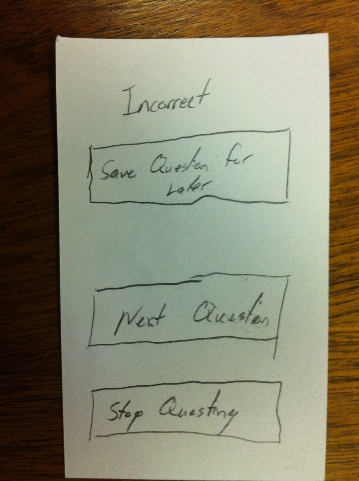
Feedback Screen:
This feedback screen gives the user a natural break after each question. They can choose how they want to deal with the previous question and even if they want to move on.
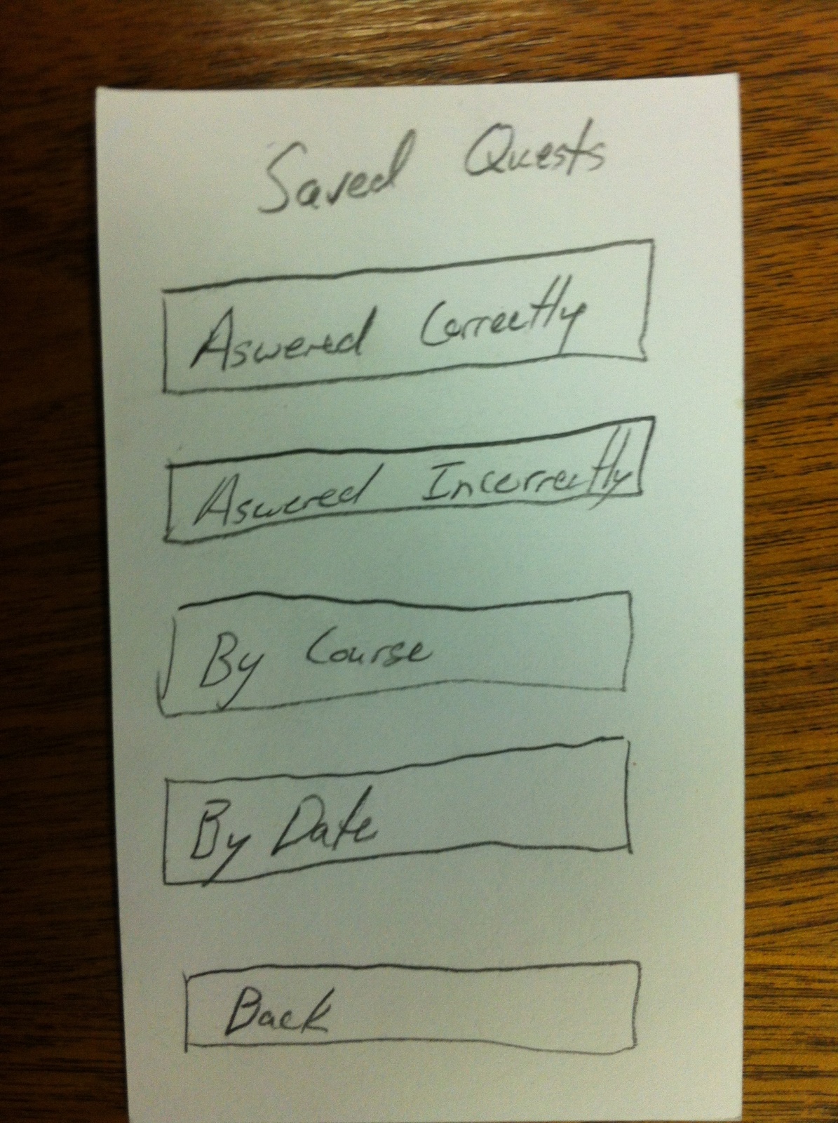
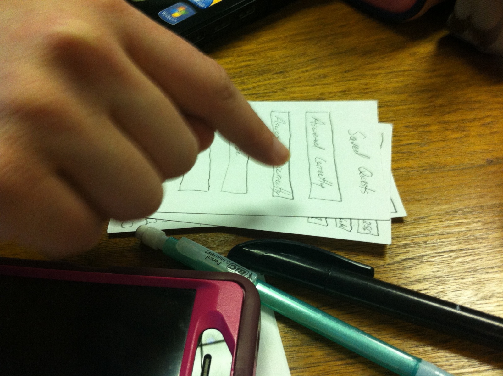
Saved Questions:
This screen is designed to help you find the different categories of saved question that you might want. The groupings include questions you answered correctly, questions you answered incorrectly, sorting by course, and sorting by date (for example today’s lectures and readings for all courses).
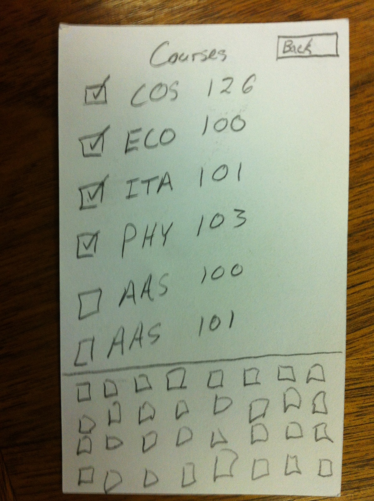
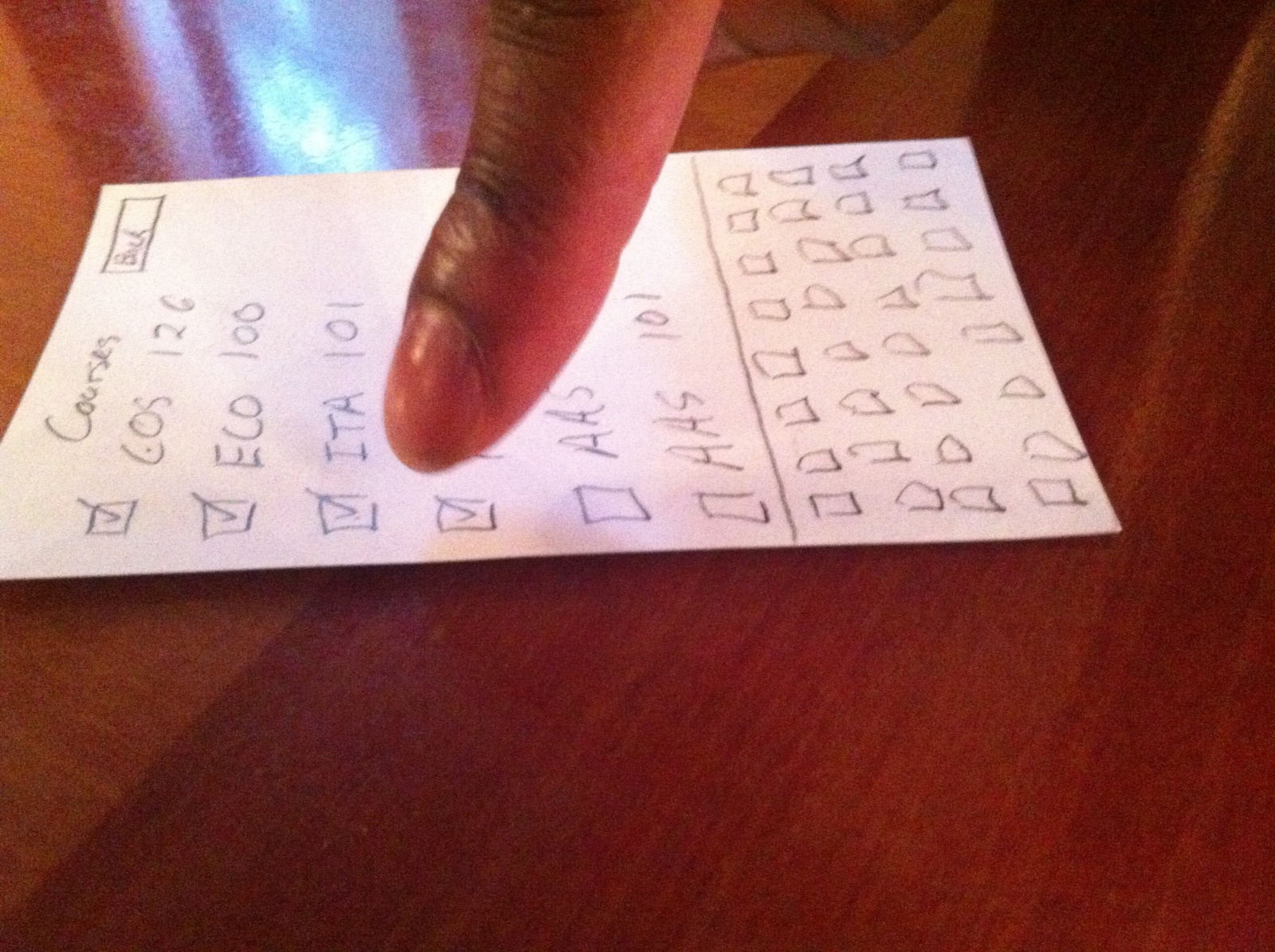
Manage Courses:
This screen helps you to manage the courses for a given semester. It is a scrollable list of all course. The courses you have selected are at the top (with checked checkboxes). Below are all other courses. By typing on the keyboard you can narrow the list to just courses that start with those letters. This helps the user find courses easily.
How Was It?:
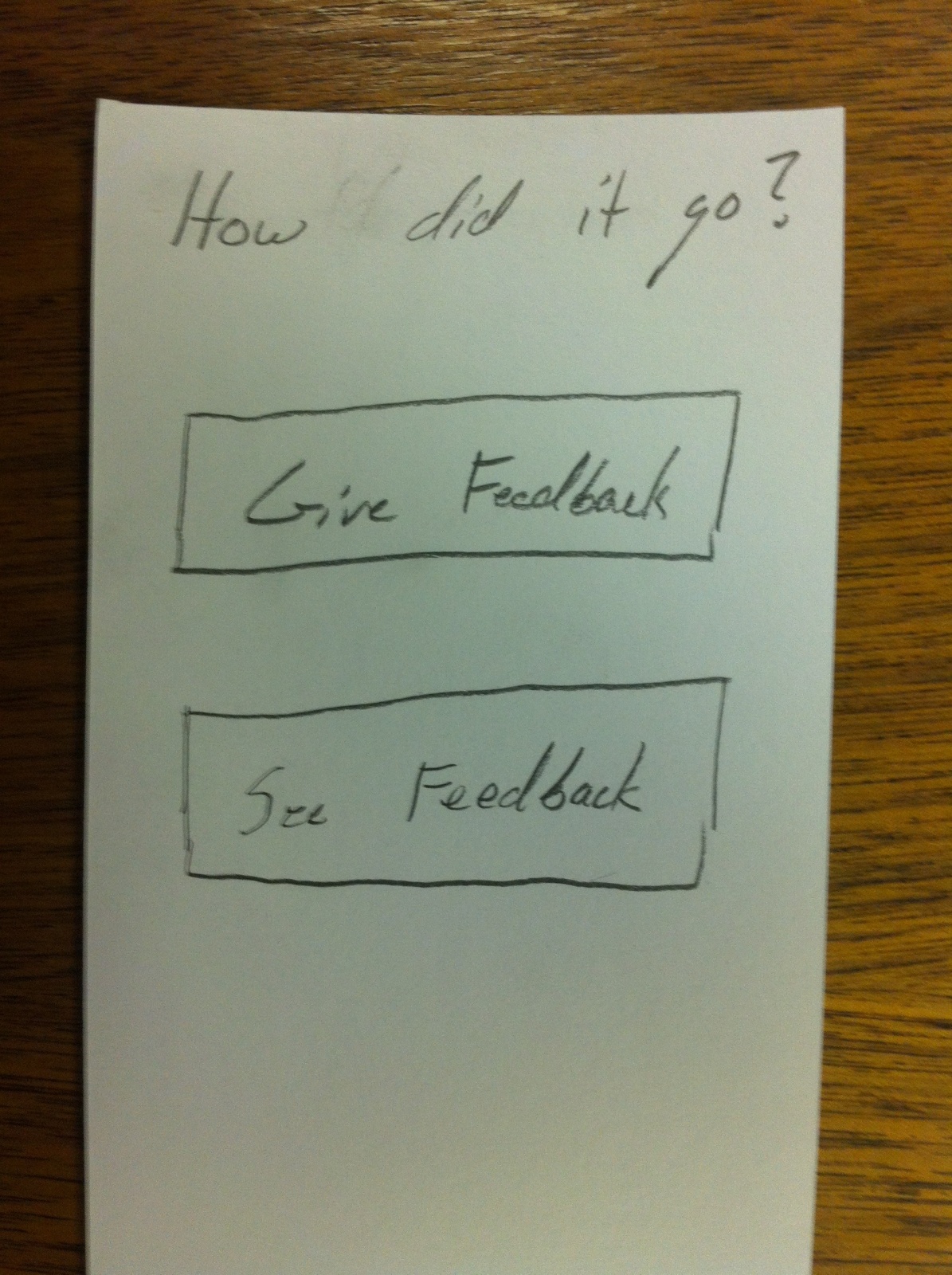
Home Screen:
This is the first screen the user sees when the application opens. It shows the two main workflows of the application: giving feedback to instructors and seeing the feedback given.
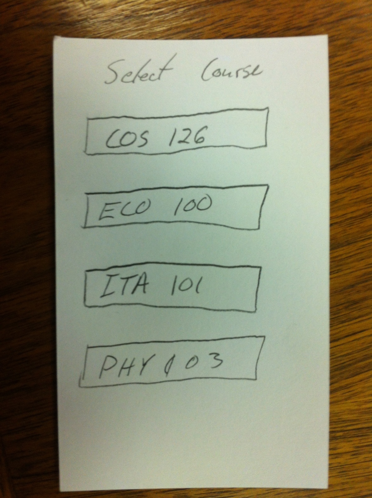
Courses:
After selecting either of those two options, the user must then select the course they are interested in.
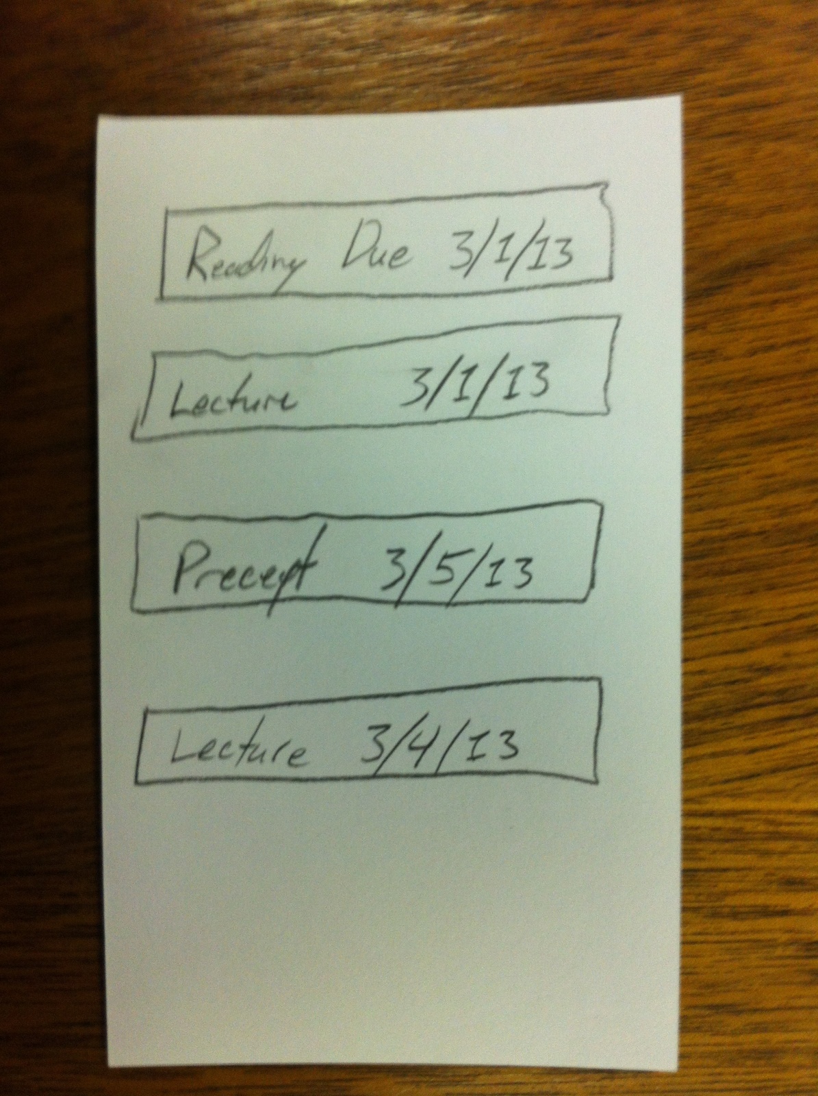
Feedback Units:
After choosing a course, they must then select which reading, seminar, lecture, assignment, or reading they are interested in.
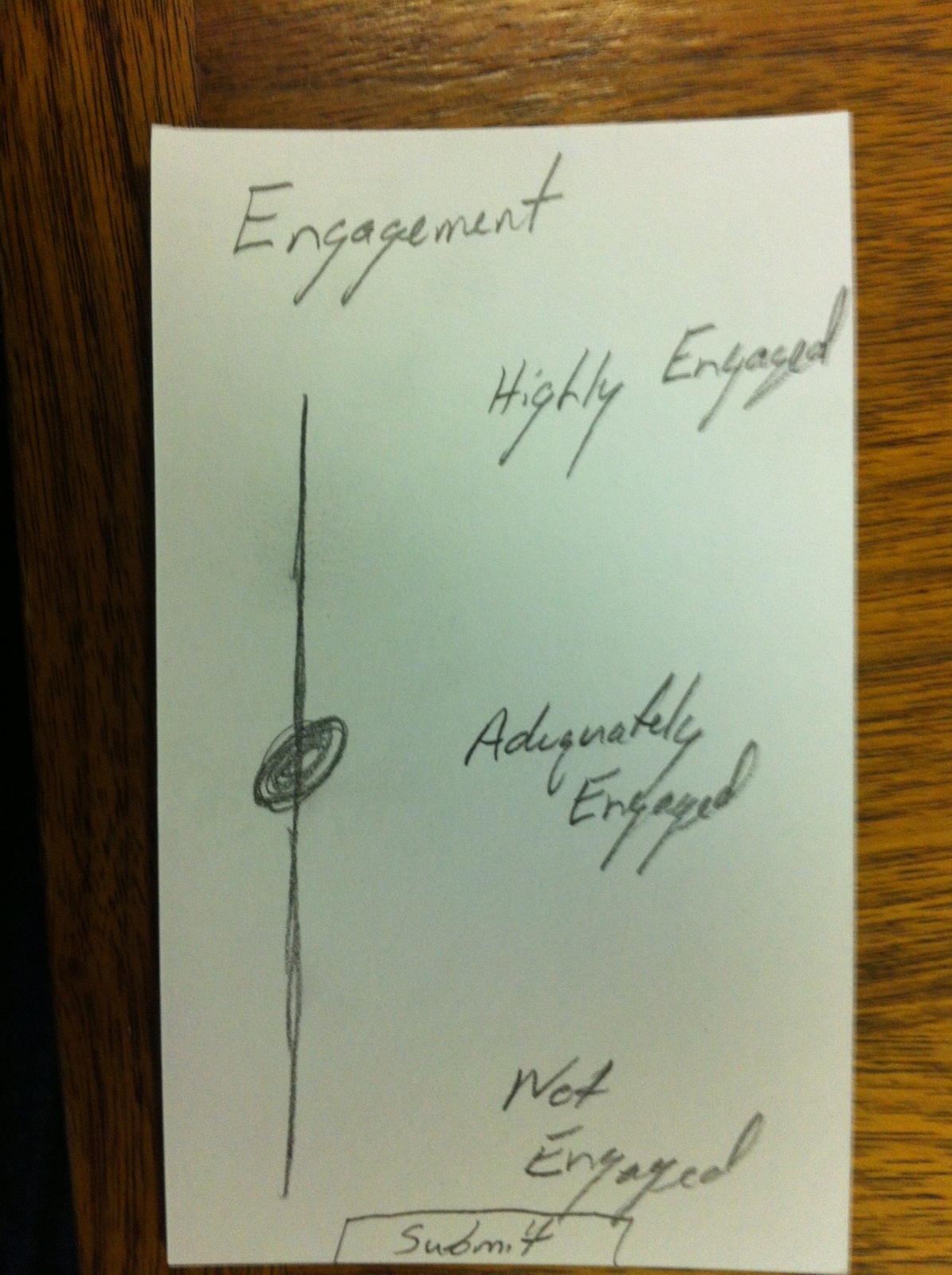
Feedback Screen:
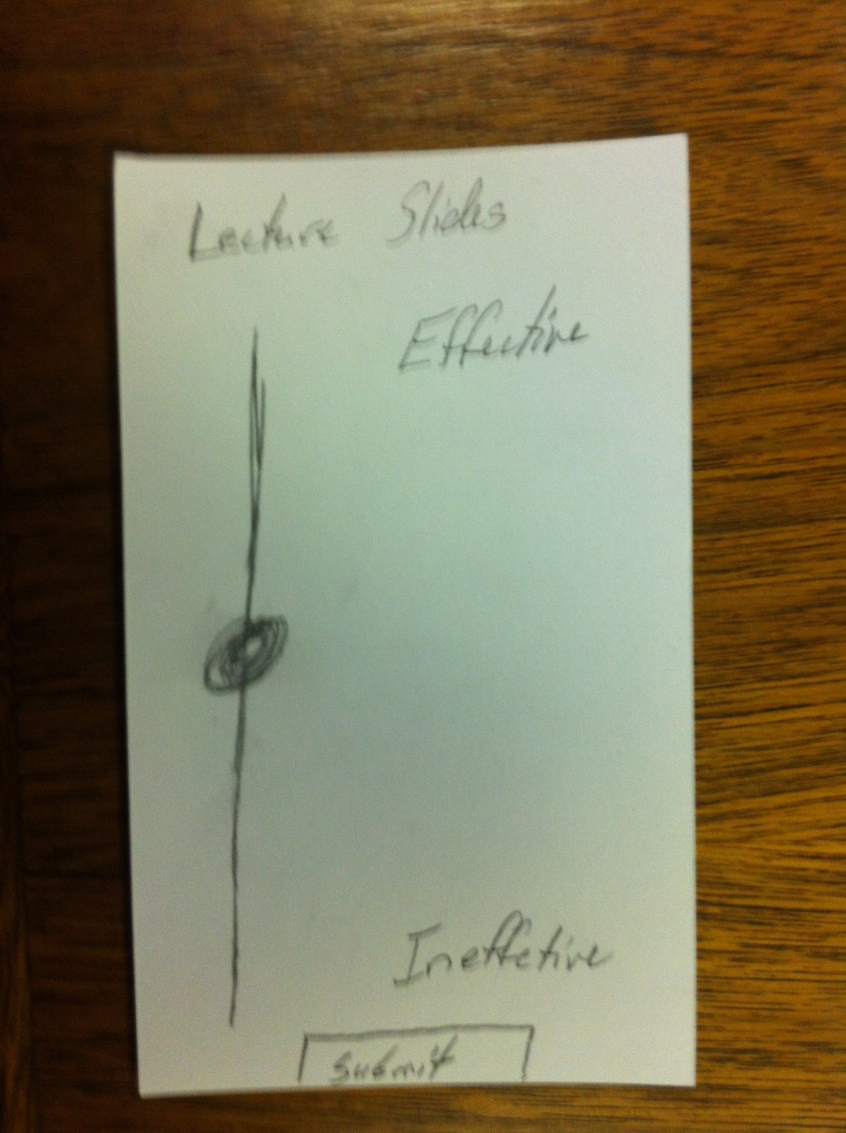
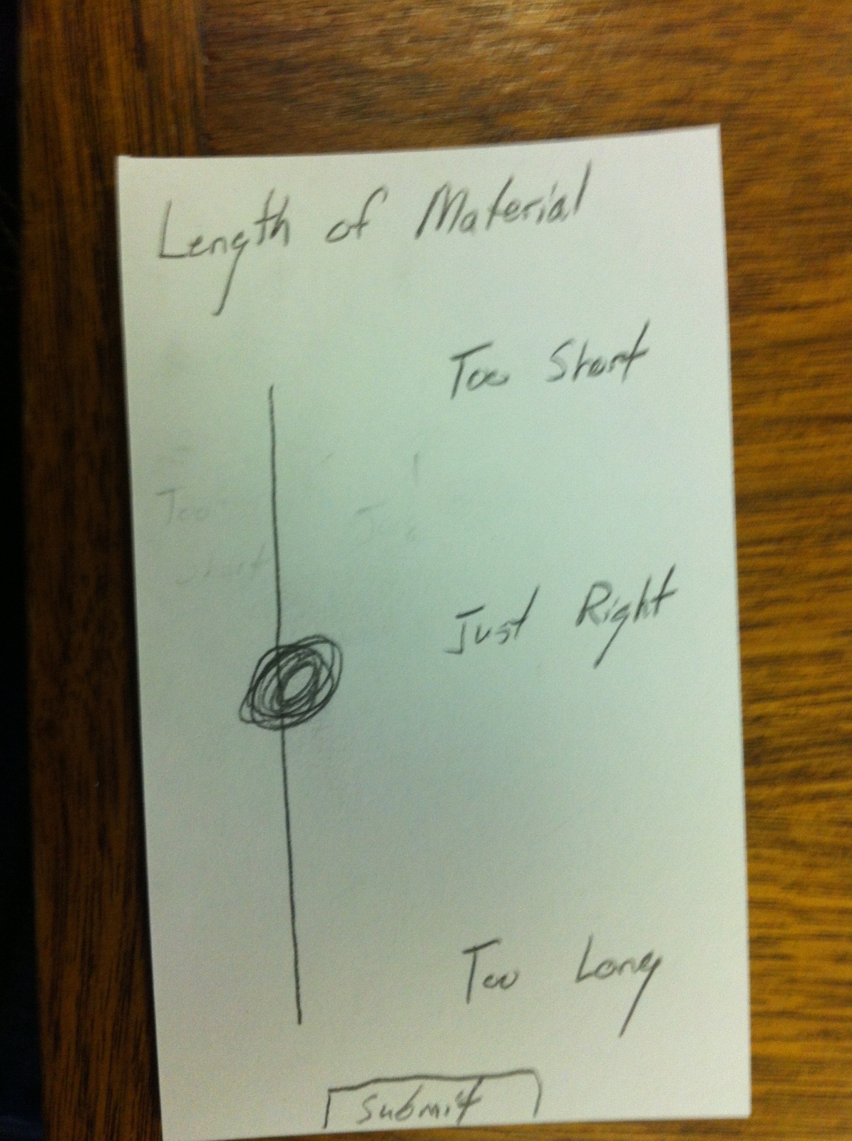
To give back, students are asked a series of questions in order. They are given a slider to in order to indicate their attitude toward the given area. I provided three example areas: “Engagement,” “Length of Material,” and “Quality of the Lecture Slides.”
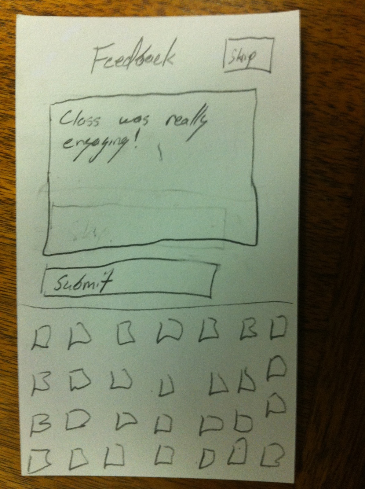
Comment Section:
After providing slider feedback, evaluations are given the opportunity to give comments on their feedback. They can skip this if they wish with the button in the upper, right-hand corner.
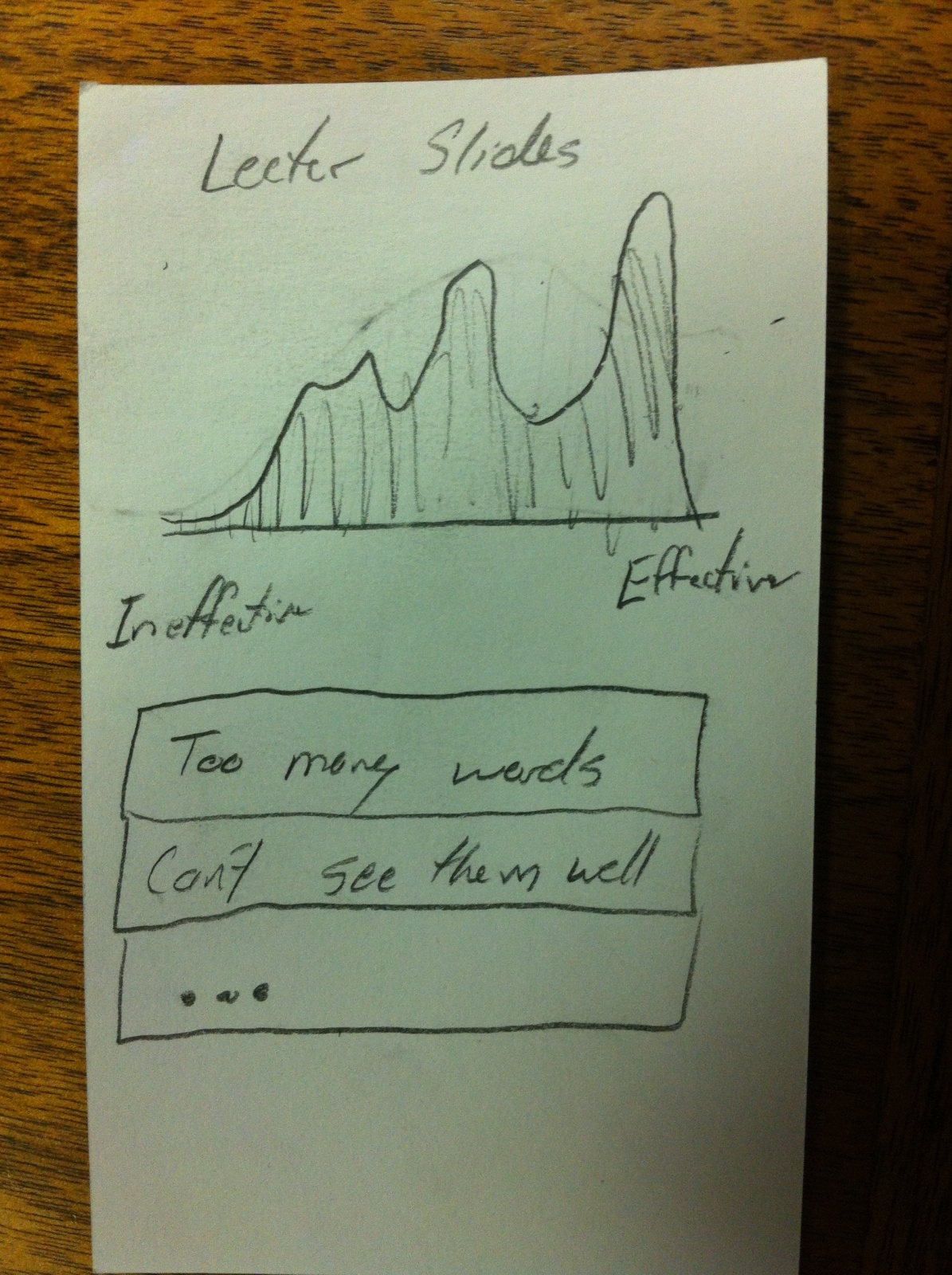
See Feedback:
Finally, this is a screen that can be used to see the feedback provided. The top section is a graph the shows how the students felt about the given area. It is a area map where the height of the line represents the number of students that gave that value. Further the the right is better. Finally, below is the list of written comments provided.
Feedback:
User Testing 1:
The first user tested started by going through a complete “Quest.” He didn’t save any questions. He found the questions simple to understand and was motivated to go forward. At the end of each question, he was pleased by the feedback. He then went into that “Manage Courses” pages and confused by the mechanics of the UI. He didn’t understand the scrolling capability of the course list. He also didn’t understand the use of the keyboard. He also didn’t understand the ordering the courses.
User Testing 2:
The second user tested also began with going through a complete “Quest.” She found the quest itself intuitive. She tried to save a question for later. When that brought her to the next question automatically, she was confused by the mechanic. She hadn’t necessarily wanted to go on to the next question. She had similar difficulty as the first user trying to add courses.
User Testing 3:
The final user tested went also through a complete “Quest.” After finished the “Quest,” he went to the “Saved Questions” section. He found that section a little intimidating. He said that having to select a category before even seeing any saved questions was a barrier to him going any further.
Insights:
- Utilized Existing Paradigms: The “Quest” section of my assignment was much more intuitive than the “Course Management” section because it was something everyone was used to doing. Quiz apps have been around for a while and everyone has used it. This is the power behind the existing desktop metaphor. It is so ubiquitous that its intuitive. New UIs must be informed and shaped by their predecessors.
- Make Simple Actions Explicit: The experience must be a simple as possible for a first time user. My “Course Management” system was powerful but unintuitive. I need to make the simple act of adding or dropping course more explicit (maybe by adding section headers or a search bar).
- Bake Complex Actions Deeper: If you want to add layers on top of the explicit simple actions, keep that away from the casual user. I liked the “float to the top model” for course selection but it threw too much at the user. It is better to hide complexity.
- Get Users To Data Fast: In my “Saved Questions” section, I created too much of a barrier between the user and the data they want. I should have gotten them to the questions directly. One there, I could add features like filter to get the user to the exact data set they need but have the imediate access would have been better.
- Always Think About All Possible Outcomes: When users saved their questions in my platform, I assumed they would want to go directly to the next question. That might be true for a majority of the users but not necessarily everyone. To make a successful UI, you need to go through all of the possible user scenarios.